
A digital marketing report dashboard is essentially the one-stop shop for all your marketing performance data – giving you answers to the really important business questions without you needing to manually dig through reports or export data all the time. It pulls in data from ad platforms, analytics tools, e-commerce systems, CRMs and all the rest, so you can keep tabs on metrics like revenue, customer acquisition cost, return on ad spend and pipeline contribution in real time. Modern dashboards make it dead simple for stakeholders, whether they’re performance marketers or CMOs, to get the exact bit of data they need in seconds – which is a game-changer for shifting marketing from being a reactive reporting exercise to a proactive strategy session.
As a digital marketing analytics agency, we specialize in building bespoke marketing dashboards for Power BI and Looker Studio that are tailored to fit a brand or agency’s exact business model, rather than trying to shoehorn them into generic templates. We’ve worked with the likes of Smith and Teleperformance – big enterprise companies – as well as industry leaders like Neil Patel, to create dashboards that link marketing spend to real revenue outcomes and support decision-making on the fly. Our experience stretches from e-commerce to B2B marketing analytics, SaaS and agency models – each with its own unique data sources, stakeholders and reporting requirements.
This article’s all about diving into some practical examples of marketing dashboards we’ve built, the step-by-step process of building your first dashboard, and how to use dashboard insights to drive both daily decisions and long-term strategy. We’ll also highlight some common pitfalls that can undermine the value of dashboards, and show you how to avoid them.
A digital marketing report dashboard is basically a real-time visual interface that brings together the key performance metrics from all your marketing channels into a single view. It’s like a control panel, combining data from all the platforms you use, like Google Analytics, Facebook Ads, LinkedIn Ads, email marketing tools and CRM systems, so you can keep an eye on how everything’s performing without having to switch between tools. Instead of getting a load of separate reports, all the data is structured around clear KPIs such as traffic, conversions, cost per acquisition and ROI.
These business intelligence dashboards are designed to be interactive and are constantly updated in real time. Data is pulled in automatically through integrations and refreshed daily – or sometimes even hourly. This approach reflects a bigger shift in analytics, where data is no longer static – it’s dynamic and embedded into decision-making all the time.
One thing to watch out for is not getting digital marketing dashboards mixed up with traditional reports. Dashboards are live tools that are used for ongoing performance monitoring and quick decision-making, with all the bells and whistles – filters, drill-downs and dynamic views. Static monthly PDF reports on the other hand, are just a fixed snapshot in time – they’re great for narrative analysis, stakeholder updates or board-level communication where context and explanation matter more than interactivity.
By 2026, digital marketing is going to be a whole lot more complex. Teams will be managing data across Google Analytics, multiple paid ad platforms like Google, Facebook, TikTok and those emerging retail media networks, all while dealing with stricter privacy rules and fragmented tracking. As a result, throwing together a spreadsheet report from scratch every month is no longer a viable option – pulling data from each platform, reconciling inconsistencies and building reports by hand just creates delays and increases the risk of errors.
Digital marketing report dashboards solve this by centralising data and automating reporting workflows. Instead of spending hours compiling reports, teams can focus on actually analysing performance and making decisions. This shift is critical as marketing cycles get faster and require near real-time optimisation.
Cross-channel marketing dashboards automate data extraction and reporting, so you can ditch the manual drudgery and focus on what really matters – strategy and optimisation.
One of our clients, a Digital Marketing Agency, reported saving a pretty sizeable 50 hours a week on reporting after we automated their dashboards across 80+ clients – it’s a game changer for their team efficiency.
With live paid media dashboards, teams can keep an eye on metrics like cost per lead, conversion rates and campaign ROI as they change – not just waiting around for the end of the month reports to come in.
In practice, that means marketers can quickly pull the plug on underperforming campaigns, shift budgets around or adjust their targeting before things get out of hand.
When all the data is combined into one view, it’s a lot easier to perform paid search analysis to see how each channel is performing and work out where to invest. Marketers can see which platforms are driving the best quality leads and adjust their spend accordingly, all of which improves their overall return on investment.
One of our clients said that having better data visibility and the ability to make decisions based on dashboard insights has led to more accurate reporting and better decision-making in their campaigns, which in turn means they can allocate their resources more effectively.
Dashboards create this one single source of truth that can be accessed by marketing, sales & leadership teams. That means that everyone’s working from the same data, and they all understand how the business is performing in the same way.
For agencies, that means managing all that multi-client reporting from one platform with consistent KPIs. For in-house teams, it means having this brand-wide visibility with breakdowns by region, product or even channel – like a global SaaS company tracking free trial signups by country and campaign all in one dashboard.
Most marketing teams don’t need one “mega-dashboard” – they need a small collection of 4 or 6 focused dashboards that are each designed for a particular audience and type of decision.
Specialists need really granular, up-to-the-minute views. Managers need to see performance trends and diagnose problems. Executives need high-level summaries. Organising your dashboards this way makes the whole thing a lot easier to use
The dashboards you see below are developed by our consultants for various clients based on their requests. They are not free templates available to download. However, if you need this analysis for your organization, feel free to contact us! Our team would love to set up a similar analysis for you.
Status dashboards are all about answering this simple but really important question: is everything running smoothly right now? They are operational dashboards reviewed every day – even several times a day.
These dashboards are focused on spotting any early warning signs of problems across tracking, campaigns, and website performance. They usually include metrics like GA4 event tracking, ad spend vs. daily budget pacing, website uptime and any spikes in 404 errors and anomalies like CTR dropping by more than 30% from day to day.
They are usually hooked up directly to live data sources via APIs and refresh every hour or every 4 hours, depending on platform limits. This way, teams are always working with the very latest info rather than relying on delayed reports.
Many teams also set up automated alerts alongside these dashboards. For example, if GA4 stops receiving events for two hours or if ad spend goes over the daily budget threshold, the system will trigger a notification so the issue can be sorted out before it causes any problems.
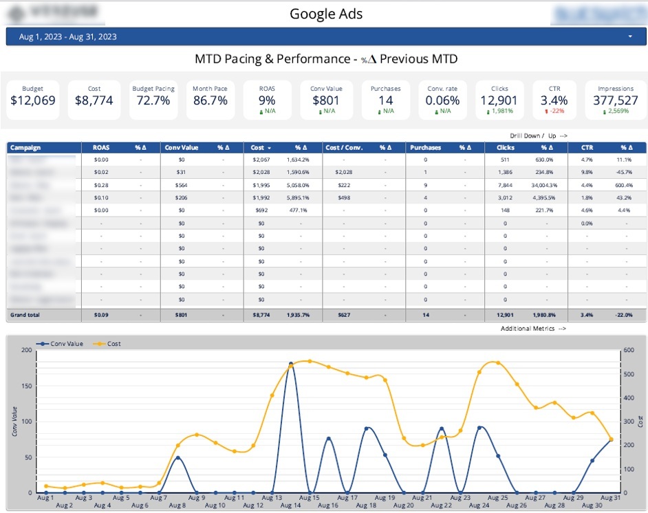
One practical example is a Looker Studio dashboard we built for a marketing agency running Google Ads campaigns. The dashboard tracks their monthly budget, actual spend, budget pacing (cost divided by budget) and month pacing (percentage of the month that’s gone).
The team compare budget pacing against month pacing to keep spend in check in real time. If spend is ahead of schedule they slow the campaigns down. If it’s lagging behind, they scale spend more aggressively to meet their targets.
The dashboard also breaks down cost and conversion value by day – that lets the team quickly spot unexpected cost spikes and rule out expensive keywords. Daily conversion value also lets them monitor campaign profitability and adjust their bidding strategies accordingly.
Executive dashboards are for those CMOs, CROs and CEOs who need a clear, one-page view of marketing performance. They are not used for low-level channel optimisation but for getting a sense of the overall impact of their marketing efforts and are usually reviewed weekly or during monthly business reviews.
These marketing reporting dashboards focus on high-level KPIs that connect marketing activity to revenue. Common metrics include total marketing-sourced pipeline, revenue, CAC vs target, marketing efficiency ratio, channel mix share and quarter-on-quarter growth in qualified leads.

A practical example is a Power BI KPI dashboard we built to analyse the impact of marketing on the company’s sales pipeline. It was used by the Global Head of Marketing and regional marketing directors to track how marketing contributes to revenue generation.
The top section of the dashboard highlights any won opportunities, expected revenue and the percentage of pipeline generated by marketing. It also breaks down opportunities and revenue by lead source and country to show where growth is coming from.
The bottom section of this overview is focused on pipeline structure, showing the number of leads at each stage of the funnel, with conversion rates between stages clearly laid out, and a detailed table showing opportunities that are won, lost, or still active. From here, users can click directly into Salesforce and take action on specific deals, with the added bonus of company logos automatically pulled via API to make all that data much easier to scan
Performance analysis dashboards are weekly or monthly reports that senior marketing teams use to review results across the full marketing function – basically, they help answer questions like “how did we do this quarter?” and “which channels are driving the most profitable growth?” These types of reports are typically used by CMOs, heads of marketing, regional marketing leads, and channel owners at mid-market and enterprise companies who are running campaigns across multiple regions, segments, or product lines.
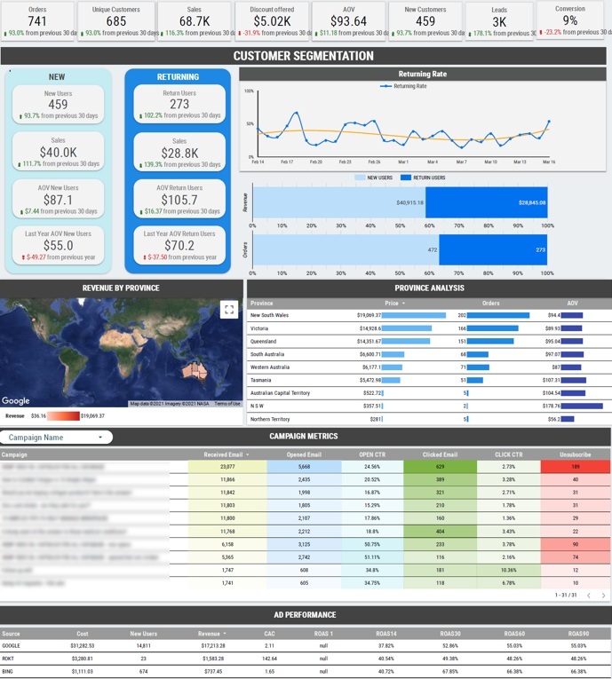
Our Looker Studio consultants developed this dashboard for a Shopify brand, pulling in data from Google Ads, Bing Ads, Shopify and Mailchimp. The dashboard tracks revenue by channel – giving them a clear picture of how Google Ads and Bing Ads are performing compared to each other – alongside customer acquisition cost per channel, so they can see which paid source is actually profitable. It also breaks down revenue split between new and returning customers, as well as visualising revenue performance by Australian state, and highlighting their most successful email campaigns so they can figure out where to allocate more budget. Every month after reviewing the data with their CEO and chief marketing officer, they’d adjust their marketing mix based on what the data revealed – shifting spend towards the channels and campaigns that are delivering the best return.
The dashboard becomes the go-to source of truth for that monthly marketing reporting. Teams use it to reallocate budget between channels mid-quarter, flag campaigns that are generating volume but no pipeline, and compare regional performance using the same definitions. Channel owners walk into each meeting with the numbers already on the table, which cuts down reporting cycles and keeps discussions on track and focused on decisions rather than slogging through data reconciliation.
PPC dashboards are used by paid media specialists, performance marketing managers and agency account teams to track the nitty-gritty performance of individual campaigns and ad-sets across multiple ad platforms. They consolidate data from Google Ads, Microsoft Ads, Meta Ads, TikTok Ads and programmatic platforms into one view. Some of the must-have KPIs to include are impressions, clicks, CTR, CPC, conversions, cost per conversion, ROAS, and share of voice or Impression Share, where the platform exposes them.
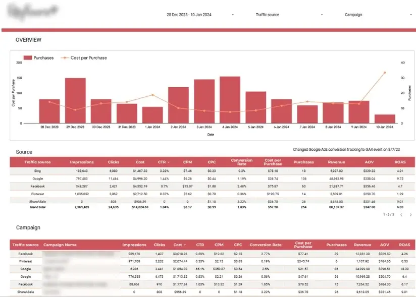
Our business analytics consultants built this marketing agency dashboard in Looker Studio for an agency that’s managing more than 150 campaigns across multiple clients. It pulls data in daily from Google Ads, Microsoft Ads, Meta Ads, TikTok Ads and programmatic sources, and centralises everything into one report. Slicers for client name, platform and campaign objective (lead generation vs ecommerce) let each account manager filter down to their own book of business in a snap. The dashboard structures performance by client, platform and campaign, with side-by-side views of spend, CTR, CPC, cost per conversion and ROAS.
The ecommerce dashboard helps support a clear daily optimisation workflow by linking spend directly to outcomes at the campaign level. Account managers use it to spot underperforming campaigns before budgets get wasted, compare CPC and CTR trends across platforms for the same client, and figure out which objectives deliver the best return per channel. Client reporting also becomes faster – instead of pulling separate exports from each platform, account teams just filter the dashboard by client name and share a single, consistent view.
SEO and content marketing reporting dashboards track how a website performs in organic search and what visitors do once they arrive. They are used by SEO managers, content leads, and heads of marketing at e-commerce brands, B2B companies and publishers who treat organic search as a core acquisition channel. The SEO reports combine data from Google Search Console, GA4 and sometimes a rank-tracking tool to answer questions like which queries drive qualified traffic, which pages convert, and how non-brand performance is trending against brand.
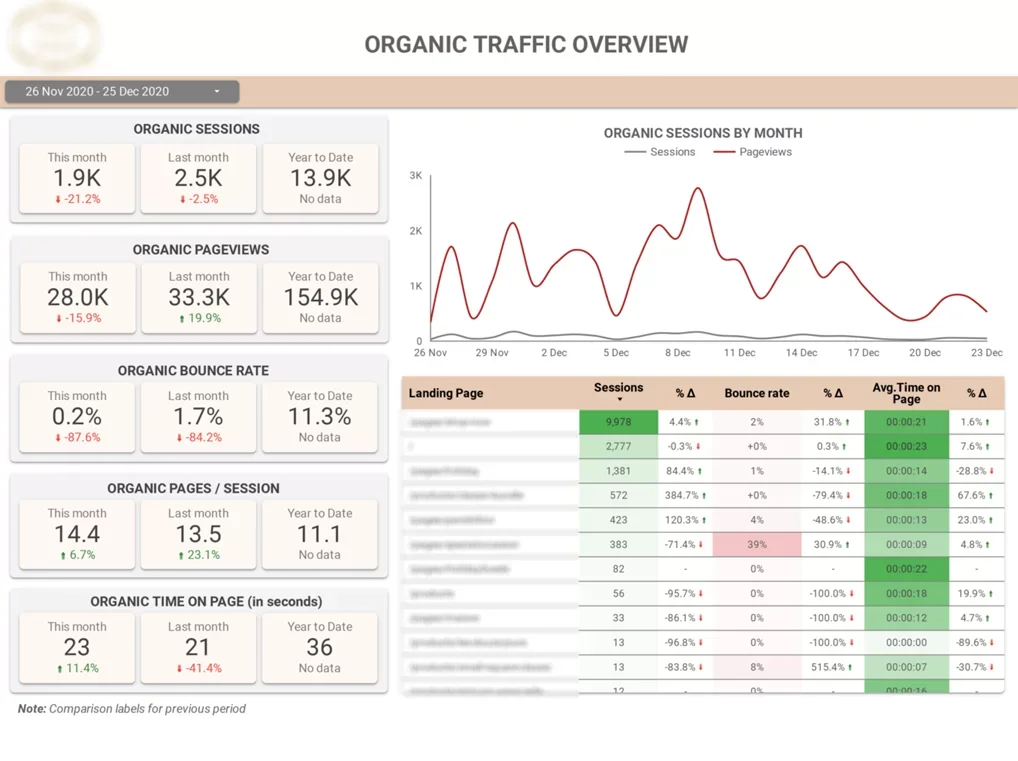
Our team developed this dashboard for an e-commerce client to measure both search visibility and on-site behaviour from organic visitors. It pulls impressions, clicks, average position, and click-through rate from Google Search Console, then layers in organic sessions, engagement rate, conversions and organic-assisted revenue from GA4 filtered to organic search. KPIs are broken down by query group to separate brand from non-brand traffic, by landing page to show top performers and high-bounce pages, and by month-over-month and year-to-date comparisons. Traffic from AI chatbots – currently grouped under Referral in GA4 – can also be included as a separate segment. Before building the report, the team ran a Google Analytics audit to make sure the GA4 data was clean and free of tracking issues.
The dashboard plays a key role in the monthly SEO review process, helping to inform the content roadmap. The team uses it to identify search queries that are pulling in loads of traffic but just aren’t engaging users, flag up landing pages that are driving decent traffic but not converting as well as they should be, and track whether new content is really starting to make its way up the search rankings. Because content and SEO people are working off the same numbers, this keeps editorial planning in line with what search is actually rewarding at any given time.
Ecommerce, and specifically revenue impact dashboards, are designed to connect marketing activity with sales outcomes for online retailers. They’re used by ecommerce managers, performance marketers, and founders at all sorts of retailers – direct-to-consumer brands, multi-channel retailers selling through Shopify, Magento, Amazon, or similar platforms. What they do is pull data from ad platforms, Google Analytics, and the ecommerce backend to track revenue, average order value, number of orders, cart abandonment rate, new versus returning customers, and return on ad spend by campaign and product category. Cohort and lifecycle views are often included, so you can compare first-time purchasers with repeat customers and get a sense of the long-term value beyond that first transaction.
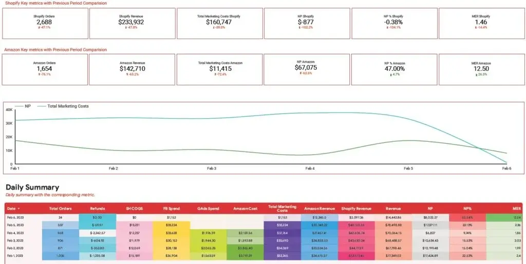
Our BI consultants built this Looker Studio dashboard for an ecommerce brand with a presence on both Amazon and Shopify. The top of it uses two rows of card visuals to give a quick sales performance summary for each platform side by side. At the bottom, a daily performance table shows total orders, cost of goods sold, revenue, and refunds on Shopify and Amazon, alongside ad spend on Facebook, Google, Amazon, and the combined total marketing cost. The same table also calculates net profit after COGS and marketing expenses, profit margin, and the marketing efficiency ratio – total revenue divided by total marketing spend. And in the middle, a line chart plots daily marketing costs against net profit, so the team can easily see how profitability is tracking over time.
The ecommerce business intelligence dashboard becomes the daily check-in for the ecommerce team and the weekly review for senior stakeholders. The team uses it to spot days when marketing spend outpaced profit, figure out which platform is delivering stronger margins, and decide where to push budget next. Decisions about scaling campaigns, pulling spend, or rebalancing between Amazon and Shopify are all made against the same set of profit-aware numbers rather than just looking at top-line revenue.
Social media dashboards are used to track content performance and audience growth across platforms like Facebook, Instagram, LinkedIn, and TikTok. They’re used by social media managers, content creators, and account managers at agencies and in-house marketing teams who need to report on engagement and audience trends without having to pull all the numbers manually from each platform. The MIS reporting dashboards typically combine native platform data to track impressions, reactions, page clicks, top-performing posts, and follower movement over time.
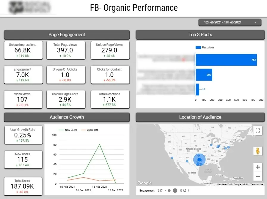
Our Looker Studio consultants worked with a social media marketing agency to build this dashboard for transparent client reporting across their social channels. It connects directly to Facebook and Instagram, and tracks total impressions, page clicks, reactions, and engagements at the account level. The dashboard ranks the top three posts by number of reactions, monitors audience growth through new followers and unfollows, and breaks down audience location by U.S. state. Each section is designed to give clients a clear view of how their content is performing and how their audience is changing day to day.
The dashboard supports both internal performance reviews and client-facing reporting. Account teams use it to identify which posts are getting the most engagement with each client’s audience and use that to inform the next content plan. Tracking follower growth and unfollows alongside campaign timing helps the team work out which posting strategies are really holding people’s attention and which ones are losing it. And the state-level audience breakdown helps inform regional content decisions, so marketers can plan posts and campaigns around where their most engaged followers actually are.
Email marketing dashboards track campaign performance and subscriber engagement across email platforms like Klaviyo, Mailchimp, and HubSpot. They’re used by email marketers, CRM managers, and ecommerce teams who run regular campaigns and automated flows and need to see what’s working without having to export reports from the platform every week. The dashboards pull together the core email KPIs – sends, opens, clicks, conversions, and revenue – so teams can compare individual messages and track performance trends over time.
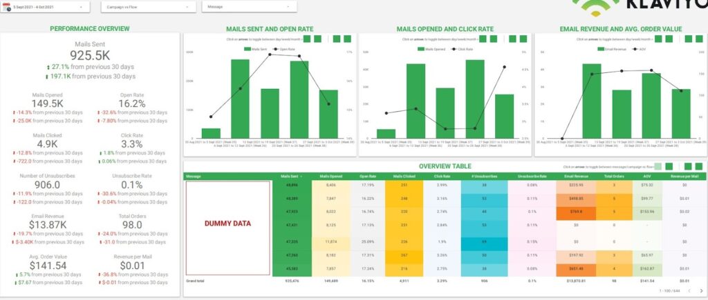
Our Looker Studio consultants built this Klaviyo dashboard to give the client a clear performance overview of their email activity within any chosen time frame. The top section displays aggregated KPI values, alongside the change in value and percentage compared to the previous 30 days – for example, showing that emails opened dropped by 14.3% or 25,000 fewer opens in the current cycle. Trend charts visualise movement over time, with a bar chart for emails sent and a line chart for open rate. And a table view breaks down the same KPIs by individual message, so users can compare performance across campaigns and export the data for further analysis when needed.
The managerial reporting dashboard is there to give the team a weekly review of campaigns and help with longer-term performance planning. But they use the period-over-period comparisons to get ahead of a slide in open rates or click-through rates before a whole quarter of data confirms the issue and they’re left feeling behind. That way they can act before it’s too late. The message-level table also makes it super easy to spot which subject lines, send times, or content formats are really pulling the engagement through, which can then feed directly into the next campaign brief. And, to top it all off, the export functionality lets the team take message-level data into deeper segmentation or list-health reviews when the need arises.

What call tracking dashboards are all about is helping out businesses where phone calls are the main way people convert on services and products. These dashboards are used by the marketing teams and ops managers in places like dental clinics, medical practices, house repair services, and law firms to try and figure out which campaigns are actually driving in valuable new customers.
This particular Looker Studio dashboard was built from scratch by Vidi Corp using CallRail data for a group of dental clinics that are focused on getting new patients from their local area. The top bit of the dashboard shows you how many calls are coming in each day, broken down into the ones that are being answered and the ones that aren’t, as well as how long those calls last on average. Then down below, the calls are split up according to whether they got answered, whether they went to voicemail, or if it was someone calling in for the first time. And to top it all off, there’s also some maps that show where calls are coming from, state by state, and some charts that let you compare call volume and how engaged callers are across different channels.
This small business dashboard does a whole lot to help teams be more efficient in both the marketing and operations departments. The marketing teams can use the channel comparisons and the average length of calls to figure out which sources are sending them high-quality leads – not just a lot of leads, but high-quality ones too. Meanwhile, the ops teams get to keep an eye on the number of calls that aren’t being answered and the first-time callers to make sure they’re not missing out on any opportunities. This creates this nice feedback loop between how well different marketing campaigns are doing and how well the team is handling the leads that come in, which means they can be way more precise about how they’re allocating their budget and get way better results from their conversions.
You can only truly judge a digital marketing dashboard by what went into it – the planning that went into it. The steps below are the way our consultants tackle client projects – from discovering the needs through to ongoing iterations. Each step takes into account how to scope, build, and improve a dashboard so it’s actually answering the right questions for the right people.
First thing to do before you even think about data analytics implementation is to ask yourself two questions: who’s the dashboard for, and what should they be able to do within five minutes of opening it? The answers to those questions are going to shape everything – the data sources, the KPIs, the layout, and the level of detail.
Different people have different requirements. A performance marketer may want to see CPL and ROAS by campaign to manage daily spend, while a CMO will be looking at marketing efficiency, pipeline contribution and CAC trends to inform quarterly planning. Trying to make one dashboard for both often results in a dashboard that doesn’t really work for either one.
Write down your clear KPI definitions and targets right now – for example, “Target CAC: under $400 by 2026” or “Target pipeline-to-spend ratio: 3:1”. Display these somewhere on the dashboard or stash them in internal documentation so everyone is on the same page with the numbers. And this makes it easier to avoid scope creep later on – every chart you add has to support an agreed-upon goal.
Useless data in, useless dashboard out. Before you even think about designing any visuals, you need to pick the right sources, confirm that everything is tracking properly, and iron out any naming issues. We recommend running a Google Analytics audit to make sure that you are collecting accurate data for reporting and making decisions. Skipping this step is the number one reason marketing dashboards get trust issues with stakeholders after a few months.
Some key tasks include connecting data sources via APIs, mapping fields across different platforms, making sure records aren’t duplicated, getting all currencies and time zones to play nice, and coming up with a unified channel taxonomy, such as “Paid Social” and “Paid Search.” Don’t even get me started on UTM hygiene – having tags like “facebook”, “fb”, and “meta” thrown around breaks cross-channel reporting till you get them sorted out.
GA4 event mapping needs just as much TLC – “generate_lead” or “purchase” need to line up with how you define conversion in ad platforms and how you track stages in the CRM. If not, the dashboard is just going to give different lead counts depending on which tile you click on.
Prioritize sources based on what the dashboard needs to answer. If you’re tracking pipeline and revenue, then you’re going to need CRM data. If it’s ROAS and profit you want to track, then ecommerce platform and cost of goods need to join ad spend.
Typical connectors these days fall into three groups: native connectors in Power BI or Looker Studio, third-party connectors, and just direct API pulls for platforms without native support. We often use Windsor.ai to pull marketing data into Power BI or Looker Studio because their connectors are pretty affordable and they cover most ad platforms. As a Windsor Premium partner, we have a pretty good handle on how to make the most of them so we can quickly build marketing dashboards for our clients.
But right off the bat, you need to think about practical constraints. API rate limits can affect refresh frequency, GA4 stores free historical data for a limited period, and most ad platforms refresh daily… though you can set up hourly refreshes for your peak campaigns. Confirming these constraints before you even start building can save you the headache later on.
Every platform calls things different. Google Ads has Campaigns and Ad Groups, Meta has Campaigns and Ad Sets, and LinkedIn has Campaigns and Campaign Groups. So you need to map all this to a common reporting concept so cross-channel views make sense.
Do standard transformations at the data model level rather than in each visual. Convert all currencies to a base currency like USD using a defined rate, unify date formats and calculate derived metrics like CPC, CPA and ROAS once so every chart is using the same definition. If you do this in every single chart, you’re just going to end up with inconsistent numbers all over the dashboard.
Next you categorise rules to map channels into a standard channel grouping – Paid Search, Paid Social, Organic Search, Direct, Referral, Email – based on source, medium and platform fields. This is the bit that lets a CMO look at one channel breakdown and trust that Paid Social means the same thing whether the spend came from Meta, LinkedIn or TikTok.
Good dashboard design is about clarity and actionability, not about trying to be too flashy or complex. Think specifically about the users and the decisions they need to make, rather than trying to appeal to some kind of broad, undefined crowd.
A few layout principles work consistently well, though. You put the most important KPIs right in the top-left where you first catch the eye, you group related tiles by funnel stage (awareness, engagement, conversion), and you keep each page to eight to ten visuals max so it’s not overwhelming. And make sure to use consistent scales and date ranges across all those charts so you can do some real side-by-side comparisons across channels and periods and get some actual answers.
Every chart should be answering a specific question, like “Which channels are actually driving the most revenue at a price I think is reasonable?” or “How is non-brand organic traffic doing against where I want it to be?” If a chart can’t answer a question, you just cut it. And crowded dashboards usually mean you didn’t get your objectives pinned down tight enough in the first place.
Marketing data breaks more often than you might think. Tracking schemas change, you lose tags during site updates, and then suddenly you’ve got bot traffic sneaking in and messing up your results, and you don’t even know it’s happening. So build those quality checks right into your dashboard itself rather than just counting on your memory.
Some practical tactics you can use include putting in daily or weekly quality assurance views that flag stuff like a sudden drop to zero conversions, or unexpected cost spikes, or traffic surges that might mean bots are getting in. And then you compare your dashboard totals to the same numbers in whatever system you’re trying to track, like Google Ads UI versus your Power BI total. And you make sure that key events like demo requests and purchases are firing off just right in GA4 and tag managers.
A real-life example from 2026 was when one of our clients had a GA4 change in their event schema that made their leads stop tracking, and a simple “Leads by Day” QA chart spotted the problem within 24 hours. If we hadn’t had that chart, we probably wouldn’t have even caught it for weeks. And you’ve got to document your data definitions too – like agreeing on what counts as a “lead” versus an “MQL” so that stakeholders don’t go and interpret the same numbers in completely different ways.
Dashboards are living, breathing things – they’re not a one-off project you just finish and walk away from. Marketing strategies shift, new channels come in, GA4 changes its event model, and your stakeholders’ questions evolve. So plan on going back and reviewing the dashboard at least every quarter.
First, just run a simple feedback loop – get together with your core users each month and see what they find useful, what gets in their way, and what decisions they just can’t make because of the layout. And track two or three adoption metrics like how many people are actually using the thing, whether it’s showing up in meetings, and whether it’s reduced ad hoc reporting requests – to confirm that it’s actually being used.
Some common things you end up tweaking over time are things like adding a new filter for region after you’ve gone global, or simplifying a chart that nobody ever looks at, or just consolidating some pages that nobody ever uses into the main view. The thing is, you don’t have to make some big, grand changes all at once. Just a few small adjustments every now and then can keep your dashboard fresh and relevant for a lot longer than some one-off, high-profile build.
A well-done dashboard supports both the everyday nitty-gritty and the longer-term big-picture stuff. The same view can help you figure out which campaign to pull the plug on in the morning, or where to invest next quarter.
In terms of day-to-day, people seem to follow a pretty routine pattern. They check spend pacing first thing in the morning, scan for channels with rising cost-per-acquisition, and pause campaigns where cost per lead has gotten crazy high. And that’s also where you catch anomalies early – a sudden drop in conversions or an unexpected spend spike usually shows up here before some stakeholder is yelling at you.
As for the longer-term stuff, marketing leaders use 90-day trends to decide where to pump more money, which content themes are worth going all in on, and how to balance brand spend against performance spend. The same dashboard that flags a campaign issue one day is where you get the numbers for the quarterly budget conversation a few months later.
Dashboards drive experimentation too – you use conversion rate data to tell you which landing pages are worth A/B testing, and then you track the results of those tests over time. Without that loop, experimentation usually stalls because people can’t see if those tests actually made a difference.
And then there’s cross-functional alignment – when marketing and sales teams work from the same dashboard views – lead quality, close rates, forecasted pipeline – conversations start to be about “what do we do next” rather than who’s right about whose numbers are right. This is where dashboards really earn their stripes.
Real-time monitoring is most valuable for campaigns where decisions need to happen within hours, not weeks. Daily monitoring of cost per lead for a webinar campaign, for instance, lets you jump on it right away if CPC spikes because of auction competition or some ad creative stops working. Your dashboard becomes the trigger for action rather than just a record of what already happened.
Daily usage tends to follow a pretty predictable pattern. Performance marketers check spend pacing first thing in the morning, scan for channels with rising CPA, and pause campaigns where cost per lead has crept up past target. The dashboard is also where tracking anomalies are spotted early – a sudden drop in conversions or an unexpected spend spike usually shows up here before anyone receives a complaint from a stakeholder.
Strategic usage, on the other hand, works on a longer time horizon. Marketing leaders use 90-day trends to decide where to increase investment, which content themes are worth expanding, and how to balance brand spend against performance spend. The same dashboard that flags a campaign issue today is the source of the quarterly budget conversation three months later.
Dashboards also drive experimentation. Conversion rate data per landing page helps you determine which pages are worth A/B testing, and the dashboard then tracks the results of those tests over time. Without this loop, experimentation tends to stall because teams cannot see whether previous tests actually moved the numbers.
Cross-functional alignment is another core use. When marketing and sales work from the same dashboard views, lead quality, close rates, forecasted pipeline, and conversations shift from disagreeing about whose numbers are right to discussing what to do next. This is where dashboards earn the most strategic value.
Real-time monitoring is especially valuable for active campaigns where decisions need to be made – and made fast – within hours rather than weeks. Daily monitoring of cost per lead for a webinar campaign, for instance, lets the team jump on a problem when the CPC spikes due to auction competition or instantly turn off a creative that suddenly stops converting. What starts as a dashboard is soon acting as the trigger for action, not just a record of what’s already happened.
Goal lines and threshold lines on charts make this way easier. Adding a reference line for “Target CPA = $60” or “Target ROAS = 4” lets marketers quickly spot where performance is ticking along just fine and where it’s time to step in. The chart can answer that question for them, saving them from having to do the maths in their head against a target they’ve got stored elsewhere.
Alerts are the final piece of the jigsaw when it comes to conditions that need sorting outside normal review hours. Setting up email, chat or even in-dashboard alerts for things like “ROAS below 2 for more than 3 hours” or “leads today down by 50% on the 7-day average” means the team finds out about a problem the moment it’s happening rather than having to wait till the next scheduled check-in. You want to get the balance right, so you’re hitting real problems without getting so many alerts that they start getting ignored.
There are some pretty consistent patterns that undermine the value of marketing dashboards, no matter what tool you’re using to build them. The mistakes below are ones we see again and again in client work, and they usually end up being the reason a dashboard stops being trusted, or even used at all.
The most common mistake is trying to display every single metric from GA4 and ad platforms on the dashboard. A dashboard with 40 tiles isn’t answering any clear business question – and it usually ends up a “data graveyard” that nobody looks at because nobody can figure out what to look for. Start with one or two focused dashboards that tie into specific decisions, and then prune ruthlessly when you see that certain charts are getting ignored.
Dashboards built on crap data lose stakeholder trust within weeks and rarely recover it. Inconsistent UTM tags, misfiring GA4 events and mismatched conversion definitions all need to be sorted out before you even think about designing any visuals. Get your UTM standards and event tracking checks sorted – and be prepared to delay the launch for a sprint or two if that means.
Dashboards built around what Power BI or Looker Studio can do rather than what users need end up looking pretty but being a nightmare to act on. Start with the user’s role, the decisions they make, and the time they’ve got to make them. A performance marketer with just 5 minutes to spare between meetings is going to need a different layout than a CMO prepping for a board meeting.
Numbers without any context are going to lead to bad decisions. A drop in traffic in the middle of a known seasonal lull isn’t a problem, but a dashboard that doesn’t show year-over-year comparisons or annotate major campaign launches will treat it like one. Add in some reference lines, annotations or comparison periods so users can make sense of the movements without having to remember what was happening last quarter.
When marketing and finance use different definitions of revenue, acquisition cost, or attributed pipeline, you’re going to have the same campaign looking successful in one report but underperforming in another. This usually comes to light during budget reviews and does some damage to the credibility of marketing reporting. Get some shared definitions for revenue, CAC and contribution margin sorted – and document them on the dashboard or in a linked glossary.
Dashboards aren’t done once they’re launched. Tracking setups change, channels evolve, and stakeholders’ questions shift – so a dashboard left untouched for a year is usually outdated by the time anyone even notices. Schedule a quarterly review to take out unused charts, add in some filters or pages to reflect the current strategy, and confirm that the data definitions still match how the business actually operates.
A well-designed marketing dashboard is the difference between guessing and knowing where to invest next. The marketing analytics examples and steps in this article are a reflection of how our consultants approach dashboard projects – from defining the right KPIs all the way to ongoing iteration with the teams who are using them every day.
If you’d like to build a custom marketing dashboard that’s tailored to your business, get in touch to discuss your reporting needs. We’ll help you link up the right data sources, design for the decisions that matter, and deliver a dashboard your team will actually use.


