
A paid media dashboard is basically a reporting tool that pulls data from all your different ad platforms and brings it together in one place. That way you can keep an eye on how your campaigns are doing and make smart calls about where to optimise.
In our experience, they’re usually built in Looker Studio for marketing agencies, while ecommerce brands and enterprises tend to lean towards Power BI or Tableau.
We’ve got some paid media dashboards that our Looker Studio agency put together over 5+ years for real businesses on different channels – Google Ads, Facebook, LinkedIn, YouTube, and even reporting on multiple channels at once. Our Looker Studio dashboard examples are all based on real-world use cases and are designed to solve specific reporting problems rather than just slapping a generic template on top of the data.
This guide is especially useful for businesses and agencies that are looking for something more than the standard free Looker Studio template that’s just doing the bare minimum. It shows you how to build a dashboard that really supports making decisions, gets you a clearer view of what’s working and what’s not, and helps you align your reporting with your unique marketing strategy.
A paid media dashboard is a visual reporting tool that brings paid advertising performance data into one place. Instead of checking separate platforms such as Google Ads, Meta Ads, LinkedIn Ads, Microsoft Ads, TikTok Ads, or Amazon Ads individually, a paid media dashboard gives marketers a central view of campaign performance, budget usage, conversions, and return on ad spend.
Paid media dashboards are used by performance marketers, media buyers, PPC specialists, marketing managers, agencies, ecommerce teams, and business owners. For agencies, they help present client performance clearly. For in-house teams, they help marketing and leadership teams understand which channels, campaigns, audiences, and creatives are driving results.
A good paid media dashboard can bring together data from ad platforms, analytics tools, ecommerce platforms, CRM systems, and spreadsheets. This may include spend, impressions, clicks, CTR, CPC, conversions, CPA, revenue, ROAS, lead quality, sales pipeline, and budget pacing. When these data sources are connected, teams can see not only how much they are spending, but also what that spend is generating.
A paid media dashboard is different from a paid media report. A report is usually a static summary created for a specific period, such as a weekly or monthly update. A dashboard is more dynamic and interactive. It is designed for ongoing monitoring, so users can filter by channel, campaign, date range, audience, or objective and spot performance changes more quickly.
This matters because paid media performance can change fast. Costs may rise, conversion rates may drop, budgets may underspend, or one campaign may start outperforming the rest. A paid media dashboard helps teams identify these changes early, make better optimisation decisions, and focus budget on the activity most likely to improve ROI.
A paid media dashboard should show more than surface-level ad performance. The best dashboards organise metrics by funnel stage, so teams can understand where performance is improving, where spend is being wasted, and which campaigns are contributing to revenue.
At the awareness stage, the dashboard should track metrics such as impressions, reach, CPM, and frequency. These show how many people are seeing your ads, how efficiently you are buying visibility, and whether the same audience is being exposed to your ads too often.
For engagement, useful metrics include clicks, CTR, CPC, video views, and watch rate. These help you understand whether your ads are attracting attention and encouraging users to take the next step. A high number of impressions with a low CTR may suggest that the creative, offer, or targeting needs to be improved. Using an AI video upscaler can also help improve the visual quality of video ads, making them clearer and more engaging across different platforms.
At the conversion stage, the dashboard should include conversions, conversion rate, CPA, and cost per lead. These metrics show whether paid traffic is turning into meaningful actions, such as purchases, enquiries, sign ups, demo requests, or form submissions.
Revenue metrics are especially important for ecommerce and revenue focused campaigns. ROAS, revenue, average order value, and profit margin help teams understand whether paid media is generating profitable growth, not just traffic or leads.
Efficiency metrics such as spend pacing, budget utilisation, and wasted spend show how well budgets are being managed. They help media buyers see whether campaigns are overspending, underspending, or spending on keywords, audiences, placements, or creatives that are not producing results.
For longer sales cycles, the dashboard should also include retention or quality metrics. These may include LTV, repeat purchase rate, lead quality, and pipeline value. These metrics help connect paid media activity to the quality of customers or leads being generated, rather than only measuring the first conversion.
| Funnel stage | Metrics |
|---|---|
| Awareness | Impressions, reach, CPM, frequency |
| Engagement | Clicks, CTR, CPC, video views, watch rate |
| Conversion | Conversions, conversion rate, CPA, cost per lead |
| Revenue | ROAS, revenue, average order value, profit margin |
| Efficiency | Spend pacing, budget utilisation, wasted spend |
| Retention or quality | LTV, repeat purchase rate, lead quality, pipeline value |
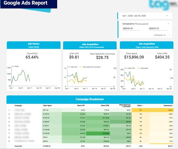
A Google Ads dashboard – the one that all the PPC specialists, in-house performance teams and marketing agencies rely on – is used to monitor campaign effectiveness and report results to stakeholders. It puts all the key metrics like spend, clicks, conversions, and ROAS into one easy-to-read view that helps with both daily optimisation and client reporting.
This dashboard was custom-built by our marketing analytics agency for a Google Ads marketing firm to standardise reporting across their client base. We worked directly with Google Ads to get all the data into clear reporting layers, including daily performance trends, campaign-level breakdowns, keyword analysis, and conversion tracking by type and location. The users can switch between different timeframes and drill down into specific campaigns, keywords or locations using interactive elements like period-over-period comparison toggles and filters.
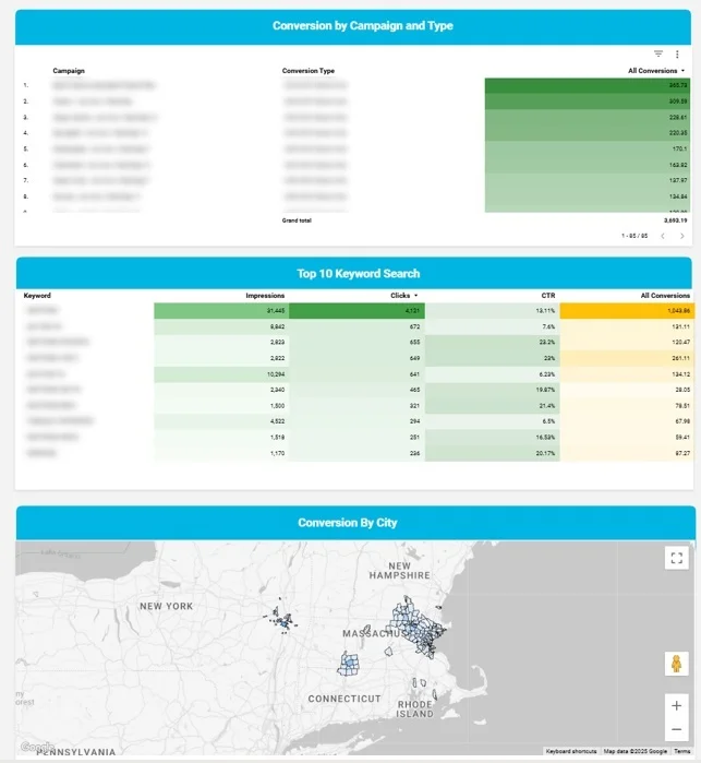
This client reporting dashboard is a game-changer for the reporting workflow as it makes performance insights instantly accessible and easy to understand. Marketing teams can quickly spot which campaigns deliver the most value, which keywords drive conversions, and how performance varies by location. This helps them make faster optimisation decisions, communicate more clearly with their clients and make more consistent decisions about budget allocation across campaigns.
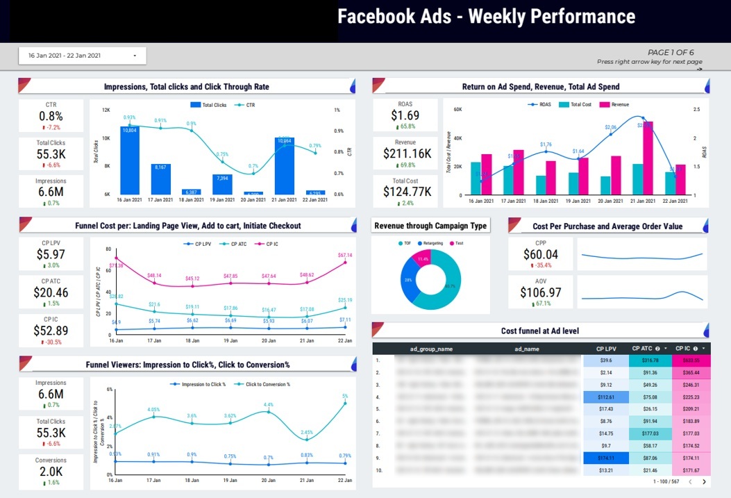
A Facebook and Instagram Ads dashboard is used daily by media buyers, performance marketers and agency account managers for data reporting to track campaign performance across the full marketing funnel. It combines engagement, traffic and conversion metrics into one view, helping teams understand how well their ad spend is converting into revenue.
This dashboard was built by our BI consultants in Looker Studio for a Facebook Ads agency to structure reporting around funnel performance and cost efficiency. It brings together key metrics like ad spend, revenue and ROAS with daily trend analysis, and includes engagement metrics like impressions, clicks and CTR. The report also breaks down the conversion funnel in detail, tracking landing page views, add-to-cart actions, and checkout and purchase events, with cost analysis at each stage.
This marketing agency dashboard really helps the optimisation workflow by showing how performance evolves across the funnel. Teams can identify where users are dropping off, evaluate the cost of moving users between stages and assess profitability through cost per purchase and average order value. This enables more precise budget allocation, faster performance diagnosis and consistent tracking of campaign efficiency.
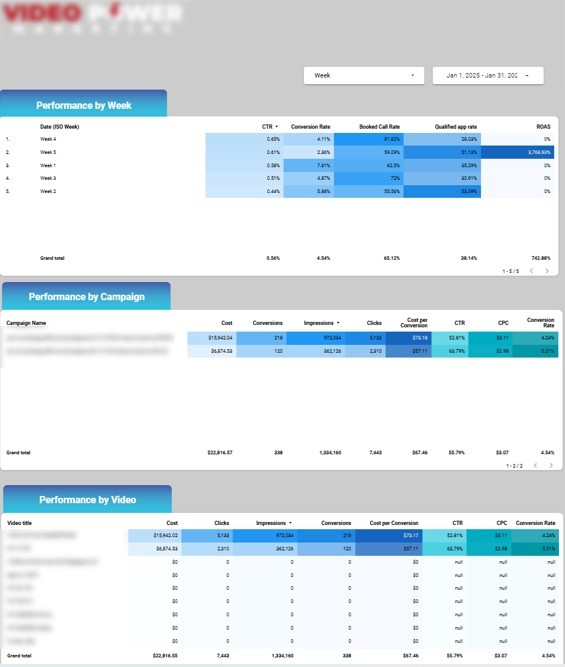
A YouTube Ads dashboard – the one used by media buyers and video marketing teams to evaluate the performance of video campaigns and optimise ad spend – is focused on engagement and conversion efficiency, helping them understand which videos and campaigns are driving the strongest results.
Our data visualisation consultants built this dashboard in Looker Studio for a YouTube Ads agency, using data sourced directly from Google Ads. It puts all the key performance metrics like cost, clicks, CTR and cost per conversion, with detailed breakdowns by campaign and individual video, allowing users to compare how different creatives and targeting strategies are performing within the same account.
The dashboard really supports a clear optimisation workflow by highlighting which videos drive the most efficient traffic and conversions. Teams can quickly spot top-performing creatives, assess cost efficiency at both campaign and video level and reallocate budget towards the ads that deliver the strongest results.
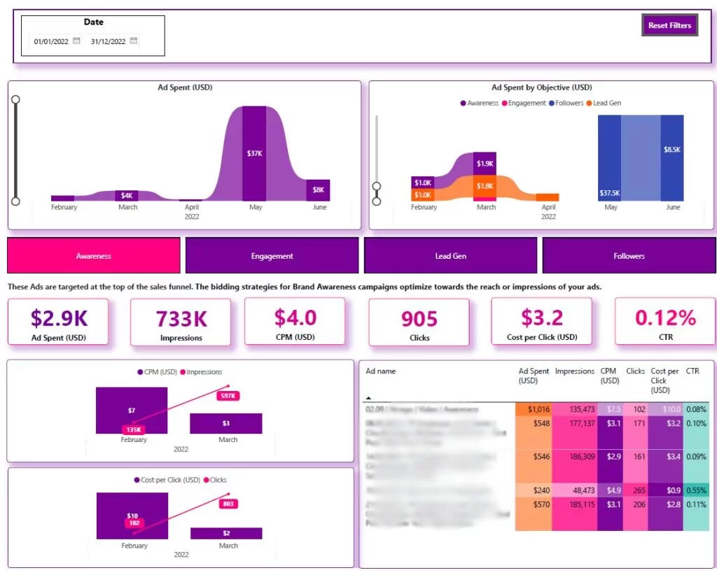
A LinkedIn Ads dashboard is used by B2B marketers, demand generation teams and paid media specialists to track campaign performance based on specific marketing objectives. It provides a structured view of how the budget is allocated and how effectively campaigns deliver results across awareness, engagement, lead generation and follower growth.
This custom-built dashboard was put together by our Power BI consultants, and it links up to LinkedIn Ads data via a dedicated connector. It organises its performance into clear sections based on how you want to measure campaign objectives – i.e., awareness, engagement, lead generation or follower campaigns. You can easily switch between views to see exactly how your campaigns are performing in the most important areas. Each section is focused on the KPIs that matter most – impressions and CTR for awareness, interactions for engagement, leads and cost per lead for lead gen and follower growth metrics for brand-building campaigns.
The B2B marketing analytics dashboard works in a pretty logical way. It shows how much budget was spent, where it was spent and what kind of results were achieved. This helps marketing teams put everything into context and evaluate each campaign on its own objective. This, in turn, means teams are able to work out whether each campaign is good value or not, make adjustments to targeting and creative strategies and keep their reporting consistent across different types of LinkedIn campaigns.
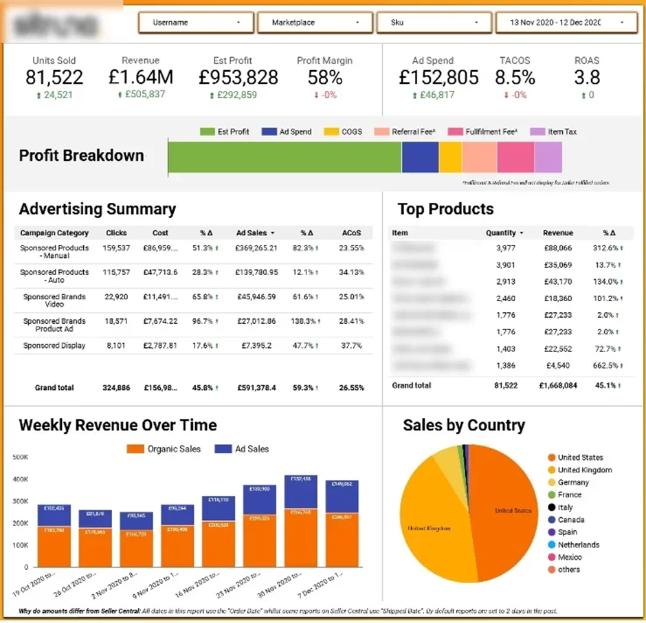
You see, Amazon Ads dashboards are used by e-commerce teams to get a handle on sales performance across both organic and paid channels. What they give is a complete picture of how products are performing on Amazon, combining retail data with ad metrics so you can make more informed growth decisions.
Our dashboard consultants created this report for an Amazon retailer. It plugs in organic sales data from Seller Central and Amazon Ads data from Amazon Ads and brings both into a single reporting layer. It looks at trends in total sales, profitability and how ads are influencing the overall picture. Plus, it breaks the data down country by country and product line and lets you drill down into individual ad campaigns to see how they’re doing based on metrics like ad spend and return.
Having this dashboard gives you better decision-making by bringing sales and ad analysis together in one place, including visibility into how Amazon creatives are performing across campaigns. It lets you identify top performers, see how ads are impacting revenue and adjust campaign strategy based on actual sales impact. This, in turn, means you can do things like allocate budget more effectively, prioritise good products and get a clearer view of how your Amazon business is performing overall.
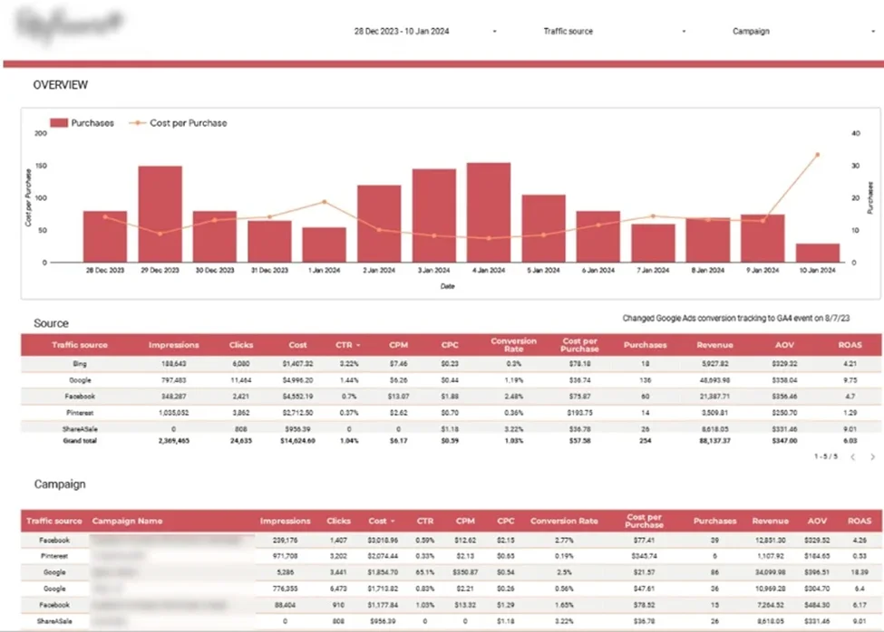
Marketing mix dashboards are used by performance marketers and e-commerce teams to compare results across multiple channels in one report. What they bring together is data from all major platforms, so you can see how each channel is contributing to traffic, conversions and overall return on investment.
Our business analytics consultants built this dashboard in Looker Studio for an e-commerce client to make reporting across Google Analytics, Google Ads, Bing, Facebook, Pinterest, and ShareASale consistent. It combines daily purchase data with cost metrics and structures performance by channel and campaign. Key metrics like impressions, CPM, cost per purchase, ROAS, conversion rates and revenue are all viewed side by side with detailed breakdowns to help you identify the strongest-performing campaigns.
The dashboard helps with a clear optimisation workflow by linking acquisition cost to revenue performance. The top bit tracks daily purchases and cost per purchase to make sure customer acquisition stays affordable relative to average order value. Below that, you’ve got channel-level and campaign-level analysis to help you work out which platforms drive awareness, which convert customers and where budget delivers the best return, so you can allocate marketing spend more precisely.
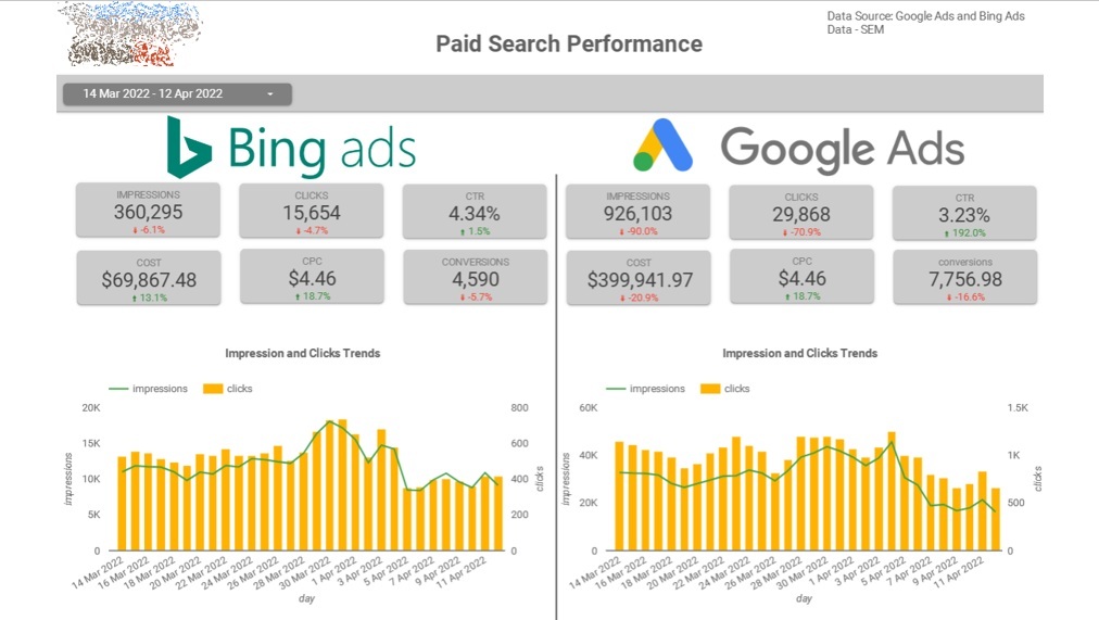
Google vs Bing Ads dashboards are used by PPC teams and performance marketers to compare search ad performance across the two major platforms. What they give is a side-by-side view of how campaigns are doing so you can see where spending budget gets the strongest results.
Our ecommerce analytics consultants built this paid media dashboard to compare Google Ads and Microsoft Ads data in a single report. It looks at metrics like impressions, clicks, CTR and conversions for each campaign and each keyword. This lets you compare performance differences between Google and Bing at both a high and a granular level.
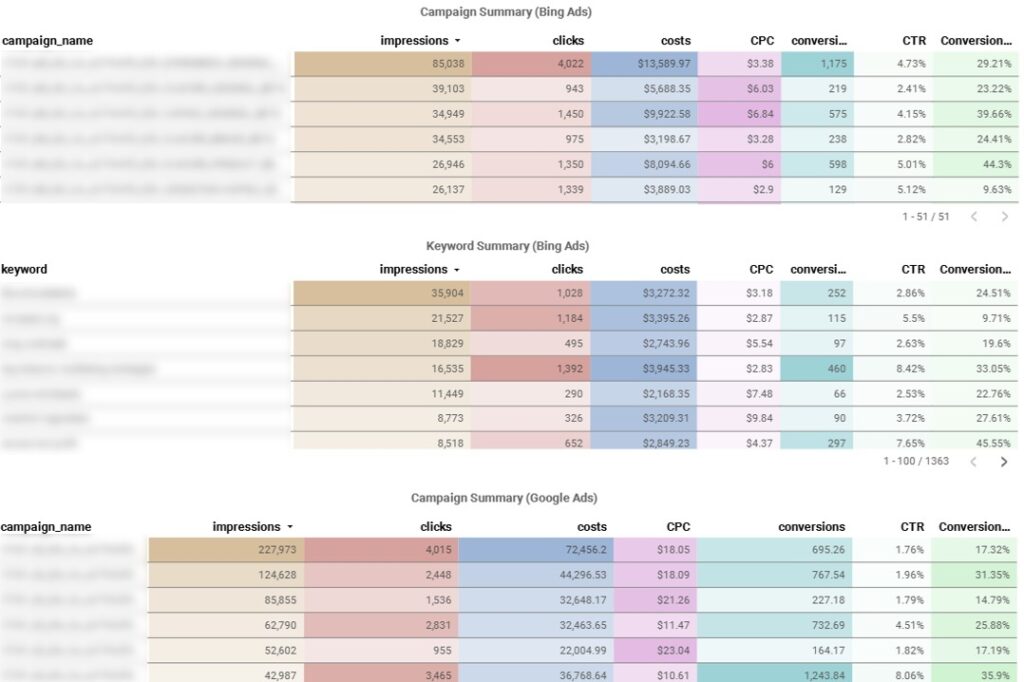
Having this dashboard helps with optimisation by highlighting which platform delivers better traffic quality and conversion efficiency. You can compare campaign performance across both platforms, see which keywords are performing well on each and adjust bidding and budget accordingly. This lets you do cross-platform strategy and make decisions about where to scale and spend more effectively.
Media buyers rely on dashboards that break down ad performance into clear, actionable insights across creatives, audiences and placements. These dashboards combine metrics like CTR, conversions, ROAS and engagement to show what’s working and what isn’t. The goal is to quickly spot winning combinations of creative, targeting and placement so you can scale budgets or reallocate with confidence.
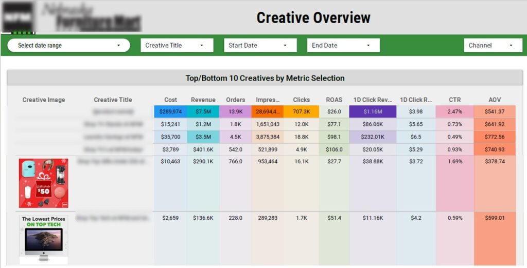
A thumbnail analytics dashboard is one of the most powerful marketing analytics examples. It is all about evaluating static creatives used in ads – images or video thumbnails. It shows each thumbnail alongside key metrics like CTR, revenue, conversions and ROAS. Media buyers use this dashboard to see which visuals get attention and drive clicks, so they can prioritise high-performing creatives and pause underperforming ones. This leads to higher engagement rates and more efficient use of ad spend.
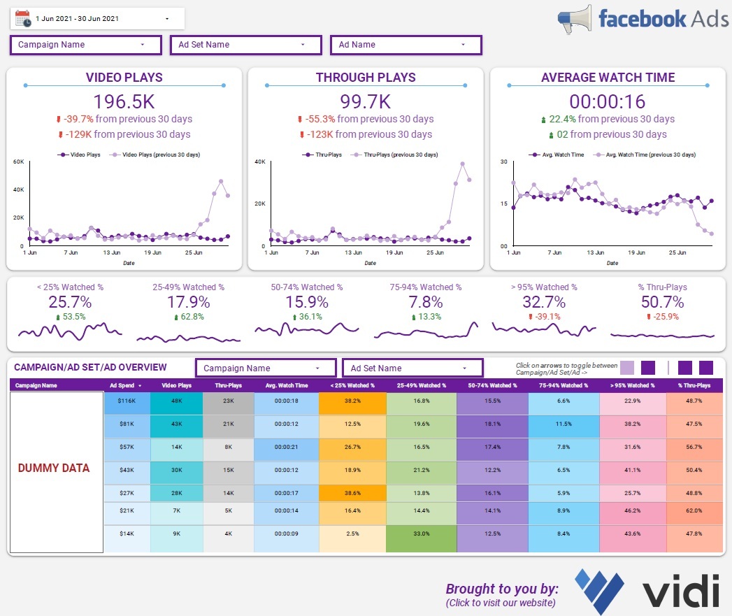
A video analytics dashboard is all about measuring how users react to video ads at different stages of the ad. We track the metrics that really matter, such as video plays, average watch time, and the percentage of people who actually watch 25%, 50% and 75% of the video. This gives media buyers a clear picture of where people are dropping off and which videos can keep viewers’ attention for the longest. This lets them refine their messaging, get their hooks right in the first few seconds, and pour more budget into the videos that really engage and drive results.
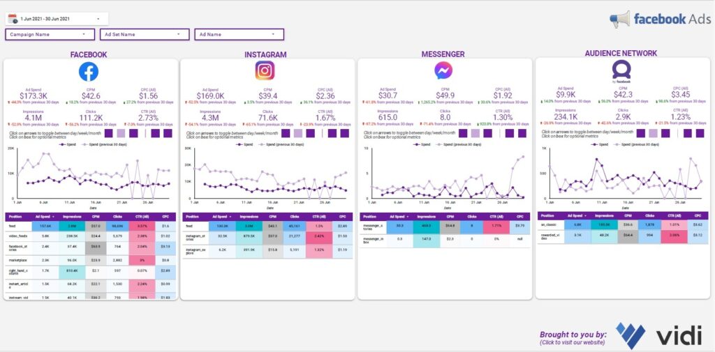
A placement performance dashboard cuts it down to how ads are performing across different platforms and placements – like Facebook, Instagram, The Audience Network, and Messenger. It focuses on key metrics like cost per click, CPM, and click-through rate, to figure out which placements deliver the best bang for your buck. Media buyers use this to work out where the ads are really delivering results and how to adjust their placements accordingly. This makes sure that the budget is allocated to the places that really work, and improves the overall efficiency of the campaign.
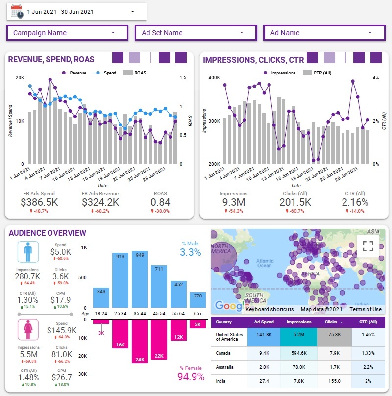
An audience analytics dashboard breaks down performance by age, gender and device so you can see which segments are really responding to your ads. It’s got metrics like CTR, conversions, and ROAS to show how each audience group is performing. Media buyers use this to refine their targeting and focus on the profiles that are really generating the highest returns. This means they get more precise targeting, less wasted spend, and a better alignment with the ideal customer profile.
Account managers are relying on dashboards to keep an eye on how multiple campaigns and clients are performing. Their main focus is controlling the budget, hitting profitability targets, and deciding which ads to scale up or shut down. These dashboards bring together performance and financial metrics so account managers can quickly spot any risks, make the right priorities, and keep campaigns aligned with client goals.
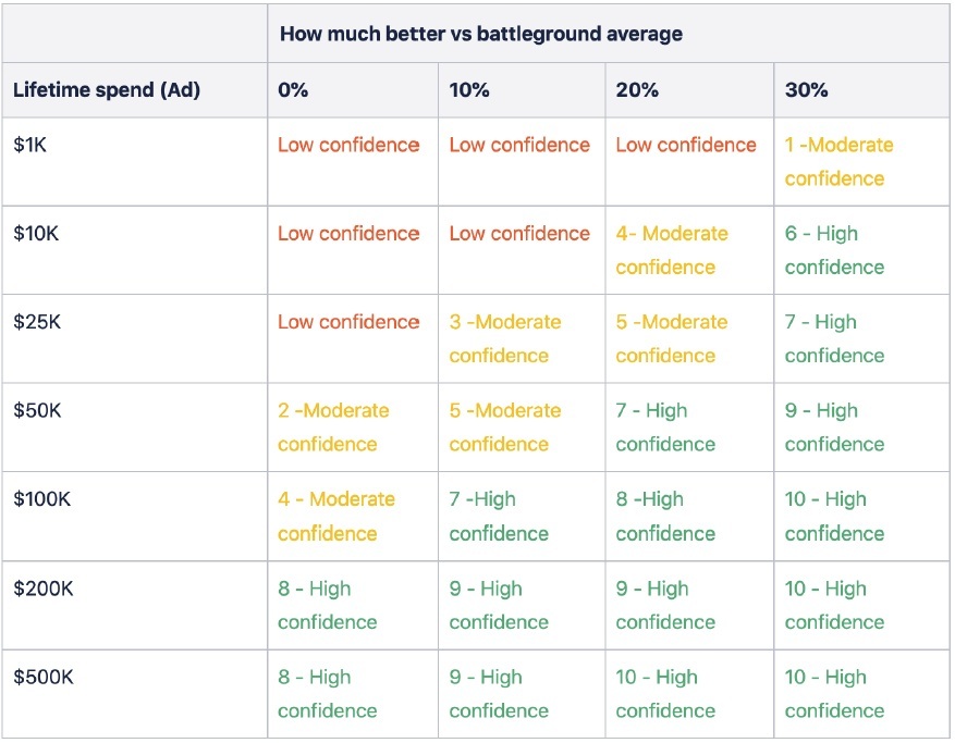
An ad evaluation dashboard is used to decide which ads to keep running and which to pause. We worked with a top agency to build this type of dashboard, and it basically segments ads based on their total spend to date and their performance against target metrics. Each ad then gets a confidence level – low, medium or high – based on how consistently it delivers results. This lets account managers make faster, more structured decisions on scaling up or shutting down ads, and reduces wasted spend and improves overall campaign efficiency.
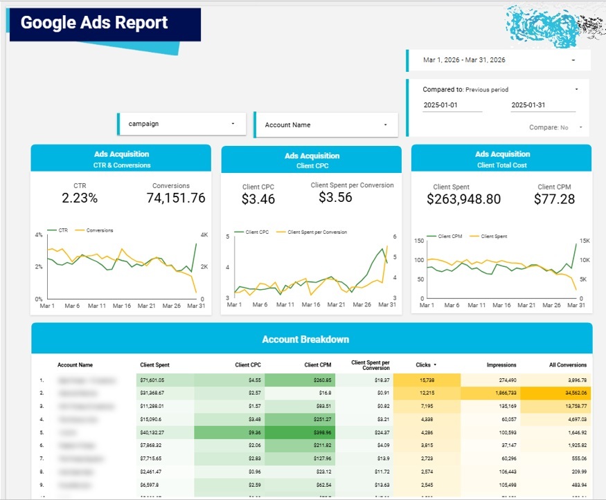
An agency-wide performance dashboard gives account managers a big picture view of all clients, including total spend and key profitability metrics. It’s easy to spot which clients are underperforming, and account managers use it to prioritise their time, focusing on clients that are struggling, while keeping an eye on the high-performing ones. This means they can be more proactive and make sure performance is consistent across the whole client portfolio.
Paid media dashboards can look very different depending on the type of business using them. An ecommerce brand may care most about revenue and ROAS, while a B2B company may need to track lead quality, pipeline value, and cost per opportunity. Choosing the right dashboard structure helps teams focus on the metrics that actually reflect business performance.
An ecommerce paid media dashboard tracks how advertising spend contributes to online sales. It usually combines data from platforms such as Google Ads, Meta Ads, TikTok Ads, Microsoft Ads, Amazon Ads, GA4, and ecommerce platforms such as Shopify, WooCommerce, or Magento.
This type of dashboard should show spend, clicks, conversions, revenue, ROAS, average order value, cost per purchase, product performance, and profit margin. It can also include campaign, channel, creative, and audience breakdowns, helping ecommerce teams see which campaigns are driving profitable sales and which ones are wasting budget.
A B2B lead generation dashboard focuses on the quality and cost of leads generated through paid media. Instead of only tracking form submissions or landing page conversions, it should connect ad platform data with CRM data from tools such as HubSpot, Salesforce, or Pipedrive.
Key metrics may include cost per lead, conversion rate, marketing qualified leads, sales qualified leads, cost per opportunity, pipeline value, and closed won revenue. This helps B2B teams understand which campaigns are generating valuable leads, not just high lead volume.
A SaaS paid acquisition dashboard tracks how paid media contributes to trials, demos, subscriptions, recurring revenue, and customer growth. It is especially useful for subscription businesses that need to understand acquisition cost, retention, and lifetime value.
Important metrics include sign-ups, free trials, demo requests, cost per trial, cost per demo, trial to paid conversion rate, CAC, MRR, LTV, payback period, churn rate, and ROAS. By combining ad platform, product analytics, CRM, and billing data, SaaS teams can see which campaigns are attracting users who are likely to become long term customers.
An agency client reporting dashboard is designed to make campaign performance easy for clients to understand. It usually includes high level KPIs, channel performance, campaign performance, budget pacing, conversion trends, and commentary on what changed during the reporting period.
For agencies, the dashboard should be clear, branded, and easy to share. It can include client specific goals such as leads, purchases, booked calls, ROAS, CPA, or revenue. A good agency dashboard reduces manual reporting time and gives clients a transparent view of what their ad spend is achieving.
An executive paid media dashboard gives leadership teams a high-level view of paid media performance. It should avoid unnecessary platform detail and focus on the metrics that matter for business decisions.
This dashboard may include total spend, revenue, ROAS, CAC, pipeline value, customer acquisition trends, channel contribution, profit margin, and budget pacing. It helps executives understand whether paid media is supporting growth targets, where budget is being allocated, and which channels are delivering the strongest return.
The best tool for building a paid media dashboard depends on the size of your team, the number of advertising platforms you use, the amount of data you need to process, and how the dashboard will be shared. Some teams need a simple client facing dashboard that updates automatically, while others need a more advanced reporting setup that combines paid media data with CRM, ecommerce, and revenue data.
| Tool | Best for | Limitations |
|---|---|---|
| Looker Studio | Agencies, client reporting, fast sharing | Can slow down with large datasets |
| Power BI | Enterprise reporting, complex models | More setup required |
| Tableau | Advanced visual analysis | Higher cost and complexity |
| Google Sheets | Lightweight reporting | Less scalable |
Looker Studio is a popular choice for paid media dashboards because it is easy to share, flexible, and well suited to client reporting. It works well for agencies, consultants, and marketing teams that need dashboards for Google Ads, Meta Ads, LinkedIn Ads, GA4, and other marketing platforms.
It is especially useful when stakeholders need a simple link to view performance without using a more complex analytics platform. However, dashboards can become slower when they rely on many data sources, large datasets, or complex blended data.
Power BI is better suited to enterprise reporting and more complex data models. It is useful when paid media data needs to be combined with sales, finance, CRM, product, or ecommerce data.
For example, a business may use Power BI to compare ad spend with pipeline value, closed won revenue, profit margin, or customer lifetime value. The main drawback is that it usually requires more setup, modelling, and maintenance than simpler dashboard tools.
Tableau is a strong option for teams that need advanced visual analysis and more flexible data exploration. It can be useful for larger organisations that want to analyse paid media performance across multiple markets, brands, products, or customer segments.
The trade off is that Tableau can be more expensive and complex to manage. It may be more than what smaller teams need if they only want a straightforward paid media performance dashboard.
Google Sheets can work well for lightweight paid media reporting, especially when teams are starting out or only need a simple performance tracker. It is familiar, flexible, and easy to customise.
However, Google Sheets is less scalable than dedicated dashboard tools. As data volumes grow or reporting becomes more complex, it can become harder to maintain, automate, and govern.
Building a paid media dashboard is a straightforward process that focuses on making sure data supports real decisions. With existing data sources and templates, most dashboards can be set up in a day or two. The key is to get clarity, accuracy, and usability right from the get-go.
The first step is to define what the dashboard is for and who will be using it. Media buyers, account managers and execs all need different views, so it’s got to align with the key questions the dashboard is meant to answer. This ensures the final product actually supports real decisions like budget allocation, campaign optimisation, or client reporting.
Next, connect your data sources to get one single source of truth. This will typically include ad platforms like Google Ads, Facebook Ads, and LinkedIn Ads, as well as GA4 for website behaviour and CRM or e-commerce platforms for revenue data. We typically use ready-made connectors from windsor.ai to pull the marketing data or create a custom Google Data Studio ETL process via BigQuery.
Once the data is in place, choose the right ad-hoc reporting tool based on what you need. Looker Studio is great for fast, shareable dashboards, Power BI is better suited for complex enterprise-level reporting, and Google Sheets is good for lightweight or temporary setups. It’s all about the level of customisation, data volume and what your audience needs.
Starting with a pre-built template really speeds up development. Templates give you a proven structure for organising KPIs, layouts and visualisations, so you can get on with adapting the dashboard rather than building it from scratch. From there, customise the metrics to fit your business model, so KPIs like CPA, ROAS or conversion rate all match how performance is measured internally.
Before you share the dashboard, check all the numbers against the original platforms. This step is critical to make sure accuracy and build trust with stakeholders. Reconcile totals like spend, clicks and conversions to confirm that the data matches source systems and that calculations are right.
Finally, share the dashboard with the right stakeholders and give them some basic training on how to use it. Set up permissions, explain key metrics, and show how to filter or drill down into the data. This ensures the dashboard is not just viewed but actively used to support ongoing decision-making.
Example Flow Using Looker Studio:
First step is to connect up Google Ads, Facebook Ads and GA4 using the built-in connectors. Choose a paid media template and then map out the key performance indicators like spend, conversions and return on ad spend that are key to your business. Add some filters to get specific dates, channels and campaigns on the dashboard and make it interactive. Once you’ve got the numbers across all platforms validated, share the report with your stakeholders using view-only access – and set up automatic updates so the report stays fresh over time.
The truth is, a paid media dashboard only really delivers if people are actively using it to make decisions. You need to get it embedded into the daily routine and make sure it’s owned by someone who’s going to take action on what it’s telling them. If you don’t get consistent usage and clear accountability, a fancy dashboard ends up being just a passive reporting tool that nobody really pays attention to.
To get the most out of your dashboard, you need a regular reporting rhythm. Weekly performance reviews are great for keeping an eye on short-term trends and tweaking campaigns on the fly with current data. At the end of each month, do a deeper dive into channel performance, ad creative and audience segments – that helps you make long-term plans. And then every quarter, use that data to inform bigger decisions like budget reallocations, channel mix and long-term growth priorities.
To make the most of it, you need to use the dashboard to answer the same set of questions over and over again. You should regularly ask yourself where you can free up 10% of your budget to get a bigger bang for your buck, which ads are killing it and which need to be pulled back, and whether you’re on track to meet your spend and conversion targets. By focusing on questions like those, the dashboard becomes a decision-making tool rather than just a report you look at occasionally.
Paid media dashboards make sense of complex marketing data and translate it into something that actually helps you make decisions. When done right, they give you a clear picture of how your campaigns are performing across channels and help you figure out where to invest your budget.
But the real magic comes from making your dashboard a part of your daily working life – getting clear on your KPIs and making sure every metric is actually doing something for you. That way, every time you look at the dashboard, you know exactly what you’re looking at and what you need to do with it.
If you want to build a paid media dashboard that’s actually tailored to your specific campaigns and data sources, get in touch with our team. We’ll work with you to build a solution that delivers real insights and helps you make better marketing decisions.


