
Ecommerce performance analytics is all about tracking and making sense of the data across your online store to figure out what drives your revenue, profitability, and growth. It takes all the marketing activity, what people do on your site, and the financial outcomes and ties them all together into a single system that you can measure.
At Vidi Corp, our ecommerce analytics consultants have had experience delivering analytics solutions for 600+ clients, helping teams take all the complexities of data and turn them into clear decisions. Our approach is about building practical analytics systems that actually support what teams are trying to achieve day to day, not just giving them reports to look at.
In this article we’re going to run through the core KPIs and principles behind ecommerce performance analytics, and show some real examples from our work to give you a sense of how this works in practice.
Not every metric is created equal, especially in ecommerce business intelligence. It’s all too easy to get caught up in the surface-level numbers like impressions, clicks or social media likes – they might look great, but they don’t actually reflect the revenue, profitability or growth of your business.
The real value lies in tracking the metrics that actually connect customer behaviour to the financial outcomes. Below are the core ecommerce metrics that actually drive decisions.
Conversion rate is a measure of how many website visitors are actually making a purchase within a given period – it’s expressed as a percentage.
There are actually 2 different ways to calculate conversion rates:
Session Conversion Rate = (Number of Orders ÷ Number of Sessions) x 100
User Conversion Rate = (Number of Orders ÷ Number of Users) x 100
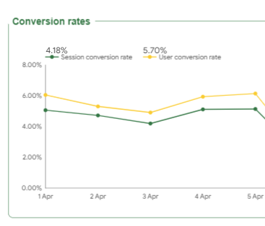
This metric shows you how effectively your website is turning traffic into revenue. It’s widely used to evaluate things like landing pages, product pages, checkout flows, and traffic quality.
If your conversion rate is low, it’s a sign that there’s friction in the buying journey – but on the flip side, improving it directly increases revenue without having to spend any more on traffic. For onsite lead capture, popup benchmark data based on 779 million impressions shows that standard signup forms average a 3.53% conversion rate, while gamified forms average 9.18%.
Average Order Value (AOV) is the average amount of revenue generated per order over a defined period, say a day, month or quarter.
Formula: AOV = Total Revenue ÷ Total Number of Orders
AOV is super important because it directly impacts profitability – and increasing it lets you generate more revenue from the same number of customers.
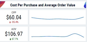
Our marketing analytics consultants usually compare the cost per purchase (how much you need to spend on marketing to attract a new customer) with the AOV. This gives us a better idea of whether our marketing efforts are profitable.
As ad costs keep rising in 2025-2026, a higher AOV is especially important because it boosts your return on ad spend (ROAS) and gets you to profitability on customer acquisition cost (CAC) payback periods a lot faster.
Customer Acquisition Cost (CAC) is the total cost required to get one new customer on board through all the paid channels.
Formula: CAC = (Total Sales & Marketing Spend Attributed to Acquisition ÷ Number of New Customers Acquired)
CAC helps you understand just how well your marketing budget is converting into new customers. It’s used to evaluate channel performance, allocate budgets and scale campaigns profitably.
In our work we usually break down the CAC by channel, which helps the marketing team to get their budget allocation to different channels spot on.

If CAC goes up without a corresponding increase in revenue per customer, your growth model becomes unsustainable.
Customer Lifetime Value (CLV) is an estimate of the total revenue or gross profit a customer is going to generate over their relationship with your brand.
Formula (simplified): CLV ≈ Average Order Value x Average Number of Orders Per Customer Over X Months
Our BI consultants find that one of the best ways to look at LTV is through cohort analysis – this is where you work out how an LTV of an average new customer grows over time. You usually compare customer cohorts of every month based on how their LTV grows.
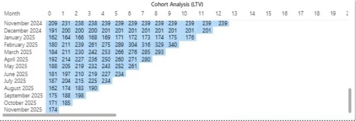
CLV shifts the focus from short term sales to long term profitability – it lets businesses decide how much they can afford to spend on acquisition and retention.
When CLV is a lot higher than CAC, you’ve got a scalable and profitable growth model.
Bounce rate is the percentage of sessions where users view only one page and don’t do anything else.
Formula: Bounce Rate = (Single Page Sessions ÷ All Sessions) x 100
In GA4, this concept is framed a bit differently with engaged sessions and engagement rate, which give a more nuanced view of user interaction.
Bounce rate should never be looked at in isolation – a high bounce rate on a blog article may be fine, while the same on a product page usually indicates a problem.
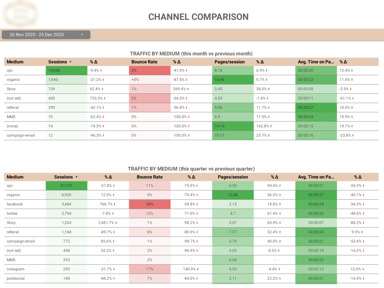
It’s always got to be interpreted in the context of page type and traffic source. For example, cold paid traffic will naturally have higher bounce rates than branded search traffic, but the conversion potential is completely different.
Ecommerce performance is best understood by mapping metrics to each stage of the customer journey – instead of tracking KPIs in isolation, you align them to four stages: Discovery, Acquisition, Conversion, and Retention.
This approach sidesteps a very common pitfall – optimising one stage over and above all the others. For instance, driving cheap traffic might just boost click metrics, but if those visitors don’t convert or come back, overall performance suffers. Keeping an eye on how each stage is doing in relation to revenue and long term growth keeps things aligned.
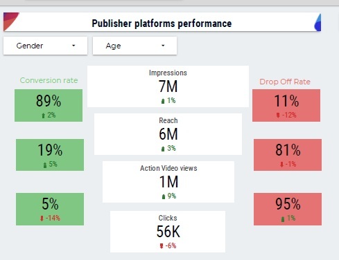
Discovery is the top-funnel stage where potential customers first stumble upon your brand, and its usually through paid ads, social media, influencers, PR, SEO, or online marketplaces.
The key metrics to track on your business intelligence dashboards are impressions, reach, brand search volume, social engagement, and that all important click-through rate (CTR) from awareness campaigns.
In 2026, discovery analysis will go way beyond last-click attribution. These days customers can interact with your brand across multiple devices and channels before converting. And with the rise of LLMs and Google AI overview, there are a lot more 0-click searches going on – so getting brand mentions in AI tools getting a lot more valuable. View-through and assisted conversions become super important for getting a handle on how awareness campaigns drive revenue.
Acquisition is all about turning awareness into website visits and getting your first-time customers through the door.
The key metrics to track here are sessions by channel, new visitors vs. returnees, CAC by channel, CTR, and that all important landing page conversion rate.
If your traffic is going up but your revenue stays flat, its usually a quality issue – which can come from targeting the wrong audience, weak messaging, or a mismatch between your ads and landing pages.
To get an accurate picture, make sure you set up GA4 to track all campaigns with consistent UTM parameters and make sure your platform conversion events are lined up with your GA4 ecommerce events, so your acquisition data actually reflects what’s going on with your business.
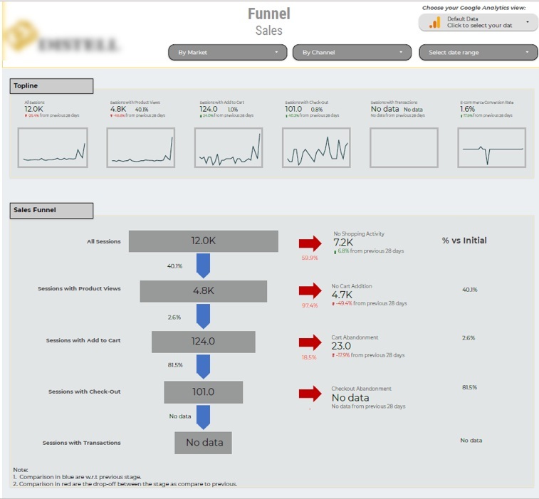
The conversion stage is everything that happens after a visitor lands on your site – navigation, product discovery, shopping cart interactions, and checkout completion.
Key metrics we usually put on our Google Data Studio dashboards here include site-wide conversion rate, how many people add something to their cart from a product page, how many people complete their checkout, checkout completion rate, and how often people use your on-site search and whether or not it converts.
Breaking down conversion into steps helps you see where people are dropping off, and lets your teams focus on specific improvements like product page clarity, pricing presentation, or checkout friction, the storefront work an ecommerce web development agency usually owns.
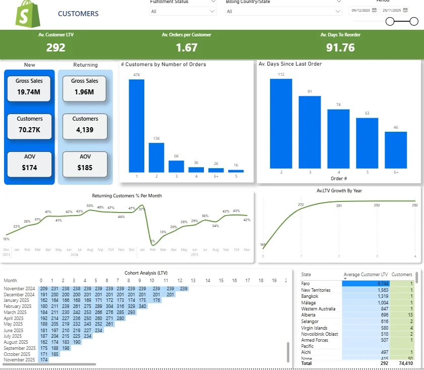
Retention is all about turning one-off buyers into repeat customers and long-term advocates.
The key metrics to track here are repeat purchase rate, average time between orders, how quickly people churn, cohort retention curves, whether your customers are renewing their subscriptions (if that’s a thing for you), and your NPS or CSAT scores.
For example, with the Shopify dashboard we developed for ecommerce brands, they can use some really useful features to optimise customer retention – like being able to:
In 2026, with acquisition costs going up, retention becomes the number one driver of profit. Improving repeat purchase behaviour often delivers more bang for your buck than just scaling new customer acquisition channels.
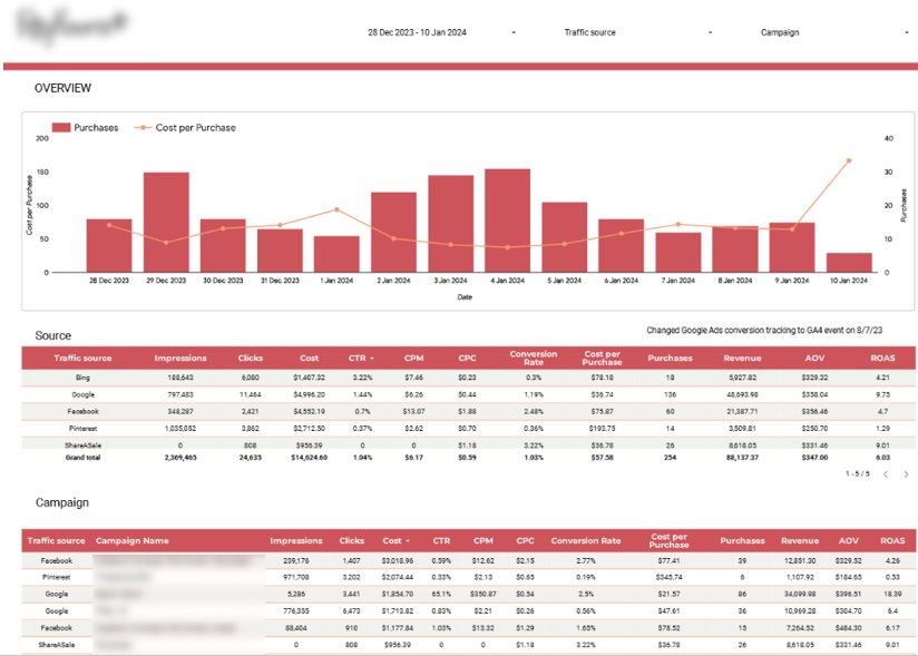
A cross-channel analytics dashboard gives ecommerce teams a clear view of marketing efficiency across all their acquisition channels. It helps you figure out which channels drive the most profitable customers, and make informed decisions about your budget allocations.
This particular paid media dashboard was custom-built for a flower delivery company by Vidi Corp. It brings together data from Google Analytics, Bing, Google Ads, Facebook, Pinterest, and ShareASale into one reporting layer. At the top you’ve got a bar chart that shows daily purchases alongside cost per purchase, and lets teams keep an eye on whether acquisition costs are staying below average order value. Below that you’ve got a table that breaks down key metrics by channel, including impressions, CPM, cost per purchase, ROAS, conversion rate, purchases, and revenue. A second table does the same breakdown at campaign level, enabling deeper analysis of performance within each channel.
This all supports a really clear decision-making process. Marketing teams can quickly identify which channels are generating profitable growth, which campaigns need optimising, and where budget should be reallocated. And it’s all doable without switching between multiple platforms, making performance analysis faster and more reliable.
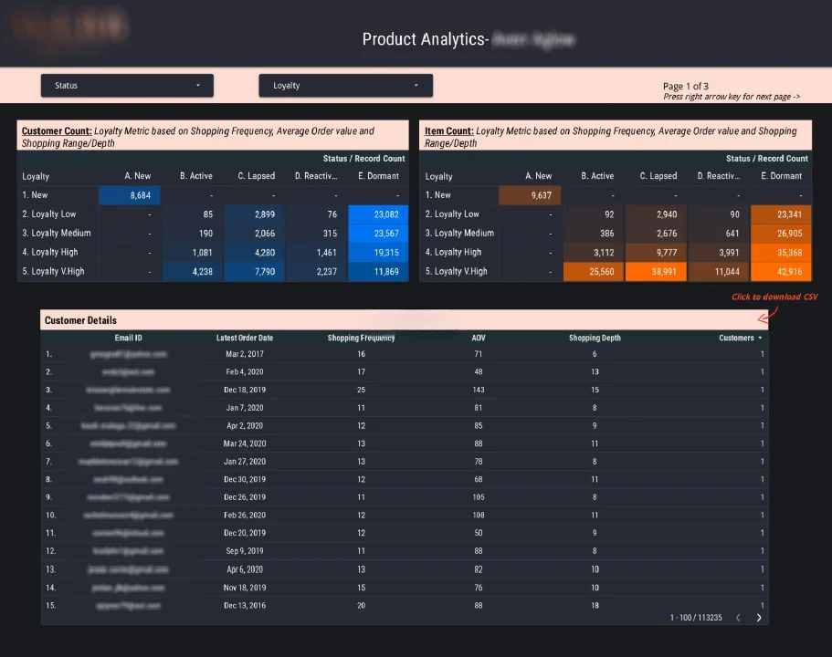
A customer retention dashboard is a game-changer for ecommerce teams. It gives them a solid understanding of how customers behave after that first purchase. The focus is squarely on loyalty, repeat purchase patterns and the various lifecycle stages – all in pursuit of well-crafted retention and re-engagement strategies.
The our Looker Studio consultants built, using Shopify data and Google Data Studio, is pretty cool. It assigns a loyalty score to each customer, based on average order value, purchase frequency and product variety – a score that sits between 0 and 1. It also groups customers by lifecycle stage, looking at the most recent purchase date and pretty much every time categorising them into New, Active, Lapsed, Reactivated, and Dormant segments. Users can filter the dashboard by both loyalty score and retention group to get a super detailed view of specific segments.
This structure is just perfect for our retention efforts. Teams can identify high-value customers and zero in on loyalty programmes, detect early signs of customer churn, and kick in re-engagement campaigns to get dormant users back in the fold. And because we can link customer behaviour directly to lifecycle stage, our retention efforts become a whole lot more focused and measurable.
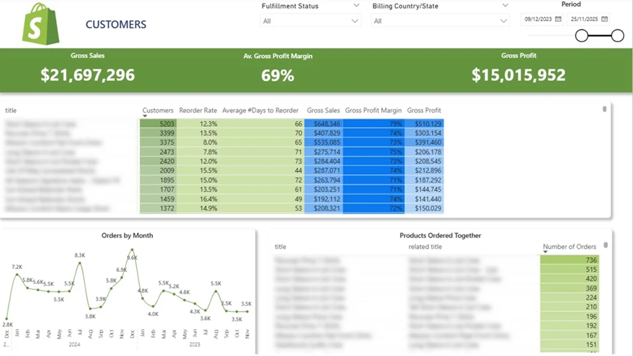
An ecommerce product analytics dashboard is a valuable tool for teams. It helps them understand all about demand patterns, repeat purchase behaviour and product relationships. It’s the insight they need to optimise merchandising, bundling and revenue growth.
Our data visualization consultants built this one specifically to analyse product performance using ecommerce transaction data. You can see, right at the top, a summary table showing how many customers have bought each product – and the percentage who come back to buy it again – along with how long it is between repeat purchases. These metrics give us a real insight into which products drive loyalty, and we can use that information to inform strategies such as multi-pack offers, cross-sells or inclusion in reactivation campaigns.
If you click on a product, a line chart below will show monthly order volumes for that item. Easy to spot trends, seasonality or any changes in demand. At the bottom, a table highlights products that people frequently buy together, so teams can design bundles, targeted promotions and personalised recommendations. This all adds up to more effective merchandising decisions – and higher average order values.
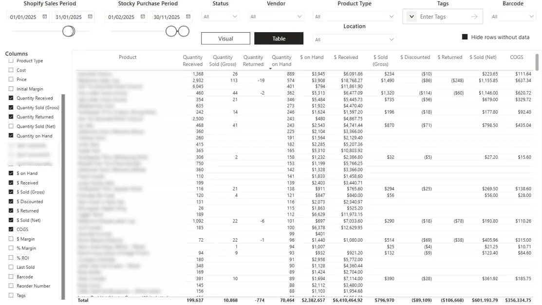
An ecommerce inventory and supply chain dashboard is yet another fantastic tool for teams. It gives them a real understanding of how stock flows from purchase to sale – with a big focus on the relationship between inventory levels, sales performance and cash flow.
Our business analytics consultants built this particular one, using Shopify sales data combined with inventory data from the Stocky app. It tracks product-level performance by keeping an eye on incoming stock, sales activity and remaining inventory. And we can filter by Shopify sales periods and Stocky purchase periods, so we can easily compare purchasing decisions with real sales outcomes. This helps us spot overstocked items, understock risks and slow-moving products.
This structure is brilliant for operational decisions. Teams can align purchasing with real demand, cut down on excess inventory and avoid stockouts on our top products. It also helps with cash flow management, by making sure that inventory investments are converted into revenue efficiently, rather than being stuck in unsold stock.
Analytics tools alone aren’t enough. For ecommerce analytics to be really useful, we need to get it set up correctly, use reliable data and use it consistently in our decision-making.
The thing is, a simple approach works best in practice. First, we need to get tracking right. Second, we need to build focused dashboards. Third, we need to establish a regular review process where data really drives our actions.
Getting the tracking right is the foundation of all ecommerce analytics. Without it, every metric is unreliable and our decisions are at risk.
At a minimum, you should set up GA4 with ecommerce events, configure conversion events in ad platforms, and use server-side or tag manager-based tracking where possible. Consistent UTM naming conventions are a must to attribute traffic and revenue correctly.
Create a simple tracking plan document. Define each event (e.g. view_item, add_to_cart, begin_checkout, purchase) and list key parameters such as product ID, price and currency.
Validate your data regularly. It’s very common for companies to need a Google Analytics audit once a couple of years. Check orders and revenue between GA4, your ecommerce platform and ad platforms on a monthly basis to catch discrepancies early.
We also need to address privacy and consent. Make sure that cookie banners and consent mode is configured correctly, so tracking respects user choices and local regulations.
Use staging environments to test tracking changes before deploying them live. Even tiny issues can have a massive impact – a duplicated purchase event can double reported revenue, while a misconfigured currency can distort AOV and ROAS.
MIS Reporting Dashboards should be focused and built for specific roles. A single dashboard for everything usually ends up in confusion and low adoption.
Create separate views for leadership, marketing and ecommerce teams. Managerial reporting dashboards should focus on revenue and profit. Marketing dashboards should track CAC, ROAS and funnel performance. Ecommerce dashboards should focus on conversion rates, AOV and cart behaviour.
Use ad hoc reporting tools like Looker Studio, Power BI or native platform dashboards, depending on your setup. The key is clarity not complexity. Limiting each dashboard to a maximum of 8 – 12 key charts or tiles is a good idea. Make sure to include clear comparisons – like vs the previous period or vs the same time last year – and add some visual cues like arrows or conditional formatting to highlight anything that really needs attention.
Always have a “north star” metric at the top of the page. This could be net revenue, profit after ad spend or the LTV: CAC ratio.
Example Weekly Marketing Dashboard Structure:
Having this structure keeps the focus on performance, not just activity.
Analytics won’t actually do much for you unless it is getting embedded into the day-to-day running of the business. That means everyone needs to be on the same operating rhythm.
Run weekly performance reviews to check up on those KPIs and get a quick response. Use monthly deep dives to really get to the bottom of any trends and spot any big issues. Save the quarterly reviews for any major strategic changes.
A simple weekly agenda works well. Take a look at the key numbers, see if there’s anything that doesn’t add up, choose 1-3 things to try or improve and sort out who is going to own each one and get them to do it by when.
Use your analytics tools to make a note of any big events – a new campaign launch, a price change or a website redesign. This gives you some context when you’re looking at the numbers over time.
Make a note of every experiment you do. Write down what you were hoping to find out, what you did, and what you actually found. Over time, this creates a valuable record of what you’ve learned, and makes it much easier to make good decisions in the future.
But it’s got to be a culture where people are rewarded for pointing out issues as soon as they see them. Data should be used to spot problems – not just to celebrate the wins.
For instance, a lot of ecommerce businesses do monthly cohort analysis. This lets them see how different customer groups are behaving over time. If they can spot when repeat purchase rates start to drop, they can launch targeted retention campaigns to try and fix the problem.
Ecommerce analytics is moving fast. The combination of AI, robotics and stricter privacy laws is changing the way businesses collect data, make sense of customer behaviour, and make decisions.
The focus is shifting from looking at big numbers to getting down to individual customer behaviour. The goal is to be able to tailor offers, product recommendations and messaging in real time.
Personalisation is not just about broad groups of customers anymore. By 2026, the leading ecommerce businesses are going to be tracking individual customer behaviour – browsing patterns, purchase history, product preferences, and engagement across all channels.
This means being able to offer each customer the right thing at the right time – whether it’s a discount, a bundle or a recommendation.
For example, a customer who keeps coming back to the same product category can be shown some targeted discounts or bundles. This will increase conversion rates, average order value, and long-term customer value.
It’s no longer just about reporting on what’s happened – it’s about designing the customer experience based on what you’ve seen.
Automation is playing a bigger and bigger role in ecommerce analytics – but it’s not going to replace human decision-making.
One of the most useful things it can do is send automated alerts. For example, a Power BI dashboard can send you an alert if a certain metric hits a certain level.
This could be things like a big drop in conversion rate, a spike in CAC, or a decline in checkout completion rate. These alerts let you respond right away – rather than waiting for the weekly report.
But automation only tells you that something has changed. You need human intuition and experience to work out why it changed and what you should do about it.
The best set-ups combine automated monitoring with regular review processes. This way you can be sure that your insights are actually turning into decisions – not just a bunch of notifications.
Privacy laws and platform changes have turned ecommerce analytics on its head.
By 2026, stricter consent rules, the phase-out of 3rd party cookies in Chrome, and platform-level restrictions have made traditional tracking methods a lot less reliable. In the EU, getting consent from users is now a legal requirement.
That means businesses have to rely on first-party data – stuff you collect directly from customers. And to make that work, you need to have a clear and transparent consent process.
This is where tools like Cookiebot come in. They help you get consent from users when it is required and hide the prompts when it’s not. This keeps you on the right side of the law while keeping your data quality as high as possible.
Ecommerce performance analytics isn’t just about tracking numbers anymore. It’s about building a system that connects data to decisions, right across your entire funnel – from acquisition to retention and beyond.
When you get it right, analytics helps you figure out what drives revenue, where you’re losing opportunities, and how to scale profitably. Good tracking, focused dashboards, and a regular review rhythm all come together to turn data into a real competitive advantage.
If you’re looking to build a top-notch ecommerce analytics setup that actually makes sense for your business, give us a shout. Our team will work with you to craft, put into place, and give your analytics systems the gas to drive some real, measurable growth.


