

Let’s be honest. Most management dashboards are too long, too late, and too safe. By the time the pack lands in directors’ inboxes, half the numbers are stale, the commentary has been edited to avoid anyone’s toes, and the real decisions get punted to the next meeting. Nobody says this out loud, but everyone feels it.
Our data visualization consultants ‘ve built more than a thousand dashboards for leadership teams across manufacturing, professional services, healthcare, and finance. The management dashboards we’ve seen work are honest and built on data that everyone trusts because nobody had to stitch it together at midnight. The ones that flop tend to share the same handful of mistakes.
So this guide isn’t theory. It’s a field-tested playbook. If you’re trying to turn your next management dashboard into something directors actually read, this is where to start.
At its simplest, a management dashboard is a single screen that shows you the health of your business. It pulls data from the systems you already use, whether that is your CRM, your HR platform, your accounting software, or your project tools, and presents it visually, in a way that is easy to read and act on.
The difference between a management dashboard and a spreadsheet is not just aesthetics. A spreadsheet is static. Someone has to fill it in, someone has to send it, and by the time it reaches you, it reflects the past. A manager dashboard is live. It shows you what is happening now.
That shift from past to present sounds small, but it fundamentally changes the kind of conversations you can have. Instead of asking “what happened last quarter?” you can ask “what is happening today, and what do we need to do about it?”
Management dashboards can be built for a single team or scaled across an entire organisation. Some are department-specific, built around the precise needs of a sales team or a finance function. Others roll everything up into a single executive view. What they all share is the same core goal: cutting the distance between data and decision.
The examples below were built for a management team, and each one maps to a section in the template above.
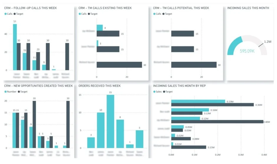
The sales management dashboard is where the C-suite finds out, at a glance, whether the sales engine is actually running on target. It covers activity, pipeline creation, and closed deals, the three things that tell you if this quarter’s revenue will land where it’s meant to, and what that means for cash flow and headcount planning. Built for speed, not forensic detail. Drilling into individual rep performance is an option, not the default.
Our Business Intelligence consultants built the sales dashboard above for a company running NetSuite as its CRM. It lines up actual performance against targets across the KPIs that matter most, calls made, opportunities created, deals won, and refreshes automatically every working hour. Leadership never opens it and finds last week’s numbers staring back at them.
Different executives use it in different ways. The CFO pulls the closed deals and pipeline trends to forecast cash and pressure-test whether the revenue targets are still realistic. The CEO and COO watch deal volume and win rates to figure out when the next wave of delivery capacity needs to come on, a new subcontractor, a new hire, whatever the business can actually support. And when activity dips below target, leadership can see it the same day rather than the following month, which gives them time to align with sales management and course-correct before it hits the top line.
That’s really the point. The dashboard takes raw CRM data and turns it into something strategic, a tool leadership actually uses to make decisions, not just a weekly report that gets skimmed and filed.
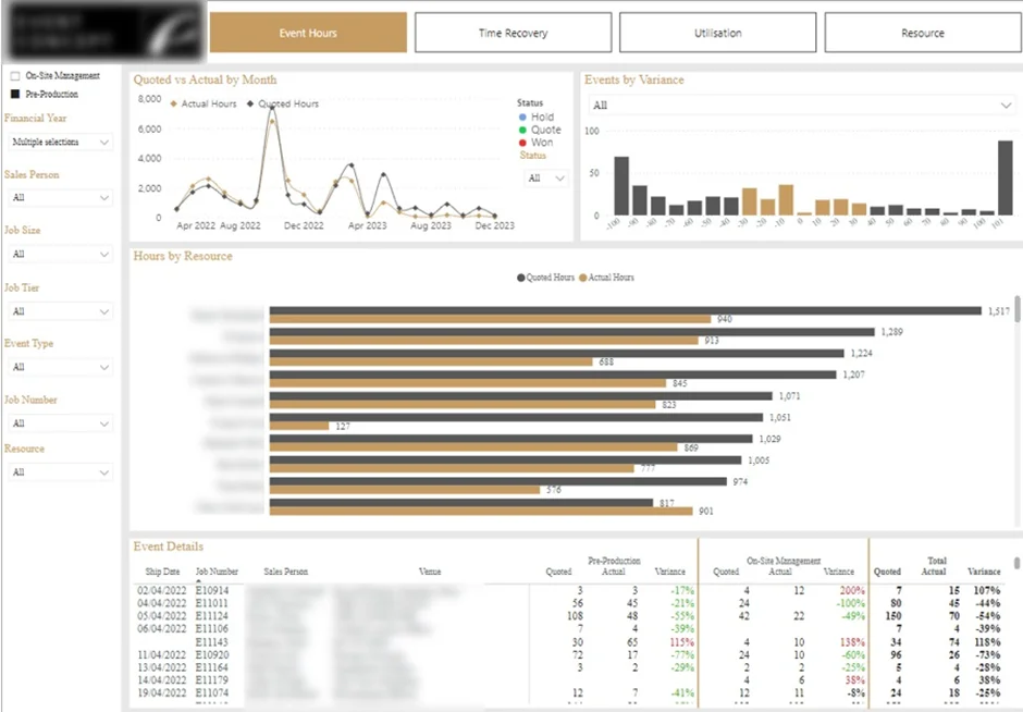
The project management dashboard shows leadership exactly how delivery teams are burning through time and budget on live projects. It zeroes in on the three things that move the needle: utilisation, estimated versus actual hours, and project-level profitability, so executives can tell whether work is being delivered efficiently and at the margin the business was promised. The decisions it supports sit squarely in the strategic seat: how to price, how to staff, and when to add capacity.
Our dashboard developers built the Power BI dashboard for an event management company in London. Their leadership team wanted one place to watch effectiveness and profitability across all their corporate events, rather than piecing it together after the fact. The dashboard compares quoted hours to actual hours at three levels: project, task type, and individual contributor, so the view zooms from the whole portfolio down to a single person in a few clicks.
It earns its keep in a few practical ways. When an event exceeds its budgeted hours, executives can see exactly where the delivery assumptions fell apart and feed that learning straight back into future estimates. It also surfaces something most leadership teams guess at: what the right senior-to-junior mix actually looks like, based on how different staff blends affect efficiency and margin. And for sales, the same data quietly calls out the reps who consistently underquote, which lets the commercial leadership tighten up pricing guidelines before the margin damage compounds.
The board uses it to answer three questions at once. Are our delivery assumptions holding up? Is the senior-to-junior mix right? Which sales reps keep under-quoting and silently eroding margin? That’s how you turn an operations section from a dull activity log into a real input for pricing and hiring.
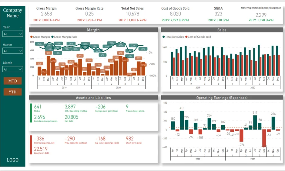
The financial management dashboard is one section the CFO absolutely has to get right. It pulls the income statement and the balance sheet into a single view so leadership can see profitability, cost structure, and cash position side by side, without flipping between three spreadsheets and a PDF. Every operational decision that touches money starts here.
Our financial analytics consultants built the above dashboard so leadership could read financial performance at a glance. The headline KPIs sit at the top: sales, cost of goods sold, gross margin, and operating earnings, each trending against the same period last year. Below that, sales and cost of sales are broken out by month and quarter. Balance sheet metrics cover assets, liabilities, and the overall picture of financial stability. Filters let executives switch between year, quarter, month, or MTD and YTD views depending on the conversation.
For the CFO, it’s less a dashboard and more a decision-support tool. A rising COGS trend is usually the opening line of a supplier conversation, time to renegotiate or shop around. Climbing operating expenses open a different discussion: where are we bloated, and which processes need streamlining? And when cash or liability metrics start to drift, that’s the cue to look hard at billing terms, chase collections, or tighten credit before the runway conversation gets uncomfortable.
That’s the whole point. When performance, cost, and cash sit on the same page, the leadership team stops debating which number is right and starts making decisions with it.
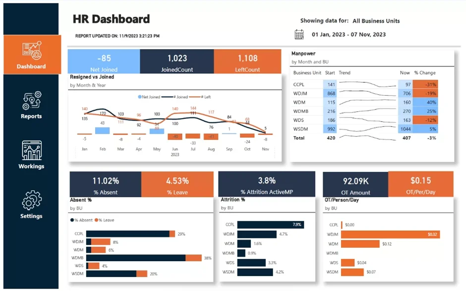
The HR business intelligence dashboard earns its place in the pack when the business is either large or hires at serious volume, think hospitality groups staffing up for summer, retailers scaling for Christmas, or travel companies riding the seasonal wave. For those companies, workforce stability isn’t an HR conversation; it’s a capacity conversation. The manager dashboard gives executives a clear read on hiring pace, attrition risk, and whether there are enough people in the right seats to actually deliver what the business has promised.
We built the Power BI HR dashboard above for a diamond refinement company with more than 400 employees and a turnover rate that was starting to bite. The leadership team used it to follow headcount moves across every department and see, in real terms, where departures were putting pressure on delivery. The core metrics were simple: new joiners, resignations, and attrition rate, each broken down by business unit, so nothing hides behind a company-wide average.
The dashboard earns its keep by forcing proactive decisions rather than reactive ones. When a department shows sustained attrition, leadership can open roles before the remaining team starts drowning in work. Patterns in resignation reasons point to structural problems, bad managers, broken processes, comp out of line with the market, that HR and the executive team can actually fix instead of guessing at. And when attrition starts driving overtime costs up, the data makes the call easy: hire faster, rebalance the workload, or put real money behind retention.
That’s the shift. HR data stops being an administrative report at the back of the pack and starts being an operational planning tool the business runs on.
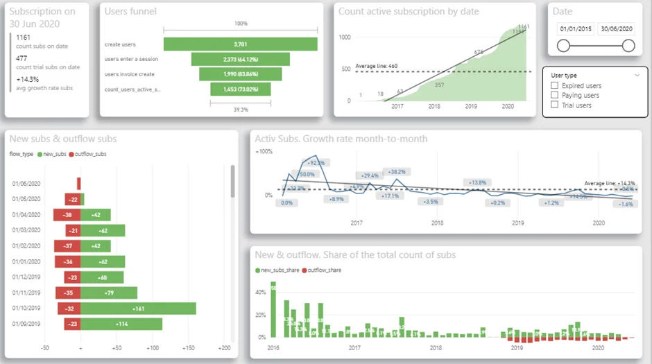
The SaaS manager dashboard exists to answer the three questions that keep any SaaS CEO up at night: Are people actually using the product? Are they converting to paid? And are they sticking around? It walks the whole product funnel, from the moment someone registers to the day they start paying, and makes it obvious where users are dropping off or quietly disengaging. With that in one view, leadership can line up product, marketing, and retention spending against what the data is actually showing, not what anyone hopes is true.
We built the Power BI version above for a UK SaaS company whose users are doctors. The CEO wanted to understand, at a real level of detail, how different user groups were actually interacting with the app and how those behaviours were translating into revenue. The dashboard brings together user demographics, weekly usage hours, average monthly sessions, active subscriptions, free-trial conversion rates, and daily trends for new and churned users. One page, the whole picture.
The CEO leans on it for product and growth calls. The funnel analysis shows how many users register, how many become active, and how many actually convert to paid, which makes it clear where the onboarding experience needs work. Usage data answers a harder question: are doctors engaging with the app often enough to justify building more features, or does the business need to invest in reactivation campaigns first? And the subscription growth and churn trends feed straight into revenue forecasting and the retention roadmap, so the biggest bets go where the data says they’ll matter most.
That’s the real win. User behaviour stops being a vibes-based guess and starts being a strategic input that the product team, the marketing team, and the board can all reason from together.
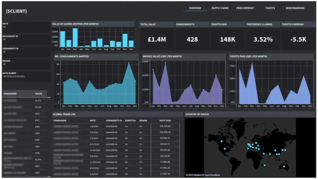
A logistics dashboard helps you make sense of what you’re buying, what’s sitting in your warehouse, and where everything is actually coming from. If you’re an importer, manufacturer, distributor, or retailer juggling shipments across borders, it can be a real lifesaver. You get a proper view of your suppliers, how much you’re shipping, and what it’s all costing you to bring in, so you can finally see how your supply chain is shaping your bottom line, your risks, and how smoothly things are running.
Our Tableau consultants put together the logistics dashboard you can see above for a UK importer we worked with. It shows where their goods are coming from country by country, and keeps an eye on monthly shipment values, how many consignments are moving, and the import duties they’re paying. It also points out which shipments qualify for preferential trade agreements and shows how much they’re claiming back compared to standard rates.
The results spoke for themselves. The client could quickly spot which countries were costing them the most in tariffs and pick out the imports that should have been getting reduced rates. By comparing what they were actually paying against what they should have been paying, they worked out exactly how much they’d overpaid and clawed that money back from the government. That meant more cash in the bank and healthier margins, just like that.
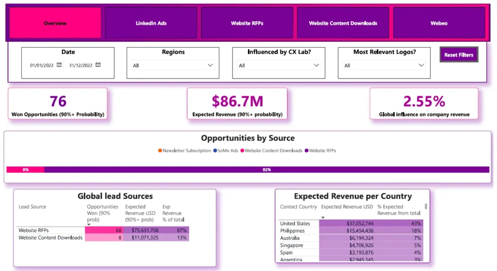
The marketing dashboard gives agencies a bird’s-eye view of how their marketing is really performing by tying marketing data directly to sales results. It shows you how your marketing efforts are translating into won deals and projected revenue, so you can finally see the impact your work is having and make sure your activities are pulling in the same direction as the business.
Our marketing analytics consultants made this marketing dashboard that tracks the numbers that actually matter, things like won opportunities, total expected revenue, and how much of that revenue your marketing channels are influencing. The overview page pulls together performance across every lead channel, and you can dig deeper to see how opportunities and revenue stack up by lead source and customer location.
What’s inside: won opportunities and total expected revenue, marketing-influenced revenue as a share of total expected revenue, a breakdown of opportunities and revenue by lead source, and a geographic view by customer country. Perfect for teams who want to get a proper handle on how their leads are performing, what marketing is actually contributing to revenue, and how well things are converting across the whole funnel.
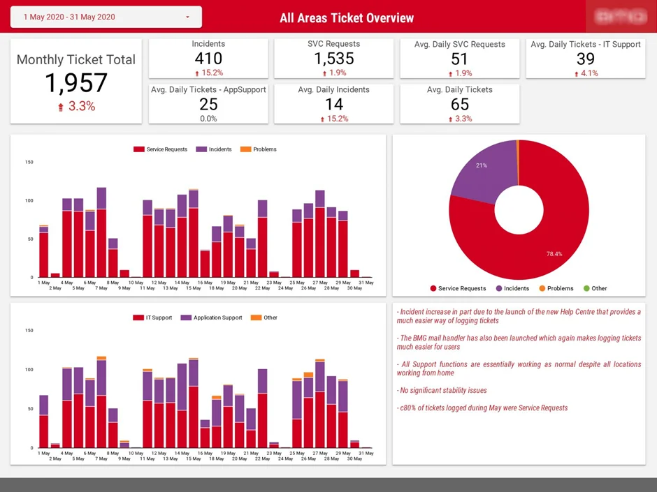
This IT management dashboard pulls together a full month’s worth of ticket activity into a single, easy-to-read view. It tracks the total volume of tickets logged, breaks them down by type (service requests, incidents, and problems), and shows how the workload is split between IT Support and Application Support. Daily averages, percentage changes, and trend charts sit alongside a written commentary that explains what’s driving the numbers.
Our data analytics consultants produced this dashboard that turns raw ticket data into a story leadership can actually use. At a glance, you can see that May’s ticket total climbed 3.3%, with incidents up 15.2%, largely because a new Help Centre and mail handler made it easier for users to log issues. It quickly surfaces what’s normal, what’s shifting, and where the pressure points are sitting, so teams can spot stability concerns early and back up board-level updates with hard numbers rather than gut feel.
IT leaders rely on this kind of dashboard for monthly reporting and board updates, where they need to show ticket trends, resolution patterns, and the overall health of support operations. Service desk managers use it to keep tabs on daily workload, balance resources between IT and Application Support, and flag any spikes worth investigating. It’s also useful for operations teams who want to understand what’s behind the numbers, whether that’s a new tool driving more tickets or a genuine stability issue that needs attention.
We have all seen it happen. A team spends weeks building a beautiful dashboard, there is a proud demo, everyone nods, and then a month later, you check the analytics and realise three people have opened it, two of them by accident. The dashboard quietly joins a graveyard of forgotten browser tabs.
It does not have to go that way. The dashboards that actually stick around, the ones people refresh on Monday mornings and argue about in meetings, tend to share a few things in common. None of them are about fancy charts. Here is what I have picked up from watching plenty of dashboards live and die.
Before you open your BI tool, sit down with the people who are supposed to use this thing and ask a simple question: “What would you actually do differently if this dashboard worked?” If they cannot answer, you do not have a dashboard problem. You have a “we have not figured out what we are deciding” problem, and no chart is going to fix that.
I cannot count the number of dashboards I have seen that exist because somebody could pull the data, not because anybody needed it. Skip that trap. Build backwards from a real decision.
The instinct is to show everything. Resist it. A management dashboard works best with somewhere between five and nine headline numbers, each one tied to something the team can actually move. If a metric is just nice to know, leave it out, or tuck it on a second page for the curious.
A quick gut check: would a meaningful change in this number actually change what someone does tomorrow? If not, it is decoration.
Executives do not study dashboards. They glance, take in the headline, and move on. So write the dashboard like a newspaper. The most important thing goes at the top. Titles should say what the chart means, not just what it measures. Instead of “Monthly Revenue,” try “Revenue is up 12% over plan.” That tiny shift saves your reader the work of decoding the chart, which is exactly what a busy person wants.
Go easy on color too. Save red and green for things that are actually good or bad. If everything is glowing, nothing stands out, and you train people to ignore the alerts that matter.
Nothing kills a dashboard faster than someone in a meeting saying, “wait, is that number right?” Once the trust cracks, every other number on the screen becomes suspicious. So be open about freshness. Stamp every panel with when it last updated. If a data source is broken, show a banner instead of letting the chart quietly lie. Your users do not need perfect data. They need to know how much to trust what they are looking at.
Sounds boring, matters a lot. Pick someone who is responsible for the dashboard the way a product manager is responsible for a feature. They handle definition changes, they keep a short changelog so nobody is blindsided when a number shifts, and they think about who should and should not see what. Sensitive numbers like payroll or pipeline by rep need access controls from day one, not bolted on after the first awkward leak.
Here is the part most people miss. A dashboard that is just a link in someone’s bookmarks will get opened a handful of times a quarter. A dashboard that anchors the Monday morning standup, or feeds a weekly written update, becomes part of how the team actually runs. The dashboard is not the end product. The conversation it sparks is.
The goal is not a pretty interface. It is a shorter gap between a number changing and somebody doing something about it. Get that loop tight, and the dashboard stops being a thing you maintain and starts being a thing the business runs on.
Building a management dashboard always sounds simple at the start. Pull a few numbers, throw them on a screen, hand it to leadership, take a victory lap. Then reality shows up. The numbers do not match the ones in last week’s deck, the CFO is asking why revenue dropped (it did not, the data just refreshed late), and somehow nobody can agree on what an “active customer” actually is.
If you have lived through a dashboard project, none of this will surprise you. Here are the challenges that tend to bite teams the hardest, and why they are tricky to escape.
The first round of stakeholder interviews almost always produces a wishlist of forty metrics, and somebody important is emotionally attached to each one. Cutting the list feels like telling people their baby is ugly. So the dashboard ships with everything, and it becomes a wall of charts where nothing stands out.
The honest fix is uncomfortable. You have to push back, ask each requester what decision their metric supports, and quietly retire the ones that cannot answer. Expect some grumbling. It is still better than launching a dashboard nobody can read.
Pull up the marketing dashboard and revenue is one number. Pull up the finance dashboard and revenue is a different number. Both teams are confident they are right, and now leadership trusts neither.
This usually is not a bug. It is two perfectly reasonable definitions sitting in two different places. Marketing counts bookings. Finance counts recognized revenue. Until somebody writes the definitions down in one shared place and labels every chart with which definition it uses, the arguments will keep coming back like a recurring bill.
“Mostly right” is the most dangerous phrase in dashboarding. It means the numbers are close enough that nobody catches the errors, but wrong often enough to embarrass somebody in a board meeting. By the time you find out, trust is already cracked.
The challenge is that data quality is invisible until it is not. Pipelines silently break. A schema change upstream nukes a column. A timezone bug makes Mondays look terrible. You need automated checks running in the background and a way to surface them on the dashboard itself, otherwise you are flying blind and will only learn about issues from the angriest user in your inbox.
This is the quiet killer. The dashboard launches, traffic spikes for a week as everyone takes a peek, and then the numbers slowly drift toward zero. Six months later, somebody asks if anyone is still maintaining “that thing.”
Usually the cause is not the dashboard. It is that the dashboard is not part of any actual workflow. There is no meeting that opens with it, no review that depends on it, no Slack digest that surfaces it. If the only way to see the dashboard is to remember to go look at it, most people will not.
The dashboard was snappy on day one. Eighteen months and ten million more rows later, opening it is a coffee break. Filters take forever. The CFO stops bothering.
This one sneaks up on teams because the slowdown is gradual. Suddenly, you are negotiating tradeoffs you did not plan for: pre-aggregating data, capping date ranges, restricting filter combinations, or rebuilding the back end. None of it is fun, and it almost always happens at the worst possible moment.
The way you defined “monthly active user” eighteen months ago is not the way you define it now. The product changed. The signup flow changed. Somebody quietly adjusted the SQL. None of this was malicious, but the historical trend on your dashboard is now comparing apples to a slightly different apple, and any conclusion drawn from it is shakier than people realize.
The fix is unglamorous: a written changelog for metric definitions, with dates, so anyone looking at a long-running chart can see when the math shifted underneath it. Almost no team does this consistently. Almost every team eventually wishes it had.
Here’s the honest truth about building a management dashboard: the template is the easy part. The hard part is stitching together data from your ERP, CRM, finance system, HR platform, and whatever else is floating around the business, and doing it in a way that’s automated, trustworthy, and keeps working month after month. Most leadership teams either sink weeks into it every quarter or settle for a pack nobody really trusts. Neither is a good outcome.
That’s where we come in. We’ve highlighted a few manager dashboard examples. Whether you’re starting from a messy pile of spreadsheets, replacing a board pack that’s quietly lost credibility with your directors, or standing up reporting for the first time after a funding round, we’ve probably done the version you need, and we can get it running fast.
If you want a management dashboard that’s genuinely automated, visually clean, and built around the decisions your board actually needs to make, get in touch with our team. We’ll walk through what you’re working with today, show you what good looks like for a business like yours, and put together a clear plan to get you there. No long sales process, no generic templates, just a working management system, built around how your business really runs.
A management dashboard is a single screen that pulls together the key performance indicators (KPIs) leaders use to run their part of the business. It typically blends data from multiple systems, such as finance, sales, operations, and marketing, into a clear visual summary so managers can spot trends, track progress against goals, and make faster decisions without digging through spreadsheets.
A good management dashboard focuses on five to nine headline KPIs tied directly to business outcomes, such as revenue, gross margin, customer acquisition cost, retention, and operational efficiency. It should also show targets, period-over-period comparisons, and a clear “last refreshed” timestamp so users know how current the data is. Anything that does not influence a real decision belongs on a deeper drill-down page, not the main view.
It depends on the metric. Sales pipeline and operational KPIs often refresh in near real time or daily, while financial figures may update weekly or monthly once they are reconciled. The rule of thumb is to match the refresh rate to the cadence of the decisions being made. Updating more frequently than that adds noise; updating less frequently makes the dashboard feel stale and erodes trust.


