
Ecommerce analytics dashboards get a whole lot trickier the more data a brand’s got scattered across advertising platforms, ecommerce systems, CRM tools, and analytics tools – and if that data isn’t being pulled together into one central report, it’s a right old mess to try and make sense of. You’ve got marketing performance, customer behaviour, inventory trends, and profitability all jumbled up together.
As a Power BI consultancy, we’ve built custom ecommerce KPI dashboards for 200+ brands and agencies, including Chilly’s Bottles, Neil Patel Digital, and many, many more. Our team has cranked out 1000+ dashboards across sales, marketing, finance, ops and customer analytics – and a lot of those are built around proven frameworks we reuse and adapt. Most of our dashboards can be replicated easily for other clients which helps cut implementation time down to size while still tailoring the reporting to match each client.
In this article we will show you 8 ecommerce dashboards we’ve built that our clients find most useful. For each one, we’ll go over the KPIs it includes and how it helps brands make better decisions on marketing, sales, inventory, and retention.
The KPIs you need in your business intelligence dashboard depend on your business model and what you’re trying to achieve. Most ecommerce KPI dashboards will cover marketing acquisition, store profitability, and customer retention at the very least.
You want to segment these by marketing channel, campaign, ad, age group, gender, and geography. Those are essential both for paid search analysis and creating paid media dashboards.
Take a closer look at these over time to ensure healthy profitability levels as time goes.
You need these KPIs to help you better understand your customers and their purchasing behaviour. You want to segment these by cohort – first purchase month, country, acquisition source, product category, and so on.
These KPIs are the foundation of most ecommerce dashboards, but you can always add more depending on your needs. Some businesses also track website conversion, inventory performance, fulfilment, product profitability or customer service metrics – and those tend to fall under specific departments.
Executive-level dashboards usually focus on revenue growth, marketing efficiency, profitability, and customer retention.
We’ve built ecommerce dashboards for brands on Shopify, WooCommerce, Magento, Amazon, and a bunch of other marketing platforms. But the work can be a whole lot harder than just connecting a few sources and slapping up some charts.
First off, you’ve got to decide whether to use a dedicated ecommerce analytics platform or go for a custom dashboard. PPC reporting tools like Triple Whale are a good starting point because they already have ready-made dashboards and pre-built integrations – perfect for smaller businesses that don’t need anything too fancy.
But as businesses grow and reporting needs get more complex, clients often want custom KPIs, blended operational and marketing data, or reports that off-the-shelf tools just can’t produce. In those cases, we usually recommend Power BI or Looker Studio for full control over analysis and automated business intelligence.
Most ecommerce KPI dashboards bring together several systems. At minimum, that’s the ecommerce platform, advertising platforms like Facebook Ads and Google Ads, and analytics tools like GA4.
In our experience, data integration quality is way more important than dashboard design. If the data is dodgy or incomplete, even the best dashboard becomes unreliable.
For PPC sources, we often use Windsor.ai connectors, which automate data extraction affordably at around $20 a month for three sources. But Windsor can time out on big pulls from sources like Shopify and Amazon – so for those, we use our own Power BI connectors to load data into an Azure SQL Server database first, then push it into Power BI, letting SQL Server handle the heavy lifting.
If you’re on Shopify, you’re probably already finding out that Shopify business intelligence reporting can be a right old nightmare.Shopify is one of the most popular platforms we work with – and one of the most misunderstood when it comes to reporting. A lot of businesses assume that revenue is simply the sum of sales transactions. But in reality, Shopify spreads sales, discounts, shipping, taxes, refunds, and returns across multiple tables that need to be combined correctly, against the right transaction dates.
Product-level analysis throws up another challenge. Revenue is usually stored at the order line level, while discounts, shipping, and refunds sit at the order level. And there’s no one single right way to allocate these values, which is why reporting tools often show different profitability numbers.
And then there’s time zones – Shopify APIs return data in UTC, but the interface shows transactions in the customer’s local time zone. Without adjusting for this, your daily sales in Power BI can look all over the shop – inconsistent with what’s happening on the Shopify side.
After building Shopify dashboards for loads of clients, we kept running into the same reporting challenges. So we built our own Shopify Power BI template – one that’s got the data model and calculations all configured and ready to go.
Our template combines orders, refunds, discounts, taxes, and shipping in a way that matches up with Shopify reporting pretty closely. It also includes pre-built dashboards for marketing performance, store profitability, and customer analytics. We usually recommend starting from the template and customising it to suit your needs, rather than building everything from scratch – it’s a lot quicker and easier that way.
4 of the dashboards below are pages from our Shopify Power BI template. The marketing, profitability, and funnel dashboards were all custom builds for specific clients, however, we could easily replicate them for you as well.
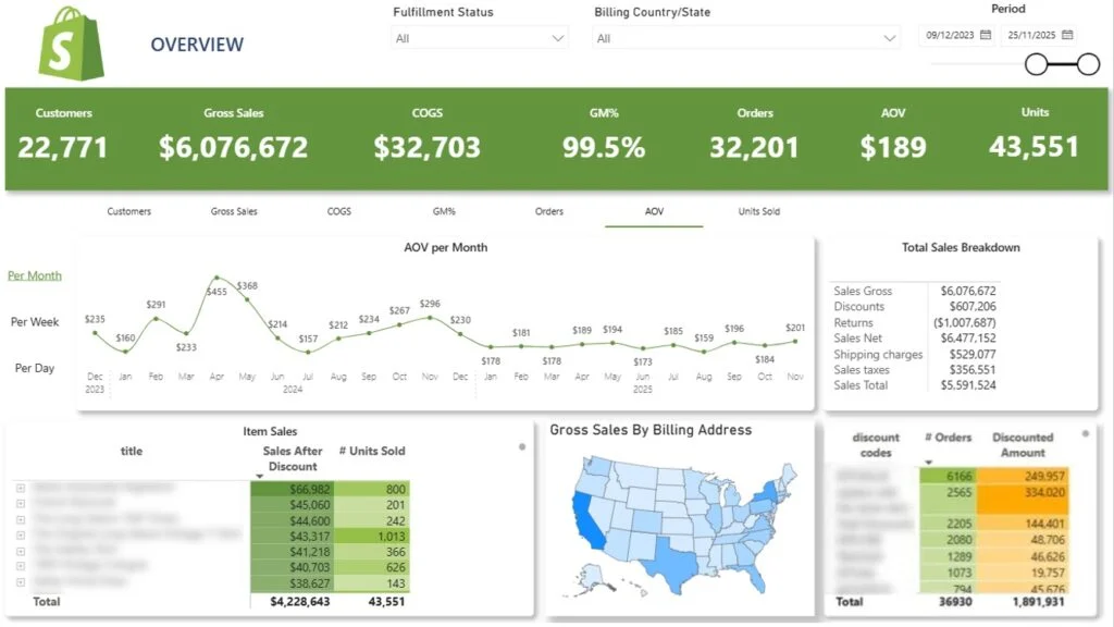
Data Source: Shopify, Magento, WooCommerce
This ecommerce business intelligence dashboard is all about analysing:
The Ecommerce Sales Dashboard is all about tracking revenue, product sales, and promotional performance. Ecommerce managers, marketing teams, and owners use it to see what drives sales growth and profitability.
Users can switch between KPIs, drill into product variants like colours and sizes, and view trends by day, week, or month. The whole dashboard filters by customer geography.
And management teams use it to find top products, evaluate promotions, and plan inventory. One client used this dashboard to identify most popular sizes for every item and identify the most successful promotions via discount codes. This helped them optimise production of new items and improve affiliate marketing campaigns.
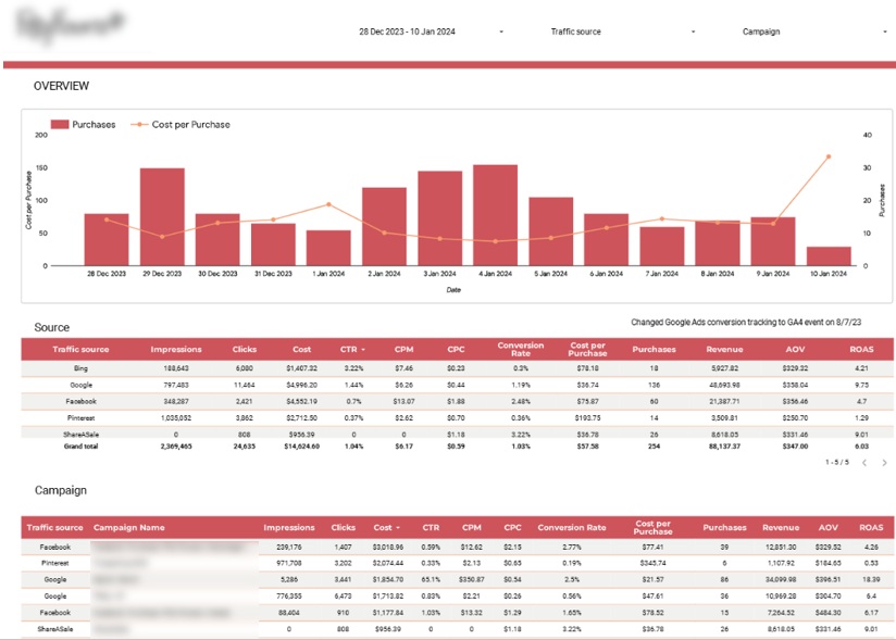
Data Source: PPC / Affiliate Platforms
The narketing dashboard digs into:
Once you’ve got a handle on sales, the next question is – where do customers come from? The Ecommerce marketing dashboard lets you compare marketing efficiency across channels and see which activities drive the most profitable acquisitions.
Our ecommerce analytics consultants built this for a flower delivery company, combining Google Analytics, Google Ads, Bing Ads, Facebook Ads, Pinterest, and ShareASale. A trend chart compares daily purchases with cost per purchase. A channel table shows which platforms generate the most revenue, conversions, and ROAS, while campaign-level analysis highlights the best balance of profit, volume, and brand awareness.
Marketers can compare every channel in one view, without having to switch between platform reports. One of our digital marketing agency clients ran these automated dashboards across 80+ clients, saved 50 hours per week on reporting, and increased GA4 reporting accuracy by 40%.
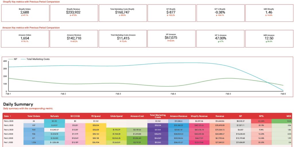
Data Source: Shopify, Amazon, Google Ads, Facebook Ads, Amazon Ads
This cross channel marketing dashboard is all about:
One common mistake is analysing marketing and sales data separately. Marketing teams focus on ROAS and acquisition cost, while management focuses on revenue. Neither metric alone shows whether the business is actually profitable.
So we usually recommend a profitability dashboard that combines ecommerce sales with ad spend. Our data visualization consultancy built this one for an ecommerce executive selling through both Shopify and Amazon. KPI cards compare sales across the two channels, then the dashboard pairs daily sales with costs from Facebook, Google, and Amazon Ads to calculate net profit, profit margin, and MER.
Revenue growth does not always equal profit growth – rising ad costs, refunds, or product-mix changes can erode margins. This dashboard tracks revenue, marketing spend, and profitability in one place, so decision-makers can see how sales affect net profit and MER over time.
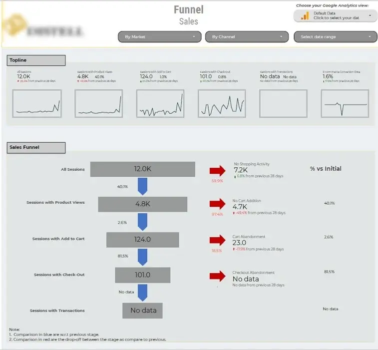
Data Source: Google Analytics 4
Funnel analytics is one of the most common marketing analytics examples. This dashboard is all about analysing:
Seeing where potential customers drop out of the buying journey is extremely valuable. Many brands mistakenly think they need to chase more traffic, when the bigger opportunity is often in improving conversion in the funnel you already have.
We put this management dashboard together for an ecommerce client to figure out where customers were losing interest between discovery and purchase. The KPI cards give a quick overview of the key conversion metrics compared to the last period. A funnel visual shows users at each stage, and the percentage that moved on to the next one. And filters let you break down performance by stuff like channel, country and time period.
Most stores have a few conversion bottlenecks, but fixing all of them at once is rarely practical. That’s where this funnel is useful – it flags up the stage where the most customers are dropping off, so your team can focus on the area that really needs work. A high cart abandonment rate might point to something like pricing or shipping costs, while a low product to cart rate often means there’s a problem with the product page or merchandising.
Pro tip: If you don’t trust your GA4 data make sure to first hire google analytics expert to run a GA4 audit and make sure your data is 100% accurate.
Data Source: Shopify
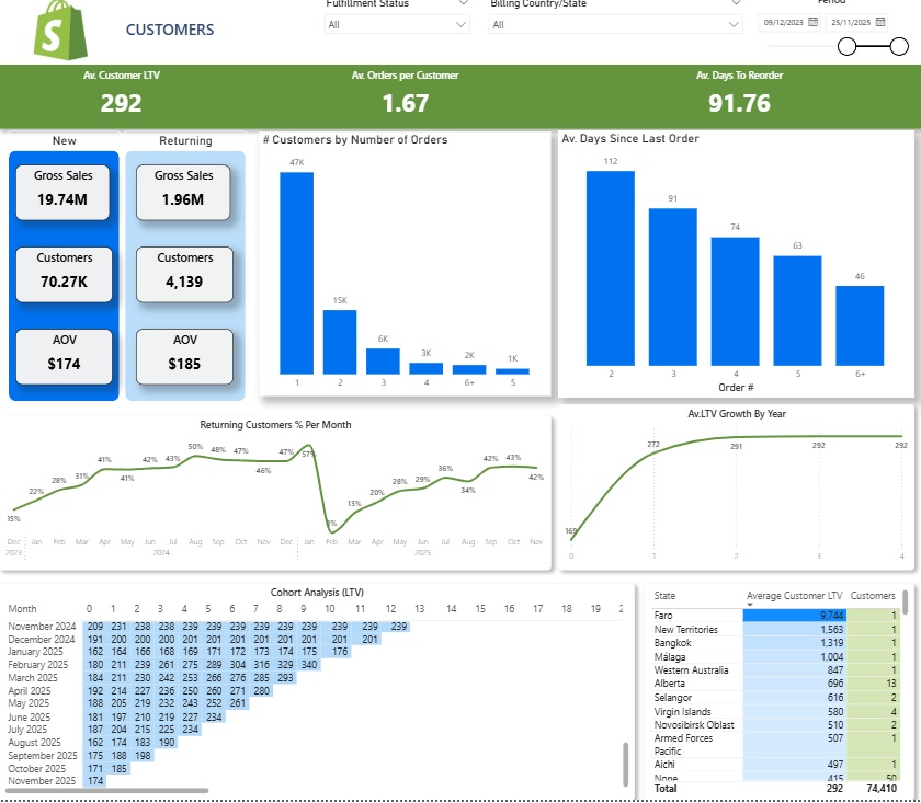
The dashboard looks at:
Understanding your customers is key to bumping up retention, lifetime value and the relevance of your offers. Customer analytics is one of the most untapped areas of ecommerce reporting – and often delivers the biggest long-term ROI.
One client we worked with wanted to get a better handle on purchasing behaviour – and boost repeat orders. Because Shopify lets us access customer emails alongside transaction history, we could build targeted segments and run personalised email campaigns. This ended up being one of our most impactful business intelligence success stories.
The real value here is being able to segment your customers rather than sending the same message to everyone. If customers aren’t reordering within their usual cycle, you can send them retention campaigns. If they’re high LTV customers, you can send them exclusive offers or loyalty rewards.
Data Source: Shopify
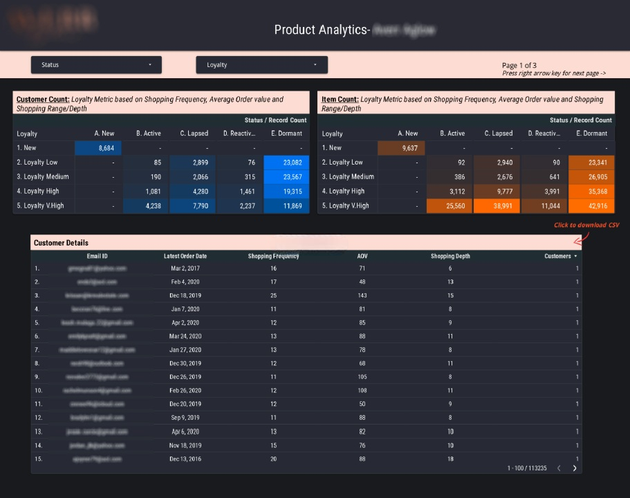
The dashboard digs into:
We built this managerial reporting dashboard a while back for a costmetics client. The logic behind it is that not all customers are created equal – some will buy a lot and generate a lot of lifetime value, while others will buy once and then never come back. This dashboard helps you identify those differences so you can build targeted retention campaigns.
Its groups customers into loyalty levels and lifecycle stages. The loyalty score takes into account things like purchase frequency, average order value and product diversity. Customers then get categorised as new, active, lapsed, reactivated or dormant – based on their recent behaviour. And filters let you pull up specific audiences quickly, like a list of dormant customers to reactivate or loyal customers to offer VIP rewards to.
Data Source: Shopify
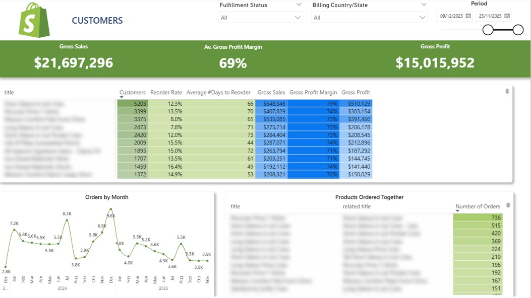
The dashboard looks at:
Knowing which products customers are buying is useful, but knowing which ones they buy again is even more valuable. This dashboard finds the products that drive repeat purchases, retention and cross-selling.
A product summary table shows you how many customers bought each product, the reorder percentage and the average time between purchases. Click on a product for a closer look at demand trends and seasonal patterns. And a bottom section shows you which products are often bought together.
Those combinations can help you build product bundles, cross-sell offers and recommendations. And they can also reveal which products build long-term revenue – even if they’re not the ones that get the most sales.
Data Source: Shopify
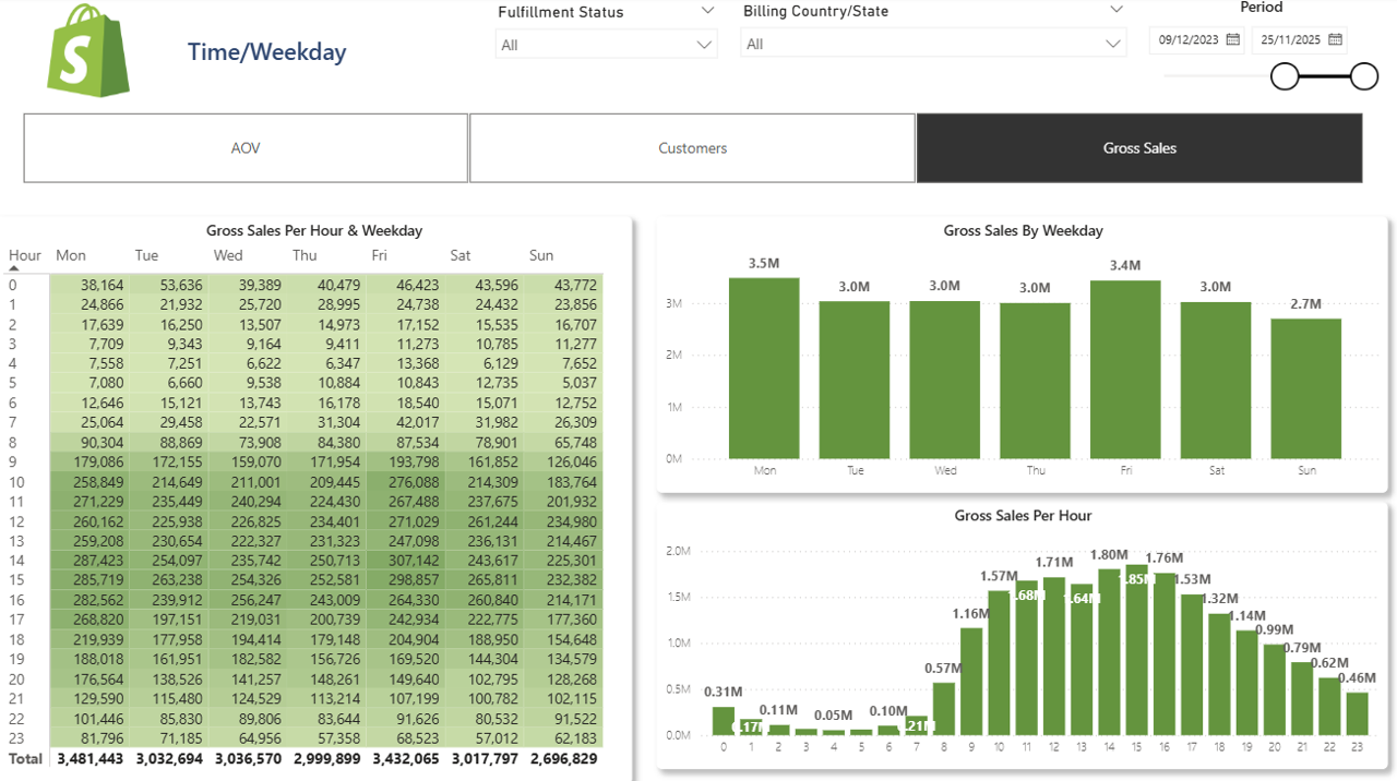
The dashboard examines:
A lot of brands focus on what customers are buying but not when they are buying. Knowing weekly and hourly purchasing patterns can help you time your campaigns, promotions and ad spend.
A toggle switch lets you switch between different visualisations – sales, customer count or AOV. Charts break down the selected metric by weekday and hour of day. And a heatmap shows you the busiest shopping periods.
Many brands schedule emails and campaigns on assumptions rather than actual behaviour. This dashboard shows you when customers are most likely to engage and buy, so you can time your activity accordingly.
The best ecommerce dashboards do more than just report numbers – they show you what drives revenue growth, retention and profitability. Most of the successful ones we see cover a shared set of KPIs across sales, marketing efficiency, customer behaviour and profit.
If you’re building in Power BI, start from a proven template and customise it to your products and customers. Its faster, more cost-effective, and avoids the pitfalls that come with building from scratch.


