A client reporting dashboard is a structured reporting solution that helps agencies, consultants, and service providers present performance data to their clients in a clear and transparent way. Instead of sending static reports or spreadsheets, dashboards consolidate key metrics from multiple systems and display them in an interactive format. This allows clients to quickly understand how campaigns, projects, or business initiatives are performing and how the work delivered contributes to measurable results.
As a business intelligence consulting company, we have developed 1,000+ client reporting dashboards for marketing agencies, consulting firms, ecommerce brands, and service providers using Power BI, Looker Studio, and Tableau. These dashboards integrate data from multiple platforms, automate reporting workflows, and present insights in a way that is easy for non-technical stakeholders to understand.
This article explains what a client reporting dashboard is, why agencies use them, and how they improve transparency and decision-making. It also explores common types of client dashboards, design principles for effective reporting, and the most widely used tools for building automated client reporting solutions.
A client reporting dashboard is a visual report that helps agencies, consultants, and service providers present performance data to their clients in a clear and structured way. Instead of sending spreadsheets or static reports, businesses use dashboards to display key metrics in interactive charts, tables, and summaries. This allows clients to quickly understand how their campaigns, projects, or business activities are performing.
Client reporting dashboards typically combine data from multiple platforms such as marketing tools, CRM systems, ecommerce platforms, and financial software. By bringing this information together in a single report, clients can monitor performance in real time and easily track progress against their goals.
The main purpose of a client reporting dashboard is to improve transparency and communication between service providers and their clients. Clients can see the results of the work being delivered, while agencies and consultants can clearly demonstrate the value of their services through measurable performance metrics. Unlike internal dashboards used by company teams, client reporting dashboards are designed specifically to communicate results to external stakeholders.
Benefits Of Client Reporting Dashboards For Agencies
Client reporting dashboards help agencies present performance data to clients in a clear and consistent format. Instead of manually compiling reports from multiple platforms, dashboards automatically collect data from advertising tools, analytics platforms, CRM systems, and ecommerce software. This reduces manual work and allows teams to focus more on analysis and optimisation.
Automation can significantly reduce the time required to prepare reports. By connecting marketing and analytics platforms directly to dashboards, agencies can eliminate spreadsheet-based reporting and keep client reports continuously updated. We helped one organisation implement automated dashboards for dozens of clients, saving around 50 hours per week previously spent preparing reports.
Below are examples of client reporting dashboards used to track marketing performance, sales results, ecommerce activity, financial health, and overall business performance. Each dashboard focuses on a specific area of the business and helps clients quickly understand how their operations are performing.
When an agency runs paid campaigns across several platforms, the client’s main question is simple: which channels are worth the money? A cross-channel dashboard answers that by reporting every channel on the same terms, so spend, acquisition cost, and return can be compared side by side rather than platform by platform.
Our marketing analysts built this dashboard for an e-commerce client, pulling data from Google Analytics, Google Ads, Bing Ads, Facebook Ads, Pinterest, and ShareASale. The top chart pairs daily purchase volume with the cost of acquiring it, so acquisition cost stays visible against the average order value it needs to stay below. The tables underneath carry the same picture at two levels, by channel and then by individual campaign, so a strong channel and a weak campaign inside it are both easy to spot.
Key Metrics:
Daily purchases
Cost per purchase
Impressions by channel
CPM (cost per thousand impressions)
Conversion rate by channel
Purchases by channel
Revenue by channel
Cost per purchase by channel
Return on ad spend (ROAS) by channel
Campaign-level revenue and ROAS
With channel and campaign performance in the same view, marketers can see which sources bring profitable customers and which ones only add spend. That makes budget decisions easier to justify to the client, and it shows in plain numbers which campaigns are worth scaling.
SEO Client Reporting Dashboard
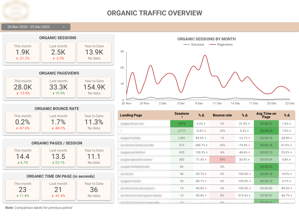
SEO reporting has to prove two things to a client: that organic traffic is growing, and that the visitors it brings are engaged once they land. A good SEO dashboard shows both together, so an agency can tie its work to traffic numbers and to what those visitors do on the site.
We built this report for an SEO agency reporting to its own clients, connecting to Google Analytics 4. Each KPI card shows a current-month figure against last month and the year to date, the line chart plots the monthly trend, and the colour-coded landing page table flags where engagement is slipping, which points the content team straight to the pages that need work.
Key Metrics:
Organic sessions
Page views
Bounce rate
Pages per session
Average time on page
Monthly organic traffic comparison
Organic sessions trend
Page views trend
Landing page performance
With the comparison figures built in, a client can see at a glance whether organic performance is improving. For the agency, the monthly SEO update becomes a short conversation about which pages and queries to prioritise next.
PPC Client Reporting Dashboard
Paid search clients judge an agency on one thing above all: whether the ad spend is making money back. A PPC dashboard has to lead with that, putting return and cost efficiency at the top before any campaign detail, so the client reaches the headline before the breakdown.
Our BI experts built this report for a Google Ads agency reporting to its clients. The header cards each hold a headline figure against the previous period, the daily trend lines below track how cost and return move through the month, and the campaign breakdown table ranks every campaign so weak performers stand out against strong ones.
Key Metrics:
Total ad spend
Cost per click (CPC)
Cost per conversion
Cost per thousand impressions (CPM)
Return on ad spend (ROAS)
Clicks Impressions
Campaign-level spend, CPC, CPM, and cost per conversion Period-over-period comparison
The layout makes weak campaigns obvious. When cost per conversion climbs on one campaign while ROAS holds on another, the client can see exactly where budget is working and where it needs pulling back, which is the conversation most paid search reviews are trying to reach.
Social Media Client Reporting Dashboard
For social media clients, follower count on its own says very little. What matters is whether the audience is growing and whether the people paying attention are the ones the brand is trying to reach. Social reporting is most useful when it shows growth and audience makeup side by side.
We built this Power BI social media dashboard for a client running an organic company page. The top row holds the headline counts against the previous month, a run of monthly charts covers reach and follower growth across the year, and two breakdowns profile who the audience is, not just how many follow.
Key Metrics:
Impressions per month
Company page views
Career page views
Jobs page views
Follower gain per month
Total followers
Followers by industry
Followers by seniority
For a B2B client, the seniority and industry splits matter more than raw follower count. A page can gain followers and still miss its target audience. This dashboard shows whether the people following are decision-makers in the right sectors, which is what makes the reporting useful for planning content rather than just counting it.
Ecommerce Sales Client Reporting Dashboard
Ecommerce brands and marketing agencies use ecommerce dashboards to report online store performance to clients. These dashboards track sales activity, customer behaviour, and promotion performance across the entire store. Pulling store, customer, and promotion data together lets businesses see what drives revenue and how customers move through the store.
Our data analysts developed a free ecommerce sales template that integrates data from Shopify and other ecommerce systems. The dashboard provides a complete view of store performance, allowing teams to analyse revenue trends, product sales, customer behaviour, and the effectiveness of promotions.
Key Metrics:
Total sales
Discounts applied
Shipping revenue
Sales taxes
Average order value
Total items sold
Customer count
Order volume
Gross margin
Cost of goods sold
Revenue by product
Revenue by region
Orders by discount code
This dashboard helps ecommerce brands understand what drives revenue growth and customer demand. By analysing sales trends over time, businesses can identify seasonal patterns, track store performance, and evaluate the impact of marketing campaigns.
The product-level analysis highlights which products and variants generate the most sales, helping teams optimise product assortment and inventory decisions. At the same time, geographic insights reveal where customers are located, while the promotion analysis shows which discount codes contribute the most to sales. Together, these insights help ecommerce teams improve marketing strategy, pricing, and promotional planning.
Email Marketing Client Reporting Dashboard
Outreach and email marketing reporting comes down to a short chain: how many leads were contacted, how many engaged, and how many became conversations worth having. The value of a dashboard here is showing that chain end to end, so effort at the top can be traced to the meetings it produces at the bottom.
We built this tracker for an email marketing agency running multi-channel outreach through Lemlist, across both email and LinkedIn steps. The header cards pair the raw volumes with their conversion rates, the activity monitor logs every action in a sequence as it happens, and the daily charts and sequence-step view show how leads move through the campaign from first contact to reply.
Key Metrics:
Unique leads mailed
Unique emails opened
Unique leads replied
Open rate
Reply rate
Meeting booking rate
Emails sent by sequence step
Activity by type (email and LinkedIn)
Because reply rate and meeting bookings are on the same screen as send volume, the agency can show a client that activity is producing conversations, not just sending emails. A weekday and hour breakdown also points to the sending windows that get the best open and reply rates, which feeds straight back into how the next batch is scheduled.
Financial Client Reporting Dashboard
Consulting firms, finance teams, and business advisors use financial dashboards to report a company’s financial health to stakeholders and clients. These dashboards track how cash moves through the business and help decision-makers understand whether operations generate or consume cash. Once the accounting data feeds in automatically, finance teams can track liquidity trends and explain performance without exporting from the ledger.
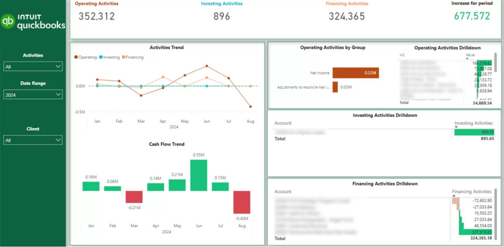
Our BI specialists developed a free financial reporting template that integrates accounting data from systems such as QuickBooks Online. The dashboard provides a clear view of how cash reserves change over time and breaks down these changes into operating, investing, and financing activities.
This dashboard helps businesses understand whether their core operations generate enough cash to sustain growth. By separating operating, investing, and financing activities, decision-makers can clearly identify which activities drive changes in cash reserves.
The detailed account-level breakdown also helps finance teams detect unusual spending patterns and monitor financial stability over time. These insights support better budgeting, investment planning, and financial decision-making. Because the refreshes run automatically, the reporting also takes routine work off the team: when we connected QuickBooks Online to Power BI for an accounting client, Stephanie Dolbeck, CEO of Angel Oak Accounting, reported it saved 4 hours a month and added value to the firm’s brand and customer service.
How To Share Dashboards With Clients
Once the dashboards are built, the next question is how clients actually reach them. There are three common ways to do it, and the right one depends on how many clients you report to and how much control you want over branding and access.
One Dashboard Per Client
The simplest option is to build a separate report for each client and share it directly. In Looker Studio this is easy, since each client opens their dashboard from a web link and never needs a licence. It works well for a handful of clients, but it gets harder to manage as the list grows, because every client is another report to build, update, and keep secure.
Row-Level Security
Row-level security keeps one report but shows each client only their own data. The report filters itself by whoever is logged in, so a single dashboard serves everyone while each client sees just their own rows. You maintain one report and one permissions table instead of dozens of copies, which scales much better. The trade-off is that every client sees the same layout, so there is less room to tailor the report to each one.
A BI Portal
For agencies and consultancies reporting to a lot of clients, a BI portal is usually the cleanest answer. It is a branded website where clients log in and see only their own dashboards, built by embedding Power BI reports into Power Pages. Clients open it like any other site, with no Microsoft or Power BI licence to buy, which keeps costs down as the client list grows and makes the reporting feel like your own product. Our BI portal page covers how we build these, including the licensing maths.
For example, we built a white-labelled Power Pages portal for a CFO practice that reports to its clients on their finances. The dashboards are built in Power BI and connected to each client’s QuickBooks data, then embedded into a portal that runs on the practice’s own web address, so the whole thing looks like the practice’s own product.
Inside the portal, each client opens a live profit-and-loss view: income, cost of goods sold, gross profit, overheads, and net income across the top, with a profit trend and an income-and-expenses breakdown below. Because it connects straight to QuickBooks, the figures stay current without anyone exporting data or rebuilding a report.
Each client logs in and sees only their own numbers, with no Microsoft account or Power BI licence to buy. That removes the onboarding and licensing overhead of sharing dashboards one client at a time, and it lets the practice deliver reporting as an ongoing, branded service rather than a set of files sent out each month.
How to Build a Client Reporting Dashboard
Building a client reporting dashboard involves combining data from multiple systems and presenting it in a clear and structured way. The goal is to help clients quickly understand performance metrics and identify areas that require attention. A well-designed dashboard focuses on the most important KPIs and updates automatically as new data becomes available.
1. Define the Reporting Objectives
Start by identifying what the client wants to monitor. Some clients may focus on marketing performance, while others may prioritise sales, financial metrics, or operational efficiency.
Clearly defining the reporting objectives ensures that the dashboard includes only the metrics that support meaningful business decisions.
2. Select the Key Performance Indicators
Once the objectives are defined, choose the key performance indicators that best represent success. For example, marketing dashboards may track conversions, cost per acquisition, and return on ad spend, while ecommerce dashboards may focus on revenue, order volume, and average order value.
Limiting the dashboard to the most important metrics keeps the report clear and easy to interpret.
3. Connect Data Sources
Client reporting dashboards usually combine data from multiple platforms such as marketing tools, CRM systems, ecommerce platforms, and accounting software. These connections are created through APIs, database integrations, or automated data pipelines.
Many agencies simplify this process by using pre-built data connectors, which automatically extract and update data from platforms like Google Ads, Facebook Ads, Shopify, Salesforce, and Google Analytics.
Connecting the correct data sources ensures that the dashboard always reflects accurate and up-to-date information.
4. Design the Dashboard Layout
The dashboard layout should present information in a logical structure. High-level KPIs are typically displayed at the top, followed by charts that show trends, comparisons, and detailed breakdowns.
Simple visualisations such as line charts, bar charts, and KPI cards make it easier for clients to quickly understand the insights.
5. Automate and Share the Dashboard
Once the dashboard is built, configure automated data refresh so the report updates regularly without manual effort. Most BI tools allow dashboards to refresh data on a schedule or when new data becomes available.
Finally, share the dashboard with the client through platforms such as Power BI, Looker Studio, or Tableau so they can monitor performance and access insights whenever needed.
Effective client reporting dashboards must present complex data in a clear and structured way. Clients should be able to understand the most important insights quickly without needing technical expertise. Well-designed dashboards focus on clarity, relevance, and usability so that stakeholders can easily interpret the information and make informed decisions.
Focus on Decision-Driving Metrics
Client dashboards should highlight the metrics that directly support business decisions. Instead of displaying dozens of indicators, the dashboard should prioritise a small number of key performance indicators that reflect campaign performance, revenue generation, or operational progress.
Selecting the right metrics helps clients quickly understand whether their goals are being achieved and where attention is required.
Keep the Dashboard Easy to Read
Dashboards should use simple and intuitive visualisations such as line charts, bar charts, and KPI cards. Overly complex visuals make reports harder to interpret and reduce the value of the dashboard.
A clear layout with logical sections allows clients to quickly scan the dashboard and identify the most important insights.
Enable Drill-Down Analysis
High-level dashboards should allow users to explore detailed data when needed. For example, a marketing performance summary may allow clients to drill down into campaign-level results or specific traffic sources.
This approach keeps the main dashboard simple while still providing access to deeper analysis.
Automate Data Updates
Client dashboards should update automatically by connecting directly to data sources such as analytics platforms, advertising tools, CRM systems, or accounting software. Automated refreshes ensure that clients always view the most recent performance data.
Automation also reduces manual reporting work and improves data accuracy.
Design for Client Accessibility
Client dashboards should be easy to access and use without technical training. Many organisations share dashboards through tools like Power BI, Looker Studio, or Tableau so clients can review reports at any time.
Providing clear navigation, simple filters, and intuitive visuals helps ensure that clients can interact with the dashboard confidently.
Best Client Reporting Software And Tools For Dashboard Creation
Client reporting dashboards are usually built on a business intelligence or analytics platform that can pull directly from the marketing, CRM, ecommerce, and finance systems a client already uses. The tool you choose shapes how much you can do with the data and how easily a client can open the result, so it pays to match the platform to the kind of reporting you deliver. The five below are the ones we work with most often on client projects.
Tool
Best For
Key Strengths
Limitations
Looker Studio
Marketing agencies reporting to a roster of clients
Free, shares from a web link with no client licence, close to Google’s marketing tools
Lighter on advanced analytics
Power BI
Finance and operations reporting for fractional CFOs, accounting firms, and executive dashboards
Strong data modelling, handles financial and accounting data, scales across a large client portfolio
Needs technical setup
Tableau
Consultancies presenting large or complex datasets to clients
Deep visual analysis, comfortable with big datasets
Higher licensing cost
Klipfolio
Always-on operational dashboards clients watch in real time
Many integrations, live metrics
Limited data modelling
Databox
Quick marketing and sales snapshots for smaller clients
Pre-built templates, fast to set up
Less flexible for complex reporting
Looker Studio
Looker Studio (formerly Google Data Studio) is Google’s free, cloud-based reporting tool. It builds interactive dashboards and connects straight to Google products such as Google Analytics, Google Ads, and Search Console, which is why it fits marketing reporting so well.
For marketing client reporting, it is usually our first recommendation: clients open their dashboard from a web link without buying a licence, which keeps reporting simple for an agency serving a whole roster of accounts. Our Looker Studio dashboards page has more examples built this way.
Pros
Free to use with easy sharing through web-based reports
Strong integrations with Google marketing platforms
Simple interface suitable for marketing teams
Quick dashboard creation using pre-built templates
Real-time collaboration
Cons
Limited advanced data modelling compared to BI tools
Performance issues with very large datasets
Fewer visualisation and transformation features than Power BI or Tableau
Power BI
Power BI is Microsoft’s business intelligence platform. It connects to a wide range of sources and builds interactive dashboards that combine marketing, sales, finance, and operations data, which makes it a common choice for detailed client reporting where the numbers need real modelling behind them.
It is also what sits behind our QuickBooks-to-Power BI work for accounting clients.
Pros
Connects to hundreds of data sources including databases, APIs, and cloud platforms
Supports complex data models and advanced analytics
Strong integration with the Microsoft ecosystem (Excel, Azure, SharePoint)
Highly customisable dashboards and visualisations
Scalable for enterprise-level reporting
Cons
Requires technical knowledge for advanced data modelling
Setup and maintenance can be complex for large datasets
Some features require Power BI Pro or Premium licensing
Tableau
Tableau is a data visualisation platform built for exploring large datasets and building highly interactive dashboards. It earns its place when a client needs deep analysis and detailed visual reporting rather than a standard monthly summary.
Pros
Powerful visualisation capabilities
Handles large and complex datasets efficiently
Strong data exploration and analytical tools
Highly interactive dashboards
Cons
Higher licensing cost compared to many alternatives
Steeper learning curve for beginners
Requires additional setup for data preparation and automation
Klipfolio
Klipfolio is a cloud-based dashboard platform aimed at performance monitoring and automated reporting. It connects several sources and shows metrics live, which suits clients who want an always-on view rather than a report once a month.
Pros
Large library of pre-built integrations
Designed specifically for dashboard reporting
Real-time data updates
Flexible custom dashboard creation
Cons
Data transformation capabilities are more limited than BI platforms
Customisation can require technical knowledge
Interface can feel complex for new users
Databox
Databox is a reporting platform for marketing and sales teams. It combines data from many tools in simple, shareable dashboards, which makes it a quick way to give smaller clients a clean snapshot without much setup.
Pros
Large number of marketing platform integrations
Quick dashboard setup with templates
Easy to share dashboards with clients
Mobile-friendly dashboards
Cons
Limited advanced analytics features
Custom data modelling options are restricted
Less flexible for complex reporting scenarios
Ready to Build Your Client Reporting Dashboard?
Client reporting dashboards help agencies present results in a clear and consistent way. Instead of sending multiple reports or spreadsheets, dashboards bring all important metrics into one place so clients can quickly see how campaigns, projects, or business activities are performing.
Automated dashboards also make reporting much easier to manage. Data from marketing platforms, CRM systems, ecommerce tools, and financial software can be collected automatically, which reduces manual work and ensures that reports stay up to date. This allows agencies and consultants to spend less time preparing reports and more time improving results for their clients.If you are looking to create automated dashboards for your clients, contact us to discuss your requirements! Our team can help you connect your data sources, design clear reporting dashboards, and build reporting solutions that scale as your client portfolio grows.