
Data analytics implementation typically relies on a framework to gather, structure, and interpret information, transforming it into actionable insights. In today’s competitive environment, where customer demands continue to rise, relying on analytics is no longer optional; it is essential for success.
As data analytics consultants, we have seen firsthand how well-executed analytics initiatives can transform the way organisations operate. One thing that all of them have in common is that they follow the same 8 steps for implementing data analytics.
In this article, we’ll walk through the 8 steps of our recommended analytics implementation process in detail and explain how to apply them in practice, sharing real-world examples.
Data analytics implementation is the process of setting up systems, tools, and practices to collect, transform, and analyze data, turning it into insights that drive better decisions. It goes far beyond buying software or relying on spreadsheets. True implementation means weaving analytics into everyday operations so your business can consistently generate, access, and apply insights where they matter most.
Without proper implementation planning, even advanced analytics tools often end up underused, disconnected, or ineffective. A structured approach ensures that:
From our experience, organisations that rush into adoption without a defined implementation plan often face delays, wasted budgets, and insights they cannot fully trust.
Every project we take on runs through the same eight steps, from figuring out what you actually want to know, all the way to keeping things accurate once it is up and running. The order matters, since each step leans on the one before it. Here is how the whole process works, and how to put it into practice, whether you plan to run it yourself or just want to know what good looks like when someone does it for you.
Want to map out your own project as you read? Grab our free template and fill it in as you go.
It is essential to identify commercial objectives of your data analytics project that can be linked to ROI. At this stage, it is important to be as specific as possible about your objectives and ideally link them to a certain process. This process should be ongoing and not likely to disappear soon, and should have a sufficient impact on the company’s revenue or cost. Some examples of well-defined data analytics objectives are:
The next step is to determine your Key Performance Indicators (KPIs) that will measure your progress towards your objective. It is also crucial to have supporting KPIs that measure the impact of different factors towards your main KPIs. For example, if your main objective is to increase marketing ROI, your supporting KPIs would be cost per click, cost per conversion, number of impressions, etc.
Once you have identified your data analytics objectives, the next step is to identify which data you can use for analysis. At this stage, we recommend following our data governance framework, where you identify the potential data sources for your analysis, assess data quality and assign responsibility for data quality and management.
The next step is data collection, where you gather data from internal and external sources, either manually or automatically through integrations. Manual data collection usually involves extracting data into Excel and then refreshing it when you need updated analysis. Automatic data integration usually involves data scraping or API integrations.
Data cleaning and preparation involves resolving data issues such as missing values, misspelled category names and conflicting data types by using formulas. This is where data analysts spend most of their time during analytics projects because these data manipulations are unique to every dataset and cannot be automated.
Common data cleaning steps include:
Data analysis refers to coding the formulas for your KPIs and calculating their values for different granularities. The main priorities at this stage is to ensure the accuracy of the data analysis and so the main stakeholders often get involved into quality checks.
For predictive analytics projects this step also includes:
At this point, data analysts should compare the results of their analysis with the original business objectives. They should ask themselves: “does my analysis help to answer the questions that were initially asked”. If the answer is yes, then they can move to the next step.
Data visualisation refers to presenting your data analysis in form of graphs so that it is easy to understand and interpret. Visualising your analysis often helps to discover trends and patterns that were not obvious when looking at plain data tables. Visualizing data also helps non-technical stakeholders to easier understand the data and not get overwhelmed by tables. Here are some of our tips for effective data visualisation.
Stakeholders with advanced business knowledge interpret the results of the analysis and make decisions based on the answers that they get from the analysis. The knowledge of operational activities in the business helps to explain the trends and make realistic conclusions about the results of the analysis.
As data analysts, we usually work together with the stakeholders to make sure that they interpret the calculations behind our analysis correctly.
Once the analytical results are interpreted, the stakeholders would usually make operational or strategic decisions to their business. This is typically where they would get ROI on their investment into data analytics.
Measuring changes refers to tracking performance after the key decisions that were made based on analysis. The main goal is to understand whether these decisions made things better, worse or made no significant impact on the performance. Analysts would support the stakeholders at this stage in multiple ways:
Maintenance of data analytics solutions includes refreshing them with new data and cleaning it to ensure there are no errors or inaccuracies. The main goal of the data analysts here is to maintain data accuracy and ensure successful data refresh so that the stakeholders can continue making their decisions based on the analysis.
As the data analytics solutions are being used, stakeholders usually start asking new questions about the data. Analysts answer these questions by producing additional analysis and visualisation. This approach is called iterative development.
You have just seen the eight steps involved. Doing all of it in-house takes analysts, clean pipelines, and time that most teams don’t have to spare. That is where we come in.
Our data analytics consulting services take you through the full journey. We start by defining your objectives and KPIs, then move through data collection, cleaning, analysis, and visualisation, and on to interpreting the results and keeping the solution accurate as it grows. Every engagement follows the eight steps above, so you always know which stage you are in and what comes next.
What an engagement covers
How we work: We start small and scale gradually. A focused first project proves value quickly, and we expand once the results are in. You keep full ownership of your data and dashboards throughout, and your team builds its skills alongside ours.
Who it’s for: Businesses that have outgrown spreadsheets and want analytics built into everyday operations, rather than another tool that goes unused. Whether you need end-to-end implementation or help with a single stage, we can fit in wherever you are.
We keep pricing simple. We work at one rate of $100 an hour and quote most projects as a fixed price up front, so you approve the total before any work begins. What changes the number is scope: how many data sources you are connecting, whether you need descriptive reporting or predictive models, and how many dashboards are involved. Here is what typical projects look like.
| Tier | Best for | What’s included | Hours | From | Delivery |
|---|---|---|---|---|---|
| Starter | A first dashboard, or one clear question answered well | One data source, a clean data model, one to two pages of analysis, polished visuals | About 10 | ~$1,000 | About 1 week |
| Standard | Teams that want live data flowing in automatically | Custom ETL from one or two sources with automated refresh, tailored DAX measures, two to three pages | About 40 | ~$4,000 | About 2 weeks |
| Large | Reporting across several teams, tools, or systems | Custom ETL across around three sources, a larger data model, multiple reports | About 100 | ~$10,000 | About 4 weeks |
| Ongoing | Evolving needs and continuous improvement | Support, changes, and new requests handled to your monthly priorities | $100/hour | As you go | Flexible |
Hours are a guide, not a cap. We scope your project and send a fixed quote first, so the number you approve is the number you pay.
The examples below show the data analytics implementation process at work in real businesses. We have kept client names out of it, but the results are exactly as they landed.
A logistics client came to us with a familiar frustration. Late deliveries kept slipping through, and by the time anyone worked out why, the customer had already noticed. Routing decisions were being made more or less blind, with no real sense of what caused the holdups in the first place.
We built predictive models that read the conditions behind late deliveries, things like traffic patterns and weather, so the team could spot a delivery heading for trouble before it happened rather than explaining it afterwards. That gave them the room to adjust routes ahead of time instead of reacting to missed windows. Late deliveries fell by 20%, and the team shifted from firefighting to planning.
An ecommerce retailer was sending the same marketing to everyone on their list. There was no way to tell which customers were worth winning back, or what might bring them in for a second order, so repeat business quietly kept slipping away.
We created customer segmentation models that grouped shoppers by how they behaved and what they were worth, then used those groups to shape campaigns aimed at the people most likely to return. The message finally matched the customer, rather than treating every shopper the same. Repeat purchases climbed by 30%.
A financial services firm was approving loans on criteria that struggled to tell a safe applicant from a risky one, which left them exposed to defaults they might otherwise have seen coming.
We built risk models that predicted how likely a loan was to default, giving the team solid evidence to tighten their approval criteria instead of leaning on gut feel. The payoff was sharper lending decisions and far less exposure to accounts that were likely to go bad.
The dashboards behind results like these are worth seeing for yourself. Below are six data analytics implementation examples we have built for clients, each one built around a specific business problem.
Most executives don’t struggle to find data. They struggle because there’s too much of it, sitting in too many places. Finance keeps its numbers in the accounting system, sales lives in the CRM, HR and marketing each have their own tools, and none of it lines up neatly. To get a read on how the company is actually doing, leaders end up opening report after report and piecing the story together themselves. That’s slow, and it’s easy to miss a trend or let a small problem grow before anyone notices. An executive analytics dashboard changes the starting point: instead of chasing numbers across systems, leaders open one report, watch the KPIs that matter, and drop into department-level detail when something needs a closer look.
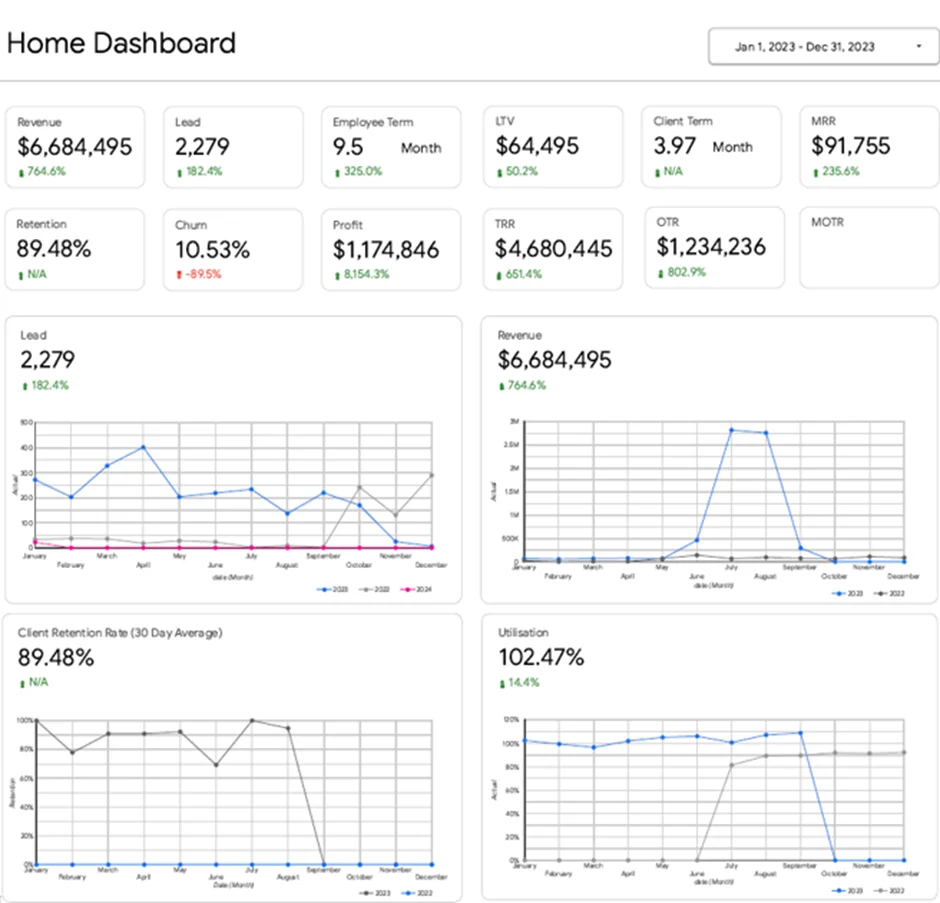
Our Power BI developers built the executive analytics dashboard above for the CEO of a marketing agency. It brings together KPIs from finance, marketing, sales, operations, and HR into a single report. The CEO uses it to keep tabs on revenue, profitability, lead generation, client retention, employee utilisation, and more, which makes it far easier to spot where performance is slipping, decide what to focus on, and get to the root of an issue before making a strategic call.
Profit is easy to measure and hard to explain. You can see the number at the bottom of the page, but working out why it moved means digging back through detailed reports and accounting records line by line. Finance teams and business owners need a faster way to see how income, costs, and margins are shifting over time, so a dip or a spike doesn’t go unexplained for weeks. A financial analytics dashboard gives them that, laying out the key financial metrics alongside account-level detail in one report.
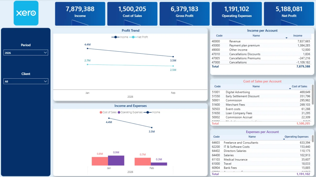
Our dashboard developers built the Xero Profit And Loss template above to give a clear read on monthly financial performance. It tracks Income, Cost of Goods Sold (COGS), Gross Profit, Operating Expenses, and Net Profit, so profitability trends across the year are easy to follow. It also breaks Income, COGS, and Operating Expenses down by account, which makes it simple to see exactly which accounts are behind a change in the numbers.
As an online store grows, the catalogue grows with it, and it gets harder to tell which products are actually carrying the business. Your Ecommerce platform hands you plenty of sales data, but it rarely answers the questions that matter most: which products bring people back for a second order, which ones make you the most money, and which tend to sell as a pair. An Ecommerce analytics dashboard pulls those answers into one report, so retailers can sharpen their product strategy, lift average order value, and market with a lot more precision.
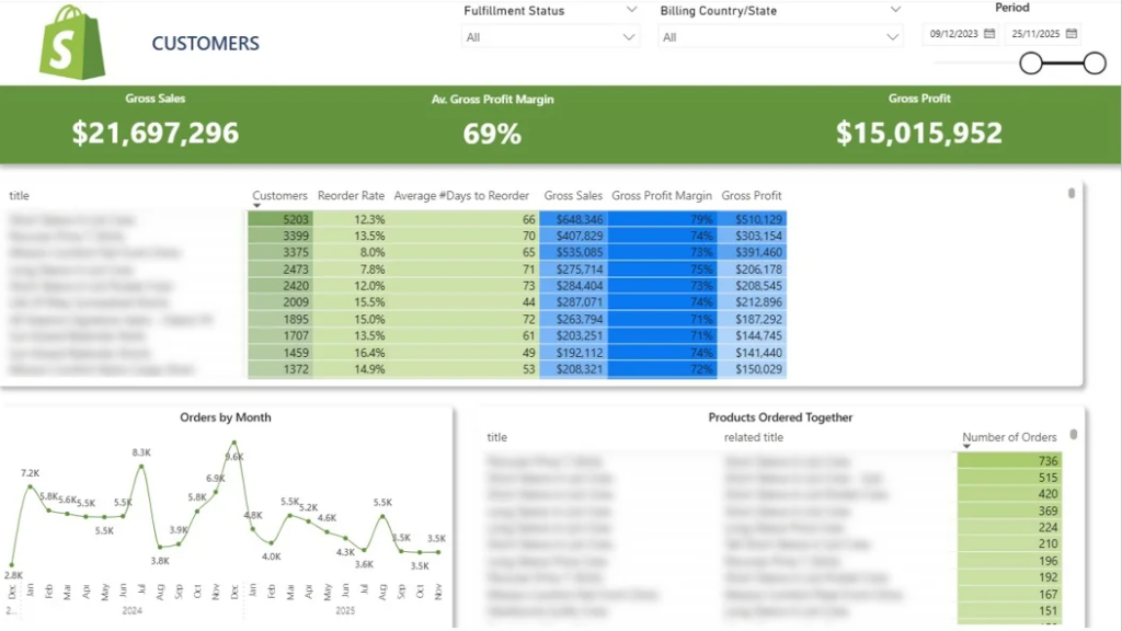
We built the Shopify product analytics dashboard above to help online retailers get a proper read on how their products perform. It tracks product sales, reorder rates, profitability, and monthly order trends, and it flags the products customers tend to buy together. With that in hand, businesses can spot their high-value items, follow how buying habits shift, put together bundles that make sense, and build targeted campaigns that bring shoppers back and push order values up.
A bigger pipeline can look like progress while telling you very little. Deals stall, pipeline value swings up and down, and a lead source that used to be reliable can quietly lose its edge without anyone clocking it. When you can’t see what’s happening across your sales activity and pipeline, those shifts are hard to explain, and it’s even harder to know where the process is starting to leak. A sales analytics dashboard draws it all into one place, so sales leaders can keep pipeline health in view, judge how the team is really performing, and catch issues while there’s still time to act on them.
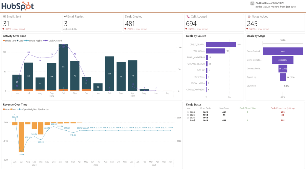
Our team built the HubSpot sales analytics template above to give a full picture of sales performance and pipeline activity. It tracks the day-to-day work of the sales team, including emails sent, replies received, deals created, calls made, and notes logged by each rep. It also breaks down deals by source, follows how they move through the pipeline, and charts weighted pipeline value over time. Users can pull up the pipeline as it stood on any past date to see exactly how many deals were open at each stage and what the total was worth, which makes it easy to see how things have moved between reporting periods and explain those changes to leadership.
Marketing teams pour real money into campaigns, but proving what that money bought is rarely simple. A brand awareness push and a lead generation campaign aren’t measured the same way, so lining them up side by side and asking “did this work?” gets complicated fast. A marketing analytics dashboard settles that by putting campaign performance in one report, so teams can watch their ad spend, measure what each campaign delivered, and compare like with like based on what each one set out to do.
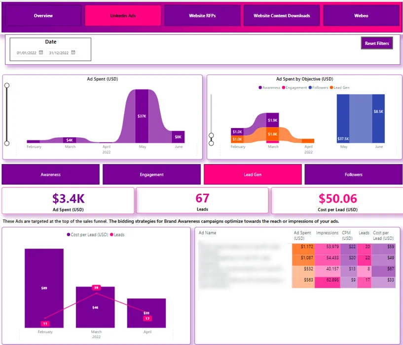
Our business intelligence consultants developed the Power BI LinkedIn Ads template above for a global company with more than 400,000 employees. It tracks monthly advertising spend, performance at the campaign level, and awareness metrics like impressions, clicks, and click-through rate (CTR). Users can switch between campaign objectives to see the KPIs that actually matter for each goal, which makes it easier to judge how a campaign performed, put the budget where it works hardest, and report results back to stakeholders.
In logistics, a promise is only as good as the delivery that backs it up. Orders need to arrive on time, complete, and matching what the customer expected, and staying on top of that across hundreds of shipments is no small task. Without analytics built for the job, late deliveries slip through unnoticed, the reasons behind them stay murky, and it’s hard to know which orders need attention first. A supply chain Power BI dashboard clears that up by showing exactly how fulfilment is performing, so teams can hold their service levels and jump on problems before they turn into complaints.
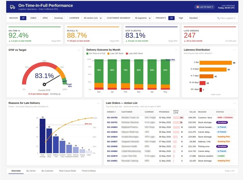
Our team built the OTIF dashboard above to help logistics teams keep an eye on delivery performance right through the fulfilment process. It tracks the metrics that matter, including On-Time %, In-Full %, OTIF %, Average Days Late, Late Delivery Reasons, and Late Orders by Order Number. From a single report, users can pick out deliveries that arrived late or incomplete, dig into what caused the holdups, and get a read on how reliable fulfilment is overall.
Every project that runs smoothly has a plan behind it. A good one says what the phases are, who owns each, when they happen, and how you know a stage is finished. That is what keeps a project moving instead of drifting.
Your plan should cover:
No need to start from a blank page. Check our Data Analytics Implementation Plan template that is the same phase-by-phase checklist we use, with room for owners, dates, and milestones, so you can map out your project in an afternoon.
You can also look at our free Power BI templates to see a finished dashboard before you commit to a build.
When decisions rest on evidence rather than gut feel, the guesswork starts to fade and teams act with more confidence. Good analytics does not just tell you what already happened. It points to what is likely to happen next, so you can prepare for it instead of reacting once it arrives.
Customers have come to expect that you understand them, and analytics is how you manage that at scale. By reading preferences, buying patterns and the paths people take on their way to a purchase, you can group customers in ways that mean something and speak to each group in a way that actually lands, instead of sending everyone the same message.
Analytics has a way of surfacing the bottlenecks and quiet waste that drain time and money without anyone quite noticing. Once your reporting runs automatically, the hours a team used to spend on manual updates go back into work that actually moves the business forward.
Seeing what is coming before it lands is a genuine advantage. Predictive models help you anticipate demand, risk and how customers behave, so you are making calls ahead of the curve rather than scrambling to catch up with it.
Based on our experience working with many clients, we’ve noticed some common challenges they face. Let’s take a look at these challenges below:
Let’s look at the best practices for a successful data analytics implementation. These are the lessons we’ve learned from working on projects for our clients:
Choosing the right tools involves balancing functionality, cost, scalability, and ease of use. Some popular platforms include:
When selecting tools, consider:
It is the work of setting up the systems, tools, and habits that let you collect, tidy, and analyse data and turn it into decisions. It is more than buying software. The point is to build analytics into how the business runs day to day, so useful insight is always there when you need it.
In eight steps: set your objectives and KPIs, assess and collect the data, clean and prepare it, analyse it, build the visuals, read the results and decide what to do, measure what changed, then maintain and improve it. Each step leans on the one before, and the work carries on rather than ending at go-live.
It depends on scope. A single dashboard is about a week, a typical build with automated data pipelines about two weeks, and a larger project across several systems around four weeks. We scope it first, so you know the timeline before anything starts.
We charge $100 an hour and quote most projects as a fixed price up front. A single dashboard starts from around $1,000, a typical build with automated pipelines from $4,000, and a larger multi-system project from $10,000. Ongoing support is $100 an hour, billed as you go.
Adoption is dipping a toe in, trying a tool or tracking something for the first time. Implementation is building analytics properly into the business, connecting systems and automating the data flow. Strategy is the why behind it, whether that is keeping more customers or getting more from your marketing spend.
As you see, there are a lot of moving parts to your data analytics implementation project. If you need professional help with implementing data analytics in your organisation, please reach out to us.
Our consultants have helped 600+ companies with every step of the data analytics implementation. We would be excited to bring our experience into your project.


