
Getting a handle on performance across an organisation is a top priority for leadership teams. That’s where monthly reports come in – providing a clear window into how different parts of the business are doing. From financial results to sales activity, marketing performance and project delivery, these reports bring together the key insights that inform strategic decisions.
But for many teams, putting a monthly report together is a laborious and error-prone chore. They’ve got to pull data from various systems, stick it into a spreadsheet, build some charts and graphs, and then present the whole thing in a neat package – and do it all again the next month.
We’ve seen it time and time again – organisations getting bogged down in manual reporting and struggling to make the most of their data. That’s where our business intelligence consultants come in with our automated custom monthly management reporting solutions. We help our clients ditch those clunky manual processes in favour of real-time dashboards that can be scaled up to meet their needs. And in this guide, we’ll show you the way – exploring what monthly reports are all about, what they should include, and how to build them without losing your mind using modern BI tools.
A monthly report is a straightforward summary of how a team has performed over the past 30 days. It’s designed with senior leadership in mind, and its purpose is to give them a high-level view of how functions like finance, sales, marketing and project management are doing against their goals. Unlike daily reports, which are all about tracking what’s going on minute by minute, a monthly report steps back to look at the bigger picture – highlighting trends, key achievements, risks and opportunities that will help leadership make informed decisions about where the business is headed next.
Monthly reports are different from operational reports in a big way. Operational reports are typically updated in real time or at least every few days, and they’re all about managing the day-to-day tasks and immediate performance of a team. A monthly report, on the other hand, is all about looking at the month as a whole – and figuring out what trends and patterns are emerging.
We all know how it goes – you’ve got to pull data from various sources, stick it into Excel, build some charts and graphs, and then export it all to PowerPoint to build your presentation. It’s a time-consuming process that’s prone to errors – and when you’re doing it every month, it can get to be a real drag.
But the good news is that you don’t have to put up with this anymore. With modern business intelligence tools like Power BI, you can automate the whole process. These tools can connect directly to your data sources, update your dashboards automatically, and generate reports that are consistent and visually rich. This means you can spend more time on analysis and less time on prep work – and that’s a big win for any team.
Monthly managerial reporting gives leadership a regular chance to step back and see how the business is performing against its strategic goals. It helps organisations spot when they need to pivot – whether because of a change in the market, a shift in priorities or an emerging risk. And that’s not all – regular reports also foster a sense of accountability across the business. When there’s a clear, recurring view of results, teams are more motivated to hit their targets and take responsibility for outcomes.
Finally, monthly reports bring all the different parts of the business together, giving leadership a complete and accurate picture of how things are going. By combining data from multiple functions, they can make more informed decisions – and get a better handle on long-term planning and strategy.
At the heart of any monthly MIS report are a few core components. First, you need some clearly defined KPIs and targets – these show how each team or function is performing, and give leadership a benchmark for success. Then there’s data visualisation – charts, graphs and dashboards that make it easy to see at a glance how things are going and what trends are emerging. And finally, a good monthly report looks forward as well as backwards – including a forecast for the next month helps set expectations, anticipate risks and align teams on upcoming priorities.
Monthly financial reports are a key part of any business – providing a clear view of a company’s financial performance and position. They bring together key areas like profitability, financial position, cash flow and collections into one clear view. And at Vidi, we make this process a whole lot easier by offering data connectors that automatically pull data from accounting systems like QuickBooks, Xero and Zoho Books. This eliminates manual data prep and ensures your reports are always up to date.
We also throw in free Power BI monthly report templates with every connector purchase – so you can build professional, fully interactive financial dashboards without starting from scratch.
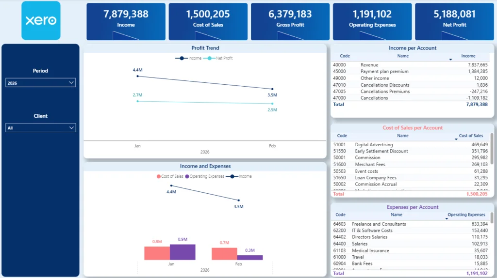
A Profit & Loss report is the core of any monthly financial report, providing a clear view of business profitability over a given period. A modern Power BI P&L dashboard shows you key metrics like revenue, cost of goods sold, gross profit, overheads and net income in an easy-to-understand format – and it’s a great starting point for your financial reporting.
Typical analysis included on a P&L dashboard gives you a pretty good idea of everything that’s going on with revenue and expenses – broken down month by month, quarter by quarter and year by year, income by the channel it came in, and how much overhead is being spent on what. Plus, with this level of detail, you can do a quick high-level review or dig in deeper whenever you need to.
There are a few reasons why building P&L reports in Power BI is such a good idea. Traditional tabular reports are just numbers – they don’t really help you understand what’s going on or why certain trends are happening. Power BI changes all that by adding some real context through charts, comparisons, and percentage analysis. And it makes it super easy to combine data from multiple systems, like multiple QuickBooks Online accounts or business entities, into one single, unified view.
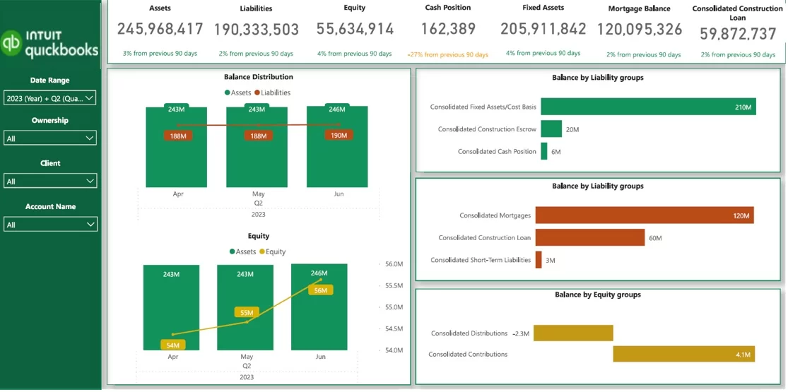
A Balance Sheet report is like a snapshot of a company’s financial health at a specific moment in time. It covers assets, liabilities, and equity. When you build a balance sheet dashboard in Power BI, it helps you see where the company is at risk, and that’s especially important for companies like real estate or construction, where big loans and high-value assets are pretty standard.
Key numbers to look at include cash position, loan amounts, and retained earnings. Cash position gives you an idea of how liquid the business is and how long it can keep going without having to borrow more money, loan amounts highlight how much the company owes and to who, and retained earnings give you a sense of how stable the business is and how much money it’s got set aside.
With Power BI, balance sheet reporting is a whole lot more interactive and easier to get to the bottom of. Users can filter, drill down into accounts, and see changes over time – giving leadership a much clearer view of the company’s financial health and what they need to do about it.
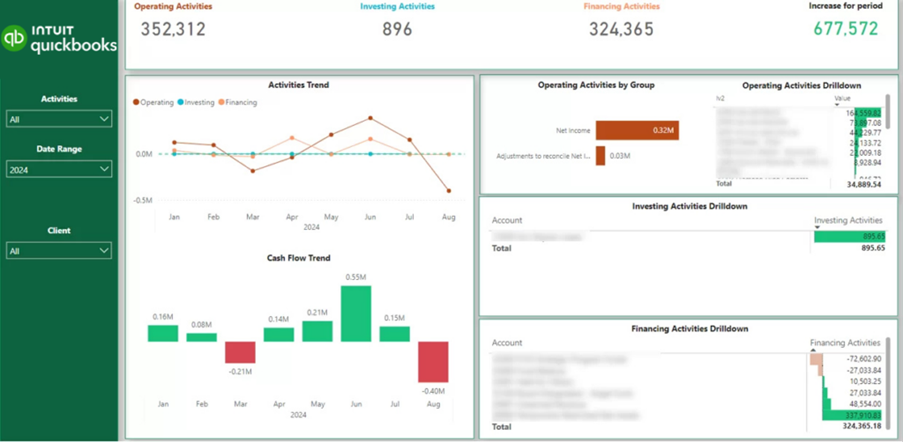
A Cash Flow report is all about how money is flowing in and out of a business – which is pretty critical stuff. After looking at a Profit & Loss (P&L) report to see how profitable the business is, companies often turn to the cash flow to see how liquid they really are. And let’s be honest – a lot of businesses fail because they run out of cash, not because they’re not making a profit.
A Power BI cash flow dashboard shows cash inflows and outflows, and some may break them down into operating, investing, and financing activities. Other systems might present it through individual account line items. The key value is that it gives you a clear view of how much cash you’ve got coming in and going out – and it helps you understand how long your current cash reserves will last and what you can do to keep going.
With Power BI, this cash flow view is interactive and real-time, which makes it a lot easier to manage cash better and make some really informed decisions.
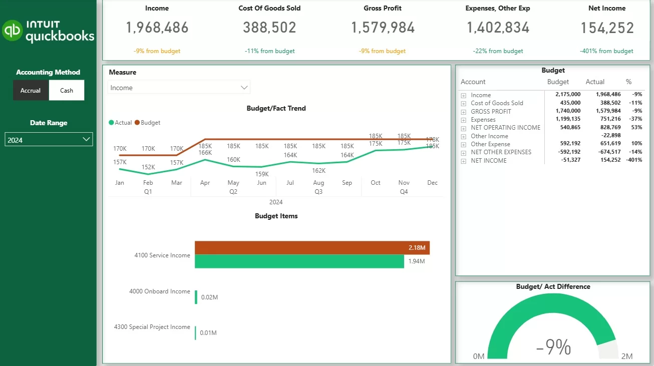
A Budget vs Actuals report is a comparison between how the business is actually performing – like sales and expenses – versus what you expected to happen. These expectations (budgets) are usually set annually or quarterly, and actuals are updated all the time. It helps organisations figure out whether they’re on track and where they’re deviating from expectations.
The layout of the report depends on how detailed the budgeting process is. Some organisations build detailed budgets across the whole P&L or balance sheet, while others just focus on specific areas like product sales or key cost categories. This makes it super flexible and means the dashboard can be adapted to whatever level of analysis you need.
Our Power BI consultants built the report above for a client showing budget vs actuals using gauge or bullet charts to visualize how the client is doing against targets. We also built line charts with overlays to compare budget and actual, and tables comparing actuals, budget, and variance. It makes it super easy to spot where things are going wrong and take action to correct it.
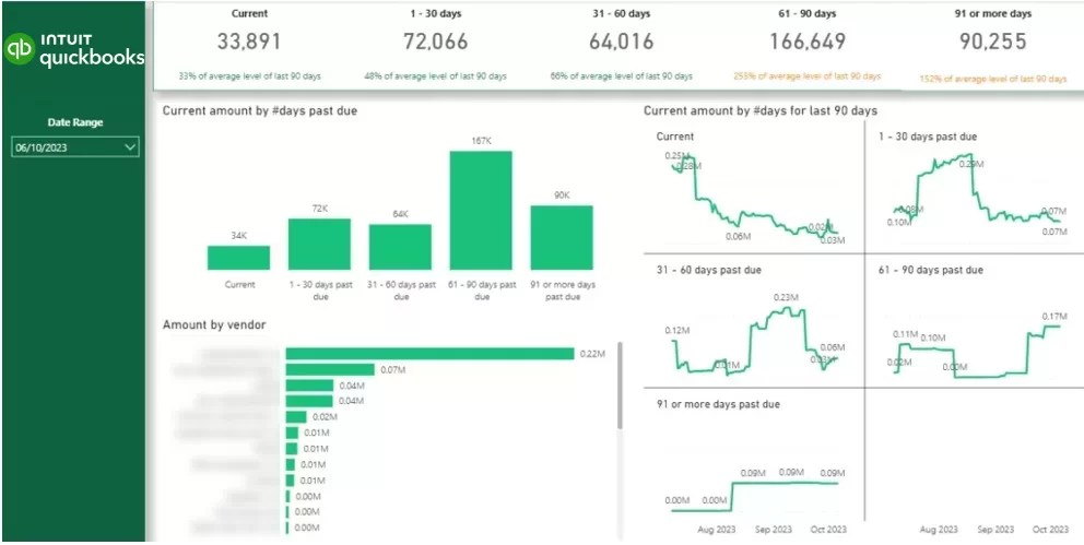
An Accounts Receivable report is all about tracking down outstanding invoices and making sure you get paid on time. A Power BI dashboard gives you a crystal-clear view of who owes you money, how much they owe, and how long it’s been since you sent the invoice – which makes it a really useful tool for keeping a healthy cash flow.
Our dashboard consultants built the report above for a professional services company. This report includes bar charts showing how much each client owes and charts breaking down invoices by how old they are (e.g. 0-30 days, 31-60 days, etc). These views make it super easy to spot where you’ve got problems and prioritise getting paid.
With interactive features, you can drill down into specific ageing buckets or even individual invoices. This lets the credit control team quickly identify overdue accounts, take action, and follow up with clients to get paid faster and reduce risk.
Monthly sales reports give you a structured view of how your sales are performing, helping organisations track the health of the sales pipeline, how well the team is doing, and how close you are to hitting your revenue targets. They bring together key insights like conversion rates, deal performance, and sales activity into a single, clear view for leadership. These reports are built using data from CRM systems and company ERPs, making sure you get a really comprehensive view of the sales process.
At Vidi, we often build custom automated monthly sales reports as part of our data visualization consulting services. We’ve done this for companies like Teleperformance, Tikkurila, and Knorr-Bremse – it’s helped their teams monitor their performance better and make some really informed decisions.
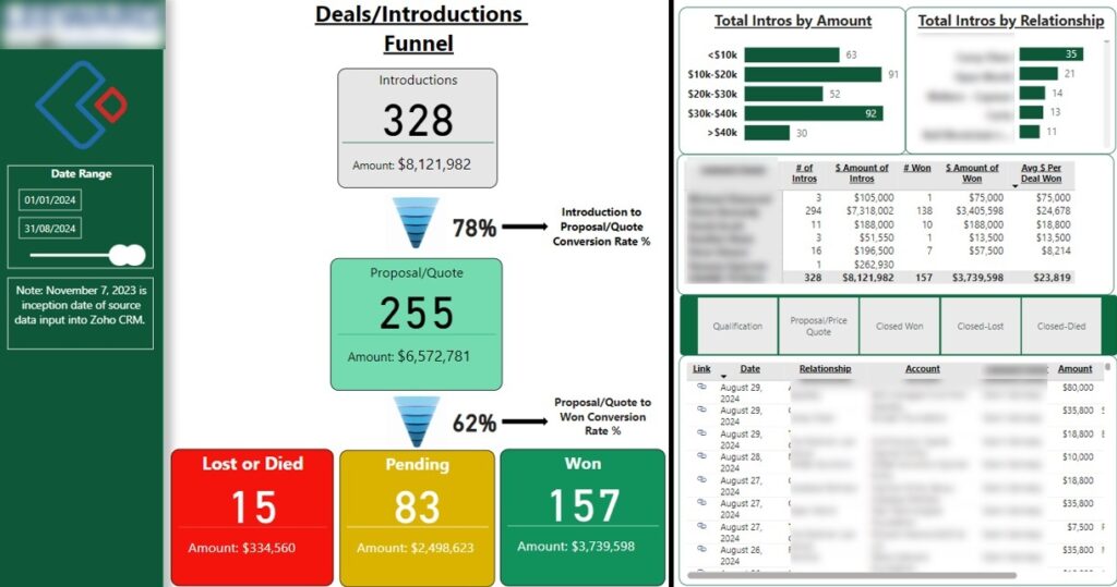
A Sales pipeline report is all about optimising the sales process by having a close look at how leads flow through the different stages of the sales funnel. It gives a clear picture of conversion performance, showing you not only how many leads are moving through each stage but also the conversion rates that go along with them.
The funnel analysis really helps to pinpoint bottlenecks and areas where we need to improve, and breaking down performance by account manager lets teams see how productive their members are and how they’re contributing to the team’s overall performance. That makes it a whole lot easier to figure out what’s driving those successful deals and where we might need a bit of support.
Plus, the report often includes some insights into where our deals are coming from and how big they are, which helps organisations work out which channels are generating the most valuable opportunities. So that all comes together to support more effective sales strategies and better forecasting.
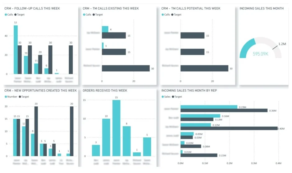
A Sales vs Target report is basically a comparison of what our sales team is actually doing and achieving against what we’re expecting them to do and achieve. This helps organisations evaluate how well the team is performing and whether they’re meeting their goals. It gives a clear view of whether our sales reps are actually meeting expectations and where they might be falling short or overachieving.
The main focus of this report is on looking at performance at the individual sales rep or team level, because they’re the ones who own the targets and are responsible for hitting them. We use metrics like calls made versus targets and new opportunities created versus targets to gauge both activity and pipeline generation, which makes this report really valuable for those performance reviews.
This type of dashboard really helps us spot where people are underperforming and where they’re overachieving, which lets managers take action – whether that’s giving some coaching, adjusting those targets or recognising those top performers – all while keeping the team aligned with the overall revenue goals.
A monthly marketing report is a way for marketing directors to get a structured view of how their campaigns are performing, which helps them figure out what’s working and what’s not, and where to tweak things for better results. These reports are usually put together by marketing pros and are also used by agencies to update their clients on the performance of their ongoing campaigns.
At Vidi, our marketing analytics consultants built custom marketing reporting solutions for big clients like DS Smith and industry-leading agencies like Neil Patel’s NP Digital. These reports often bring together data from multiple platforms to give a clear, easy-to-follow view of marketing performance.
We usually build these reports in Looker Studio because it makes it easy to share them without needing to buy extra licenses, which makes it particularly effective for agencies and teams that need to send out reports regularly to lots of different stakeholders.
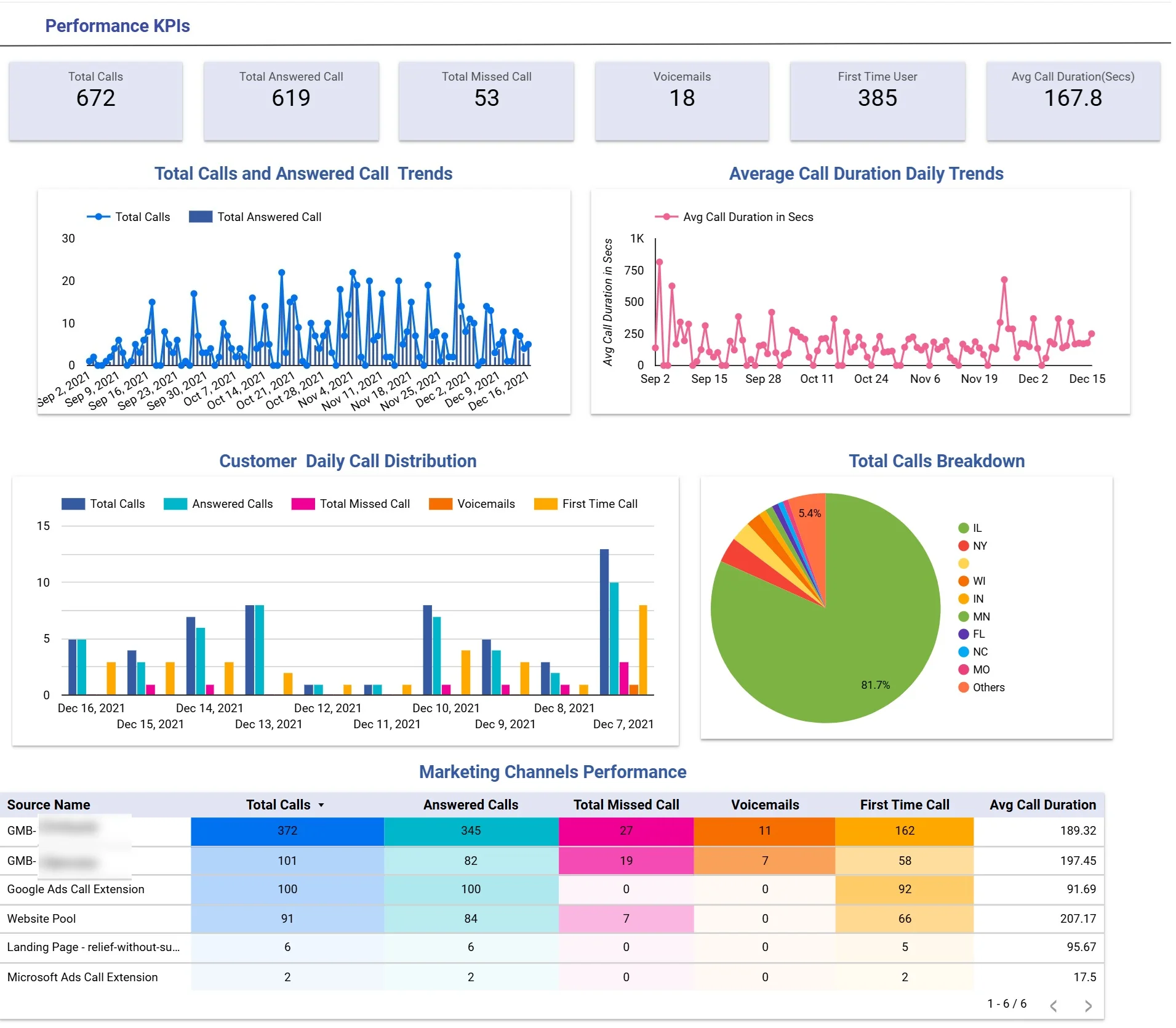
A lead generation report is all about measuring the effectiveness of marketing efforts in driving up enquiries, especially for businesses that rely on inbound calls – like dental clinics, medical practices, home services and legal firms. These reports give a structured view of call performance and help us spot which channels are generating the most valuable leads.
Our Looker Studio consultants develop those within 2 weeks on average, and they include key metrics like total calls, answered calls, average call duration and call status breakdowns (like missed, voicemail and first-time callers). They often also feature geographic analysis and channel-level comparisons, which let businesses figure out where their leads are coming from and how good the quality of those interactions are.
By analysing performance across different marketing channels, teams can tell the good from the bad and figure out which channels are driving high call volume versus which ones are generating more engaged leads. That lets them make more informed decisions about where to put their budget and how to optimise their campaigns, which basically means their marketing efforts are focused on driving meaningful results.
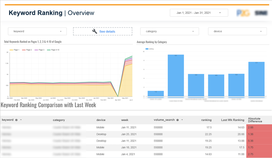
SEO monthly reports track the performance of our search engine optimisation efforts over time, using data from sources like Google Search Console, SEMrush and other SEO platforms. These reports typically focus on key metrics like keyword rankings, clicks and impressions to measure how we’re doing online and how our traffic is growing.
When it comes to client reporting, the focus is on showing them the value of SEO – that is, how improvements in rankings translate into increased visibility, website traffic and ultimately conversions. We’re looking to show them progress over time and make them see the return on investment, which encourages them to keep with the SEO plan.
For example, a keyword ranking report might group the keywords into categories and look at average rankings within each group. It can also show how many of our keywords are sitting on page 1, 2, 3 or beyond, as well as tracking weekly changes in position. That level of detail helps clients see the performance trends and the impact of our ongoing optimisation efforts.
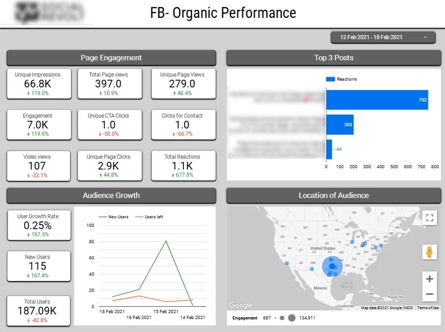
Social media reports give us a clear view of how our content is performing and how our audience is growing across platforms like Facebook and Instagram. We usually build these in tools like Looker Studio, which helps marketing teams and agencies give their clients a transparent view of how their social media activity is translating into engagement.
Key metrics we usually look at include impressions, page clicks, reactions and overall engagement, along with insights into the top-performing posts. By highlighting what really resonates with our audience, these reports help teams refine their content strategy to better engage their audience.
We also track audience growth – like new followers and unfollows – and often include geographic analysis, which makes it easier to evaluate our campaign impact over time and optimise our content and targeting based on where the most engaged audiences are located.
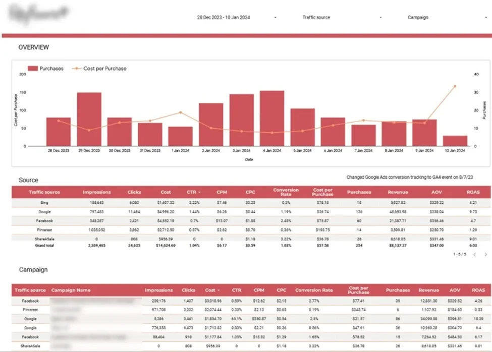
PPC monthly reports give a clear picture of how well paid marketing efforts are doing across different channels, helping businesses to see where their ad budget is really going and what kind of returns it’s giving them. These reports typically pull in data from platforms like Google Ads, Bing Ads, Facebook, Pinterest, and various affiliate networks – and also bring in data from tools like Google Analytics to get a complete view.
Our data analysts use tools like Looker Studio to build dashboards that track key numbers like impressions, CPM, cost per purchase, conversion rates, revenue and return on ad spend (ROAS). They often include daily trends for purchases and the cost of acquiring new customers so that you can keep a close eye on whether it’s really worth the money. This way, you can make sure customer acquisition is profitable and in line with the average order value.
By looking at how each channel and campaign is doing, these reports give marketing teams the information they need to work out which channels are best for raising awareness, which ones are generating actual sales, and which ones are giving the best return on investment. This makes it much easier to budget and to keep tweaking and improving your paid campaigns.
Monthly project management reports give a view into how the team is doing, what the workload is looking like and how projects are coming along. They’re usually built from data in project management systems like Jira and ClickUp, which track tasks, timelines and how resources are being allocated.
These reports are really useful for measuring how well the team is using its resources and for understanding how effectively resources are being used by the organisation. By looking at metrics like task completion, time spent and how workloads are distributed, leadership can spot any bottlenecks, improve planning and make sure that projects stay on track.
At Vidi Corp, we offer data connectors to automatically extract data from ClickUp and Jira. We also have a free ClickUp Power BI dashboard for visualising the data coming from our ClickUp connector.
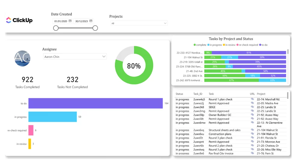
These kinds of dashboards typically track how many tasks each team member has completed to give a clear view of how productive each of them is. They also look at how tasks are distributed across different statuses and allow you to filter specifically for tasks that are blocked, which helps teams to quickly spot and sort out any bottlenecks.
Project managers can then drill down into a detailed table of all the tasks which has a direct link back to ClickUp so that issues can be fixed without having to jump between systems.
In addition to all that, a bar chart shows how many tasks are in each status for each project – giving project managers a high level view of how things are going, and making it easy to identify which projects are ongoing and which ones might need some extra attention.
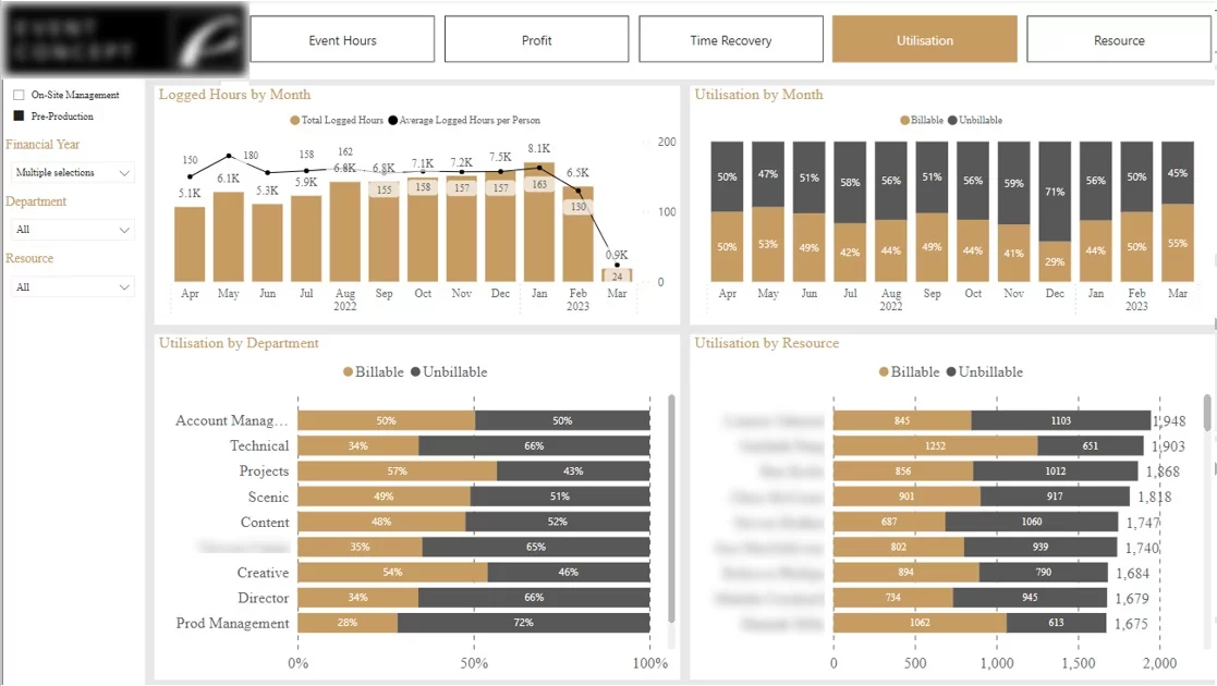
A utilisation report looks at how team time is being spent between billable and non-billable activities. For example, when our Power BI developers worked for an event management company, we showed it as a percentage of time spent on billable work (like delivering services) versus time spent on non-billable work (like admin or sales) to get an idea of how effectively your resources are being used.
Getting a handle on this is key to making sure that teams are spending enough time on work that brings in revenue and keeping time spent on non-billable work under control. These reports often break this down by team member, department and over time (like monthly trends) to help keep performance consistent.
Generally, utilisation reporting gives a clear view, at an executive level, of how resource-efficient your projects are. It helps project managers identify any gaps, rebalance workloads and improve overall project performance by making sure that time and effort are aligned with what the business wants to achieve.
This is the approach we take at Vidi to build fully automated monthly reports in Power BI so that we don’t have to spend hours at the end of each month manually getting everything ready.
Start by figuring out what the key objectives of the report are and what KPIs you’ll be tracking on a consistent basis each month. Consistency is key here, as these metrics are what’ll provide the foundation for an automated reporting process.
Next, connect up to the underlying data sources. We usually use native integrations in tools like Power BI, Looker, or Tableau to pull data in automatically. In more complicated cases, we build a business intelligence data warehouse to extract and combine data from multiple systems into one reliable source.
Once you’ve got data coming in, define and automate your transformation steps. For example, Power Query in Power BI lets you clean, structure, and transform data, making sure these steps get applied automatically every time the data gets refreshed.
Finally, you create clear and interactive visuals in your BI tool and set up automatic data refresh, which means the reports are always up to date and ready to review without any manual effort.
To get reliable monthly reports that’ll keep going for months and years to come, teams need a scalable and sustainable approach. The goal is not just to create a good report once, but to build a process that consistently delivers accurate insights with minimal effort.
Manual reporting can quickly become a bottleneck as data volumes grow and reporting frequency goes up. Automating data extraction, transformation and visualisation ensures consistency, reduces errors and frees up time for analysis rather than prep work.
Senior leadership’s time is usually pretty tight, so reports must get in there and hammer home the key points straight away – clarity and getting the message across quickly is paramount. What’s more, well-designed charts and dashboards let decision-makers get a grip on what’s important at a glance, sparing them from having to trawl through raw data tables trying to work it all out.
As time goes by, business priorities can shift pretty dramatically. Its crucial that you keep a weather eye on which KPIs and metrics you’re reporting on – just to make sure they’re still relevant and still aligning with what your company is trying to achieve. That way, your reporting stays focused, gets actual results, and people start to take notice
Making monthly reports is a vital tool for giving the top table a clear, consistent view of what’s going on across the finance, sales, marketing & ops departments. When you get reports designed and automated (and trust us, it’s not rocket science), they not only save you loads of time but they also help decision-makers make faster & more informed decisions and get on with the long-term plan.
At Vidi, well experts at building fully automated reporting systems using software like Power BI & Looker Studio – which means our customers can ditch the manual drudge and get real-time insights from their data.
If you’re looking to streamline your monthly reporting and get those dashboards up and running smoothly, get in touch with us today.
![]()
![]()
![]()