
A Power BI dashboard turns raw business data into a single screen of charts, tables and KPIs that a team can read at a glance. The right dashboard makes it obvious what is happening across sales, finance, ecommerce, operations or HR, and where action is needed.
Over the last decade, our Power BI consultants have delivered more than 1,000 custom KPI dashboards for clients across different industries. While every business has unique reporting requirements, many of the underlying systems they use are the same. For example, companies using QuickBooks Online, Xero, Shopify, HubSpot, Salesforce, or Google Analytics often track similar metrics because the structure of the source data is largely consistent.
As a result, we rarely start dashboard projects from scratch. We have developed a large library of proven dashboard frameworks, KPI calculations, data models, and visualisations that can be adapted to different businesses. Some of these Power BI dashboard examples have been fully productised and can be installed quickly as ready-made templates. Others serve as starting points for custom dashboard development, allowing us to accelerate delivery while tailoring the analysis to each client’s requirements.
In this article, we will showcase 22 Power BI dashboard examples built for real-world business scenarios. Some are available as ready-to-use templates, while others demonstrate custom solutions that can be adapted to your organisation. We hope these Power BI KPI dashboard examples provide inspiration for your next reporting project and help you identify the KPIs that matter most to your business.
This article is pretty long so we recommend making most out of the page-level navigation menu to see the Power BI dashboard examples that are most relevant to you.
A Power BI dashboard is a single-page view that combines the most important metrics and visuals from one or more data sources. It is designed to answer key business questions quickly, without the reader having to open several separate reports.
Dashboards pull data from systems such as accounting platforms, CRMs, ecommerce stores and HR software. Business users, managers and executives use them to monitor performance, spot trends and decide where to act. Filters and drill-downs let a single dashboard answer many questions at once.
Analysts usually group dashboards into three types. Operational dashboards track live, day-to-day activity. Analytical dashboards support deeper investigation of trends. Strategic dashboards give leadership a high-level view of progress against goals.
A quick clarification, since the two terms are often mixed up. A dashboard is the whole view that brings several visuals together. A KPI is one measured value inside it, such as revenue or net income, usually shown against a target.
Finance teams rely on dashboards to keep track of the bottom line, cash flow, expenses, and overall performance of their business. Rather than having to wade through multiple reports from accounting systems, they can get a bird’s eye view of the most important metrics in one place and quickly pick out issues that really need attention.
Below are some examples of how different financial dashboards have helped businesses manage their budgets, get a better view on how their business is performing financially, and make faster decisions based on real-time data.
This dashboard suits any business running QuickBooks Online. It pulls data from multiple sources into a single view of Income, Overheads and Net Income. Finance teams can see how profitable each company is, break down expenses and track progress day to day.
Data Source: QuickBooks Online
How To Build This Dashboard
To build this dashboard you’ll need to automate data extraction using a QuickBooks Online Power BI connector. This connectoor extracts the data to an Azure SQL Server database. You will need the connection string to this database to install the template.
The reason we used this connector is because it is certified by Intuit for data security and technical capability as evidenced by it’s placement on Intuit App Marketplace. It also allows to pull data from multiple intuit accounts which is relevant for multi-entity businesses and fractional CFO consultants.
After this you can install a ready-made QuickBooks dashboard which contains all the formulas to make your numbers match between QuickBooks Online and Power BI.
Once you download this template you need to install it. Open Power BI Desktop and click -> file -> import -> Power BI template and select the template that we linked above. It should have a pbip file extension.
After this you can customise the PBIX file however you want. To help with multi-entity reporting, key tables like P&L and Balance Sheet have columns like company and class.
Key metrics: Net Income, Overheads, Profit Trend, Income and Expenses Trend.
This dashboard let one client cut financial report compilation time by more than 75%. It improved reporting accuracy, gave a real-time view of performance, and helped leadership close the books faster.
We also provide QuickBooks Online Balance Sheet and Cash Flow dashboards inside our template.
Please note: we also provide QuickBooks Online Balance Sheet and Cash Flow Power BI dashboards inside of our template.
This is a Power BI balance sheet dashboard we built using data from Xero. It gives finance teams a complete view of assets, liabilities, and equity, letting them keep an eye on their financial position and see what’s shifting over time in their balance sheet accounts.
Data Source: Xero
How to Build This Dashboard
Rather than building everything from scratch, we usually begin with a proven Xero Power BI template and connect it directly to the client’s Xero account. Since the structure of Xero data is consistent across organisations, most of the heavy lifting has already been done. All the formulas for calculating making sure your balance sheet statement balances out are already in this template. Simply use a Xero Power BI connector to extract your data automatically in a convenient format.
The focus then shifts to tailoring the model to the business. This typically involves organising balance sheet data into meaningful categories, adding tracking dimensions where required, and creating the calculations for calculating custom accounting KPIs.
Key metrics: Total Assets, Total Liabilities, Total Equity, Balance Distribution by Assets/Liabilities.
We initially built it for a multi-entity company operating in 5 countries to help them create a unified dashboard. Now they can see their current asset, liability and equity position with all the currency conversion done in the background.
Please note: we also provide the Xero P&L dashboard inside of our Power BI template.
This is our take on a Power BI cash flow dashboard. Its goal is to give you a clear view of where your cash is coming from, where its going, and what this all means for your business.
Data Source: Zoho Books
How to Build this Dashboard
We’ve already built the visualisations and all the required formulas for previous clients, so we typically use this dashboard as a starting point when we work with Zoho Books data.
If you want to build this dashboard yourself from stratch, install the Zoho Books Power BI connector and extract your data into Power BI. The zoho_chart_accounts_transactions table contains all the data needed for cash flow reporting. You then need to group accounts inside of this table to those that are usually found inside the cash flow table. Below is an example how we did it for one of our clients.

You can then use column zoho_chart_accounts_transactions[Amount] to calculate the value of those accounts on any particular day.
Key metrics: Total Cash Inflow, Total Cash Outflow, Net Cash Flow.
The dashboard gives finance teams a real-time view of cash flow, which makes it easier to spot potential shortages and understand what is driving changes in cash balances. The clearest benefit our clients report is better liquidity management, with earlier warning of cash shortages before they affect operations.
Please note: we also offer the P&L, Balance Sheet, Aging Receivables and Outstanding Invoices dashboards in our Zoho Books template.
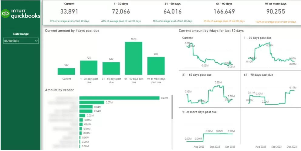
This Power BI dashboard helps finance to keep on top of unpaid invoices, track down overdue balances and get a grip on their collection activities based on how old invoices are and how much each customer owes.
Data Source: QuickBooks Online
How To Build This Dashboard: To build this dashboard yourself, start by using the QuickBooks Online Power BI connector to extract your data into Power BI. Before refreshing the data, enable the additional Aging Accounts Receivable table in the connector settings, as this table is not included by default.
Once the data is loaded, filter the table to row_type = “Data” to filter out the totals. Use attr_value as the aging bucket (1-30 days, 31-60 days, etc.), cust_name_value as the customer name, and the sum of subt_open_bal_value as the outstanding balance. Finally, use report_date to analyse month-end snapshots, as the Aging AR table stores one snapshot at the end of each month.
Key metrics: Current Accounts Receivable Balance, Current Amount by Days Past Due, Current Amount in Last 90 Days, Current Amount by Vendor.
We built this as part of a larger automated financial reporting solution. The automated reports saved the finance team 10+ hours per month, helped identify overdue invoices faster, and supported automated follow-up workflows.
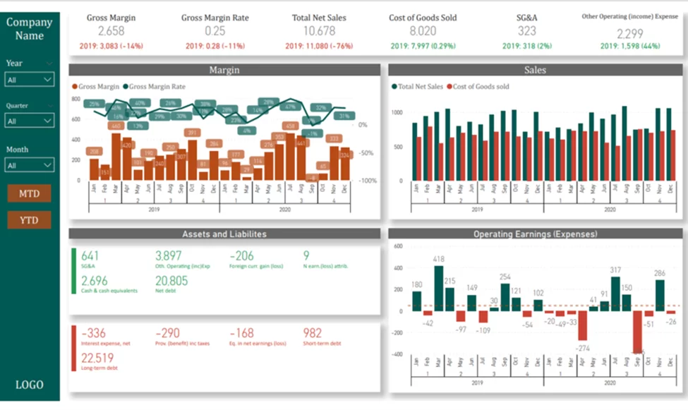
We built a Power BI financial KPI dashboard for CFOs and finance teams to get a real clear picture of how the company is doing – all in one place. It takes the Profit & Loss and Balance Sheets and mashes them together to help you keep an eye on revenue, profitability, costs, assets and liabilities, and operating earnings over time.
Data Source: Cloud Accounting System/ERP
How to build it: Connect Power BI to your accounting data, whether that is QuickBooks Online, Xero or an ERP such as NetSuite. Load transactions, revenue, expenses and balance sheet data, then build a model that lets you analyse both statements in detail. Create measures for Sales, COGS, Gross Margin, Gross Margin %, Operating Earnings, Assets and Liabilities. Add time-intelligence calculations for MTD, YTD, monthly, quarterly and yearly views.
Key metrics: Gross Margin, Gross Margin Rate, Total Net Sales, COGS, SG&A, Other Operating Income/Expense, Margin by Month and Year, Sales by Month/Year, Assets and Liabilities, Operating Earnings by Month/Year.
We created this as part of a broader reporting solution built on ERP data. The suite helped identify a €50,000 cost-saving opportunity shortly after launch and uncovered €10,000–€20,000 in monthly recurring revenue. It also removed the need for a full-time analyst to maintain financial reports in Excel, and the reports formed part of the CFO’s successful Ernst & Young “Transformation of the Financial Function” award application in 2024.
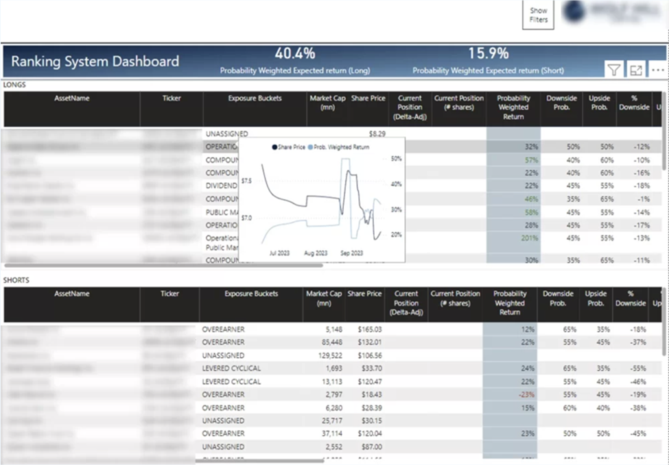
We built this for a hedge fund whose portfolio managers report results to current and prospective clients, including on sales calls.
Data source: Yahoo Finance and Excel
How to build it: Combine two sources. The first is market data, extracted from Yahoo Finance into Excel through a custom automation. The second is a spreadsheet of portfolio positions, including buy and sell transactions, long and short positions, leverage and shares held. Build a model that joins positions with the latest market prices, then calculate current position value, market capitalisation, probability-weighted return, upside potential and downside risk. We scheduled several refreshes per day so managers always had current numbers.
Key metrics: Probability-Weighted Return, Market Cap, Current Position, Downside Probability, Upside Probability, % Downside.
The fund used the dashboard for end-of-day portfolio reviews and to show historical performance to prospective clients. Having portfolio and market data in one report made it easier to monitor risk and communicate results.
This is our take on a Power BI Budget vs Actual dashboard. Its goal is to help management understand whether revenue, expenses, and profit are tracking ahead or behind plan and identify the specific accounts driving any variances.
Data Source: QuickBooks Online
How to Build this Dashboard
We’ve built Budget vs Actual dashboards for several clients before, so we typically start with an existing template that already contains the visualisations and variance calculations.
If you want to build it yourself, start by installing the QuickBooks Online Power BI connector and extracting your data into Power BI. The connector already includes all actual financial data inside the P&L table. To access budget data, you also need to enable and extract the BudgetBudgetDetail table.
Use the following fields from the BudgetBudgetDetail table:
Next create a mapping table of account names from both tables, then build variance measures comparing budget against actual.
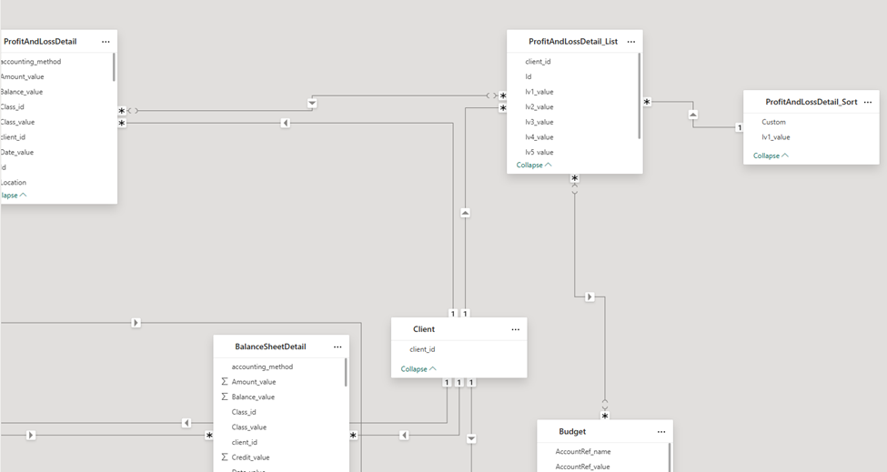
Key metrics: Actual Amount, Budget Amount, Budget Variance, Budget Attainment %.
The dashboard shows finance teams where performance is above or below expectations and which departments, accounts or product lines are responsible. Instead of finding issues at month-end, management can act mid-month, before small variances grow.
Sales dashboards give leaders a clear view of revenue, pipeline and individual performance. The examples below span revenue tracking, deal velocity, pipeline, rep performance and account growth.
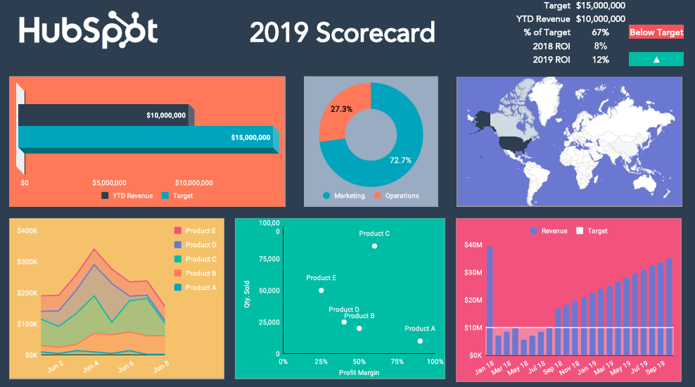
We built this for leadership teams to track revenue performance, profitability and progress against growth goals. It brings customer and revenue data into one report, so it is easier to see which products, services and teams drive growth.
Data Source: HubSpot CRM
How to build it: Connect Power BI to HubSpot with the HubSpot Power BI connector and import deal, revenue, pipeline and customer data. Build a model that places actual revenue alongside targets, product performance and departmental numbers. Create measures for Target Revenue, YTD Revenue, Profit Margin and ROI, then add time-based calculations for monthly, quarterly and year-to-date views.
Key metrics: Target Revenue, YTD Revenue, Profit Margin, Year ROI.
The dashboard gave leadership a real-time view of revenue across products, services and departments, making revenue gaps easier to spot. By tracking performance against targets through the year, the client improved revenue forecasting by 15% and could act on units falling behind plan far earlier.
We built this to answer the question every sales team cares about: how do we close deals faster? It tracks how long deals spend in each pipeline stage, so teams can see exactly where deals get stuck.
We also analyzed conversion rate and average # of days to win a deal by company industry, size and country. Our goal was to help the sales team identify which companies they need to target to close deals faster on average.
Data Source: HubSpot CRM
How to build it: Connect Power BI to HubSpot with the HubSpot Power BI connector and import deal and deal-stage history data. The stage history is the important part — it lets you calculate how long each deal spent in each stage, not just where it sits now. Timestamp each stage transition, then build measures for average time to close, time in each stage, and time to close by deal-value band. Add a pipeline slicer to benchmark each pipeline separately.
Key metrics: Average Time to Close, Time in Each Stage, Sales Cycle by Pipeline, Time to Close by Deal Value.
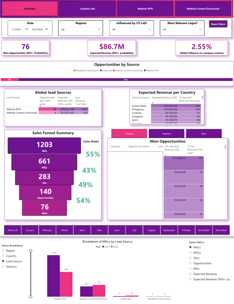
This dashboard helps sales and marketing teams track pipeline performance, see which channels work, and improve revenue forecasting. It combines CRM and marketing data into one view of opportunities, expected revenue, lead sources and regional performance.
We built this for a company with 400k+ employees. It gave sales and marketing leaders one view of pipeline performance across regions. Automating the reporting removed around 6 hours of manual prep per refresh and freed that time for daily pipeline reporting and forecasting.
Crucially, this dashboard helped to measure the impact of the marketing department on sales. We did this by only showing the leads from the marketing-owned lead sources and leads that consumed marketing content such as a case study or a whitepaper.
Data source: CRM such as Salesforce
How to build it: The simplest route we found is our own Salesforce Power BI connector. The native Salesforce Reports connector has a 2,000-row limit, and the Objects connector is slow and hard to model. Our connector extracts reports in 2,000-row batches and combines them into one analysis-ready table. From there, build visuals for opportunities, lead sources, expected revenue, win probability and region.
Key metrics: Opportunity by Source, Won Opportunities (90% probability), Expected Revenue (90% probability), Global Influence on Company Revenue, Global Lead Sources, Expected Revenue by Country, Won Opportunities by Company and Opportunity Name.
11. Salesperson KPI Dashboard
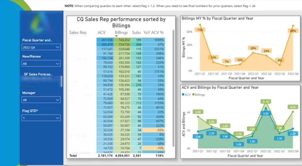
We built this to help a Finance Business Partner (FBP) report see performance by sales person. Every month the FBP would sit with the sales director to review this dashboard, spot coaching opportunities and focus resources. The sales director would then arrange meetings with top performers to learn from their good practices and help the rest of the team to learn from them.
Data source: CRM system
How to build it: Connect Power BI to your CRM and load opportunities, billings, subscriptions, quotas and rep data. Build a model that combines activity and revenue per rep. For most teams the key measures are revenue and number of sales; for the software client shown here, the main metrics were Annual Contract Value, Billings, Subscriptions and year-over-year growth.
Key metrics: ACV by Sales Rep, Billings by Sales Rep, Subscriptions by Sales Rep, YoY ACV % by Sales Rep, ACV and Billings by Fiscal Quarter and Year.
This dashboard helps commercial leaders track revenue against targets and spot growth opportunities across the business. It combines sales and financial data so it is clear which regions, teams and customer groups drive results.
Data source: ERP such as Dynamics NAV
How to build it: The key step is combining actual and budget data in one model. Actuals usually come from the ERP, while budgets sit in Excel and update once a year. Create shared dimension tables for Date, Customer, Salesperson, Region and Product so both sources use the same structure. Build measures for Actual Revenue, Budget Revenue, Revenue Variance and Revenue Variance %. A useful extra is revenue linearity: divide the monthly budget by the number of days to get the pace needed to hit target, then compare it with actual revenue through the month.
Key metrics: Total Revenue, Revenue by Payment Terms, Revenue by Location, Revenue by Salesperson Group, Revenue by Region, Revenue and Margin by Salesperson, Current Revenue vs Target.
By tracking revenue and margin against targets in real time, the client improved forecast accuracy by 12% and spotted shortfalls earlier, usually before the end of the reporting period.
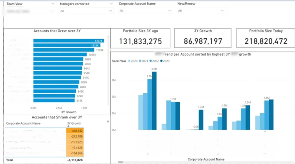
In B2B sales, success often depends on growing existing accounts over time. This dashboard tracks how the whole client portfolio performs across several years, so teams can see long-term account trends and focus where they matter.
We built this for a software company. It helped the team upsell to accounts that had grown, manage shrinking accounts with retention offers, and identify the fastest-growing industries. For companies with large customer portfolios, this analysis has surfaced growth opportunities worth up to 10% of current account revenue. Not bad!
Data source: CRM and ERP
How to build it: Connect Power BI to your CRM and ERP and load customer, revenue, account ownership and transaction data. Build a model that combines past and current performance per customer. Create measures for portfolio size, account growth, account decline and growth rate, and show growing and shrinking accounts separately, since they need different management.
Key metrics: Portfolio Size 3 Years Ago, 3-Year Growth, Portfolio Size Today, Accounts That Grew, Accounts That Shrank, Account Growth Trend.
Successful ecommerce teams track more than sales. They study how customers behave, what they buy and why. The examples below show how teams track retention, product demand and buying habits to improve marketing, merchandising and inventory decisions.
We built this to help ecommerce teams track sales performance, product demand and promotion results. It combines sales, customer and product data in one report.
One of our clients uses this dashboard for end-of-month reporting. They use it to review the top-selling products and sizes which helps them plan the inventory for next month. They also assign discount codes to social media influencers and analyse the number of orders by discount code to identify the top performind affiliates.
Please note that we deliberately removed product names and customer names from this dashboard to anonimize the data.
Data source: Shopify
How to build it: Most of the analysis comes from two Shopify tables inside our Shopify Power BI connector, Orders and Order Lines, plus a refunds table for net sales. Join the three on Order ID to create a complete sales model. Then create measures for revenue, discounts, shipping revenue, taxes, units sold and average order value, and analyse by product, customer, geography and promotion.
Key metrics: Sales Trends, Product-Level Insights, Geographic Breakdown, Discount Code Analysis.
We built this to help ecommerce brands understand how customers shop, how often they return and how valuable they are over time. It combines retention, purchasing and lifetime-value analysis in one report.
The main benefit is sharper segmentation. By identifying higher-LTV cohorts, the client found groups of customers worth up to twice as much as average, and prioritised marketing spend on the customers likely to bring the best returns. The dashboard also helps to estimate how much an average customer spends with a brand after 6-12 months. This is important to know for planning how much you can spend to attract a new customer.
Data source: Shopify
How to build it: Shopify data volumes are usually large, and we found one Shopify Power BI connector that handles them without timeouts. Group orders by Customer ID and calculate customer-level metrics such as lifetime value, order count, average order value and repeat-purchase behaviour. The most useful analyses include customer cohorts, LTV growth, days between purchases and customer lists by behaviour.
Key metrics: Customer Lifetime Value, Repeat Purchase Rate, Orders per Customer, Days Between Orders, Cohort LTV.
We built this to help ecommerce teams understand product demand, repeat sales and buying patterns across the catalogue. It combines product performance and customer behaviour in one report.
The client discovered product combinations customers regularly bought together but were not being promoted as bundles. New cross-sell campaigns based on that data increased average order value by around 10%.
Data source: Shopify
How to build it: Use a Shopify Power BI connector to extract your data. The key table is Order Lines, which holds the products bought in each order along with customer and order information. Create measures for product sales, customers per product, repeat-purchase rate and monthly demand, and calculate how often product pairs appear in the same order.
Key metrics: Customers per Product, Repeat Purchase Rate, Time Between Purchases, Monthly Product Demand, Product Combinations.
This is a Power BI order timing dashboard we created to give e-commerce teams a better sense of when their customers are most likely to make purchases. It digs into purchasing patterns by day of the week and hour of the day, to help businesses figure out the best times to run their marketing campaigns, schedule staff, and send out promotions.
Data source: Shopify
How to build it: The Shopify Orders table provides the date and time of each order. For deeper analysis, convert order times to local time zones. Build measures for sales, average order value, customers and order volume, then create views by weekday and hour.
Key metrics: Sales / AOV / Customers toggle, Performance by Weekday, Performance by Hour, Time Heatmap.
The client found most revenue came in a few peak periods each week and shifted email, promotions and ads to match. Moving budget to peak purchasing periods lifted campaign conversion rates by 12% and made spend more efficient.
Project management dashboards keep delivery on track by monitoring workloads, deadlines, budgets and resource use. The examples below show how teams used them to understand progress, resource allocation and project finances.
This is a Power BI dashboard we put together to help project managers tackle their task tracking woes – keeping up with task progress, staying on top of workloads, and getting their projects back on schedule. It gives you a real-time snapshot of where tasks are at across projects and teams so you can quickly spot the bottlenecks and reallocate resources where they’re needed most.
The Power BI dashboard above is anonimized so we only kept the IDs and removed all the names of projects, users and tasks.
Data source: ClickUp
How to build it: Set up a ClickUp Power BI connector, which extracts tasks, projects, assignees, statuses, priorities and completion dates. Install the pre-built ClickUp dashboard template or follow the installation steps. The template already includes the relationships and calculations for progress, completion rates, workload and team performance.
Key metrics: Tasks Completed, Tasks Not Completed, Total Tasks by Status, Tasks by Project and Status.
The dashboard revealed that some team members carried far more work than others and some projects had large task backlogs. Rebalancing workloads and clearing bottlenecks led to a 25% drop in overdue tasks and a more consistent delivery record.
This is what we came up with: a Power BI task performance dashboard that helps project managers get a handle on task completion trends, see how their teams are performing, and figure out where things are getting stuck. It gives a clear view of how all the work is coming along across projects, teams, and individual team members.
We have seen our clients using this dashboard for monthly employee performance review. If an employee had more than 50% of tasks uncompleted by the end of the month, this would indicate the problem with workload or productivity. Managers would also use this dashboard to monitor whether employees are updating their task status in Clickup properly throughout the month. If the data wouldn’t update for multiple days, they followed up with employees to remind them to update Clickup.
Data source: ClickUp
How to build it: Start with our ClickUp Power BI template and connect it through our ClickUp Power BI connector. Import tasks, assignees, projects, statuses, time-tracking records and creation dates. Build a model linking tasks to team members and projects, then create measures for Tasks Created, Tasks Completed, Completion Rate and Hours Worked.
Key metrics: Tasks by Created Month, Tasks by Assignee, Hours Spent on Each Project.
The client found several projects adding tasks faster than they were completed, along with overloaded team members. Seeing throughput and completion rates helped managers rebalance workloads and increase task completion rates by around 20%.
This dashboard helps project managers track budgets, monitor spend and forecast project costs. We built it for a project where our partner was pitching a tender to a defence contractor. It has dummy data so no sensitive information is exposed.
The key things that all project managers need to know is whether they are on track to stay within the allocated budget or the costs are forecasted to exceed. This dashboard helps to forecast spend every month by multiplying number of approved work days with the daily rate of each consultant. It then presents the actual cost vs approved budget by month, job and consultant to keep costs under control.
The other parts of this dashboard show the current status of all the contractor staffing requests, which office locations they are at and what specialisations are being recruited. This is helping managers to keep an eye on what areas of operations the staff shortages affect the most.
Data source: Jira
How to build it: Connect Power BI to your ERP and project management platform and import project budgets, actual costs, forecasts, request data and organisational structure. Build a model that ties these together across departments, entities and projects, then create measures for Actual Cost, Approved Budget, Remaining Budget, Budget Variance and Forecast Cost.
Key metrics: Actual Cost, Budget Approved, Budget Remaining, Actual Cost and Forecast by Year, Actual Spent by Hierarchy, Actual Cost and Forecast by Request ID, Actual/Budget/Remaining by Entity. Budget owners could immediately see which projects were overspending and which had spare capacity. Spotting overspend earlier helped the client cut budget overruns by around 18% and improve cost-forecast accuracy
HR dashboards bring people data together so teams can manage recruitment, labour costs and retention. The examples below show how HR teams cut hiring time, understood attrition and analysed workforce demographics.
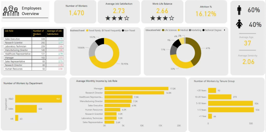
This HR dashboard helps HR teams and leaders understand workforce composition and plan with confidence. It pulls together headcount, compensation, tenure and how employees are distributed across departments and roles.
Data source: HRIS system
How to build it: Connect Power BI to your HRIS and import employee records, organisational structure, pay, tenure and demographic data. Build a model that ties workforce and organisational data together, then create measures for Headcount, Average Monthly Income, Tenure and workforce composition by department and role.
Key metrics: Headcount by Department and Role, Demographics, Average Monthly Income by Role, Employee Tenure.
The client gained a much clearer view of workforce composition that had been hidden in spreadsheets. The analysis showed that nearly 40% of one business unit had less than a year of tenure, flagging a retention risk that needed management attention.
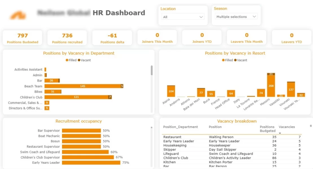
This recruitment dashboard helps HR teams monitor the hiring process, see where open roles stand and plan recruitment needs. It gives a real-time view of hiring by department, role and location.
Data source: Applicant Tracking System (ATS)
How to build it: Connect Power BI to your ATS and import vacancy data, candidate records, job postings, recruitment stages and hiring results. Build a model that brings recruitment activity together across departments and locations, then create measures for candidates in progress, open vacancies and hiring performance.
Key metrics: Filled vs Unfilled Positions, Positions by Job Role, Vacancies by Location.
The dashboard showed that a few business units accounted for most open roles and that some key roles stayed unfilled far longer than average. Prioritising those vacancies helped the team cut the average time-to-fill for the most important roles by 18 days.
If you’ve never dabbled in Power BI before, don’t worry – it’s designed for business users & analysts, not coders, so you don’t need to know your way around code to create reports and dashboards that actually do something.
In this walkthrough, we’ll use a sample dataset to build a simple sales dashboard. You can use the same process for finance, marketing, HR, operations, and any other reporting project that comes your way.
If you’d prefer to follow along visually, watch the complete step-by-step tutorial below before starting.
Resources we’ll be using in this tutorial:
First things first, download and install Power BI Desktop. Once that’s done, fire it up and head to the Home ribbon to click Get Data.
Power BI can connect to just about any data source you can think of – Excel, CSV files, SQL Server, SharePoint, Salesforce, the list goes on. For this example, select Text/CSV and import the Supermarket Sales dataset.
Once the file is loaded, you’ll get a preview of the data. Before you do anything else, click on Transform Data to take a closer look and make any necessary tweaks to the dataset.
Power Query is your friend here – it lets you get your data in order before you even think about creating reports.
Take a good hard look at the dataset and make sure each column is using the right data type. For example, date columns should be dates, and revenue and quantity fields should be numbers.
This is also a great opportunity to:
For instance, if your dataset has a time field, you can pull out the hour value and use it later to see how sales change throughout the day.
Once you’re happy with the data, click Close & Apply to load it into Power BI.
Once the data is in, switch over to the Report View and start building some visuals. Pick a field like Date and Revenue, then choose a Line Chart from the Visualisations pane. This will give you a quick idea of how revenue is changing over time.
Next, build some more visuals to answer some common business questions, like:
At this stage, focus on building visuals that actually tell you something, rather than just filling up the page with charts.
Once you’ve built all your visuals, it’s time to get them looking nice and tidy. Organise them into a clean layout and stick the most important KPIs and charts near the top of the page. Use some consistent colours and chart styles to make it easy on the eye.
Power BI also lets you add themes, background images, shadows and all sorts of other fancy formatting to make your report look professional.
Remember, the whole point of a dashboard is to help people understand what’s going on at a glance. Keep it simple and avoid cluttering the page with too many visualisations.
One of Power BI’s best features is the fact that it’s super interactive.
Add some slicers and filters so users can explore the data themselves. For example, you might let them filter by:
This lets a single dashboard answer lots of different business questions without having to create separate reports.
Before you share the dashboard with anyone, give it a good once over to make sure the data is displaying correctly. Test it by clicking on different filters and checking that the charts update as expected. Once you’re happy, publish it to Power BI Service so it can be accessed online and shared with other users.
As your reporting needs change, you can just keep adding new KPIs, data sources and visualisations to the dashboard.
Designing a top-notch KPI dashboard is all about creating a solid foundation that lets people make sense of their data and make confident decisions without hesitation.
1. Define Clear Objectives: Start by getting crystal clear about what you want to accomplish – and make sure your dashboard stays focused on that goal. This keeps the metrics you choose to display from getting too overwhelming.
2. Pick the Key Performance Metrics That Matter: Don’t go overboard with too many metrics on the dashboard. Just pick the handful that are most relevant to what you’re trying to accomplish and let those drive action.
3. Organize the Layout in a Way That Makes Sense: Put the most important metrics right at the top and group similar ones together. This lets users get a feel for how things are going overall before they start digging deeper.
4. Give People a Way to Dive Deeper: Include filters and drill-downs so people can get into specifics without turning the dashboard into a cluttered mess.
5. Choose Visuals That Are Easy to Understand: Stick with visuals that match the data and keep your formatting looking neat and consistent. This makes it easy for people to follow what’s going on.
Power BI offers a few ways to display a KPI, and choosing the right one matters. The built-in KPI visual shows a single value against a target and a trend line, which suits metrics with a clear goal such as revenue or net income. A card shows a single number on its own, and a gauge shows a value within a defined range.
Most KPI visuals rely on three inputs: a base measure (the actual value), a target measure (the goal), and a trend field (usually a date). Create the base and target as DAX measures, then assign them to the visual. Conditional formatting — green above target, red below — makes status readable at a glance.
Key Performance Indicators (KPIs) are essential in any business domain as they provide measurable and actionable insights into the performance and efficiency of various processes. By tracking KPIs including KPIs for affiliate marketing, organizations can make data-driven decisions, identify areas for improvement, and align their strategies with business goals. Effective KPI management ensures that companies stay on track to achieve their targets, enhance productivity, and maintain a competitive edge.
With Power BI, organizations can easily monitor their KPIs in real-time, identify trends, and make timely adjustments. The ability to customize dashboards and reports ensures that businesses can focus on the most relevant metrics for their specific needs.
If you need a similar Power BI KPI dashboard or any other KPIs requirements, feel free to reach out to us at Contact – Vidicorp. We’re here to help you harness the power of data to drive your business forward.
These examples show what is possible across finance, sales, ecommerce, project management and HR. If you need a similar dashboard, or a KPI dashboard built around your own metrics, our Power BI consultants can help. Contact us to talk through your reporting needs.
A dashboard is the full view that brings several visuals and metrics together on one screen. A KPI, or key performance indicator, is a single measured value within that dashboard, such as revenue, net income or customer retention, usually shown against a target. In short, a dashboard is the report; a KPI is one of the numbers on it.
The most common mistakes are showing too many metrics, using visuals that do not match the data, and burying the most important numbers instead of placing them at the top. A focused dashboard with a clear objective and a logical layout almost always outperforms a crowded one.
To build a KPI dashboard, start by selecting the key metrics you want to monitor. Next, identify the appropriate data sources. After that, visualise the data using suitable charts and graphs. Finally, share the completed dashboard.
The three main types of dashboards are: Operational Dashboards, Analytical Dashboards, and Strategic Dashboards


