

A B2B marketing dashboard pulls your lead, pipeline and channel data into one view, so you can see what’s generating qualified leads and what’s just generating activity. Instead of stitching together reports from your CRM, ad platforms and analytics tools, you get one screen that answers the questions your sales and leadership teams actually ask.
The easiest way to understand what a good one looks like is to see real examples. Below you’ll find actual dashboards we’ve built for B2B marketing teams, covering lead generation, CRM pipeline, PPC, SEO, email and executive reporting, along with what to track on each and templates you can use as a starting point.
Read on to see real dashboard examples.
B2B marketing analytics is the process of pulling together data from channels like SEO, PPC, email and social to measure what’s actually driving qualified leads and pipeline. Unlike B2C, where purchases are often impulsive, B2B sales cycles are long and involve multiple decision-makers, which makes your CRM the most important data source because it shows how leads are generated and move through the pipeline. The clearest way to make sense of all that data is a dashboard, so let’s look at some real examples.
We have created custom marketing analytics solutions for many B2B companies including DS Smith, Teleperformance and Autodesk. Here is the approach that we used for B2B marketing analytics implementation for our clients:
We mostly use this approach for planning a custom B2B marketing analytics implementation. However, it can also be used as a selection criteria for a third-party marketing analytics software.
Below are core data sources for b2b marketing analytics:
| Category | Data Sources | Purpose |
| CRM Analytics | Salesforce, HubSpot | Analysing Lead Generation and Nurturing |
| Email Marketing Analytics | Mailchimp, Brevo, Klaviyo | Analysing the effectiveness of outbound marketing |
| Website Analytics | Google Analytics, Hotjar | Analysing the user journey and optimising the website for conversion rates |
| PPC Analytics | Google Ads, Bing Ads, Facebook Ads, Pinterest Ads, etc | Analyse cost per lead, find the most effective lead generation channels |
| SEO Analytics | Google Business Profile, Google Search Console, SEMRush, Ahrefs | Analyse the effectiveness of organic search efforts |
Below, we will dive into every analytics type in more detail by exploring the main KPIs and giving examples of the B2B marketing analytics dashboards.
Lead generation is the main task of a marketing department in B2B, and it is essential to analyse. The main data source for this analysis is the company CRM, which contains data on every lead, where they come from, and the associated deals. This data can be used to create CRM dashboards that analyse the movement of a lead through the sales funnel.
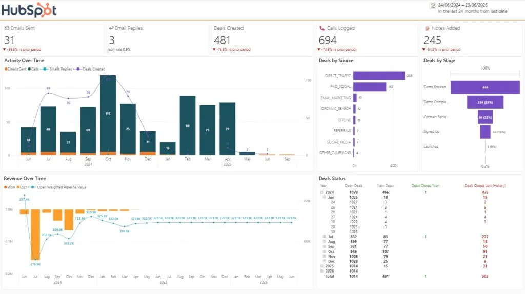
The main KPIs to Analyse on this dashboard:
Outreach activity: emails sent, calls logged, and notes added. The scorecards along the top show the raw effort your sales team is putting in. In this example, 31 emails sent and 694 calls logged over the period tell you immediately that this team is call-led rather than email-led. The red indicators versus the prior period (emails down 99.5%, calls down 74.9%) flag a sharp drop in activity that would warrant investigation before it shows up in revenue.
Email reply rate. Raw send volume means little without engagement. This dashboard tracks 3 replies against 31 sends, a 0.9% reply rate, which signals that either the messaging or the targeting needs work. Watching reply rate alongside send volume tells you whether to fix quality or quantity first.
Deals created. With 481 deals created, this is the bridge between activity and pipeline. Comparing it against the prior period (down 79.8% here) shows whether your top-of-funnel effort is actually converting into opportunities.
Deals by source. The source breakdown shows where pipeline actually comes from: direct traffic (258) and paid social (165) dominate here, while email marketing, organic search, and referrals contribute a handful each. This is the chart that settles budget arguments, because it ties channels directly to deal creation rather than clicks.
Deals by stage. The funnel view exposes where deals stall. In this example, 444 demos were booked but only 234 (53%) completed, and just 66 (15%) signed up. Each stage-to-stage drop-off is a specific, fixable problem, whether that’s no-show rates on demos or friction at contract stage.
Revenue over time and weighted pipeline value. The revenue chart tracks won and lost deal value monthly alongside open weighted pipeline (hovering around $323K here). Weighted pipeline is the forward-looking KPI: it tells you what revenue is realistically coming, not just what closed.
Deal win/loss status. The deals status table shows closed-won against closed-lost by month. One won versus 502 lost across the period is the kind of ratio a summary metric would hide, and it’s the single most important number on this dashboard to interrogate: are these genuine losses, or stale deals being bulk-closed?
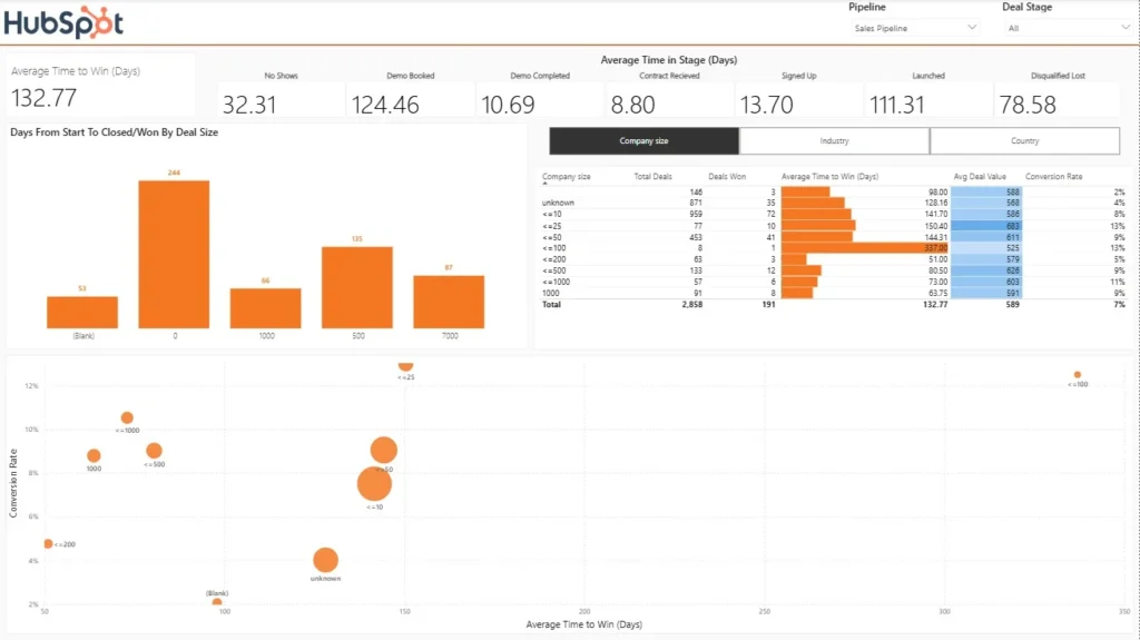
It is in the interests of every organisation to generate leads that are highly motivated to convert. The way you measure this is by tracking pipeline velocity, which is the number of days it takes your leads to progress from any step in the marketing/sales funnel to the next one.
Analysing your pipeline velocity helps to predict when the deals are expected to close. This is therefore an important step towards predictable revenue as it helps businesses to predict the new business revenue in the future months.
Check out the installation guide here
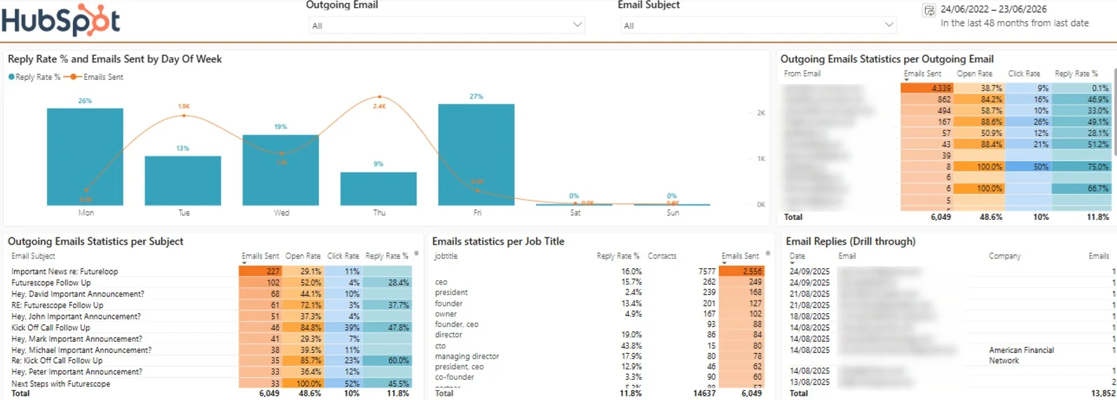
Overall reply rate. The single most important number here is the 11.8% total reply rate across 6,049 emails sent. Opens and clicks measure curiosity; replies measure genuine engagement, and they’re the metric that actually feeds pipeline. Everything else on this dashboard exists to explain what drives that number up or down.
Reply rate and volume by day of week. The top chart pairs send volume with reply rate per weekday, and the two clearly diverge: Thursday gets the highest send volume (2.4K) but only a 9% reply rate, while Friday earns 27% and Monday 26% on far fewer sends. This is the KPI that reshapes scheduling, because it shows the team is sending most of its email on the worst-performing days.
Performance per sender. The per-email-address table breaks down sends, open rate, click rate, and reply rate for each sender. The spread is dramatic: the highest-volume sender pushed 4,339 emails at a 0.1% reply rate, while smaller senders achieved 33 to 75%. That contrast usually points to a bulk-blast versus personalised-outreach split, and it tells you exactly whose approach to scale and whose to fix.
Performance per subject line. The subject-line table is a built-in A/B test archive. Follow-up subjects dominate here: “Re: Kick Off Call Follow Up” earned a 60% reply rate and “Kick Off Call Follow Up” 47.8%, while cold “Important Announcement” variants mostly sat below 12%. Analysing this KPI shows which framing earns responses so winning patterns can be reused.
Reply rate by job title. The job-title breakdown reveals who actually responds: CTOs replied at 43.8% and directors at 19%, while presidents managed just 2.4% despite heavy targeting. This is the KPI for refining your ideal customer profile, because it shifts effort toward the personas that engage rather than the ones you assume matter.
Open and click rates as diagnostics. The 48.6% open rate and 10% click rate work as supporting diagnostics rather than goals. A low open rate points to subject lines or deliverability; decent opens with few replies point to the message body or the offer. Reading them as a sequence tells you which stage of the email is leaking.
Reply drill-through. The replies table on the right lets you inspect individual responses by date, contact, and company. It’s the qualitative check on all the percentages above, confirming whether replies are real conversations or auto-responses and out-of-office messages inflating the rate.

The key metrics for A/B testing your campaigns are:
1. #Sent Emails – receiving 10 replies per 100 emails is a very good result. However, receiving 10 replies per 5,000 emails shows that the results are very disproportionate to the amount of effort it takes to achieve them.
2. Open rate – if the open rate is 50%, it means that half of the work that the team does is for nothing, since half the targeted people don’t read the emails.
3. Click rate –email recipients who click on your site show more interest than others. It is sometimes a good idea to keep targeting them in your marketing communications.
4. #Replies – since this one is our primary objective, it needs no explanation.
The screenshot above demonstrates how to compare your email marketing sequences to each other. As for analysing the audience that you target, this comes down to analysing the company profile and personal profile of your email recipients.
For example, below is an example of the Power BI HubSpot dashboard that we created for our client. It analyses the company profile that they are targeting now and they can filter to deal stage = “Won” to find which companies are buying from them.

A key marketing goal is to convert website traffic into leads by collecting their contact details. The main marketer tools for driving website visitors to submit their contact details is changing the page structure and internal linking of the website pages. This is exactly what the website analytics is about.
There are 3 essential tools for website analytics:
| Software | Purpose | Best for |
| Google Analytics | Captures the statistics on what pages users visit and actions that they perform | Websites of all size |
| Heatmap software (e.g. Hotjar) | A/B Testing software (e.g. Google Optimise) | Websites with low traffic |
| A/B Testing software (e.g. Google Optimize) | Enables marketers to change one thing on the page (e.g. a colour of a button) and evaluate the impact of the change | Websites with high traffic |
Google Analytics is great for understanding which pages users go through before they convert. For example, we use the path exploration reports in our GA4 to see that most visitors that convert do this on the “contact us page”. We can also see which informational pages help us the most to drive website traffic towards the “contact us” page.

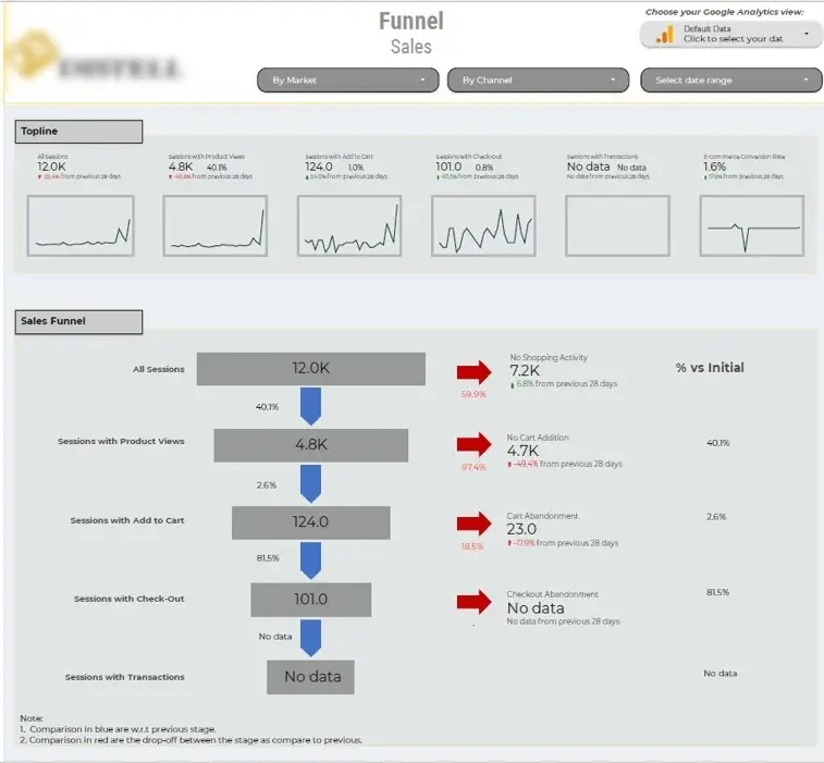
If your website has a defined user journey for converting visitors into paying customers, you can also build a website funnel analysis. This helps to identify at which step of the website funnel your website visitors drop off.
This below Google Analytics sales funnel dashboard tracks how 12K sessions narrow down through product views (4.8K), add-to-cart (124), and checkout (101), ending at a 1.6% e-commerce conversion rate. The red drop-off metrics expose where buyers leak out, most dramatically the 2.6% add-to-cart rate, with 4.7K sessions viewing products but never carting. Filters for market, channel, and date range let you isolate which segments drive the losses, though the missing transactions data suggests a tracking gap that needs fixing first.
The main objective of PPC advertising in B2B environment are:
PPC Analytics helps to compare the performance of every PPC marketing source based on these metrics. This helps to plan allocating the PPC budget and ensure that more budget is allocated to marketing sources with the highest return on investment.

Depending on the PPC channel, it is also possible to analyse the keywords that generate most conversions with the lowest cost per conversion. This is important to ensure that the top keywords are targeted consistently across all the search-based PPC channels.

It is worth saying, though that not all the PPC channels/campaigns are conversion-oriented. For example many of our clients use Facebook to generate awareness and Google to generate conversions. It is important that the awareness campaigns are measured using different KPIs as compared to lead generation campaigns.
For example, consider our LinkedIn Ads Power BI template below. The awareness section focuses on cost per 1000 impressions and cost per click since the main goal of awareness campaigns is to get more eyeballs on the brand and pairing it with the best linkedin automation tools can further amplify outreach at scale. Once a user switches to the lead gen section of it, the KPIs change to cost per lead and number of leads.

If you are using SEO platforms like SEMRush or Ahrefs, they likely already provide you with some SEO reports. For many companies this is enough, and Ahrefs/SEMRush do a fantastic job teaching you how to use them on their blogs. If you are looking get started with SEO analytics, we would highly recommend to begin with their educational content.
Some need to take their SEO analytics one step further by creating custom SEO dashboards. There are several cases when companies may want to do this:

3. Sometimes these SEO tools have limitations in their reporting. For example, they offer some surface-level competitor reporting, but if you want to analyse how the visibility changes over time, you may need to build custom reports. For example, we have built the SEMRush report in Looker Studio below to help our client see how their brand performs vs competitors over time.

In our Business Intelligence consultancy, we mainly use Power BI, Tableau and Looker Studio for producing custom marketing analytics reports. Comparing these 3 is outside of the scope of this article so we will only share quite advice here.
Power BI excels in seamless integration with Microsoft ecosystems and internal reporting. If you are planning to only share your reports within your organisation, we would recommend Power BI as your reporting tool.
Looker Studio is great for analysing data from Google systems like Google Analytics 4, Google Search Console, Google Ads, etc. It is also a better choice if you want to share your marketing analytics reports with people outside of your organisation, such as your investors
Tableau is best if you need advance data visualisation or you want to analyse the data from your Salesforce account.
If you want to learn more, you can read our guides about Tableau vs Power BI and Looker Studio vs Power BI.
Every dashboard we build is tailored to the client, but the strongest B2B marketing dashboards tend to share the same core components:
Identify your business objectives and find KPIs to measure your progress towards them. Use our BI implementation planning process if you want to be very structured :
Use SMART goals. For example, “Increase webinar-attendee-to-MQL conversion by 20% in Q3 using LinkedIn retargeting”.
Integrate siloed data into a single platform (e.g., Power BI) to create a 360° customer view. For instance, combining CRM data with web analytics reveals which content drives lead generation.
Tools like Power BI, Tableau, and Looker Studio can be enhanced with AI-driven automation to analyse multi-touch attribution, segment audiences dynamically, and personalise campaigns at scale.
Deploy predictive analytics to optimise lead scoring, prioritising accounts based on firmographics, engagement patterns, and historical conversion data. Implement real-time dashboards to monitor KPIs like pipeline velocity, CAC, and CLTV, enabling agile adjustments to campaigns.
Pair these tools with A/B testing frameworks to refine messaging and channel strategies
Build dashboards that highlight:
Insights from these dashboards should directly inform how marketing assets are created and optimised across channels. For example, if analytics shows strong engagement with video-led campaigns, working with a professional video production company like Content Beta can ensure your videos are high-quality, cost-effective, and aligned with your marketing goals. Their expertise in creating compelling video content for SaaS and B2B tech companies can make a difference in your videos’ effectiveness and ROI.
B2B marketing analytics is no longer optional, it’s the backbone of competitive strategy. By implementing a robust analytics framework, companies like HubSpot and Salesforce have reduced customer acquisition costs by 30% while doubling lead quality. Start small: focus on integrating one key data source, then scale with AI and predictive models. Remember, the goal isn’t just to collect data but to transform it into actionable stories that drive boardroom decisions.
Ready to accelerate your B2B Marketing analytics journey?
A B2B marketing dashboard is a single screen that brings together data from your CRM, ad platforms, email tool and website analytics to show how marketing is performing against pipeline and revenue. Rather than exporting reports from five different tools, you get one live view of leads, conversion rates and channel performance that your whole team works from.
At minimum, it should cover MQLs and SQLs, lead-to-opportunity conversion, pipeline value by source, customer acquisition cost and channel ROI. The right mix depends on who’s looking at it: an executive view leans towards pipeline and revenue, while a channel view goes deeper on campaign and cost data. The full breakdown is in the section above.
It depends on your stack and budget. Power BI is the strongest choice if you’re on Microsoft 365 and need robust data modelling across CRM and marketing sources. Looker Studio is free and works well for dashboards built mainly on Google data such as Google Ads, GA4 and Search Console. Tableau is powerful but usually harder to justify on cost for marketing reporting alone. We build in all three, and most of our B2B clients land on Power BI.
Start by agreeing the questions the dashboard needs to answer, then connect your data sources, with the CRM as the backbone. Define your metrics consistently (what counts as an MQL, when a lead becomes an opportunity), design the layout around how people will actually read it, then test it with the team before rolling it out. If you’d rather skip the build, our team can design and deliver one for you, which is exactly what the examples on this page came from.


