

CRM systems have a huge volume of data on leads, customers and revenue – but most teams are only using a tiny fraction of it effectively. Without proper analysis, it’s tough to get a handle on what’s driving pipeline growth, where things are going wrong or how customer value changes over time.
As a BI consultancy we help organisations convert their CRM data into clear, decision-ready insights. Our approach involves automating the extraction of data into Power BI or Looker Studio dashboards, where it can be looked at across sales, marketing and customer success in a consistent and scalable way.
In this article, we’re going to explain how CRM data analysis works in practice based on our BI success stories. We’ll cover the core types of analysis, the key metrics, some real-life dashboard examples and a step-by-step guide that teams can use to improve performance throughout the customer lifecycle.
CRM data analysis is the process of properly examining the data held in systems like Salesforce, Hubspot, Dynamics 365 or Zoho to figure out how prospects and customers move through the sales funnel. We always start with automating the extraction of CRM data into a centralised BI environment, where we create CRM dashboards.
This analysis typically covers a wide range of data types, including contact and company details, firmographics, activity logs (emails, calls, meetings), deal stages, products, quotes, invoices, and support tickets. In most cases, we’re analysing multiple years of historical CRM data – often from 2019 up until 2026 – to identify long term trends and get rid of short term noise.
The goal is not just to look at the data, but to uncover the patterns that have a direct influence on revenue. The same data-first approach applies in the nonprofit sector, where organizations rely on a nonprofit CRM to analyze donor behavior, track giving patterns, and identify which segments and campaigns are driving the most sustainable fundraising outcomes.
For example, we might identify which industries convert at the highest rate, which campaigns produce customers with the highest lifetime value or which regions are consistently underperforming against targets. These insights then inform specific changes to sales & marketing strategy.
It’s worth noting that CRM data analysis is different to just basic reporting. Data reporting focuses on surface-level metrics like the number of deals or calls made. CRM data analysis goes deeper by examining the relationships between variables, such as lead source, customer segment and pipeline stage, and how they change over time. This is typically done in BI sales dashboards, where multiple dimensions can be looked at together in a structured way.
For example, we once analysed pipeline data and discovered that demo no-show rates doubled in 2025 after a change in the booking process. In another case, by combining CRM and marketing data we found that one lead source produced fewer leads but significantly higher-value deals, which led us to reallocate the budget.
In most of our CRM analytics projects, we combine four types of analysis – descriptive, diagnostic, predictive and prescriptive – to move from understanding what’s happened to deciding what to do next. This progression is important because the raw CRM data only becomes valuable when it drives clear actions.
We don’t just treat these as abstract concepts; we apply them directly to real-life use cases. For example, descriptive analysis summarises pipeline performance, diagnostic analysis explains win/loss trends, predictive models forecast deal conversion or churn risk, and prescriptive analysis recommends actions such as shifting sales effort or adjusting targeting.
All four approaches can be implemented within modern CRM reporting tools or, more commonly in our case, by extracting the data into BI applications like Power BI or Looker Studio. This setup allows us to combine CRM data with marketing, finance and operational sources, which is essential for deeper analysis and more reliable decision-making.
In practice, CRM databases are often cluttered with unused or inconsistent fields, which makes analysis harder than it needs to be. Rather than trying to analyse everything, we focus on a core set of data categories that consistently drive insight and can be reliably structured in BI dashboards.
These are the main categories we prioritise in most CRM analysis projects:
We’re now going to show some CRM analytics reports that we created in Power BI and Looker Studio.
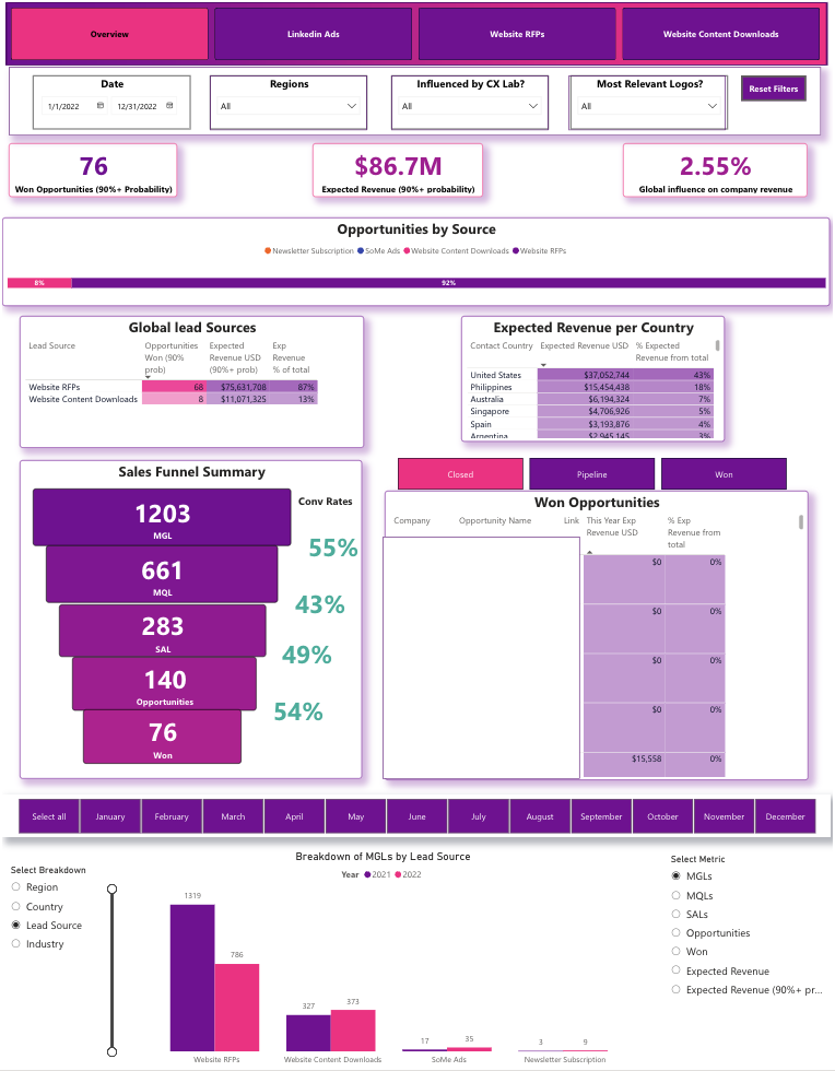
The marketing influence dashboard is a tool used by global marketing leaders and regional marketing directors to get a handle on how marketing activities contribute to pipeline creation and revenue. It’s typically used in B2B organisations where multiple lead sources and long sales cycles make attribution really hard.
This custom-built dashboard, designed by our Power BI consultants for a client, is all about diving into the relationship between marketing inputs and sales outcomes. By combining CRM data and marketing source data, we’re able to track won opportunities, expected revenue, and the share of pipeline generated by marketing. The overview page breaks down opportunities and revenue by lead source and customer country, giving you a clear idea of how your marketing efforts are paying off. You’ll also get a funnelling analysis showing lead volumes by stage and conversion rates between stages – super useful for seeing where you’re losing leads and how to improve. All opportunities are listed in a detailed table, along with their current status, and if you need to, you can open records directly in Salesforce.
This enterprise dashboard basically lets the marketing team quickly evaluate how they’re doing in different regions and channels, all in one convenient workflow. They can spot which lead sources are generating high-value pipelines, review conversion rates between funnel stages, and jump from insight to action by going straight to a live CRM record. It all helps to speed up campaign optimisation, make attribution clearer, and keep pipeline management more consistent across teams.
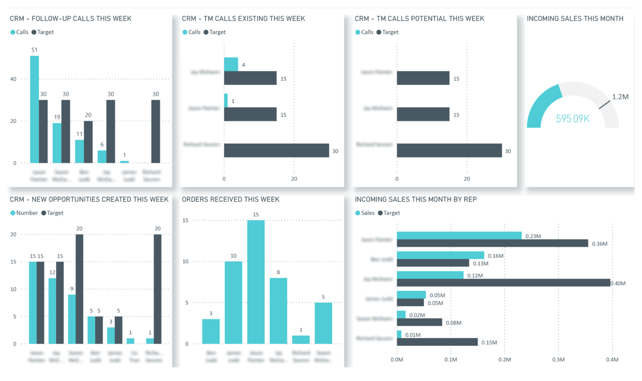
The sales activity dashboard is where sales managers and team leads come to see how individual reps are doing against their targets. It’s particularly useful for companies with structured outbound processes where activity levels really do have an impact on revenue.
This was built by Vidi Corp to compare how actual performance stacks up against predefined targets across key sales activities. We track the number of calls each sales rep makes and new opportunities they create, compared to their targets. You’ll also get a birds-eye view of team performance against targets, so you can see both individual and aggregate results in one place.
This data visualization dashboard lets sales leaders monitor the quality of execution across the team in a consistent way. They can spot which reps are below or above target, work out how activity levels turn into pipeline creation, and focus on coaching or resource allocation where needed. It all makes structured performance reviews a bit easier and helps keep everyone aligned with daily activity and revenue goals.
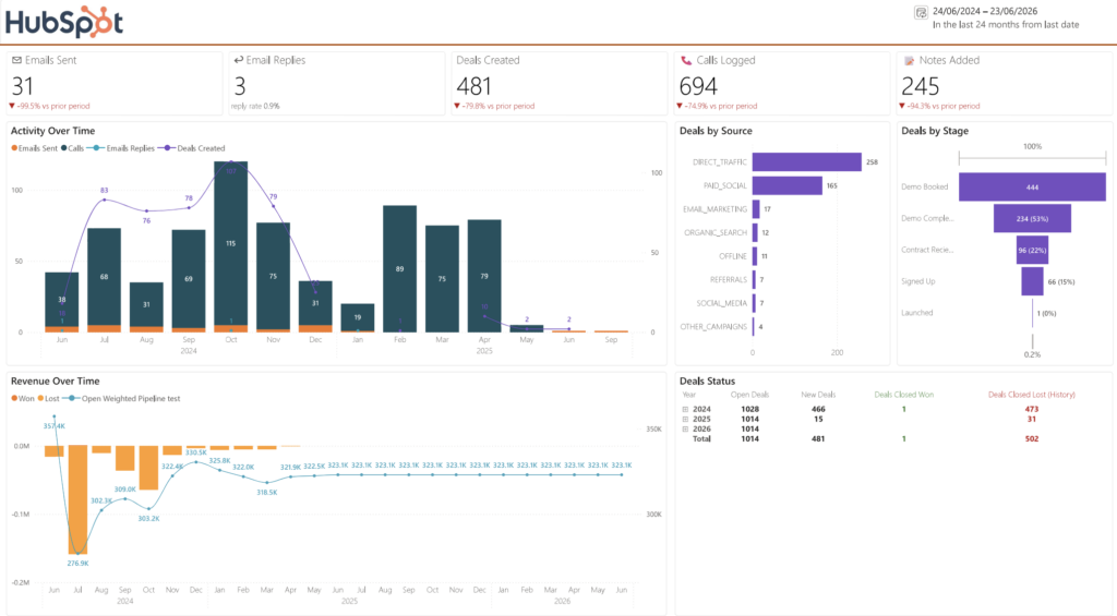
The sales and pipeline dashboard is the first stop for sales leaders and revenue ops teams who want a high-level read on sales activity and pipeline health in one place. It’s especially useful for teams running structured outbound in HubSpot, where email sequences, calls and logged activity all feed directly into pipeline creation.
Developed by Vidi Corp, this HubSpot Power BI template summarises sales activity across the team. It surfaces core metrics such as emails sent through sequences, replies received, deals created, calls made, and notes logged by sales reps. You can view these trends month by month, or drill down into daily performance when you need a closer look for weekly reviews. The dashboard also breaks down deals by source so you can compare where opportunities are coming from, tracks pipeline progression so you can see how deals move through stages, and shows pipeline value over time – specifically how your weighted open pipeline changes month to month.
This structure is especially handy when pipeline value drops. You can quickly see whether the decline happened because deals were lost, stalled, or moved in a way that reduced open weighted value. You can also inspect the pipeline at a daily level, looking back at a specific date to see the exact state of the pipeline on that day – including open deal count by stage and total open amount. It all helps sales teams stay on top of activity and pipeline in a single workflow, and makes it easier to spot and explain changes before they turn into forecasting surprises.
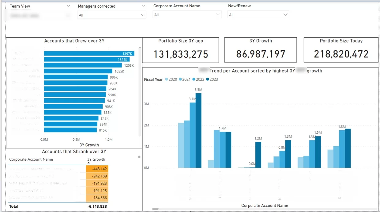
The customer growth dashboard is where sales managers and account managers track how client portfolios change over time. It’s perfect for businesses that are all about account expansion, retention, and long-term revenue growth.
Developed by Vidi Corp, this management dashboard analyses how customer value changes across each sales rep’s portfolio. We track account performance over time and categorise customers into those that are growing and those that are declining. This lets users break down portfolio trends by salesperson and see how individual accounts contribute to the bigger picture of growth.
This structure helps sales teams focus on the right accounts in their workflow. They can quickly spot which portfolios need some attention, understand why certain accounts are growing or shrinking, and set realistic targets for expansion. It all helps with proactive account management and prioritising actions that drive consistent revenue growth from existing customers.
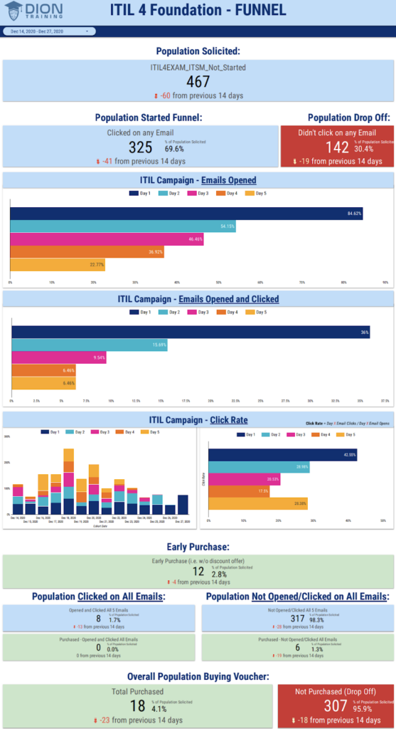
The campaign analytics dashboard is used by marketing teams and campaign managers to see how CRM email sequences contribute to engagement and sales outcomes. It’s a big help for organisations that rely on email as a key channel for lead nurturing and conversion.
Developed by Vidi Corp, this marketing dashboard pulls data from Active Campaign and dives into the full email campaign funnel, from engagement to purchase. We track all the key metrics such as email opens, clicks, click-through rate, and resulting purchases across the whole audience. There’s also time-based analysis, with bar charts showing how open rates and click activity change over time – super useful for seeing how engagement evolves during the campaign period.
This structure helps marketing teams keep an eye on campaign performance in a consistent workflow. They can spot which campaigns or days drive the highest engagement, understand how interactions turn into sales, and adjust timing, messaging, or targeting accordingly. It all helps with optimising email strategy, and makes it easier to keep marketing activity aligned with revenue outcomes.

The pipeline velocity dashboard answers a question every sales team cares about: how can we close deals faster? It’s built for sales leaders and revenue ops teams running structured pipelines in HubSpot, where long sales cycles can hide the stages that quietly slow revenue down.
Our Hubspot Power BI template lets you select a sales pipeline from HubSpot and see the average number of days from deal creation to close, which gives you a benchmark for overall sales cycle length. From there you can break the cycle down stage by stage to see where deals sit the longest, and if one stage consistently takes much longer than the rest, that’s where process improvement will pay off first. The dashboard also compares deal size with average time to close. In our sample data, deals between $500 and $1,000 closed faster than deals under $500 – smaller buyers often take longer to decide, which challenges the assumption that small deals are quick wins. The same analysis works by company headcount, and in our sample, companies with 100 to 200 employees were the quickest to buy, so you get a sense of how long a deal is likely to take the moment it enters the pipeline.
You can also view average days to close for each industry and each country, which makes it easy to see where your fastest wins are coming from. Read alongside conversion rates, this helps you point outreach at the segments that close quickest and convert most often, so reps spend less time on deals that drag and more on the ones that actually move. Sales leaders get realistic timelines the moment a deal enters the pipeline, cleaner forecasts, and a clearer sense of where to focus effort for the biggest return.
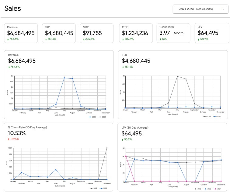
The customer lifetime value dashboard is for marketing leaders and agency owners who want to see how client relationships turn into long-term revenue. It’s especially relevant for subscription-based or retainer-driven businesses where retention and recurring revenue drive profitability.
This executive dashboard was created by Vidi Corp in Looker Studio to get to the bottom of revenue and retention trends over time. It keeps tabs on monthly revenue – both the recurring and one-off income – and also looks at monthly recurring revenue as the key performance metric. The dashboard also tracks client churn rate by month, average customer lifetime value and average client lifespan. These metrics are updated on a rolling monthly basis so we can see how changes in retention and revenue are impacting overall client value.
This framework really helps marketing agencies keep growth on an even keel. They can watch how churn affects lifetime value, see how long clients tend to stick around for, and figure out the balance between recurring and one-time revenue. The dashboard gives them the tools to make better decisions about client acquisition, retention strategies and pricing models – and ensure that growth is both sustainable and profitable.
When we work on CRM data analysis in our projects, we follow a tried-and-tested workflow: define the question, get the data ready, analyse it, visualise the results and take action. This way, we know that our insights are consistent and directly connected to business decisions rather than just one-off reports.
We recommend including core CRM analysis as part of your monthly reporting, with a deeper dive once a quarter. Most of this work gets presented through simple visuals like funnel charts, cohort tables and time series graphs – which make patterns easy to spot and act on.
Every data analytics implementation starts with 1–3 specific questions that the business needs to answer. For example: “Which campaigns in January–June 2025 produced the highest LTV customers?” or “Why is our EMEA win rate lower than North America in 2026?”
Those questions determine exactly what data we need to pull out. They define the time frame, segments and CRM fields we’re interested in – which stops us getting bogged down in unnecessary analysis and keeps the focus on decision-making.
CRM data almost always needs cleaning before we can get any real insights from it. In practice, this means merging duplicate accounts and contacts, standardising fields like industry and country, filling in missing pipeline stages and chucked out old or unused fields.
We usually focus on a recent time frame, such as the last 12–24 months to avoid distortions from older processes. Common problems we tackle include deals without owners, missing close dates and inconsistent lead source tagging – all of which can mess up results if left as is.
Analysis only gets useful when we break the data down into meaningful chunks. Instead of looking at overall averages, we compare performance across groups like company size, industry, region or product line.
For example, we might segment companies by size (less than 200, 200–1000, over 1000 employees), deal value (less than $10k, $10k–$50k, over $50k) or acquisition cohort (customers we picked up in 2024 vs those in 2025). This lets teams spot which segments deliver the best results and where performance gaps lie.
Now we crunch the numbers for the core metrics that define sales and customer performance. These usually include win rate, average deal size, sales cycle length, pipeline coverage, churn rate and expansion rate.
For example, win rate is found by dividing closed-won deals by total closed deals, while average deal size is total revenue divided by number of deals. Pipeline coverage is often benchmarked at around 3–4x quarterly target in B2B environments – meaning you need £3–£4 of pipeline for every £1 of target revenue.
CRM dashboards should be clear and easy to understand – not complicated or confusing. We design most of our dashboards with 5–10 core charts per role, focusing on time trends, segment comparisons and funnel conversion rates.
A standard setup for managerial reporting includes separate dashboards for new business, customer retention and expansion, and sales rep performance. It’s also easy to fall into common pitfalls like overreacting to short-term fluctuations or drawing conclusions from small sample sizes – so we try to avoid those.
The final step is to turn insights into clear actions. If a segment has low conversion rates, the team might refine qualification criteria, adjust pricing, provide targeted sales training or other smart moves.
Each action should have a clear owner, deadline and measurable target. For example: improve demo-to-proposal conversion from 45% to 55% by Q3 2026. This way CRM analysis turns into real operational changes rather than just a reporting exercise.
This section covers the core CRM metrics we track in most client projects. These metrics are grouped into acquisition, conversion, retention and productivity and are reviewed on a weekly or monthly basis depending on the sales cycle.
The goal is to focus on a small set of metrics that directly explain performance and guide decisions. In practice, these metrics are built into BI dashboards that combine CRM, marketing and revenue data into one clear view.
Lead quality metrics help figure out whether marketing is really adding value in the pipeline, or just throwing mud to see what sticks. We track these through the lifecycle stages in the CRM, watching as leads move from being a marketing Qualified Lead to Sales Qualified Lead to Sales Accepted Lead and finally into opportunities. According to B2B intelligence experts at SG Analytics, tracking these data points through the formal lifecycle stages in the CRM is vital to maintaining clear attribution
A Marketing Qualified Lead (MQL) is a lead that’s sort of engaged with marketing but still isn’t ready to be handed over to sales just yet. In our projects, we define MQL’s based on how much they’ve engaged – that is, how much they’ve touched base with our marketing efforts – and how much they fit the company they’re with. We want MQL’s to match the job role and company size for that specific region, otherwise they don’t get counted as such.
A Sales Qualified Lead (SQL) is the point where the lead is actually ready for sales to take over. This usually happens after a bit of nurturing by marketing or some direct engagement – like responding to a campaign, attending an event, or asking some higher-intent questions. Once a lead is classified as SQL, it gets passed on to a sales rep to check it out a bit more.
A Sales Accepted Lead (SAL) is the point where a sales rep has actually looked over the lead and decided it’s a potential opportunity. From there, the lead can either be accepted – that is, we decide to go after it – recycled for further nurturing, or rejected – that is, we decide to forget about it. And that’s important to track because it shows how many SQLs actually turn into real pipeline.
Another key metric is the Opportunity Acceptance Rate, which tells you how many qualified leads actually turn into active opportunities. This helps you work out if your lead quality is good enough and whether your sales qualification standards are on point.
Pipeline metrics tell you how smoothly leads glide on through the sales funnel and convert into actual revenue. These are probably the most important indicators of how well your sales team is performing.
Pipeline coverage is basically about making sure you’ve got a steady supply of potential revenue in the pipeline. This is usually measured as the ratio of open pipeline value to your revenue target. And as you might expect, most B2B companies need around a 3 to 4 times coverage ratio to be sure they’re going to hit their targets.
Win rate is just another way of saying what percentage of closed deals actually get ‘won’. This shows you how effectively your sales team is converting opportunities into actual revenue.
Conversion rates between stages help you figure out if your lead quality is any good and whether your sales process is efficient. For example, if your MQL’s aren’t turning into SQL’s very well, that might be a problem.
Pipeline velocity is about how quickly leads move through the sales funnel. This is usually measured as the average number of days between stages, or from the point where they enter the pipeline to the point where they get closed. The faster they move the faster you’re going to get revenue and the more predictable your sales are going to be.
All these metrics need to be broken down by segment, sales rep, and product line. That way you can easily tell what’s going wrong and where you need to make some changes.
The revenue and retention metrics show you how CRM activity is turning into actual money. These are usually combined with invoicing or subscription data to give you some real-world numbers.
Customer Lifetime Value (CLV) tells you the total revenue you get from a customer over the whole time you’re doing business with them. And this is influenced by the size of the deal you did with them in the first place, how many times you can get revenue from them, and whether you can expand that deal or get them to renew.
Churn rate just tracks the number of customers you lost in a given period. This is a useful indicator of how well you’re doing at satisfying your customers and how well your product fits the market.
Net Revenue Retention (NRR) measures how revenue from existing customers changes over time. This includes whether you lose any customers, and if you get any new revenue from them either by upselling, cross-selling or getting them to renew.
Expansion revenue tracks any additional revenue you get from existing customers, either by upselling to them, cross-selling something else, or getting them to renew.
Productivity metrics help teams understand how all that sales activity is turning into real results. These are usually based on what the CRM is telling us about how sales reps are spending their time.
Some common ones include meetings booked per sales rep per whatever time frame, emails sent that get a response, calls that lead to the next step, and revenue generated per rep per quarter. This helps you see how much effort is actually translating into results.
It’s also worth tracking leading indicators – such as how many high-quality discovery calls you’re doing, or how many meetings with decision-makers you’re having. These can often predict future revenue before the deal’s actually closed.
In most of the projects we do, we build dashboards that show all these metrics by rep and by team. That way, managers can see where people are struggling, give them some targeted coaching, and design incentive structures that actually work.
The same CRM data model can be used to improve performance across the whole customer journey – from first touch to long term retention and expansion. In our projects, we build shared dashboards that let sales, marketing and customer success teams all work off the same data and align around a common set of priorities.
This section just outlines how each function uses CRM insights in practice. The goal is to combine some high level strategy with some concrete actions that teams can start doing within a quarter or so – usually through joint reviews and shared reporting.
Sales teams use CRM data to take a close look at conversion rates across stages, reps, and segments. This helps them refine those qualification rules and make sure everyone’s managing opportunities in the same way. For example in one project we found that deals without an executive sponsor in the CRM notes were having significantly lower win rates. So the client went ahead and updated their sales checklist to ensure that multi-threading and executive engagement were required before even advancing deals
CRM data is also super useful for rep coaching. Managers will compare individual performance metrics – win rates, sales cycle length and the number of stakeholders involved – against team medians over a set timeframe. This highlights where specific reps need extra support and what actually works when it comes to driving better outcomes
In one case a team managed to shave 10 days off their median sales cycle after they re-defned pipeline stages and started automating follow-ups between steps. This created a much more structured process that cut out a bunch of delays between key actions.
Marketing teams use CRM data to track how their campaigns are doing beyond just lead volume. Instead of only looking at MQL numbers, they dig deeper into how campaigns are turning into opportunities, closed deals and in the long run customer lifetime value.
Segmentation is really important for B2B marketing analytics. By digging into how campaigns are performing by industry, persona and deal size, marketers can test different messaging and offers for each segment and get better at targeting and
campaign effectiveness.
Getting marketing and sales aligned is crucial. Most of the time we get the two teams to establish a shared definition of what a MQL and a SQL means and build joint dashboards that get reviewed every week. This way both teams have a similar set of criteria for evaluating performance
Customer success teams use CRM data to keep an eye on account health and pick up on any risks before they lead to churn. This usually involves combining CRM data with support tickets, engagement logs and product usage metrics.
For example in one analysis we found that accounts with loads of high-priority support tickets and no recent exec check-in were significantly more likely to churn. We used that insight to start triggering early interventions for accounts that were at risk.
CRM-based playbooks can then automate some key actions – scheduling quarterly business reviews, assigning follow-up tasks when engagement drops, or even triggering upsell prompts when usage reaches certain thresholds
By the end of 2026 most customer success teams are relying on dashboards tracking net revenue retention and expansion pipeline. These dashboards help them prioritise accounts for retention efforts and identify where additional revenue opportunities exist within the customer base
The quality of CRM analysis all comes down to how consistently the data is captured and maintained across the go-to-market team. Even the best dashboards will go to pot if the underlying data is incomplete, inconsistent or poorly defined
In our projects, we treat CRM data management as a proper operational discipline. The most effective teams follow a clear set of practices that can be implemented over 6-12 months and then reviewed regularly
Standardisation is basically the foundation of reliable CRM analysis. If the inputs aren’t consistent, then metrics like conversion rates and pipeline velocity are going to be misleading in no time
We recommend using picklists for key fields like industry, country and lead source. So instead of letting reps just type in whatever they like, we use something like “Paid Social – LinkedIn” or “Partner – Marketplace” to make sure consistency across reports.
It’s also super important to define what gets people from one stage to the next in the pipeline – so for example a deal shouldn’t move to “Proposal Sent” until a formal quote is shared. This way the stage duration and conversion metrics are reflecting actual process steps and not just wishful thinking
Finally, keep a simple data dictionary that explains what each field and metric means, who updates it and when. And try to limit one-off custom fields as much as possible – they often create inconsistencies and make reports less clear in the long run
Getting CRM data right all comes down to consistent usage by sales reps and customer success teams. Activities, stage updates and notes need to be logged as part of their daily workflows, not as an afterthought
We recommend embedding CRM hygiene into onboarding and then reinforcing it through incentives – so for example making fields like close reason required since mid-2024 to get better loss analysis, or tying commission eligibility to data completeness to improve compliance
Leaders should also use dashboards in regular team meetings – when performance reviews and pipeline discussions are always based on CRM data, teams naturally develop a stronger data discipline
Reporting automation reduces manual effort and improves data accuracy. Loads of CRM updates can be triggered automatically based on defined rules or integrations.
Examples include creating follow-up tasks after form submissions, syncing email and calendar activity into the CRM, and updating stages when specific actions occur. Integrations with marketing platforms, billing systems and product analytics tools can also enrich CRM records with campaign, revenue and usage data
In one case, automating mandatory close reasons pretty much overnight improved loss analysis by a bunch. Stuff like that makes dashboards more reliable and reduces the need for manual data fixes
CRM data analysis is a job that never gets done – it’s just a matter of building up on what you’ve already got. As a business changes, it’s only logical that the metrics they’re tracking, the dashboards they’re using & the definitions they’re applying will need to change too.
We reckon monthly operational reviews should become the norm – this way performance can be tracked and quarterly strategic reviews can be used to refine what’s not working & sort out some better processes. These sessions often turn into a team effort with sales, marketing & customer success getting round the same set of dashboards
It’s also super important to keep an eye on the impact of the decisions that came out of previous analyses – for instance, if you changed your pricing or messaging, you need to check in 3 months later to see if that change improved conversion rates & revenue. This just helps build a clear loop of continuous improvement.
CRM data analysis only really gets results when it’s treated like a priority, done consistently and linked up to real decisions across the sales, marketing & customer success world. If your got the right dashboards & processes in place then you can move from just reacting to what the data tells you to actually driving growth with accurate, data-based decisions.
If you want to set up a similar CRM analysis dashboard in Power BI or Looker Studio, get in touch. We can help you knock up a set of dashboards that really work for your CRM system, data sources and business goals.


