

Business Intelligence applications are computer-based tools that allow collecting, analyzing, and visualizing information in order to enable organizations to make better and evidence-based decisions.
The most widespread BI tools at the moment include Microsoft Power BI, Tableau, and DOMO; each has its own strengths tailored to specific needs of businesses. The examples of uses of such BI tools include monitoring of sales performance, creation of dashboards, management of the supply chain, and analysis of finances. For the purposes of collecting data from different sources, BI tools typically apply an ETL process.
At Vidi Corp, we have helped over 600 clients unlock the full potential of their data through business intelligence applications. With more than 1,000 BI projects delivered, we are the number-one Business Intelligence consultancy in the world, according to G2.
This guide draws on that expertise to help you understand, evaluate, and implement the right BI applications for your organisation.
Applications for business intelligence are software systems that help to gather, aggregate, analyze and display the data collected by businesses in an easy-to-understand manner. Business intelligence software allows non-technical users to generate reports, dashboards and data visualizations of business data at any time based on real-time data coming from the systems connected such as CRM, ERP, marketing solutions, and finance databases.
Business intelligence includes many features; some are basic, such as creating ad-hoc reports, while others are more advanced, such as using predictive analytics or deploying complex graph analytics services to uncover hidden node networks. The most important thing that these solutions offer is the power to each team member to have access to answering business questions without having to wait for days for other people to create a report for them.
Business intelligence applications are built to be simple, flexible, and practical for everyday business decisions. The most important features include:
The modern reporting and analytics platform is built in such a way that any user, irrespective of technical knowledge, can make reports. The entire interface revolves around basic functionalities like clicking, dragging items, and making choices from drop-down menus. This concept is similar to common tools like presentation and spreadsheet tools, where one does not require technical know-how to create content. There are no programming languages or queries for users; they simply work with visuals. One would need only to click and drag a chart widget to the screen and choose data fields that will be shown in the chart. Such ease of use means that any analyst or manager, and even employees, can generate reports without specialized knowledge or dependency on developers.
The conventional approach to reporting involved the use of static data snapshots, which made the reports obsolete immediately after their preparation. Real-time connectivity resolves this issue by forming a real-time link between the reporting tool and its data source.
The data source can include any database, cloud storage, CRM platform, or enterprise resource planning software. Every time the report is accessed or refreshed, the data is extracted from the data source. Consequently, business leaders always have access to the latest performance data. It is especially helpful in situations when rapid decision-making is critical, such as in sales management, logistics, or financial surveillance.
The requirements for each organization are unique, and only when the system is fully customizable will it adapt to the user, not vice versa. Almost every feature of the reporting tool can be changed to fit the needs of the users.
The business intelligence dashboards can be made to bring out the most important KPIs. Graphs can be replaced according to type, color coding, and even scaling. Data filters enable narrowing down data based on time frame, location, products, or anything else pertinent. The layouts can be customized for individual preferences or to match company branding standards.
However, what makes customization possible with such great potential is the possibility of connecting to multiple data sources and integrating them into one. It allows for the same tool to cater to both the finance and marketing departments equally well.
In traditional settings, the creation of reports and data analysis involved requesting the process from the IT department or a separate team that specialized in analytics, causing delays for days, or sometimes even weeks.
With self-service reporting, decision makers take control into their hands and are able to independently create reports and perform analyses on their schedule. In addition, they have an opportunity to investigate data trends and derive key insights from the data without any delays. Not only does it allow companies to make more data-informed decisions faster, but it also gives IT and data specialists time to concentrate on other, more important tasks.
The usefulness of the report becomes fully maximized once it is delivered to the proper recipient in the appropriate form. Exporting and sharing features make sure that information can be disseminated effortlessly within the organization or even externally.
The report can be exported as an Excel file for further processing or analysis, exported as a PDF document for presentation purposes, or shared via a direct link, enabling users to manipulate the live dashboard on their end.
Other options include scheduling email dissemination, publishing the report on internal web portals, or setting up access permissions depending on the user’s role. Thus, whatever the recipient of the report may be, be it the board of directors, field officers, or a third-party stakeholder, it can be delivered in the most fitting way possible.
Companies look for business intelligence solutions whenever they have a problem that requires solving and when they want to improve operations. Observe how businesses implement BI, and you will notice a similar trend. They collect data from different sources which normally do not communicate, and they use that aggregated data to achieve more efficient decision-making and operations.
The following business intelligence applications examples were developed by our dashboard consultants for real clients. They demonstrate the process of BI analytics within various industries such as finance, sales, marketing, operational management, human resource management, and health care. In all the use cases listed, you will find a description of the problem faced by the organization, its BI solution, and its outcome.
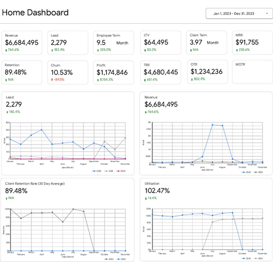
It was hard for a marketing agency to understand the current state of its affairs since different departments had different types of reports and metrics (finance, marketing, sales, operations, and human resources). It took much effort from the management to get access to a unified and consistent view of how well the business performs.
Our Looker Studio consultants helped the agency design an executive dashboard that unites all those metrics and reports into one single place. Such a dashboard shows an overview of some major figures like revenue, profitability, lead generation, customer life-time value, monthly revenue, retention rate, and staffing efficiency. All metrics can be drilled to provide more details for managers who need to analyze the data and take appropriate actions.
Today, the CEO can detect any performance challenges immediately on the executive dashboard. For example, when there is any change in lead generation rate, customer retention rate, or staffing utilization, the management can notice this issue and take appropriate measures. As a result, the management team gets the ability to align its teams towards achieving company goals and making informed decisions.
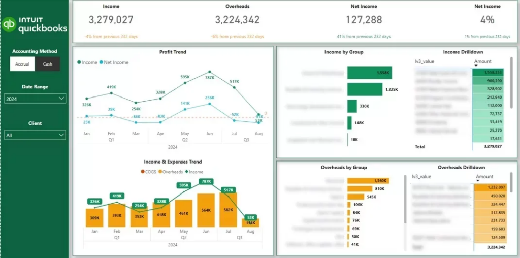
The fee-for-service CFO Consulting firm was having issues with accounting for their clients because they needed to manually sift through hundreds of QuickBooks Online files, which was very inefficient and error-prone, thus reducing the integrity of the data.
Our Power BI specialists have created and implemented an all-encompassing financial dashboard that works seamlessly within the QuickBooks Online platform used by our client. This project has proven to be revolutionary in its implementation since it allows for the consolidation of all financial data from 20 QuickBooks Online accounts in one place. No more will our clients waste their time on manual data retrieval; the financial business intelligence dashboard ensures consistency and accuracy in reports from all areas of their business.
This initiative has had an immense effect. Our clients no longer have to spend about four hours each month maintaining their reports. They also get high-quality reports that can be relied upon in the future due to their accuracy. With such well-presented and precise data, the staff can communicate useful information to their clients easily without putting in additional efforts and without having extra work.
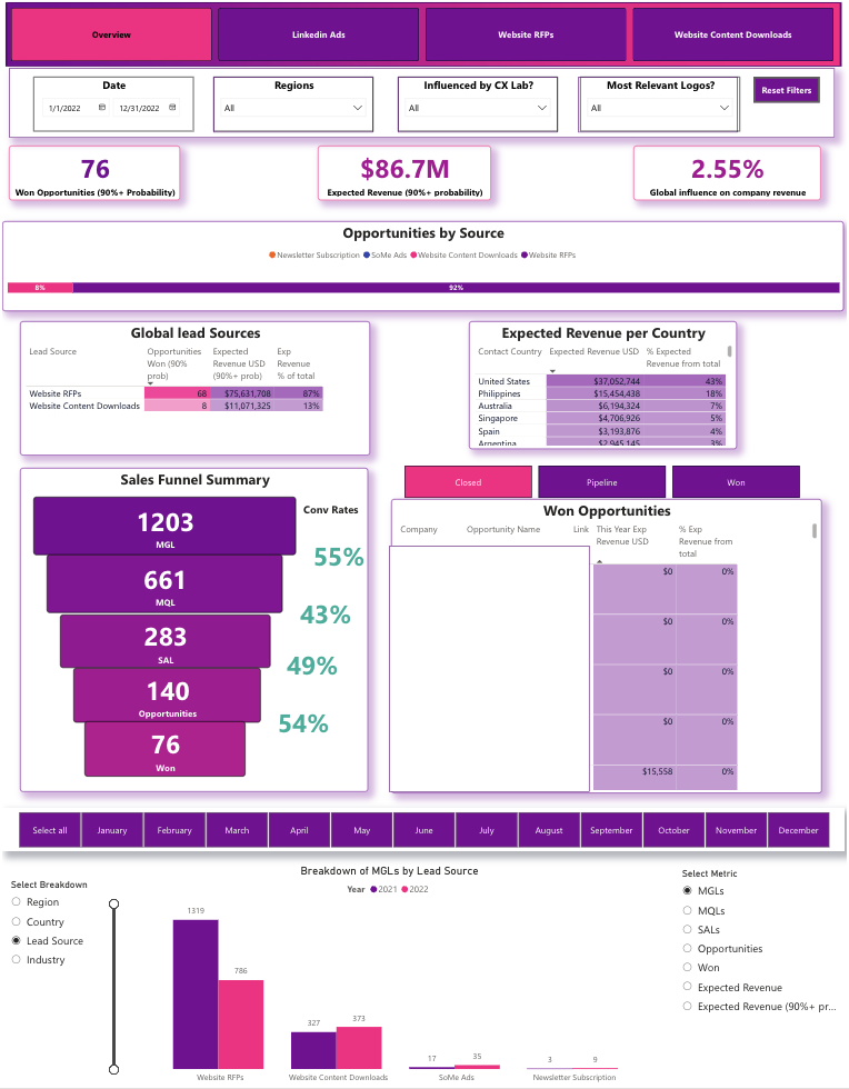
It was simply impossible for sales teams to have a comprehensive picture of their pipeline efficiency when it came to reporting to important stakeholders. The absence of an organized view made it difficult for them to track their deals, gauge how conversion ratios fluctuated at different stages, and identify which channels were generating revenues for them.
In response to the requirement for greater visibility in the sales process, our team of expert Power BI developers created a sales dashboard capable of analyzing and tracking leads and opportunities in detail throughout the entire sales pipeline process. The Power BI dashboard provides the essential figures such as total wins, expected revenue, and marketing contribution to revenue, which are highly valuable to the user. The dashboard further analyzes opportunities according to their status and illustrates the sales funnel process, providing a visual representation of conversion performance at various stages of the sales funnel process.
Due to the detailed information provided by the Power BI sales dashboard, it will become easier for teams to track the progress of deals and identify areas where inefficiencies may arise. As a result, the Power BI dashboard offers users insight into their conversion performance and marketing contributions to revenue, enabling teams to improve the overall sales pipeline efficiency.
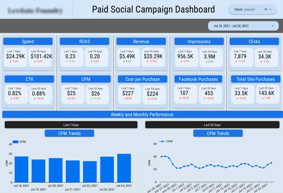
A marketing agency got buried in the tedious process of preparing marketing performance reports. It took them ages to collect data from six different platforms, but what’s more important is that the more they tried to cope with collecting information from all of those sources, the greater the chance of making some mistakes grew.
Our Power BI developers developed a marketing agency dashboard that automatically collects information from all their CRM and ad accounts – 6 of them for Facebook Ads, 7 for Google Ads, and 14 for LinkedIn Ads. The dashboard helped to gather all marketing-related information in one accessible source, so there was no need to go through that time-consuming procedure anymore.
As a result, the marketing team managed to save a significant amount of 30 hours per month that they were using to prepare reports manually before. Now they can control their campaign performance without wasting time on gathering all the information needed, as it gets updated automatically, so they can focus on optimization of campaigns instead.
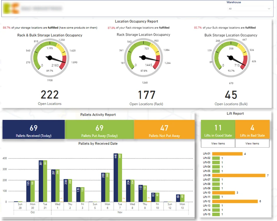
Our supply chain business intelligence consultants came forward and developed a Power BI warehouse dashboard, which clearly highlights all the significant figures, such as warehouse usage, movement of inventory, and the precise time when deliveries would be made. Along with the dashboard, we have even incorporated certain automated notifications for raising red flags in case any potential problems, such as underutilization or delays, arise.
With our solution, the organization has managed to eliminate any superfluous costs by identifying the inefficiencies in its warehouse operations well before things get out of hand. The dashboard gives an organization a detailed picture of the performance of its inventory as well as logistical operations, thus ensuring the team acts immediately once they identify potential problems.
The business intelligence market offers a wide range of credible platforms, each with distinct strengths. The five applications below cover most of the scenarios encountered by modern data teams, from departmental self-service reporting through to enterprise-grade governed analytics.
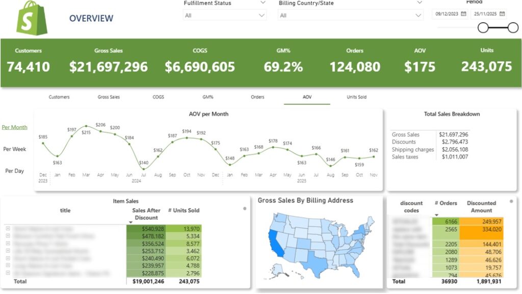
Microsoft Power BI is the most widely used self-service business intelligence application on the market. The platform combines a drag-and-drop report canvas with extensive data integrations, live dashboards, and a development experience that extends naturally from Microsoft Excel.
Features: Power BI connects to more than 250 data sources out of the box, including Microsoft Dynamics, Asana, and Salesforce. Reports are authored visually, while the underlying data preparation engine (Power Query) and modelling language (DAX) are extensions of capabilities already familiar to Excel users. Pivot table skills transfer directly to the platform, which shortens the learning curve substantially for new developers.
Unique capabilities: The standout feature of Power BI is its tight integration with the Microsoft ecosystem. Reports embed cleanly in Teams, SharePoint, and PowerPoint, and the platform inherits authentication and governance from Microsoft Entra ID. Power BI also benefits from a deep network of AI assistants that allow users to generate visuals from natural language prompts, and it scales efficiently to datasets with millions of rows.
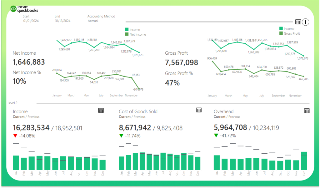
Tableau converts raw data into interactive visuals at speed and is favoured by both technical analysts and business teams. Vidi Corp ranks Tableau second in overall software quality, with a particular reputation for visualisation depth.
Features: Tableau provides a rich library of chart types, advanced statistical calculations, and a mature data preparation tool (Tableau Prep) bundled with the Creator licence. The platform supports both cloud (Tableau Cloud) and self-hosted (Tableau Server) deployments, giving enterprises flexibility over data residency and infrastructure.
Unique capabilities: Tableau’s visualisation engine is widely regarded as the best on the market, particularly for geospatial analysis and complex statistical visuals. As a Salesforce-owned product, it integrates natively with the Salesforce CRM, which makes it the natural choice for embedding business intelligence inside Salesforce workflows. Tableau has also been reported to handle datasets with billions of rows, making it suitable for the largest enterprise deployments.
The trade-off is complexity. Tableau’s feature set can feel technical to newcomers, and the learning curve is steeper than Power BI’s. Once mastered, however, Tableau implementation becomes highly efficient.
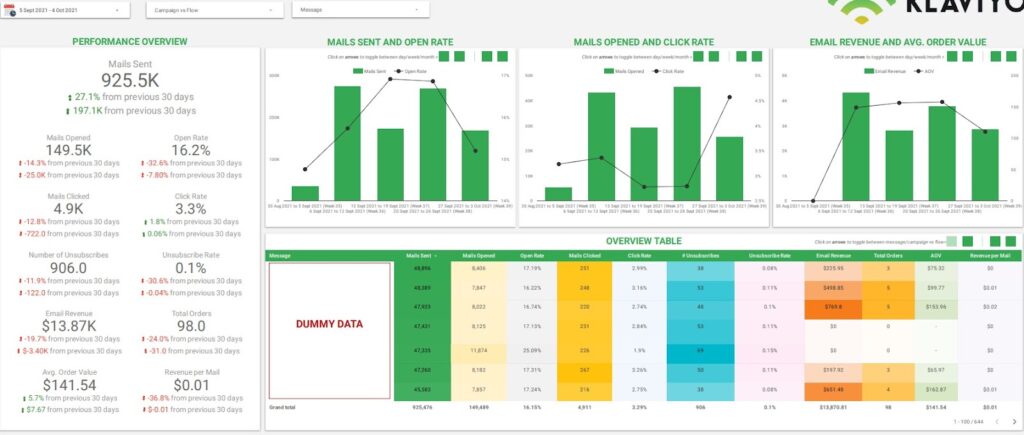
Looker Studio is a free business intelligence application that produces live dashboards from Google Sheets, BigQuery, and a wide range of marketing data sources.
Features: Looker Studio is fully browser-based and accessible from any device. It offers a straightforward report builder, supports calculated fields, and includes native connectors to Google Ads, Google Analytics, Google Search Console, and BigQuery. A large catalogue of affordable third-party connectors extends coverage to platforms such as Facebook Ads and Klaviyo.
Unique capabilities: The platform’s defining feature is that report viewers do not require a licence, which removes considerable administrative overhead for external reporting. Based on Vidi Corp’s experience, Looker Studio is the best fit for scenarios such as marketing agencies sharing dashboards with clients or businesses sharing performance updates with investors.
The application is well-suited to lighter reporting needs. Visual customisation and formula capabilities are more limited than in Power BI or Tableau, and because Looker Studio does not offer an on-premises deployment option, organisations with strict data residency requirements may find it unsuitable.
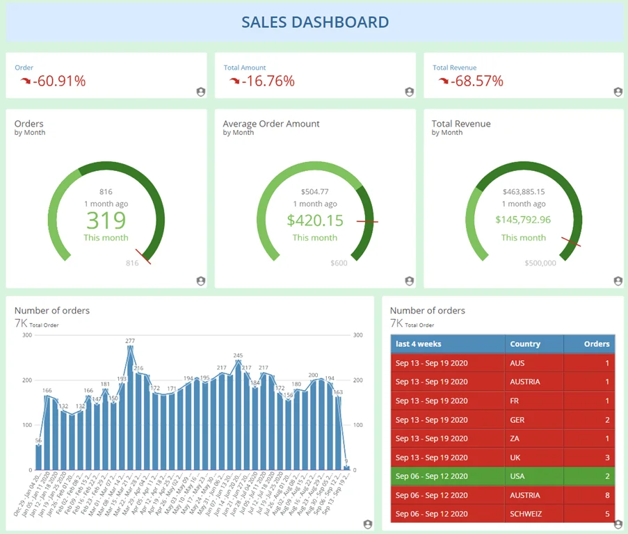
DOMO is positioned as an all-in-one data experience platform, combining ingestion, transformation, visualisation, and collaboration in a single environment.
Features: DOMO connects to more than 2,000 data sources out of the box, which is substantially more than any competing platform. The product includes a no-code transformation tool (Magic ETL), workflow automation, alerting, and a strong mobile experience. Live collaboration features allow users to comment on and discuss metrics directly inside dashboards.
Unique capabilities: DOMO’s most distinctive strengths are the breadth of native connectors, the integrated social collaboration layer, and the quality of its mobile interface. The platform suits organisations with dozens of data sources to integrate and a need for executive-level reporting that is consumed primarily on phones and tablets.
The DOMO development experience leans heavily on SQL, so teams without SQL proficiency may face a steeper learning curve. DOMO is also the most expensive option in this comparison, targeting enterprise customers exclusively through custom pricing.
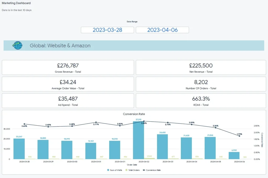
Now part of Google Cloud, Looker is an enterprise-grade business intelligence platform used by data teams to build governed reports and semantic models for business users. It is a distinctly different product from Looker Studio and is considerably more technical.
Features: All data loading and transformation in Looker is handled through a proprietary modelling language called LookML, which allows data teams to define business metrics centrally and reuse them consistently across the organisation. Looker offers strong native integration with Google BigQuery and other cloud data warehouses, role-based access controls, and a robust API for embedded analytics deployments.
Unique capabilities: Looker’s defining capability is the LookML semantic layer, which enforces a single, governed definition of every metric across the business. This makes it particularly powerful for large organisations where metric consistency is critical, and it is widely used as the engine behind embedded analytics inside customer-facing applications.
The trade-off is that Looker does not automatically aggregate data in the pivot table style familiar from other tools. Every breakdown for every chart must be coded explicitly in LookML, which means a dedicated analytics engineering capability is generally required to operate the platform effectively.
| Platform | Entry price | Notes on full pricing |
| Microsoft Power BI | Free for development. $14 per user, per month for Power BI Pro (paid yearly). | Power BI Premium Per User is $24 per user, per month. Microsoft Fabric capacity (typically chosen by organisations with more than 500 users) and Power BI Embedded are priced separately and quoted on request. |
| Tableau | Tableau Cloud Standard Edition starts at $15 per user, per month for the Viewer licence (billed annually). | Standard Edition: Viewer $15, Explorer $42, Creator $75. Enterprise Edition: Viewer $35, Explorer $70, Creator $115. Tableau Next (the agentic analytics product) starts at $40 per user, per month. The Tableau+ Bundle is quoted on request. |
| Google Looker Studio | Free. | Looker Studio Pro adds team workspaces and personal links at $9 per user, per Google Cloud project, per month. Viewers never require a paid licence in either tier. |
| DOMO | Custom pricing only. DOMO publishes a 30 day free trial and a single Paid plan, with all per user and per consumption rates quoted by sales. | Custom pricing only. DOMO publishes a 30 day free trial and a single Paid plan, with all per user and per-consumption rates quoted by sales. |
| Google Looker | Custom pricing only. | Industry sources report a Standard edition entry point of approximately $60,000 per year, including ten Standard Users and two Developer Users. Average annual contract value is reported at around $150,000, scaling into seven figures for large embedded deployments. |
Business intelligence applications provide your team with the speed and flexibility to gain data-driven insights when it matters most. Here is how they help your business:
In traditional reporting environments, generating a single report could take days or even weeks. A request would typically be submitted to an analyst or IT team, queued alongside other priorities, and eventually delivered in a static format that may already be partially outdated by the time it reaches the decision maker. Business Intelligence applications fundamentally change this dynamic by placing analytical power directly at the user’s fingertips.
For example, War Room Operations reported a 40% faster turnaround on strategic decisions after Vidi Corp implemented real-time analytics and dashboards. They also said executive review cycles were cut by 2 business days per week.
Through interactive dashboards and pre-built report templates, users can retrieve the answers they need in a matter of minutes. Whether it is identifying a sudden dip in sales performance, spotting an unusual spike in customer complaints, or recognising an emerging trend in web traffic, the ability to access insights almost instantly means that leaders and teams can act with speed and confidence.
One of the most immediate benefits of business intelligence is that it reduces the time teams spend preparing reports. Automated dashboards replace repetitive manual work and make performance data available without constant spreadsheet updates.
A good example is The Art of Digital Pty Ltd, which said its team reduced the time spent preparing reports by over 50% after Vidi Corp built automated dashboards and data feeds. They also noted that leadership could make decisions much faster because insights were available in a single view.
Business intelligence gives companies one clear view of performance across departments, entities, or systems. This makes it easier to compare results, track trends, and manage the business without switching between disconnected tools.
Modern Cannabis reported that Vidi Corp helped them consolidate multiple QuickBooks Online companies into one real-time dashboard. As a result, they reduced time spent compiling financial reports across entities by over 75% and cut their month-end close process by several days.
Business intelligence reduces the manual effort required to collect, combine, clean, and refresh data for reporting. Instead of spending hours exporting files, updating spreadsheets, and checking formulas, teams can rely on automated dashboards that stay up to date with much less intervention. This saves time every month and reduces the operational burden on finance, operations, and management teams. It also allows staff to focus on interpreting results, solving problems, and acting on insights rather than maintaining reports. Much like how modern professionals rely on utility software, such as MacKeeper alternatives worth trying in 2026, to automate device cleanup and eliminate manual hardware maintenance, BI tools automate data hygiene so your team can focus on strategy.
For example, Mercy Corps reported that automating procurement reporting from SAP Ariba saved around 5 hours per month and allowed the team to refresh reports more often.
Business intelligence improves reporting quality by pulling data directly from source systems and applying the same logic across every dashboard, report, and metric. This reduces the risk of manual mistakes, conflicting formulas, and inconsistent numbers between teams. It also gives decision-makers more confidence because they know the data is structured, refreshed, and calculated in a reliable way. When teams trust the numbers in front of them, they spend less time validating reports and more time using insights to make decisions.
Business intelligence makes it easier to add new entities, data sources, teams, or reporting requirements without rebuilding everything from scratch. A well-designed BI setup creates a structure that can expand as the business becomes more complex. This is especially important for growing companies that need reporting to keep up with new products, locations, departments, or acquisitions. Instead of creating more spreadsheets and manual workarounds, teams can extend the existing reporting model in a controlled and efficient way.
Business intelligence applications deliver tremendous value, but there are common pitfalls you must address to maximise their effectiveness:
Selecting the right BI application requires careful consideration of several factors. Start by asking who will consume the reports. Many BI tools (such as Power BI or Tableau) primarily support internal sharing within your organisation, which means raising a paid licence for every viewer. Tools like Looker Studio, by contrast, support external sharing without requiring viewers to hold a licence, saving significant administration effort for client-facing or investor-facing reporting.
Another critical factor is your data source ecosystem. As a general rule, Power BI integrates best with Microsoft sources, Looker Studio with Google sources, and Amazon QuickSight with AWS services. Each major technology company is building BI capabilities into its broader ecosystem.
Finally, consider visualisation requirements. Every BI tool has certain limitations in how data can be displayed and customised. For advanced visualisation needs, Power BI or Tableau are typically the strongest choices. For simpler analytics, Looker Studio offers unique advantages at no cost.
Here are the key criteria to evaluate:
The best business intelligence application should fit your data, your people, and your goals simultaneously.
The fastest path to adopting a new BI application is to engage business intelligence consultants. Consultants typically handle the most technically challenging development work and then hand the reports over to your team. Your staff can then learn the new tools by customising existing visualisations and adding new analysis to the pre-built reports.
Alternatively, your team can develop reports from scratch. The initial outputs may not follow best practices, but your team will gradually build important skills. From personal experience, it took the author approximately 18 months to begin developing Power BI reports that consistently followed good reporting practices.
If you choose the in-house development route, it is essential to select a BI application with a large user community and strong learning resources, such as Power BI or Tableau. This ensures your team can find answers to their questions quickly and make faster progress.
Follow these phases for a smooth implementation of BI applications within your organisation:
Begin with a single department, such as your sales team, as a pilot. This allows you to concentrate your efforts and address any issues before rolling out to the entire organisation. Sales departments typically have clear-cut goals and abundant data, making them an ideal starting point.
Before building any reports, clean your data to eliminate inconsistencies and fill gaps. Then agree with your team on the key performance indicators that matter most, such as conversion rates, revenue per customer, or operational efficiency metrics. Clean data and clear KPIs form the foundation for effective BI reporting.
Develop three to five simple templates that your team can start using immediately, such as a sales pipeline report, a campaign performance tracker, or a weekly summary dashboard. These templates deliver quick wins and help users build confidence with the tool.
Conduct training sessions that allow users to explore the tool with data from their own daily work. Show them how to apply filters and drill down into charts to answer the questions they face regularly. This makes training directly relevant and increases adoption rates.
After launch, track how the tool is being used. Identify where people encounter difficulties, collect feedback, and address blockers promptly. Continually refresh your templates and training materials. The more support you provide, the greater the value your team will extract from the BI application.
Business intelligence applications are evolving rapidly. Here are the key trends shaping the future of the industry:
Modern BI tools increasingly use artificial intelligence to detect anomalies in your data and provide explanations automatically. For example, if sales for a product drop by 20%, the tool can identify both the decline and its likely cause without requiring anyone to conduct manual analysis. AI technologies integrated into Power BI allow users to query their data using plain English questions, opening up a new range of analytical possibilities.
Increasingly, analytics capabilities are being embedded directly into everyday business applications. CRM tools like Salesforce already integrate BI functionality natively, leading to improved user experiences and more efficient decision-making without requiring users to switch between separate tools.
With a growing majority of professionals checking their business data on mobile devices multiple times per day, BI applications are increasingly designed to deliver real-time alerts and interactive dashboards optimised for mobile screens.
Business intelligence applications give you the freedom to explore your data, find quick answers, and make smarter decisions without waiting on anyone else. When implemented correctly, they save time, reduce costs, and empower every team across your organisation to operate with greater confidence and agility.
If you are ready to realise the full value of your data, reach out to Vidi Corp Data Analytics Consultancy. We will help you choose the right business intelligence application, set it up, and get your team using it with confidence.
A Business Intelligence application is a software platform designed to collect, process, analyse, and visualise data from across your organisation to support informed decision-making. Unlike traditional reporting tools, which typically produce static, predefined reports that offer a fixed snapshot of historical data, a Business Intelligence application provides dynamic, interactive dashboards that connect to live data sources.
Accuracy in reporting is often compromised by manual processes, including copying data between spreadsheets, consolidating figures from multiple sources by hand, and applying formulas that are prone to human error. A Business Intelligence application addresses these risks by automating the entire data pipeline. It connects directly to your underlying data sources, such as accounting software, CRM platforms, ERP systems, and cloud databases, and pulls information automatically without any manual intervention.
Yes. One of the most valuable characteristics of modern Business Intelligence applications is their ability to integrate seamlessly with a wide range of existing business systems and data sources. Whether your organisation relies on accounting platforms such as QuickBooks or Xero, customer relationship management tools such as Salesforce or HubSpot, enterprise resource planning systems such as SAP or Oracle, cloud storage services such as Google Sheets or SharePoint, or even internal databases and flat files, a Business Intelligence application can connect to these sources and consolidate the data into a single, unified environment.


