
Power BI CRM dashboards enable businesses to dig deeper into their sales, marketing, customer service, and lead generation data – all coming straight from CRM systems like Salesforce, Hubspot, Netsuite and Zoho CRM. By merging that with info from finance systems, other marketing platforms, ERP software and even customer support tools, you can end up with a single hub for monitoring the whole customer journey from start to finish.
As a Power BI consultancy, we’ve built multiple CRM dashboards for various business units across sales, marketing, finance and customer support teams. Our Power BI consultants help organisations to get their CRM reporting automated, tie together their disparate business systems using APIs and custom connectors & build dashboards that give them an inside look at what’s going on with pipeline activity, campaign performance, customer satisfaction and sales performance – all in near real-time.
Here we’ve got some real-life examples of Power BI CRM dashboards we’ve helped build for businesses in different areas and with different CRM systems. We’re giving you a rundown on how CRM dashboards get used in practice, the important metrics to keep an eye on, how to integrate CRMs with other systems, and some general best practices for building a solid Power BI CRM reporting system that can handle whatever comes your way.
A Power BI CRM dashboard is a reporting tool that makes customer relationship management data easy to visualise from systems like Salesforce, HubSpot, or NetSuite. A lot of businesses use these dashboards to take a closer look at sales pipelines, how their customers are interacting with them, where their lead generation is coming from, and how their marketing campaigns are doing – all in one place.
Power BI lets businesses pull in CRM data from lots of different systems using data connectors, which they can then combine with other data on marketing, finance, customer support, and operations in their dashboards. This means data is always up to date – no more exporting spreadsheets or hunting around between different systems for the latest numbers.
The thing is, Power BI CRM dashboards are really important because they give you a super clear view of the whole customer journey. Sales managers can see how the pipeline is moving and how their team is doing, marketing teams can see if their campaigns are working and what they need to tweak, and customer service teams can get a handle on customer satisfaction and feedback. And with the ability to drill down into specific areas – like a particular region or product – businesses can make decisions a whole lot faster, hold their teams to account, and focus on the things that are going to bring in the most revenue and value for their customers.
Common purposes of Power BI CRM dashboards are:
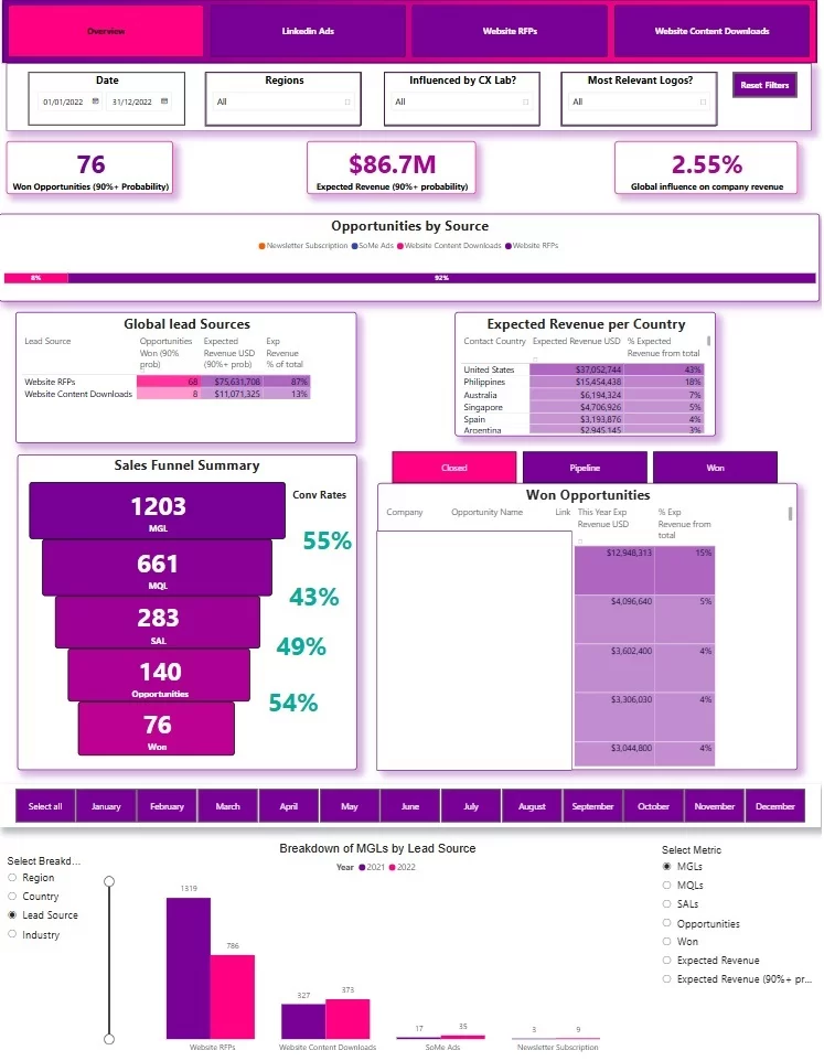
Our sales pipeline dashboard dives into the numbers on how marketing and sales efforts are actually driving pipeline growth and projected revenue. Built on top of Salesforce CRM data, it’s a simple tool that lets teams see at a glance which lead sources are producing the best opportunities, how deals are moving through each stage of the sales funnel, and where we tend to get stuck. Sales managers can use it to keep tabs on what’s currently in play, review the deals that got away and the ones that came in, and jump straight in to follow up on specific deals and get things moving again.
CRM: Salesforce
Metrics included: won opportunities, expected revenue, marketing-influenced revenue %, opportunities by lead source, expected revenue by customer country, leads by funnel stage, conversion rates between stages, opportunity status (won, lost, in progress), and active sales pipeline opportunities
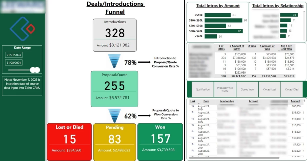
This Sales Funnel dashboard is all about helping businesses get the most out of their sales process by digging into their Zoho CRM data and making sense of how to improve their conversion rates throughout the sales pipeline and beyond. It’s a tool that lets sales teams see where the deals are coming from, track how opportunities are moving along through each stage, and get a clear picture of what’s working (and what isn’t) – from the average size of deals to how their sales team are performing versus others. And because it’s all automated, they get access to basically up-to-the-minute data without having to go through the hassle of manually exporting info from their CRM.
CRM: Zoho CRM
Metrics you’re looking at here: deal sources, the average deal size, how conversion rates tick along between each stage, where the sales funnel is currently at, how many opportunities are piling up at each stage, total intro’s and how each account manager is doing.
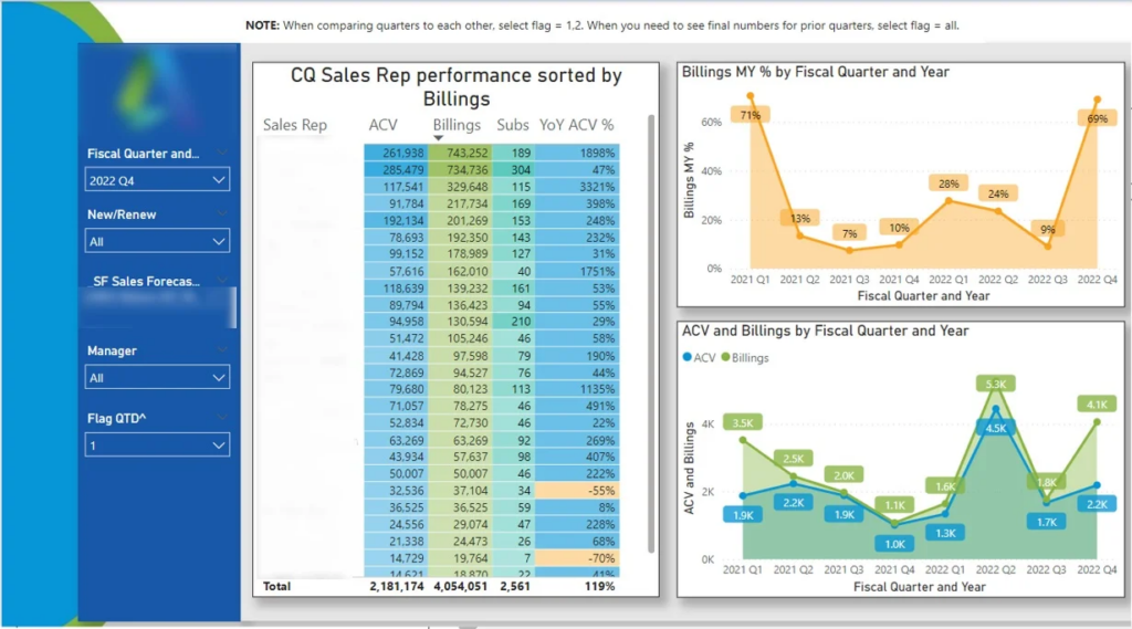
Our data visualization consultants crafted a Sales Performance dashboard in house to get a closer grip on quarterly sales trends and see over time how individual sales reps and sales managers are performing. The idea was to create something that lets businesses easily compare how their teams are doing, spot which sales reps are consistently delivering, and catch any productivity slumps before they start to impact on sales targets. You can also use the dashboard to drill down on specific sales teams by filtering by manager and get a detailed look at the individual activity and sales trends of each sales rep.
CRM: Pipedrive
Some of the metrics we included are: quarterly sales trends, how individual sales reps stack up against their peers, how managers are doing themselves, what the overall team performance looks like over time, how individual sales reps are performing, and where you might be slipping on productivity over time.
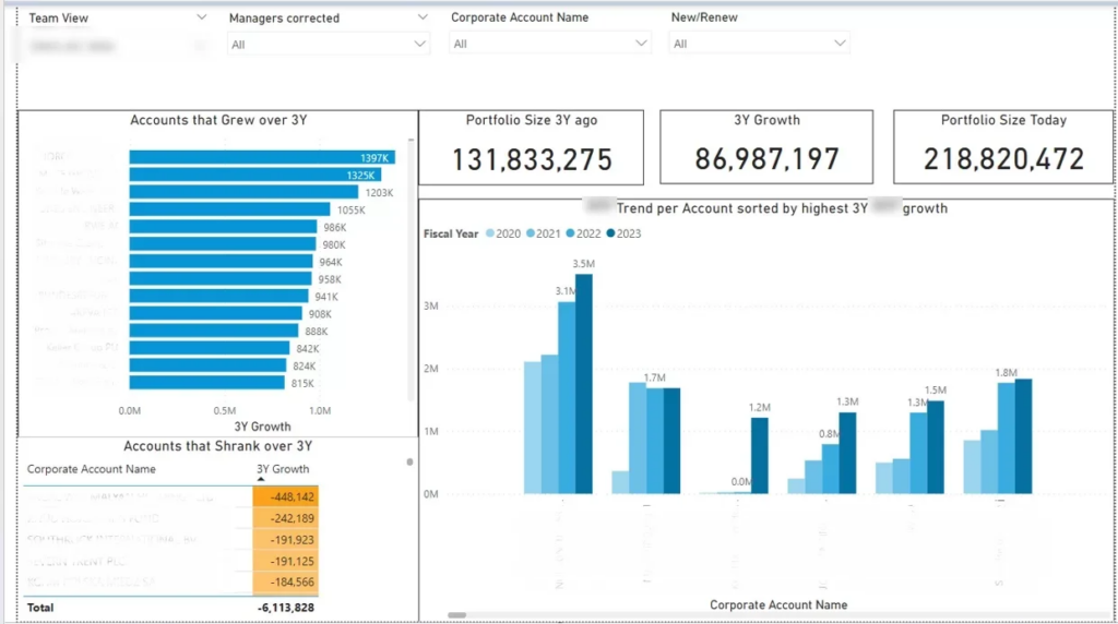
Our Business Intelligence consultants built this Customer Growth dashboard is what sales managers and account managers need to see how their customer portfolios are evolving over time. It gives a close-up look at how each sales rep’s accounts are performing and breaks customers down into two groups – those whose accounts are on the up and up, and those that are in decline. Plus, you can drill down and see what’s going on with portfolio trends by salesperson so you can understand which individual accounts are really driving the growth.
The dashboard is actually pretty useful for sales teams because it helps them spot the portfolios that need some TLC and keep tabs on how account performance is changing over time. That gets them focusing on the customers that are actually driving the growth, which is a big help with account management work.
CRM: Pipedrive
The metrics we’ve got included: customer portfolio growth trends, how account performance stacks up by sales rep, growing accounts, declining accounts…and how those portfolio trends are doing by salesperson.
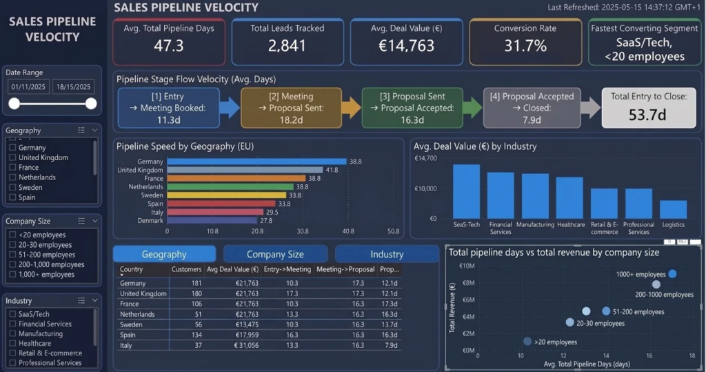
This Sales Pipeline Velocity dashboard is a game-changer for sales leaders and their revenue operations teams – it lets them get a better handle on just how quickly leads make their way through the sales pipeline. The dashboard is all about tracking the time it takes for opportunities to move through each stage of the sales funnel and understanding how that sales cycle length stacks up across different industries, company sizes, and geographic regions.
The analysis digs in on the average amount of time that slips by between key sales milestones – lead creation, meeting booked, proposal sent, and deal closed, for example. On top of that, we’re also tracking total sales cycle length and comparing pipeline velocity across customer segments and other key metrics like average deal value and how many customers are in each segment. This helps sales teams figure out which segments are moving through the pipeline the fastest and how they can use that information to make their revenue forecasting even more predictable.
CRM: Netsuite
The metrics included are: average days between sales stages, total sales cycle length, how long it takes a lead to go from creation to conversion, a breakdown of opportunities by pipeline stage, average deal value, customers by segment, and sales pipeline velocity by industry, geography, and company size – amongst others.
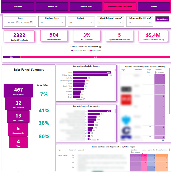
This Marketing Campaign dashboard does a deep dive into the performance of your website lead magnets and downloadable content – all thanks to the invaluable insights provided by Salesforce CRM data. Marketing and sales teams can get their heads around what’s working and what’s not – ie which campaigns and content assets are really bringing in the leads and turning them into opportunities. And they can even pinpoint which industries these leads are coming from, plus what topics are really getting people engaged. The dashboard also makes it super easy to follow up on leads – you can jump straight into the relevant content pieces for each campaign, no fuss. This type of analysis is often combined with dedicated content marketing reporting to better understand how content contributes to lead generation and pipeline growth.
CRM: Salesforce
Metrics we’ve included are: the total number of leads, how many opportunities are coming from lead magnets, leads broken down by the type of content they downloaded, leads that have downloaded specific content pieces, leads that come from certain industries, and how people are engaging with your downloadable content.
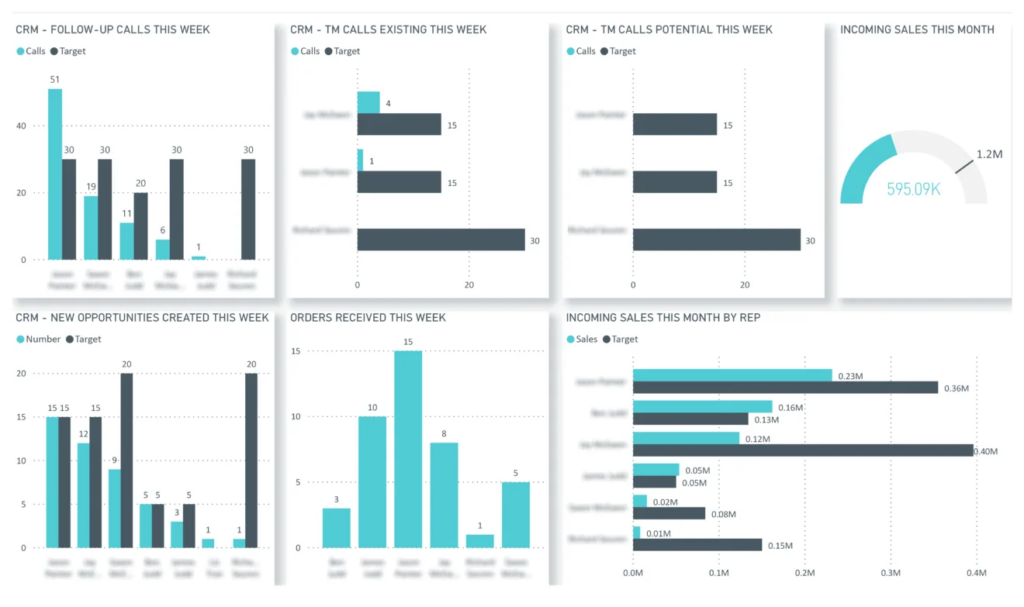
Our Power BI consultants built this Actual vs Target sales dashboard designed to give sales managers a clear picture of how each rep is doing against what they’re expected to do. Its main job is to help you keep an eye on whether your reps are actually making the calls they say they’re going to make, creating as many leads as they’re supposed to, and actually closing deals like they said they would. And if not, you can use this dashboard to see who’s not hitting the mark and who’s doing great, so you can take action before things start to slip and your team misses its sales targets.
The dashboard also gives you a quick glance at how the whole sales team is doing overall. You can look at the bigger picture and get a sense for whether you’re on track to hit your company-wide goals. This helps you monitor your progress, figure out where things might be going off track, and make sure your current pipeline and efforts are actually going to get you to where you want to be.
CRM: NetSuite
The dashboard tracks: how many calls are actually getting made vs how many reps said they’d make, how many leads are getting created vs how many they were supposed to, how many deals each rep is closing, how each rep is doing in terms of sales performance, and how far we are from hitting our sales targets.
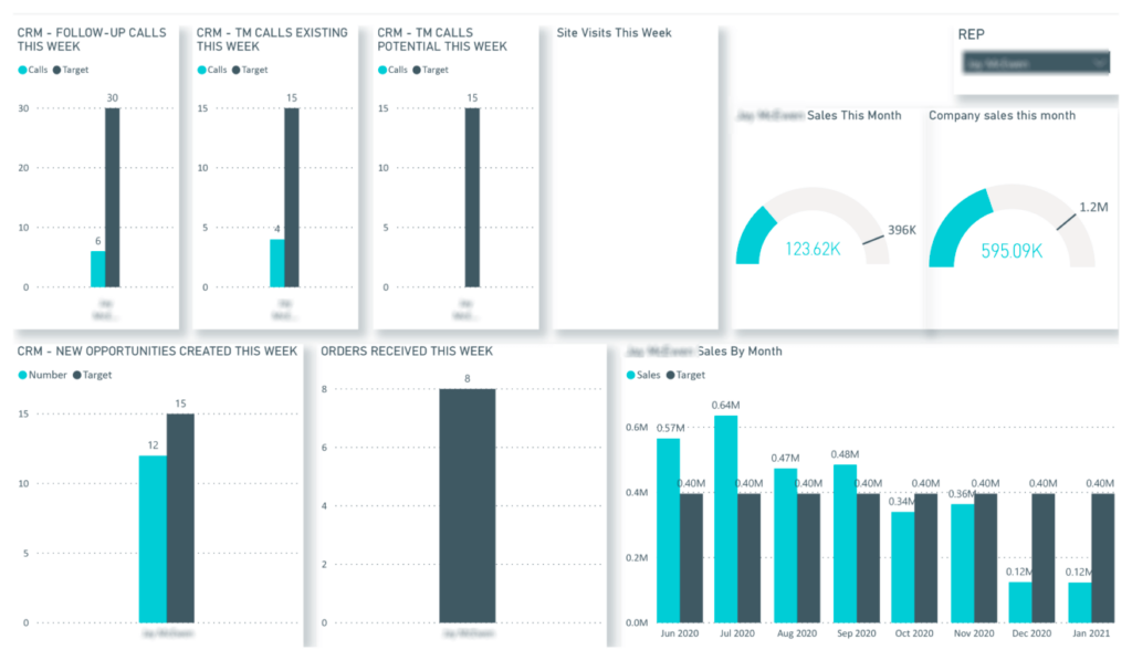
This Sales Rep Performance dashboard takes a close look at the day-to-day activity and sales numbers for each individual sales rep. Its main purpose is to help sales managers keep tabs on whether each rep is really meeting their activity targets, coming up with enough new leads, and on track to hit their sales targets. The dashboard also makes it a heck of a lot easier to compare where a rep is at versus where they should be over time, and spot when someone might need a little extra help or follow-up.
CRM: NetSuite
Metrics we’re tracking include: how many calls each sales rep is making, how many orders they’re bringing in, the new opportunities they’re creating, where they stand on actual sales compared to their targets for each month, how close they are to hitting their sales target, how many new opportunities they’re creating each week and all the individual performance metrics that are relevant to a sales rep.
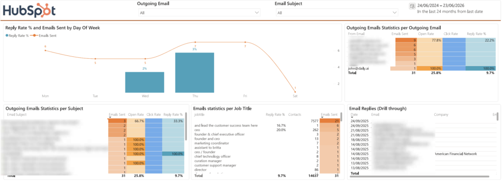
This Email Outreach dashboard is all about helping sales teams understand not just how much outreach is going out, but what’s actually landing. Built on top of HubSpot data, it compares email volume against reply rate by day so teams can spot which outreach days consistently perform best, and it surfaces which subject lines are pulling the strongest open rates – making it a lot easier to sharpen sequences over time. You can break activity down by rep to see who’s sending the most emails and who’s getting the best response from it, and there’s a particularly handy cut of the data by job title that highlights which roles reply most often – a strong signal for where to focus your prospecting. And it doesn’t stop at summary numbers: you can drill straight through from reply counts into the individual email conversations, which is really useful for understanding where a contact sits in the process or why a deal stalled.
CRM: HubSpot
Metrics we’re tracking include: emails sent and replies received by day, reply rate by day, open rates by subject line, email activity and reply rates by rep, email performance by job title, and drill-through into individual email conversations.
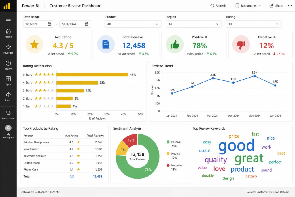
Our data visualization consultants developed this Customer Service dashboard is all about keeping a close eye on how customers are feeling about our products and services. It’s a tool that lets customer experience teams and product managers get the low down on what customers think of our different products and services, not to mention getting to the bottom of what people like and dislike about them. It also gives us a pretty good idea of how customer satisfaction is tracking in different parts of the world and across different product lines. Plus, it helps us spot any issues with our service quality before they get out of hand, and figure out where we need to make some changes to get things up to scratch.
The analysis gives us not only some high-level numbers and stats, but also a really detailed breakdown of what people are saying in their feedback. That means we can take a look at how customer opinions have changed over time, see how satisfaction levels are measuring up for different products and in different places, and even identify the buzzwords and hot topics that keep popping up in customer feedback.
CRM: HubSpot
Metrics we’re tracking include: average rating, total number of reviews, positive vs negative review ratios, rating distribution, how review trends are shaping up, how different products are stacking up, top keywords from customer reviews, how customers are feeling overall (sentiment analysis), and let’s not forget reviews by product and by region.
The first step in connecting your CRM data to business dashboards is figuring out exactly where that data lives & which business processes you need to be keeping an eye on. A typical Power BI CRM dashboard will likely pull data from a variety of sources – all the usual suspects like Salesforce, HubSpot, NetSuite, Dynamics 365 or Zoho CRM – and then also bring in data from supporting systems like ERP platforms, marketing tools, finance databases, customer support systems & website analytics platforms.
Next up is getting the data integration in place. With Power BI, there are loads of ways to connect to your CRM systems – native integrations, APIs, SQL databases, cloud warehouses or custom-built API connectors – so it all depends on what you need. Sometimes our Power Automate consultants also help our clients automate the data extraction & refresh process using things like Power Automate, Azure, Python scripts & cloud data pipelines – which makes life a lot easier and means the data on your CRM dashboard is always up to date with the latest on sales, marketing & customer service.
Once you’ve got the data integration sorted, you then need to get the data transformed & made ready for reporting inside Power BI. At this point you can start building your fully automated CRM dashboards with scheduled refreshes, row-level security, drill-down functionality and near real-time reporting. This lets sales, marketing, customer service and leadership teams keep track of CRM performance from one single dashboard without having to manually juggle data from all the different systems.
The key performance indicators (KPIs) included in a CRM dashboard vary from one business model to another, depending on the sales process and the point at which the customer is in the lifecycle. Even so, most Power BI CRM dashboards concentrate on keeping tabs on sales performance, the progression of leads through the pipeline, the effectiveness of marketing efforts, and customer satisfaction – ideally all in real time. The end goal is to give teams a straightforward look at how leads move through the business and where they might be able to make things more efficient.
Sales Power BI CRM dashboards typically look at things like pipeline value, how many deals are actually being won, the conversion rates, the number of calls completed, what kind of sales activity each rep is up to, the average size of the deals a rep is closing, and how actual performance stacks up against targets.
Then there are the marketing Power BI CRM dashboards, which usually are looking at lead generation, how well a given campaign is doing, where the leads are coming from in the first place, the cost per lead, conversion rates, and what portion of revenue can be attributed to marketing efforts.
Customer service Power BI CRM dashboards tend to follow customer satisfaction scores, how long it takes to respond to a customer, what the general sentiment of reviews is, trends in how quickly tickets get resolved, and themes that keep popping up in customer feedback.
More often than not, businesses also toss in some interactive filters and drill-down capabilities, which lets them dig into CRM performance by rep, by campaign, by region, by customer segment, by product, or by time period. It makes it a heck of a lot easier to get to the bottom of changes in performance, identify any bottlenecks that might be causing problems, and take action based on real-time insights from the CRM rather than relying on stale monthly reports. Before building the dashboard, it might also be useful to create a Power BI implementation plan to structure the reporting requirements, integrations, KPIs, and automation processes.
Decision-Driving KPIs Should Be Priority One
The top Power BI CRM dashboards are all about helping your team make decisions faster and with more confidence. They don’t load users up with a gazillion charts and metrics – that’s just overwhelming. What you want to focus on are KPIs that actually drive sales performance, get marketing results, keep customers, and grow that pipeline. A clear layout and navigation that makes sense will get you further adoption with your sales, marketing and customer service crew.
Get Your CRM Data In Order – Automate It
Automating your CRM data extraction is one of the most important things you can do for your dashboards. Most folks are combining data from their CRM with some marketing platform stuff, ERP system, finance database and customer support tools. Using APIs, custom connectors, Power Automate workflows, Azure pipelines or SQL databases means your reporting data just refreshes automatically without anyone having to manually crank the whole thing over again or update a spreadsheet. That’s one of the reasons a lot of our clients work with our data integration consultants to get all their reporting workflows streamlined and reporting set up across lots of different systems.
Align Your Dashboards to Team Workflows
CRM dashboards should be structured to fit the workflows of the different teams in your business. Your sales managers are probably looking for pipeline and sales rep analysis, marketing is usually focused on campaign performance and lead gen and your customer service team is monitoring customer satisfaction and support trends. Breaking these down into separate dashboard pages with drill down functionality and interactive filters makes it so much easier to get to the analysis you need and more actionable across the whole organisation.
Get Your Dashboards Running Smoothly
With big CRM systems running millions of records you’re going to hit performance problems if your dashboard is not structured right. Proper data modeling, aggregated tables, incremental refreshes and cloud storage solutions will keep your dashboards running fast and scalable as your business grows.
Power BI dashboards for CRM help businesses get all their customer info in one place, streamline their reports, and get a better view of how their sales, marketing and customer service teams are doing. By combining data from your CRM with numbers from your finance software, ERP system, marketing tools and customer support apps, you can suddenly have a clear picture of your customers from start to finish.
The examples in this article show just how well a Power BI CRM dashboard can help with sales pipeline management, tracking sales, campaign analysis, keeping an eye on customer service and writing reports for the executives. With the power of automated integrations, being able to drill down deep into data and getting up to the minute reporting, these dashboards allow teams to spot blockages and make better business decisions, much faster.
If you’re thinking of building a Power BI CRM dashboard you’re in luck. Our Power BI experts can help connect up your CRM data, automate those tedious reporting tasks, and create a custom dashboard that matches how your sales, marketing and customer service teams work. Drop us a line and we can chat about what CRM reporting you need.


