
A HubSpot dashboard template turns your contacts, deals, emails, and calls into a ready-made set of reports. Search for one, though, and most of what you find falls into two camps. There are static spreadsheets that only update when someone types the numbers in by hand, and single-page reports locked to a connector subscription you keep paying for.
Our template takes a different approach. It is a full Power BI solution with five dashboards, an automated cloud database, and daily pipeline snapshots that let you see your pipeline exactly as it stood on any past date. Every formula is editable, and the data model can be joined with your own sources, from Excel files to ClickUp or QuickBooks Online.
Our Power BI consultancy has built 1000+ dashboards and data connectors for 700+ companies, including Google, DS Smith and Heineken. We have seen how industry leaders analyse their CRM data and used this knowledge to bring this Hubspot dashboard template to you. This guide explains what the template covers, how it compares to the alternatives, and how to install it step by step. Let’s jump straight in.
A HubSpot dashboard template is a pre-built reporting layout that pulls your HubSpot data into a set of charts and tables. Instead of sifting through records one by one, you see your sales and marketing performance at a glance in a CRM dashboard.
Every day, HubSpot logs activity from across your business. That includes new contacts, form submissions, email opens and replies, deal stage changes, call logs, and won or lost revenue. A dashboard template organises all of those signals into pages your team can actually use.
HubSpot’s own report templates are a sensible starting point. The catch is that they are shaped around HubSpot’s framework, so the presentation is rigid and gaps appear quickly. Our template is built in Power BI, which hands control back to you and frames the reporting around the questions your team cares about.
When you first open the template, you get five working dashboards covering sales activity, email outreach, calls, pipeline velocity, and your current pipeline. Here is why building this reporting in Power BI pays off.
Because the template runs in Power BI, nothing inside it is locked. Every formula, measure, and visual is open, so you can edit our calculations or write your own. If your team defines a “qualified lead” or a “stalled deal” differently, you change the logic once and every page updates.
The template comes with a complete data model connecting your contacts, deals, emails, calls, and pipeline history. All the tables and relationships are already in place. That means you can drag fields into a new page and build any analysis you need, without spending weeks on data modelling first.
HubSpot only sees what happens inside HubSpot. In Power BI, you can join the template’s data model with Excel files, project management systems like ClickUp, or accounting systems like QuickBooks Online. That lets you compare pipeline value against actual invoiced revenue, or line up deal activity with project delivery, all in one report.
The template is powered by a cloud database that refreshes your HubSpot data automatically. It also stores daily pipeline snapshots, so you can look back at the exact state of your pipeline on any past date. Native HubSpot reports cannot reconstruct history this way.
Our Power BI template includes five core HubSpot analytics dashboards. Together they cover outreach activity, email and call performance, sales cycle speed, and the live state of your pipeline.
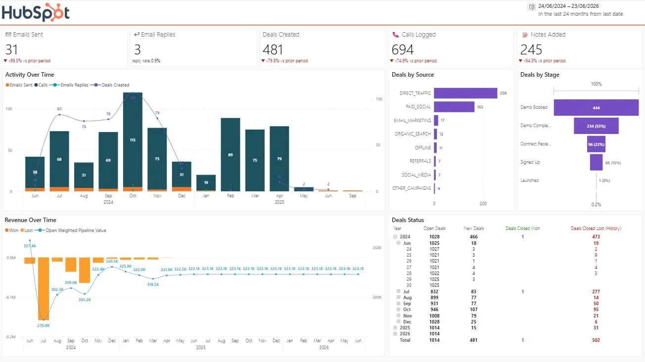
The first page of the Power BI dashboard gives a high-level summary of sales activity.
It surfaces core metrics such as:
You can view these trends month by month, and drill down into daily performance when you need a closer look for weekly reviews.
The same page also shows:
This is especially useful when pipeline value drops. Instead of guessing, you can see immediately whether deals were lost, stalled, or moved in a way that reduced open weighted value.
You can also inspect the pipeline at a daily level. Pick any past date and see the exact state of the pipeline on that day, including open deal count by stage and total open amount. That makes it easy to explain to leadership exactly what changed between two board meetings
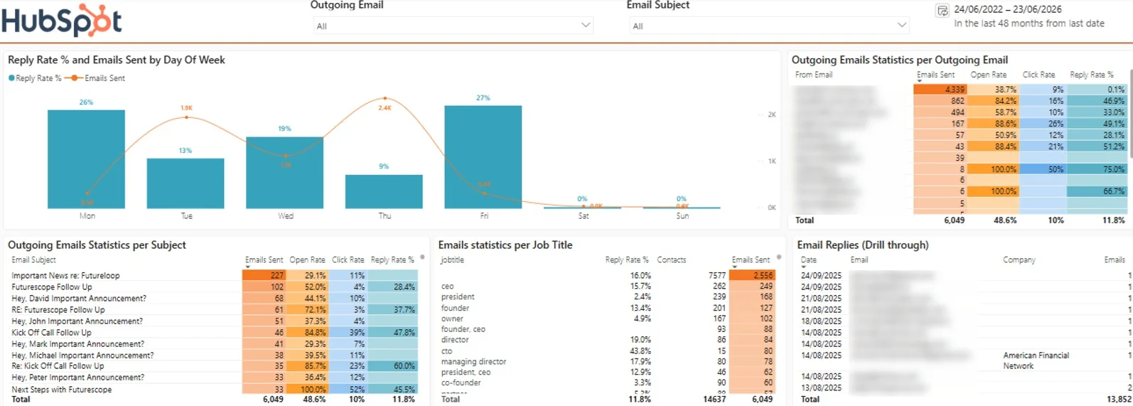
The email page shows not only how much outreach is happening, but what is actually working. It is one of the most practical ways to optimize your outbound process.
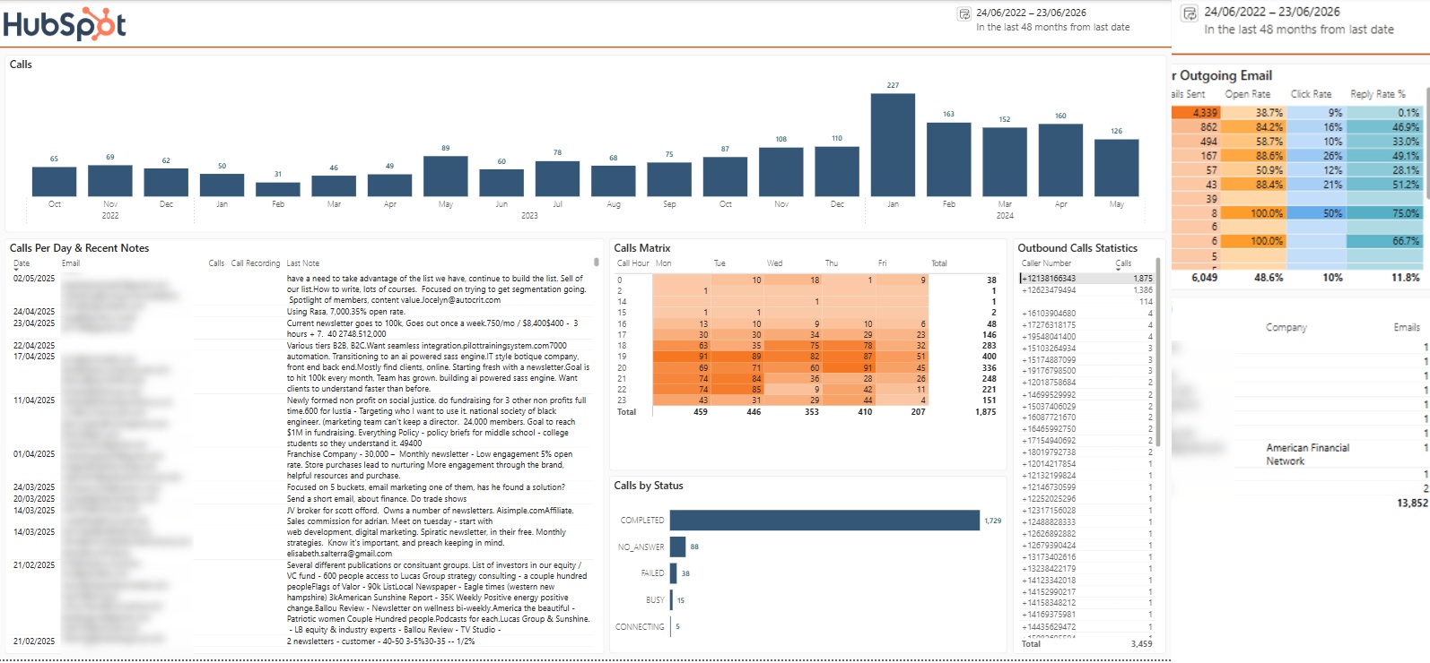
The calls section helps you assess how calling activity is being distributed and whether those calls are productive.
You can analyse:
This gives you a much clearer sense of call quality, not just call quantity.
This gives you call quality, not just call quantity. Rep comments show whether anything actually came out of each call, and call status shows whether reps are connecting with people at all. If connection rates are low, that is a signal to change your timing or targeting.
You can also drill into data for a specific caller number. That is useful when evaluating an individual rep’s performance in detail.
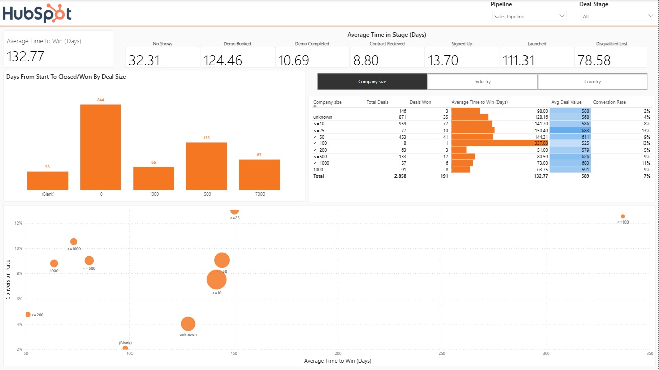
The pipeline velocity tab answers a question every sales team cares about: how can we close deals faster?
Average time to close. Select a sales pipeline from HubSpot and see the average number of days from deal creation to close. That gives you a benchmark for overall sales cycle length.
Time spent in each stage. Break the cycle down stage by stage to see where deals sit the longest. If one stage consistently takes much longer than the rest, that is where process improvement will pay off first.
Velocity by deal value. The dashboard compares deal size with average time to close. In our sample data, deals between $500 and $1,000 closed faster than deals under $500. Smaller buyers often take longer to decide, which challenges the assumption that small deals are quick wins.
Velocity by company size. The same analysis works by company headcount. In our sample, companies with 100 to 200 employees were the quickest to buy. Knowing this tells you how long to expect a deal to take the moment it enters the pipeline.
Velocity by industry and country. You can also see the average days to close for each industry and each country. Combined with conversion rates, this shows you exactly which segments to prioritise in outreach. The best targets are the ones that close fastest and convert most often, and this page makes them stand out.
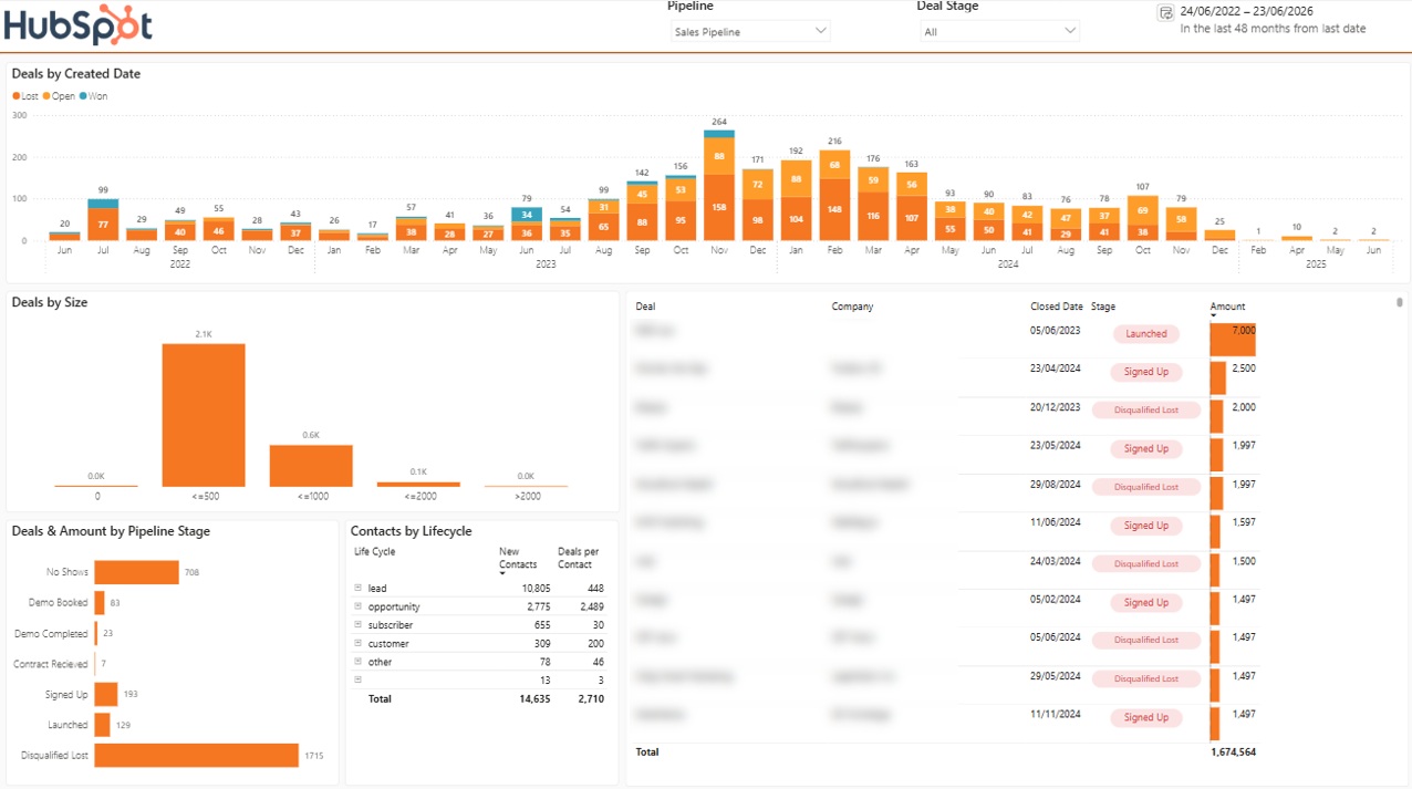
The final section gives a live view of the current pipeline.
Here you can see:
This page answers everyday management questions in seconds. How full is the pipeline, which stages are crowded, and what value is currently on the table? Because deals are grouped by created date and status, older deals that are still sitting open are easy to spot and chase.
There’s plenty of useful information in HubSpot’s built-in dashboards, but the figures can feel thin without the wider context around them. If you run a business or lead a marketing team, you often need to line up numbers from different systems before you can make a confident call. Weighing customer acquisition cost against lifetime value is a classic example, and that sum usually relies on data that sits outside HubSpot.
A few common limits are worth bearing in mind. Native reports concentrate on what happens inside your HubSpot account, so they do not sit easily alongside the spend data in your ad platforms, the revenue in your accounting system, or the usage data in your product. On top of that, custom calculations can be hard to set up, some reports only go back so far, and stitching HubSpot data together with another source is rarely a clean job.
The way around this is to bring your data from sources like Google Ads, Facebook Ads, Google Analytics, and your finance tools into a custom HubSpot dashboard. That gives you the full story behind every metric and a clear view of your funnel from first touch right through to closed revenue. Our marketing analytics consultants have done this for hundreds of companies, so reach out if you would like to talk through pulling your sources together.
The setup is straightforward and split into two main steps.
Inside the connector portal, you create an account and navigate to the HubSpot connector. From there, installation begins by automatically creating a cloud database where your HubSpot data will be stored.
This process sets up the database and creates the tables in the correct structure, ready to receive your data.
Once the database is ready, you authenticate with your HubSpot account and select the company you want to connect.
In the background, an Azure Cloud Function is deployed to handle both the initial data load and ongoing refreshes.
If your HubSpot instance contains several years of activity, the initial sync can take some time.
Most tables load fairly quickly, often within 10 to 15 minutes. The table that tends to take the longest is the emails table, because it includes the full body of the email, which means much more text has to be pulled and stored.
Because of that, a first full load can take a couple of hours. After that, refreshes are much faster.
So if the first load feels slow, that is normal. It is a one-off cost to get the full history into place.
Once the connector is installed, you can request the Power BI template. The system sends over both the template file and the connection string for the cloud database.
Inside Power BI, you simply enter:
Those details come directly from the connection string. When authenticating, use database credentials rather than Windows authentication, then enter the supplied username and password.
After that, the template connects to the database and loads the model for you.
The real value here is not just that HubSpot data lands in Power BI. It is that the data arrives in a usable structure, refreshes automatically, includes historical pipeline tracking, and comes with a dashboard that already answers the questions sales teams typically care about.
That means less time spent on setup and modelling, and more time using the data to improve outreach, prioritise better segments, and close deals faster.
For anyone serious about HubSpot reporting in Power BI, that is the difference between having data and actually having insight.


