
If you run a restaurant, you already know how the end of a busy Saturday feels. The tills reconcile, the team goes home, and you are left with a rough sense of whether the day was good or bad. A rough sense tells you nothing about which channel drove the sales, whether your staff costs quietly ate the margin, or how much of the revenue only existed because you discounted it into being. It tells you nothing about which channel drove the sales, whether your staff costs quietly ate the margin, or how much of the revenue only existed because you discounted it into being.
A restaurant KPI dashboard replaces that rough sense with actual answers. It pulls the numbers from your point of sale system, your rota, your delivery platforms and your accounting software into one screen you can check in 2 to 3 minutes rather than half a day of spreadsheet wrangling.
At Vidi Corp, our Power BI consultants have built these dashboards for independent restaurants, hotel food-and-beverage departments, and multi-site restaurant groups.
In this article, we will show you what to track, walk through real dashboards from our client projects, and explain how to build one for your own business.
A restaurant dashboard should focus on the key performance indicators (KPIs) for restaurants that support practical operating decisions: average table occupancy, table turn rate, average spend per head, delivery vs in-house sales, staff cost, food cost and discounts.
Managerial reporting helps restaurant managers, operations directors, finance teams, and area managers track performance by site, brand, channel, shift, menu category, and day of week. It helps them understand where revenue is growing, where margins are falling, and which operational issues need attention.
A useful restaurant KPI dashboard usually connects data from POS systems, booking tools, delivery platforms, staff scheduling systems, finance software, and marketing channels. This gives teams a structured view of revenue, costs, demand, and customer behaviour.
A hospitality data analytics should focus on metrics that support practical operating decisions. Common KPIs include average table occupancy, table turn rate, average customer spending, delivery vs in-house sales, staff cost, and site discount.
Covers tell you how many customers you served, and table occupancy tells you how efficiently you used the space to serve them. Occupancy is calculated as occupied tables divided by total available tables, and it becomes genuinely useful when you break it down by time of day. A restaurant that is full at 8pm and empty at 5pm has a very different problem to one that is steadily half full all evening, even if their daily covers look identical.
This measures how long a customer occupies a table on average. It sets the ceiling on how many covers you can physically serve in a day, which makes it central to any conversation about growing revenue without growing floor space. If turns are slow, the fix might be service speed, menu design or how quickly the bill lands. The dashboard will not tell you which, but it will tell you that the problem exists and how big it is.
Formula: covers served ÷ number of tables, per service period.
Your revenue divided by your covers. This is the KPI that tells you whether your upselling actually works and whether menu changes moved the needle. It is also the honest counterweight to covers. A busy week with a falling spend per head can easily earn less than a quieter week where each guest spent more.
Formula: total revenue ÷ total covers.
Labour is usually the highest controllable cost in a restaurant, and it behaves badly when nobody watches it. Tracking staff cost as a percentage of revenue by day, by shift and even by hour shows you where the rota and the demand have drifted apart.
Staff turnover belongs next to the rota numbers. Hospitality replaces people at a rate most industries would treat as an emergency, and every replacement costs real money in recruiting and training before the new starter earns their keep. Tracking turnover by site and by manager alongside staff cost shows you whether a cheap rota is quietly becoming an expensive one.
Formula: (labour cost ÷ revenue) × 100.
The percentage of your sales coming through delivery platforms versus your own dining room. Delivery revenue is not the same quality as in-house revenue once commissions are taken out, so knowing this split is essential before you celebrate a strong sales month that was quietly built on 30 per cent commission orders.
Formula: (delivery revenue ÷ total revenue) × 100
Total discounts, split between internal discounts such as staff meals and external discounts to customers. Discounts are the easiest way to manufacture sales figures that look healthy and are not, which is why this number deserves its own place on the dashboard rather than being buried inside net revenue.
Formula: (total discounts ÷ gross sales) × 100
Food cost percentage is your cost of goods sold divided by the food revenue those goods produced: (COGS ÷ food revenue) × 100. Most full-service restaurants aim to keep it between 28 and 35 per cent, though the right number depends on your concept. A steakhouse lives with a higher food cost than a pasta restaurant and earns it back on the average check.
Add labour to your COGS, and you get prime cost, the single number that decides whether a restaurant makes money. As a rule of thumb, prime cost under 60 per cent of revenue leaves room for rent, overheads and profit. Anything approaching 65 per cent means one of the two components needs attention.
Gross profit margin is revenue minus COGS, as a percentage of revenue. Net profit margin subtracts labour and overheads too, and for most restaurants it lands somewhere between 3 and 9 per cent. That narrow band is exactly why every other KPI on this list matters: there is very little room between a good month and a loss.
Break-even is the revenue that covers your total costs: fixed costs ÷ (1 − variable costs as a share of revenue). Put it on the dashboard as a line your daily revenue either clears or does not. A manager who can see that Tuesday closed short of break-even treats Wednesday differently. In the Group Overview dashboard below, this is what margin by brand and by site is really tracking.
Not every KPI comes out of the till. Review scores from Google and Tripadvisor, CSAT survey results and complaint counts tell you how the revenue felt to the people who paid it. The reason to put them on the same screen as sales is correlation: when a site’s review average dips in the same week its table turns speed up, you have probably found your cause. A rolling average of review scores per site, next to complaint counts by category, is enough to catch a service problem while it is still a training problem rather than a reputation problem.
| KPI | Typical healthy range | Worth investigating when |
| Food cost percentage | 28 to 35% of food revenue | Above 35% |
| Staff cost percentage | 25 to 35% of revenue | Above 35%, or swinging by shift |
| Prime cost | Under 60% of revenue | Approaching 65% |
| Net profit margin | 3 to 9% | Below 3% |
| Table turn time | 45 to 75 minutes (casual dining) | Creeping up with no change in menu |
| Peak table occupancy | 80 to 90% at peak | High peaks with empty shoulders |
| Discounts | 2 to 5% of gross sales | Any site well above the group average |
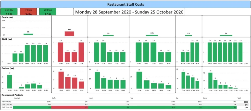
A staff cost dashboard is used by restaurant managers, F&B directors, hotel operators, and finance teams. It helps them compare labour cost against revenue by service period, outlet, site, and hour of day.
A hotel our data analytics consultants worked with wanted to know what it really cost them in staff to serve breakfast, coffee, lunch and dinner. When we broke staff cost down as a percentage of revenue for each meal period, coffee came out as the most expensive service by some distance.
The ticket sizes are small, so even light staffing swallows a big share of the takings. It also turned out 2 people were rostered onto coffee at hours when there was barely enough work for one. We then compared hourly order volumes against the number of staff on shift, which showed the managers whether their part-time rotas were built around real demand or just routine.
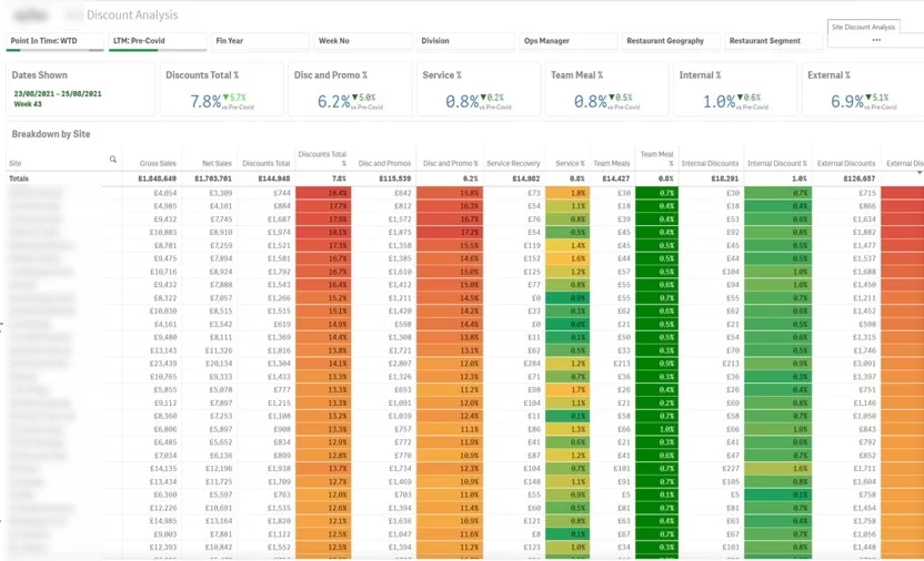
Discounts are one of those costs that never feel like costs. A free staff meal here, a loyalty offer there, and nobody’s watching the total. This dashboard changed that for one restaurant manager we worked with. It shows exactly how much each site is giving away, and just as importantly, what those discounts are made of, whether that’s free meals for staff or offers handed out to customers.
The site-level breakdown is where it earns its keep. When you can see every restaurant in the chain side by side, it becomes obvious which ones are genuinely selling and which ones are quietly discounting their way to a decent-looking sales figure.
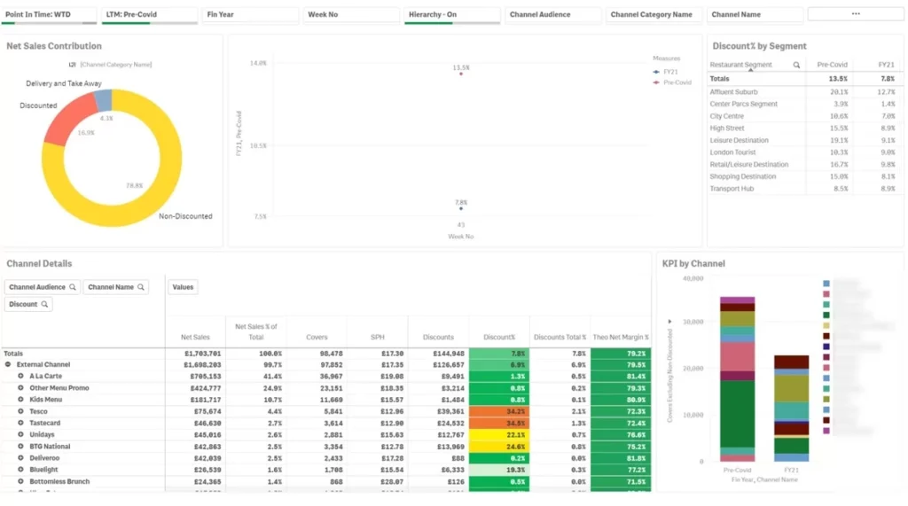
A channel overview dashboard is used by restaurant groups, commercial managers, operations teams, and finance teams. It shows which channels generate sales and how each channel affects discounts, margins, and site performance.
Not all sales are earned the same way, which is why it’s worth knowing exactly which channels bring in your revenue and what it costs to win it. For one client, the numbers told a clear story. À la carte, the kids menu and Deliveroo orders came in at full price, no discounting needed. Unidays and Testcard sales, on the other hand, barely existed without a discount attached. Same revenue line, very different quality of revenue.
The same pattern shows up whatever the platforms are called. For a US operator, swap in DoorDash, Uber Eats and Grubhub orders against student-discount and voucher channels, and the question stays identical: which revenue arrives at full price, and which has to be bought.
We ran the same lens across locations too, comparing sales and discounts site by site. That view fed straight into the bigger decisions, because when you’re choosing where to open next, you want to copy the sites that sell at full price, not the ones propped up by offers.
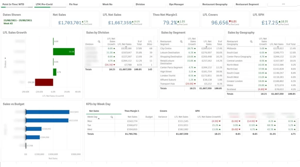
Before this operations dashboard existed, the group’s ops team started every week buried in a stack of separate reports, one per brand, each built slightly differently. Now sales, margins, covers and spend per head sit in one view for ops, finance and senior leadership, sliced by brand, by region and by day of the week, finally speaking the same language.
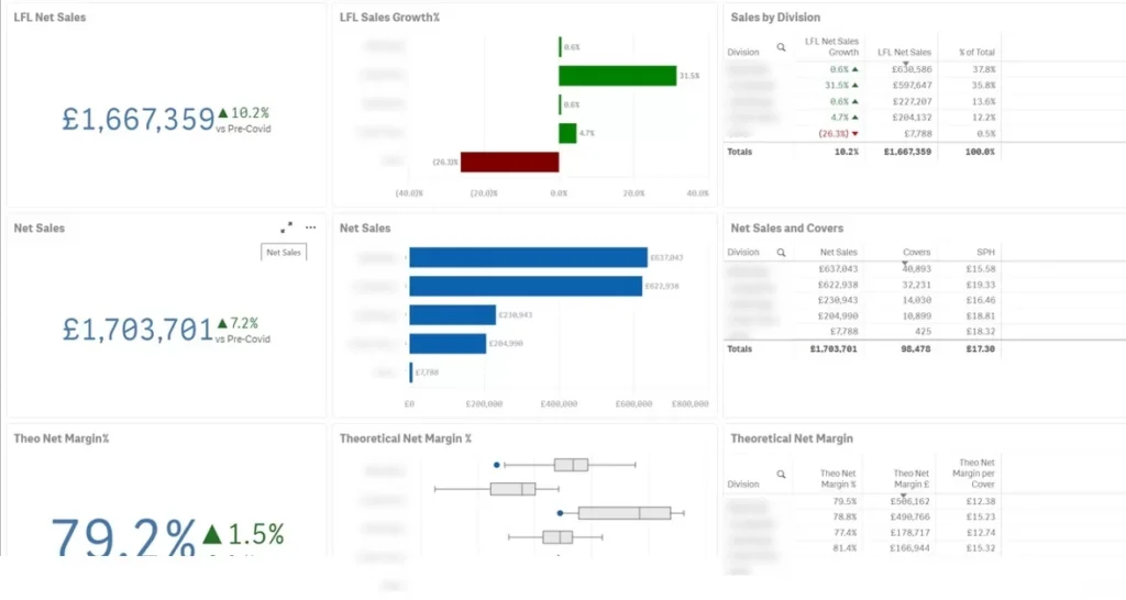
There’s a particular kind of frustration in finding out on Friday that Tuesday went badly. That was the reality for these restaurant managers, who used to wait days for their weekly sales updates. Now the management dashboard shows everything lands in a single snapshot: sales, margins, covers, and spend per head across every brand. The difference isn’t really the reporting; it’s the timing.
When you spot a soft Tuesday on Wednesday morning, you can still do something about the rest of the week. Managers here now make those calls midweek, catching dips while they’re still small instead of reading about them after they’ve snowballed. This can also make monthly reporting seamless for the management team.
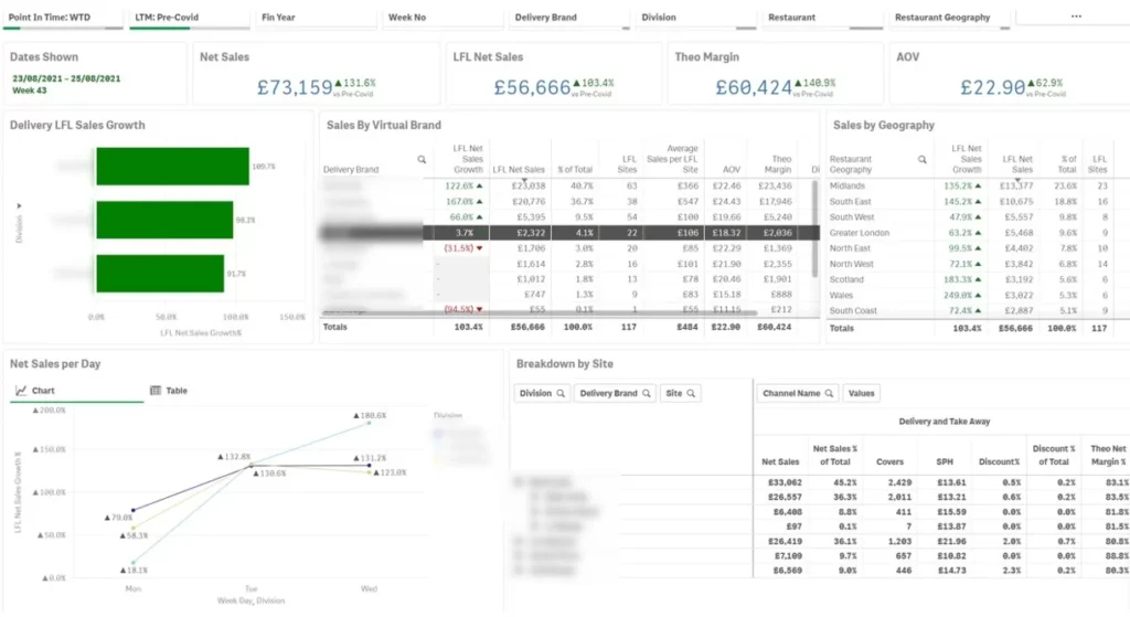
Delivery is often the least understood part of a restaurant business. The orders come in, the money arrives, but the detail lives inside each platform’s own portal, and nobody has time to stitch it together. This dashboard fixed that for the group. For the first time they could see the whole delivery operation in one place: sales, margins and average order value, broken down by brand, by geography and by site. It turned delivery strategy from educated guessing into decisions backed by their own numbers.
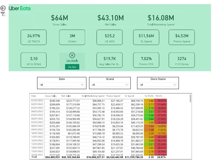
This report analyses the performance of two major food delivery platforms, DoorDash and Uber Eats to help understand sales, order trends, customer behaviour, and operational performance. Each dashboard is broken down below for clarity.

This dashboard shows an overall picture of how the business is doing on these platforms. It shows total sales and marketing spend for Uber Eats and DoorDash


This dashboard helps spot trends over time, like whether sales are going up or down.
It shows:

This report analyses how much was spent on promotions via Uber Eats from January to December 2022, with a comparison to January 2023. The goal is to understand:
This helps optimise staffing, operations, and promotional timing.

This dashboard visualises sales performance and marketing efficiency over 13 months, highlighting volatility in spend and declining sales.

A restaurant KPI dashboard that follows BI best practices gives managers one place to review performance across revenue, staffing, discounts, delivery, and margins. This is achieved by connecting key systems and refreshing the data automatically, so teams can act during the week instead of waiting for static reports.
For one Vidi Corp client, automated real-time analytics reduced report generation time from 48 hours to under 5 minutes. The same project enabled daily dashboards instead of weekly or monthly reports and helped cut executive review cycles by 2 business days per week.
A restaurant KPI dashboard helps teams protect margin by showing the relationship between sales, labour, discounts, and channel performance. This is achieved by tracking staff cost as a percentage of revenue, discount cost by site, margin by brand, and delivery performance by platform.
For Galeta Bakery, Vidi Corp created financial analytics dashboards from Sage data. The reports helped the team determine customer profitability, highlight the most profitable accounts to the sales team, and track key business metrics every day.
A restaurant KPI dashboard reduces reporting workload by replacing recurring spreadsheet preparation with automated dashboards. This is achieved by extracting data from source systems, cleaning it, modelling KPIs, and presenting the results in Power BI, Tableau, or Looker Studio.
For a Vidi Corp dashboard client, automated data feeds and streamlined dashboards reduced report preparation time by more than 50%. The client also reported better data accuracy and faster leadership decisions from having real-time insights in one view.
Restaurant dashboard data comes from the tools you already run. The sources that matter most are POS data, staff schedules, delivery platform reports and finance software, with booking systems, guest feedback platforms, CRM and marketing channels adding depth.
Together they show how demand, cost, channel mix and customer behaviour affect profitability. The dashboard becomes genuinely useful when these sources are connected into one reporting model, so teams can drill down from a headline KPI to the specific site, shift, channel or menu category behind it.
The three tools we see most often in hospitality are Power BI, Tableau and Looker Studio, and each has a genuine case for and against.
| Tool | Best For | Ideal Fit |
|---|---|---|
| Power BI | Restaurant groups already using Microsoft tools that need clean reporting for internal teams | Operations, finance, and leadership dashboards |
| Tableau | Groups that need more advanced visual design and deeper data exploration | Larger businesses with complex reporting needs |
| Looker Studio | Lighter reporting needs, especially when data sits in Google Sheets, Google Ads, GA4, or other Google tools | Smaller teams working within the Google ecosystem |
We have delivered over 1,000 data and reporting projects for more than 600 clients, including Google, American Express and the Ministry of Defence, and restaurant and hospitality reporting is one of the areas we return to again and again. The process is deliberately simple. A standard hospitality business intelligence starts with the questions, not the data. Write down the 5 to 10 decisions you make regularly, such as how to set next week’s rota, whether a promotion earned its keep, or which site needs attention.
We start with a short call to understand how your business actually runs: how many sites, which POS, how you schedule staff, and which numbers you argue about in the weekly trading meeting. From that, we agree a specific KPI list for your dashboard, not a generic template. If labour percentage is your pain point, that leads. If it is delivery commission, that leads instead. This call also surfaces the awkward realities early, like a legacy till at one site or a rota system with no export, so nothing derails the build later.
Next we connect the systems that hold your numbers: your POS, your rota or payroll system, your delivery platforms and, where useful, your accounts package. Wherever a system offers an API, we use it, so data flows automatically rather than through manual exports. We have data connectors to extract your data from the sources.
With the data flowing, we build a proper data model first: sites, dates, channels and like for like logic all defined once, so every page of the dashboard agrees with every other page. Then we design the dashboard itself, front page KPIs for a thirty-second read, drill downs for the detail. A dashboard that looks good but calculates like-for-like wrongly gets ignored within a month, so the model is where we spend the care.
We walk the first version through with you and, ideally, one or two of the managers who will live in it. They always spot things we cannot: a discount code that means something specific, a daypart boundary that does not match how you trade. We refine until the dashboard answers questions in the words your team uses. The goal is not delivery, it is adoption.
Once the dashboard is signed off, we set up scheduled refresh so the numbers update themselves every day, usually overnight so yesterday’s trading is waiting with the morning coffee. We also add refresh monitoring, so if a source fails you find out from an alert rather than from a suspiciously quiet chart.
Finally, we hand over documentation covering the data model, the connections and the refresh setup, so you are never locked in to us. Plenty of clients keep us on for ongoing changes and new reports, but that is a choice, not a dependency. You own the dashboard, the model and the know-how.
A restaurant KPI dashboard will not run your restaurant for you, but it removes the fog. It tells you which sites lean on discounts, which hours are overstaffed, which channels bring profitable sales and which merely bring busy ones. Everything in this article came from real projects, and in every one of them the most valuable insight was something the client did not know to look for.
If you would like a dashboard like the ones shown above built on your own data, our team at Vidi Corp has done this for restaurants, hotel food and beverage departments and multi-site groups. Get in touch, and we will show you what your numbers have been trying to tell you.
The core set is covers, table occupancy, table turn rate, average spend per head, gross margin, staff cost as a percentage of revenue, the split between delivery and in-house sales, and total discounts given. Most restaurants are better served by tracking these 8 well than by tracking 30 superficially.
For most restaurants, Power BI offers the best balance of cost, connectivity and capability. Looker Studio suits simple, Google-centric setups on a zero budget, while Tableau suits groups with an analyst and a need for deeper visual exploration.
It depends almost entirely on how many systems need connecting and how messy the data is. A single-site dashboard fed by one POS is a small project. A multi-brand group pulling in POS, rota, three delivery platforms and accounting data is a larger one. The software itself is rarely the main cost.
Yes. DoorDash, Uber Eats, Grubhub and Deliveroo all provide order-level reporting through their merchant portals, either as scheduled exports or through an API. We connect those feeds into Power BI alongside your POS data, so delivery sales, commissions and average order value sit in the same view as your in-house numbers instead of living in four separate portals. That is exactly what the delivery analysis dashboard above was built from.
It is a rough budgeting guide: about 30 per cent of revenue goes to food costs, 30 per cent to labour, 30 per cent to overheads, and whatever remains, roughly 10 per cent, is profit. Real restaurants rarely split this neatly, and that is the point of tracking the actual percentages on a dashboard. The rule is a sanity check, not a target: if any of the three thirds is running well past 30, you know where to look first.


