

Operations dashboard gives you a glimpse of how businesses really tap into their operational data to track their daily performance. It all starts with collecting data from all the usual suspects – your ERPs, warehouse systems, Customer Relationship Management tools, helpdesk software, and even workforce management platforms. That data gets tidied up and slotted into one central view that shows you everything at a glance. This makes it a breeze for managers to keep tabs on workloads, bottle-necks, service levels and basically how well everything is running.
As a business intelligence consultancy, we’ve had the chance to work with 1,000+ businesses across all sorts of industries – manufacturing, warehousing, healthcare, customer service, supply chains and IT. What we’ve seen is that operations dashboards give teams a super-efficient way to bring together their operational data, automate reporting and keep an eye on the key metrics that inform their day-to-day decisions.
This article will give you the lowdown on what an operations dashboard actually is – and how it differs from the other two types of dashboards that are out there (strategic and analytical). We’ll also be looking at some of the key features you should expect to see, some real-world examples of how operations dashboards are being used out there, the kinds of benefits you can expect to get from one, and our top tips for building a dashboard that really delivers.
An operations dashboard is basically a management tool that lets you keep an eye on how your business is performing from day to day. It takes a bunch of essential metrics from operations and rolls them into one easy to read view, so your team can see what’s going on with your workload, where things might be getting clogged up, and be able to jump on any problems before they start impacting customers or your business in general.
Operations dashboards get used all over the place – Manufacturing, Warehousing, Customer Service, Healthcare, and IT are just a few examples. The specific numbers you end up tracking will depend on what your business does, but some common metrics include how many orders are building up, how much inventory you’ve got on hand, how many tickets or calls you’re getting, how much of your staff is actually putting in work, how well you’re doing with deliveries, or what kind of service you’re providing to your customers.
The main point of an operations dashboard is to help you run your business better. By giving you a real-time look at what’s going on with your most important processes, you can then use that information to make better use of your resources, decide what needs to get done now and what can wait, and just make decisions about operations generally a lot quicker.
| Dashboard Type | Primary Users | Purpose |
| Operational Dashboard | Managers, Team Leaders | Monitor daily operations |
| Strategic Dashboard | Executives, Directors | Track long-term goals |
| Analytical Dashboard | Analysts, Managers | Investigate trends and root causes |
Operational dashboards are all about keeping an eye on how the business is running day to day. Managers and team leaders use them to see how things are going right now, spot any problems that are holding things back, and address any issues as soon as they pop up. They usually give an up-to-the-minute picture of the business via real-time or near-real time metrics like how much stock you’ve got in, how many orders are backed up, the number of support tickets coming in, how you’re using your staff, and how long customers are waiting.
Strategic dashboards give the big picture view of how the business is doing for the top brass – the execs and the senior leadership team. They tend to focus on the long-term plan and the things that are important for success – like making money, keeping customers, and getting a bigger slice of the market. Rather than trying to make decisions on the fly, strategic dashboards help those in charge figure out if the business is heading in the right direction.
Analytical dashboards are really for people who like to dig into the numbers and figure out what’s really going on. They let you look back into the past, spot patterns that may have passed you by and work out what’s behind changes in how the business is doing. Data analysts and business analysts will often use them to get answers to specific questions and to make better decisions.
Real-Time Data – and We Mean Real-Time: You need to be able to glance at your dashboard and see what’s going on right now – not 15 minutes ago or 24 hours ago. So, managers can spot problems as they come up and fix them before they cause any damage.
KPIs that Count: The dashboard should only be showing you the things that really matter – the kind of metrics that’ll actually help you make decisions. That typically includes things like stock levels, orders waiting to be processed, how many staff are working, how many tickets are getting dealt with, service levels, and how well you’re delivering on your promises.
Warnings and Red Flags: A good operational dashboard should also be able to tell you when things are going off the rails. The sort of alerts, colours and thresholds that change when something gets out of whack all help you see straight away when there’s a problem that needs sorting.
Digging In: Users should be able to take a high-level look at the key numbers and then drill down to see the tiny details that are driving those numbers. That way they can really get to the heart of the problem and figure out what on earth’s going on.
Build it Around the Business, Not Just the Data: Operational dashboards need to be put together with the business in mind – not just the departments and data sources. So you see where the work is flowing smoothly and where it’s getting stuck, and where you need to step in and help.
Operations Dashboards vary in how they’re structured but the end goal is the same – to support a specific business process. Some are heavily focused on production and stock levels, while others help teams keep tabs on staffing numbers, customer service numbers or more technical systems like IT. Below are a few operational dashboards in the real world which have helped to boost efficiency, make more informed resource decisions and catch any problems before they start to cause real issues for a business.
A manufacturing operations dashboard is the tool that lets ops managers and production teams keep an eye on all the key metrics – order backlog, sales demand, and how we’re doing on delivering on time. What it really does is give those folks a window into where things are getting bottlenecked in production and what might throw a spanner in the works when it comes to customer deliveries.

Our Power BI consultants built this dashboard for a company that makes parts for trains and commercial vehicles, and it really drills down into backlog trends – by month, by customer, by product – compares that to their average sales, and tries to identify the root cause of all those delayed deliveries.
Building this type of manufacturing dashboard often requires data from multiple production, sales, and ERP systems. Our data integration consulting services help businesses consolidate operational data into a single dashboard.
For management, the big advantage is being able to figure out where to put their efforts on getting that backlog down and improving the production planning. When you break it down to the level of individual customers, it highlights who needs some help right now – and at the product level, you can make much more accurate promises to customers about delivery and make sure everyone has the resources they need to actually deliver on that.
A warehouse operations dashboard is a tool that lets warehouse managers keep track of how much space is being used for storing goods, when deliveries are coming in and where those deliveries are being put away. It gives managers a clear idea of just how well the warehouse is being used and points out any snags in the operation that might cause stock to be missing when it’s needed.

This dashboard was built by our business intelligence consultants for a warehouse that handles distribution. It looks at how much of the warehouse is actually in use – whether it’s in the big storage areas or the smaller ones – it keeps an eye on the pallets that are waiting to be put away and it tracks the stock that’s currently assigned to forklifts. With this info, managers can spot which storage areas are full and which ones are empty, see which pallets have still got to be put away and figure out where specific items are on each forklift.
This type of reporting is most effective when inventory and warehouse data are stored in a centralised reporting environment supported by Data Warehouse Consulting Services.
The dashboard helps the warehouse team get their priorities straight and run the warehouse a lot more smoothly. By spotting which deliveries haven’t been processed yet and which stock is still waiting to be put away, managers can use their resources a lot more effectively and prevent delays from happening in the first place.
An inventory planning and operations team’s best friend is a supply chain operations dashboard – one that gives ’em a clear view of how much stock they’ve got on hand and when they need to restock on their products. It gives real visibility into the state of their inventory health and flags up any products that are running worryingly low.
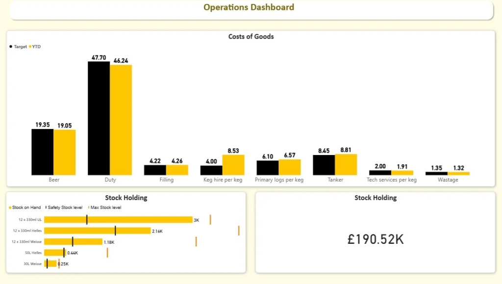
Our team created this dashboard that visualises what’s currently in stock, how much safety stock they should have and the absolute max they can reasonably hold for each product. And then, with a bit of automated magic, it pinpoints which products are crying out for more stock and which ones are over-accumulating and could be safely chucked back to bring in some extra cash.
It helps the operations team keep the products on the shelves without over-accumulating too much stock in the process – a delicate balance that’s got to be just right. By keeping tabs on their inventory thresholds in real-time though, businesses can get their replenishment planning sorted out, cut down on those panicked emergency restocking orders and make better use of all that cash tied up in stock.
A healthcare operations dashboard is a game changer for hospitals and care facilities – it lets them keep tabs on how their staff are doing, how many patients they’re seeing, and the costs of running the show all at the same time. Operations managers use these dashboards to work out why they’re running short on staff, sort out their workforce planning, and basically keep the patients safe.
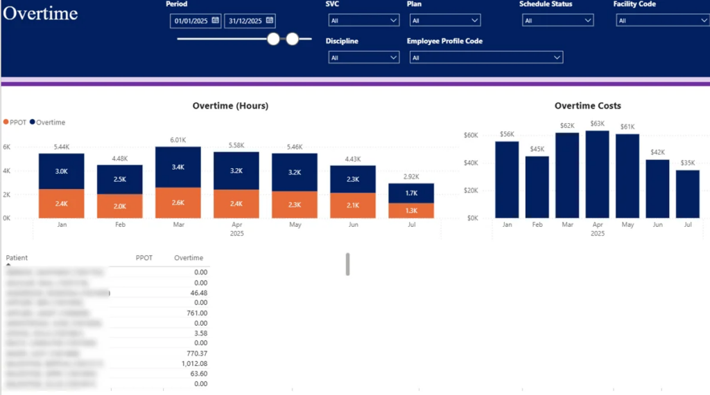
This dashboard digs deep into overtime costs month by month and tells you just how much of that is coming from patients and how much from the hospital itself. And – and this is a big benefit – it gives you a really detailed look at who’s using up all the overtime – which patients, which cases, which assignments are causing the most hassle. You can also use it to filter the results by which department, which specialty, and who the employee is.
The upshot is that healthcare organisations can keep their labour costs under control without having to sacrifice the level of care they’re giving to patients. By figuring out what’s driving the overtime, management can do a better job of juggling workloads, planning the right staff levels, and keeping an eye on just how stressed things are getting – right now.
A customer service operations dashboard – that’s the key for contact centre managers to keep tabs on how their service level is doing, how their agents are performing, how many calls are coming in, and how long people are waiting around for a response. It gives them a clear view of how customer service is running and lets them figure out where things might be falling apart, and how that’s going to affect the customer.
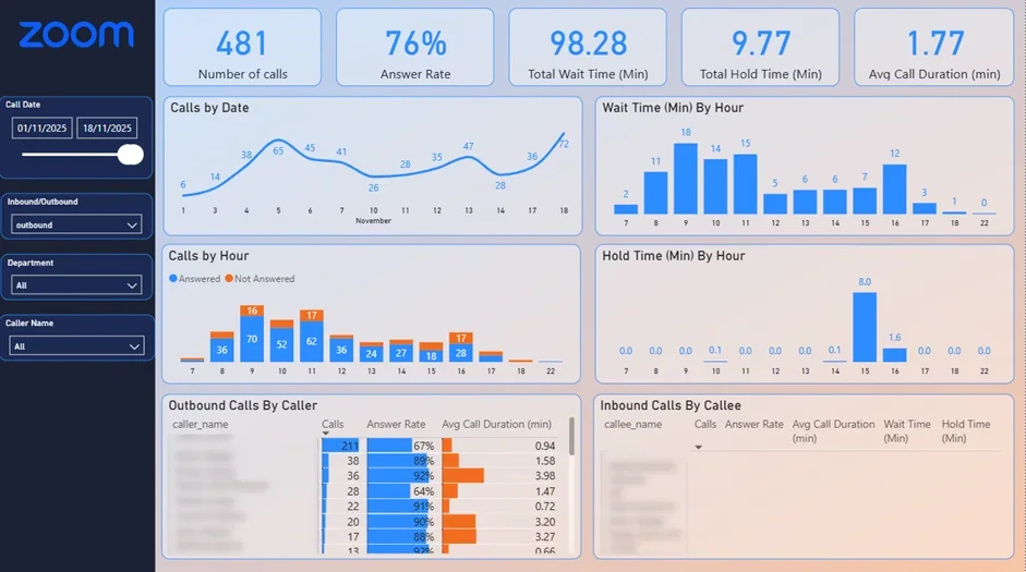
This dashboard digs into the details of all the incoming calls, by the hour and by each agent. It tracks the ones that don’t get answered, how often people pick up, how long people are waiting and the total number of calls coming through, so you can spot when things are getting really busy and where you might be getting stuck. Managers can see when calls are getting missed, take a closer look at how each individual agent is doing, and get a grip on how long people are waiting in the queue across the whole contact centre.
The dashboard helps customer service teams make sure they are doing a better job of serving customers and getting the right resources in the right place. By spotting when things are getting really busy and where it’s taking longer to respond, managers can start adjusting their staffing, tweak the call routing system and cut down on people hanging up because they don’t get an answer.
An IT ops dashboard (or IT operations dashboard) is the go-to tool for IT leaders and service desk managers to keep a bird’s eye view on ticket numbers, service performance, support workloads and the whole shebang – operational stability. It gives you a clear view into support operations and lets you and your teams pick up on trends that might have an impact on service quality or resource needs.

This dashboard shows ticket activity across service requests, incidents and problems – it’s not just a numbers game, it’s also got trend analysis and written commentary to help you make sense of changes in ticket numbers and support demand.
The dashboard’s purpose is to help IT teams spot potential workload crunches and get a handle on the overall health of support ops. By keeping a close eye on changes in ticket trends and incident volumes, managers are better placed to allocate resources smartly, get on top of emerging issues early, and give stakeholders a clear and transparent view of how things are running.
Operational problems usually don’t come out of the blue. Delays in getting orders out, stockroom shortages, staffing headaches and a decline in service levels – all these have a telltale sign in the data long before they start causing real business headaches. An operations dashboard is there to help your managers pick up on these issues early on, and do something about it before it’s too late and the customers or the business suffer.
Operations dashboards do a lot more than just spot problems though. By giving your managers a clear view of where workloads are at, how much stock is on hand, how your staff are being used and how much operational capacity you’ve got, they can send resources where they are needed most – and that saves a lot of inefficiency and keeps teams performing consistently.
You also get quicker decision-making out of the deal. No more poring over spreadsheets and reports that were cobbled together by hand – managers can just go to one place and find all the operational metrics they need. That makes it a heck of a lot easier to measure performance, figure out what priorities are and get on top of changing business situations fast. Many organisations achieve this through our Business Intelligence as a Service offering, which provides ongoing dashboard development, reporting, and analytics support.
As your organisation grows, running the day-to-day operations gets a whole lot trickier. An operations dashboard gives you a clear view of what’s going on, to help you improve efficiency, make people more accountable, and keep a better grip on what’s going on in your business.
Start with the problem you want to actually crack: The best operations dashboards are only as good as the problem they’re trying to solve. So you need to start with a clear business goal in mind – whether that’s getting orders out the door on time, or getting the right people in the right place. It’s probably something like that. Whatever it is, the dashboard should be built to help the people making the decisions get the answers they need.
Focus on the key metrics that really matter: Resist the temptation to cram every single metric you can get your hands on into the dashboard – that just makes it a whole lot harder for people to use it. Instead, pick the key performance indicators that have a real impact on the way the operation runs, and that will actually help teams take some action. Working with dashboard development services specialists can help ensure the dashboard is aligned with operational goals and business processes from the outset.
Make it easy for people to get to the bottom of things: A good operational dashboard should be more than just a list of problems – it should be a tool that lets people dig into the data, apply some filters, and get to the nitty gritty of what’s going wrong. That way, they can figure out what’s causing the problems and where they need to take corrective action.
Design it for the people who are actually going to use it: A good dashboard should feel like it’s been made for the people who are going to be using it – not just some dry, generic thing that will confuse them. Make sure it’s got the kind of information and visuals that the operations managers are actually going to need, and lay it out in a way that makes sense to them.
Expect it to be a work in progress: The truth is, your business – and your operation – are going to change over time. You’ll get new systems, new priorities, new processes. So your dashboard needs to be something you can get on with and improve as need be. You need to be prepared to go back in and tweak it, add new bits, and generally keep it fresh so it stays useful.
Managing a business with more than one location can be a real headache. Compared to a single site, you’ve got different teams, systems and processes all juggling around each other – and let’s be honest, it can make keeping everything running the same way and knowing when something’s about to go pear-shaped a real challenge.
Visibility is one of the biggest problems people run into – trying to see the big picture when you’ve got all those different locations can be tough. Without a central hub of operational data, managers find themselves struggling to make comparisons, keep an eye on how well things are running and spot areas that might require additional attention before they affect the customers. Having an ops dashboard in place does a lot to change that – by bringing all the key info together in one place, it makes spotting where things are going right (or wrong) a lot easier.
Data consistency is another one of those common pain points. Where one location might be using one process, definition or reporting method, another might be using a completely different one. All of which makes it hard to get a clear picture of how things are really going – and so standardising those dashboards helps make sure everyone’s on the same page, working to the same key performance indicators and reporting framework.
And then of course there’s the accountability angle. With an ops dashboard, you get easily see how each location is performing and identify the ones that are really doing it right – or the ones that need a bit of extra love. It makes it a lot easier to pass on best practice to other locations in the business.
What is the best dashboard platform ? Well – it all comes down to what you need to report on, where your data is coming from and who is actually going to use it. What works great for getting data to the exec team isn’t going to cut it for operational reporting where people need to be able to get to the facts in real-time , break down the detail and keep an eye on performance at all hours.
When you are evaluating dashboard platforms – dont forget to think about how easily they can connect to the systems you already use. Most operational dashboards have to draw data from loads of different places – like ERPs , CRMs , warehouse systems , HR platforms , helpdesk tools and databases . If the platform you pick can talk easily to all these systems then you can avoid a whole lot of messing around with manual reports – and make sure your data is in good shape.
You might find Power BI , Tableau and Looker Studio are among the most commonly used dashboard platforms out there. Power BI is pretty widely used for operational reporting because it works so well with Microsoft , scales really well and has some serious data modelling chops. Tableau is known for making really pretty visualisations and letting users ask some really clever questions of their data. Meanwhile Looker Studio is a lightweight reporting tool that is easy to get going and works particularly well if you are already using some Google stuff.
Other practical things you should think about are how often you need to refresh the data , how secure the platform is , who gets to see what and how they get to see it , whether it works on a mobile, and how easy it is to use. The best platform for you isn’t necessarily the one with the most bells and whistles – it is the one that meets your specific needs and makes a real difference to how you run your business.
Before you make a decision – take some time to actually work out what your goals are, your reporting workflows, your user groups and what data you actually need to get your hands on. That way you can pick a platform that actually fits the way your organisation works – and sets you up well for all the reporting you are going to be doing in the future.
Whether you’re trying to get a better handle on what’s going on in the factory, warehouse, customer service department, hospital, supply chain or IT operations – the right dashboard can be a game-changer for your team. By pulling all those disparate pieces of operational data into one simple place, businesses can spot problems sooner, make better use of their resources and keep things running a whole lot smoother from day to day.
If you’re actually in the market for a custom operations dashboard, get in touch with us to run the numbers and talk about what you’re hoping to achieve!


