
An IT operations dashboard is the fastest way to get a clear picture of how your IT function is really performing. By gathering data from your service desk, ticketing systems, monitoring tools and compliance processes in one place, IT teams and their leaders can see ticket volumes, incidents, resolution times and control execution in front of them – no more digging through databases and spreadsheets to piece it together.
At Vidi Corp, we’ve built more than 1,000 business intelligence solutions for organizations across many different industries, including custom Power BI dashboards for IT departments that need to track service desk activity, incident trends and security controls. We build reporting solutions that bring together data from ticketing platforms and every other business system, helping IT leaders automate their reporting and get real answers from the operational data they rely on.
In this guide we’ll cover what an IT operations dashboard is, walk through 5 real examples of dashboards we’ve built (with the metrics behind each one), cover the essential IT operations KPIs worth tracking, and show you how to build your own Power BI dashboard in practice.
An IT operations dashboard is a single reporting view that consolidates data from service desk systems, infrastructure monitoring tools, cloud environments and security systems. IT teams use it to track system health, monitor support performance, spot operational problems early and make better-informed decisions faster.
It isn’t like a dashboard that focuses on one part of the business, such as a standalone ticket-management or cybersecurity view. An IT operations dashboard gives you the bigger picture of how your entire IT function is performing. It brings together operational key performance indicators from many different systems, giving your organization a much clearer view of how well your technology, support teams and infrastructure are working together.
Exactly which metrics you’ll find on an IT dashboard depends on the organization, but you’ll typically see areas such as service desk performance, infrastructure availability, security and compliance posture, cloud spend and how much your systems are being used. With automatic refreshes throughout the day, they keep the IT team up to date with current data without any manual reporting.
Modern IT departments have far more on their plate than solving support tickets – they’re managing infrastructure, cloud platforms, cybersecurity and compliance, software and end-user support, all of it spread across different systems that don’t really talk to each other. That makes getting a complete picture of how IT is doing genuinely difficult.
An IT operations dashboard takes the data from service desk software, monitoring tools, cloud services and security systems and stitches it together, giving IT teams a single view of service performance, infrastructure health and the risks on their watch. Instead of jumping between applications or manually combining spreadsheets, teams can spot issues sooner, get a clearer sense of what needs to happen next and take action before a small problem becomes a major outage.
For IT leaders, a dashboard also makes reporting far easier. It gives you a clear view of how things are performing, surfaces long-term trends and makes conversations with senior management straightforward – using real, up-to-date information rather than something cobbled together from scratch.
“IT operations dashboard” is something of a catch-all. In our experience, IT teams rarely build one dashboard that does everything – they build a handful, each aimed at a different audience and a different question. Which ones you need comes down to how your IT function is set up, but they tend to fall into four groups.
Ticketing & Service Desk Dashboards
These are the ones almost every IT team starts with. A service desk dashboard answers the everyday question – is the support team keeping up? – by tracking the flow of work through the service desk and how satisfied users are with the outcome. You’ll usually find ticket counts broken down by status and type here, alongside resolution times and, where teams collect it, a satisfaction score from users after a ticket closes. The audience is the service desk manager and their team leads.
Systems & Infrastructure Health Dashboards
Where the ticketing view is about people and requests, this one is about the machines underneath. It watches the availability and performance of servers, networks and core systems so the ops team can see trouble building before users start logging tickets about it. Uptime is the headline figure, usually sitting next to how hard the hardware is being pushed (CPU, memory, storage) and how the network is holding up (bandwidth, latency, dropped packets). This is the infrastructure team’s real-time early-warning screen.
Security & Compliance Dashboards
This group exists to answer a nervier set of questions – where are we exposed, and can we prove we’re on top of it? It pulls together the security team’s picture of open vulnerabilities and threat levels, whether systems have been patched, whether backups are completing, and whether the scheduled security controls are being carried out on time. Two audiences use it: the security team day to day, and auditors or the board when they want evidence.
Cost & Cloud Spend Dashboards
The newest of the four, and increasingly important now that so much infrastructure is rented by the hour rather than bought outright. This dashboard keeps IT spending honest – tracking what’s being spent on cloud services like Azure or AWS, how that compares to what was budgeted, and what IT costs per user once everything’s totaled up. Finance and IT leadership are the audience, usually in the same budget conversation.
Below are real IT operations dashboards our team has built, each covering a different part of running an IT organization – from day-to-day ticket monitoring to board-level compliance reporting.
Keeping on top of ticket volume is the bread and butter of IT operations reporting. You need to know how many tickets are coming in, what type they are, which teams are handling them and whether this month is better or worse than the last.
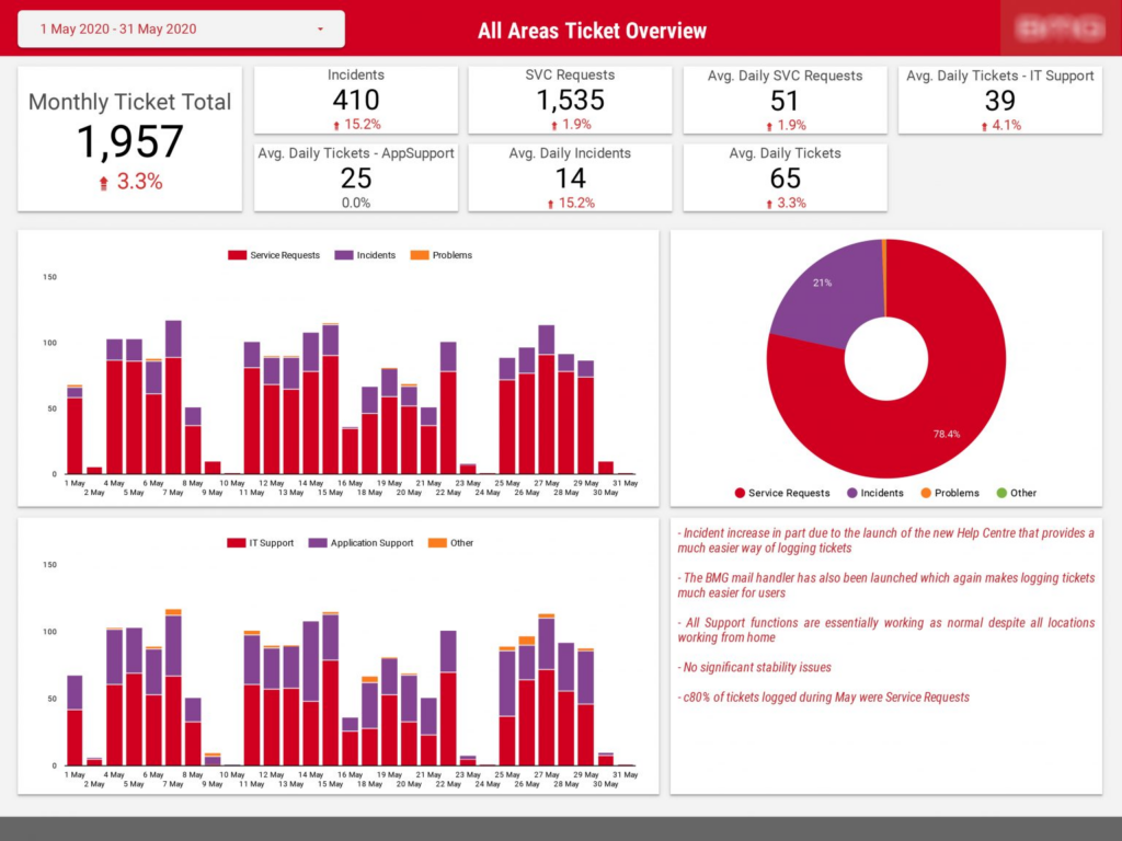
The ticket overview dashboard our data visualization consultants built puts the whole month on one screen. KPI cards along the top show the monthly ticket total, incidents, service requests and average daily volumes – each with a comparison against the previous month, so a spike stands out immediately. Below that, daily stacked bar charts break the volume down by ticket type (service requests, incidents, problems) and by support function (IT Support vs Application Support), while a pie chart shows the overall ticket mix. There’s also a month filter, so users can jump back to any reporting period.
One detail worth copying: the commentary panel on the right. When incidents jumped 15% in a single month, the note explained why – a new Help Center had just launched, making it easier for users to log tickets. Numbers without context get misread in meetings, and a short written explanation next to the charts prevents that.
Service desk managers use this page for their weekly ops reviews, and Heads of IT use it for monthly reporting. It answers the first question anyone asks about an IT organization: are we keeping up with demand?
When your users are spread across multiple offices and countries, a single global ticket number doesn’t tell you much. You need to see where the demand is coming from and whether your support capacity is sitting in the right places.
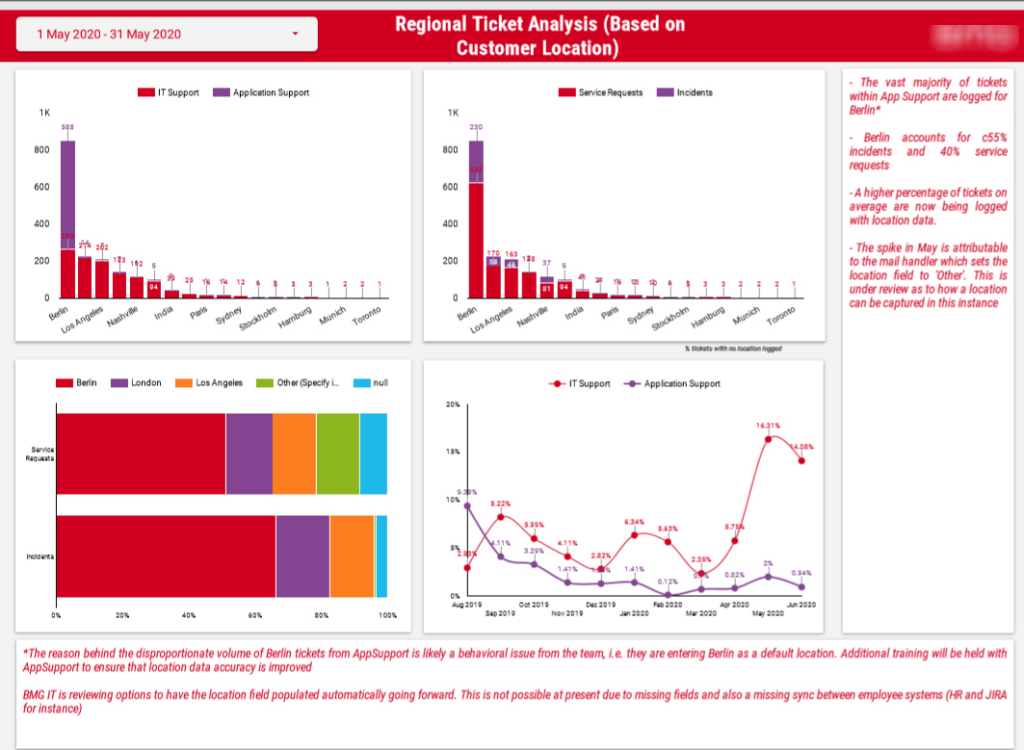
Our business intelligence consultants built this regional analysis dashboard that breaks ticket volume down by customer location and ticket type. Bar charts rank each office by IT Support and Application Support tickets, a stacked view shows how service requests and incidents split across locations, and trend lines track the month-over-month movement for each support function. Like the overview page, everything can be filtered by month.
The regional cut is also excellent at catching data-quality issues. On this dashboard, one office appeared to generate over half of all incidents until the analysis showed the App Support team had been entering that city as a default location on every ticket. The dashboard surfaced the problem, and additional training fixed it at the source. That’s half the value of a regional view: some of what it finds is genuine demand patterns, and some of it is bad data you didn’t know you had.
Regional IT leads and service desk managers use this dashboard to allocate support capacity, justify headcount in busy locations and keep an eye on the share of tickets logged with no location at all.
For many IT leaders, the hardest reporting isn’t tickets – it’s compliance. Boards want to know that information security controls (user access reviews, segregation-of-duties checks, financial transaction reviews) are being executed on schedule, and pulling that evidence together manually is painful.
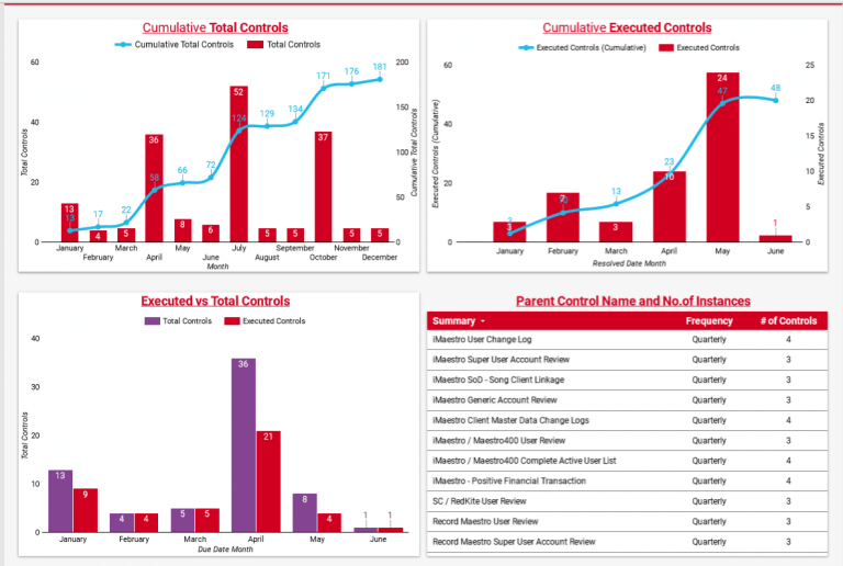
This controls dashboard was built for exactly that audience. It tracks the total number of security controls due each month against the number executed, with cumulative running totals across the year so progress is visible at a glance. A comparison chart puts executed and total controls side by side for each month, making any gap immediately obvious. And a table lists every parent control with its frequency and number of instances – so when a board member asks “what exactly are these controls?”, the answer is already on the page.
The VP of IT used this dashboard for board presentations, and the security team used it to plan the month ahead. It turns compliance from a scramble before every board meeting into a report that’s always ready.
Knowing that controls are behind schedule is one thing. Knowing which systems are behind is what lets you act on it.
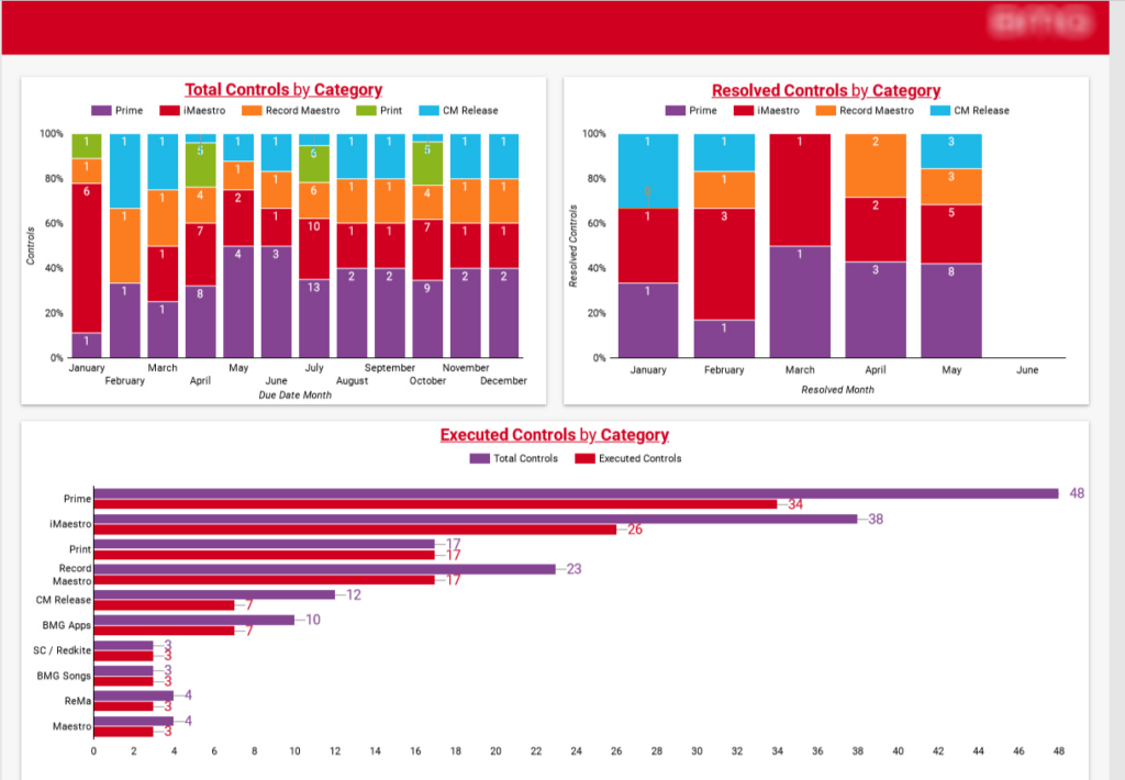
This dashboard built by our data analysts breaks the same security controls down by the application category that raised them. Stacked bar charts show how the control mix shifts month to month across each system, and separate views cover total, resolved and executed controls per category. The chart that gets the most attention is the horizontal comparison at the bottom: executed versus total controls for every application, side by side. When one system shows 34 of 48 controls executed and another shows 17 of 17, the security team knows exactly where its next sprint should go.
Information security teams and application owners used this dashboard to prioritize their workload and to show auditors precisely where the execution gaps sit – and where they’ve been closed.
The other side of running an IT organisation is what it all costs. As more infrastructure moves onto platforms like Google Cloud, IT leaders need to see where the money is going – which applications, which services, and whether spend is holding steady as usage grows.
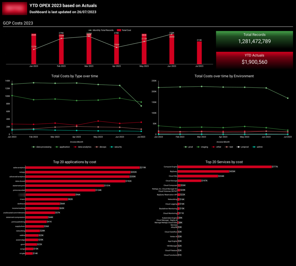
Our dashboard developers created this dashboard that tracks the year-to-date operating cost of running IT infrastructure on Google Cloud. The top section pairs monthly cost against the number of records processed, and the story it tells is the one every IT leader wants to hear: record volume climbed into the hundreds of millions per month while cost stayed flat – proof the platform is scaling efficiently rather than spend running away with growth. Below that, cost is broken down by environment (production, staging, test and the rest) and by application, with a ranked bar chart of the top 20 applications by spend and another for the top 20 Google Cloud services. Compute Engine, BigQuery and Cloud SQL sit at the top of the services list.
Finance and IT leadership use this dashboard together in budget reviews – it shows which applications are the most expensive to run, where cloud spend is concentrated, and whether cost per unit of work is heading in the right direction.
IT organizations track a wide range of KPIs covering demand, speed, reliability and governance. The exact set varies by organization, but the following IT operations metrics are among the most commonly used – and they map directly onto the dashboards above.
| KPI | Description |
| Total Tickets | Total tickets logged per period, with month-over-month change. |
| Ticket Volume by Type | Split between service requests, incidents and problems. A rising incident share signals instability. |
| Ticket Volume by Priority | Counts of P1/P2 tickets – high-priority work deserves its own card. |
| Incident Volume | Number of incidents logged per period. |
| Backlog (Open vs Closed) | Whether the team is keeping pace with incoming demand. |
| KPI | Description |
| MTTR (Mean Time to Resolve) | Average time from ticket creation to resolution, ideally split by priority. |
| First-Response Time | Average time before a ticket gets its first human response. |
| SLA Compliance Rate | Percentage of tickets resolved within their SLA target. |
| KPI | Description |
| System Uptime / Availability | Availability percentage for each critical application or service. |
| Change Success Rate | Percentage of changes deployed without causing an incident. |
| KPI | Description |
| Controls Executed vs Due | Of the security controls due in a period, how many were performed. |
| Control Execution by Category | Execution rate broken down by application or system. |
A quick point on segmentation, too: raw KPIs tell you that something changed, but slicing them tells you where. When you break these metrics down by region, application component and team, a number you couldn’t act on becomes one you can – the regional example above only caught its data-quality problem because tickets were split out by location.
Building an IT ops dashboard in Power BI involves a lot more than plugging in some data. You need to bring together information from multiple IT systems, highlight the right metrics for each team, and make sure it all refreshes itself so decisions are based on the latest numbers. We’ve learned a thing or two about building IT reporting solutions, so this is the process we recommend.
Step 1 – Work Out What You Need to Report On
Before you can build your dashboard, you need to figure out who will be using it and what decisions they need to make. Your service desk managers will want to see how many tickets are piling up and whether SLA targets are being met, while your infrastructure teams care about whether their systems are up and running, and your security teams keep a close eye on compliance and vulnerabilities.
We start every project by listing all the business questions stakeholders need answered. Then we group those questions into dashboard pages and work out which KPIs, calculations and visualizations we need to make sense of them. This planning stage is important – get it wrong and you’ll end up with charts that don’t answer any useful questions.
Step 2 – Get Your IT Data Sorted
Most IT teams use multiple systems, so the first thing to do is bring all that data together. Ticket information might come from ServiceNow or Jira, system metrics from Azure Monitor or Datadog, cloud costs from Azure or AWS, and user information from Active Directory.
Power BI can connect straight to many of these systems using its native connectors, but sometimes you’ll need APIs or custom connectors. Once you’ve got all the data in one place, you’ve got a single source of truth for the whole IT function.
Step 3 – Get the Data in Shape
Before you can start reporting, you need to clean the data and get it into the right format. That means removing duplicate records, standardizing your ticket categories, working out relationships between different data sources, and building calculations for key operational metrics.
If the data isn’t properly prepared, even the best dashboard won’t produce reliable insights. Many organizations use data engineering services to clean, transform and structure their data before building reports.
A well-designed data model not only makes your reports perform better, it also ensures your KPIs are all calculated the same way and give you a consistent view of what’s going on.
Step 4 – Build Your Dashboard Pages
Rather than throwing every metric onto one page, build your dashboard around the different roles within the IT department. Each page should answer a specific set of operational questions for its audience.
Your service desk managers might need an ITSM dashboard for ticket management, your infrastructure engineers will need something to monitor system health, and your security team will focus on compliance. IT leadership, meanwhile, will want a high-level view of the health of the whole IT operation.
Good page structure is only half the battle – how you lay out the visuals determines whether people use the dashboard at all. If you want to see these design principles applied step by step, our Power BI dashboard design tutorial walks through the whole process, from choosing the right charts to arranging a page people can read at a glance:
Step 5 – Make It Refresh Automatically
Finally, make sure your IT ops dashboard updates by itself. Set up scheduled refreshes so the latest data is always available without anyone lifting a finger. You can also use Power Automate to send alerts when reports refresh successfully or when operational metrics move out of range, so teams can jump into action rather than waiting for the next reporting cycle.
Where the section above explained why fragmentation makes a dashboard necessary, here are the measurable outcomes organizations report once one is in place – the efficiency, earlier problem detection and faster decisions that follow from combining data from many systems into one automated, real-time report.
Complete Visibility Across IT Operations
IT departments are often scattered across different tools – service management, infrastructure monitoring, cloud platforms, security. An IT operations dashboard brings all that information into one view, so you can see what’s happening across the whole IT function and catch issues before they escalate.
For example, one company took six operational systems and consolidated them into a single reporting platform. This cut manual data consolidation to 5%, so reports were ready in under 5 minutes – down from 48 hours – and leadership could make decisions 40% faster with real-time dashboards.
No More Manual Reporting
IT teams lose a huge amount of time wrangling data, combining spreadsheets and preparing reports for management. Automating these tasks lets them get back to what matters – resolving operational issues.
One company automated data extraction from SAP Ariba into Azure SQL, saving around 5 hours every month previously spent on manual refreshes. The same automated pipeline gave them a solid foundation for future automation projects.
Better-Informed Decisions
With real-time dashboards, IT managers can jump on operational issues as they happen rather than waiting for scheduled reports. Whether it’s growing ticket volumes, rising infrastructure costs or poor SLA performance, you can spot problems well before they escalate.
For example, one client cut report-prep time by over 50% with automated Power BI dashboards. They finally had operational data in one place, leadership could make decisions far more quickly, and internal teams could maintain and update their own reports.
Getting to the Truth with Data
When reports rely on manual spreadsheets, inconsistencies and errors inevitably creep in. Centralizing operational data into one automated solution gives you the accuracy and confidence you need in the data that drives your business.
One company replaced its old reporting platform with Power BI and reached over 99% data accuracy. Report load times dropped from 20–30 seconds to under 5 seconds – and they hit 100% user adoption within 4 weeks.
Getting started begins with figuring out what you want to know. Which metrics matter most to you? Do you need to monitor ticket volumes and SLAs? Are you tracking incidents by application or region? Or are you trying to show the board that your security controls are being executed on time? If you don’t know which questions you’re trying to answer, it’s much harder to decide which data sources, KPIs and pages you need.
From there, it’s about connecting all your ITSM tools, ticketing systems and compliance data into one place that can make sense of it, modeling that data so comparisons hold up, and designing pages your teams will want to look at every week – not just glance at occasionally.
Planning to build an IT operations dashboard, or need a custom reporting solution for your IT team? Get in touch – we’ll work with you to build a dashboard that ties together all the data you need and gets the right insights to your team in a way that makes a real difference.
An IT operations dashboard is a report that consolidates service desk, incident and infrastructure data into one live view, so IT teams can monitor ticket volumes, resolution speed, reliability and compliance without pulling numbers from multiple tools manually.
The core set: ticket volume by type and priority, incident count, MTTR (mean time to resolve), first-response time, SLA compliance, backlog of open vs closed tickets, system uptime, change success rate, and controls executed versus controls due.
An operational dashboard tracks day-to-day activity – tickets, incidents, response times – and refreshes daily for team leads and managers. A strategic dashboard tracks longer-term goals like cost and project delivery, and is reviewed monthly or quarterly by executives.
Power BI is the most common choice: it connects directly to ITSM tools like ServiceNow, Jira and Zendesk, supports scheduled refresh, and handles the calculations IT reporting needs (MTTR, SLA %, month-over-month change). Looker Studio is a decent free alternative for simpler setups.


