

A Tableau sales dashboard puts revenue, pipeline and sales activity on one screen and keeps it current on its own. Sales leaders use it instead of rebuilding a spreadsheet pack every Monday morning.
Our Tableau consultants have built custom sales dashboards for 200+ companies including franchises, real estate investors, retail brands, and B2B software companies. In a recent project that we delivered a Senior Director of Inside Sales reported that our Tableau dashboards save him 5+ hours per week.
Below are 7 sales dashboards we designed and built for clients. For each one, you get the typical audience, the data sources behind it and the metrics on screen. These are examples of our Tableau development work; they are not free templates, and none of them is available to download here.
A Tableau sales dashboard is a single view that reports on sales performance: revenue, pipeline value, conversion and sales activity.
The data almost always comes from more than one system. A B2B company pulls opportunities from a CRM such as Salesforce, HubSpot or Dynamics 365 and payments from Stripe, while a retailer combines Shopify orders, POS till data and ERP invoices.
Who uses it depends on the detail. Reps want deal-level records and daily numbers, regional directors want fair comparisons between locations, and the C-suite wants revenue, forecast against plan and overdue receivables.
Building Tableau dashboards means everyone works from the same KPIs. Filters narrow the dashboard to each person’s patch, and the published workbook refreshes on a schedule rather than when someone remembers to export data.
A sales dashboard is only as reliable as the plumbing behind it. These are the systems that normally feed one, and what each contributes.
For B2B teams, the CRM is the primary source, holding opportunities, deal stages, close dates, owner, amount, industry and country. What it does not hold is cash collected, so on its own it gives a pipeline dashboard, not a revenue one. CRM data also needs cleaning, since stage names get renamed and deals re-dated; we model that history in SQL so a funnel does not shift under users mid-quarter.
Stripe covers charges, refunds, disputes, subscriptions and recurring revenue, and for subscription businesses it is usually the most accurate record of what was billed and collected. Used alongside a CRM, the split is simple: the CRM shows what the team expects to win, Stripe dashboard template app shows what the business was actually paid.
Retail and direct-to-consumer brands sell in several places at once: Shopify holds online orders, a POS system holds in-store transactions by location, and a tool such as Skio holds subscriptions. Producing one revenue figure means agreeing how products, locations, currencies and refunds are matched – the mapping work where most e-commerce dashboards succeed or fail.
Companies running an ERP have sales orders, quotes, invoices, part-level margin, receivables and payables in one place, which is what makes a genuine executive sales dashboard possible. Smaller companies use accounting platforms for the same purpose; where there is no ERP, we connect QuickBooks Online to Tableau.
Nearly every sales dashboard needs numbers that live in no system at all and usually start life in a spreadsheet for example, quota by rep, plan by region, budget by month. We load that plan data into a proper table so plan and actual sit in the same model, and variance comes from a governed table rather than a hidden tab one person maintains.
For Stripe, Shopify and HubSpot, we use our own Tableau data connectors rather than a direct Tableau connection. Each extracts data from the source API on a schedule into a SQL Server database that Tableau then reads: the Stripe Tableau Connector, the Shopify Tableau Connector and the HubSpot Tableau integration.
SQL Server does the heavy joins so extracts refresh faster; it keeps history beyond the API retention window, and several tools can read the same tables instead of each hitting the API. On a Shopify and QuickBooks project for Omnycode, this saved five hours a week and moved refresh from weekly to daily.
Sales data normally sits in a CRM, a payment platform, an ERP and a handful of spreadsheets. Consolidating those into one modelled database gives a single definition of revenue, a won deal and a customer, so sales, finance and leadership stop debating whose figure is correct.
The CEO of a home services platform we built reporting for went from six separate systems down to one consolidated source. Manual data consolidation fell by 95% and report generation dropped from 48 hours to under five minutes, with data integrity measured at 99.7%.
A scheduled refresh means the dashboard is already current when someone opens it. Nobody exports a CSV, rebuilds a pivot table or emails a weekly pack, and the sales meeting starts with the numbers instead of the preparation.
Splitting revenue by customer, product, rep and location shows where growth is coming from. Ranked tables with conditional colour make the strongest accounts and the slipping ones obvious in seconds.
Once sales, margin and cost sit in one model, the gaps show up. Underpriced accounts, unprofitable products and customers who quietly stopped buying all become visible in the same view.
The CFO of telecoms operator Neterra identified EUR 50,000 of cost savings immediately after launch and EUR 10,000 to 20,000 a month of new business opportunities. The reporting also removed the need for one full-time analyst post and formed part of a CFO of the Year 2024 award in Bulgaria for transformation of the finance function.
Each dashboard below was built by our team for a specific client, on that client’s own data model. Figures shown in the screenshots have been anonymised or replaced where the data is commercially sensitive.
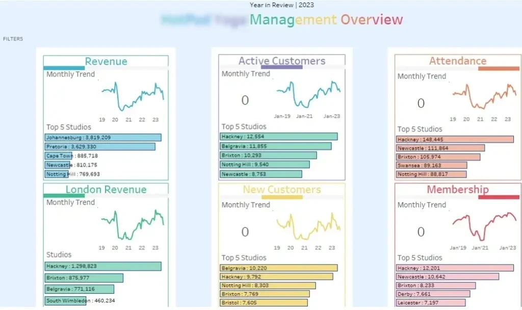
This regional sales dashboard was built for a fitness company operating around 80 studios across the UK, South Africa and Europe, split between company-managed and franchised locations. Their problem was getting one view of performance across a mixed estate where direct and franchised studios cannot fairly be compared side by side.
Our business intelligence consultants built it around five KPIs: revenue, active members, new customers, attendance and total memberships. Each appears three ways: current total, monthly trend, and a top-five breakdown by location. A filter set then splits studios by size of city, year of opening and whether the site is franchised or company-managed.
Leadership uses it to see which locations are growing membership and which are losing attendance, without waiting for a report from each region. Franchise managers compare franchised sites against company-run ones on equal terms using the location breakdowns. During strategic reviews, the filters make like-for-like comparison — newly opened suburban studios against established city-centre studios — a two-click exercise, which is what decisions about opening or closing sites depend on.
Typical audience: regional managers, franchise directors, COOs and senior leadership in multi-site businesses.
Typical data sources: membership management platform, class booking and attendance records, studio-level payment and POS data, and a studio reference table holding city size, opening year and ownership type. All consolidated into SQL Server before Tableau connects to it.
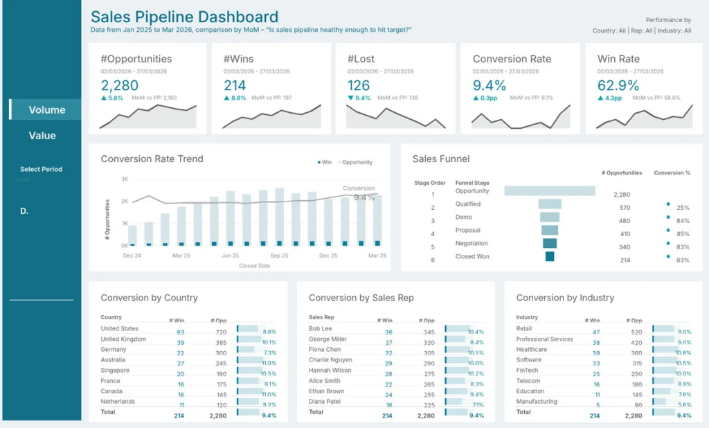
This sales pipeline dashboard serves B2B companies with a defined sales process and several reps. This CRM dashboard exists to answer the question printed under the title: is the sales pipeline healthy enough to hit target?
We built it on CRM opportunity data with a month-on-month comparison. A KPI row reports opportunities, wins, losses, conversion rate and win rate, each with its change and a sparkline. A funnel tracks stage-by-stage drop-off from opportunity to closed won, and three ranked tables break conversion down by country, sales rep and industry. A toggle switches the whole dashboard between deal volume and deal value.
Sales directors use the funnel to find the stage where deals stall. Here it is qualification, where three-quarters of opportunities drop out. The rep table sets conversion next to opportunity count, so a busy rep converting at 10% is coached differently from a quieter one at 7%. Country and industry conversion feed territory planning and headcount decisions.
Typical audience: CRO, sales director, sales operations and revenue operations managers.
Typical data sources: CRM opportunity and stage history tables from Salesforce, HubSpot or Dynamics 365, a rep and territory reference table, and a quota or target table for the plan comparison.
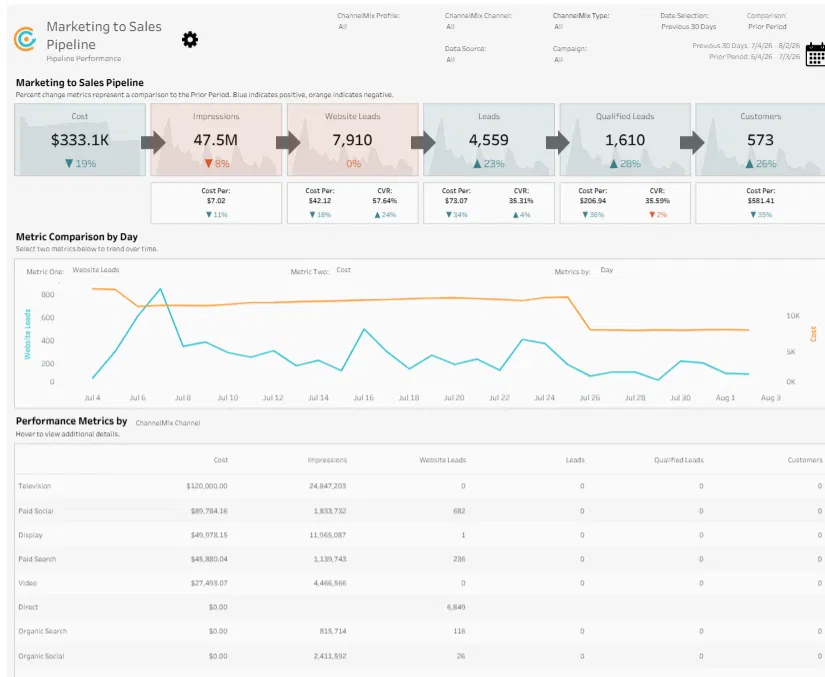
This second Tableau sales pipeline dashboard was built to show what marketing spend produced in the sales pipeline. It suits B2B companies buying across several channels, where cost per customer matters far more than cost per click.
Our dashboard developers built it as a funnel that runs from spend to customers: cost, impressions, website leads, leads, qualified leads and customers. Under every stage sits a cost per unit and a conversion rate, and a channel table lists cost, impressions and leads by channel, from paid television down to zero-cost organic search. A two-metric selector trends any pair of metrics against each other by day.
Marketing leads use the stage costs to move budget between channels inside the month rather than at quarter end. When qualified leads rise and cost falls, the channel table shows which channel caused it. Sales and marketing then review the same funnel, so lead quality is discussed using conversion rates instead of opinion.
Typical audience: CMO, head of demand generation, revenue operations, and agency account directors reporting to clients.
Typical data sources: advertising platforms including Google Ads, Meta Ads and LinkedIn Ads, offline media spend files, web analytics for website leads, and CRM data for the lead to qualified lead to customer stages. HubSpot data is loaded into SQL Server with our connector.
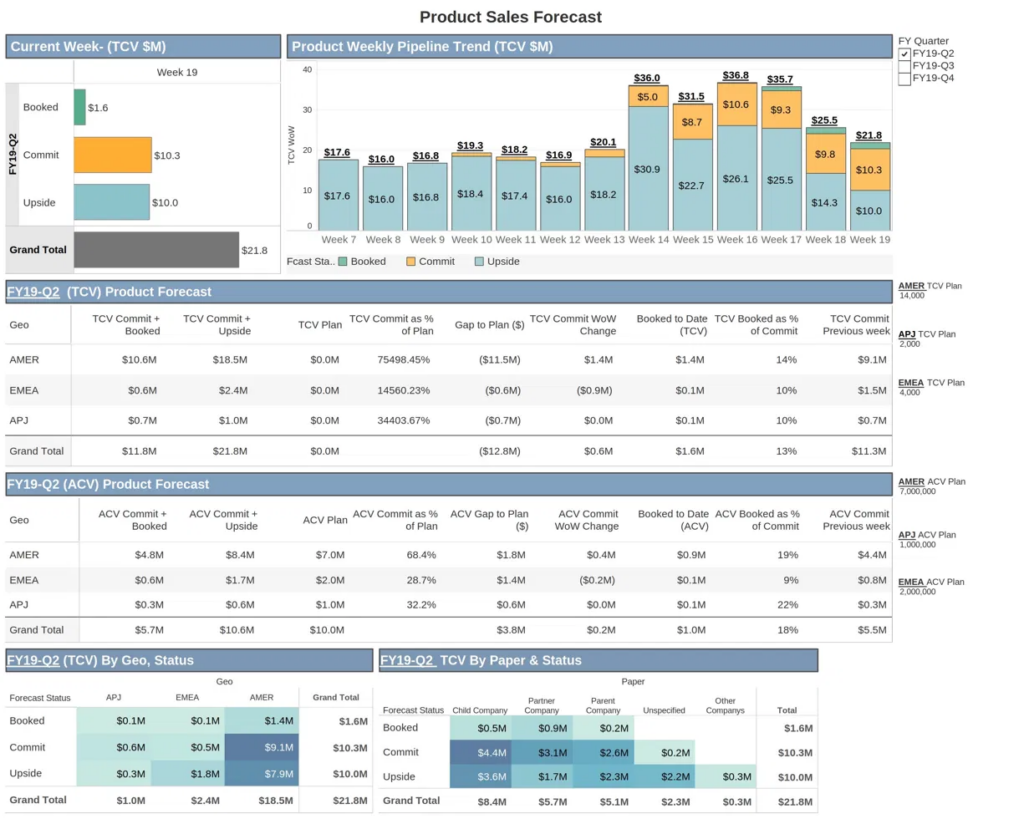
This sales forecast dashboard was built for a software company that forecasts weekly against a quarterly plan. It is designed for the weekly forecast call where each region has to defend its commit number.
Our financial analytics consultants structured it around three forecast categories: booked, commit and upside – with a weekly trend chart showing how that mix has moved across the quarter. Two tables report by region (AMER, EMEA, APJ) on total and annual contract value, covering commit against plan, gap to plan, week-on-week change, booked to date and booked as a percentage of commit. Heat-mapped crosstabs then split the quarter by region and by contract paper type.
The week-on-week commit column shows whether a region’s forecast is improving or quietly slipping. Booked as a percentage of commit tells leadership how much of the forecast is still at risk. Regional directors use the gap-to-plan figure to decide which deals to escalate while there is still time to close them.
Typical audience: CRO, VP of sales, regional sales directors, sales operations and the CFO.
Typical data sources: CRM opportunities with forecast category, contract dates and paper type, quota and plan data from finance, and subscription billing data from Stripe for booked revenue.
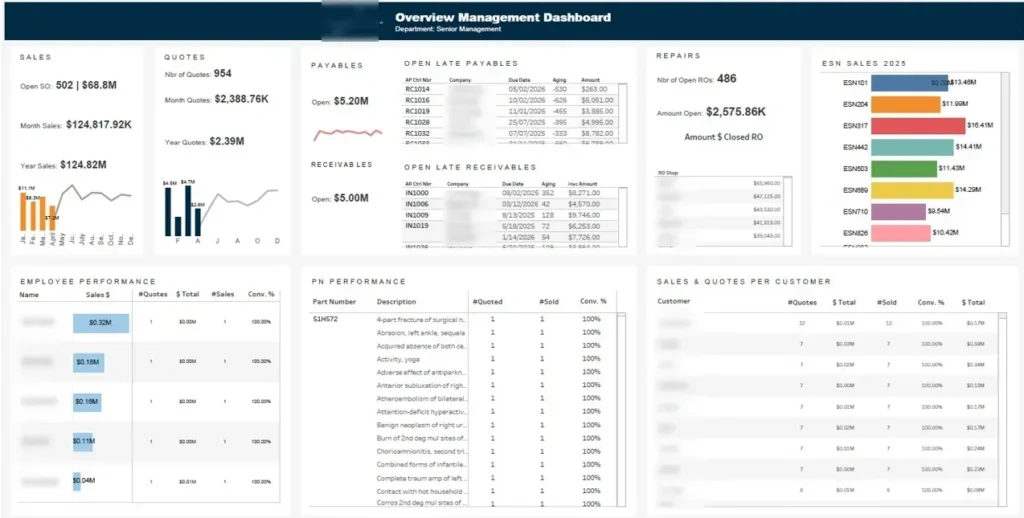
This executive dashboard was built for the C-suite who need a view of the whole business without opening department-level reports. It shows sales performance, cash exposure and product mix at the top level, so leadership can see where attention is needed. It does not replace operational dashboards; it tells you which one to open next.
We built it as six blocks on one screen. Sales and quotes each show open, month and year-to-date values with a trend chart, while receivables and payables list the company name, due date, ageing in days and amount for every late item. A repairs block tracks open repair orders, and three further tables break performance down by employee, part number and customer, each with quotes, sales and a conversion percentage.
The C-suite opens this at the start of the week for a snapshot of where the business stands. Overdue receivables with ageing days and company names show exactly which client to chase, and high payables balances inform cash management decisions the same morning. The sales breakdown by item shows which products are selling and which need attention before the problem grows, and the employee table gives visibility of who is selling what without commissioning a separate sales report. We build the same style of view in other tools too — see our executive dashboard examples.
Typical audience: CEO, COO, CFO and senior management teams.
Typical data sources: ERP data covering sales orders, quotes, invoices, receivables and payables ageing, repair orders and part numbers, plus CRM data for the quote pipeline and a customer master list.
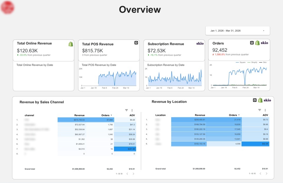
This sales revenue dashboard was built for a company selling through both retail and online channels. The problem it solves is straightforward: every channel has its own reporting tool, and none of them reports total revenue.
We built this management dashboard using the data from Shopify for online orders, a POS system for in-store sales and Skio for subscriptions. Four KPI cards report online, POS and subscription revenue plus total orders, each with a daily trend and a comparison against the previous quarter. Two tables then break one combined total down by sales channel and by location, showing revenue, orders and average order value side by side, and a date control switches the whole dashboard to any period.
Merchandising and marketing teams use the average order value column to see which channels and locations create value per order rather than order volume. Because online, POS and subscription revenue reconcile to one total, finance stops rebuilding the quarter by hand. The daily trend lines also make it a daily sales dashboard, so a mid-quarter drop in POS revenue is visible the next morning rather than at month end.
Typical audience: e-commerce manager, retail operations director, founder or managing director, and finance.
Typical data sources: Shopify orders, products, discounts and refunds; POS transactions by location and till; Skio subscription orders; and Stripe payments and payouts. Our Shopify and Stripe connectors load these into SQL Server on a schedule.
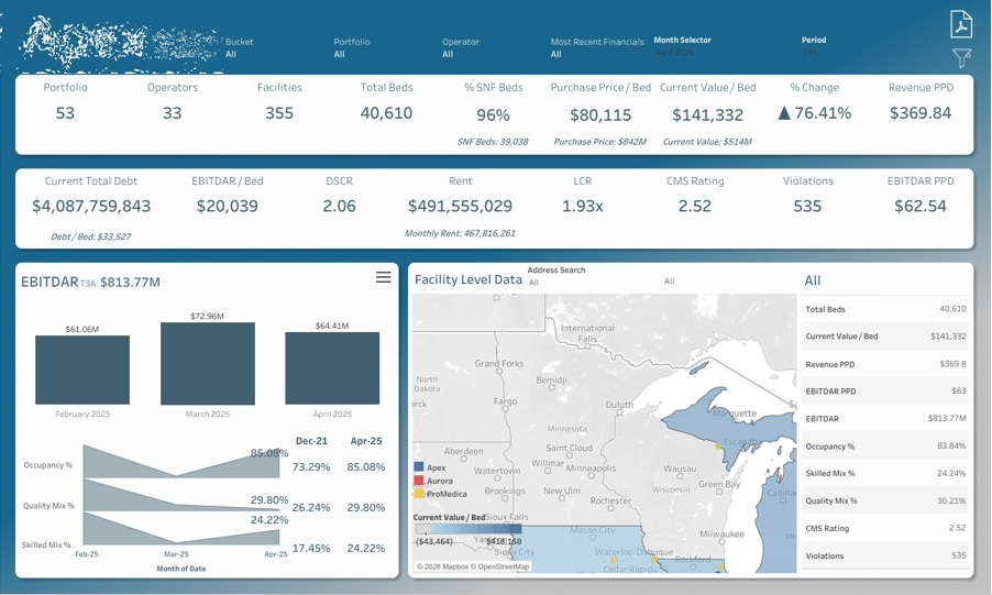
This private equity business intelligence dashboard was built for an investor in medical and skilled nursing real estate. It values portfolios, monitors operator performance and informs what to buy, hold or sell, solving a specific problem: performance data arrives monthly from dozens of operators in different formats.
Our team built it around portfolio and facility-level performance. Header rows summarise the portfolios, operators, facilities and beds with purchase price against current value per bed, plus debt, rent, EBITDAR per bed, debt service coverage, average CMS quality rating and violations. Below that, trailing three-month EBITDAR sits next to occupancy, quality mix and skilled mix trends, and a searchable map drills into any single facility to show its beds, value per bed, revenue per patient day and rating.
Acquisition teams use value per bed and revenue per patient day to price a portfolio against comparable assets already owned. Asset managers watch coverage ratios and CMS ratings to spot operators heading for difficulty before rent payments slip. The month selector and period control mean the investment committee reviews the same defined metrics every cycle rather than a new spreadsheet each time.
EBITDAR is earnings before interest, tax, depreciation, amortisation and rent. Revenue PPD is revenue per patient day. CMS ratings are the US government quality star ratings for care facilities.
Typical audience: acquisitions teams, asset managers, investment committees and CFOs at healthcare real estate investors and REITs.
Typical data sources: monthly operator financial reporting packs, rent rolls and loan schedules, CMS public quality and violation data, and a facility master table with addresses and bed counts.
Everything on this page is client work, shown with permission and with commercially sensitive figures removed or anonymised. We do not publish free Tableau templates, and none of these dashboards can be downloaded here.
There is a practical reason. Each one was built on a specific data model — a specific CRM configuration, chart of accounts and set of product and customer hierarchies. A workbook built on someone else’s model will not connect to your data, and making it fit is the work of building it in the first place.
What we do instead is build the equivalent for your systems, using your definitions of revenue, pipeline and a won deal. If a dashboard above is close to what you need, send us the screenshot with your notes and we will scope it against your data sources.
This is the sequence of data analytics implementation steps we follow on a sales dashboard project, whether you build it in-house or bring us in.
Start with decisions, not metrics: which region to escalate, which reps to coach, whether to open or close a site, which customers to chase. Each decision points to a specific metric and breakdown — the fitness network dashboard has a location breakdown on every KPI because leadership had to decide where to open next.
Write down each system and the fields you need: CRM for pipeline, Stripe for payments, Shopify and POS for orders, ERP for invoices, spreadsheets for quota. Check API limits, history retention and refresh frequency first — finding out a platform only exposes 90 days of history after the design is done is an expensive discovery.
Decide when a deal counts as won — signature, invoice or payment — whether revenue includes shipping, tax and refunds, and which exchange rate applies. Put those definitions where users can see them, because most disputes about a sales dashboard are disputes about definitions.
Extract each source into SQL Server on a schedule and do the joins, cleaning and business logic there, so Tableau reads clean tables. This is exactly what our Stripe, Shopify and HubSpot connectors do — faster refreshes, preserved history, and one set of tables other tools can reuse.
Put the KPI row across the top, the trend in the middle and the breakdowns underneath, with filters in the same place on every sheet. Every example in this article follows that pattern, so users learn one layout and read every dashboard quickly.
A nightly refresh suits most sales dashboards; daily sales tracking and retail POS reporting usually need hourly or more. Publish to Tableau Cloud or Server with row-level security so a rep sees their accounts, a manager their region and leadership everything, all from one workbook.
Run a short session per audience, since a rep and a CFO use the same dashboard differently. Hand over the definitions document, the refresh schedule and a named contact for changes — a dashboard nobody has been shown how to filter gets abandoned within a month.
We add filters on the attributes that make a comparison fair: city size, opening year, ownership type, customer segment, channel. Without them, a two-year-old suburban site gets judged against a flagship store and the conclusion is wrong.
Our connectors extract Stripe, Shopify and HubSpot data into SQL Server on a schedule, and the same approach covers CRM, ERP and POS extracts. The refresh never depends on someone remembering to run it, which is what makes the dashboard dependable enough for a Monday meeting.
Row-level security lets one workbook serve several audiences: reps get their accounts, managers their teams, directors the region. Every KPI also gets a written definition, so revenue, a won deal and an active customer mean the same thing in every meeting.
Every dashboard on this page began as a conversation about which decisions were being made too slowly or on the wrong numbers. If you need something similar for your CRM, POS, ERP or payment data, tell us which systems you run and what your weekly sales meeting struggles to answer.
Our Tableau and dashboard consultants will scope it against your data sources and show you what is realistic with the data you already have. Get in touch, and we will take it from there.


