
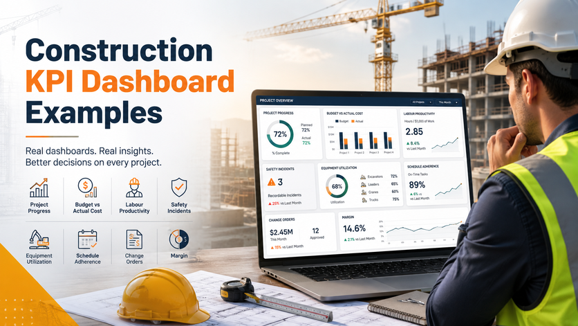
A construction KPI dashboard visualizes all the data from across a project into one single, up-to-the-minute view of how a project is going: cost, programme, safety, and cash flow. This means no more digging through static weekly reports and spreadsheets to get a picture of what’s going on.
Our Business Intelligence consultants have built 1000+ custom dashboards for 700+ clients including large construction companies, project management consultancies and surveyors. The 6 examples below are real dashboards we’ve built – for a construction consultancy, a reconstruction contractor, and a building compliance and surveying firm – and each one is tailored to the client’s own data.
This guide will cover the basics of a construction KPI dashboard, the KPIs to track, 6 real-life examples, how to build one, and what data lies behind it.
A construction KPI dashboard is a live, digital view of the most critical metrics on a project or portfolio all on one screen, which updates automatically. It replaces spreadsheets and weekly reports, so you don’t have to be chasing numbers around between teams.
It pulls data straight from the systems you already use: job-cost and ERP software, scheduling tools like Primavera P6 or Microsoft Project, field apps and safety or quality systems. Your live site feeds can refresh every few minutes, cost and programme figures once a day. Since the numbers in this KPI dashboard come straight from the source, a project manager, a surveyor, and a director will all see the same trustworthy picture without having to do any manual legwork.
Most projects run a few interconnected dashboards, each one tailored to its audience.
Construction management dashboard This is a high-level executive dashboard across every active project, focused on the big headline numbers – forecast cost, programme, safety, cash. Leaders get a bird’s eye view of which projects need attention, without having to open ten different reports.
Construction project management dashboard (single-project view). This is an in-depth look at one single project. This project management dashboard is used it to track cost, programme, and progress, drill down into the packages that are slipping.
Site & field dashboard. This is a daily log of safety events, quality checks, progress, built to open on a tablet at the site office so teams keep the record up to date.
Finance & commercial dashboard. This is where you get a view of committed and actual spend, cash flow, and revenue against forecast. Surveyors and finance teams use financial dashboards to manage margin and time payments.
You don’t need to track every metric – just the ones that will change a decision. Show each one against a target and a clear status so problems stand out.
Every business intelligence dashboard below was built by Vidi Corp for a real construction client, using their own data – cost, cash flow, safety, programme, compliance, and tender revenue. These are not templates – we build dashboards for individual clients that meet their specific needs.
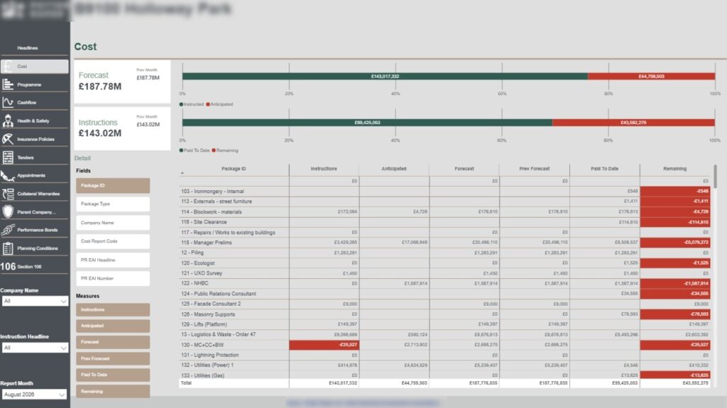
A cost KPI dashboard gives commercial teams one live view of forecast, committed, and actual spend across every package, so quantity surveyors, commercial managers, and directors can catch overspend early on, rather than at month-end.
Our Power BI developers built this for a construction consultancy that specialises in project management, surveying and design. It tracks how each project is progressing against 6 key measures :
Then there are the headline numbers, showing us how these six numbers compare to the same numbers for the previous month. We’ve also thrown in two bar charts – one to show instructed vs anticipated spending, and one to show how much has been paid out versus how much is yet to be spent. We’ve also included a table that will flag up any exposed spending in red.
When surveyors look at this month-end report, they can see right away which packages are trending over budget, and if they drill down to a single package before it reaches the final account, they can see exactly how far over budget it is. Directors get to see the same numbers at the portfolio level.
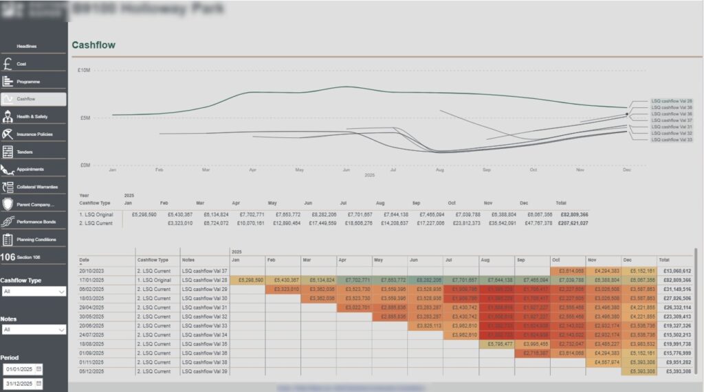
A cash flow dashboard is a really useful tool for helping commercial and finance teams plan ahead and make sure they have enough money coming in to cover the costs of a project as it progresses. It does this by showing how much a project is likely to spend, and when, across the entire programme. This means finance teams can plan ahead and make sure that they’ve got enough money available to draw down as needed, and commercial teams can make informed decisions about when and how to make payments. Rather than just focusing on the forecast, it also shows how the forecast is changing over time, so teams can spot any issues before they become major problems.
Our data visualization consultants built this alongside the same consultancy’s cost view. This shows every single forecast revision as its own line, plotted against the original baseline, so finance teams can see exactly how the cash profile is changing over time. We’ve also included a dated table and a month-by-month heatmap below, which shows exactly which months will carry the heaviest spend. This means finance can pick any period they want and see exactly how the cash profile has changed, and which months are now carrying the heaviest spend. Commercial managers on the other hand use the revision history to spot when and why the spend has changed, and to plan accordingly.
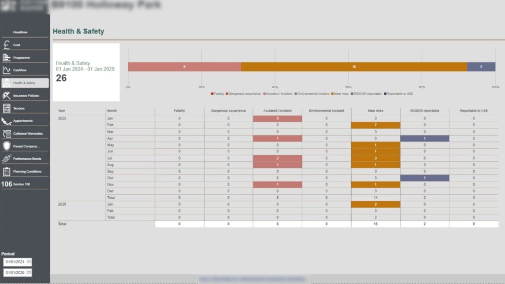
A health & safety dashboard is a really useful tool for helping site managers and directors to keep on top of health and safety incidents. It does this by recording every single health and safety incident that occurs, and showing how the numbers change over time.
We built this management report for the same consultancy. It logs incidents by month across seven different categories:
This means that site managers can keep on top of where the biggest problems are, and keep their teams safe. It also includes a headline count, a severity split, and a colour-coded table that makes it easy to see which months were the worst. Site managers use this information to focus on the toolbox talks where the numbers are rising, and SHEQ leads use it to make sure they’ve got evidence of all the RIDDOR and HSE events in case of any audits.
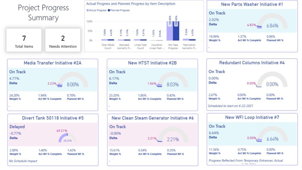
This construction KPI dashboard compares how actual progress is tracking against the original plan, for every single work package on the project. This means that planners and project managers can spot if anything is slipping behind schedule, and take action to get it back on track before it overruns the whole project.
Our Power BI consultants built it for a company that was delivering a big reconstruction project, involving insulation, piping and mechanical works. Each package sits on a gauge that shows how much progress has been made against the plan, and how much of a delta there is. We’ve also included an On Track or Delayed status, as well as headline cards for total items and which ones need attention. This means that the team and the client can get a clear read on when the project is going to finish, and if anything needs to be done to get it back on track.
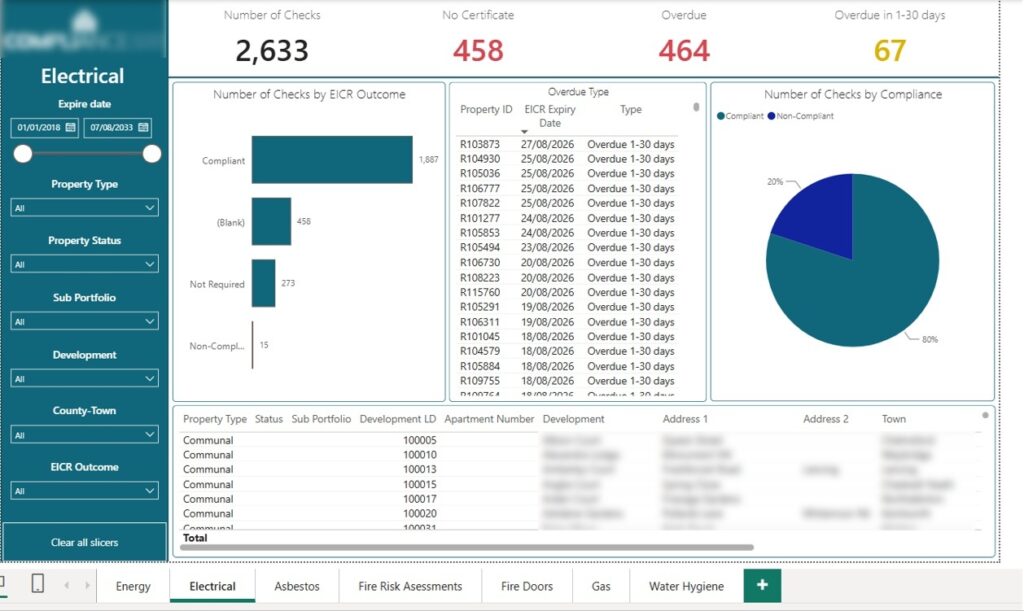
A building compliance dashboard is a really useful tool for helping compliance and safety managers to keep on top of compliance checks. It does this by tracking the status of every single statutory safety check that’s required, across a whole property portfolio.
Our dashboard developers built this construction KPI dashboard for a company that specialises in building compliance, surveying and consultancy work. It’s set up with a tab per stream, one for Electrical, one for Gas, one for Fire Risk Assessments, and so on. Each one has the same layout: headline counts (total checks, missing certificates, overdue, due within 30 days), a compliant/non-compliant/not-required split, slicers, and a named overdue list.
This means that compliance and safety managers can see at a glance which certificates are valid, overdue or missing, and take action to get them sorted. Because every stream reads the same way, directors and clients get one clear view for audits.
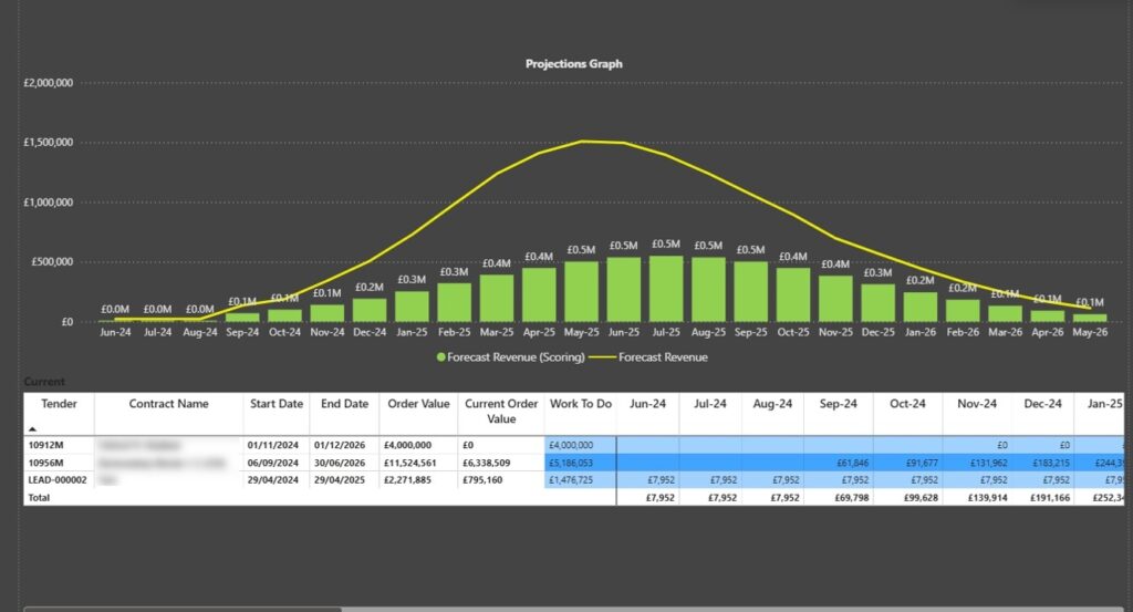
A tender revenue forecast dashboard is a really useful tool for helping construction companies to plan ahead and make sure they’re aware of when their revenue is going to come in. Because construction work typically earns unevenly, building up slowly through the middle of the project and then tapering off at the end, it’s hard to predict when and how much revenue is going to come in. A tender revenue forecast does this by taking each tender’s start date, end date and order value, and spreading that value out across the timeline.
We built this sales dashboard for a construction company to help them see how much revenue was coming in, and when. It takes each tender’s start date, end date and order value, and spreads that value across the timeline. We’ve also included a chart showing combined monthly revenue, as well as a table that shows the order value, work to do, and monthly forecast for each tender.
Leadership can see the busy and quiet periods across all won work, and when a new tender is close, the team can add it to the dataset and see the effect straight away.
At Vidi Corp we build construction dashboards on a project basis, rather than using templates that we sell. This means that each dashboard is built specifically for a client’s needs, and is tailored to their data and the specific requirements of their project. What does that mean in practice? Well, when you need a dashboard, we’ll work with you to design and build one that’s perfect for your needs, and if you need something similar again in the future, you can come back to us and we’ll build it around your data.
The dashboard pulls in the latest data from your systems, on a schedule. For cost and programme data, this is usually daily – we want the team to be reading today’s position, not last week’s. For live site feeds, we can pull in updates more frequently if that’s what’s needed. The result is that the team always has the latest view of what’s happening on the project.
Every one of our dashboards has the ability to drill down from the big picture right down to a single project or cost code. This means that the same dashboard can serve both the board and the surveyor. Whether you’re a director looking at the big picture, or a surveyor trying to get to the bottom of a specific problem, our dashboards are designed to help you do just that.
Alayout that opens perfectly on a tablet in the office, so daily logs and progress are always up to date right where the work happens.
We built this on the data and cost codes you already use, on the software you own – whether that’s Power BI or Tableau – so you don’t have to worry about learning a whole new platform or paying for another subscription.
A dashboard only really works if its data is reliable – figures pulled straight from the source, not typed in by hand. Getting that layer right means every KPI will be trusted.
Data comes from a handful of core systems: job-cost and WIP from your accounting or ERP system, planned-versus-actual from your scheduling tools like Primavera P6 or Microsoft Project, daily logs from your field apps, and incidents from your safety platforms. When a system doesn’t have a built-in connector, these are joined up through APIs or a data warehouse – our guide on how to connect an API to Power BI goes into detail on building one with a coding assistant doing the donkey work. But for the numbers to add up, cost codes, project IDs and naming conventions all have to match up across systems – if they don’t, you can’t even start to calculate a KPI like cost variance let alone do it accurately more than once.
Most teams get to this point in stages – they connect up accounting and scheduling first, then add safety and quality as they get more confident. Once you’ve built it, data refreshes on a schedule with no need to bother with manual exports; the diagram below shows how it all flows from source systems into a data warehouse and out to the dashboard. But building and maintaining that pipeline can get pretty technical, so if that happens we can build the business intelligence data warehouse for you – your team gets clean, ready to use tables to report from without needing to touch the code.
The tool isn’t that important – it’s what you decide to do before you start that counts. Start small, prove it works, then scale up.
Either one builds great construction dashboards, so it usually comes down to your existing setup. Power BI suits teams already using Microsoft 365 with Excel-based finance, and is cheap to roll out further. Tableau is better suited to really exploring big, complex datasets. You can see our Tableau dashboard examples if you are interested. What really matters though is that the dashboard is built around your data, not forced into a template – we can build it in either Power BI or Tableau, so the tool follows your project.
A good construction dashboard gives everyone – from the site office to the board – the same up-to-date view to work from. The hard part is rarely the charts themselves – it’s the data behind them and choosing the KPIs that actually matter. If you’d like a dashboard like that built around your own projects, get in touch.


