

A Power BI marketing dashboard pulls your campaign, web, ad and CRM data into one place so you can see what is working without opening five different tools. As marketing analytics consultants we build these for marketing teams and agencies, and over the years we have delivered 1,000+ reporting solutions to 700+ companies including Neil Patel, Teleperformance and DS Smith. Below are real dashboards we have built, from lead generation and email through to social media, followed by the metrics that matter and how the data fits together behind the scenes.
The examples are a mix of custom client builds and ready-made templates. Three of them, our LinkedIn Ads, Shopify and HubSpot dashboards, you can download and connect to your own data, and the rest are custom-built examples of our work around a client’s goals and systems. Whether you need a single marketing campaign dashboard in Power BI or a full cross-channel view, the approach behind each one is something you can apply to your own reporting.
A Power BI marketing dashboard is a single report that brings together data from all the places your marketing lives, so paid ads, organic search, social, email and your CRM sit side by side instead of in separate exports. Rather than checking each platform on its own, your team gets one view of spend, reach, leads and revenue, and can filter down to a single campaign or channel when they need the detail.
Most teams start with a Power BI digital marketing dashboard that answers a few plain questions. Where is the budget going, what is it bringing back, and which channels are moving people toward a sale. A good marketing analytics dashboard does not try to show everything at once. It focuses on the numbers that support a decision and lets you drill deeper only when you want to. Set up well, a Power BI dashboard for marketing becomes the one marketing performance report your whole team trusts.
The short video below is a quick tutorial on what a marketing dashboard in Power BI can pull together and how the pieces connect.
Each social network measures success in its own way, so rather than cram every platform onto one page, we build a dedicated Power BI social media dashboard for each source. Facebook, Instagram and LinkedIn each get a report shaped around how that platform works and what it measures. Built this way, a social media analytics dashboard in Power BI keeps each channel’s detail intact, which matters because a metric like reels views or follower seniority only really makes sense on the platform it comes from.
The examples below run from a cross-channel view of paid and organic spend down to a separate dashboard for each network. Every one connects straight to its source and refreshes on its own, so the client is not exporting spreadsheets every month.
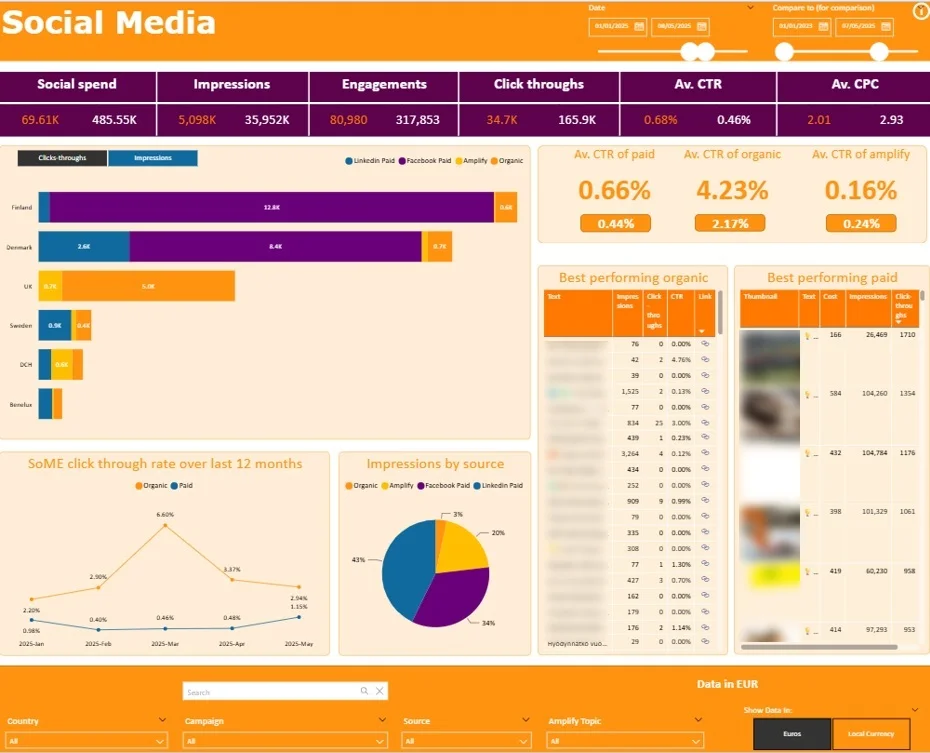
Built for a FTSE 100 team off their Hootsuite data, our dashboard lines paid, organic and Amplify (when employees repost company’s content on social media) up on the same spend, impressions, engagement and CTR, so a finding like that is backed by the numbers instead of a hunch.
From there you can see which countries and which posts are carrying each channel, with best-performing tables for organic and paid and a rolling twelve-month CTR trend. The Amplify comparison is the one bigger brands tend to fixate on, since it shows what staff resharing company content adds on top of the paid and organic baseline, which is the thinking behind our cross-channel marketing dashboard work.
Ideal for: brands running employee advocacy alongside paid and organic that want the three measured on one scale.
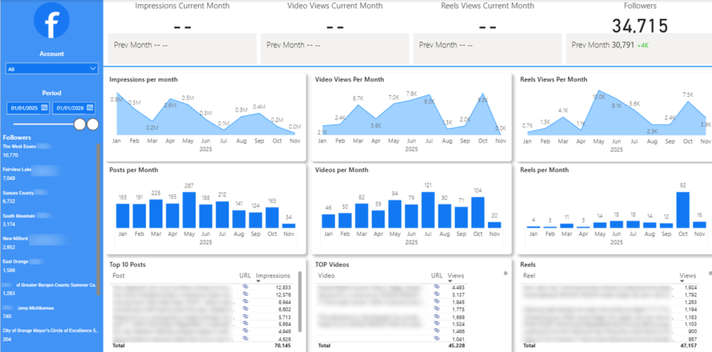
This Power BI Facebook analytics dashboard tracks the account’s monthly reach and growth, with impressions, video views and reels views shown against the previous month, and follower count front and center. Monthly charts break down each metric over the year alongside how many posts, videos and reels went out, and the tables at the bottom rank the top posts, videos and reels by views.
That layout makes it easy to line up output with results and see whether a busier month earned more attention, then spot the specific pieces of content that did the heavy lifting.
Ideal for: social teams and agencies that want a clear monthly read on a Facebook page and need to show clients which content is working.
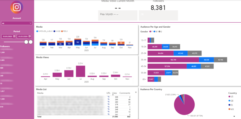
The Instagram dashboard leads with followers and media views for the current month, then breaks content down by type so you can see the split between carousels, single images and reels each month, with a separate chart tracking how media views move over the year. What sets it apart is the audience detail, with a breakdown by age and gender and an audience-by-country view where the United States makes up the clear majority.
That demographic and geographic read is what lets a team plan content and posting times around the people following the account, rather than guessing. A media list ranks individual posts by likes and comments so you can see which ones resonated.
Ideal for: brands and agencies that care who their audience is, not just how many followers they have, and want to plan content around it.
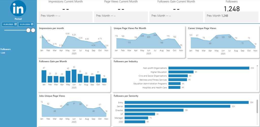
Our Power BI LinkedIn analytics dashboard is built for organic page performance, which matters more on LinkedIn than on most platforms because of who the audience is. It tracks impressions, unique page views, career and job page views by month, and followers gain month over month, so you can see both how far the content is reaching and how fast the page is growing. The two breakdowns at the bottom are the real value: followers by industry, and followers by seniority from entry level through to CXO.
Knowing your audience skews toward a particular industry or seniority is what tells you whether you are reaching decision makers or just building a number, which is exactly what account-based and recruitment-led teams need to see.
Ideal for: B2B companies using LinkedIn as their main organic channel, and anyone running ABM who needs proof they are reaching the right people.
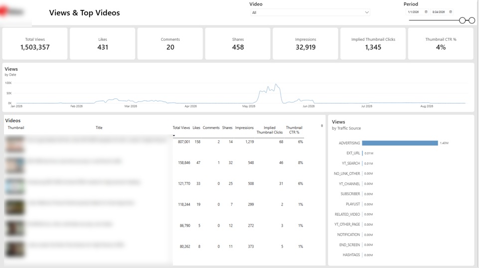
This dashboard tracks a brand’s entire YouTube channel in a single view. It’s built for social media managers, content marketers, and channel owners who publish video regularly. They need to know which videos earn views, how people find them, and whether thumbnails are doing their job.
Our developers created this dashboard as part of our Power BI managed services by connecting directly to the YouTube Analytics API. The top row displays seven headline metrics: total views, likes, comments, shares, impressions, implied thumbnail clicks, and thumbnail click-through rate. A “Views by Date” line chart plots daily view volume across the selected period, making spikes and quiet stretches easy to spot.
Below it, a ranked table lists each video with its own views, engagement counts, and CTR. A “Views by Traffic Source” chart breaks down where views originate, from advertising and YouTube search to subscribers and external links. Two filters at the top control the video selection and the date range.
With every metric in one place, teams can see which videos drive results and which fall flat. The traffic source breakdown shows whether views are earned or paid, so budget decisions rest on real data. A low thumbnail CTR flags videos worth re-testing, turning channel management into a set of clear, repeatable checks.
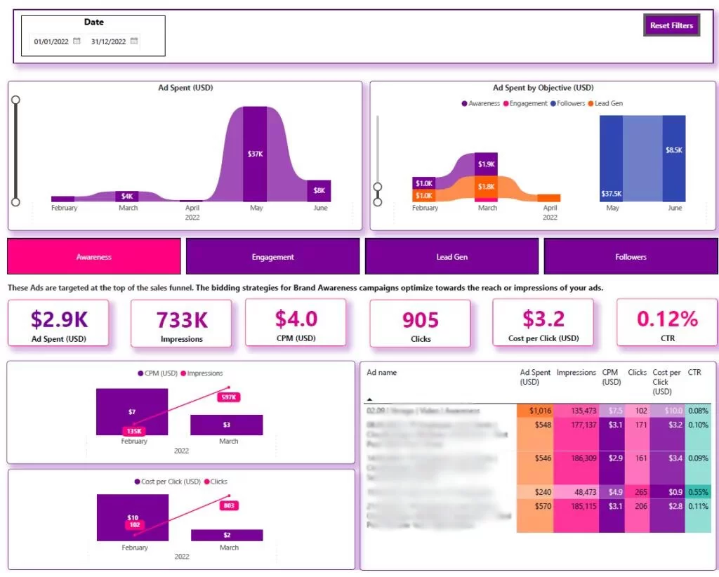
LinkedIn awareness campaigns are built to reach people, so judging them on cost per lead misses the point. Our LinkedIn Ads Power BI dashboard reports them on the metrics that matter at the top of the funnel: ad spend, impressions, CPM, clicks, cost per click and CTR, all on one screen.
It tracks spend month by month, then pairs CPM against impressions and cost per click against clicks so you can see what reach is costing as the budget moves. A table of individual ads ranks each one on spend, impressions, CPM and CTR, which makes the creative pulling the cheapest reach easy to spot. We offer it as a ready-made template you can connect to your own LinkedIn Ads data.
Ideal for: B2B teams running LinkedIn awareness campaigns who want them measured on reach and efficiency rather than lead metrics.
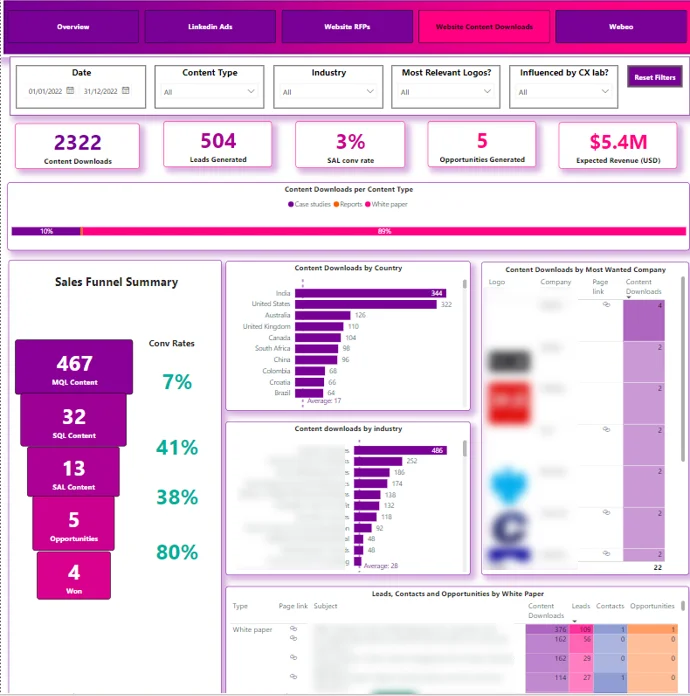
A content team can rack up thousands of downloads and still have no idea whether any of it turned into revenue. Our Power BI consultants built this dashboard for a global outsourcing company to close that gap. Every case study, report and whitepaper sat behind an email capture, so the moment someone grabbed an asset we could follow them from that first touch through MQL, SQL, opportunity and, where it got there, closed-won.
The page shows the drop-off at each stage, the pipeline value sitting behind it, and a breakdown of downloads by country, industry and company, so a single whitepaper can be traced to the accounts it actually pulled in. Content stops being reported as a download count and starts being reported as a pipeline. It is one example of the content marketing reporting we build for teams under pressure to show what their content returns.
Ideal for: B2B teams running gated content or demand gen who keep being asked to prove what it is worth.
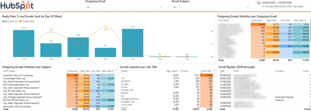
Most email reports tell you how many emails went out. This one tells you which of them were worth sending. Built as an email marketing dashboard in Power BI, it sets reply rate next to send volume by weekday, ranks subject lines by how often they get opened, and breaks activity out by rep, so a manager can tell at a glance who is busy from who is getting replies.
The part people lean on most is the drill-through. Click a reply figure and you drop straight into the threads behind it, which is usually where the real story of why a deal moved or stalled turns out to be. It ships as part of our HubSpot dashboard template, so you can point it at your own data rather than rebuild it from scratch.
Ideal for: sales and outbound teams, and agencies handling email for clients who want proof of results rather than an activity log.
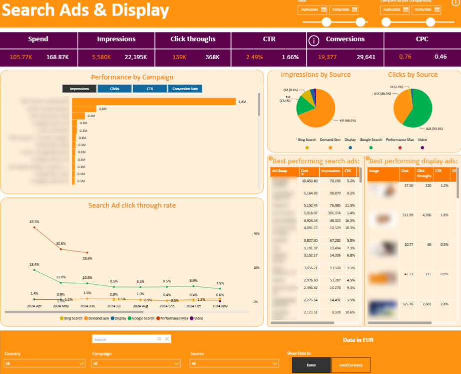
Our data analysts built this Power BI dashboard that pulls paid advertising from every channel you run into one performance view, from search and display through Performance Max, Demand Gen and video, across platforms like Google Ads and Microsoft Ads. The header tracks spend, impressions, click-throughs, CTR, conversions and CPC, each shown against a comparison period so you can tell at a glance whether this month beat the last.
Below that, a performance-by-campaign chart and source breakdowns for impressions and clicks show where the budget and the results are landing, while separate tables surface the best performing search and display ads so you can see which creative is doing the work. Country and currency filters mean a team running ads across markets can switch between local currency and one reporting currency without rebuilding anything.
Ideal for: advertisers and agencies running paid campaigns across several platforms and markets who want one performance view instead of a tab per network.
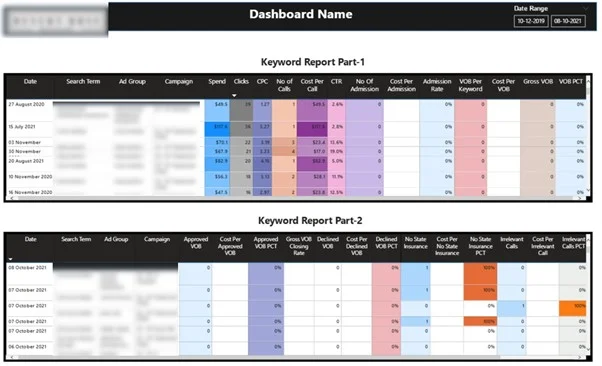
For a healthcare client, clicks were easy to count and sales were not, so our Power BI consultants pulled Google Ads, CallRail and Salesforce into one report. That lets us follow each search term past the click, through the calls it generated and into the deals that actually closed in the CRM, so the account could be judged on the keywords driving sales rather than the ones driving traffic. The client fed that back into Google Ads to bid harder on what was really working.
The detail that earns its keep is the gap between the keyword you bid on and the search term someone actually typed, since broad and phrase match quietly burn budget on queries that were never going to convert. Reporting spend against real search terms is what surfaces that, and it makes the housekeeping easier too, from negative keywords to grouping by intent. Because closed deals came back from Salesforce, every keyword could be judged on cost per sale rather than cost per click, which our paid search analysis guide goes into in more depth.
Ideal for: businesses where the sale starts with a phone call, like healthcare, legal or home services, and PPC managers tired of judging keywords on clicks alone.
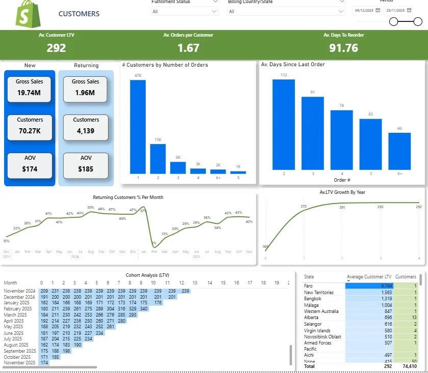
Our Shopify Power BI dashboard tracks new versus returning customers, the share of buyers who come back each month, and how many orders the average customer places, then follows lifetime value as it builds over time.
Two parts do the heavy lifting for a marketer. The reorder timing chart shows how many days people leave between their first, second and third orders, which is the window your reactivation emails and retargeting should aim at. The cohort table groups customers by the month they first bought, so you can watch LTV climb and see how long each intake takes to cover its acquisition cost, with a state-level view that flags where your highest-value customers sit. The template is free to any store, so you can download it, connect your data and skip the build, and our ecommerce analytics team can fold your ad data in on top.
Ideal for: Shopify brands that want to plan acquisition spend and reactivation around real lifetime value rather than one-off order counts.
A Power BI marketing dashboard puts campaigns, channels and the wider customer journey in one place. Once the right data is connected, it takes most of the manual work out of reporting, makes the numbers more consistent, and shows where marketing is producing results.
Spend Less Time On Marketing Reporting
When a dashboard pulls your ad platforms, social accounts and CRM into one report on its own, the monthly reporting grind mostly disappears. The team spends less time keeping reports alive and more time digging into what the numbers mean and improving campaigns off the back of it.
DS Smith is a good example. We pulled 6 Facebook Ads accounts, 7 Google Ads accounts, 14 LinkedIn Ads accounts, organic social and their CRM into a single automated report. It replaced three legacy reports and gave the marketing team back more than 30 hours a month that had been going into consolidating data and keeping reports up to date.
Make Marketing Performance Easier To Understand
Marketing data gets a lot more useful when every channel is measured against the same KPIs. The team can drill into a single campaign when they need the detail, while managers get a clean view of how everything is doing overall.
We did this for a digital marketing agency, building automated dashboards across 80+ clients that brought Facebook Ads, Google Ads, SEMrush, form data, GA4 and more into one place. The new setup saved the agency 50 hours a week and lifted the accuracy of its GA4 reporting by 40%.
Get More Reliable Marketing Data
A dashboard is only worth anything if people trust the numbers in it. Pulling from connected sources and using the same calculations everywhere cuts out the mismatches that creep in when each platform is tracked and reported its own way.
That 40% jump in GA4 accuracy for the same agency is a case in point. Once we tidied up how its tracking and reporting were set up, the team had conversion data it could rely on across its whole client roster.
Get Better Visibility Across Marketing Channels
Joining campaign data to website data shows you what happens after someone clicks an ad, not just that they clicked. Rather than judging a channel on impressions or clicks alone, you can follow people further along the journey and see which channels are contributing to results that matter.
For The Wanamaker Project, we automated reporting across 7 clients and cleaned up its GA4 tracking. The agency reported a 25% lift in customer visibility across ad channels and saved 10 hours a month on reporting.
Marketing data is scattered by nature. Ad spend sits in Google and Microsoft, engagement in each social platform, leads in your CRM, opens and clicks in your email tool, and traffic in analytics. Power BI connects to all of it and joins it into one model, so a lead in Salesforce or HubSpot can be traced back to the campaign, channel and keyword that created it rather than sitting in a silo. We handle the joins with our own Power BI data connectors for Facebook Ads, LinkedIn Ads, Google Ads, CallRail, HubSpot, Salesforce and Shopify, and if your systems do not talk to each other, our data integration team lines them up before the data ever reaches a report.
The other reason is control. A Power BI report refreshes on its own, so nobody is rebuilding a spreadsheet every month, and it holds enough data to let you drill down from a single headline number down to one campaign without slowing down. Because the model is yours, the definitions are yours too, so an MQL or a qualified lead means the same thing everywhere instead of whatever each platform decides. With your own sources, your own definitions and an automatic refresh, the exports stop being a monthly chore and become a report the team can rely on.
There is no shortage of things you could measure, and cramming all of them onto one page is the quickest way to make a dashboard nobody reads. The marketing metrics that earn a place on a Power BI dashboard are the ones that answer a real question, so in practice reporting works best when it is built around four areas: visibility, engagement, conversion and revenue. That way you cover the full journey from someone first finding you through to a closed deal, without drowning the report in vanity numbers.
| Stage | Metrics to track | What it tells you |
| Visibility and reach | Impressions, reach, clicks, CTR, rankings, organic traffic | Whether the right people are finding you, and whether that audience is growing |
| Engagement | Likes, comments, shares, reactions, video and reel views, time on page | Whether the content is holding attention rather than just being served |
| Lead and conversion | Leads, MQLs, SQLs, opportunities, conversion rate by stage, cost per lead | How efficiently interest turns into pipeline, and where people drop off |
| Revenue and influenced pipeline | Influenced pipeline value, closed revenue, LTV, gross margin, CAC against LTV | What marketing is worth in money, not just in activity |
Visibility And Reach Metrics
Reach and impressions tell you how widely your content and campaigns are being seen. For paid and organic social this means impressions, clicks and click-through rate by channel, and for search it means the traffic and rankings feeding into the top of your funnel. The point is not to chase big numbers for their own sake. It is to see whether the right people are finding you and whether that audience is growing over time.
Engagement Metrics
Reach gets your content in front of people, engagement tells you whether any of it landed. This is where likes, comments, shares and reactions come in, along with video and reel views on social or time on page and scroll depth on your site. On their own these are soft numbers, but read against reach they show which topics and formats are holding attention rather than just being served.
The practical use is deciding what to make more of. When a particular theme or post type keeps pulling stronger engagement, that is a signal for the content plan, and it is often the first place you notice a shift in what your audience cares about before it ever shows up in the lead numbers.
Lead And Conversion Metrics
Some leads come straight from your marketing, like someone filling in a form to download a report or registering for a webinar. Others are nurtured, so they arrive from somewhere else but engage with your content along the way before they buy. Both matter, and your reporting should be able to tell one from the other.
The way to track this is to define the stages a lead moves through, usually lead, then marketing-qualified lead (MQL), sales-qualified lead (SQL) and opportunity, and set what someone has to do to reach each one. Downloading a benchmark report might make someone an MQL, and booking a demo might move them to SQL. Once those rules are in place, the dashboard can show how many people pass from one stage to the next and which content moved them. It also helps to credit content that assists a conversion without being the final step, like a guide read early in the process, since otherwise you undervalue the pieces doing quiet work in the background.
Revenue And Influenced Pipeline
Influenced pipeline is the total value of deals where someone engaged with your content inside a set window, usually 60 to 90 days before the opportunity was created in your CRM. It shows how content contributes to revenue even when it is not the final touch before a purchase, and it ties marketing directly back to the pipeline. This is where a sales and marketing dashboard in Power BI earns its keep, because it puts marketing activity and CRM outcomes on the same page. Once your data is mature enough, it is worth looking at lifetime value or gross margin for content-sourced customers, so you can see which assets bring in high-value buyers rather than just volume.
Start with the questions the dashboard needs to answer, not the data you happen to have. Something specific like “how many qualified leads did content generate last quarter” keeps the report focused and stops it turning into a wall of charts. From there, pick the KPIs that answer those questions and agree on what each term means, so a lead or an MQL means the same thing to everyone reading the report.
Next, connect and clean the data, decide who each view is for, and design around that audience. A leadership view might be a single page of pipeline and revenue, while a channel team needs to drill into campaign detail. A generic, one-size-fits-all marketing dashboard template will rarely cover all of that, which is why our templates are built for a specific source and our fully custom reports are built around a team’s own data. If you would rather not build and maintain it yourself, our dashboard development and reporting and analytics teams can set it up around your data and your goals.
The most common mistake is putting everything on the page. A dashboard with sixty metrics gets opened once and then ignored, so start from the decisions the report needs to support and cut anything that does not inform one. Close behind is skipping definitions. If nobody agrees what counts as an MQL or a conversion, two people will read the same chart and reach different conclusions, so pin the terms down before you build.
The other big one is stopping at activity. Impressions, clicks and opens are easy to show and easy to feel good about, but on their own they do not tell you whether marketing made any money, which is why tying the report back to pipeline and revenue in the CRM matters so much. Finally, a dashboard is not a set-and-forget asset. Data sources change, campaigns get renamed and definitions drift, so a little maintenance keeps it trusted, and matching the refresh to how the report is actually used, daily for most marketing teams, saves chasing real-time data nobody looks at.
If you want a marketing dashboard that pulls everything together and updates on its own, we can help. Contact us to have a custom Power BI marketing dashboard built around your data, your channels and the way your team works.
It is a single Power BI report that combines data from your ad platforms, website, social channels and CRM, so you can track spend, reach, leads and revenue in one place and filter down to a single campaign or channel when you need to.
Yes. Power BI can connect to Facebook, Instagram and LinkedIn to report impressions, engagement, follower growth and audience demographics. We build a separate dashboard for each network so the reporting fits how that platform works, rather than forcing everything into one view.
We offer ready-made Power BI templates for specific sources, including a free Shopify analytics template, our HubSpot dashboard template and a LinkedIn Ads dashboard, and we also build fully custom marketing dashboards around each client’s own data and goals. A template is a fast way to get started, though for most teams the most useful reports end up tailored to how they actually work.
Common sources include Google Ads, Facebook Ads, LinkedIn Ads, GA4, CallRail, HubSpot, Salesforce and Shopify. The value comes from joining them, so a lead in your CRM can be traced back to the campaign, channel and keyword that created it.


