

A recruitment analytics dashboard turns hiring data into one live view of your pipeline, your costs and your results. It answers the questions recruitment teams get asked every week. Which roles are at risk, what each hire actually costs, and which recruiters and channels are producing.
Our dashboard development consultants build these dashboards for recruitment agencies and in-house talent teams. We connect them to the systems your data already sits in: your CRM or ATS, job boards, LinkedIn Ads and your finance data. The numbers then update on their own, without anyone rebuilding a spreadsheet each month.
This article shows 4 recruitment dashboards we have built for clients. For each one you will see who uses it, what it tracks, and what it changes day to day. We finish with how we build them from a client’s own data.
A recruitment analytics dashboard is a single screen that tracks hiring performance using live data from your recruitment systems.
The data usually starts in the CRM or ATS where your pipeline already lives. We then combine it with spend data from LinkedIn Ads and job boards, and revenue data from your finance system. That combination is what makes cost per hire and ROI possible to calculate at all.
Two groups use these business intelligence dashboards, and they need different things. In-house recruiters and HR managers track open roles, time to fill and sourcing cost. Agency CEOs and managing directors track recruiter performance, client growth and margin.
HR analytics is the wider practice of using data analytics in recruitment to make hiring decisions. The HR dashboard is simply how that recruitment data reaches the people who act on it.
A recruitment metrics dashboard shows every budgeted position against every filled position, split by department, location and job role. Vacancies stop being a number in a monthly report and become a live list of what is still open.
This matters most where unfilled roles carry operational risk. A vacant supervisor role in one site is a very different problem from three vacant admin roles across five sites. Seeing vacancies by location tells you which part of the business is genuinely exposed.
Recruitment funnel metrics show how many candidates sit at each stage: applications, CVs sent, interviews, offers and placements. When you can see the drop-off between stages, you can estimate how long a role will realistically take to fill.
Stage-level data also shows where the delay actually is. A role stuck at CV stage needs more sourcing. A role stuck at interview stage usually needs the hiring manager, not the recruiter.
Most teams know their total recruitment spend. Far fewer can say what a placement costs from LinkedIn versus a job board versus a referral. That requires joining spend data to placement data, which is exactly what we build.
Once the two are joined, the KPI dashboard calculates cost per applicant, cost per interview and cost per placement for every source. Budget decisions then stop being based on which channel feels productive.
Revenue alone is a poor measure of a recruiter. A high-revenue recruiter carrying high sourcing and advertising costs can contribute less profit than a quieter colleague. A recruitment KPI dashboard shows revenue, cost and profit side by side for each person.
This gives managing directors a fair basis for commission conversations, territory decisions and hiring. It also surfaces recruiters who are close to breaking even, early enough to do something about it.
For agencies, the health of the business sits in the client portfolio. Tracking revenue per client over several years shows which accounts are growing, which have plateaued and which are quietly shrinking.
Average order value per client adds the second half of the picture. A client placing the same number of roles at a lower fee is a different problem from a client placing fewer roles, and each needs a different response.
Below are four recruiting dashboard examples we have built. Two are for in-house talent teams, and two are for recruitment agency leadership.
This talent acquisition dashboard tracks progress towards filling open roles across a large, distributed workforce. It is used by HR directors, in-house recruiters and operations managers at employers who hire at volume. The need it addresses is simple: knowing which roles are still open, and where that hurts most.
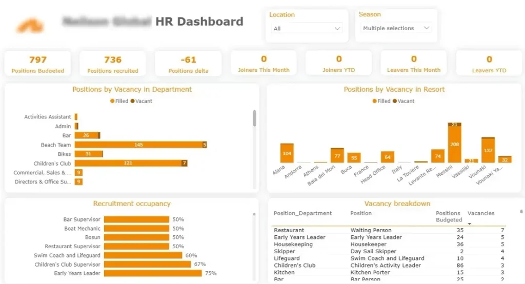
Our Power BI consultants built this dashboard for a packaged holiday provider that hires a large number of seasonal workers every year. The top row tracks positions budgeted, positions recruited and the resulting gap, alongside joiners and leavers for the month and year to date. Below that, vacancies are broken down by department and by resort, with a recruitment occupancy percentage for each job role and a detailed vacancy table by position. Location and season filters let each regional team see only their own hiring.
Recruiters use it to decide where to spend the week. The occupancy view shows which roles are furthest from being filled, and the resort breakdown shows which sites are carrying the most operational risk from unfilled positions. Senior managers can check headcount against budget without asking anyone to prepare a report.
This dashboard answers one question: which sourcing channels are worth the money. It is built for talent acquisition leads and agency owners who spend across job boards, LinkedIn, sourcing tools and referrals.
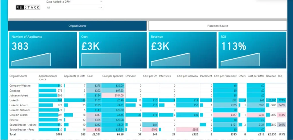
Our business intelligence consultants created this for a recruitment business that wanted to see spend and outcomes in one place. The KPI row shows total applicants, total cost, revenue generated and overall ROI. The table underneath breaks every source down the full funnel: applicants from source, applicants added to the CRM, cost, cost per applicant, CVs sent, cost per CV, interviews, cost per interview, placements, cost per placement, offers and revenue. A toggle switches between original source and placement source, so you can see where candidates come from and where they actually convert.
The value is in the gap between volume and outcome. One source in this view delivered over 300 applicants and no placements. Another delivered a fraction of that at 778% ROI. Without the cost columns joined to placement data, those two channels look similar on an applicant count.
Recruitment agency CEOs and managing directors use this executive dashboard to see how each consultant contributes to the business. It moves the conversation from billings to profit.
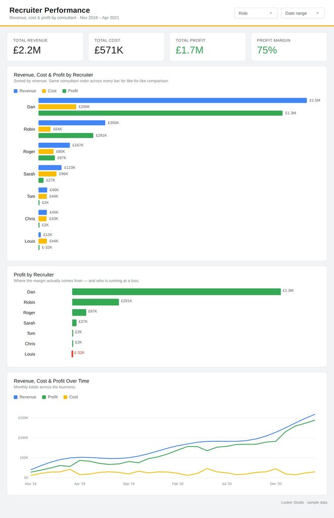
Our Looker Studio consultants worked with a recruitment agency to build this for their managing director. The top section compares revenue against cost for every recruiter, with profit shown separately so the two are never confused. The contribution charts show what share of total revenue, total cost and total profit each recruiter accounts for. A monthly trend view tracks revenue, cost and profit across the full period, including the months where profit turned negative.
The profit contribution chart is the one that changes decisions. It makes clear when a recruiter’s costs are consuming their billings, and when a smaller biller is quietly one of the more profitable people in the team. Role and date filters let the MD review a single desk or a single quarter.
This sales dashboard tracks the commercial health of an agency’s client base. It is used by agency leadership and account directors who need to know where growth is coming from.
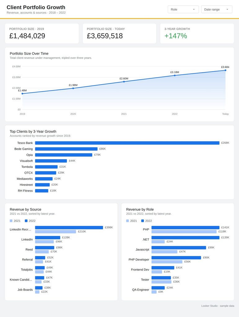
Our digital analytics consultants built this for the same agency to sit alongside their recruiter view. It tracks which client companies have grown over a three-year period, and compares portfolio size three years ago against today with the growth figure between them. Average order value per company shows how fee levels are moving client by client. Three further views break revenue down year on year by recruiter, by source and by job role.
Leadership use it to decide where to put business development effort. The year-on-year role view shows which specialisms are growing and which have fallen away, and the source view shows which channels bring in revenue rather than just candidates. Flat or declining accounts become visible while there is still time to act on them.
Every custom recruitment dashboard we deliver follows roughly the same data analytics implementation plan. Here is how we approach it.
Our first conversation is never about charts. We ask what decisions you make each week and what you currently cannot answer without asking someone to pull a report.
In our experience this saves the most time later. Teams often start with a list of thirty metrics, and once we work back from actual decisions, six of them do the real work.
We look at your CRM or ATS first and check what is genuinely being recorded. Source fields left blank, placements logged inconsistently and duplicate client records are all common, and all of them break cost calculations.
We tell you what we find before quoting on a build. Sometimes the honest answer is that a small change to how your team logs data will unlock more than any dashboard would.
Next we bring in the systems that hold the rest of the picture: LinkedIn Ads, job boards, sourcing tools and your finance or invoicing data. Joining spend to placements is the step that makes cost per hire and ROI possible.
This is usually the hardest part of the project and the part clients underestimate. Matching a LinkedIn campaign to a placement six weeks later requires the data model to be built properly, not just pointed at a spreadsheet.
We design the layout around who opens it and why. A recruiter needs their own roles first, a managing director needs the whole desk, and a hiring manager needs one department.
We have found that management reports fail when everyone sees the same screen. Filters and role-based views keep each person looking at their own numbers.
Finally we set the data to refresh on a schedule that matches your reporting rhythm, whether that is daily or every few minutes. We then walk your team through it and leave documentation behind.
We also stay available afterwards. Recruitment businesses change how they work, and dashboards need adjusting when a new desk, client or channel appears.
The dashboard reads directly from your CRM or ATS rather than a manual export. Numbers update on a schedule, so nobody spends the first morning of the month rebuilding a report.
We build the calculations for cost per applicant, cost per interview, cost per placement and ROI into the data model. The figures stay consistent regardless of who opens the dashboard or which filters they apply.
Every headline number can be opened up. A revenue figure breaks down by recruiter, a vacancy count breaks down by department and location, and a cost figure breaks down by channel.
Recruiters, managers and directors see views built for their level of responsibility. This keeps commercially sensitive figures with the people who need them.
Every recruitment business records data differently, which is why a dashboard built around your own CRM, ad spend and revenue will always tell you more than a generic report.
If you would like to see what your hiring data could look like, get in touch with our team or read more about our BI consulting services.
Recruitment analytics is the use of hiring data to guide recruitment decisions. It covers pipeline volumes, time to fill, sourcing cost, recruiter performance and client revenue. A dashboard is how those numbers get in front of the people making the decisions.
Most teams need time to fill, cost per hire, source effectiveness, offer acceptance rate and pipeline conversion between stages. Agencies usually add revenue, gross profit and average fee per client. We recommend starting with the handful that change what you do next week.
A template is a reasonable way to see what is possible, but it will not match your CRM fields, your fee structure or your sources. We build from your own data instead, which is what makes the cost and ROI figures reliable.


