
The HR dashboard examples below are real builds we delivered for clients in Power BI and Tableau, not off-the-shelf templates. We design each one around your own HR systems and the metrics your team reports on.
A Power BI HR dashboard reports on your human resources data, from recruitment and payroll to absenteeism, overtime and other workforce metrics. HR teams use it to spot staffing issues by department, report to leadership and base their decisions on real numbers.
We’ve built dashboards for 600+ clients, including Google, Teleperformance and Heineken.
Our Power BI developers have created HR dashboards that automatically extract data from dedicated HR systems like Workplace and Workvivo. On many projects we’ve also worked with recruitment data from CRM systems, employee satisfaction data from surveys, and training data from learning management systems.
In this article, we’ll walk through examples of custom HR dashboards we’ve built, discuss their key features and explain how clients use them.
An HR dashboard is a visual report of a company’s HR data: headcount, recruitment, payroll, attrition and so on. It feeds off the tools HR already uses, usually an HRIS, a payroll system, a recruitment CRM, sometimes a learning platform. HR teams use it to keep track of staffing, pull together reports for leadership, and catch the numbers that are heading the wrong way.
A good HR KPI dashboard has a dedicated tab for analysing every area of operation of the human resources department.
The HR analytics needs of every organisation are slightly different, but the areas of analysis are generally the same. Below are examples of custom HR dashboards we’ve built for clients. Each one is designed around a specific organisation’s data – they’re not templates.
HR attrition dashboard helps to measure the problem of attrition, where departed employees are not replaced for a long time, increasing the workload per employee. The key metrics in an attrition dashboard are the number of new joiners, resignations and attrition %.
The main benefits of a Power BI HR dashboard analysing attrition are:
For example, we built the Power BI attrition dashboard below for our client. This dashboard analyses the number of new joiners, resignations and the net change in the headcount. It also breaks down the headcount change by business unit between the start and the end date.
The dashboard goes on to analyse attrition % by business unit, which measures the number of people who left and haven’t been replaced in 3 months.
Finally, because of attrition, employees have to work overtime, so we also analysed which business units pay more overtime per person on an average day.
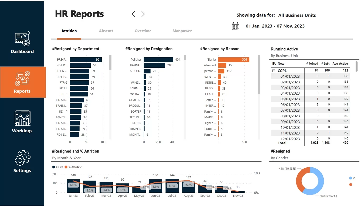
The second page of our HR attrition dashboard that you can see below is measuring the number of resignations by department, job role and reason. This analysis helps to set the recruitment priorities and highlights the main resignation reasons to address.
The number of resignations and attrition % is also analysed by month to monitor the effectiveness of measures to reduce attrition and turnover.
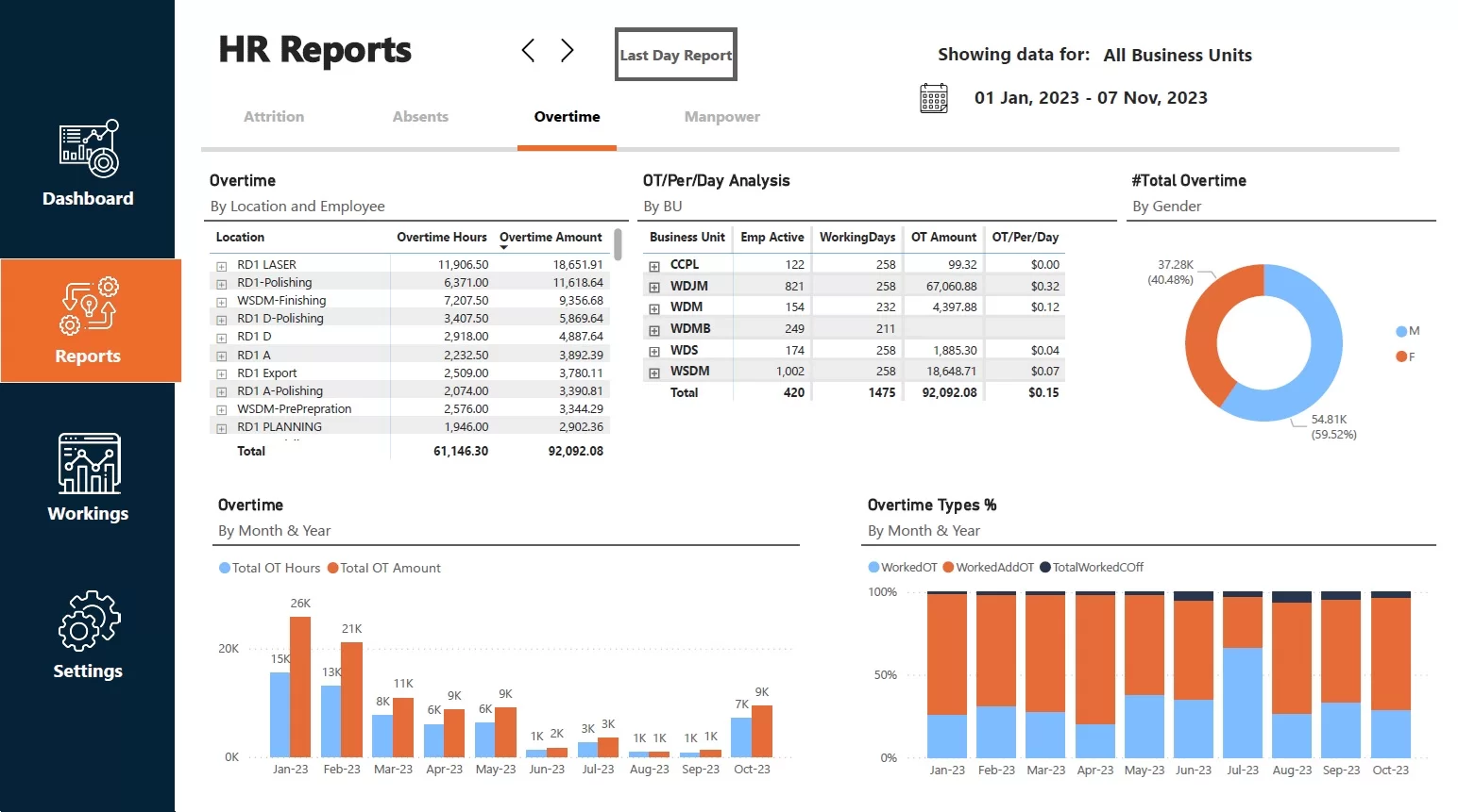
The final tab of this Power BI HR dashboard analyses the impact of attrition on overtime. It analyses which locations and business units have worked the most overtime hours and are due the most money for working overtime.
The dashboard also analyses overtime hours/amount per month to monitor how effectively the impact of attrition is minimised.
HR recruitment dashboard is designed to track progress towards filling the open roles and optimise the candidate sourcing process. It is usually built from the company CRM, where the hiring pipeline data is stored.
The main benefits of this dashboard are:
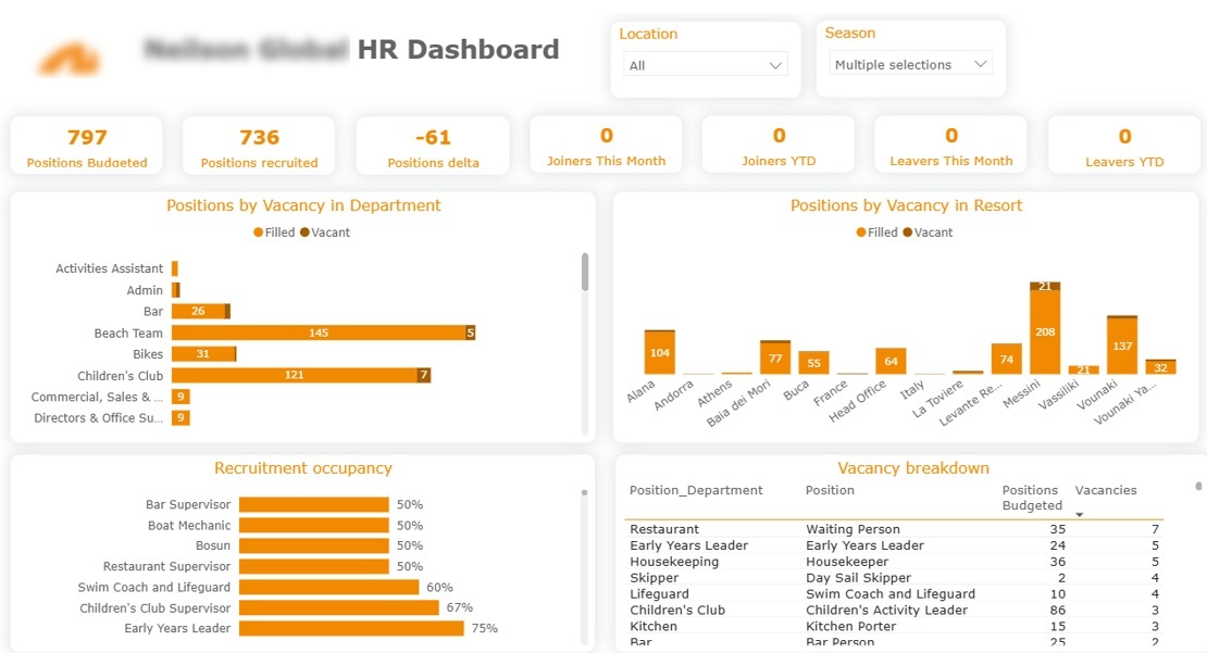
For example, we have built the Power BI recruitment dashboard below for a packaged holiday provider that hires a large number of seasonal workers every year.
The dashboard visualises the total number of filled and unfilled positions by job role. This way, the recruiters can clearly see what roles they need to focus on. This dashboard also shows the resorts that are most affected by the vacancies, which highlights operational risks.
The Power BI recruitment dashboard below our Power BI experts developed for a different company, but it is a good addition to the analysis we discussed previously. It breaks down the number of applications, costs and job offers by source. Crucially, it calculates the cost per application, interview and job offer by source, which helps to identify the most cost-efficient way of sourcing candidates.
HR payroll dashboard is a tool that visualises the employee compensation data to measure the full payroll costs and allocate them to specific departments, projects or business processes. For companies that pay staff in several countries, this data often comes from a global payroll provider that consolidates local payslips, taxes and employer contributions into one feed.
The benefits of an HR payroll dashboard are:
For example, we have built the Power BI payroll dashboard below for a security services company. This dashboard helps them measure the payroll costs for providing their services vs the invoiced revenue of these services.
Note: All data in this dashboard is anonymized. No real client data is shared here.
The dashboard breaks down the payroll costs into wages, pension contributions and employee insurance paid by the employer.
The next page of our Power BI payroll dashboard breaks down the payroll costs by day. These payroll costs are then allocated to specific clients based on the hours of service provided by the security company.
Some team hours are invested in non-billable activities such as training. This Power BI HR dashboard shows them separately and visualises the payroll cost of those hours.
Finally, the dashboard visualises the number of hours worked by every employee and every job role to measure current demand for certain services.

HR diversity dashboard is a tool that analyses the correlation between different demographic characteristics and salary or promotions.
The benefits of the HR diversity dashboard are:
For example, we have built a Power BI diversity dashboard for a recruitment agency specialising in marketing professionals. The dashboard analysed the anonymous survey data where employees of a single organisation answered questions about their seniority level and different protected characteristics such as age, gender, sexual orientation, disability, etc. Organisations often use anonymous employee feedback tools to gather this type of workforce sentiment while encouraging honest participation.
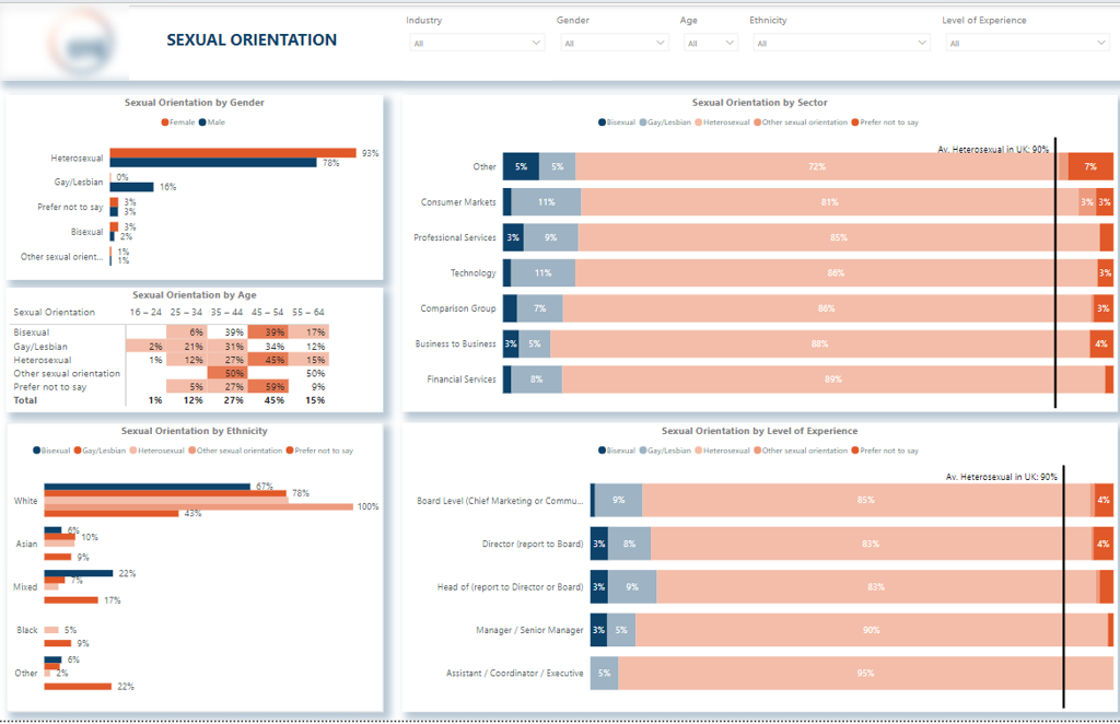
The first page of this HR diversity dashboard analyses the age and gender distribution. Through our analysis, we found that women have higher representation in the workplace among 25-45-year-olds, whereas men have higher representation among employees over 45. The analysis revealed a potential bias favouring the hiring of younger women while presenting increased hiring and promotion challenges for those over 45.
The next page of our Power BI HR DEI dashboard analyses the potential biases towards sexual orientation. For example, when we analysed the number of employees by sex and gender, we found that gay men make up 16% of the male workforce, whereas gay women make up close to 0%. This highlighted that the HR potentially preferred hiring gay men for DEI compliance.
You can view other pages of our Power BI diversity dashboard here.
An HR dashboard for the CEO is a single-page executive summary that gives senior leadership a high-level view of the whole workforce without going through every operational HR tab.
The main benefits of this dashboard are:
For example, we built the Power BI executive HR dashboard below to give CEO a single view of the workforce.
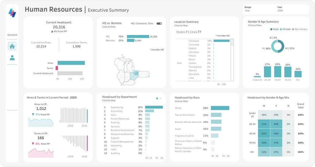
The dashboard opens with the numbers leadership tends to ask for first: current headcount, cumulative hires and terminations, and the hires and terminations in the current period against the prior one. Each figure sits next to a trend line, so it is easy to see whether the workforce is growing or shrinking and how this year compares with previous ones.
From there it breaks the workforce down by location and department. The HQ versus remote split and the location map show where people are based, and the headcount by department view shows which teams carry the most people. This way, the CEO can quickly see which parts of the business carry the most cost.
The lower half of the dashboard covers the demographic picture: gender, age and race, along with a gender and age mix table. At summary level it gives leadership a fast read on the shape of the workforce for board reporting, while the detailed DEI analysis is handled on a dedicated dashboard elsewhere.
Finally, because it sits above the operational tabs, this kind of executive summary works well as the front page of a wider management reporting setup.
HR employee dashboard is designed to analyse the headcount distribution across roles, departments and demographic characteristics.
The main benefits of this dashboard are:
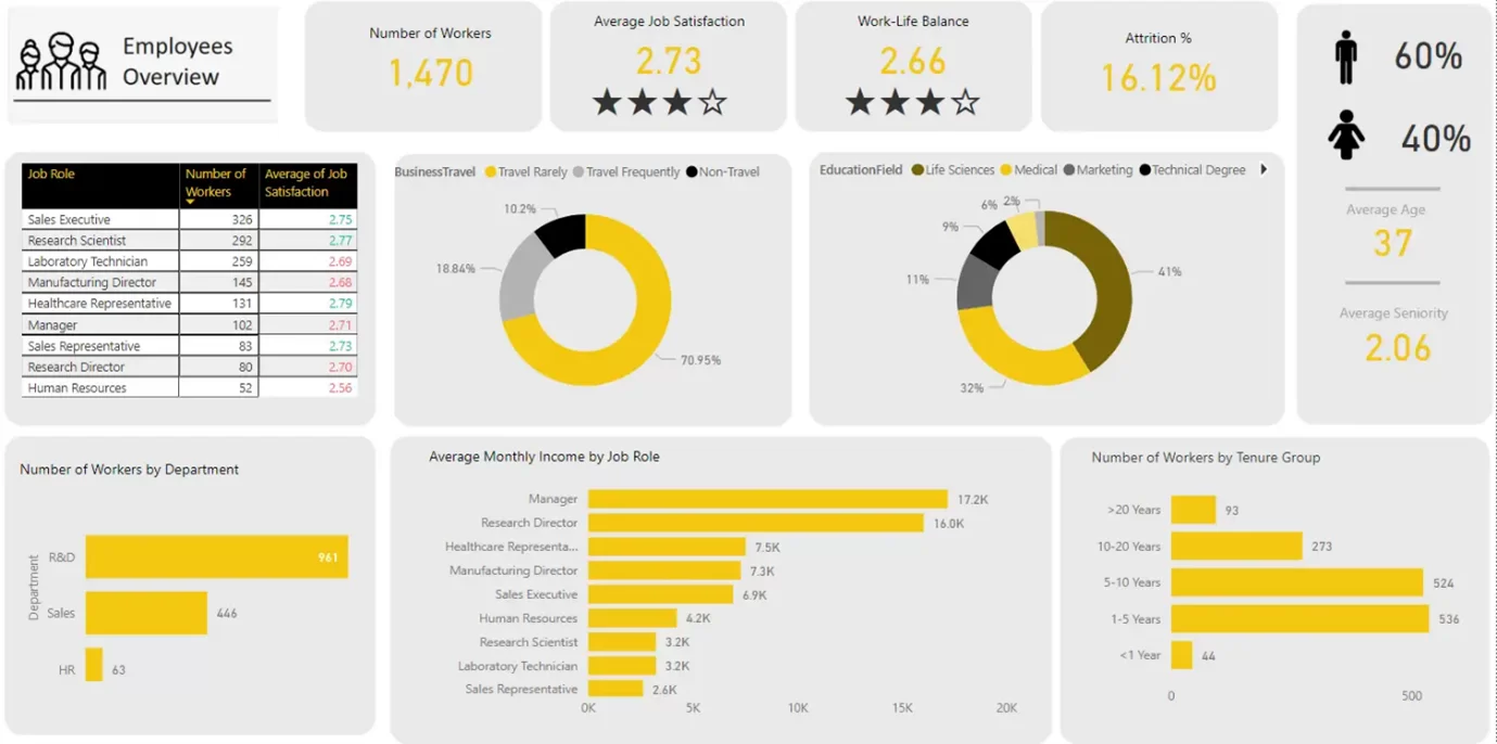
For example, our BI consultants created the HR metrics dashboard below to help a mid-market organisation report on its headcount to senior management.
A part of this dashboard is dedicated to understanding the background of the workforce: gender distribution, average age and education.
The Power BI HR dashboard further analyses headcount by job role and department, helping assess the human capital costs associated with each.
Average monthly income by job role insights helps to identify the most expensive job roles to employ.
Finally, the dashboard analyses the headcount by years of tenure to assess how effective the company is at retaining talent.
An HR performance dashboard shows how people and teams are tracking against their goals and ratings, so a manager can walk into a review with the numbers already in front of them.
The main benefits of this dashboard are:
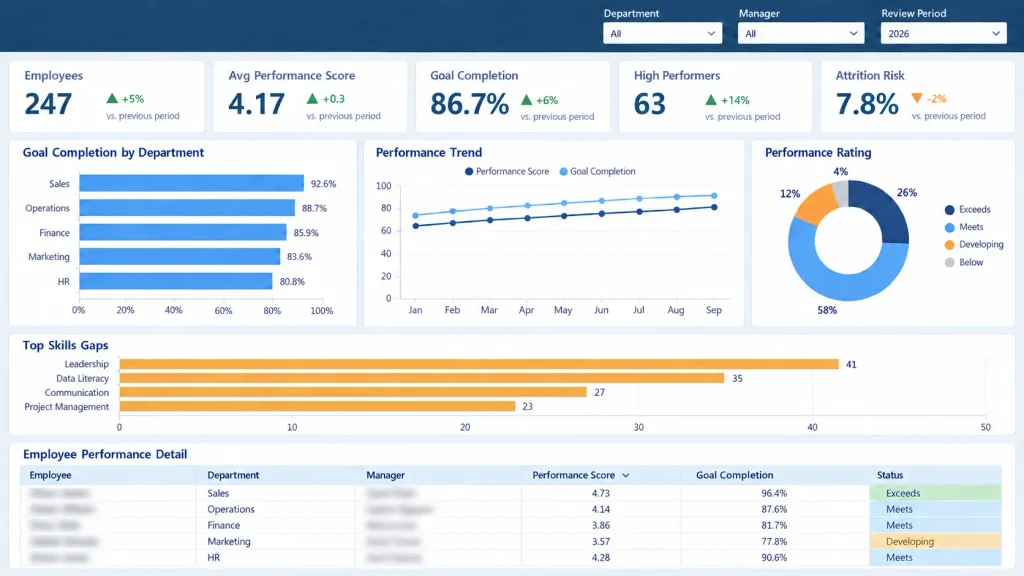
For example, here’s a Power BI performance dashboard we built. The top row carries the headline numbers a manager checks first: total employees, average performance score, goal completion, how many people are high performers and how many are at risk of leaving, each set against the previous review period. Below that, goal completion is split by department, performance and goal completion are trended across the year, and a rating breakdown shows how the team splits across exceeds, meets, developing and below. It also surfaces the widest skills gaps, leadership and data literacy among them, and ends with a table of individual scores, goal completion and status.
An HR engagement dashboard shows how staff survey results break down: the overall score, how it varies from team to team, and what is pushing people up or down. It saves HR from staring at a single company-wide number with no idea where to start.
The main benefits of this dashboard are:
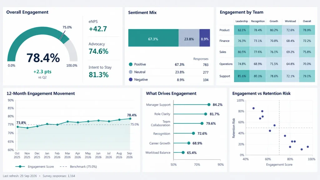
For example, here’s a Power BI engagement dashboard our data visualization consultants built from staff survey data. It leads with the overall engagement score and how it has moved since the last round, next to eNPS, advocacy and intent-to-stay. Sentiment is split into positive, neutral and negative, and a team heatmap shows how each department scores on things like leadership, recognition, growth and workload. The lower half trends the score against a benchmark over the year, ranks what is driving engagement from manager support down to workload balance, and plots engagement against retention risk so the teams most likely to lose people stand out.
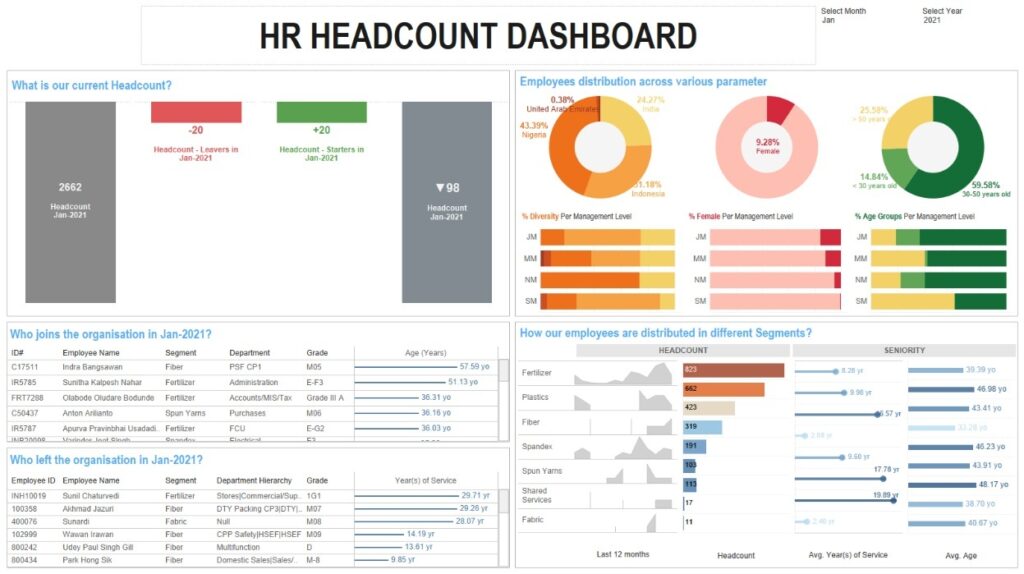
This Tableau HR dashboard is a headcount view our BI consultants built, showing how the same kind of HR reporting works in a different tool.
It opens with the headcount at the start of the month alongside the number of resignations, new joiners and the headcount at the end of the month, then lists the specific people who joined and left that month.
From there, headcount is broken down by age, gender and nationality to give a picture of how diverse the team is.
The dashboard closes by breaking headcount down by department and showing the trend of new hires over the last 12 months. We also looked at the average tenure and average age of employees in each department, which helps spot where a team might be ageing or turning over quickly.
There’s no standard set of HR KPIs. Which HR metrics you need comes down to what you’re trying to fix: a team worried about losing people builds around turnover; a team struggling to fill roles builds around recruitment. Most HR dashboards draw from five areas:
You won’t need all of it. The dashboards that get used stick to the numbers managers keep asking about and drop the rest.
Every dashboard we build is shaped around one thing: your data. Before any design work starts, we look at where your HR data actually lives, whether that’s your payroll system, a recruitment CRM, your HRIS, a learning platform, or a mix of all of them. Getting this right early is what makes the final dashboard something you can trust.
From there we sit down with you to work out what the dashboard actually needs to answer. Every HR team reports on slightly different things, so we focus on the metrics your managers and leadership genuinely care about instead of filling the screen with numbers nobody uses.
Once the direction is agreed, we build the dashboard in Power BI or Tableau, depending on what suits your tools and your team. We test it against your real data as we go, so what you see is accurate from day one and not just a nice looking mockup.
After it goes live, we stay involved. Data sources change, teams reorganise, and new questions come up, so we support the dashboard over time and adjust it as your needs shift. What you end up with is something built around your setup, rather than a template you have to bend to fit.
Whatever your team reports on, which usually comes down to headcount, turnover, recruitment numbers like time to fill and cost per hire, and an engagement score. Start with five or six metrics that answer a real question and add more only when you use them. Thirty numbers nobody checks is a spreadsheet, not a dashboard.
Start with who will read it and what they need to decide. Pull the data from wherever it lives, usually an HRIS, payroll and a recruitment CRM, then build and test it in Power BI or Tableau against real numbers. Most of the effort goes into cleaning the data and agreeing the metrics, not the build itself.
There is no official five, but the ones on almost every HR dashboard are headcount, turnover rate, time to fill, cost per hire and an engagement or eNPS score. Between them they tell you how big the team is, whether people are leaving, how quickly you hire and how people feel about being there.
In business intelligence, dashboards are usually grouped as strategic, operational, analytical and tactical. Strategic ones track long-term goals for leadership, operational ones handle day-to-day monitoring, analytical ones dig into why something happened, and tactical ones follow a specific project. An HR dashboard can be any of these: an executive HR summary is strategic, a live recruitment tracker is operational.
Both. We have dashboard templates we can start from to save time, but the real work is customizing them around your data and the metrics your team reports on. Whether we begin from a template or from scratch, what you get is built for your organization rather than a generic layout you have to adapt yourself. We build in either Power BI or Tableau.
We regularly pull data from systems like Workday, BambooHR, payroll platforms, recruitment CRMs and learning management systems. If your data lives somewhere, we can usually connect to it.
Both do the job well. Power BI tends to suit teams already using Microsoft tools, while Tableau is often chosen for heavier visual analysis. We build in both and can advise based on what you already use.
It depends on how many data sources are involved and how complex the reporting is. The quickest way to get a realistic timeline and quote is a short consultation call where we look at your setup.
At Vidi Corp, we have helped 600+ clients, including Google, Teleperformance and Heineken, to build their dashboards. Our data analysts would be excited to bring our experience into your project. Contact us now to discuss your requirements, or request any of these HR dashboard examples, and our Power BI consultants will start building your custom HR metric dashboard!


