
An inventory management dashboard is used to see what you’ve got in stock, where it is and whether that stock is actually selling. Ultimately it’s two questions that drive every stock decision: are we about to run out and how much cash is tied up in dead stock.
Our dashboard development consultants at Vidi Corp specialise in building these dashboards in Power BI, Tableau and Looker Studio for companies of all shapes and sizes – manufacturers, distributors, retailers and brands selling through third-party partners. We connect them automatically to the systems where your stock data already lives – that might be your ERP, warehouse management system, retailer portals or even a spreadsheet-based mess – so numbers update automatically without anyone having to still build a report.
This blog post shows six real inventory dashboards we’ve built for actual clients. Each one tackles a different inventory headache – from reordering stock to getting warehouse throughput up to the job of getting stock off the shelves in retailers.
A single screen that keeps track of stock levels, movement and value – that’s what an inventory management dashboard is. And it does this using live data from your operational systems.
The data source can vary depending on the business type. For manufacturers & distributors it is usually an ERP. For warehouse operators it is the warehouse management system. For brands selling through retailers it is the retailer’s own supplier portal, and for smaller operations it is often a set of spreadsheets that we come in and sort out.
And the audience can be pretty varied too. Operations managers need it to prevent stockouts, warehouse managers need it to clear the bottlenecks and finance directors need it to see how much working capital is tied up in dead stock.
The most common inventory mistake is finding out about a shortage after the horse has bolted. A business intelligence dashboard that calculates a reorder point from demand and lead time flags up stock that is running low while there is still time to order.
This turns replenishment into a scheduled decision rather than a mad panic. Teams stop paying for emergency shipping to fix problems that could have been seen weeks in advance.
Every unit in storage is cash that can’t be used elsewhere. Tracking how long items have been in stock shows exactly where that money is sitting and for how long.
This really matters when we are talking about expensive items. A handful of high-value products sitting unsold for a year can represent more cash that is locked up than thousands of fast-moving cheap items.
Stock that’s arrived but not been put away is invisible to most systems, and orders that are picked but not staged never show up in a stock count. Breaking activity down by status makes both visible which is an essential part of any firm’s supply chain analytics strategy.
Warehouse managers can then take action on the specific stage that is blocked rather than just throwing more labour at the problem.
If you are selling through retailers you rarely control the stock that they hold. A management report that tracks on-hand stock and weeks of supply inside the retailer gives you the facts to make your case when you go to the buyer.
Turning up to a buyer meeting with the retailer’s own numbers changes the discussion completely. Requests for bigger orders become data-backed rather than just based on an anecdote.
Below are six inventory dashboards our business intelligence consultants built for real clients – covering manufacturing, warehousing, luxury retail and third-party retail distribution.
This one tracks current stock against the calculated level so teams know when to reorder. It is most useful for manufacturers, distributors and FMCG brands that need to keep tight control over stock levels to avoid stockouts or excess working capital tied up in stock.
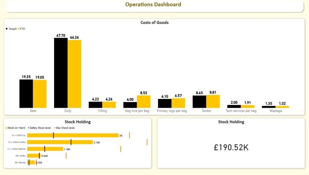
Our Power BI consultants built this for a beer company. It tracks Stock on Hand by product and calculates both a Safety Stock Level and a Max Stock Level from demand patterns and lead times. Plotting all three together shows the safety stock line as an actual reorder point: when a product’s bar hits it, that product needs ordering. The KPI dashboard also compares the cost of goods against target by category, so operations and finance work from the same page.
The client now places their replenishment orders before the stock hits the threshold rather than after a shortage shows up. This has reduced emergency restocking, improved service levels and kept inventory healthy without over-ordering into the max stock level.
This Power BI logistics dashboard shows warehouse teams a live view of receiving activity and storage capacity. It is used by warehouse managers, shift supervisors and operations directors in logistics-driven organisations.
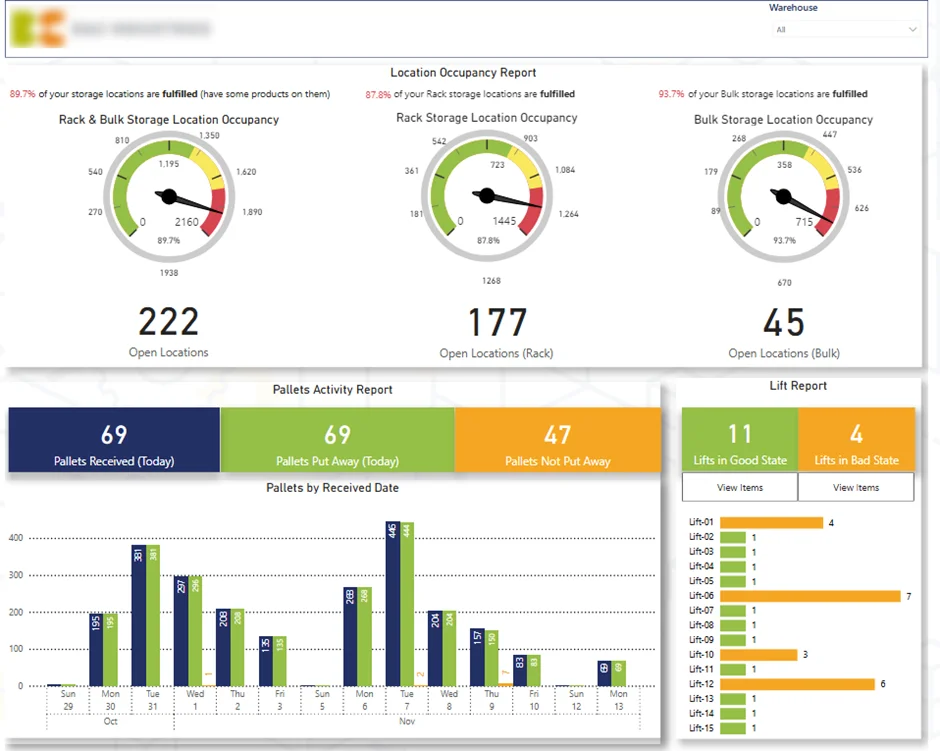
We pulled this data directly from the client’s warehouse management system, which is what makes location-level detail possible. This warehouse dashboard shows just how full rack and bulk storage are, with open locations counted separately for each, then tracks pallets received against pallets put away on the day. The lift report breaks up remaining items by individual forklift, so a manager can see which lift still has stock on it and tell that driver to get on with it.
The result was tighter control over inbound activity. Occupancy views highlighted capacity constraints before congestion set in, and the pallets-not-put-away and per-forklift figures let managers prioritise work rather than guess at it.
The second page this dashboard build is focused on outbound performance and delivery readiness. It’s geared towards those being judged on their on-time despatch performance – the fulfilment managers.
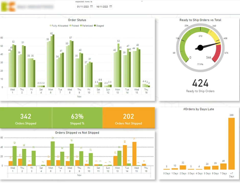
A gauge on the page tracks the percentage of items Ready to Ship – and it’s the team’s aim to keep that as high a number as possible throughout the week. Order flow is broken down by status – Fully Allocated, Picked, Palletised and Staged – so any blockage at any of those stages is visible in isolation. The dashboard also compares shipped against not shipped by expected ship date and gives a visual overview of outstanding orders by days late with a histogram.
It’s the days-late histogram that changes the way people work. This kind of data reporting lets managers tackle the worst-delayed orders first rather than just working through the queue in the order it arrived – which has actually improved on-time delivery rates and reduced the number of orders drifting past a week.
This operations dashboard is all about tracking stock that lives outside your own warehouse – at customer sites. It’s perfect for businesses that place, rent or consign inventory with clients and need to know where their stock is located.
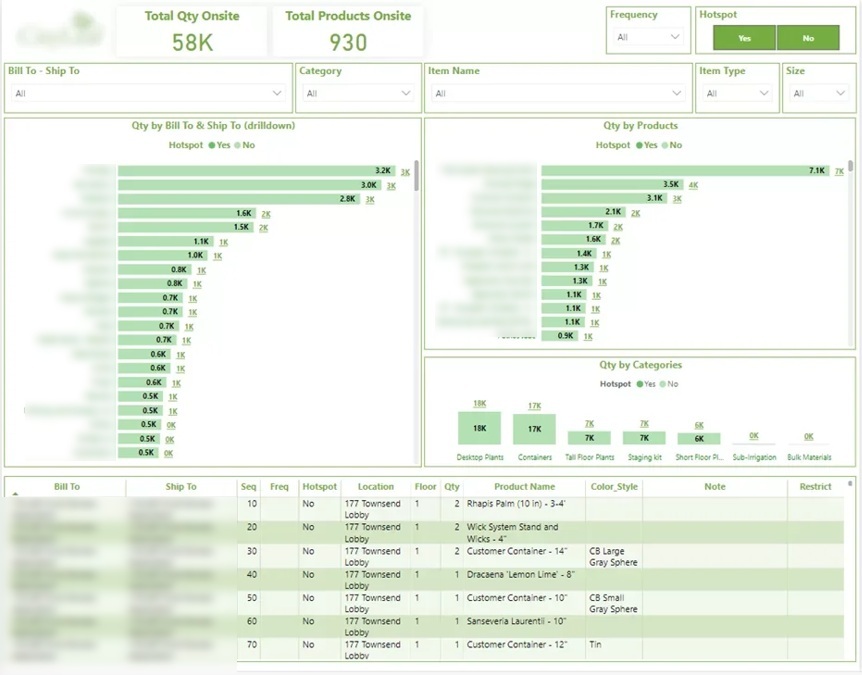
We had a company that rented office plants to corporate clients and were using dozens of disconnected spreadsheets to track inventory across locations. It was taking staff more than 5 hours a week to do it and still leaving warehouse teams having to hunt for stock. We built an inventory management Power App solution that actually runs off the warehouse floor – staff can just scan an item’s barcode and it updates the stock level and schedules a delivery in one go. It integrates with ShipStation through API so freight labels get generated automatically as orders come in.
Our Power Platform consultants then paired it with the dashboard above, giving live stock quantity and location and how much each customer is holding at any given time. It gave back the five-plus hours a week that were being lost to spreadsheet updates, made stock actually traceable to a location in real time rather than just a guess, and gave the company some reliable numbers to plan their purchasing around.
This dashboard tells you how long stock has been sitting and which items deserve the closest attention. For businesses where a single unit represents a significant sum, every week that item stays in stock is capital that could be used elsewhere.
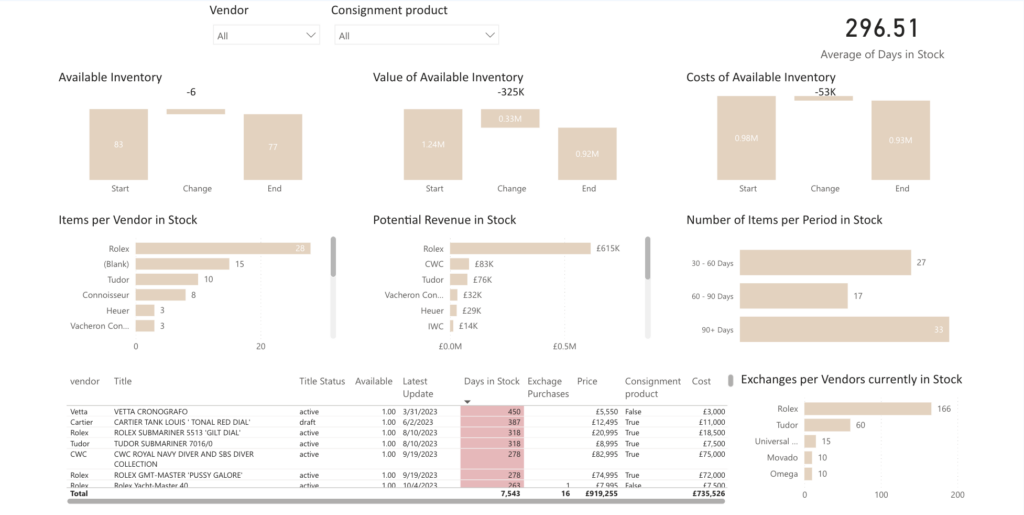
Our data visualization consultants built this for a luxury watch business that sells on consignment. It tracks available inventory, the value and cost of that inventory, and the average days in stock, then groups items into ageing bands of 30-60, 60-90 and 90+ days. Potential revenue and item counts are broken down by vendor so buying decisions can be traced back to the supplier that generated them.
This view supports ABC analysis – the practice of splitting inventory into three groups based on how much of your total stock value each represents. Category A is the small number of items that account for most of the value and needs tight, frequent review; category B is in the middle; category C is the high-volume, low-value tail that requires far less oversight. Reading ABC categories alongside days in stock is what makes the executive dashboard actually actionable – if an A-category watch is sitting in the 90+ day band then that’s a capital problem that needs attention straight away, whereas a C-category item at the same age isn’t.
This supply chain dashboard tracks stock a retailer is holding on behalf of a brand. It’s perfect for consumer goods brands, wholesalers and manufacturers that sell through large retail partners and need visibility into store-level availability.
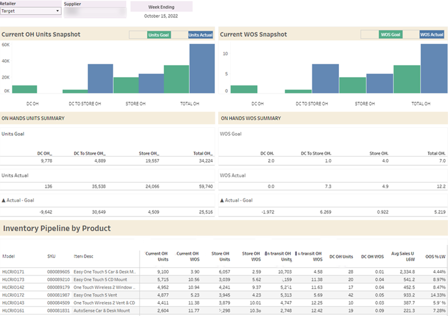
Our Tableau consultants built this for a brand selling through Target and it compares on-hand units and weeks of supply (WOS) against agreed goals at three points in the chain – the distribution centre, stock in transit to store, and stock on the shop floor. A product-level table then shows current units, WOS, in-transit units, average weekly sales and out-of-stock percentage for every single SKU.
When products dropped below target weeks of supply, our client could have a word with Target and often picked up additional replenishment orders and incremental sales. The same approach works for any partner-held inventory model – brands selling through Fulfilment by Amazon (FBA), wholesalers supplying grocery chains, or distributors holding stock on behalf of a manufacturer. In each case the brand carries the commercial risk of a stockout but doesn’t actually control the stock – which is exactly the gap a Tableau dashboard like this closes.
Every inventory dashboard we deliver follows roughly the same path – here’s how we approach it.
Our first question is what you would do differently if you had the numbers right in front of you. We’re talking about decisions like reordering, discounting, chasing a retailer and reassigning warehouse staff – all different decisions that need different views.
In our experience this is where most inventory projects go off the rails. Teams ask for everything the ERP holds and the result is a screen that nobody looks at twice.
We Do a Deep Dive Into Your ERP, WMS or Spreadsheets Before Quoting On A Build
When we look at the ERP, WMS or spreadsheets before quoting on a build, we often encounter stock counts that have drifted away from reality, items that lack a recorded cost, and locations that are logged inconsistently. And each of these common problems can break a calculation down the line.
We’ll give you a heads up on what we find first. Sometimes, the honest truth is that sorting out how stock is recorded will deliver way more than any pretty dashboard ever could.
A stock level on its own just isn’t enough. Things like safety stock and reorder points need a bit of history around demand and lead times to work properly, and ageing analysis needs a record of when each item landed in stock. And joining all those things together is what tends to catch people out. It’s also what sets a dashboard that just tells you about your stock apart from one that actually tells you what to do about it.
A warehouse supervisor needs to see today’s put-away queue, a buyer is going to want ageing and vendor performance, and a finance director needs to know the inventory value. So we design separate views, rather than one screen that sort of, kind of meets everyone’s needs.
We’ve found that dashboards used on the warehouse floor need to work quite differently from month-end reports. Screen size, how often it refreshes and the level of detail all change.
We set the data to refresh at the right time to match how the business works, which for an inbound warehouse operation is often several times a day. And then we train the team and leave some documentation behind. After that, we stick around since inventory operations and processes can change. New locations, suppliers and retail partners all need adding once the dashboard is live.
The right metrics depend on the business, but most inventory dashboards we build include some combination of:
Every business is different, and that’s why a dashboard built around your own ERP, warehouse system or retailer data will always be more useful than some generic template.
If you’d like to see what your inventory data could look like, get in touch with our team or check out our supply chain business intelligence work.
Most often it’s an ERP system, a warehouse management system, or a retailer’s supplier portal. We also build from ecommerce platforms, spreadsheets, and custom databases, and often combine several sources if stock data is split across systems.
The reports in your ERP system will show you what stock you hold right now. But an inventory dashboard adds some context around that – thresholds, ageing, movement over time and cost – all in one view, designed to help you make a decision rather than just display some numbers
Yes, and it’s a pretty common starting point. In fact, two of the builds mentioned above replaced spreadsheet processes, although we usually recommend sorting out how stock is recorded at the same time.
Both – the examples above include builds in both, and the right choice usually depends on what your team already uses and how the dashboard will be accessed.


