
Manufacturing data visualization turns IIoT, MES, and ERP data into live dashboards that help teams track OEE, quality, throughput, and machine performance in real time.
As manufacturers modernize operations, more plants rely on live data visualizations for predictive maintenance, capacity planning, and energy monitoring instead of static spreadsheets and paper reports.
Every minute of unplanned downtime costs manufacturers thousands. That is exactly why over 600 clients, including manufacturers like Lightwave Group and Isovolta AG, trust Vidi-corp to turn their data into action. Ranked the number one business intelligence consultancy worldwide on G2 with over 1,000 projects delivered, our Power BI consultants know what it takes to make data work on the factory floor. From real-time dashboards that flag issues in seconds to unified KPI views that align operators, engineers, and executives, we help manufacturing teams cut unplanned downtime and stay ahead of schedule.
In this article, we’ll cover the key concepts, benefits, dashboards and case studies of manufacturing data visualization.
Manufacturing data visualization is the process of turning complex, fast-moving production data into clear visuals that people can understand quickly. This often includes metrics like cycle times, scrap, OEE, downtime, throughput, and energy use shown in line charts, heat maps, KPI cards, and role-based dashboards.
The data usually comes from systems such as PLCs, industrial sensors, SCADA, MES, WMS, and ERP. It is then brought into a central analytics or IIoT platform, where it can be structured, analyzed, and displayed in real time.
Unlike raw reporting, data visualization is not just a dump of numbers in large tables. Its purpose is to highlight context, trends, bottlenecks, and anomalies so teams can spot what matters faster and respond more effectively.
These visualizations can be shown on large shop floor screens, operator tablets, and management portals. That gives operators, engineers, supervisors, and executives a shared real-time view of production.
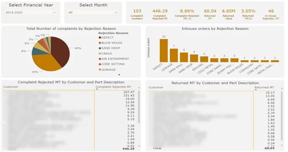
The Quality Control dashboard tracks production quality by analysing defects and rejections over time, providing manufacturing managers and quality teams with a consistent view of quality performance and the ability to identify recurring issues before they escalate.
Our dashboard development services experts built this for a steel manufacturer to analyse defects, including blow holes, sand drops, cracks and other rejection reasons. The dashboard displays rejection volumes and values by month or financial year, quantifies the financial impact of returned items, and breaks down complaints and rejections by both customer and individual part. This level of detail allows teams to move beyond surface-level quality metrics and understand exactly where, why and how often defects are occurring across the production process.
The analysis enables the factory to identify which quality problems arise most frequently and which carry the greatest financial cost. Teams can use this insight to prioritise corrective actions where they will have the most impact, reduce waste and rework across production lines, and protect customer relationships by addressing the root causes of complaints. Over time, the dashboard gives the business stronger control over product quality and a measurable foundation for tracking improvement, supporting a culture of continuous quality management that directly contributes to operational efficiency and margin protection.
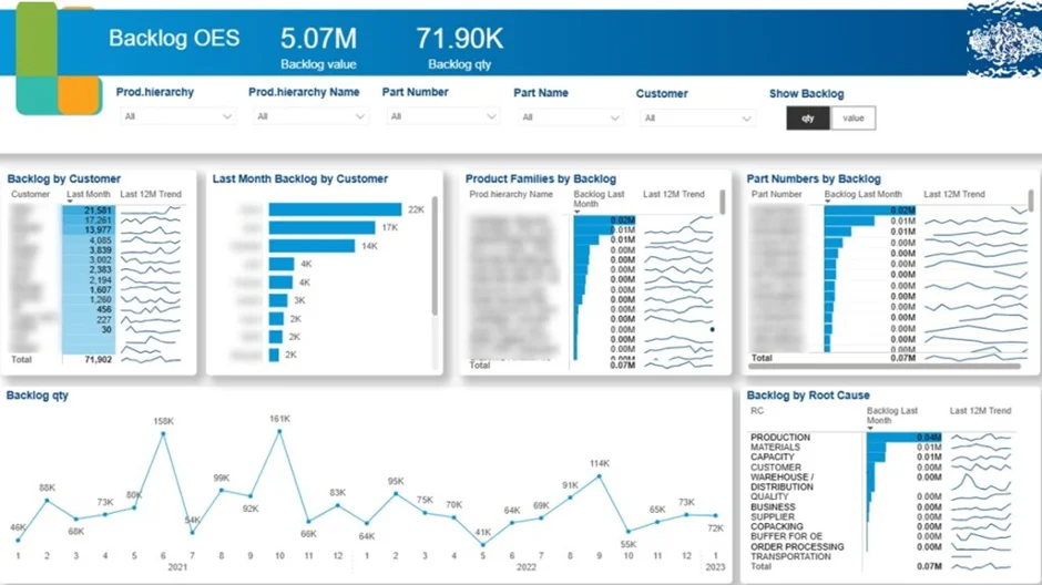
This manufacturing backlog dashboard helps teams monitor sales demand and order backlog over time. Sales leaders, operations managers, and supply chain teams use it to assess delivery pressure and understand the potential impact on customers.
Our Business Intelligence consultants built this dashboard for a manufacturer of train and commercial vehicle parts. The dashboard analysed backlog trends by month, customer, and product, compared backlog with average monthly sales, and highlighted the root causes behind delivery delays.
This analysis helps the business focus backlog reduction efforts where they matter most. Customer-level insights show which key accounts need urgent action, while product-level analysis supports more accurate delivery commitments. By combining root cause analysis with backlog-versus-sales trends, management can make better decisions to reduce backlog faster than new demand adds to it.
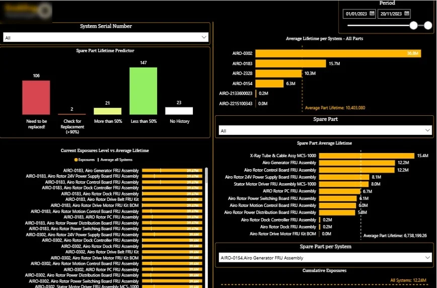
A business intelligence machinery dashboard links directly to shop floor equipment to track usage, performance, and component wear in near real time. It helps manufacturers maintain stable production and gives maintenance teams a clearer basis for action by showing how machines are actually being used instead of relying only on fixed service schedules.
In one of our projects for a medical device company, our reporting and analytics experts analysed detailed machinery data to understand equipment performance across its full lifecycle. Although this was not a standard manufacturing setting, the same approach is highly relevant in any operation where machines run repeated cycles and component wear affects uptime, reliability, and output.
The first dashboard focused on the remaining life of individual machine parts based on the number of cycles, or exposures, they had completed. Each machine was broken down into key components, and for each one we calculated the expected lifespan in cycles and matched it with the latest replacement history.
A histogram in the top-left corner showed which parts had already gone beyond their expected lifespan. The red bar made it easy to see how many components were operating past safe limits, and users could click it to identify the exact parts at risk. We also grouped components by replacement risk, including those above 90%, above 50%, and below 50% of their expected lifetime. This gave maintenance teams a practical way to plan replacements, reduce emergency downtime, and align spare-parts ordering with actual usage rather than estimates.
The line chart in the bottom-right shows the cycle history of a selected part in more detail. In this example, the part reaches roughly 3.3 million cycles before replacement, after which the count resets and the new part begins at around 1.1 million cycles. This makes replacement history easy to follow and helps teams assess whether parts are being replaced too early or left in service for too long.

A manufacturing sales dashboard helps manufacturers see where sales growth comes from and how it changes over time. For large organisations, this visibility is important because it shifts the focus away from topline revenue and toward the underlying drivers of performance. The dashboard brings structure to complex sales data and makes growth trends much easier to understand.
Our data consultants worked with the Head of Strategy at a German manufacturing company with annual revenue exceeding €8 billion. The goal was to create a clear year-over-year view of sales growth by supplier, product, and product group. This gave leadership a more direct way to link strategic decisions to measurable commercial results.
The dashboard highlighted which products and product groups were growing fastest, helping the business spot market trends and anticipate future demand. It also showed where sales were declining by supplier and product, which supported earlier action in procurement and supply chain planning. As a result, the dashboard became a practical tool for both growth planning and supplier management.
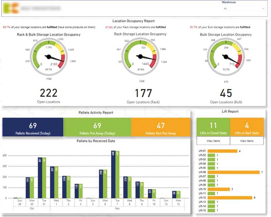
The first page of this dashboard gives warehouse managers an instant view of inbound operations. Built for a manufacturing client, it shows current inventory levels and available storage capacity across both racking and bulk storage. By comparing occupied and open locations, the team can quickly spot space constraints and plan incoming deliveries with more confidence.
We also visualised daily pallet intake to show which pallets have already been put away and which are still waiting. This helps managers remove bottlenecks faster and keep inbound flow moving. On top of that, the dashboard tracks items sitting on each forklift, making it easy to drill into the exact SKUs and direct teams to clear them without delay.
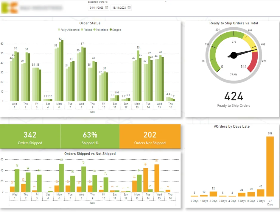
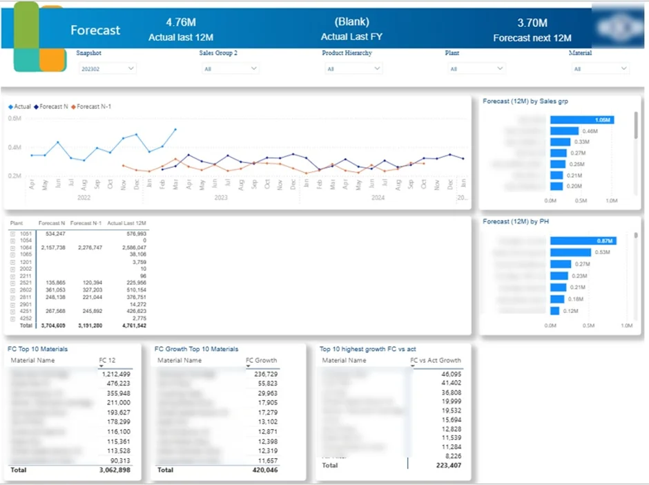
A Power BI demand planning dashboard helps manufacturers turn sales forecasts into clear production priorities. By showing expected demand in a visual format, it helps teams focus capacity on the parts that are actually needed, reduce backlog, and keep production, inventory, and customer fulfilment better aligned.
There are two common ways to build this kind of dashboard. In some businesses, forecasts are created outside Power BI, usually in Excel, and then brought into Power BI for analysis and sharing. In others, the forecasting is done inside Power BI using tools such as AutoML or statistical models built with DAX.
For one manufacturing client, we built a demand planning dashboard that visualised forecasted demand at the individual part level. This gave planners a clear view of which parts were causing backlog and where production needed to increase or slow down. As a result, the dashboard became a practical tool for setting priorities, reducing backlog, and improving planning decisions across the factory.
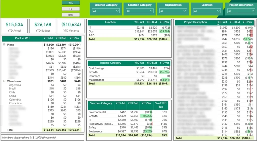
A Power BI CapEx dashboard helps manufacturers see where capital is being invested and whether spending is staying in line with the plan. In manufacturing, that matters because large budgets are tied up in plants, equipment, infrastructure, and ongoing asset replacement.
We built a Power BI CapEx dashboard for a chemical manufacturer to compare actual spend against budget across production plants, warehouses, and corporate offices. The dashboard also breaks investment down into key categories such as maintenance, capacity expansion, and cost-saving projects.
Management can click into any category and immediately see actual versus budget at the individual project level. This makes it easier to spot overspend early, stay within the annual CapEx budget, and decide whether to reallocate funds, delay other projects, or adjust investment priorities.
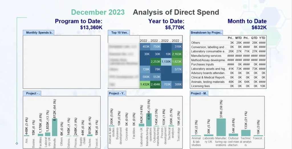
An OpEx dashboard helps manufacturers keep a close eye on the operating costs behind production. That level of visibility is critical for controlling manufacturing costs and protecting margins, especially when materials, lab work, and outsourced processes make up a large share of total spend.
Our Tableau consultants built this OpEx dashboard for a biotechnology company that manufactures drugs. It tracks expenses across multiple time views, including prior month to date, month to date, prior quarter to date, quarter to date, and year to date, so finance and operations teams can monitor both short-term changes and longer-term cost trends.
The dashboard breaks spending down by laboratory, project, and cost category, making it easy to see where costs are rising. The client can review areas such as in-house manufacturing, outsourced production, technical analysis, and laboratory studies, and compare costs by quarter across labs. This helps the business spot overspending early, improve cost control, and make better decisions to protect profitability.
The benefits of data visualization in manufacturing usually fall into three groups: operational, financial, and strategic. On the shop floor, dashboards help teams respond faster, reduce downtime, and improve quality. From a financial perspective, they reduce manual work, reporting effort, and avoidable errors. At the leadership level, they support faster decisions, better planning, and clearer alignment across teams.
Data visualization makes quality issues easier to spot before they spread through production. Instead of reviewing raw tables or waiting for end-of-shift reports, teams can monitor scrap, defect rates, rework, yield, SPC trends, and quality exceptions in one place. That gives engineers and supervisors a faster way to see where quality is slipping, which lines or products are affected, and whether the problem is improving or getting worse.
In one manufacturing-related project for Lightwave Group, interactive dashboards and factory-floor reporting led to improved quality and fewer missing inspection points and documentation.
In manufacturing and machine-heavy environments, visualization helps teams move from reactive maintenance to earlier intervention. Instead of discovering issues only after a stoppage, maintenance and operations teams can track cycle counts, utilization drops, temperature patterns, alarm frequency, downtime trends, and component wear in real time. That makes it easier to identify machines that are drifting out of normal performance and act before a breakdown disrupts production.
This is one of the most practical uses of manufacturing dashboards. In a machinery analytics project for a medical device company, clearer reporting helped the client identify declining utilization sooner and contributed to a 20% increase in service revenue while reducing costs.
When manufacturing data is pulled automatically from source systems and visualised in dashboards, reporting becomes more reliable. Manual exports, spreadsheet manipulation, copy-paste steps, and version confusion create too many opportunities for reporting mistakes. Automated dashboards reduce that risk by connecting data sources directly, applying one set of logic, and presenting the same numbers to everyone.
In a manufacturing-related project for Isovolta AG, automated reporting saved around 10 working hours per month while reducing manual errors and improving data accuracy.
Real-time dashboards help operators, engineers, and managers react sooner when something goes wrong. Instead of waiting for daily summaries or hearing about a problem after it has already affected production, teams can see delays, exceptions, equipment changes, and workflow bottlenecks as they happen. That shortens the gap between detection and action, which is critical on the shop floor.
This benefit is operational, not cosmetic. Faster response means supervisors can redirect attention to the right line, maintenance can investigate the right machine, and managers can make decisions before service levels or production targets are missed. It also improves communication across teams because everyone is working from the same live view of what is happening.
One client reported 40% faster turnaround on strategic decisions after implementing real-time dashboards, while another said centralized real-time reporting cut the time spent compiling reports by over 75% and shortened month-end close by several days.
Manufacturing data visualization starts with data capture at the source. Signals from PLCs, industrial sensors, and control systems are collected from machines and production lines, then passed through edge gateways or historians before being sent into cloud or on-prem analytics platforms where dashboards are built and refreshed. This pipeline turns raw machine data into a live operational view that teams can actually use.
The data itself can cover a wide range of production metrics. Common examples include spindle speeds, oven temperatures, press tonnage, takt time adherence, first-pass yield, line changeover duration, and machine states such as RUN, IDLE, and DOWN. When these data points are brought together in one system, they give operators, engineers, and supervisors a much clearer picture of how the line is performing right now.
Modern visualization tools have made this much more accessible than it used to be. With drag-and-drop BI platforms and no-code IIoT dashboard tools, process engineers and continuous improvement teams can often build useful visualizations without heavy coding or complex software development. That means teams can move faster from raw data to practical dashboards that support daily decisions.
A good shop floor screen usually tells a simple visual story. One production line can be shown on a single dashboard with status tiles for each machine, cumulative output for the shift, OEE gauges, and a clear indicator of the current bottleneck. This makes it easier to see not just what is happening, but where attention is needed first.
Refresh speed depends on the type of process and the underlying infrastructure. Critical equipment may require sub-second updates, while higher-level KPIs are often refreshed every 5 to 15 minutes. The right setup depends on how quickly conditions change and how fast teams need to respond.
Manufacturers are facing a perfect storm of challenges. We’re talking labour shortages, wildly unpredictable demand, razor-thin profit margins, and a toughening up of expectations when it comes to quality and sustainability. All of which makes running a factory with any semblance of efficiency a real headache. But just as things are getting tougher, factories are producing more data than ever before – which is only useful when the teams actually get around to looking at it.
That’s where manufacturing data visualisation comes in. It takes the massive amounts of machine, production, quality and energy data and condenses it down into bite-sized, easy-to-understand visuals that are tailored to each person’s role. Rather than dumping a whole heap of raw numbers on teams, it shows operators, engineers and managers what needs sorting out now, what’s starting to drift off track and where things are actually getting better or worse.
The end result is pretty tangible – better visualisation helps teams get on top of problems faster, reduces the number of dodgy products that slip through and gets goods out the door on time. And by making the most of scarce resources like labour, equipment and materials, teams can get more done with less.
But it also fundamentally changes how teams collaborate with each other. When everyone’s got access to the same set of dashboards during walk-arounds, meetings, and reviews, it makes conversations shorter, more to the point and more action-focused because everyone’s on the same page.
This is also why data visualisation is becoming such a big part of Industry 4.0. It’s a key enabler of smart factory initiatives by making it easier to keep an eye on what’s going on, helping digital twins give a more realistic picture of production conditions and giving teams the visibility they need to keep tweaking their processes for maximum efficiency. Put simply, data visualisation isn’t just something you do on top of the rest – it’s a fundamental part of modern manufacturing’s never-ending quest to get better and better.
Different data visualization types help answer different manufacturing questions. Some show what is happening now. Others help explain why something happened, and some support planning for what may happen next. A strong manufacturing dashboard usually combines several visual types so teams can monitor current performance, investigate root causes, and spot future risks more easily.
Time-series charts are some of the most useful visuals in manufacturing. They show how metrics such as cycle time, scrap rate, OEE, and changeover duration move over time across days, weeks, months, or seasonal periods. This makes it easier to detect trends, recurring disruptions, gradual deterioration, or sudden anomalies that would be hard to spot in static tables.
Spatial and layout-based visuals are also valuable on the shop floor. Heat maps of a factory layout can highlight bottlenecks, material congestion, areas with repeated downtime, or zones with unusually high energy use. These visuals help teams understand where issues are happening physically, not just numerically, which is especially useful in larger plants with multiple lines or departments.
Categorical charts help teams compare performance across groups. Pareto charts are widely used to show the most common defect types or downtime reasons, making it easier to focus improvement efforts on the biggest causes first. Bar charts can compare shifts, production lines, product groups, suppliers, or work centres, helping managers quickly see where performance differs and where deeper investigation is needed.
Successful manufacturing data visualization depends on three things: the right KPIs, the right tools, and strong adoption on the shop floor. Without that combination, dashboards often become static reports instead of practical decision tools.
Start small by piloting on one line or cell first. Use feedback from operators, supervisors, and engineers to improve the dashboard, then scale it across other areas and plants once the value is proven.
It is also important to tie the project to clear business goals, such as reducing scrap, improving OEE, or increasing schedule adherence. Strong data governance matters too, because teams need shared definitions for each KPI, clear ownership, and regular data validation
Below are three core areas to focus on: KPI selection, tool choice, and workforce adoption.
KPIs should reflect the company’s priorities, whether that is lead-time, cost, quality, sustainability, or output. Common manufacturing KPIs include OEE, first-pass yield, scrap rate, schedule adherence, MTBF, MTTR, and energy per unit.
Definitions must be clear and consistent. For example, teams need to agree on what counts as planned versus unplanned downtime, or which defects are critical. Each dashboard should stay focused on 5 to 10 essential KPIs to avoid clutter.
The right platform should connect easily to PLCs, historians, MES, and ERP systems while supporting real-time or near-real-time updates. It should also scale across multiple plants and meet the company’s security requirements.
Low-code and no-code tools are especially useful because they let process experts build and adjust dashboards without heavy IT support. Manufacturers should also think about deployment needs, whether on-premise, hybrid, or cloud-first, and make sure the tool works well on large screens, mobile devices, and multilingual environments.
Dashboards only deliver value when people use them confidently. Hands-on training helps operators and supervisors learn how to read live data, spot trends, and respond to issues faster.
It also helps to build dashboards into existing routines such as daily stand-ups, Gemba walks, and weekly performance reviews. When teams review the same live data regularly, dashboards become part of everyday decision-making rather than something people ignore.
Manufacturing business intelligence dashboards are only as good – and that’s being generous – as the data that backs ’em up. If machine readings are missing records, time stamps don’t match, scrap is logged in a complete mess, or ERP data is stuck in traffic, then that shiny new dashboard is nothing more than a lie. In all too many factories, the real problem isn’t the pretty pictures themselves. It’s the fact that the source data was never even designed with clean, up-to-the-minute analysis in mind.
It all comes down to a trust problem. Once operators or managers catch a whiff of a few rogue numbers, they stop relying on that fancy dashboard and go old-school – back to spreadsheets, emails, or just plain good old-fashioned manual checks. That’s why getting your data quality act together needs to be treated as part of the visualisation project from day one, not as some annoying technical thing to sort out later on down the line.
Even when data is available, all too often it’s just not set up in a way that really lends itself to useful analysis. One team might log downtime as “mechanical”, another as “a problem with the machine”, and a third will just write a free-form note in the margin. Reasons for scrap, types of maintenance, shifts, product families and stages of production get categorized differently – sometimes across whole systems, sometimes just down different production lines – and sometimes in different plants altogether.
This makes analysis a real mess pretty quickly. Let’s say you want to compare downtime by cause, but the categories just don’t line up. Or you want to track scrap trends by product group, but the way the product gets mapped just isn’t consistent. The problem isn’t that your dashboard is a mess – although to be honest, that can become a problem in itself. What you’ve really got is a situation where the business just doesn’t have a shared rulebook on how important events should be classified.
Manufacturing data is all too often scattered all over the place – living in a multitude of separate, unconnected systems. You’ve got PLCs and sensors providing machine-level data, MES on top of that tracking all the work orders and how production is actually playing out, WMS for inventory movements, and ERP dealing with the actual orders, materials and the financials. Each one in its own right is great at what it does, but none of them gives the full picture of what’s really happening on the production floor.
This is probably one of the biggest reasons manufacturing dashboards can be such a source of frustration for people. A manager might see that production is going down in one particular report, but the actual maintenance problem that’s causing that its been logged into a totally separate system somewhere, and the material shortage that’s also a problem is logged in somewhere else yet again. And without the data being connected in some way, it’s up to them to stitch the whole story together manually.
A lot of manufacturers are still stuck using older gear that was never meant to handle the kind of big data analytics we need these days. Some of that old equipment is a real pain – it doesn’t give up its data easily, it often doesn’t come equipped with standard connectors, and sometimes it only stores a tiny amount of information right on the machine itself.
Sometimes production teams are still having to do things by hand because the equipment can’t send data into the system in a way that makes sense. In other words, it’s not transmitting the data in the format that the reporting system needs, so they have to manually record it.
Manufacturing data visualisation is looking to ditch static dashboards and become a fundamental part of the Industry 4.0 movement . Over the next few years, 2024 to 2030, it will take a central role in smart factories, digital twins, and AI-driven operations by turning real-time production data into faster, better-connected decisions that happen quicker.
One of the key shifts is the growing use of AR and mixed reality. Instead of heading over to a separate dashboard to check on things, operators and engineers will increasingly be using tablets or a headset to see live KPIs, plus machine status and maintenance alerts straight on the equipment and production lines. This makes the data right there and a heap easier to take immediate action on.
AI is also going to change how visualisations work. With advanced analytics and generative AI able to flag anomalies, suggest the root causes and crank out plain English summaries of trend changes, future dashboards will do more than just show a problem – they will explain what changed, and where to turn first.
At the same time, more manufacturers are shifting towards integrated operations control centres. These bring all your production, maintenance, logistics and quality data into one shared view – giving leaders a clear picture of how problems in one part of the factory can impact the rest.
As these tools get smarter, people-focused design is going to matter more and more. The goal is not to add another screen to the wall or increase complexity. It’s to make sure that visualisations stay clear, useful and actually get used by the people out on the shop floor who rely on them every single day.
Manufacturing data visualization turns mountains of production data into something you can actually do something with. When built on solid data and the right metrics, it gives you a clear picture of your operation – whether that’s OEE, quality issues, downtime, throughput, or how your machines are running – all across the plant.
It’s not about the pretty charts, though those can be nice too. The real payoff is when everyone – from the operators on the floor to the engineers in the office to the top brass – is looking at the same data. And that makes a huge difference – they can respond faster, make better decisions, and not just go on gut instinct.
Our data strategy experts are ready to build a detailed manufacturing data dashboard for you. At Vidi Corp, we build data solutions around your manufacturing processes, data complexity, and decision-making needs, helping you turn raw data into measurable business results.
Manufacturing data visualization is the process of converting raw production data into graphical formats such as charts, dashboards, and heat maps. It enables manufacturers to interpret complex datasets quickly, identify patterns, and make informed decisions about their operations.
By presenting defect data, SPC (Statistical Process Control) charts, and inspection results in visual formats, teams can quickly spot trends and outliers. This enables faster root cause analysis and corrective action, ultimately reducing scrap rates and rework costs.
Data visualization provides real-time clarity into production performance, quality control, and supply chain operations. It helps teams detect anomalies, reduce downtime, minimize waste, and improve overall equipment effectiveness (OEE) without sifting through spreadsheets or raw data logs.
Common data types include production throughput, defect and rejection rates, machine utilization, cycle times, inventory levels, energy consumption, supply chain logistics, and workforce productivity. Essentially, any metric that impacts operational performance can be visualized.


