A Power BI financial dashboard gives finance teams a single live view of the numbers they used to rebuild by hand every week. In my experience these dashboards have become the default way finance teams report, mostly because of how well Power BI handles large datasets and repetitive data preparation. Used well, Power BI works as a full financial reporting dashboard: one place to track profit, cash, receivables and sales performance without emailing spreadsheets around. This article walks through 12 examples we have built, the KPIs worth showing, and a free template you can download to get started.
I used to work as a financial analyst in Autodesk for 3+ years where I created a tonne of Power BI financial dashboards. My dashboards used to go to financial directors and VPs of Finance. They were mainly used for financial forecasting, tracking sales performance vs targets and sometimes for managing sales people. My biggest achievement in Autodesk was creating one Power BI financial dashboard that went to the CEO and CFO of Autodesk.
In 2021 I transitioned to running my Power BI consultancy where my team and I created many financial Power BI dashboards. I had a privilege of delivering financial analysis to companies like Google, Teleperformance and Heineken. You will see some of the dashboards that we created below.
Power BI is often the tool of choice for financial reporting and for a good reason!
Firstly, Power BI evolved from Excel which offers the finance and accounting departments room all the important functionalities that they are used to. Power BI essentially becomes a natural next step from crude financial Excel reports.
Secondly, Power BI has superior data visualisation capabilities which allows financial analysts to improve the user interface. We have seen many cases when the companies switched away from Excel tables to build Power BI financial dashboards. Many noticed that the visual presentation of data in Power BI makes it easier to discover insights and leads to more data-driven decisions. That visual layer is also what separates a financial analytics dashboard from a static spreadsheet report.
Finally, Power BI has integration with many financial and accounting systems like QuickBooks, Xero, Anaplan and many others! Those integrations enable companies to automate the financial data extraction and save valuable working hours.
Let’s now look at 12 Power BI financial dashboards we have built. The first group comes with a free template you can download and connect to your own data. The second group is custom work we have delivered for clients.
Free Power BI Financial Dashboard Templates
Each of these is a Power BI accounting dashboard you can download as a free template and connect to your own data. They are built on QuickBooks Online, Xero and Zoho Books, with the formulas already in place so your numbers match what you see in your books.
A profit and loss dashboard shows the headline profitability numbers, revenue, cost of goods sold, gross profit, overheads and net income, and lets you filter by period and drill into the transactions behind each line. It is usually the first report finance teams put into Power BI.
If you have not installed a Power BI template before, the video below shows how to load it:
We have written a fuller walkthrough with more examples in our guide to Power BI P&L dashboards, so this is the short version.
A Power BI balance sheet dashboard brings assets, liabilities and equity into one view, which makes it easier to see risk in the asset and liability mix. We build it on whichever accounting system you already run, and the three versions below show what that looks like on QuickBooks Online, Xero and Zoho Books.
Common KPIs on a balance sheet dashboard:
Retained earnings: how much is carried over from previous years. Higher retained earnings point to a more stable business with room to reinvest.
Cash position: how much cash is in the bank and how many months of operations that covers.
Loan amount: how much is borrowed and who the main creditors are.
The QuickBooks Online version matters most in industries like real estate and construction, where large mortgages are common and the value of the assets counts as much as the revenue. It splits liabilities into mortgages, construction loans and short-term liabilities, and pulls out cash position and fixed assets as headline figures. It reads straight from QuickBooks Online, and the same file feeds our P&L and cash flow pages too.
The video below walks through installing the QuickBooks Online template and connecting it to your data:
The Xero version below leans on monthly trends. It plots assets, liabilities and equity month by month so you can see how the balance sheet shifts, breaks each category down into its account groups, and shows net assets as a built-in check: net assets should equal total equity, which confirms the balance sheet still balances.
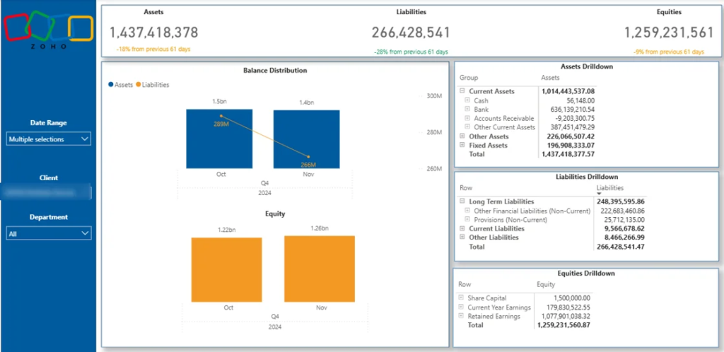
The Zoho Books version pulls assets, liabilities and equity straight from Zoho Books through our connector and groups each one into its drilldown: current assets, fixed assets, long-term and current liabilities, share capital and retained earnings. There is a tabular view too, so you can expand and collapse each category and drill down to the transaction level when you need to.
The next thing companies usually worry about after their P&L is their cash flow. It is well known that many companies go out of business because the lack of cash, not lack of profit.
Power BI cash flow dashboards usually show the difference between cash flowing in and out. Depending on the data structure, it is sometimes possible to break down the cash flow further into activities. For example QuickBooks Online returns the cash flow data broken down by investing, operating and financing activities.
Other data sources like Zoho Books just show the account line items that contribute to positive or negative cash flow.
Please note: Our Zoho Books Power BI dashboard includes pages on P&L, Balance Sheet and Cash Flow, Aging Account Receivables and Outstanding Invoices analysis.
Custom Power BI Financial Dashboard Examples
The dashboards in this group are custom builds we have delivered for clients, not templates. They cover forecasting, sales analysis, expenses, account management and investment tracking. If one is close to what you need, we can build something similar.
A Power BI budget dashboard compares actual sales and expenses against the targets set each year or quarter. Budget numbers are basically targets so they are usually updated once a year whereas forecast numbers can be updated every week.
The specific type of budget would largely affect what the dashboard would look like. Financial departments can create budgets for every level of their P&L or balance sheet statement if they want to. Less granular budgets can be for sales of specific product or product group.
Common Power BI budget vs actual visualizations are:
A gauge chart where you can see progress to
A bullet chart which is basically a horizontal version of a gauge chart
Line or bar charts with a dashed line for budget
Tables with 3 columns: actuals, budget and actuals/budget
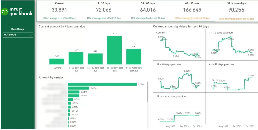
The process of collecting open invoices can be better managed with a Power BI financial dashboard. Consider the example above!
The horizontal bar chart shows how much each client owes you. The vertical bar chart shows how many days the invoices have been outstanding for and the amount of those invoices.
A credit control specialist can press on the “61-90 days past due” column and see the amount of money outstanding by client. They can then contact every client and chase them for collecting the invoices.
Some account receivables dashboards also drill down to the invoice level enabling the users to see the outstanding invoices and number of days that invoices are overdue.
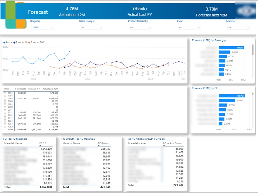
Power BI sales forecast dashboards usually visualize the forecast data and compare it with the actual data. The main purpose of a sales forecasting dashboard is to help finance leaders plan how to structure finances for the future. If you build for a CFO specifically, we cover that audience in our CFO dashboard examples and templates.
A common approach to sales forecasting is calculating a weighted pipeline where each stage in the sales pipeline would be assigned a percentage probability score for closing the deal. You would then multiply the revenue from deals sitting in each pipeline stage with their respective percentage probability score.
There are 2 approaches for creating Power BI forecasting dashboards:
Forecasting outside of Power BI – financial directors often forecast in Excel and then visualize their forecast in Power BI.
Forecasting in Power BI – some developers use Power BI forecasting features like AutoML and Linest DAX function to forecast performance based on statistical modelling.
For example,when we worked on the sales forecasting dashboard you see above, our client did all the forecasting in Excel. They forecasted the sales of the selected range of products in every country to help with demand planning. They also compared their current forecast with the previous version (Forecast N-1) to measure the forecast accuracy.
Sales analysis was the main topic of my Power BI financial dashboards when I was working in Autodesk. I used this experience to create the dashboard you see above for the financial director of Tikkurila (data is randomised).
Power BI sales financial dashboards are commonly built on top of ERPs like Dynamics Nav, Netsuite, etc. These dashboards allow Financial Directors to identify areas of business growth and slowdown. These insights ultimately drive the weekly forecasting decisions that are important for sales management and expense planning.
During my time in Autodesk, Financial Directors also collaborated with VPs of Sales by relying on insights from these Power BI financial dashboards. For example if sales slowed down, Financial Directors advised taking measures such as giving discounts or processing the deals in the pipeline faster.
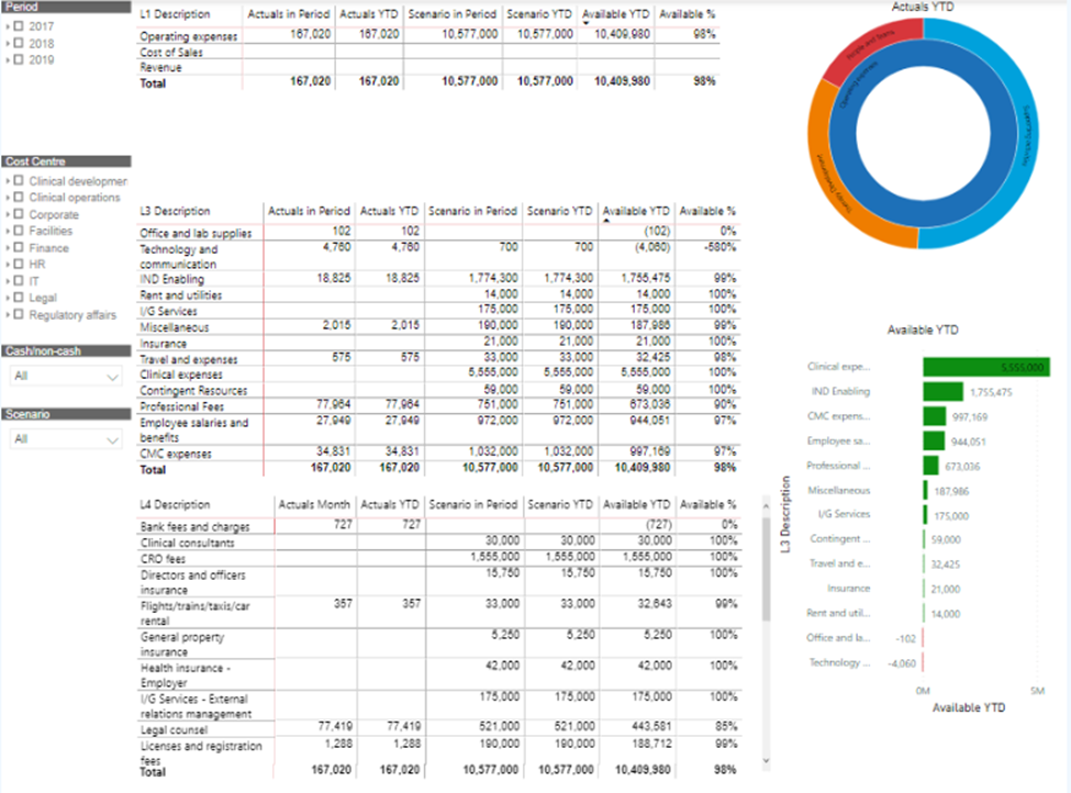
These Power BI financial dashboards are very common for operational expenses management. We used to have a dedicated person for OPEX management in our team at Autodesk. This person had their own Power BI financial dashboard pulling the procurement data from SAP Hana.
OPEX Power BI financial dashboards usually compare actual spending to budget and analyse the amount of money that is still available to spend.
This way when a request for reimbursement comes in, the OPEX manager will be able to view whether the department who requested it still have any budget left.
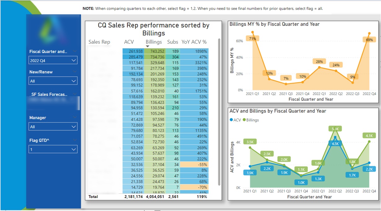
When I worked in Autodesk every sales team had a dedicated Finance Business Partner. Their job was to support the sales managers and directors with financial insights. Above is an example of a Power BI financial dashboard that could be used by Finance Business Partners.
Finance Business partners would open this dashboard and apply the manager filter. They would then see the performance of every sales person under that manager.
Once they click on the salesperson name in the table, they would see the quarterly trends for their performance.
Such Power BI financial dashboards help finance business partners to spot top performers and encourage them to share knowledge with others. Equally, the salespeople with slowing performance might need help such as adding extra leads to their pipeline or extra training.
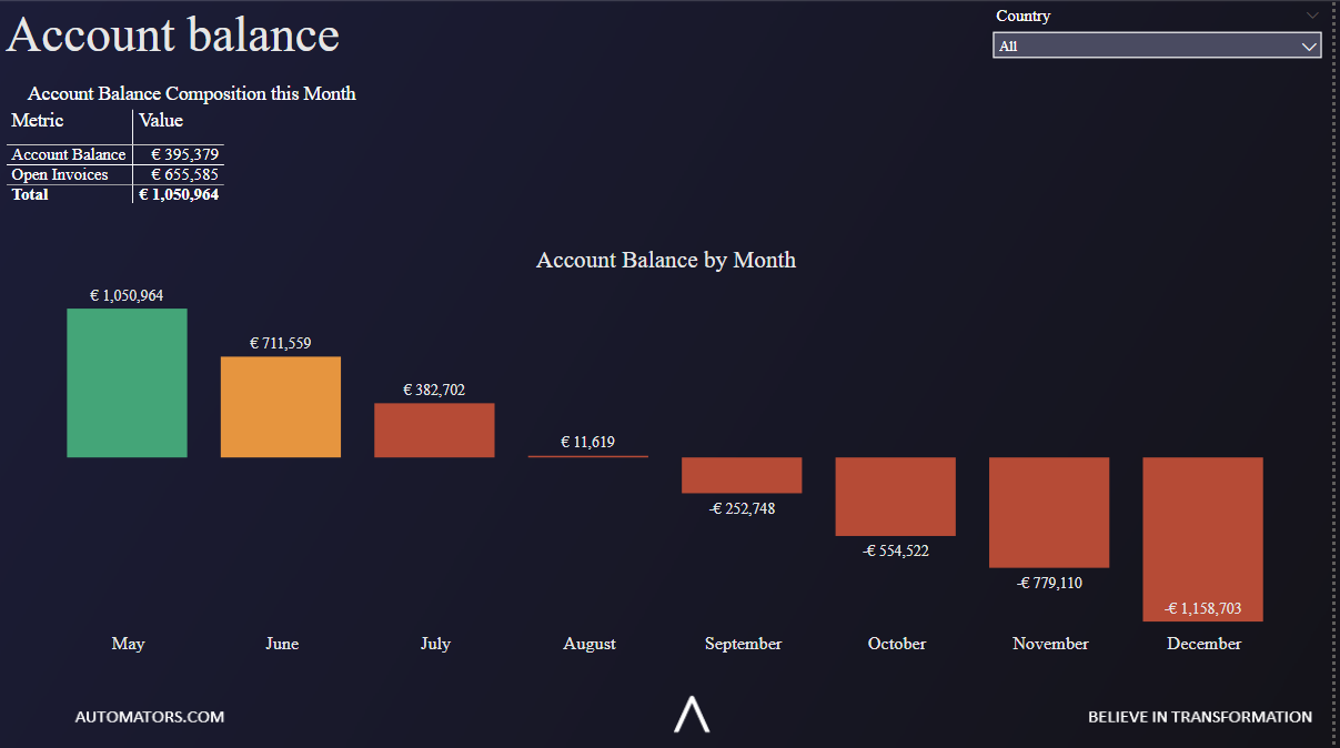
We built this Power BI financial dashboard for Will Dispute Lawyers NSW so they could keep a close eye on their reserves. It tracks the running account balance month by month against open invoices, so the team can see how much cash is in the bank and how much is still owed to them without opening the accounting system. The summary at the top adds the current balance and open invoices into a single total, and the chart below plots the balance across the year.
It shows the balance holding up for around four months before it turns negative, which is what makes the case for chasing open invoices before the reserve runs down. Once that trend is visible the finance team knows when to push on collections rather than waiting for the shortfall to land.
It is the goal of every sales organisation to grow the business from every client over time. A Power BI financial dashboard can really help to identify priorities in the customer growth. Finance Business Partners would be using this dashboard to support their sales team with insights.
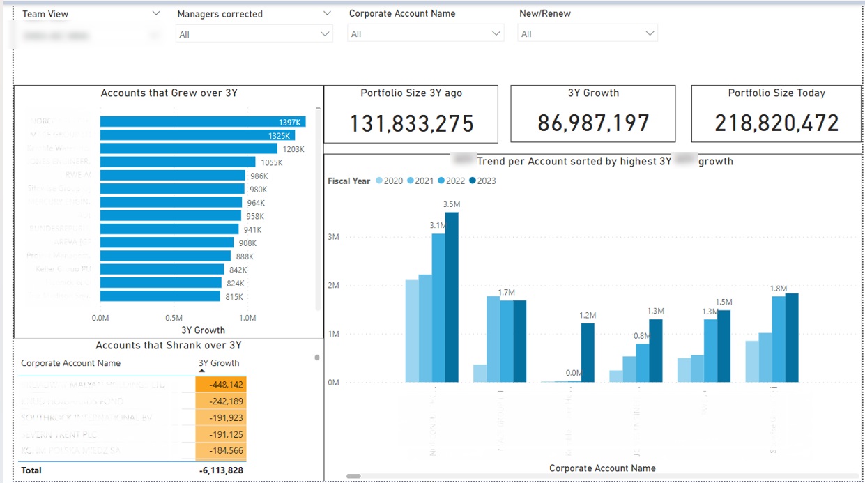
Above is a Power BI financial dashboard that I created to measure the total growth of client portfolio of every sales manager. This dashboard helped them to quickly identify the accounts that grew and accounts that shrank over the last 3 years.
A few insights followed from this dashboards:
Sales teams started targeting accounts that shrank trying to find out the reason why and provide support.
Sales managers worked to identify patterns for accounts that grew. It was soon identified that the top growing accounts were from the same industry. The sales people then shifted their focus to the industries with high growth potential.
Using this Power BI financial dashboard can help to identify the specific targets for account management efforts which directly leads to more sales and revenue. I have personally seen very steep increases in revenue once companies became more proactive with their account management.
Power BI Investment Dashboard
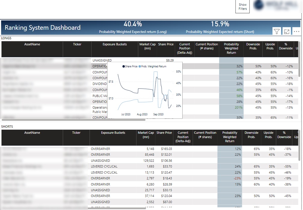
I had the pleasure of working with a few hedge funds to build their Power BI dashboards. They use them every day to track their portfolio across longs, the stock they are buying, and shorts, the stock they are selling.
The main page above lists every position in one place, with the ticker, exposure bucket, market cap, share price, current position and a probability-weighted return for each holding. Hover over any row and you get a small trend chart of that position’s share price and expected return without leaving the page.
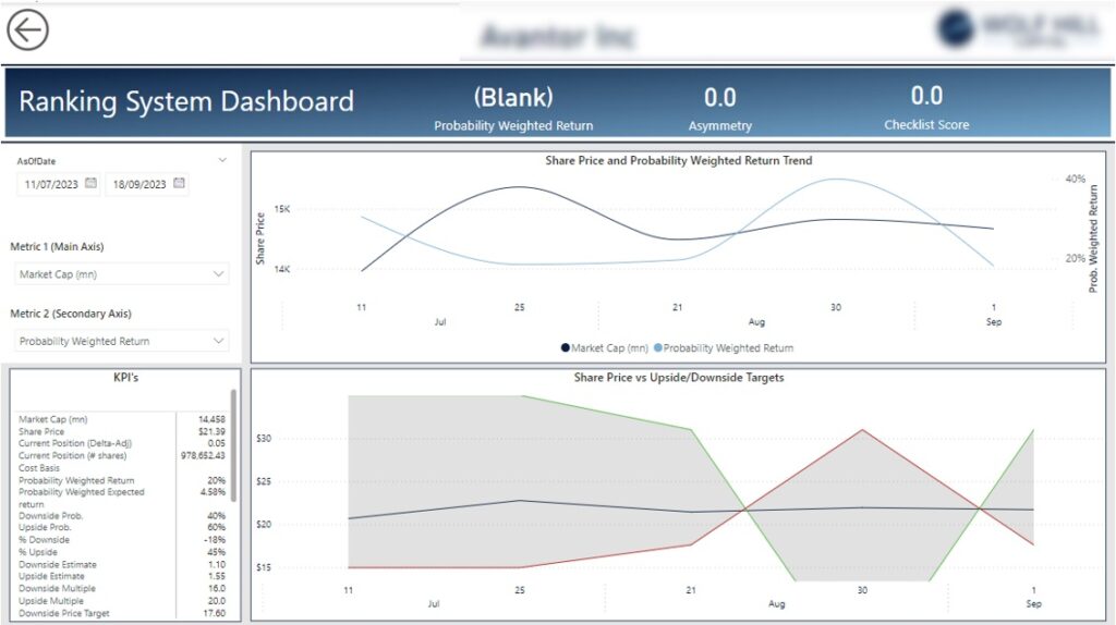
Select an open position and the dashboard drills through to a detail page for that holding. It plots the share price against the probability-weighted return, sets the price beside its upside and downside targets, and lays out the full set of metrics behind the position: market cap, cost basis, probability-weighted expected return, downside and upside estimates, and the price targets.
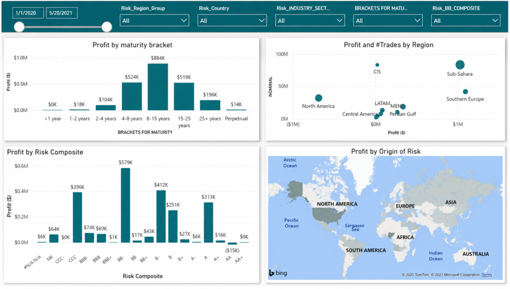
We built another dashboard for a trading team who wanted to see where their profit was coming from. It breaks their book down four ways: profit by maturity bracket, profit and number of trades by region, profit by credit risk rating, and profit by the geographic origin of the risk on a world map.
They can filter by region, country, industry sector, maturity and rating, or narrow to a single trader to see that person’s positions and the profit behind them. It makes it easy to see which desks, regions and rating bands are carrying the book and which are holding it back.
Benefits of Power BI Financial Dashboards
When I joined Autodesk, they were in the middle of a big push to move their financial dashboards from Excel to Power BI. This shift showed how business intelligence in finance can automate reporting, improve financial analysis, and make reports easier to share across the organisation. The financial department wanted to achieve multiple benefits by using Power BI:
Automation – the maintenance of financial dashboards often takes a ridiculous amount of time! During busy periods we would refresh our Excel dashboards several times a day which means that as a financial analyst I was spending all day on data extraction and transformation! On the other hand, Power BI financial dashboards that we built automated the data extraction and transformation.
Better user interface – this is not just a nice-to-have! Communicating insights in a clearer way through a Power BI financial dashboard meant better business decisions. Clearer communication style allowed us to find more insights for optimising our financial management.
Easiness to share files – imagine sending 100MB Excel files to people with old laptops! This is what we were doing before creating Power BI financial dashboards. Many of those files just didn’t open for half of our audience. On the other hand, Power BI allows you to share the dashboard through a web portal which means that there was no need to download heavy files to view the report.
Financial KPIs For Your Power BI Dashboards
The KPIs below are the ones we lean on most for financial analysis in Power BI. Pick the handful that match your audience and build your financial analytics dashboard around those, rather than showing everything at once.
Profitability KPIs
Gross Income – your revenue minus cost of goods sold. Knowing gross income you can efficiently plan for overheads.
Net Income – your gross income minus overheads e.g. profit before dividends and tax. This is arguably the most important financial metric since the point of business is to make profit, not revenue.
Net Customer Profit – customer lifetime value minus customer acquisition cost. Calculating this metric by customer acquisition channel and customer type helps with planning your business development strategies.
Return On Investment (ROI) – revenue divided by expenses represented as a percentage. ROI is useful to measure when you can tie your revenue and expenses to a certain initiative or a project.
Liquidity KPIs
Net Cash Flow – cash inflow minus cash outflow. Net cash flow is usually measured by month and as a total for a certain period.
Current Ratio – Current assets divided by current liabilities. A ratio higher than 1 means that a company has enough current assets to cover short term debt.
Account Receivables Aging – total amount on revenue sitting in unpaid invoices. This is how much money is owed to the company. Finance departments usually analyze how much money has been outstanding for 1-30 days, 30-60 days, 60-90 days and 90+ days. Keeping track of AR helps to minimize bad debt over time.
Sales KPIs
Revenue Growth Per Customer – revenue per year for every B2B customer. This KPI measures how effectively the sales team is growing every customer over time
Revenue vs Budget – actual revenue divided by targeted revenue. This KPI measures the forecasting accuracy and ability of the team to meet the targets.
Sales By Sales Rep – revenue from each sales representative. This helps the management to measure who performs the best and who is struggling to meet their targets.
How to Build a Financial Dashboard in Power BI
Building a financial dashboard in Power BI follows the same five steps whichever report you start with.
Connect your data. Power BI has 250+ connectors for finance sources like QuickBooks, Xero, Salesforce, Microsoft Dynamics and SAP HANA, so you can pull figures straight from source instead of exporting to Excel. If your system is not listed, you can build a custom Power BI connector.
Shape the data in Power Query. Set your cleaning and transformation steps once, and Power Query repeats them every time the data refreshes.
Build the model. Link your tables and write the DAX measures for the KPIs you want, for example net income, current ratio or revenue vs budget.
Design the pages. Lay out one page per report, P&L, balance sheet and cash flow, and add filters so users can move between periods and drill into detail.
Schedule the refresh. A standard Power BI Pro licence refreshes up to eight times a day, and higher tiers allow more frequent refreshes for teams that need intraday numbers.
Once these five steps are in place the dashboard maintains itself, which is the whole point of moving finance reporting off spreadsheets.
Is Building a Power BI Financial Dashboard a Good Idea?
As you can see Power BI can be used for creating a wide range of financial dashboards, from a single P&L view to a full financial analytics dashboard. Building financial Power BI dashboards helps businesses to automate their reporting, improve user experience and avoid sharing large spreadsheets.
Vidi Corp can support finance departments in multiple ways:
We have our own Power BI connectors for sources like Xero, QuickBooks Online and Zoho Books. Those connectors can be used to automate data extraction.
We have free Power BI templates that contain all the formulas to make your numbers match to what you see in QuickBooks Online or Zoho Books. Using these Power BI financial templates helps to speed up your development process.
Our Power BI consultants can develop custom financial dashboard based on your needs. We have delivered 1000+ dashboards for 600+ clients. We would be excited to bring our experience into your project.