Shopify’s analytics dashboards help you understand customer purchasing patterns and uncover insights that support data-driven marketing. A typical Shopify dashboard tracks business performance across a range of KPIs, including sales, orders, refunds, and more.
At Vidi Corp, we took this a step further by building our own set of custom Shopify KPI dashboards in Power BI. These dashboards reveal unique insights into your customers’ behaviour, such as:
We’re now offering our custom Shopify dashboard template for free to every e-commerce store. In this guide, we’ll walk you through the kinds of decisions you can make using our dashboards and how to get the most value from them. Let’s dive in! make based on our dashboards and how to make the most out of them. Let’s jump straight into it!
When you hear “Shopify analytics dashboard,” what comes to mind? For most people, it’s the default analytics reports available in Shopify’s reporting section.
Here’s a helpful way to frame it: Shopify is constantly capturing signals, traffic patterns, product views, conversion rates, sales by channel, returning-customer share, average order value, and more. Their native dashboards compile these signals and let you break them down by time period, channel, device, or customer behaviour.
While the data in Shopify’s default dashboards is valuable, the way it’s presented is limited and often doesn’t tell the full story. Our Shopify reporting template in Power BI solves this by making it easy to build custom analytics tailored to your business.
To keep expectations grounded, it’s important to clarify what Shopify dashboards don’t include. Shopify focuses on ecommerce activity within your store, not the wider marketing funnel across your ad platforms, awareness channels, or upper-funnel efforts. If you’d like to integrate your marketing data into the Shopify dashboard, our ecommerce analytics consultants can help you do exactly that.
Our Power BI template includes four core Shopify analytics dashboards:
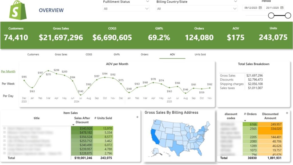
The Shopify Sales Dashboard helps brand owners track sales performance over time and spot key patterns in their store’s activity. It highlights core sales metrics such as Gross Sales, Discounts, Shipping Charges, Sales Tax, AOV, and units sold.
The line chart at the top displays whichever metric you select—by day, week, or month. Users can choose from KPIs like number of customers, gross sales, COGS, gross profit margin, orders, AOV, and units sold. You can also switch between monthly, weekly, and daily views.
The table below breaks down sales by product, including the number of units sold. Users can expand any product to see performance by variant.
The map provides a visual view of gross sales by billing address. Clicking on any state filters all other visuals on the dashboard to that location.
Finally, the table in the bottom right shows the number of orders by discount code, making it easy to analyze the effectiveness of your promotions

The Shopify Order Time Dashboard shows when people buy. It breaks down sales, AOV, and customer counts by weekday and hour, helping you spot clear patterns in shopping behaviour.
A toggle at the top lets you switch the metric displayed across all visuals—AOV, number of customers, or gross sales.
The histogram in the top-right shows the selected metric by weekday. In the example above, Monday and Friday stand out as the strongest days, suggesting customers are more likely to shop at the beginning and end of the workweek. Insights like this can help you plan the timing of marketing emails.
The histogram below displays the metric by hour of the day, revealing when customers tend to shop. This can help you schedule your Facebook Ads to hit during peak activity times.
A heatmap-style table on the right combines both weekday and hour. Each cell shows the value for the selected metric, with darker shades highlighting stronger performance. At a glance, you can identify:
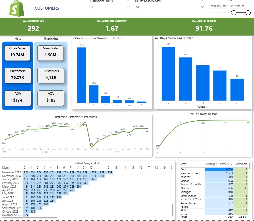
The Shopify Customers Dashboard provides in-depth insights into customer behaviour, showing how often customers return, how much they spend over their lifetime, and how their lifetime value (LTV) grows over time. It’s one of the richest parts of our Shopify analytics template.
The dashboard begins by analyzing the number of new versus returning customers, their associated sales, and AOV.
The line chart below tracks the percentage of returning customers by month, helping you monitor how effectively new customers are being converted into repeat buyers.
It also gives insight into the average number of orders per customer. For example, you on the screenshot above you can see that 47k customers placed only one order, while 13k placed two orders, and so on.
The bar chart on the right shows how many days it takes for customers to make their second, third, and subsequent orders. You can use this analysis to plan your customer reactivation campaigns on social media and email.
The dashboard then focuses on customer lifetime value. A line chart on the right tracks how the average LTV grows over the years. This information is essential for planning your customer acquisition costs and ensuring that LTV exceeds acquisition cost.
At the bottom, a cohort analysis table groups customers by their first order month and tracks how their average LTV grows over time. This helps you understand how long it takes to become profitable for each customer cohort. For example:
Finally, another table shows average customer LTV by state. This lets you identify markets where customers have above-average LTV, enabling you to target these regions and maximize long-term returns on your marketing investment.
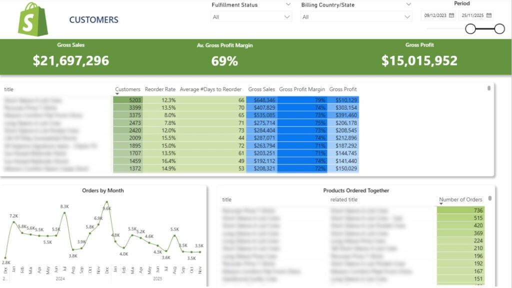
The Shopify Product Dashboard lets you analyze the performance of every product in your store. It tracks reorder rates, product profitability, and sales over time, and also shows which products are frequently purchased together.
The table at the top displays how many customers bought each product, the percentage of those customers who reordered it, and the average number of days between orders. This information can help you design new product strategies. For example, if a product is frequently reordered, you could encourage customers to buy multiple items at once, increasing your AOV or offer your customers to buy the same product in your reactivation campaigns.
Clicking on any product in the table filters the line chart below, allowing you to see monthly orders for that specific product. This makes it easy to track trends and seasonal demand.
Finally, the table at the bottom shows product pairs that are often bought together. You can use this insight to plan targeted marketing campaigns, design product bundles, and promote them to website visitors—helping boost average order value and overall sales.
As you can see, our Shopify Analytics Dashboard provides a wealth of valuable insights. However, the numbers alone sometimes lack context. For instance, as a business owner, you need to compare customer lifetime value (LTV) with customer acquisition costs to make informed decisions.
To address this, we highly recommend connecting your marketing data from sources like Facebook Ads, Google Ads, and Google Analytics to our Shopify dashboard template. This integration provides deeper context on your marketing performance and gives you a complete view of your marketing funnel.
Our marketing analytics consultants have extensive experience working with these data sources. We’ve delivered similar analyses for over 600 companies, including Teleperformance and DS Smith. Reach out today to discuss your marketing analytics needs—we’d be excited to bring our expertise to your project.
The template is available to download for free.
To connect your data, you need to start your free trial for the Vidi Corp Shopify Power BI connector. This connector automates the data extraction from Shopify into Power BI and transforms it to an easy format for analysis.
Once connected, all the views graphs above will be populated with your live data.
Shopify Business Intelligence (BI) refers to the process of collecting, integrating, and analysing data from a Shopify store to support better business decisions. Instead of reviewing isolated metrics inside Shopify reports, BI tools combine the most relevant metrics in dashboards that reveal trends, patterns, and performance drivers.
In practice, Shopify BI solutions connect Shopify data with other sources such as Google Analytics, PPC platforms, inventory systems, and financial tools. Shopify business intelligence dashboards solve multiple challenges:
Shopify business intelligence goes beyond basic reporting. It helps teams understand what is driving revenue, which marketing channels perform best, and how inventory and customer behaviour impact overall store performance.
Shopify business intelligence provides several practical advantages for ecommerce teams. By consolidating data from Shopify and other business systems into analytics dashboards, companies gain a clearer view of performance across marketing, sales, and operations. Below are some of the key benefits businesses achieve when implementing Shopify BI solutions.
1. Faster Decision-Making
Shopify business intelligence helps teams make decisions based on clear performance data rather than assumptions. By consolidating ecommerce, marketing, and financial data into one dashboard, decision-makers can quickly identify trends and evaluate performance.
In one project, a BI implementation consolidated multiple business systems into a single data environment with real-time dashboards. This reduced report generation time from 48 hours to under 5 minutes and enabled faster strategic decision-making.
2. Better Visibility Across Marketing And Sales Channels
Shopify BI connects ecommerce data with advertising platforms, analytics tools, and CRM systems. This allows teams to measure marketing ROI, identify high-performing channels, and understand which campaigns generate the most revenue.
In another project, automated analytics dashboards integrated data from advertising platforms, analytics tools, and CRM systems. This improved reporting accuracy by 40% and saved around 50 hours per week previously spent on manual reporting.
3. Improved Operational Efficiency
Shopify business intelligence also improves operational efficiency by automating data collection and reporting. Automated pipelines ensure that dashboards are always updated and reduce the need for manual data preparation.
For example, automated data extraction into Power BI dashboards eliminated manual reporting tasks and saved around 5 hours per month while enabling more frequent data refresh and analysis.
4. Deeper Insights Into Product And Customer Performance
Shopify BI dashboards allow ecommerce teams to analyse product performance, customer behaviour, and purchasing patterns in much greater detail. These insights help identify profitable products, understand customer lifetime value, and optimise marketing strategies.
For instance, our business intelligence consultants built analytics dashboards for a retailer that integrated Shopify data with financial and inventory data. These dashboards helped the business identify slow-moving products and optimise inventory purchasing decisions, preventing capital from being tied up in unsold stock.
Implementing Shopify business intelligence involves building a system that collects, structures, and analyses ecommerce data so teams can use it for decision-making. The process typically includes several stages that ensure the data is reliable, integrated across systems, and presented in a useful format.
1. Define Business Objectives And Key Metrics
The first step in a Shopify BI implementation is identifying the business questions that the analytics system should answer. These objectives usually relate to revenue growth, marketing performance, customer retention, or inventory optimization.
Once the objectives are defined, the next task is selecting the KPIs that measure progress toward those goals. For Shopify stores, these often include metrics such as revenue, average order value, customer lifetime value, marketing ROI, and product profitability.
2. Connect Shopify And Other Data Sources
Shopify business intelligence solutions typically combine data from multiple systems. In addition to Shopify, companies often integrate marketing platforms, analytics tools, financial systems, and CRM software.
Data extraction is usually done through APIs, automated connectors, or scheduled data pipelines. This step ensures that all relevant data flows into a central environment where it can be analysed together.
3. Prepare And Structure The Data
Once the data is collected, it must be cleaned and structured before analysis. This step involves resolving missing values, removing duplicates, standardising categories, and creating relationships between datasets.
Data preparation is essential because inaccurate or inconsistent data can lead to incorrect insights. Analysts often create custom metrics and calculated fields during this stage to ensure the data reflects real business performance.
4. Build Shopify BI Dashboards
After the data model is prepared, analysts design dashboards that visualise key metrics and trends. These dashboards usually include charts, tables, and filters that allow users to analyse performance by product, channel, time period, or customer segment.
Interactive dashboards make complex data easier to interpret and allow non-technical stakeholders to explore insights without needing to analyse raw data manually.
5. Enable Decision-Making And Continuous Improvement
The final stage focuses on using the insights generated by Shopify BI dashboards to guide business decisions. Teams analyse trends, identify opportunities, and evaluate the impact of strategic changes.
Over time, new questions emerge and additional dashboards or analyses are created. This approach ensures that the business intelligence system continues evolving alongside the company’s data needs.
Shopify business intelligence is typically implemented using specialised analytics and visualisation tools. These tools extract data from Shopify and other systems, transform it into structured datasets, and present the results through dashboards that support business decisions.
Power BI is one of the most widely used tools for Shopify business intelligence. It allows analysts to combine Shopify data with information from marketing platforms, financial systems, and CRM tools to create comprehensive ecommerce dashboards.
Power BI is particularly strong in data modelling and automation. Teams can build dashboards that analyse revenue trends, product performance, customer lifetime value, and marketing ROI while automatically refreshing data on a scheduled basis. Our team has also developed Shopify Power BI connectors, making it easier to extract store data and build fully automated ecommerce dashboards.
Looker Studio is a popular choice for marketing and ecommerce reporting because it integrates easily with Google products. Shopify data can be combined with Google Analytics, Google Ads, and Search Console to analyse website traffic, campaign performance, and conversions.
The tool is often used by marketing teams that need interactive dashboards to monitor campaign results and share reports with stakeholders. To simplify data extraction, we have also created Shopify Looker Studio connectors that allow teams to automate data pipelines and build real-time marketing dashboards.
Tableau is another advanced business intelligence platform used by companies that require highly interactive data visualisations. It allows teams to analyse large ecommerce datasets and explore trends through dynamic dashboards and drill-down analysis.
Many organisations use Tableau when they need more advanced visual storytelling or complex analysis across multiple departments. We have also built Shopify Tableau connectors that automatically extract store data and make it easier to create ecommerce analytics dashboards without manual data preparation.
Shopify stores generate large amounts of data every day, but without the right dashboards it can be difficult to understand what drives sales and customer behaviour. Shopify business intelligence helps organise this data into clear analytics dashboards that reveal trends in sales, customers, products, and marketing performance.
Our free Power BI Shopify dashboard template demonstrates how these insights can support better decisions and deeper ecommerce analysis.
If you would like to implement Shopify business intelligence dashboards or customise our template for your store, contact us! Our BI consultants design analytics solutions that connect Shopify with marketing and financial systems to give you a complete view of your ecommerce performance.
![]()
![]()
![]()