

Wealth management analytics is the practice of turning client, portfolio and revenue data into reporting that advisers and firm leaders can act on. It matters because most wealth firms hold the answers already spread across a CRM, a platform feed and a stack of spreadsheets.
Our data visualization consultants build this automated reporting for wealth managers, hedge funds and investment firms. Our work includes a time-series management reporting suite for a wealth management company in London, a position-ranking dashboard for a hedge fund tracking longs and shorts, and a portfolio dashboard for a firm that sources and manages property investments for high net worth clients.
This guide explains what wealth management analytics covers, the benefits firms get from it, and real dashboards we have built. It also walks through how automated reporting is set up in Power BI, Tableau and Looker Studio.
Wealth management analytics is the use of data from a firm’s CRM, platforms and accounting systems to measure assets, fees, clients and adviser performance in one place.
The data usually comes from three sources. The CRM holds clients, cases, plans and revenue. Platform and custodian feeds hold valuations, holdings and transactions. Accounting systems hold invoiced and received fees.
Data analytics in wealth management joins those sources into a single model. Advisers use it to see their own pipeline and book. Directors use it to see AUM growth, fee income and where new business is coming from.
The output is a business intelligence dashboard rather than a report pack. Figures refresh on a schedule, and users filter to the adviser, service level or date range they need.
Most wealth management firms keep client data in a CRM and valuation data on a platform, with no link between them. Analytics for wealth management joins these into one model, so a client’s plans, fees and holdings sit on a single record. Advisers stop reconciling two systems by hand.
Monthly reporting slows down when figures are compiled by hand from several exports. A dashboard that pulls directly from source systems removes the compilation step entirely. Month-end becomes a review of numbers rather than a build of them.
Firm leaders need to see performance split by adviser, service level and portfolio option. Wealth management performance reporting does this by tagging every case and fee with the adviser and service that produced it. You can then compare pipeline, landed business and AUM across the team.
Good reporting surfaces the numbers that were previously buried. Fee leakage, inactive clients and unbilled ongoing services all become visible when revenue is modelled properly. Firms then act on specific accounts rather than general trends.
Automated financial reporting means the numbers update on a schedule from source systems, with no manual export or copy-paste. The reporting tool connects to the CRM, platform data and accounting system, applies your calculation rules, and refreshes the dashboard.
We build automated wealth management dashboards in Power BI, Tableau and Looker Studio. The right tool depends on where your data sits and how the firm works.
Power BI suits firms with data in an Azure SQL databases, Excel or Microsoft 365. It handles time-series modelling well, which matters when you need to compare AUM or pipeline year on year. Scheduled refreshes run daily or more often, and row-level security limits each adviser to their own book.
Tableau suits firms that want deep visual exploration of portfolio and market data. Analysts can pivot through holdings, exposures and performance without a developer rebuilding the view each time. It connects directly to SQL databases and cloud warehouses.
Looker Studio suits firms that want lightweight, shareable dashboards at no licence cost. It works well for marketing, lead source and client acquisition reporting. It connects to Google-based sources and to SQL databases through connectors.
The analytics process automation itself sits underneath the tool. We extract data through APIs or database connections, land it in a data store, and capture daily snapshots so historical figures stay correct even when records change. The dashboard then reads from that store rather than hitting live systems.
A CFO at a fiduciary and compliance firm reported that the automated Power BI reports we built from QuickBooks, Zoho CRM and Excel saved more than 10 hours per month. Read the review on Clutch.
KPI development for wealth management firms starts with the metrics that drive fee income and growth. These are the ones we implement most often:
Each KPI needs a written definition before it is built. Firms often disagree internally on what counts as landed business or when a fee is recognised, and the KPI dashboard has to settle that.
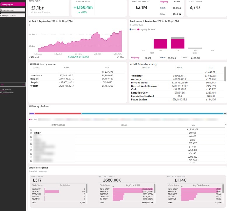
This wealth management dashboard is for directors, heads of operations and finance leads at advice firms. It answers the questions asked in a board meeting: how much do we manage, what is it earning, and where is growth coming from.
Our Power BI consultants built this for EQ Investors as a time-series reporting suite. It reads from PlannrCRM as the golden source for clients, plans, cases and revenue, and from a MySQL server holding platform valuations, holdings and transactions. The top row tracks total AUMA, AUMA growth, fee income split into initial, ongoing and other, and total client count. Below that, AUMA and fees break down by service and by strategy, then by platform. A household grouping section shows total circles, average circle AUMA and average circle revenue by status.
The time-series design is what makes the comparisons work. Daily AUM snapshots and slowly changing dimensions are captured, so a director can compare any custom date range or run year-on-year figures without the numbers shifting as records are edited. Case-level fields such as expected initial revenue, proposed service, proposed strategy and active adviser let the team drill from a firm-wide figure to the specific cases behind it.
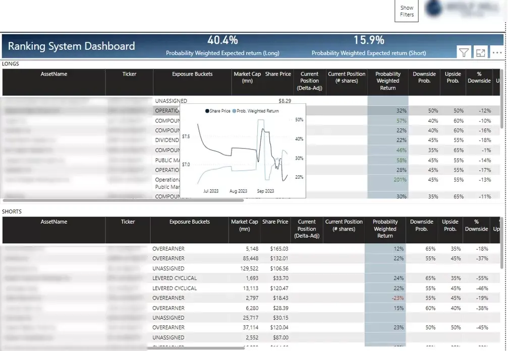
Portfolio managers and analysts at hedge funds use this Power BI investment dashboard daily. It tracks every position across longs, the stock being bought, and shorts, the stock being sold.
Our Power BI developers created this for an investment firm in New York managing a long/short book. Every position is listed with its ticker, exposure bucket, market cap, share price, current position in delta-adjusted terms and share count, and a probability-weighted return. Downside and upside probabilities sit alongside percentage downside and upside. The header calculates probability-weighted expected return separately for the long book and the short book, since the two need to be assessed on their own terms. Hovering any row brings up a small trend chart of that position’s share price and expected return without leaving the page.
The main page acts as the daily review screen. A manager scans the ranked list, spots positions where expected return has moved, and opens only those that need attention.
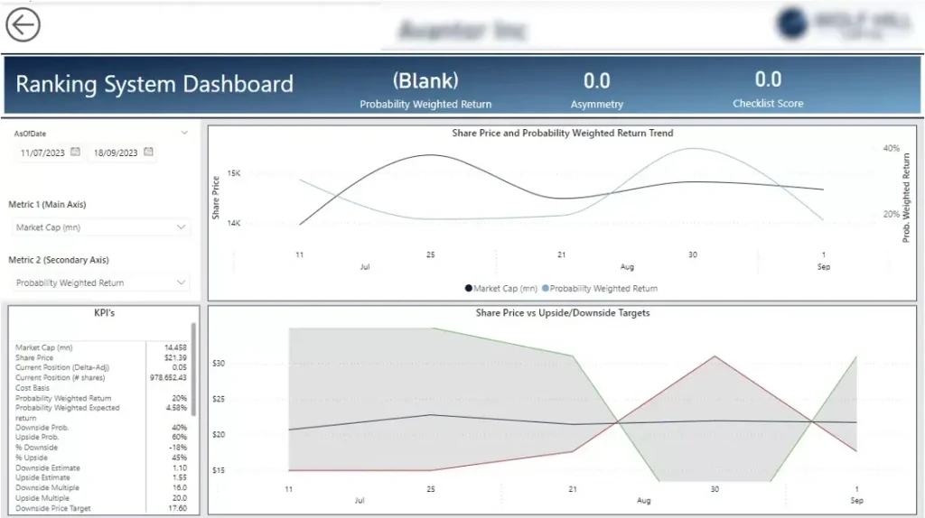
This page is for the analyst who owns a specific holding. It opens when a position is selected on the main ranking screen.
Our business intelligence consultants designed the page in three parts. The top chart plots custom historical metrics over a selected date range, defaulting to share price and probability-weighted return, with selectors to swap either axis to another metric such as market cap. A KPI table on the left lists the full set of figures behind the position: market cap, share price, current position, cost basis, probability-weighted return and expected return, downside and upside probabilities and estimates, multiples, and the resulting price targets. The bottom chart plots share price against the upside and downside target prices across the same period.
An analyst can check a position’s full history and thesis in one screen. Reviewing where price sits relative to the target range no longer means opening a separate model.
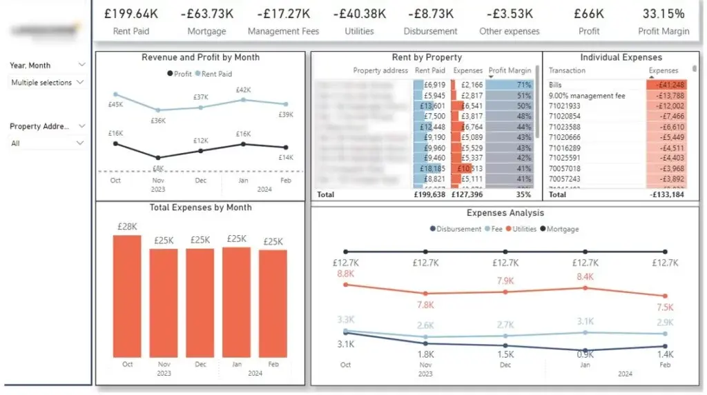
This Power BI real estate dashboard serves firms that source property investments for high net worth clients and manage the projects afterwards. Investors and asset managers use it to see whether each property performs as planned.
Our dashboard development consultants developed this for a real estate investment business. The header tracks rent paid, mortgage, management fees, utilities, disbursements, other expenses, profit and profit margin. Revenue and profit are plotted by month, expenses are broken out by category, and a rent-by-property table ranks each address by rent, expenses and profit margin with conditional formatting. An individual expenses table lists every transaction, so an unexpected margin drop can be traced to the exact line item.
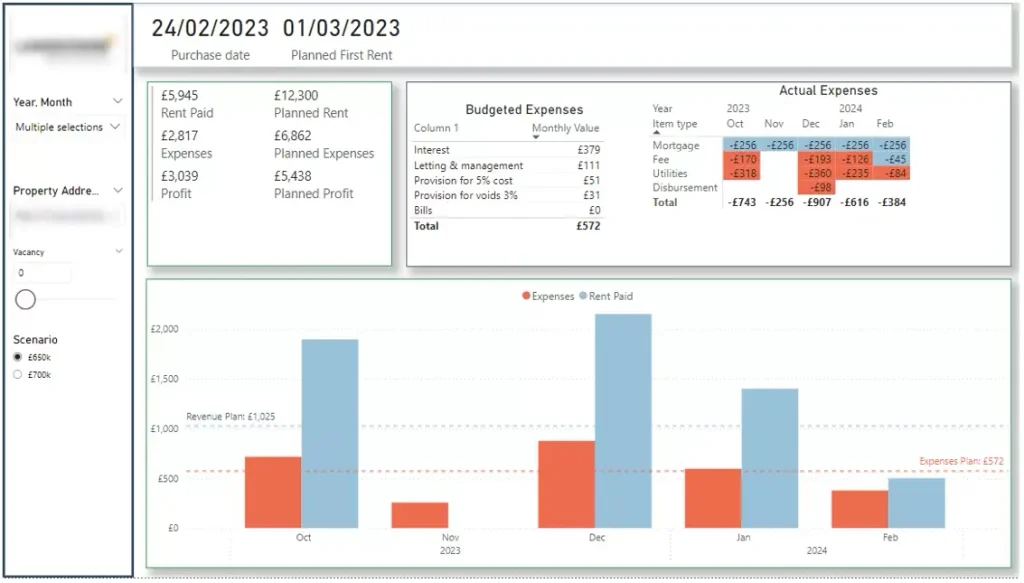
A second page compares plan against actual for a single property. Budgeted expenses such as interest, letting and management, void provisions and bills sit beside actual monthly figures for mortgage, fees, utilities and disbursements. Planned rent, expenses and profit appear next to the real figures, with revenue and expense plan lines drawn across the monthly chart. A scenario selector switches between purchase price assumptions, and a vacancy control adjusts for void periods.
Investors can see which properties are running to plan and which are not, at the level of a single month and a single cost line.
Write down how each KPI is calculated before any build work starts. AUM, landed business and ongoing fee revenue all have edge cases that different teams treat differently.
We run this as a short workshop with the people who own the numbers at the start of every data analytics implementation project. The definitions then go into the data model, so every report uses the same logic.
Identify which system is the golden source for each data type. For most advice firms the CRM owns clients, cases and revenue, while the platform feed owns valuations and holdings.
Connections are then built through APIs or direct database access. Where a source has no API, we automate the extraction so no one is exporting files by hand.
CRM data analysis alone cannot answer historical questions. If a client’s adviser or service level changes, past reports change with it unless history is captured.
We build a data store that takes daily snapshots of AUM and of slowly changing dimensions. This is what allows year-on-year and custom date range comparisons to stay accurate.
Start from the decisions users make, not the fields available. A director reviewing growth needs different pages from an adviser reviewing their own pipeline.
We put headline figures on the first screen and use drill-throughs for detail, as in the position page described above. Filters cover adviser, service level, strategy, platform and date range.
Schedule the refresh to match how the firm works, which is usually daily. Then apply row-level security so advisers see their own clients and directors see everything.
We monitor refresh success after launch. A failed refresh that nobody notices is the fastest way to lose trust in a dashboard.
Predictive analytics in wealth management uses historical patterns to estimate what happens next. Common uses include forecasting AUM, scoring which leads are likely to convert, and flagging clients showing signs of leaving.
The requirement is clean historical data. A firm that has captured daily snapshots for two years can forecast credibly, while a firm reporting only current state cannot.
We treat this as a later stage rather than a starting point. Once the core reporting and time-series store are in place, the same data supports forecasting without additional collection work.
Wealth management analytics works when the metric definitions are agreed, the data sources are properly joined, and the reporting refreshes without anyone touching it. The dashboards above show what that looks like for advice firms, hedge funds and property investment businesses.
If you want reporting like this for your firm, get in touch with Vidi Corp and we will walk through your data sources and KPIs.


