
Event data analytics is the practice of collecting, connecting and analysing the data your events produce. It turns registrations, attendance, engagement, working hours and spend into decisions you can defend.
Our business intelligence consultants regularly build custom event analytics dashboards for corporate event organisers, experiential agencies and marketing teams running webinars. We are also a Zoom certified partner and maintain our own Zoom and HubSpot data connectors, which pull registration and attendance data from online events like webinars automatically.
This guide shows four dashboards we built for real clients, the data sources and metrics worth tracking, how to tie event analytics to ROI, and the privacy rules that shape what you can collect.
Event data analytics is the process of consolidating data from every stage of an event and analysing it to improve performance, prove value and plan the next one.
The data comes from several systems at once. Registration and ticketing platforms, webinar tools, event apps, badge scanners, surveys, ad platforms, CRMs and time-tracking systems each hold one piece of the picture. Data analytics implementation becomes possible when those pieces sit in one model.
The people who use it are event directors, operations and project managers, marketing teams and finance leads. One note on terminology: this article covers data from real-world and virtual events, not product “event tracking” of clicks and user actions inside software.
The examples below are custom event data analytics solutions we developed for our clients in Power BI. If you want similar event data analytics dashboards, please reach out to us to discuss your project.
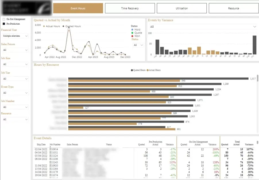
This dashboard analyses how a team’s working hours are used across projects. It was built for a London company that organises corporate events for large clients, where work splits into a pre-production phase and on-site event delivery.
Our Power BI consultants developed it to compare actual hours against quoted hours by month, project, task type and employee. It shows how many projects came in 20% or 10% under estimate, and a second tab tracks billable versus non-billable time by person and department, with a monthly target for team utilisation.
Project managers use it to see which projects and task types consistently overrun before the invoice is raised, and to price the next event more accurately. Because estimating accuracy and billable utilisation are the two levers on margin in a project business, this project management dashboard directly supports profitability on every event delivered.
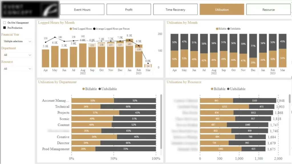
This dashboard tracks how much of a team’s time goes to billable client work versus non-billable admin and sales. It was built as a second tab of the same resource allocation solution for the London corporate events company, where delivery hours are billable and internal tasks (admin and sales) are not. Operations managers and finance leads use it to protect margin across a busy event calendar.
Our dashboard development consultants built it to show the percentage of billable versus non-billable hours by person, department and month, measured against a target billable rate. Filters let a manager drill into any individual or team to see where non-billable time is building up. A monthly view tracks whether billable activity is holding steady rather than dipping between events.
Managers can see mid-month when billable utilisation is slipping below target, while there is still time to reassign work or resource a project differently. Because billable utilisation is a direct driver of profit in a delivery business, keeping it on target across every event protects the margin on the whole portfolio. The same view also shows where there is spare capacity to take on more work, or a sustained squeeze that justifies another hire.
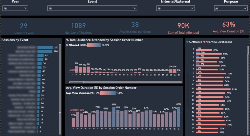
This event data analytics dashboard measures how audiences engage with individual sessions across an event programme: what percentage of registrants attend the event and average attendance duration. We built it for an award-winning creative agency delivering live, digital and hybrid experiences for global business and consumer audiences. An event visitor would usually come to a conference and attend different sessions depending on their interest.
Vidi Corp built a data workflow that consolidated 30 separate datasets into a single cohesive dataset, then a Power BI dashboard on top of it. The dashboard answers three questions: which sessions were most attended and how attendance moved over time, the average percentage of each session viewed, and the average number of unique sessions per attendee.
The agency can now report session-level engagement to clients with evidence rather than headline attendance figures. Knowing which formats hold an audience and which lose it feeds directly into how the next programme is designed and sold.
This dashboard tracks the conversion from webinar registration to actual attendance. It is aimed at marketing teams responsible for driving prospects into webinars, and it was a custom build rather than part of a standard reporting pack.
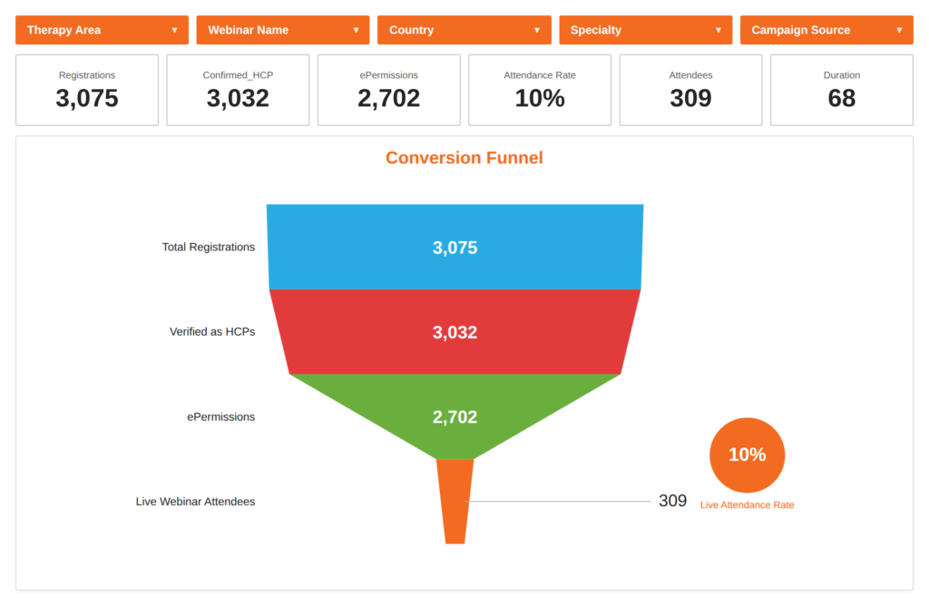
Our Power BI developers created it by combining data from Zoom, Facebook Ads and Google Ads. A central funnel chart shows the flow from registrations to attendees, filtered by webinar name, marketing campaign or registrant country. A second section splits registrations and attendance by professional speciality, since these webinars targeted doctors across different fields.
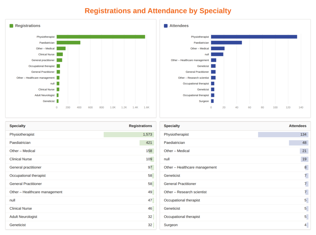
Marketing can see which campaigns produce attendees rather than sign-ups, and calculate a true cost per attendee by channel. Budget then moves toward the campaigns and specialties that actually show up, which is where the pipeline value sits.
We extract this data automatically using our own Zoom Power BI connector, as a Zoom-certified partner. Our HubSpot Power BI Integration does the same for marketing event data, including registrations and attendance, so this kind of analysis can be built from either source without manual exports.
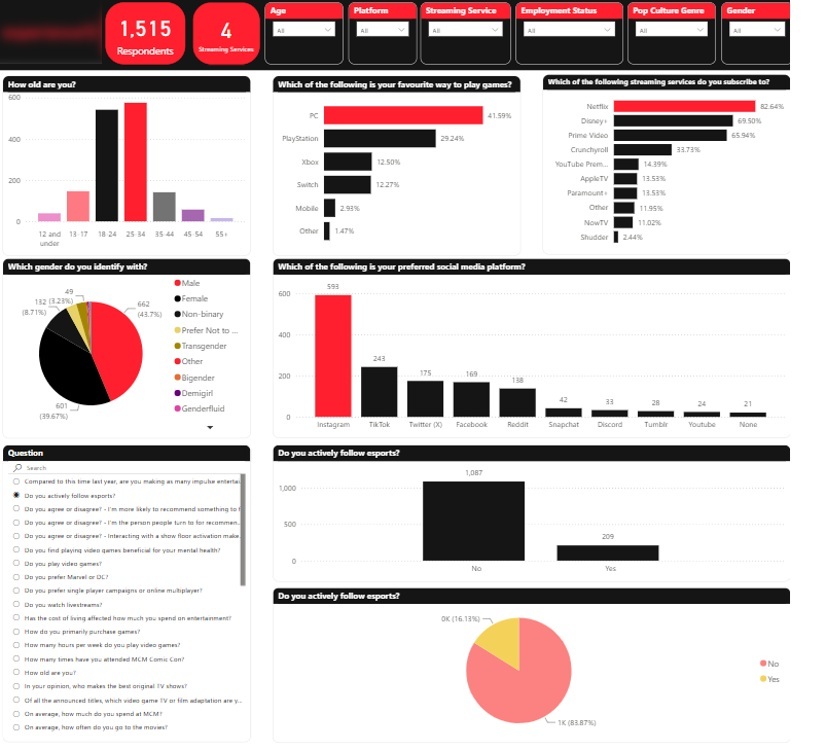
This business intelligence dashboard turns raw survey data collected at events into a tool for cross-tabulation, demographic segmentation and trend analysis. We built it for a pop culture marketing agency that runs experiential campaigns and collects fan surveys at comic conventions and similar events.
Our data visualization consultants integrated historical data going back to 2016, covering roughly 20,000 to 25,000 records gathered through several different survey platforms. Significant cleaning was needed to normalise inconsistent phrasing and free-text “Other” answers into usable categories. The finished model filters by age, employment status, pop culture genre, gender and platform, with a year dimension that shows how interests shift over time.
The agency uses it to win work. Instead of pitching on instinct, they can show entertainment brands what several years of fan data says about a target audience, and answer follow-up questions during the pitch process in minutes. The same model powers their paid fan insight service, so reports that once took weeks are produced in days and the wider team can pull their own figures.
Event data is generated in more places than most teams realise. These are the sources we most often connect:
The value comes from joining these together in your management reporting, not from any single tool. A registration figure means little until it sits next to the campaign that generated it, the badge scan that confirms attendance and the cost of delivering the session.
Track registrations over time against your target, broken down by acquisition channel and campaign. Add registrant profile data such as job role, sector or specialty so you can tell whether the right people are signing up.
Estimated hours, supplier costs and budget by phase belong here too. These become the baseline you measure delivery against.
Attendance rate is the first number that matters, since registration alone overstates reach. Session-level scans, watch time and drop-off points show which content held the room.
Live figures on check-in progress, session capacity and stand footfall let teams move staff or space while the event is still running.
Compare actual hours and costs against estimates by project and task type. Add engagement measures such as average percentage of sessions viewed, unique sessions per attendee, satisfaction scores and qualitative feedback themes.
Then benchmark against previous events. A single event’s numbers say very little on their own; the comparison is what makes them actionable.
Executive dashboards only pay for themselves when they affect management decision. Below are four outcomes our clients have measured, drawn from projects across different industries.
Event data typically sits in separate registration, finance, marketing and operations tools, so every report starts with a reconciliation exercise. A consolidated data model removes that step by loading each source into one place on a schedule.
For a one client, our team consolidated six systems into one and cut report generation from 48 hours to under five minutes, with a 95% reduction in manual data consolidation and 40% faster strategic decisions. The CEO described the results in this Clutch review
Sponsors and boards want to know what an event returned, not how many people registered. Joining ad spend and CRM data to attendance data in a Power BI marketing dashboard lets you attribute pipeline and revenue to specific campaigns and events.
A regional category manager had us combine six Facebook Ads, seven Google Ads and 14 LinkedIn accounts with organic social and CRM data. It replaced three legacy reports, saved over 30 hours per month, and presents marketing ROI in real time to directors outside the marketing team, as described in their Clutch review
Manual reporting is the hidden cost of event analysis, and it scales badly when you run many events or serve many clients. Automated BI minimizes manual work by automating data refresh and transformation and improves accuracy at the same time by removing manual errors.
We built Looker Studio dashboards and fixed GA4 tracking for a digital marketing agency serving over 80 clients. Automated reporting saved 50 hours per week, removed 20+ hours of manual quarterly lead reporting and increased reporting accuracy by 40%, according to their director of business services in this Clutch review
Where events are delivered as billable projects, margin depends on estimating accurately and keeping billable utilisation high. Hour-level analysis by project, task type and person makes both visible while there is still time to act.
For one client, our Power BI reports built on ERP data identified EUR 50,000 in cost savings immediately after launch, plus EUR 10,000 to 20,000 per month in new business opportunities, and saved a full-time analyst position. The CFO gave more detail in this Clutch review
Event data is personal data. Attendee names, job roles, session movements, dietary requirements and survey answers all identify individuals, so richer tracking has to be matched by clear consent, tight security and honest communication.
Points to plan for before you start collecting:
We handle this in the data model itself, by separating identifiable fields from reporting layers and aggregating where individual-level detail adds no analytical value.
Start from the questions the business needs answered, such as which campaigns deliver attendees or which projects overrun. Metrics chosen without a decision attached become reporting nobody opens.
Automate extraction wherever possible. Our Zoom connector pulls webinar registration and attendance data directly, and our HubSpot connector does the same for marketing event data, which removes manual exports and the errors that come with them.
Event data is rarely tidy, especially when surveys or registration platforms have changed over the years. Normalising inconsistent categories and free-text answers is usually the difference between a dashboard that is trusted and one that is argued with.
Structure the dashboard around roles: funnel and campaign views for marketing, hours and utilisation for delivery teams, cost and revenue for finance. Filters should match how each team thinks about the work, by event, campaign, task type or audience segment.
Every example above began with data the client already held, spread across systems that did not talk to each other. The gain came from connecting it and building analysis around the decisions that mattered.
If you would like a dashboard like these built for your events, get in touch with our team to discuss your data sources and what you need to measure.


