

Power BI sales dashboards usually cover 2 things: sales team activity and revenue. You can combine the data from CRM systems, ERP systems, e-commerce platforms, marketing tools and your financial software all in one place, the CEO and sales management can get a nice clear picture of business development efforts across the whole organisation.
As a Power BI consultancy, we’ve put together 1,000+ of custom sales dashboards for businesses in all sorts of industries like manufacturing, e-commerce, finance, and retail just to name a few. These dashboards are meant to make things easier for the sales team, finance department and the bosses – by automating the reporting process, linking up lots of different data sources and giving people real time information to make better decisions.
This article explains what Power BI sales dashboards are all about, looks at useful ways of presenting the sales data on the dashboard. It’s also showing real world examples of B2B and B2C dashboards that we created for clients, along with some tips on how to design a good one.
A sales dashboard is one of the most common types of business intelligence dashboards that allows businesses to keep track of revenue.
Sales dashboards are used by sales reps, sales managers, finance teams and executives to keep an eye on all the key metrics like:
Depending on what kind of business you run, the dashboard will focus on either B2B sales processes like identifying new business opportunities & managing existing accounts , or it’ll be looking at B2C performance metrics like sales by product and marketing channel.
Power BI sales dashboards will also let you drill down into any data, whether it’s by salesperson, region, product line, customer or time period – which is super helpful for working out what business processes you should optimize.
You can roughly divide Power BI Sales dashboards into 2 types: pre-revenue and post-revenue.
Most pre-revenue dashboards focus on customer acquisition activities. This kind of dashboard is very common in B2B sales departments since the sales cycles are long and require proper analysis to get the full picture. These dashboards typically rely on data sources like CRMs, call tracking software packages, or email sequences software. The goal of pre-revenue dashboards is essentially to forecast sales in the near future and find bottlenecks in the process of converting leads to customers.
Most post-revenue dashboards focus on which products, salespeople, and regions drive more revenue. This kind of dashboard is used by both the sales and finance departments and by both B2C and B2B businesses. These dashboards rely on the sources of revenue data like ERPs, Accounting systems, etc. The goal of those dashboards is usually to monitor the trends of what is bringing revenue now vs what used to bring revenue before. These dashboards can be integrated into sales review meetings, quarterly planning, etc.
The exact Sales KPIs that you should include in your Power BI dashboard depend on the purpose of your dashboard. Many Power BI sales dashboards are also used as KPI dashboards because they help businesses monitor performance targets, revenue growth, and sales activity in real time.
You will see examples of most of those KPIs in the dashboards below.
Common KPIs for Sales Performance Power BI Dashboards are:
Common KPIs for Power BI salesperson management dashboards are:
Common KPIs for Power BI Sales Pipeline Dashboards:
Sales reporting is one of the most common Power BI use cases because it combines financial, CRM, marketing, and operational data into a single reporting environment.
We created this sales performance dashboard in 2020 for the financial director of a paint manufacturing company to help with monthly forecasting and planning promotions. Its the kind of tool that gets used to dig into how different regions are performing, who the top sales performers are, and whether you’re on track to hit your revenue targets. This client ended up giving us a 5 star review for this job.
Our Power BI sales performance dashboard goes deep on revenue and profit performance across regions, sales teams and individuals – giving the client a real clear picture of how the business is doing. You will notice that the second page covers payment terms as well as the finance director needs to make sure that revenue is collected as fast as possible. He does it by making sure that customers aren’t overwhelmingly paying by credit.
What it tracks: Revenue by region, revenue by salesperson, profit by salesperson, revenue by sales team, payment methods, monthly revenue trends, revenue vs prior year, revenue vs target.
The sales executive dashboard – a real game-changer for senior leadership, is designed to give them a top-down view of how their commercial performance is tracking across products, suppliers and regions. It gives them the big picture on where revenue growth really comes from and points out the product groups that are in real need of some extra commercial attention.
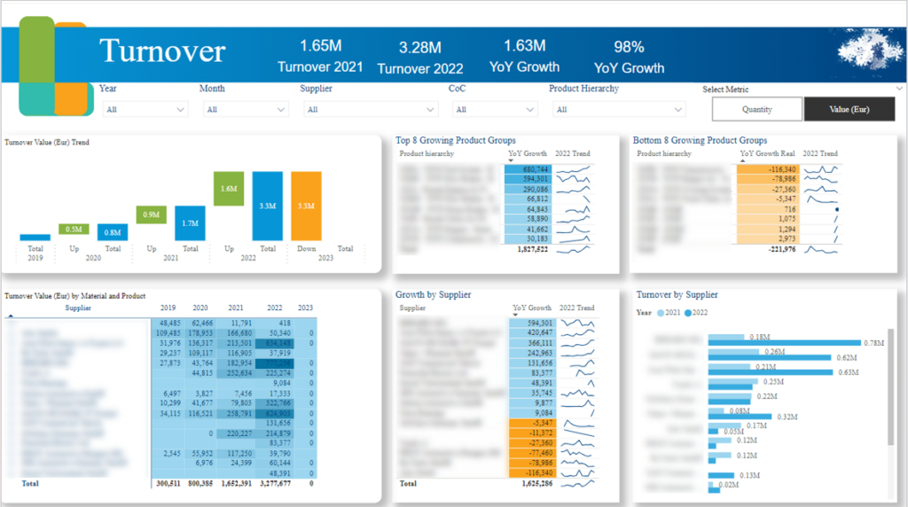
We built this Power BI sales executive dashboard the head of strategy of a manufacturing company. It measures how effectively the company manages key supplier relationships by calculating turnover by supplier and YoY growth. It also measures the product groups that grow and shrink the most YoY driving decisions like which products to discontinue and which ones to promote.
What it tracks: Year over Year turnover growth, how much turnover is coming from each supplier, the top and bottom performing product groups of the year, what supplier growth trends are looking like, and turnover trends by region and year.
Dashboards like this are commonly used as part of managerial reporting processes for executive meetings, sales reviews, and strategic planning.
Knowing the sales pipeline numbers is very important for any sales professional. The only pathway to predictable revenue is monitoring your sales pipeline and making sure that the new opportunities are coming consistently and conversion rates are optimised over time. This is exactly why companies create sales pipeline dashboards.

We built this Sales Pipeline Power BI dashboard from Salesforce for the Global Head of Marketing. The goal was to show the impact of the marketing team on sales. We did it by visualising the sales pipeline value from leads that came from marketing-owned lead channels or that consumed marketing content (e.g. downloadable whitepaper) at any time.
Up top, you’ll find a clear breakdown of the deals that’ve already been won – including the revenue potential and just how much of that came from marketing efforts. And it’s not just about looking at the wins: the dashboard also lets you compare your opportunities and expected revenue across different lead sources and countries, which is super useful for sales and marketing strategy sessions.

Down below, you get a visual breakdown of where leads are in the sales funnel – and just how well they’re converting from one stage to the next. There’s also a detailed table showing which leads have been won, lost, or are still working their way through the pipeline. The best part? You can even click right through from that table to the relevant Salesforce record and take action on a lead right away.
The deal velocity dashboard is built for sales leaders and revenue ops teams who want to answer the question every sales team cares about: how do we close deals faster?
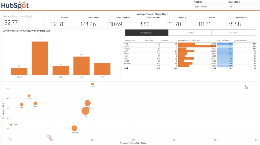
We developed a standard Power BI Hubspot dashboard you see above exactly for that. It measures the average time to buy and conversion rate by company size, industry and country. Sales reps can use this information to find out which companies that make purchasing decisions faster than average and adjust their outreach accordingly.
We also calculated the average number of days a deal spends in every stage so to help sales managers forecast when new deals will close.
You can follow the video tutorial below for how to install this Power BI template.
The sales rep dashboard is designed for sales managers and finance teams to get a better feel for how their sales reps and teams are doing. It’s the go to tool for them to check on account activity, figure out who’s bringing in the most sales, and compare how everyone’s doing against their revenue goals.
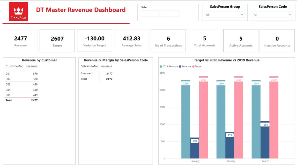
Our Power BI sales rep dashboard digs deep into account activity and sales performance – by the salesperson, by the sales team, or whatever mix of the two is most helpful. We look at how many accounts someone’s still working on are active within a given time frame and how their activity stacks up against other reps and managers in terms of sales volume, transaction count, and actual revenue. And then we check to see how well their actual sales match up to the targets they’ve been assigned.
What does it keep an eye on: Active accounts, number of deals getting done, how much money each salesperson is bringing in, how salesperson groups are doing, accounts that have been assigned to each rep, and where actual revenue stands versus the targets set.
The product sales dashboard is built to give finance directors and sales managers a clear picture of how different product groups are performing. It’s a powerful tool for identifying the products that are really flying, spotting trends in sales and making informed decisions about whether to promote one product over another.
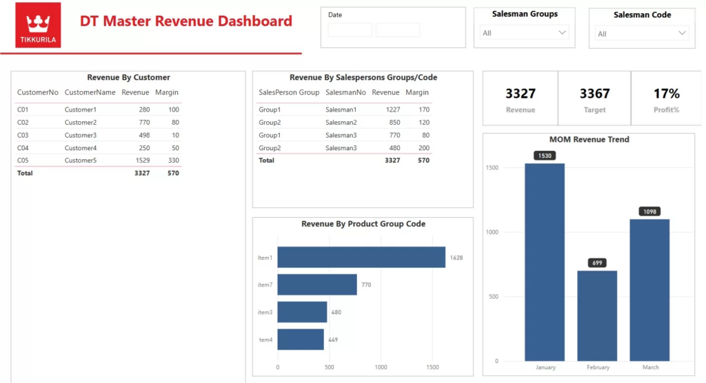
Our in-house built Power BI product sales dashboard breaks down revenue by product group and pits sales teams against each other and individual sales reps against the others. What this means is you can see which products are really pulling in the cash and whether certain salespeople have a knack for selling certain types of product.
What it tracks: This dashboard logs revenue by product group, by sales team, by customer and by individual salesperson, as well as sales trends and sales performance by salesman code.
The Actual vs Target Sales dashboard is designed to give sales leaders a clear view on whether their sales teams – and reps – are actually on track to meet their performance targets. Most of the time it’s used to keep an eye on how many sales are happening, new leads are being generated, and just how well – or not so well – the sales team is doing against their goals.
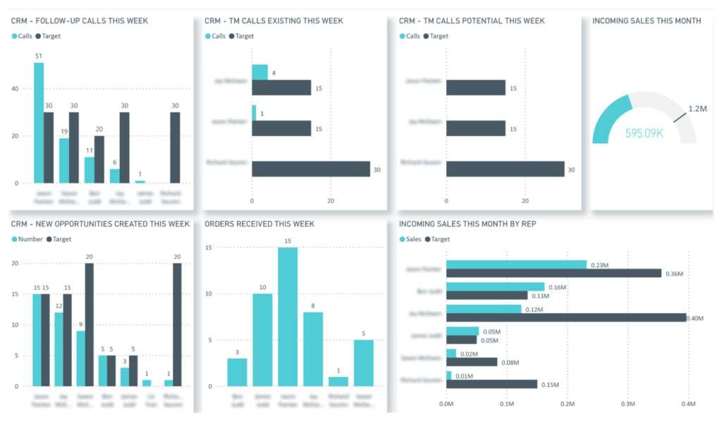
Our Power BI actual vs target dashboard looks at how each sales rep is doing by comparing what’s actually been achieved against what we were hoping to see. We check how many calls each rep is making versus the target, and we compare the number of leads our reps are creating and closing against our expected performance levels. It also gives us a handle on just how far along the sales team as a whole is in terms of hitting our company-wide sales goals.
What it keeps an eye on: Calls vs the target number of calls, leads that get created versus the expected number, how many deals each rep closes, sales performance breakdown by individual rep, how close we are to hitting our target.
The sales team performance dashboard – that’s been designed to let sales directors and their finance buddies get a sense of how their sales reps and managers are doing over time. They can use it to figure out who are the top salespeople in the business, spot trends in performance, and pick out the ones who might need a bit of extra help or some more training.
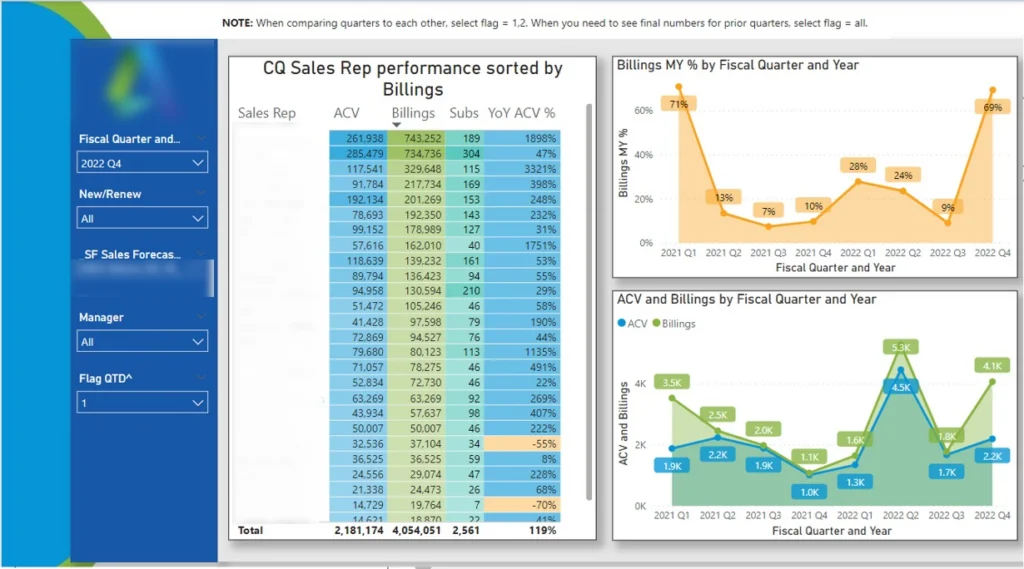
Our Power BI consultants built this sales performance dashboard digs into quarterly sales habits – how individual sales reps & managers are doing, and how that has changed over time. We can filter the dashboard by the manager to get a look at how all the salespeople are doing in a particular team. If you want to dig deeper, you can drill down into a salesperson’s performance, and see what’s changed in their productivity and sales over time.
What it tracks: Quarterly sales trends, sales performance by salesperson, sales performance by manager, team performance trends, individual sales rep performance.
The sales revenue dashboard is built to let agency leaders keep a close eye on how the business is doing – looking at revenue from different clients and countries over different periods of time. It’s the go-to tool for tracking trends, seeing how much each client is chipping in, and comparing where we are now against where we thought we’d be at the end of the year.
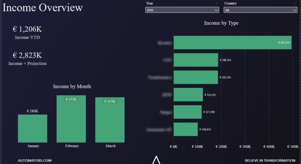
Our data visualization consultants created a sales revenue dashboard that is specifically designed to break down monthly changes in revenue and compare what different clients and countries are contributing. We also throw actual revenue in the mix with projected forecasts to enable management to get a clear read on how the year is shaping up and where to focus for growth.
What it tracks: Revenue by month, revenue by client, YTD revenue, actual revenue plus forecast, revenue by country.
The Account portfolio growth dashboard helps sales managers and their account management teams analyse how customer portfolios are doing over time. It’s a nifty tool for spotting high-growth accounts, identifying when customer relationships are starting to slip away, and figuring out how to tailor your account management strategy.
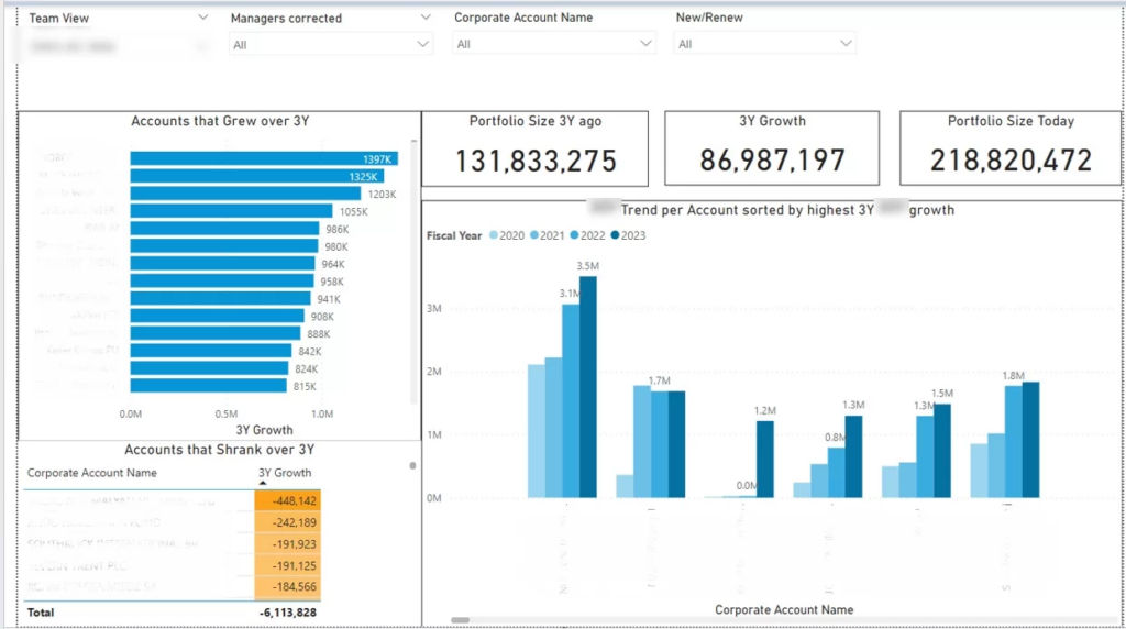
Our Power BI consultants developed this account portfolio growth dashboard that breaks down how sales managers and sales reps are doing across individual years. We compare the accounts that are seeing growth with the ones that are going downhill, which lets your management team work out what’s working and where there’s potential for problems and opportunities – industries that are really taking off, that is. Plus, with this analysis, sales teams can get a better idea of how the work they’re putting in with accounts is actually impacting their revenue over the long haul.
What it’s tracking: Portfolio growth by sales manager, growing accounts, shrinking accounts, account growth trends, portfolio performance over time
Our consultancy sales dashboard is designed to help consultants and professional services firms dig in on how well individual salespeople are doing and compare how they’re tracking against the targets they need to meet. It’s a crucial tool for sales leaders and management teams who want to keep a close eye on revenue, sales projections, and how they’re doing against their overall sales goals.
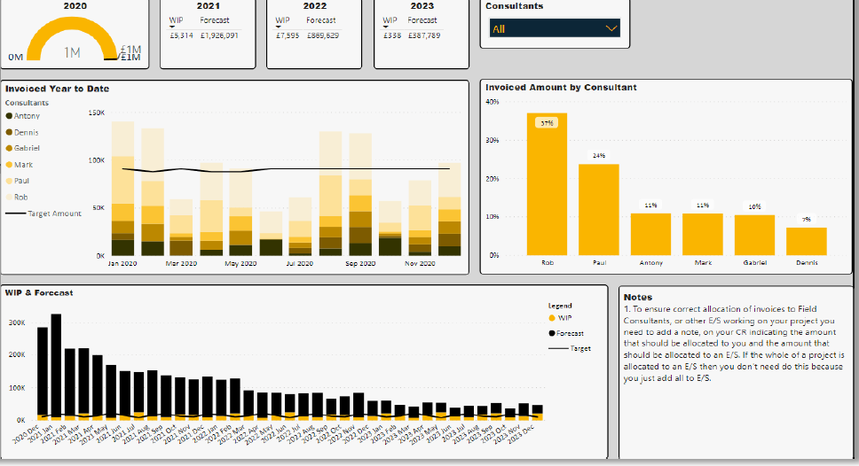
Our Power BI consultancy sales dashboard cuts through the numbers to show you exactly what percentage of sales each individual is bringing in – month by month and over time – and how that stacks up against what the targets are. We also use it to keep an eye on what’s in the pipeline and where forecast sales are headed in the coming months – so management can get a real sense of what to expect.
What it tracks: Sales contribution by salesperson, percentage of total sales by employee, actual sales vs target, work in progress, monthly sales forecast, forecast vs target.
An ecommerce performance dashboard is designed to let Shopify brands get a clear view of how their overall store is doing across sales, products, customers and promotions – all the things that matter for business success. It’s the go to tool for ecommerce managers and leaders to look at what’s driving sales and spot trends that can help them make informed decisions.
Our free Power BI Shopify template is able to crunch numbers for you on revenue trends, what your customers are doing, product sales performance and where people are buying from over time. And with some easy-to-use filters users can easily switch between different ecommerce key performance indicators and compare trends across daily, weekly or monthly periods. When you drill down on products you can see which ones and variations are really moving units, and with regional analysis you can identify which locations are driving the most revenue. The dashboard also looks at whether your promotional campaigns are actually working or not – by checking the number of orders linked to each discount code.
What it tracks: Total sales, discounts, how much we make from shipping, sales taxes, customer numbers, average order value, our gross margin, orders, how many units are sold, sales broken down by product, and by variant, and even by region. Sales figures by discount code are tracked too.
Our retail sales dashboard is designed to help retail and ecommerce businesses keep tabs on how stores are performing, what products are selling well and bad, and what’s driving customer purchasing decisions in different locations. It’s a go-to tool for merchandising teams, store managers, and the regional leaders who want to see how different stores stack up and figure out which products and collections are really moving the needle on revenue growth.
Our Power BI retail sales dashboard takes a close look at how sales are going across different stores, product categories, collections, and sub-collections. Thanks to some clever dynamic filtering and drill-down analysis, users can quickly switch between key retail KPIs, and see how performance is varying across different levels of product hierarchy. You can even zero in on specific locations to see how products and collections are doing in those places and where things are going wrong.
What it tracks: Sales, revenue, average order value, the number of orders, sales per store, sales by product category, sales by collection, sales by sub-collection.
Email marketing sales dashboards help businesses get a handle on how their email campaigns are performing and the actual sales that come from them. Its the kind of tool used by the marketing and sales crew to see how well their email strategy is working over time.
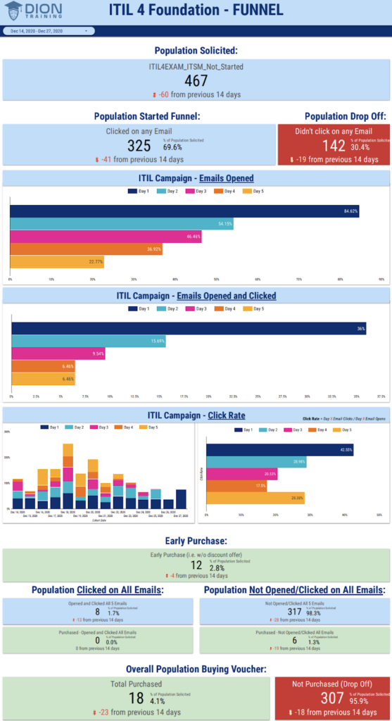
Our team created this Power BI email marketing sales dashboard that is all about following the conversion trail from opened emails through to clicked emails and actual sales – and then using that data to compare click rates and email engagement over the course of the day. This way business owners can watch how their campaigns are changing over time and make better decisions.
What it’s tracking: Opened emails, clicked emails, click through rates, purchases, click rates by day, how many emails are getting opened by day, and how many clicks are generated by day.
This Power BI email marketing sales dashboard lets business see at a glance how well their email campaigns are doing and whether or not email is really driving sales performance for them.
The subscription analytics dashboard is built to help subscription businesses get a handle on how their subscrition base is growing. Stripe is a common data source for this analysis which is exactly why we developed our Power BI Stripe Template App. We are also Stripe partner so we passed their technical and data security review to place our app on their marketplace.
The second page of this dashboard analyses the key subscription metrics like annual and monthly recurring revenue. Importantly it also analyses customer retention by product and customer cohort as every SaaS company wants to retain customers on subscription for longer.
Some customer churn is very avoidable, for example a customer’s credit card can expire. You will notice that the third page of our dashboard analyses the upcoming renewals by date and highlights when a renewal is at risk because the credit card is about to expire. The customer service team can then proactively reach out to the client and ask them to update the payment method ahead of the renewal.
Power BI sales dashboard templates can be a handy starting point for businesses that need to get some quick reporting up and running. These templates usually come with pre-built visuals for all the standard sales KPIs – revenue, pipeline value, conversion rates, and sales performance. They’re particularly useful for smaller teams who don’t want to invest a lot of time and money into building a custom dashboard from scratch. If you’re looking for ready-made dashboard designs, you can also browse our Power BI dashboard templates for more ideas and examples.
The catch is that most templates aren’t flexible. They’re locked to standard metrics and layouts, and it’s rare to find one that matches how your sales team actually operates. Companies often struggle to hook up multiple data sources, build custom calculations, or create workflows that make sense for their teams.
Custom Power BI sales dashboards, on the other hand, are built around the way your business actually works: the KPIs, regions, products, customer segments and sales activities that matter to you, plus extras like drill-down functionality, automated reporting, CRM integrations and forecasting models.
For companies with complex sales processes (account management, opportunity tracking, supplier analysis), a custom dashboard is pretty much a must-have. In practice, many businesses start with templates and move to custom once reporting gets more complicated.
Step 1 – Define Key Performance Indicators
KPIs translate your sales objectives into measurable metrics on your Power BI sales dashboard that pinpoint progress. Outline 4-5 critical KPIs under these categories:
Focus on big picture metrics that offer insights into sales health, trends and outcomes. Granular statistics can overload your dashboard.
Below is the process that we use for KPI planning:
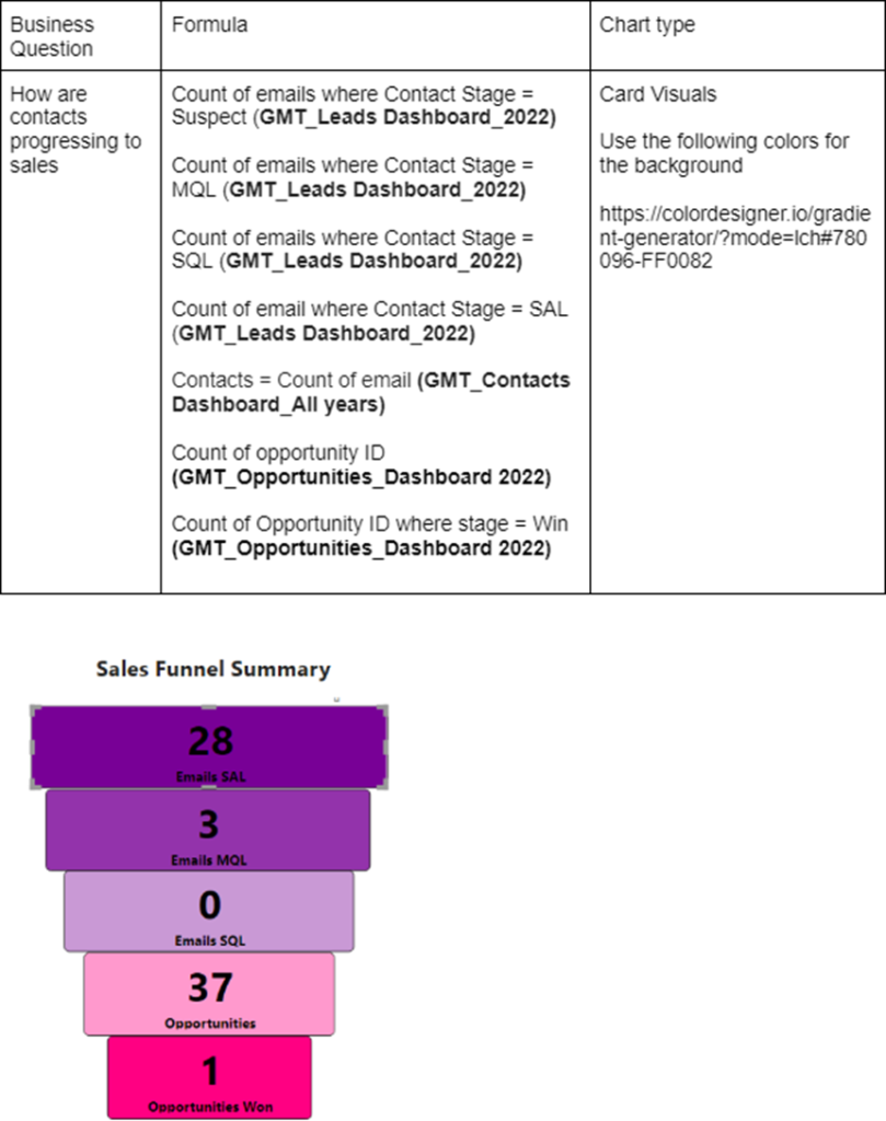
Our KPI planning process from a previous project.
Once you know your KPIs, plan for dimensions: the attributes by which you’ll segment KPIs for deeper analysis. Useful dimensions for sales dashboards include:
Step 2 – Connect your data to Power BI
The foundation of an impactful sales dashboard is access to accurate and up-to-date data. Your dashboard is only as good as the data behind it.
Here are the key data sources that you might want to use:
Some sources have native Power BI integration; for others you might need third-party connectors or a custom connector. Our Power BI Connectors guide will help you find the best way to connect your data.
Explore your data thoroughly across sources to uncover issues that need resolving beforehand. Data issues are very common in sources that rely on manual entry, like CRMs and Excel sheets. Examples include:
Once those issues are taken care of, it will be analysis-ready. You will be able to blend together data from multiple sources using relationships and modeling features.
Step 3 – Design Your Sales Dashboard Layout
With data connected and KPIs defined, start structuring your sales dashboard layout. Use these best practices for effective design:
Keep the layout clean, organized, and focused only on crucial sales metrics. Avoid cramming your dashboard with decorative elements.
Step 4 – Set up Automatic Refresh
As a single source of truth for sales data, your dashboard needs to stay refreshed with the latest information. Leverage native auto-refresh capabilities in your dashboard platform to schedule hourly, daily, or weekly data updates.
Identify optimal refresh frequency based on source data timelines, dashboard usage peaks, and volume of data. Real-time direct query connections offer the most up-to-date dashboards. But balance refresh needs with data warehouse loading.
Effective Power BI sales dashboards should present complex sales data in a super easy to get through way. What it all boils down to is presenting data in a way that lets users quickly pick up on trends, areas that need a bit of TLC, and areas where action is needed ASAP.
You’d be surprised, but the best sales dashboards tend to focus on just a handful of key performance indicators (KPIs) that are actually important, rather than showing every single metric that’s available. Things like revenue trends, pipeline performance, conversion rates, targets and product performance should be prioritised based on what the end users need out of the system. Executive dashboards tend to stick to the high-level view, while operational dashboards are a lot more focused on detailed drill-down analysis.
Effective dashboard design also demands that you pay attention to the visual hierarchy – it’s all about getting your most important KPIs right at the top, and keeping the supporting analysis and detailed tables lower down on the page. Consistent use of colours, spacing and chart styles all helps to speed up the process and stops the user from getting bogged down with info.
Interactive filtering is another really important design consideration. Users should be in a position to filter dashboards by anything from region, to the sales person, to product or customer, without having to jump all around the reports to do it. And let’s not forget about drill-down functionality, which makes a big difference by letting users move from high-level summaries straight down to detailed transaction or account-level analysis.
When it comes to dashboard development, you also have got to think about performance and usability. Big datasets, too many visuals and poorly optimised calculations can really slow things down and make users give up. You need to get the balance just right between visual detail and performance if you want reports that are responsive and easy to use. Following proper analytics reporting best practices during data preparation and modelling is essential for building accurate and reliable sales dashboards.
Don’t forget mobile. Sales reps are the most on-the-go audience a dashboard will ever serve, and Power BI lets you design a dedicated mobile layout for each report page. A phone-friendly view with the two or three KPIs a rep checks before a meeting will get used daily; a desktop layout squeezed onto a phone screen won’t.
One design decision almost every sales dashboard project runs into: should reps see each other’s numbers? Power BI’s row-level security (RLS) lets you build one report and control what each viewer sees, so a rep opens the dashboard and finds only their own accounts and pipeline, while their manager sees the whole team. It’s configured once in the data model with simple filter rules tied to user logins, and it saves you from maintaining separate reports per rep or team. If your sales data includes commissions or customer-sensitive figures, plan RLS in from the start rather than bolting it on later.
Finally, dashboard design should mirror the actual workflow of the business. Sales leaders, account managers, ecommerce teams and execs all use data differently, so dashboards need to be tailored to the decisions each group makes.
Business intelligence can be a real game-changer for sales teams, helping them turn large amounts of CRM, ecommerce and operational data into actual useful insights. With Power BI sales dashboards, businesses can get a much clearer view of how they’re doing and automate their reporting processes to make faster commercial decisions using real-time data.
Getting a Clearer Picture of Sales Performance
Business intelligence gives sales teams one single place to look at their sales performance – revenue, pipeline, customer activity and sales trends all in one go, and in real-time. No more digging through multiple spreadsheets or CRM reports – teams can just see how they’re doing from a single dashboard.
One of our clients reduced their report generation time from 48 hours to under 5 minutes when they got automated dashboards and centralised reporting sorted. And that’s not all – they also cut down on data-entry errors by 80% and improved data integrity to 99.7%.
Making Faster Sales Decisions
Power BI sales dashboards let businesses quickly identify performance issues, sales bottlenecks and growth opportunities. Managers can now use interactive filtering and drill-down analysis to get to the bottom of declining sales, underperforming regions or low conversion rates without having to wait on manual reports.
One of our clients reported a 40% faster turnaround on strategic decisions after switching to real-time dashboards and automated reporting processes. They also managed to save two business days a week by reducing their executive review cycles.
Using BI to Improve Sales Forecasting
BI tools let businesses look at historical sales data and pipeline trends in a way that’s more accurate than before. This makes a big difference to planning around sales targets, staffing, inventory and budgeting.
One of our clients automated their Power BI reporting, which means their sales and operational data is refreshed every five minutes – giving management a pretty clear picture of what’s going on with transactions, products and customer activity.
Getting the Most Out of Your Sales Team
Sales dashboards let businesses keep an eye on salesperson activity, revenue contribution and target achievement in real-time. Managers can now spot top-performing sales reps, catch declining performance early and give more targeted coaching.
One of our clients saw a 25% increase in report usage after swapping out their old reporting system for some more interactive and user-friendly Power BI dashboards. They also managed to get 100% of their legacy users transitioned over to the new system within four weeks.
Sales reporting lets businesses keep tabs on their performance, forecast their revenue, and track sales activity – but too many organisations are still struggling with a mess of scattered data, manual processes, and inconsistent reporting standards. As a result, they’re ending up with reporting that’s not very accurate and decision-making is being slowed down across the sales teams.
When Sales Data is Spread Everywhere
Too often sales data is scattered all over CRMs, ERP systems, marketing platforms, spreadsheets and ecommerce tools. That makes it a nightmare to create a single version of the truth for sales reporting.
Power BI steps in and helps solve this problem, by bringing all that data from multiple systems into a single centralised dashboard. It all works by using native integrations, APIs and custom connectors where they’re needed. That means businesses can lump together all their CRM, finance, marketing and operational data into one place, with automated updates as well.
Getting Stuck in Manual Reporting
Still, loads of sales teams are just exporting spreadsheets and then manually stitching together their reports every week or month. It’s a real time waster and it makes it way more likely that there’ll be reporting errors.
Power BI makes easy work of automating all the data extraction, transformation and dashboard refreshes. Automated reporting pipelines cut down on the manual work and ensure that sales reports always get updated with the latest available numbers. Some organisations even go and invest in data pipeline services to automate the whole data movement process between CRMs, ERP systems, ecommerce platforms, databases and Power BI dashboards.
The Problem with Poor Data Quality
Sales reporting often gets hit by inconsistent CRM data, duplicate records, missing values and inconsistent naming conventions. It all makes the reports less trustable and forecasting way less reliable.
When Power BI is involved, data cleaning and transformation is usually part of the project. This improves reporting consistency and gets rid of the trust issues. Businesses can even standardise their data structures and get automated flags for data quality issues before they start messing with reports.
A Lack of Insight into Sales Performance
When teams are stuck with static spreadsheets and disconnected reports, it’s a real challenge for leadership teams to spot sales trends, pipeline risks or underperforming regions quickly.
Interactive Power BI dashboards let users drill into sales data and filter by region, salesperson, product, customer, or time period. It’s all much faster and helps teams identify performance issues and make more informed decisions.
When Reporting Slows Down Decision-Making
When reporting is manual or broken in some way, it’s no wonder that leadership teams have to wait days or even weeks for the latest reports. It all delays operational and strategic decisions.
When you’ve got real-time or near real-time Power BI dashboards, it’s a whole different story. Businesses get continuous visibility into sales performance and can automate report refreshes so that decision-makers can spot any issues – and act on them – much quicker.
Sales Dashboards that Nobody Uses
Loads of sales dashboards just don’t get used because they’re too complex, slow or difficult for teams to use. And if they don’t fit into business workflows, people just go back to spreadsheets and manual reporting.
You can see the difference when Power BI sales dashboards are designed to be super user-friendly, with clear KPI structures, fast performance and interactive filtering. And if you tailor the dashboards to the user groups, adoption rates go way up and teams start to integrate reporting into their daily decision-making processes.
Power BI sales dashboards are the key to getting a grip on all your sales data in one place. They help businesses ditch manual reporting and get a clear view of how they’re doing when it comes to revenue, pipeline performance, customer activity, and forecasting sales. Whether you’re shopping for a B2B sales pipeline dashboard, an ecommerce sales dashboard or something that’ll help the big cheeses make sense of it all, we can tailor a custom Power BI dashboard to match your unique sales process and KPIs.
Here at Vidi Corp, we build custom Power BI sales dashboards that plug your data from crm systems, erp software, ecommerce platforms, marketing tools, and financial systems all into one place where it’s easy to see what’s going on. We design our dashboards so they’re more accurate, make it easier to make decisions and get teams real time access to business data.If you’re looking to build a custom Power BI sales dashboard or sort out your reporting, get in touch and we’ll chat about the project details.
Sales teams use Power BI to combine data from CRMs, ERPs, ecommerce platforms and finance systems into interactive dashboards that track revenue, pipeline, conversion rates and performance against targets. Instead of stitching spreadsheets together, reps, managers and executives get one automatically refreshed view they can filter and drill into, which speeds up everything from weekly sales reviews to forecasting.
Dashboards are commonly grouped into four types: strategic (high-level KPIs for executives), operational (day-to-day monitoring, like a live pipeline view), analytical (deep exploration of trends and drivers), and tactical (tracking progress against specific goals, like actual vs target). Most of the sales dashboard examples above blend at least two of these, and in practice we find the pre-revenue vs post-revenue split more useful for planning sales reporting.
The most common friction point is sharing: viewing shared reports generally requires the right Power BI licence per user, or a capacity-based setup for wider or external distribution, which needs planning if you want dashboards in front of many people. Performance can also suffer on large, poorly modelled datasets. Both are solvable with the right licensing setup and a well-built data model, but they’re worth budgeting for upfront.
You can build reports free in Power BI Desktop. To share dashboards with colleagues through the Power BI service, users generally need a paid per-user licence, or the organisation needs capacity-based licensing that lets wider audiences view content. The right setup depends on how many people need access and whether any of them are outside your organisation; this is something we scope as part of every dashboard project.


