
Data analytics in financial services is now central to how firms across the sector operate, because few industries generate or rely on data to the same degree. Every transaction, policy, trade and client interaction leaves a record, but most of it stays locked in the system that produced it, so the numbers a firm needs end up scattered across platforms that were never designed to connect. The discipline comes down to connecting those sources and reporting from them reliably, so decisions on risk, growth, customers and compliance rest on current evidence rather than a spreadsheet rebuilt by hand each month.
This is the work we do at Vidi Corp. Through our financial analytics consulting services we build reporting and dashboards for financial services firms of all kinds, part of a wider track record of more than 1,000 reporting solutions delivered to over 700 companies across industries, including Neil Patel, Teleperformance and DS Smith.
This guide covers what data analytics in the financial services industry involves, the main use cases and benefits, how it works across four sectors with real dashboards we have built, and how to build the capability without a lengthy rollout.
Data analytics in financial services is the use of data from a firm’s operational and market systems to measure performance, risk, customers and compliance, and to support decisions with evidence. It covers everything from a monthly management report to a real-time fraud model, and the common thread is that the numbers come from a governed source everyone works from.
The data usually comes from several systems that were never designed to talk to each other. In banking that means core banking platforms, payment rails, CRM and accounting software. In insurance it is policy administration, claims, billing and telephony. In wealth management it is a CRM, a platform or custodian feed and an accounting system. This is a data integration problem at heart: data analytics in financial services connects those sources under one set of definitions, so a figure means the same thing wherever it appears.
It helps to separate reporting from analytics. Reporting tells you what happened, revenue last month, claims this quarter, assets under management today. Analytics goes further, into why a number moved, what is likely to happen next, and what to do about it. Most firms start with reliable reporting and grow into forecasting and modeling once the underlying data is trustworthy.
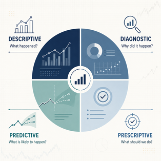
Data analytics in finance is usually described in four levels, each answering a different question and building on the one before it.
Descriptive analytics reports what has already happened. A dashboard showing net interest margin by quarter, claims frequency by product, or assets under management by adviser is descriptive. This is where most firms begin, because you cannot forecast a number you cannot yet measure cleanly.
Diagnostic analytics explains why a number moved. When margin drops, diagnostic analysis traces it to the specific product, region or cost line responsible, so the conversation moves from noticing a problem to understanding it.
Predictive analytics estimates what happens next. In financial services that means forecasting assets under management, scoring which leads are likely to convert, flagging clients showing signs of leaving, or estimating loss ratios on a book of business. It depends on clean history, so a firm that has captured consistent data for two years can forecast credibly while one reporting only current state cannot.
Prescriptive analytics recommends an action. It sits on top of the other three and suggests the next best step, such as which product to offer a client or which claims to hold back for review. Few firms start here, but it is where the value compounds once the foundation is in place.
Some uses of data analytics show up across every corner of financial services, whatever the sub-sector. These are the functions firms invest in first.
Financial firms lose money to fraud in real time, so detection has to run against current data rather than a monthly report. Analytics joins transaction patterns, customer history and device signals to score risk and flag anomalies as they happen, catching genuine fraud without blocking so many legitimate customers that analysts drown in false alerts. Banks run this through dedicated fraud dashboards, covered in the banking section below.
Risk analytics covers credit scoring, loan underwriting, portfolio exposure and anti-money-laundering monitoring. Bringing lending, payment and customer data together lets a firm judge credit quality, size up capital at risk and spot the patterns that only appear when separate sources are read side by side. AML monitoring in particular depends on connecting activity that looks harmless in isolation.
Financial firms hold rich behavioral data but rarely use it to tailor what they offer. Analytics segments customers by how they behave, which products they use, how engaged they are, what they are worth over their lifetime, so acquisition, retention and cross-sell decisions follow the evidence.
Financial services is heavily regulated, and much of the burden is proving how every reported figure was derived. Analytics creates governed datasets for finance, actuarial, solvency and regulatory reporting, so a metric is produced the same way every period and data lineage shows exactly which records feed a submitted number. That shortens audit and review cycles and reduces the risk of a figure that cannot be defended.
The most immediate return is usually the plainest one. Automated pipelines replace the manual export-and-stitch that eats days of every reporting cycle, so reporting that once took days can refresh in minutes and teams spend their time reading the numbers instead of assembling them.
Data analytics in financial services looks different in each sub-sector, because the data sources, regulations and decisions all differ. The sections below look at four of them, banking, insurance, wealth management and private equity, and how each puts its data to work, with a real dashboard we have built for that industry to show what it looks like in practice.
Banks sit on some of the richest data in financial services, spread across core banking systems, payment platforms, CRM, and accounting software that all generate activity constantly. The problem is that this data stays split across those systems, so each team sees only its own slice. Data analytics in banking brings those sources together in a single model, which is why banks now run dedicated dashboards for executive reporting, customer segmentation, credit risk, liquidity, and fraud. Fraud is one of the clearest examples, because the losses do not wait for a reporting cycle. Card fraud, account takeover, and payment scams play out in seconds, so a report that lands at month-end only explains money that has already gone, and detection tuned too tightly swings the other way, blocking real customers and burying analysts in false alerts they clear by hand.

Our consultants built this Power BI banking dashboard for a bank’s fraud, AML, and risk teams. The top row carries the numbers they check first: fraud cases opened, the fraud-to-sales ratio in basis points, recovery rate, loss prevented, detection rate, and the false positive ratio. Below that, a quarterly view plots case volume against net loss, so a rise in cases reads next to what it cost. A card-present breakdown splits fraud into stolen and lost cards, counterfeit, and skimming. A trend panel tracks detection rate against false positive rate over time, and a channel view compares the false positive ratio across card POS, e-commerce, mobile app, online banking, and wire or ACH, each against a benchmark range.
With everything in one view, the fraud team spends its time on the cases that warrant it, not on clearing noise. The detection-versus-false-positive trend shows whether a model change improved results or just shifted the problem elsewhere, and the channel view points straight to where detection is drifting outside the benchmark. For the Chief Risk Officer, the scorecard gives a single read on exposure and on how well controls are holding, without waiting for the next cycle.
Insurance is one of the most data-heavy corners of financial services and one of the most tightly regulated, which is what makes the data problem acute. Carriers hold decades of policy and claims history across policy administration, claims platforms, billing, CRM and telephony, and much of it is nonpublic personal information governed by rules like the GLBA Safeguards Rule and the NAIC Insurance Data Security Model Law. The obligation is not just to report accurately but to prove how every figure was derived and to keep the underlying data secure, which is hard when it is scattered across systems and exported by hand. This is why data analytics in insurance almost always starts with insurance data modernization: connecting the sources through governed pipelines so that reporting is both current and defensible. Communications data is a good example of the problem, because for many carriers it sits locked inside a phone system with no route into reporting at all.
We solved exactly that for a US property and casualty carrier that ran its phone system and internal meetings on Zoom, with all of that activity trapped inside the platform. Our Zoom connector extracts the carrier’s call and meeting data automatically across the Zoom API and writes it into a PostgreSQL database on the carrier’s own infrastructure, with nothing retained on any Vidi system, including logs, and personal details held under AES-256 encryption so the database returns ciphertext rather than names to anyone without the configured connector.
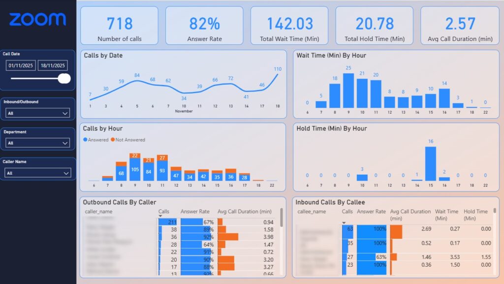
The build the carrier reads day to day is a Zoom analytics dashboard in Power BI, tracking call volume, answer rate, wait time, hold time and average call duration. For a support line, the unanswered-calls-by-hour view shows when calls are being missed so staffing can follow demand; for the outbound team, the same dashboard reads as a performance view, showing whether each agent is making enough calls and which hours produce the best answer rates.
The result is communications reporting the carrier fully owns. The figures land on a schedule and refresh into Power BI without anyone exporting a file, so the numbers are ready to use the moment the team opens them. Because the design put governance first, running through the carrier’s architecture review board and an NDA before any data moved, it stands up to the data-residency and disclosure questions insurance regulators ask. The same connector approach extends to the carrier’s other systems, which is where insurance data modernization moves from a single fixed source to a pattern the whole business relies on.
Wealth firms hold the answers to how the business is performing, but the data sits in three places that rarely connect: a CRM for clients, plans, cases and revenue, a platform or custodian feed for valuations and holdings, and an accounting system for fees. While those stay separate, monthly reporting becomes a manual build from several exports, and a simple board question like where growth is coming from takes days to answer. Data analytics in wealth management reads from all three, so directors can see assets, fees, clients and adviser performance side by side, and advisers can see their own book and pipeline. The firm-wide management information dashboard is the clearest example, since it answers the three questions asked in every board meeting: how much do we manage, what is it earning, and where is growth coming from.
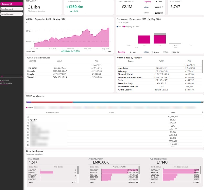
Our business intelligence consultants built this wealth management analytics dashboard for EQ Investors, an advice firm, using Power BI with daily historical snapshots behind it. Two systems feed it: PlannrCRM, which owns the client, plan, case and revenue records, and a MySQL server that holds the platform side, valuations, holdings and transactions. Along the top, a director gets the headline read at a glance, total AUMA, growth over the selected window, fee income separated into initial, ongoing and other, and a live client count. From there the numbers open up by service, by strategy and by platform, so a figure can be traced to where it comes from. A separate circle intelligence panel groups related clients into households, reporting how many circles the firm holds and what each is worth on average, which stops a single family relationship being counted as a set of unconnected accounts.
The time-series design is what makes the comparisons hold. Daily AUM snapshots and slowly changing dimensions are captured, so a director can compare any custom date range or run year-on-year figures without the numbers shifting as records are edited behind them. Case-level fields such as expected initial revenue, proposed service, proposed strategy and active adviser let the team move from a firm-wide figure down to the specific cases behind it, which is what makes the dashboard usable in the room, not just a headline view.
Private equity runs on faster, better-evidenced decisions than it used to. Deal timelines have tightened, competition for good assets is harder, and partners now expect the same rigor in monitoring a portfolio company that they applied to buying it. The data to support that is scattered, though, across fund accounting, portfolio company ERPs, CRMs and operational systems, and portfolio companies often report on different definitions, which makes performance hard to compare across the book. Data analytics in private equity gives investment teams and operating partners a continuous read on fund, deal and portfolio performance, from sourcing through to exit. Nowhere is that read under more scrutiny than at exit, when the evidence has to hold up as the story a buyer will price on, and buyers pay for durable earnings, not just headline growth.
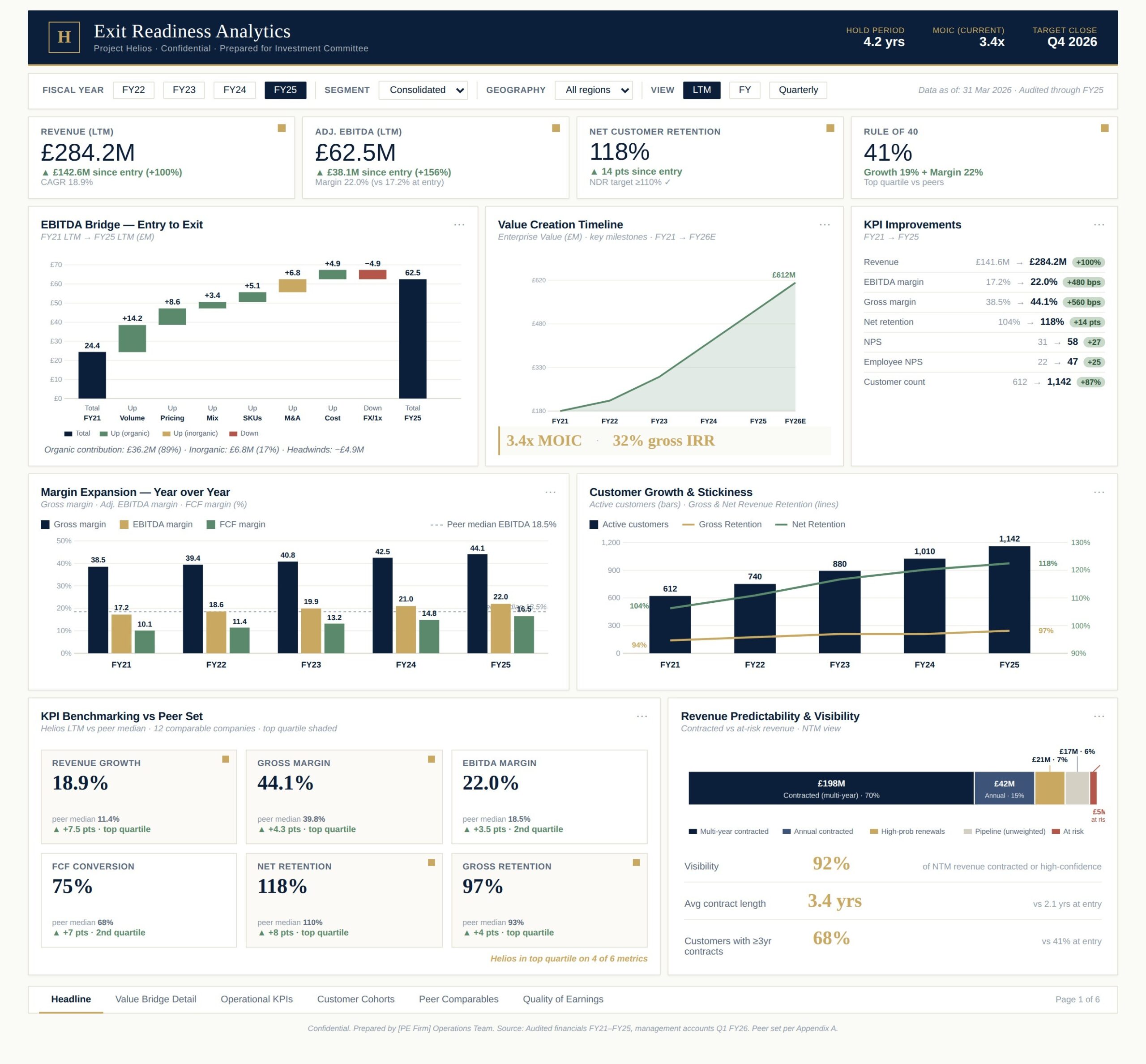
We built this private equity dashboard for a PE-backed portfolio company as the headline page of an investment committee pack in Power BI. The top strip leads with what a buyer looks at first: revenue and its growth since entry, adjusted EBITDA and margin against the entry margin, net customer retention, and a Rule of 40 score. An EBITDA bridge breaks the entry-to-exit move into its parts, volume, pricing, mix, SKUs, M&A, cost and FX, and separates organic growth from inorganic. A value creation timeline maps enterprise value from entry toward the projected figure at the targeted exit, with MOIC and gross IRR called out beneath it. Lower panels benchmark the company’s KPIs against a peer set and split next-twelve-months revenue into contracted, renewals, pipeline and at-risk, showing how much of the forward number is already secured.
For the investment committee, this is what the sale narrative rests on. A buyer can see where EBITDA growth came from, whether it was organic or bought, how margin expanded year on year, and where the company sits against its peers. The revenue visibility panel answers the question every buyer asks about how durable the earnings are, showing contracted revenue and lengthening contract terms rather than asking anyone to take future growth on trust. Because the financial, operational and commercial KPIs all read from one reporting layer, diligence moves faster and the growth story stands up to the scrutiny it gets during a sale.
Financial services generates data at a scale few other industries match: every card swipe, quote, trade, claim and login is a record, and much of it arrives continuously rather than in tidy batches. Big data analytics in financial services is what lets firms work with that volume, velocity and variety, structured transactions alongside unstructured documents, call recordings and web activity, without it becoming unmanageable.
Handled properly, that scale changes what a firm can do. A fraud model can weigh months of behavior behind one transaction. An insurer can price against decades of claims history, and a bank can read customer activity across every channel at once. That depth is out of reach for a spreadsheet-based process.
Making that work depends on the infrastructure underneath the reports. Cloud data engineering, automated pipelines and a governed store are what let a firm hold years of history, refresh it on a schedule and feed it to reporting and models without duplicating copies or babysitting refreshes. Big data and analytics for financial services is only as reliable as that foundation, which is why the strongest programs invest there first and layer dashboard development on top.
Once the data is connected, the results financial services firms see are practical ones. The main benefits are faster reporting, quicker decisions, less manual data consolidation and more accurate data.
Faster Financial Reporting
Reporting slows down when someone has to pull figures from accounting, CRM and operational systems by hand every month. Analytics removes that step by connecting those systems to one reporting environment, so finance teams track P&L, cash flow, receivables, sales pipeline and other KPIs through dashboards that stay current on their own.
For a financial services company, our team automated Power BI reporting from QuickBooks Online, Zoho CRM, Zoho Creator and Excel. The client reported saving more than 10 hours a month on financial reporting.
Faster Decision-Making
When executives share one current view of financial and operational KPIs, decisions stop waiting on the next reporting cycle. Real-time dashboards make it easier to spot a change in performance, check what caused it and act while the information is still current.
We built that environment for TGUC Financial, with real-time dashboards and automated data flows. The company reported a 40% faster turnaround on strategic decisions and cut executive review cycles by two business days a week.
More Efficient Data Consolidation
Most finance teams rebuild the same dataset by hand because the source systems do not connect. Analytics brings that information into one structured environment, so every department reports and analyzes from the same data instead of its own extract.
On the same build, we consolidated six separate systems into one central database, which cut manual data consolidation by 95% and brought report generation down from 48 hours to under five minutes.
More Accurate Data
Every manual copy and reformat is a chance for an error to slip in. Automated pipelines move data straight from source systems into the analytics environment, so the numbers behind reporting, KPI tracking and analysis are more reliable.
For our client, automated REST API feeds reduced data-entry errors by 80% and lifted data integrity to 99.7%.
The obstacles to data analytics in financial services are consistent across the industry, and each has a practical answer.
Data silos and legacy systems are the most common. Decades of policy, account or portfolio data sit in systems that do not connect, and replacing them wholesale is rarely realistic. The answer is to leave core systems running and connect them through APIs and automated pipelines, so their data becomes available without a risky rip-and-replace.
Data quality is next. Analytics is only as good as the records feeding it, and inconsistent definitions cause conflicting figures across teams. Agreeing metric definitions before any build, and enforcing them in the data model, settles this early.
Regulation and data privacy raise the bar in financial services specifically. Nonpublic information has to be secured and its handling proven. Designing controls, encryption, access rules, retention, against named obligations rather than adding security features at random keeps the environment defensible.
Talent and tooling gaps are real but manageable. Few firms can staff a full data team internally, which is where a data analytics provider for financial services fills the gap, delivering the capability while the in-house team focuses on the decisions the data supports. If you are weighing up options, our guide to the top data analytics companies sets out the main providers and what each is best suited to.
AI and data analytics in financial services are converging fast. Machine learning already drives fraud scoring, credit models and churn prediction, and generative AI is now reading unstructured documents, claim forms, contracts, statements, and drafting the first pass of analysis that a person then checks. The pattern holding across serious firms is that models handle extraction and pattern-spotting while people keep the judgment calls.
Real-time analytics is becoming the expectation rather than a premium feature. As pipelines push changes through in seconds, reporting shifts from a monthly cycle to a live view, which matters most in fraud, liquidity and trading where minutes count.
Cloud and self-service BI are widening who can use data. Governed cloud platforms let more of a firm query its own numbers safely, and self-service dashboards move routine questions off the analytics team’s queue. The firms getting the most from these trends are the ones that got the foundation right first, because live and AI-driven analytics only work on data that is already clean, connected and governed.
Building a data analytics capability in financial services does not need a multi-year project. The strongest starts are small and specific: a single reporting cycle that takes too long, or a board pack that eats a week to build. Prove the value of that, then expand once the underlying architecture has earned the trust.
The sequence is the same whatever the tools. Agree how each metric is calculated before building anything. Identify the golden source for each type of data and connect it through APIs or direct access. Capture history so past reports stay correct. Design dashboards around the decisions people make, not the fields that happen to be available, following clear data visualization principles. Automate the refresh and set access rules so each user sees only what they should. The best data analytics tools for financial services, Power BI, Tableau, Looker Studio and the cloud platforms behind them, all work well once that groundwork is done; the tool matters far less than the foundation.
We build the connected data foundations, automated pipelines and dashboards behind the examples above, and our data analytics consulting applies the same approach across the rest of a business, not just finance.
Get in touch and we will walk through your data sources and the decisions you need them to support.
It is the use of data from a firm’s operational and market systems to measure performance, risk, customers and compliance, and to support decisions with evidence. In practice it means connecting sources like core banking, policy, CRM and platform data under one set of definitions, then reporting and modeling from that governed foundation.
Data analytics in finance is the same discipline applied to financial data specifically, revenue, costs, portfolios, cash flow and risk, using descriptive, diagnostic, predictive and prescriptive techniques to understand what happened, why, what is likely next, and what to do about it.
A financial data analyst gathers financial and operational data, builds and maintains reporting, and produces the analysis that supports decisions on performance, risk, pricing and investment. Day to day that ranges from maintaining dashboards to forecasting and investigating why a number moved.
AI is changing the work rather than removing the analyst. It automates data extraction, pattern-spotting and first-pass analysis, which frees analysts for judgment, context and the decisions that carry real consequences. The current pattern across financial firms is AI for the heavy lifting and people for the calls that matter.
Power BI, Tableau and Looker Studio are the most widely used, sitting on top of cloud data platforms such as Azure, Microsoft Fabric, Snowflake and Databricks. The right choice depends on where a firm’s data lives and how it works, and any of them performs well once the data foundation beneath it is clean, connected and governed.


