
Internal reporting is a must have for businesses that want to stay on top of their game, spot potential problems, and make better choices. Whether you’re in finance poring over cash flow statements, a sales manager keeping tabs on the pipeline, or an HR team trying to make sense of workforce trends, internal reports give you the info you need to run your business with confidence.
We have built 600+ custom reporting solutions in all sorts of areas – finance, sales, marketing, operations and more – for years now. And the more we do it, the more we see how a well-designed report can transform the way you work: it gives you a clear view of what’s going on, cuts out unnecessary hassle and makes decision-making a whole lot easier for your management team.
In this guide, we’ll break down what internal reporting is all about, how it differs from reporting you do for outsiders, and just why it’s such a crucial part of making business decisions. And to really drive the point home, we’ll share some real-life examples of the sorts of reports we’ve built for our clients.
Internal reporting is the process of knocking up reports that really help employees and managers keep an eye on how the business is doing and make decisions about how to make things run better. This kind of reporting is for internal use only – in other words its not meant to be shared with outsiders like investors, regulators, customers or anyone else who isn’t part of the organisation.
You can produce internal reports at a lot of different levels within the business. Some are high-level overviews that senior management need, while others are focused on specific bits of the company like departments, projects, processes or teams. Common examples include internal financial reporting, sales reporting, operational reporting, project reporting, marketing reporting, and HR reporting. Just which level you go for depends on what the report is supposed to be used for – and that might be daily, weekly, monthly or even quarterly updates.
The main point of internal reporting is to get accurate and useful information out to the people who need it – the ones who are going to be making decisions about how to run the organisation.
Many organisations support this process using an internal reporting system that automatically collects, consolidates, and distributes information from multiple business systems. The information is often delivered through internal reporting dashboards and management reports that give decision-makers access to timely and consistent information.
It’s worth noting though that the term “Internal Reporting” can sometimes get mixed up with internal compliance or whistleblowing processes. In that case, employees will be reporting on things like misconduct or fraud, or just plain old policy breaches or behaviour that they think is a bit dodgy. But when business folk start talking about internal reporting in the context of management or business intelligence, what they usually mean is reports that help them keep a close eye on how things are going and make informed decisions, rather than just being a safety valve for employees to report on things that are not quite right.
Reporting in business is typically split into three basic camps – Internal reporting, External reporting and Regulatory reporting.
Internal reporting is the kind that’s mainly used by staff and managers to get a grip on how the business is doing & to help make key decisions. This would include the likes of budget reports, sales figures, project update reports and operational performance dashboards.
External reporting is basically there to keep stakeholders outside the company in the picture – that’s investors, banks, customers and business partners. Annual reports are a good example as are financial statements.
Regulatory reporting is the type of report that’s prepared to meet all the necessary laws, tax requirements or industry-specific rules. Depending on the actual business you’re in this could be anything from submitting tax returns, pulling together financial information or sending reports to the government and regulatory bodies it needs to.
Internal and external reporting both get the word out about an organisation, but they’ve got entirely different audiences and jobs to do.
Internal reporting is put together for the people on the inside – that’s employees, managers, and execs. Its main goal is to help them make decisions, keep an eye on how things are going, and figure out how to keep the daily operations running smoothly. You can create internal reports on just about any aspect of the business you can think of, like finance, sales, marketing, projects, operations, and human resources.
External reporting is made for anyone on the outside looking in – that might be investors, lenders, regulators, auditors, customers, partners, or even government agencies. External reports are usually put together to meet some specific requirement or obligation, whether that’s reporting, compliance, or just keeping people in the loop.
One big difference is that internal reports are usually super flexible – you can tailor them to the needs of one team or department, and change them up as things change in the business. External reports, on the other hand, are often tied to rules and regulations – accounting standards, contractual obligations, and agreed-upon reporting formats are all part of the picture.
At the end of the day, internal reporting helps get the internal gears turning, and external reporting helps organisations show off their accomplishments to external stakeholders.
Internal reports are way more than just a collection of numbers, they can help managers get a handle on what’s really going on across the business and provide the data they need to make decisions, steer resources and react to problems a lot faster. Below are some of the main benefits of internal reporting – along with some examples from our client work.
Making Better Decisions (Instead of Guessing)
Internal reports give managers access to timely information about how the business is performing, so they can make informed decisions rather than relying on just assumptions. They pull together data from multiple systems to give a really clear picture of whats going on across the whole organisation.
One of the clients we worked with was able to cut the time it takes to make strategic decisions by 40% after we helped them set up real-time reporting and analytics.
Getting A Deeper Look At Performance
Internal reports let organisations track their progress against goals and keep an eye on key metrics over time. This makes it way easier to see how different departments, teams, products or projects are doing.
One client used automated reporting to track how different businesses were performing and to spot the causes behind revenue and profit changes, as well as keep an eye on inventory and other operational metrics.
Catching Problems Before They Get Out Of Hand
Lots of business problems show up in reports before they become serious operational or financial issues. Internal reporting lets managers spot trends, anomalies and risks early enough to take action before they become a problem.
For example, one client used operational reporting to spot that medical device usage was declining – they were able to get in touch with customers and address the issues before it affected revenue.
Holding People More Accountable
Internal reports give everyone a shared view of performance across teams and departments. When targets and results are in the open, it makes it a lot easier to see how everyone’s doing and hold teams to account for the outcomes.
One client swapped out an old reporting process for Power BI and now stakeholders can get all the information they need from one place – report usage went up by 25%.
Planning That’s More Consistent
Having a view of past performance data lets organisations make better decisions about stuff like budgets, staffing, inventory, sales targets and resource allocation. Reporting gives the context they need to have a bit more confidence in planning.
One client used inventory and financial reporting to spot that they were holding onto certain products for too long – it helped them improve their purchasing and keep cash flow healthy.
Internal reports tend to fall into a handful of categories, grouped by the part of the business they serve and the decisions they’re meant to support. Most companies end up with some mix of the following.
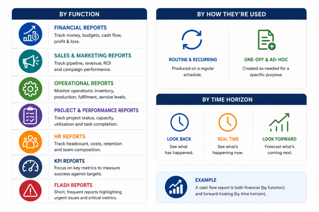
Internal financial reporting covers the money picture: budgets versus actuals, cash flow, profit and loss. Finance teams and leadership lean on these to track performance against plan and keep the business on a solid footing.
Sales and marketing reports track the commercial side of things: pipeline, revenue against target, channel ROI, and how individual campaigns are performing. They help commercial teams work out where to put their effort and their budget.
Operational reports deal with the day-to-day mechanics: inventory levels, production, fulfilment, service levels. Operations leads use them to keep things running smoothly and catch bottlenecks before they bite.
Project and performance reports cover project status, team capacity, utilisation and task completion. Project and team managers rely on them to keep delivery on track and balance workloads sensibly.
HR reports look at headcount, staffing costs, retention and the make-up of the team that is the information HR and senior management need for people planning.
KPI reports focus on the key metrics that organisations use to measure success. They are commonly delivered through internal reporting dashboards and provide a high-level view of performance against targets. Executives often use them to monitor the overall health of the business.
Flash reports are short and high-frequency reports designed to highlight issues that require immediate attention. They are often distributed daily or weekly and focus on a small number of critical metrics, such as sales, cash balances, production output, or inventory shortages.
It’s also worth noting that the same reports can be grouped a second way: by how they’re used. Some are routine and recurring, others are one-off and ad-hoc. And they differ by time horizon too, some look backward at what’s happened, some show the picture in real time, and some look forward to forecast what’s coming. A cash flow report, for instance, is both financial and forward-looking at once.
Internal reports are absolute game changers for managers – they give a clear view of what’s going on across the company and help inform better decision making. There’s a big difference between reports created for investors or the regulators, those are all about presenting a polished face – internal reports on the other hand are built for the everyday management needs of finance, sales, projects, marketing, operations, and HR.
The exact reports a company needs of course all depends – size of the business, what industry they’re in, what really matters to them. Those are all factors that end up defining what reports get created and how often they get shared.
Below are some examples of internal reports we’ve put together for clients, they show how different teams really use reporting to stay on top of performance, spot problems as they come up, and make informed choices.
Our client was looking for a better way to understand why actual results were differing from budget throughout the year. While budget and actual figures were available in the accounting system, there was very little visibility into which accounts were driving the largest variances or whether those variances required action.
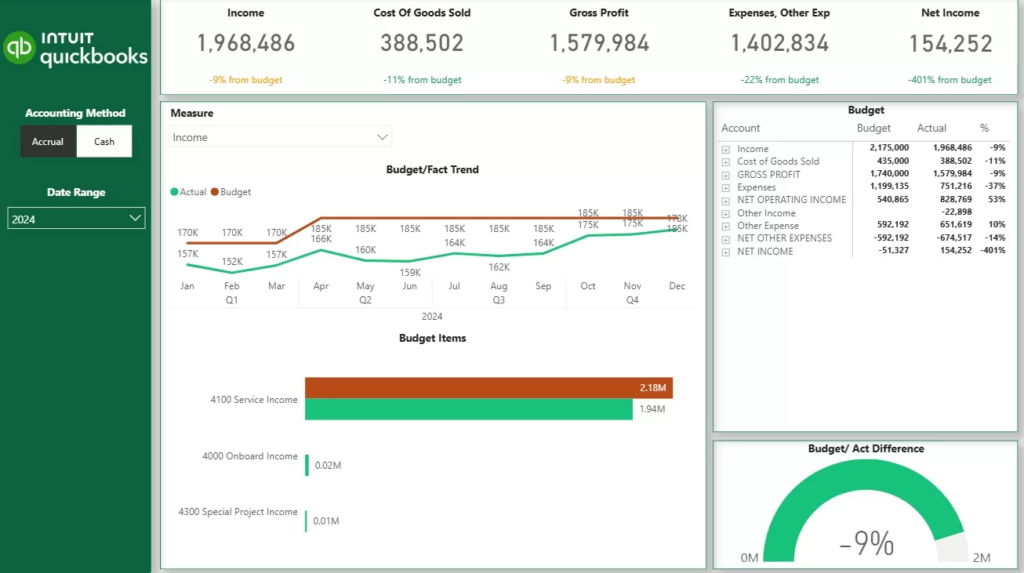
The report pretty much paired up budget and actual values into one view, so that you could see at a glance how things were tracking. It broke down the income, cost of goods sold, gross profit, expenses, and net income into individual lines, and showed you the month-over-month budget vs actual trends, plus the variance percentage for each account – so you could instantly tell where things were going wrong. And if you saw some sort of variance that you needed to investigate, you could drill down into the individual budget lines to see exactly where the problem was coming from.
This report became a regular part of their monthly financial review meetings. Managers would use it to spot expense categories that were outstripping their budget, and revenue streams that were falling short of targets – and that gave them the info they needed to start tweaking their forecasts, digging into unexpected costs, and making sure they were focusing on the areas that really mattered.
The reason the report worked so well was that it tied the big picture financial numbers to the detailed line-item numbers, so you could actually start to understand the cause of the problem, rather than just spotting that something was off.
A financial team was having trouble getting their heads around how cash was flowing in and out of the business each month. All they could see from their profit reports was how the whole business was performing – not where the cash was coming from or going to.
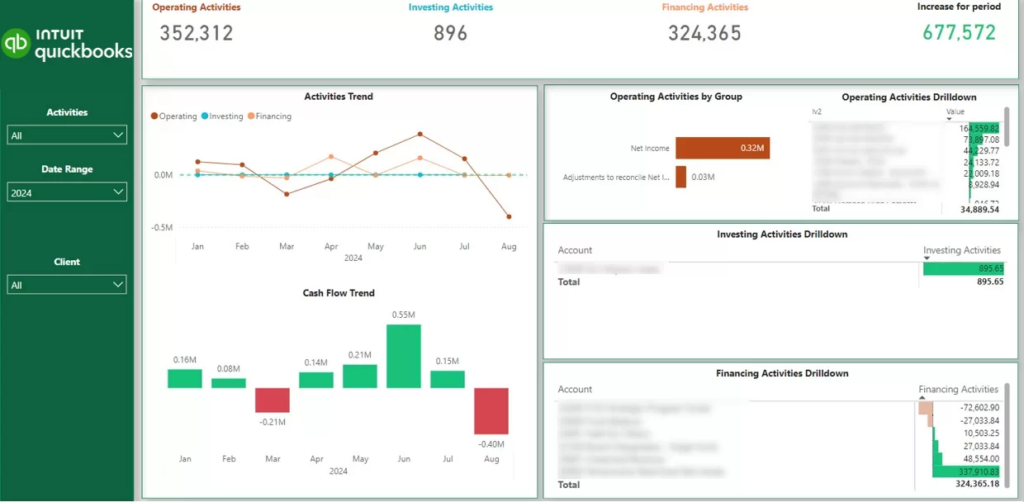
The report our Power BI consultants came up with broke down cash movements into four key areas: Operating activities, Investing activities, Financing activities, and the total cash flow for the period. It also included some nice visualisations to show how cash flow was changing over time, and let users drill down into the individual accounts that were making or losing cash. This meant they could spot where the cash was coming from and where it was going in a jiffy.
When cash balances took a sudden and unexpected dip from one month to the next during financial reviews, the report helped managers figure out whether it was something to do with how they were running their day-to-day operations, a change in investments, or something they’d done about borrowing money. By drilling down into the details, they could get a better idea of what was going on.
In the end, the finance team got a much clearer view of where cash was coming and going, and were much more confident when making decisions about funding, investments and spending.
A consulting firm was struggling to get a clear picture of its sales performance across the business. On the surface, the overall revenue numbers were available, but trying to dig deeper into which consultants were driving the sales numbers, how individual performance stacked up against targets, and whether they were on track for future revenue was a nightmare.
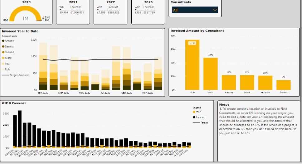
Our team built a report tracking the sales contribution by individual salesperson, as a percentage of the total sales they were generating, how they were actually doing against their targets, and what was still in the pipeline, as well as the monthly sales forecasts and whether those were lined up with what they were expecting. This gave managers the ability to get a good reading on each individual’s performance without losing sight of the bigger sales picture.
The report quickly became a crucial part of the monthly sales reviews. Managers were using it to identify the top performers, keep an eye on progress against their targets, and determine whether the forecasted revenue was going to be enough to cover the hiring and delivery plans they had lined up. And the work-in-progress analysis was particularly good at highlighting any potential gaps between what they were expecting and what they needed – before things started to go south.
As a direct result, leadership got a much clearer line of sight into what was happening with current sales and what they could expect in the future, which in turn helped them make better informed decisions about what to plan for next.
The CEO of a marketing agency found themselves stuck in a rut, having to sift through loads of separate reports from finance, sales, marketing, ops, and HR to get the full picture of how the business was performing. While all the component reports existed – detailed and all that – there was still no single view that gave them a clear idea of where the organisation stood.
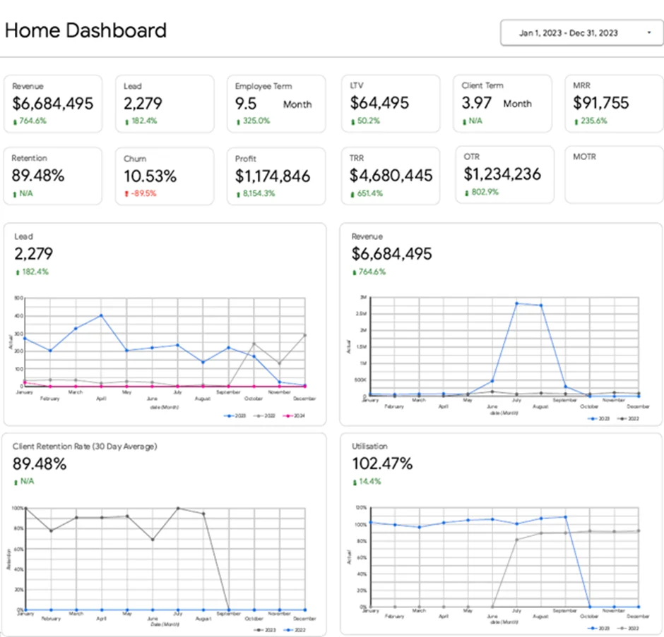
We came up with a KPI dashboard that took the agency’s top-line business metrics and bundled them all together into one neat report. This included revenue and profit of course, but also the number of new leads coming in, customer lifetime value, and all sorts of other key metrics like monthly recurring revenue, one off revenue, client retention rates, churn, and how long on average we were holding onto our clients for. We also tracked employee utilisation and retention.
The dashboard quickly became the go-to place for weekly management meetings. If lead numbers started to slip, the CEO could get straight to the bottom of it and have a chat with the marketing team. And if client retention or churn started to head in the wrong direction, the leadership team could make sure to prioritise discussions around customer satisfaction and account management. It also helped identify when teams were getting close to max capacity and whether we needed to bring in some additional resources.
One of the implementations we did was designed to help managers get a better sense of how team capacity was being used across different projects. The thing that was really tough about tracking task completion on its own was figuring out which employees were running at full capacity, underutilised, or just plain worn out – or vice versa – over time.
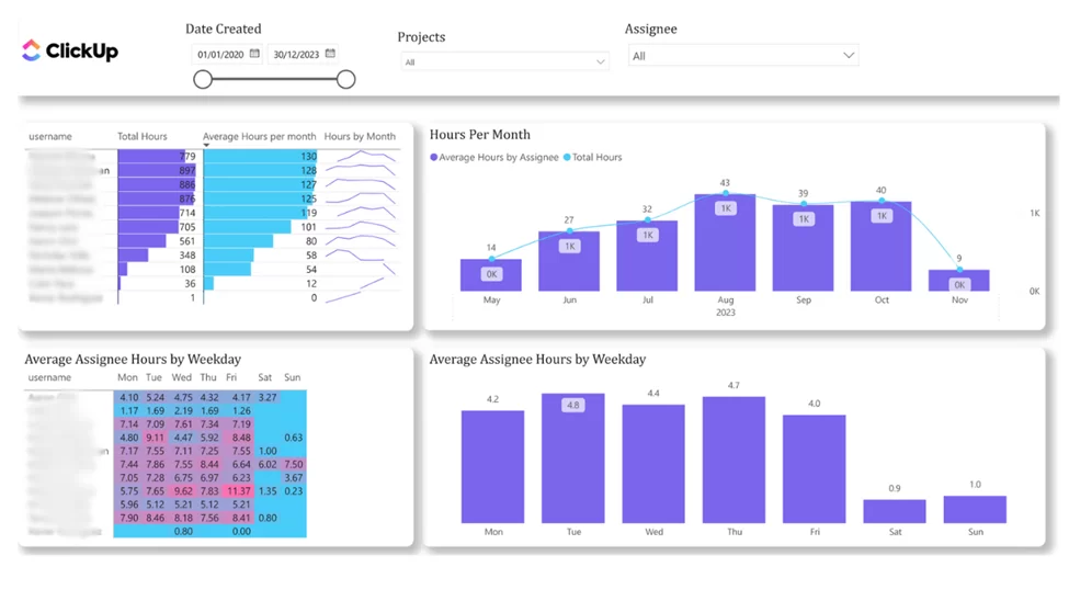
Our data analysts built this report that tracked total hours worked and average hours worked per employee over both daily and monthly timeframes. Managers got the flexibility to drill down into workload by project, department or even individual team member and see how utilisation trends were shaping up across the whole team.
This report got used pretty regularly in resource planning meetings to head off capacity issues before they actually started affecting project delivery. Employees who were consistently shouldering a heavy workload could get some extra support by redistributing some of those tasks, while team members who weren’t being utilised as much as they could get some new work thrown their way. And those historical trends really helped managers spot when something outside the norm was going on – and get to the bottom of what was causing it.
As a result, their workload planning became a whole lot more balanced and forward-looking. Managers finally got a clear eye on what their team’s capacity was really like – and were able to make some real decisions about staffing based on actual data rather than just making some educated guesswork.
This report worked so well because it tied together employee workloads, project activity and utilisation trends all in one place.
The supply chain team was running into a big problem – they had hundreds of products, with all the stock data on hand but no clear way to figure out which ones needed an order in, which ones were stuck with too much stock, and where they were wasting valuable working capital by not being mindful of their stock levels.
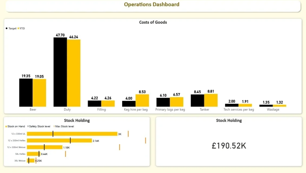
The report had to track a bunch of stuff – current stock levels, how much extra stock they needed to keep on hand to cover unexpected losses, maximums on how much stock they could hold, and suggestions of when to put in new orders for each product. It also pointed out which products were running low and which ones were just piling up with way more stock than they needed.
Our client used the report in inventory planning meetings to decide which orders to put in and what to do with excess stock. When a product got down to the level where they’d start to run into problems, they could schedule a new order before anything went wrong. At the same time, they could spot products that were stuck with too much stock and deal with them before they started costing them money to store the stuff or put pressure on their cash flow.
Thanks to the report, the operations team was able to get their act together on inventory planning and make better decisions based on clear rules rather than just relying on gut feeling or assumptions.
A distribution company was frustrated with the fact that their monthly management reports provided a super detailed analysis of how things were doing – but that just wasn’t sufficient for making day to day decisions. They needed a super simple, at-a-glance view of which key metrics were really driving sales, inventory and cash flow – and customer service too.
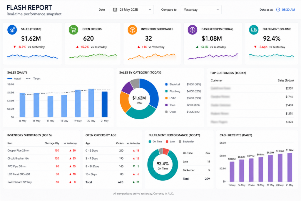
So we built them a flash reporting dashboard to give them a real-time snapshot of all the key numbers that matter. This was tracking day to day sales, open orders, stock levels running low, money coming in, how well their warehouse was performing, sales by product category and how long orders were taking to get out the door – all that kind of stuff. By putting all those different metrics together in one place, management were able to get a sense of how the business is doing in just a few minutes – rather than having to wait till the end of the month to get their report.
This became a daily habit for the management team – they started to use it to compare where they were now against where they were same time last week, to see how they were running low on stock, to review how many orders were still in the pipeline and to keep an eye on how well they are getting orders out to customers through the day. With this instant visibility into what’s really driving the business, they were able to make better informed decisions a whole lot quicker – and keep a much tighter grip on the day to day performance of the business.
We had a client who was really struggling to keep track of how all the different teams in their projects were doing. Project managers could at least see which projects were currently active, but trying to figure out which ones were lagging behind and which team members were shouldering too much of the load was turning into a real headache.
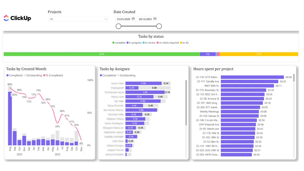
So our data visualization consultants put together a report that lets project managers track tasks on a real-time basis by how they’re going, which projects they relate to, and who’s ultimately responsible for getting them done. It also keeps a tally of new tasks being created each month, how many are actually getting wrapped up, how many are still outstanding, how many hours are getting put into each task and project, and where we’re trending overall on our task completion rates. And let me tell you – that gives managers a crystal clear view of how things are panning out across the team in terms of workload distribution and project progress.
When we put this report in front of them during their regular project review meetings, it’s been super helpful for identifying which projects are starting to build up backlogs and which team members are either taking on way too much or not enough. They can then take a closer look at what’s causing delays and rebalance things between projects, making sure critical stuff gets the attention it needs before the deadlines start slipping.
Because of it, teams have way more visibility into how much progress they’re really making and can catch bottlenecks much earlier. And on top of that, managers have a much more objective way of keeping tabs on team capacity and project execution all across the organisation.
Our client was stuck with all their marketing data scattered across loads of different platforms. As a result, they just couldn’t get a clear picture of which channels were actually driving the strongest returns on investment. Leadership really needed a single source of truth on how marketing was performing in order to make informed budget decisions.
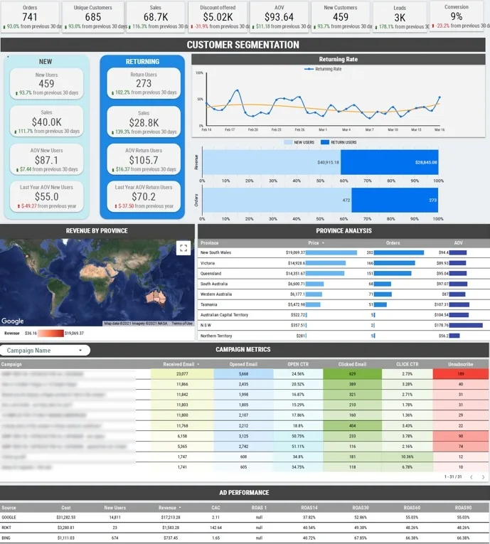
Our BI consultants took a whole bunch of data from Google Ads, Bing Ads, Shopify, and Mailchimp and mashed it all together into a single view. This allowed us to track the revenue coming in from each channel, how much it was costing to get new customers, how much of that revenue was coming from new customers vs returning ones, the revenue by state in Australia, and how individual email campaigns were performing. Essentially, this gave the marketing team a complete picture of how every channel was contributing to business growth.
Every month, marketing leadership would review the report to get a handle on channel performance and spot any opportunities to improve that return on investment. If one channel was delivering strong revenue at a lower cost, they could shift budgets to make the most of it. This report also helped the team identify any underperforming campaigns and regions that were needing some extra attention.
As a result of all this, marketing decisions just got a whole lot more data-driven and focused on what really matters: driving the business forward. Teams were able to compare performance using the same set of measures and make budget decisions with a lot more confidence.
The report worked so well because it managed to bring together revenue, acquisition costs and customer behaviour in one easy to read view.
A company in growth needed a better way to see how its team was evolving over time. Managers were after a clearer picture of headcount distribution, staffing costs and employee retention across the different departments.
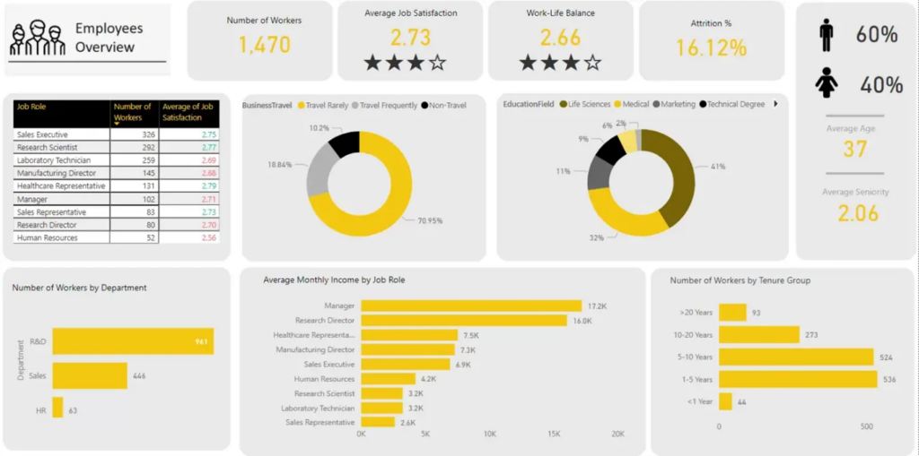
The report broke down headcount by department, job role, gender, age, level of education, average monthly income and years of tenure. This gave HR and senior management the elbow room they needed to drill down into workforce composition, get a handle on staffing costs and keep tabs on headcount growth in the different parts of the business.
During management reviews, the report helped teams spot departments that were growing fast, weigh up the cost of different job roles and get a feel for whether retention was a problem or not. The analysis of how long staff had been with the company helped leadership spot where employee turnover might become a problem and where they needed to step up their recruitment or retention efforts.
As a result, workforce planning became a lot more organised and a lot more informed by data. Leadership can make staffing and budgeting decisions with a crystal clear view of headcount trends rather than relying on loads of disconnected HR reports.
The best reports are always ones that actually help the people reading them make a decision. When it comes to internal reports, the ones that really matter are the ones that are designed around the decisions that need to be made – not just the data that has been collected. Of course, what actually goes in the report will depend on the audience and the purpose of the report, but most useful reports include a mix of performance metrics, some context, analysis, and recommendations that help people figure out what is going on and what needs to be done.
Defining The Timeframe
Every single report needs to clearly state the period of time being reported on. Whether its just a day, or the whole year, having a clear idea of when the data was collected is vital in helping people make sense of the information. Otherwise its like trying to read a map without a key – you just don’t get much out of it.
Metrics That Matter
Reports should focus on the metrics that actually make a difference to the people reading them. This might include financial figures, or how many sales you made last week. Maybe its how many project milestones you met, or how well your marketing campaign is doing. Or it might be about the people’s side of the business, like how staff are performing. Whatever the purpose of the report, it should be about showing the things that will actually make a difference to your business.
Looking At The Bigger Picture
Numbers only start to make sense when you compare them to something else. Are you doing better this quarter than you did last year? Are you on track to meet your targets? How do you compare to your competitors? These are all the things that will help people understand whether you are improving, or just coasting along.
Analysis: What It All Means
A good report is not just about presenting the data – it’s about explaining what it all means. You need to highlight the bits that are worth paying attention to – the changes, the risks, the opportunities and the things that don’t quite add up. People need to be able to focus on the bits that actually matter.
One-Offs And Non-Recurring Items
When something unusual happens that affects your performance, it should be flagged up as a separate issue from the normal day to day business. So if you had some big unexpected expenses, or a one-off sale, that should be treated separately from your normal business performance. Its not about just talking about the abnormality – but about helping people understand what is really going on.
Getting Things Done
Many reports are written to help people make decisions. And at the end of it all, you need to be able to say – what now? What do we do next? What is the plan for the next steps? When you do include some recommended actions, you can be sure that the report will actually have an impact.
Writing A Report That Makes Sense
Reports should be easy to navigate and understand. Most people have a format that they stick to – so a summary of the key findings, followed by the data and analysis, and then the recommended actions. It’s not rocket science – but having a clear structure does help people find what they need quickly, and makes life easier for everyone.
Making Data Visualisation Work For You
Using charts and tables and other visual aids is a great way to make complex data more manageable. Just think about how confusing it would be if you had a huge spreadsheet with loads of numbers in it. A good visualisation can help people pick out trends and patterns that might not be immediately obvious from the numbers alone.
Reporting Regularly
Finally, how often you report is just as important as what you put in the report. Do you need to do a report every day, or every week, or maybe every quarter? Whatever it is, make sure it is regular enough to help people make the decisions they need to make in a timely way.
The 5 C’s of audit reporting are a widely used framework that helps make complex findings a lot more understandable. However, the real secret to making these reports effective lies in being able to tell the whole story behind what went wrong.
Criteria is basically what you were expecting to happen – that standard, policy, procedure, regulation, or expectation that we use to judge our performance against. It tells us what we’re aiming for.
Condition is just a fancy way of saying what you found when you looked into things. In other words, it’s the outcome – how what you observed stacked up against what you were expecting.
Cause gets to the real nub of the issue – why did it happen in the first place? Was it down to a process that just wasn’t working, a control that’s not doing its job, a lack of training, unclear responsibilities, a system that’s struggling, or simply human error?
Consequences bring it all into perspective – how did that issue actually impact the business? Was it a question of losing money, getting things done inefficiently, breaking a rule, damaging your reputation, or taking on more risk than you could handle?
Corrective Action is what you’ve got to do next to fix the problem and make sure it doesn’t happen again. Usually this involves strengthening your controls, sorting out your processes, making things clearer, or just addressing the weaknesses that you found.
The 5 C’s show up most often in audit and compliance reporting, but basically its the same principle that helps keep internal reports on track – you want to do more than just highlight a problem – you want to explain what caused it, what it did for the business, and what you did, or are going to do, about it.
Trying to make good decisions is tough, but when your organisation produces accurate timely reports, you’re more likely to succeed. But here’s the thing: making those reports isn’t easy. As businesses grow, reporting becomes more complicated because there’s just more data floating around, less time to get it all sorted, changing requirements and lots more people waiting for answers.
Data Silos
Imagine you’ve got all your data spread out across loads of different systems – accounting software, CRM platforms, HR systems, project management tools and spreadsheets. You’d think that should make it easy to get a decent report together, right? Wrong. Because when it’s all scattered to the winds, reporting teams spend ages gathering, reconciling and checking the data before they can even get started.
Many organisations implement an internal reporting system built around a central data warehouse. This stops the manual data prep, makes the reports more consistent and means you can produce something you can actually trust.
Poor Data Quality
Your reports are only as good as the data that goes into them. Missing records, duplicate entries, different naming conventions, conflicting metric definitions – all these things can make your reports useless and cause people to stop trusting your numbers.
Fixing data quality usually means getting clear ownership of business data, making sure everyone follows the same processes and agreeing definitions for key metrics. When you’re all on the same page, reports are a lot more reliable and people can have faith in what they’re seeing.
The Trouble with Manual Reporting
In many organisations, people still rely on employees to export data, update spreadsheets, create charts and distribute reports. While this approach might have worked in the past, it becomes a nightmare to keep up with as reporting needs increase.
Lots of businesses sort this out by business process automation. This reduces the amount of work people have to do, makes the data more accurate and means stakeholders get the information they need, without having to do any manual updates.
Too Much Information
One of the most common mistakes in reporting is trying to put in every last metric. Reports that are too detailed can just overwhelm the reader, making it harder to spot the important stuff.
The best internal reports are all about helping people make decisions. Rather than trying to cram in every possible measure, they focus on the KPIs that are actually going to help. They show the trends and exceptions that need some attention.
What’s the Story Behind the Numbers?
Numbers can be pretty meaningless on their own. A revenue figure might look great, but it might be way off budget. The project completion rate might be up, but the rate of new project starts isn’t high enough to sustain that progress. Staff turnover might be down, but the underlying reasons might be that you’ve lost all your best people.
Providing some context, like benchmarks or trends, helps people understand what the data is really saying. This means they can make better decisions and reduce the risk of them getting it wrong.
Getting Your Reports Read
Even if you’ve got reports that are accurate and easy to understand, people won’t use them if they’re not available when they need them or don’t answer the question they’re trying to solve.
To get people to actually use your reports, you need to involve them in the design process, simplify the layout and make sure it’s got the information they need. If you can follow some good data visualisation principles, that will help too.
Internal reporting can be created using all sorts of tools – and that can range from a basic spreadsheet to a high-end business intelligence platform. The right tool for the job will depend on how much data you’re working with, how many people need access to reports, and how often those reports need to be updated.
A modern internal reporting system doesn’t live in one place. It pulls together operational systems, data warehouses, BI platforms, and automation tools so your whole organization is always looking at the same picture.
Spreadsheets
Lots of organisations start out with something like Microsoft Excel or Google Sheets – they’re pretty flexible, and people generally know how to use them. They work great for budgeting, crunching financial numbers, and just general ad-hoc reporting.
But as time goes on and data starts piling up, and reporting requirements get more complicated, things can get tricky to manage with just a spreadsheet.
Business Intelligence Tools
Business intelligence tools are specifically built for reporting and analytics. They let you connect data from all sorts of different systems, automate report generation, build interactive dashboards, and share information with the right people.
Some of the more popular business intelligence tools out there include Microsoft Power BI, Tableau, and Looker Studio.
Reporting Built-In to Your Systems
Many business applications come with built-in reporting capabilities, so you don’t have to do much work to get started. ERP systems, accounting software, CRM platforms, HR systems, and even project management tools all tend to come with standard reports that help you monitor what’s going on in a specific area of your business.
Those reports can be pretty handy, but they’re usually limited to what’s stored within that one system.
Data Warehouses
As your reporting requirements get more advanced, lots of organisations end up implementing a central data warehouse – a place where you can consolidate data from all your different systems into one spot. That makes it way easier to create reports that are consistent across the board, improves data quality, and lets you get a handle on how your whole business is performing.
Data warehouses tend to be the foundation for a lot of modern reporting environments – and often get used alongside business intelligence tools.
Automated Reporting Solutions
A lot of organisations automate the process of collecting, transforming, and distributing reporting data. That can save you a ton of time and effort – and just generally makes sure everyone has access to the most up-to-date information.
Those automated reporting solutions often get built using a combination of business intelligence platforms, workflow automation tools, and data integration technologies.
Getting a grip on internal reporting really does matter : it lets managers get the lowdown on how things are performing, spot potential problems and make smarter decisions. And whether it’s crunching numbers in finance, tracking sales, getting operations running smoothly, running projects, pushing marketing or sorting out HR – that ideal report gives you the clear, relevant and actionable insights you need, rather than just tossing data at you.
Nowadays a lot of businesses are ditching their old trusty spreadsheets and disconnected reports for more advanced automated reporting systems, business intelligence platforms and centralised data management – this makes it a whole lot easier to get a consistent view of how everything’s performing across the whole organisation and ensure that your decision makers always get reliable info.
If you’re trying to lift your internal reporting game, automate some of those reporting tasks or build some dashboards that give you a better look at how the business is doing then get in touch with us! Our team can help you craft a reporting system that gives you the info you need to act with some real confidence.


