

Board reporting dashboards help directors and executive teams keep their finger on the pulse of business performance, sniff out potential risks, track the progress of key initiatives, and make smart, informed decisions that are backed up by the numbers. By pulling in the key metrics into one easy-to-glance view, they give you a crystal-clear picture of just how well your organisation is doing – and where management might want to focus its efforts to drive some real progress.
At Vidi Corp, we’ve delivered 600+ data visualisation solutions that have helped organisations turn their reporting into a lean, mean, decision-making machine. Our team has worked with a diverse bunch of businesses across loads of different industries to craft board reporting dashboards that are super clear, bang on the money & easy to keep up to date.
In this guide, we’re going to break down what a board reporting dashboard actually is, why you really need one, and what kind of information it should include.. We’ll also take a look at some common board reporting dashboard setups, share some hard-won best practices from the trenches, swap notes on some top-notch reporting tools, & walk through the steps you’ll need to take to build a dashboard that really works for your organisation.
A board reporting dashboard is a visual tool that directors can use to keep an eye on how their organisation is doing. Rather than having to sift through a load of spreadsheets, presentations and management reports you can get all the key financials, operational metrics, staff numbers, strategic objectives and potential risks in one easy to use place.
Board reporting dashboards are usually built using business software tools like Power BI and draw data from loads of different systems within the company. This lets directors keep track of things in real time and spot problems as they happen. It’s also easy to look deeper into the numbers if you need to.
Most board reporting dashboards cover things like financials, operations, HR and risks. The structure of these will vary from company to company but the aim is always the same: give the board a clear view of how the business is performing so that they can make better decisions.
Traditional board reporting often relies on people manually putting together these big packs of information the board needs to review. These reports can be pretty good but they are always a bit of a pain to put together and can soon become outdated.
A board reporting dashboard is a much more efficient way to keep an eye on how your organisation is doing. By automatically bringing together data from all the different systems like finance, HR, ops, CRM and ERP, directors can get hold of the latest numbers without having to wait for somebody to send them an email saying “report is ready”.
Board reporting dashboards also make it a lot easier to spot trends, compare things over time and identify any potential problems before they blow up in your face. No more wading through dozens of pages of reports to find the bits that matter – just focus on the metrics, risks and opportunities that need your attention.
For companies that are growing fast, board reporting dashboards make it easier to ensure that reports are always consistent and that people aren’t spending hours of their time on this sort of thing. They also make sure that the people making decisions at the top of the company always have access to accurate and up to date information.
Most organisations don’t have a law that says they have to do a board report in a certain way, but directors do need to be able to see what’s going on with the company in order to make good decisions.
In public companies, and in places like charities where there’s a lot of oversight, board reports are often needed by the rules they work under, or by law. Even if there isn’t a rule that says they have to be done, it’s considered good practice to have some kind of board report.
These reports usually need to have things like financial results, a look at the risks the company is taking, and how the company is doing in compliance with the law. All that kind of thing.
Even when they’re not strictly required, having a good system for getting information to the board is really important because it means everyone gets the same information at the same time and they can keep an eye on how the business is doing. As companies get bigger, the way they do their board reports usually gets more formal. They start using things like dashboards and regular packs of information to help the board make sense of what’s going on.
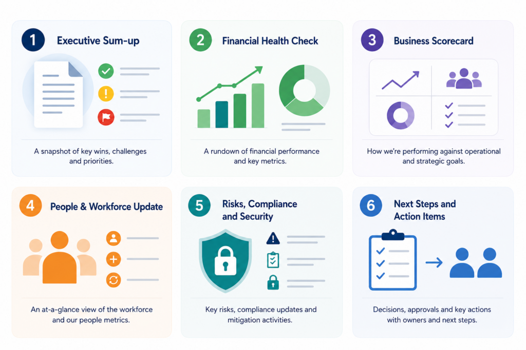
While we do see some variation from one organisation to the next, most companies follow a consistent structure for their board reporting dashboards. The main idea is to paint a complete picture of the business, all while keeping things concise and making it easy for directors to take action.
1. Executive Sum-up: The executive summary is like the headlines of your board dashboard – it gives you a broad overview of the major happenings since the last directors meeting. Think of it like a snapshot of the business’s biggest wins, challenges and things that need the board’s urgent attention.
2. Financial Health Check: In this section you’ll find a rundown of how the business is performing financially. You can expect to see numbers on revenue, profitability, cash flow, budget variances, and any other key metrics that will help the directors get a clear picture of how the business is doing.
3. Business Scorecard: This bit of the report is all about how the business is delivering on its operational and strategic goals – in other words, how are we doing on the things that really matter? You’ll see stats and metrics on sales, customer engagement, progress towards projects, operational efficiency and how we’re tracking against the key objectives.
4. People & Workforce Update: Here you’ll get an at-a-glance view of what’s happening with the workforce – that means headcount, hiring activity, employee retention and turnover, and how we’re tracking on our ability to deliver on our plans.
5. Risks, Compliance and Security: In this section we highlight any major operational, financial, regulatory or cybersecurity risks that the business is facing, along with an update on compliance and audit activities, and the work we’re doing to mitigate those risks.
6. Next Steps and Action Items: The final bit of the report lays out any decisions, approvals, investments or policy changes that the board needs to be aware of, along with a summary of key actions and responsibilities to make sure we all know what needs to get done and who’s doing it.
A Board Reporting Dashboard is the central hub where directors, executives & investors get all the info they need at a glance . It provides a clear framework for communicating how the business is doing, the progress we’re making on our strategy, where our finances are at, which trends are shaping our workforce, and what risks are lurking in the shadows – all without having to wrestle with multiple spreadsheets, presentations, and reports.
Board reporting dashboards are super useful during board meetings, executive reviews and investor presentations – and that’s no surprise given how well they work as a single source of truth . They help stakeholders get a quick snapshot of how the organisation is doing, where their attention is really needed, and what they should be prioritising.
1. Work Out What Your Board Needs to See
The first thing to do is figure out what information gets used to make decisions. As a rule this will include financial performance, some business KPIs, and workforce metrics. You may also want to include strategic initiatives and risk indicators in the mix.
A good board reporting dashboard will focus on the numbers that really matter. Too much information just makes the thing too hard to use.
2. Get Your Data in One Place
Most companies store their information in multiple systems – financial stuff in accounting software, sales numbers in a CRM, workforce data in HR and so on. To create a reliable dashboard you need to get all this information into one place where it can be properly reported on. Data integration services can help link these systems up and provide a single source of truth.
3. Create a Clear and Intuitive Dashboard
A board reporting dashboard needs to be easy to understand at a glance. Most companies group their information in sections like finance, business performance, workforce metrics and risk management. The goal is to let directors quickly pick up on important trends without having to delve into masses of data.
4. Get Your Data Up To Date Automatically
A dashboard is only as good as the data it contains. If the numbers are out of date then the whole thing is useless. Automating the data collection and refresh process makes sure directors always have the latest info.
Many companies also use RPA services to automate boring reporting tasks and free up staff to do more interesting things.
5. Review and Improve Regularly
As an organisation grows its board reporting needs are likely to change. New KPIs get introduced, priorities shift and directors ask for more insights. That’s why it’s so important to review your board reporting dashboard regularly to make sure it still delivers what your board needs.
Board reporting dashboards are a lifesaver for directors and executives who have to sift through tons of spreadsheets, reports, and presentations to get a handle on business performance. By pulling all the key metrics into one place, it makes it a heck of a lot easier to keep tabs on how the business is doing, from financial performance to operational efficiency, workforce capacity, and the kinds of risks that might be lurking in the wings.
Not every board reporting dashboard is the same – some give you a birds eye view of the whole organisation, while others drill down into specific areas like finance, ops, HR, or risk management. The right one for you depends on what kind of information directors need to see and what kinda decisions they’ve got to make.
The table below gives you a rundown of the most common types of board reporting dashboards. We’ll then dive in a bit deeper on each one and show you how leadership teams actually use them to make informed decisions.
| Dashboard Type | Key Question It Answers | Typically Presented By | When to Use It |
| CEO Dashboard | How is the business performing overall, and where should leadership focus its attention? | CEO | Every board meeting |
| CFO Dashboard | Is the organisation financially stable, and does it have the resources to support future growth? | CFO | Every board meeting |
| Operations Dashboard | Are projects, teams, and operational activities being delivered efficiently and on schedule? | Head of Operations or COO | Every board meeting |
| HR Dashboard | Do we have the workforce capacity, skills, and retention levels needed to achieve our objectives? | HR Director or CHRO | Quarterly or during periods of workforce change |
| Risk & Compliance Dashboard | What risks could affect the organisation, and are controls working effectively? | Executive Leadership Team, Compliance Lead, or Internal Audit | Every board meeting, with more detailed quarterly reviews |
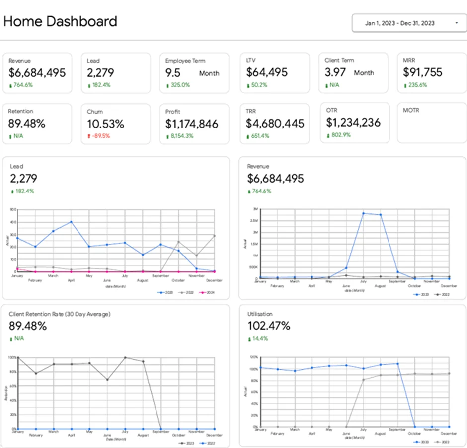
A high-level overview of the company’s overall performance across all major business functions is what you get from a CEO dashboard – essentially a snapshot by the CEO for the board that lets them know if the company is on the right track and where its leadership should be focusing its attention.
Who prepares it and who is it for?
CEO dashboards are typically prepared by the finance team, or a business analyst using information from across the organisation. The dashboard is then reviewed and presented by the CEO to the board of directors, investors, and other senior stakeholders.
What generally gets included in a typical CEO report
When to use it
For most companies, CEO dashboards are a regular feature at board meetings – whether it’s once a month or once a quarter. They help provide context for the more detailed financial, HR, operational, and risk reports that come later.
The dashboard you see above was built by our Power BI consultants for a marketing agency’s CEO. It’s a single view that brings together key performance indicators from finance, sales, marketing, operations, and HR. So, if lead generation is down, client numbers are dropping, or employee usage is getting to be too high, the CEO can see the issue right away and drill down to get a better look at what the departmental dashboards say and decide on a course of action.
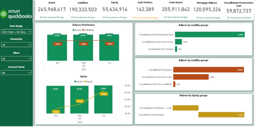
A financial dashboard paints a clear picture for the board on just where the organisation stands in terms of its financial situation and its potential long-term prospects. It gives directors a much broader view than just how much profit the business is churning out, it also helps them see whether that profit is being used wisely in terms of cash, assets, liabilities and debt.
Who normally prepares it and who’s it for?
Finance analysts and accounting teams are usually responsible for preparing and maintaining the dashboard. The CFO then reviews the results, ensures the figures are accurate, and presents the information to the board of directors and other key stakeholders for discussion and decision-making.
What can you usually expect to find in one
When do they get reviewed?
As a rule, financial dashboards are reviewed each time the board meets and they are extra important when the business is going through budgeting cycles, fundraising or looking to make big investments, or even when we’re talking about financial risk.
The dashboard above was made to give leadership teams a very clear view of the organisation’s financial wellbeing. It takes all the balance sheet numbers like assets, liabilities, equity, cash position, loan balances and retained earnings and puts them all together in one handy report. This lets directors get a sense of the business’s liquidity, understand how much debt it’s got on its hands, check its financial stability and spot any potential problems that might start to cause it problems.
This type of dashboard is especially useful in industries that rely a lot on assets like property and construction, where the balance between assets, liabilities, and financing is just as important as revenue and profit.
How to Get This Dashboard Up and Running
Want to put this dashboard to use in your organization? First off, you’ll want to grab the QuickBooks Online Power BI template we’ve provided, and then follow along with our YouTube tutorial – we take you through the whole setup process, step by step.
We cover everything you need to know in this video – from getting your data in order to customising reports to look just right for your company’s financial reports. It’s all pretty straightforward, so you should be able to get this dashboard up and running with ease.
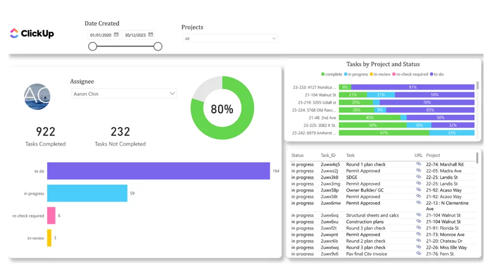
A head of operations dashboard gives the board a clear picture of whether an organisation is delivering its work on target and whether teams, projects and resources are doing what they’re supposed to be doing. It’s all about giving people a view of how projects are going, how busy teams are, and what might be blocking things or putting the business at risk.
Who puts this together and who needs to see it?
Data analysts, PMO teams, and project managers are usually responsible for preparing the dashboard. The Head of Operations then reviews the information and uses it to update the board and executive leadership team on project delivery, resource utilisation, operational performance, and potential risks.
What to look for inside the report
When to take a good hard look
If you’re the kind of organisation that does lots of projects, an operations dashboard is going to be a regular fixture at the board table – at every single meeting – because how you deliver those projects can make such a big difference to the bottom line, to customer happiness and to how fast you grow.
This dashboard was made to help the top team keep an eye on how projects are performing across lots of different teams. It lets you see where all the tasks are at – finished, in progress, or waiting for someone to make a decision, and it gives a clear picture of how all the teams are doing. From here, any executive can spot the projects that are on track and the ones that need a bit of extra love. The dashboard also keeps an eye on team workload by showing how many tasks are going on each team. If you click on a single task it takes you straight to ClickUp so you can dig into all the details and even fix things without ever leaving the report.
How to Install This Dashboard
You can download the ClickUp Power BI template you see above, and then follow along with the YouTube tutorial to build your own version of this dashboard. We’ve put a detailed guide together, covering all the bases – data setup, integrating it with ClickUp, configuring the dashboard, tracking workloads, monitoring projects, and the maths behind the report’s calculations.
By the time you’ve worked your way through the tutorial, you should have a fully working operations dashboard that you can tailor to your team and processes.
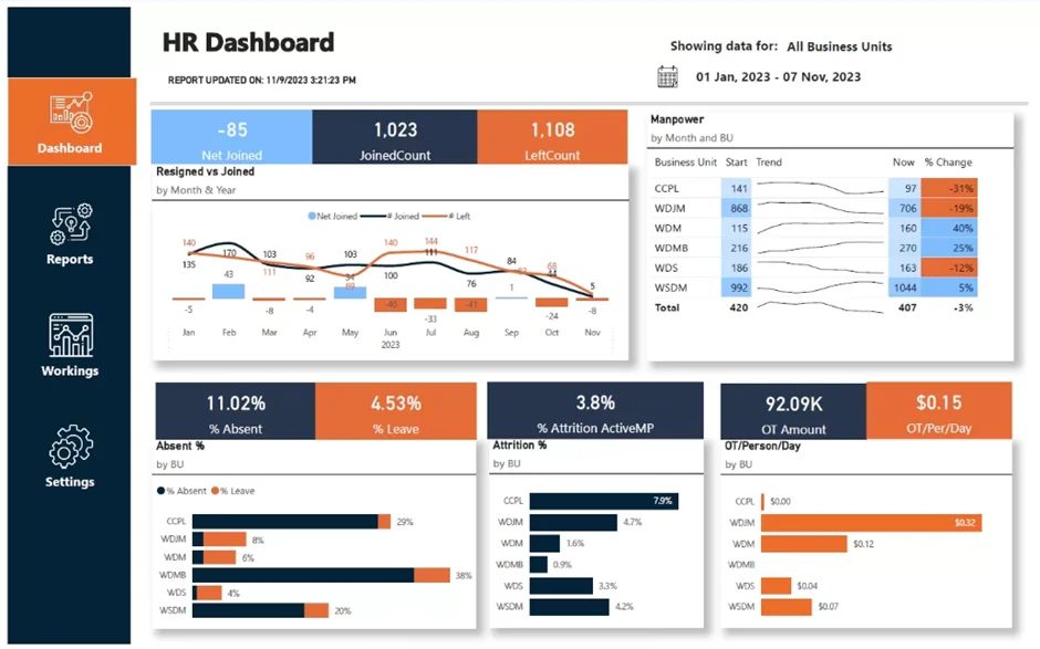
An HR dashboard helps the board get a feel for how many staff they have, how many are sticking around, and whether we’re getting the right people in to carry out our plans. It gives a snapshot of whether the organisation actually has the people and skills it needs to make its strategy work – and whether we’re putting ourselves in a position to grow in the future.
Who puts it together and who needs to see it?
The data behind an HR dashboard is usually compiled by HR analysts, People Operations teams, or HR managers. The dashboard is then reviewed by HR leadership and used by the board of directors and executive team to monitor workforce capacity, retention, recruitment, and organisational health.
What kind of information it usually includes
When is it useful?
HR dashboards usually get reviewed every quarter, but if we’re hiring a lot or really struggling with staff we might need to take a closer look every month or even at every board meeting. They’re particularly useful when we’re going through a period of rapid growth, when we’re restructuring, or when there’s a shortage of talent to go around.
Our data visualization consultants built the dashboard above for a company with more than 400 employees to give the leadership team a clear view of how stable our workforce is and whether we’ve got enough staff to meet our operational needs. It keeps an eye on all the key numbers – like how many staff we’ve got, who’s joining, who’s leaving, how many are sticking around and how much overtime is being put in – across all the different business units. By spotting areas where turnover is rising or overtime is going up, executives can then get to the bottom of why and take steps to sort it out – maybe by recruiting new staff, maybe by addressing some of the issues that are driving people away, and make sure the teams have got the capacity to get the job done.
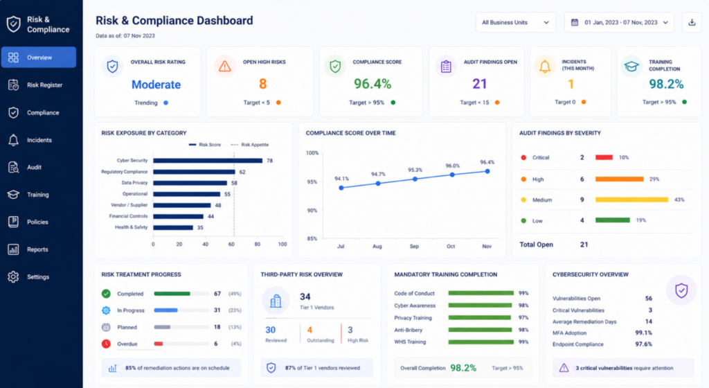
A risk and compliance dashboard does a lot more than just give the board a heads up on the things that could potentially go wrong and impact the company’s finances, operations, its reputation or its legal liabilities. It also gives a sense of how the organisation is coping with emerging risks and whether or not the controls in place are actually working as intended.
Who writes it and who needs to see it?
Risk and compliance dashboards are usually the result of a collaboration between a bunch of teams rather than just one person. Finance teams tend to contribute their knowledge on financial risks, IT teams are responsible for the cybersecurity and data protection metrics, HR teams have to report on health and safety and workforce-related compliance issues, and compliance, legal and internal audit teams bring in the regulatory and governance information.
Then the dashboard gets reviewed by executive leadership and eventually gets presented to the board of directors, or the audit committee or whoever is in charge of keeping an eye on risk.
Typical content
When to use it
Risk and compliance dashboards get reviewed at every single board meeting, with a bit more detail being added in with quarterly reviews. They start to be even more important when there are changes to the regulations, rapid expansion, acquisitions, a major cybersecurity incident or a big operational disruption.
The dashboard shown here has been designed to give leadership a single view of the state of risk and compliance across the whole organisation. It tracks the number of open audit findings, compliance incidents, how many people have done their needed training, how many cybersecurity risks there are, and how well the company’s policy is being followed across departments and business units. By being able to see all of these indicators in one place, directors can spot any emerging risks early on, allocate resources to the parts of the business that are at the greatest risk and make sure the organisation stays compliant with both its internal rules and external regulations.
There is no perfect formula when it comes to how many charts, KPIs and pages a board reporting dashboard should have. The main aim is to give your directors enough information to get a grip on how the business is performing and make sensible decisions, without drowning them in too much unnecessary detail.
A good board reporting dashboard is laser-focused on the metrics that really need the board’s attention. This usually means financial performance, operational KPIs, workforce metrics, key strategic initiatives and potential organisational risks. If you need all the nitty-gritty operational analysis, that’s still there in other reports or has drill-through options to get under the bonnet.
The best dashboards strike a balance between clarity and volume. Your directors should be able to quickly pick up on key trends, work out what’s changed since the last set of results and spot the areas that need further discussion.
That’s why a lot of organisations invest in custom dashboard development services – to create reporting environments that are tailored to their way of doing things. Rather than making directors sift through multiple spreadsheets and disconnected reports, a well-designed dashboard gives them the right information in a way that gets them to the right decisions faster.
As a general rule, if directors can whip through the dashboard in a few minutes and instantly get a handle on how the organisation is doing, what the risks are and what the priorities are, then you’re probably about right on the level of detail.
Even a well-designed board report can go downhill if it’s got too much information, forgotten the context or requires way too much manual effort to keep up with. Some of the most common issues we see with board reporting processes are outlined below.
1. Overloading the report with too much detail
Board reports should be about giving directors a clear understanding of the state of the business, not duplicating the work that’s already being done on the ground. When reports get too bogged down in detail, it becomes tough to pick out the key trends, risks and decisions.
Just focus on the metrics and developments that really need board-level attention. If there’s a specific area that needs further investigation, separate analysis can be provided – that way directors can drill down into things without getting bogged down in the weeds of the report.
2. Reporting on metrics without giving any context
Most of the time KPIs only tell half the story. Directors need to know why performance changed, whether the trend is expected and what management plans to do about it.
For every significant metric, it helps to give a quick rundown of the underlying drivers and any actions being taken. That way the board can focus on making decisions rather than having to try to interpret the data themselves.
3. Spending too much time looking back
Lots of board reports spend too long reviewing past performance and not enough time looking at future risks and opportunities.
A good board report should combine historical results with forecasts, strategic initiatives, pipeline metrics and emerging risks. That way directors get a clear idea of what’s coming down the track, rather than just what’s happened.
4. Report layouts and metrics all over the shop
Changing the layout, KPI definitions or calculation methods between reporting periods makes it a nightmare to compare performance over time.
Consistency is key – use the same metrics, visualisations and reporting format at every board meeting wherever possible. That way directors can spot trends in no time and spend less time trying to figure out the report structure.
5. Still relying on manual reporting processes
You’d think that by now most organisations would have moved away from manually collecting data from spreadsheets, emails and departmental reports, but all too often that’s exactly what they’re still doing. This is not only time-consuming, but it’s also prone to errors and by the time the board meeting takes place the information is probably out of date.
Organisations that are modernising their approach are starting to automate data collection and report preparation – this makes the whole thing faster, more accurate and less of a chore. By combining business process automation with board reporting dashboards, organisations can create a single reliable source of truth that gives directors the information they need at the right time – and significantly cuts down the time spent preparing reports.
A company’s board reporting dashboard is only worth its salt if it actually helps the directors get a clear picture of what’s going on in the business and help them make better decisions. The best dashboards though are the ones that know their limits – they don’t try to cram every last bit of information in there. Instead they zero in on the key metrics, trends & risks that really matter to the board.
Whether your building a top-shelf CEO dashboard, a financial tool for the books, an operations dashboard to get things moving or a risk dashboard to watch out for trouble, the following best practices will help you make sure your reporting stays crystal clear, actionable and easy to keep up with.
1. Start with a Real Summary
Board members are always short on time when it comes to reviewing reports beforehand. So make sure you put a good summary at the top – something which highlights the most important bits. This could be your key findings, the risks to watch out for, the big opportunities that have come up and any major decisions that need the board’s attention.
At a glance you should give a clear picture of what you think is important, and this will give the directors some context for the details that come later.
2. Keep It Focused On the Big Picture
When you’re putting together a board report, the focus should be on the information which really matters to governance and decision making. Now operational details are important – but for the directors, it’s the business as a whole that tends to interest them most. So think about performance, financial health, major initiatives, the state of your workforce and any organisational risks.
A good rule of thumb is to only include what the directors really need to see to keep the business on track – and leave out anything that’s only relevant to day-to-day management.
3. Visual Reporting Makes a Big Difference
Using good clear visualisations like dashboards, charts and scorecards helps the directors see what’s going on in a flash – way faster than trawling through spreadsheets and tables. And it’s also way better for comparing past and present performance – so you can spot any issues that need looking at a bit more closely.
If you want to get the best out of your visual reporting, remember to stick to some basic data visualization principles: keep it accurate, don’t overcomplicate things and make sure you get the message across.
4. Tell the Directors the Story Behind The Numbers
Numbers on their own are useless to the directors. They want to know why the figures are where they are, what caused any changes and whether the managers are actually doing anything about it.
If you just give them the facts and stats, you’ll just waste a lot of time in the meeting – and have a bunch of confused directors. So take a few minutes to explain what’s going on.
5. Consistency is Key
Using the same reporting format, KPIs and methods from one period to the next is seriously helpful – it makes it a lot easier to spot trends and measure real progress.
And – let’s not forget – it really helps the directors too. Sane and consistent reporting means they can focus on performance rather than trying to figure out what’s new each time.
6. Get Your Reporting Processes On Auto Pilot
Manual reporting is a real pain in the neck, and it’s also a recipe for errors. And if you’re a growing organisation, collecting and consolidating info from multiple systems is one of the biggest reporting headaches of all.
The good news is that lots of organisations have caught on and are now using RPA services and reporting dashboards to automate the whole process. It saves loads of admin time, gets the data right and ensures that the directors get the info they need to make those all-important decisions.
As companies grow, the board reporting process gets progressively more complicated. You’re stuck with financial data, operational KPIs, workforce numbers and risk indicators scattered all over the place, making it a nightmare to get accurate reports out quickly. But there are tools out there that can help centralise that information, make it easier to automate and just give directors easy access to the business insights they need to make informed decisions.
Business Intelligence Tools That Really Work
Business intelligence platforms like Power BI, Tableau and Looker – they’re all game changers when it comes to turning data into interactive dashboards and reports that really tell a story. They let directors monitor the financial performance, operational trends, workforce metrics and organisational risks all from the one place, giving them the single reporting environment they need to make better decisions.
Loads of organisations use Power BI development services to build board reporting dashboards that fit their specific governance, reporting and decision making needs – and that’s exactly what they need to stay competitive.
Getting Your Data In Line
Effective board reporting relies on having accurate and complete data – and that’s where data integration comes in. You can’t expect to get good reports if you’re pulling data from different systems like accounting, CRM, ERP and HR apps all over the shop.
Data integration services are key here as they bring all that data together into a central reporting environment – and if there’s no standard integration available, custom data connectors are there to help you connect niche or unsupported applications to Power BI so your board reports have everything they need.
Automating Repetitive Tasks
The last thing you want to be doing is manually preparing board packs – it’s time consuming and error prone. But there are tools that can make it all a lot easier by automating tasks like data collection, validation and report prep.
Loads of organisations are using Robotic Process Automation to automate all this, so they can get their reports out faster and based on the latest info.
The following table summarises the main categories of tools used to streamline board reporting and their role in the reporting process.
| Tool Category | Primary Purpose | Typical Use Case |
| Business Intelligence Platforms | Visualise and analyse business data through dashboards and reports. | Monitoring financial performance, operational KPIs, workforce metrics, and business risks. |
| Data Integration Tools | Consolidate data from multiple systems into a single reporting environment. | Combining information from ERP, CRM, HR, accounting, and operational systems for board reporting. |
| Automation Tools | Reduce manual effort involved in data collection and report preparation. | Automating data extraction, validation, report generation, and board pack preparation. |
A board reporting process that really serves its purpose gives your directors a clear picture of how the organisation is doing, what progress is being made on strategy, and where potential problems might be lurking. It lets them make decisions with confidence based on facts and figures – not some patchwork of spreadsheets or manual updates that are just a pain to keep on top of.
Trouble is, way too many organisations are still stuck with clunky reporting processes that make it hard to put together a board pack and really tough to trust the numbers. Collecting data manually is a recipe for delays, heaps of discrepancies, and reports that go stale the minute the directors open them up.
Board reporting dashboards have the answer – they bring together data from loads of different systems into one neat place where directors can get on with it. If you get the data integration and automation sorted, directors can get the info they need in double quick time, and management teams can spend their time on more important things than hammering away at reports.
If you’re keen to give your board reporting process a bit of a shake up, get in touch and let’s have a chat about what you need. We can help build a board reporting dashboard that makes sense for you, connect the dots between different systems, and make reporting workflows automatic so directors get the insights they need at the right time.


