

Customer engagement analytics is the practice of measuring how people actually use your product, then acting on what the data shows. For SaaS and app businesses, it is the difference between guessing why users leave and knowing exactly where they drop off.
At Vidi Corp our digital analytics consultants analyse engagement data from Firebase, Amplitude, Mixpanel, AppsFlyer, GA4 and Stripe, and turn it into custom dashboards in Power BI and Looker Studio. Our clients include mobile app companies, healthcare platforms and ChargeBee, a subscription management company valued at over $1bn. We are also a Stripe partner, with our connector listed on the Stripe Marketplace.
This guide shows the dashboards we have built, the metrics that matter, how to choose the right tools, and a 90-day plan to get started.
Customer engagement analytics is the analysis of behavioural data that shows how often, how deeply and how long customers interact with your product.
It draws on event data from your app or website, subscription and billing records, and attribution data showing where users came from. Product managers use it to decide what features to build, marketing teams use it to judge which channels bring users who stay, and founders use it to forecast revenue.
The distinction worth making is this: engagement metrics are the numbers, while engagement analytics is the practice of connecting those numbers to a decision. A business intelligence dashboard full of counts that nobody acts on is reporting, not analytics.
The benefits below come from engagement analytics projects we have delivered for clients. They reflect the outcomes this work makes possible, not a guarantee of specific numbers.
Later on in this article we will show customer engagement dashboards that we have built and talk you through how exactly these benefits were achieved.
Higher free trial to paid conversion. Engagement data shows which actions users take before they convert, and which they skip. Once you know the activation moment, you can redesign onboarding to push users toward it faster.
Lower churn through early warning. Disengagement almost always precedes cancellation. Tracking usage frequency by account gives you weeks of warning, which is enough time to intervene before renewal.
Higher customer lifetime value. Feature-level analysis reveals the behaviours that come before an upgrade. Targeting those behaviours in the wider user base grows expansion revenue without new acquisition spend.
Better acquisition spend. Joining engagement and retention data to acquisition source shows which channels deliver users who stay, not just users who install.
Faster product decisions. Screen and event data replaces opinion with evidence about which features earn their place and which are ignored.
These are Looker Studio dashboards our team built for real clients. They show what engagement analytics looks like in practice.
We built a series of customer engagement dashboards for a field service and maintenance app used by hotels, facilities teams and contractors. The CTO wanted to understand engagement patterns, conversion and app stability in one place. We linked Firebase to BigQuery, wrote the KPI logic in SQL and built the reporting in Looker Studio.
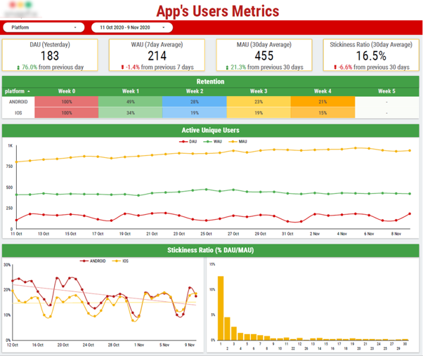
It is essential that your engagement dashboards track daily, weekly and monthly active users. Without them, you have no reliable measure of whether your product is growing or quietly losing the people who already signed up. A useful KPI for adding context to your MAU number is the stickiness ratio. In this case, our Google Data Studio consultants calculated a stickiness ratio of 16.5% means roughly one in six monthly users opens the app on a given day. The retention table breaks cohorts down by platform and shows Android holding 49% of users at week one against 34% on iOS.
The business impact is that these three views together tell the product team where to spend their time. The active user trend shows whether the base is expanding, the stickiness ratio shows how habitual the product is, and the retention gap between platforms points to a specific, fixable problem: iOS users are churning faster in their first week, so improving the iOS onboarding experience is a clear priority with a measurable payoff.
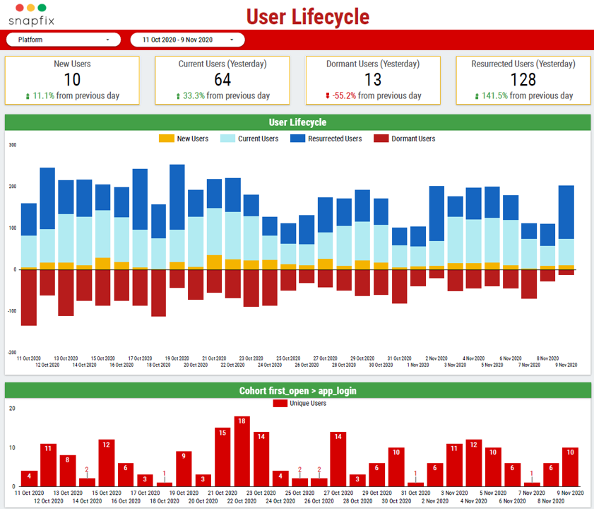
This view splits active users into new, current, resurrected and dormant. Dormant users sit below the axis, which makes any growth in that group immediately visible. The cohort chart underneath tracks how many users who first open the app go on to log in.
The goal of this analysis is to measure how effectively the company is moving users from dormant to resurrected through their reactivation techniques like phone notifications.
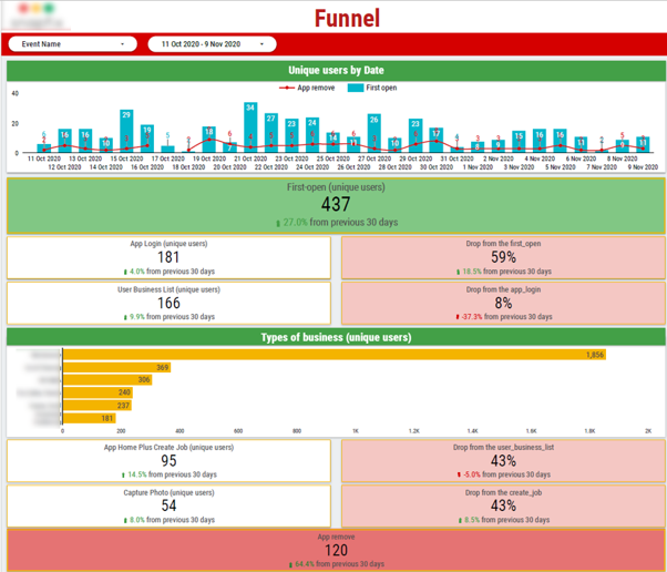
The funnel analysis follows users from first open through login, actions that make someone an active user to uninstalling the app, with drop-off calculated at each step.
In one of our projects our business intelligence consultants helped the SaaS company measure the funnel from someone opening the app for the first time to performing key actions e.g. business list, job creation and photo capture. We discovered 437 first opens converting to 181 logins, a 59% drop at the very first stage. That single number tells the product team where their biggest drop off is so they can focus on it before anything else.
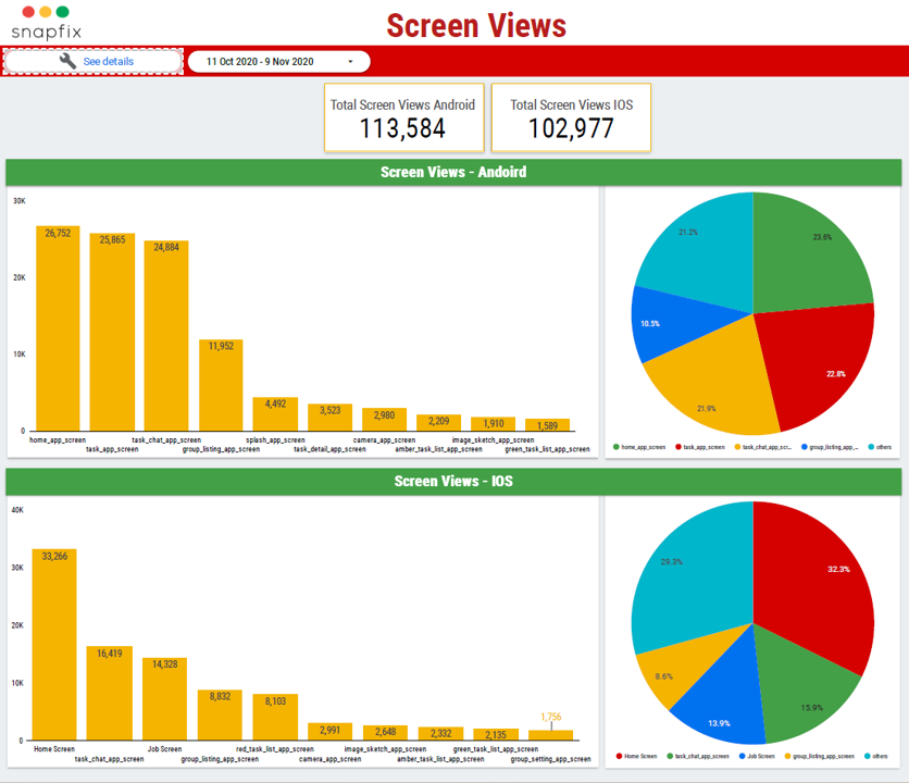
Screen view analysis ranks every screen by traffic across key operating systems. With 113,584 Android and 102,977 iOS screen views in the period, the team can see which features carry the product and which are barely touched.
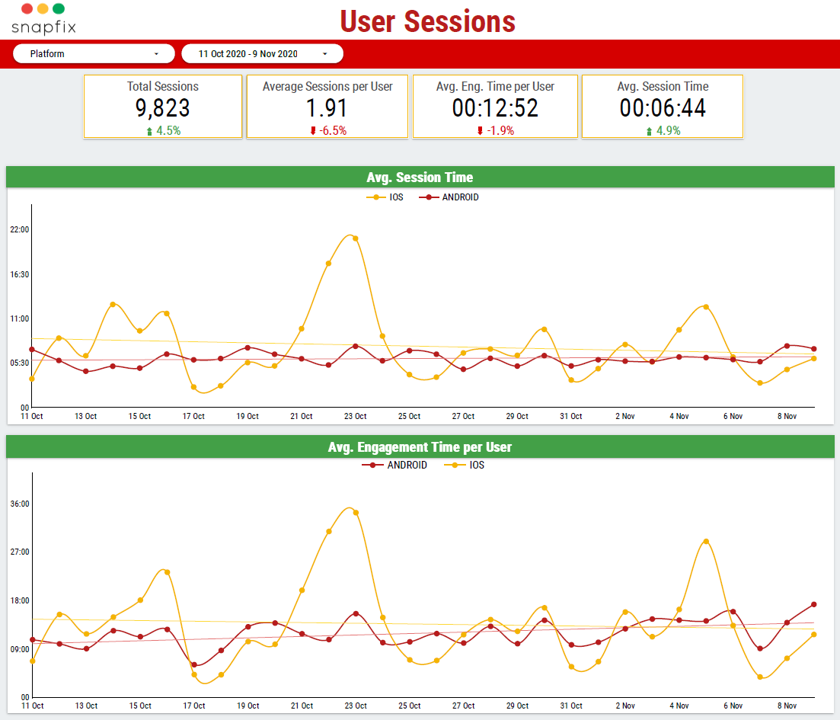
Counting sessions is not enough, so it’s important to analyse average session time, average engagement time per user and sessions per user, split by platform. In one of our projects this analysis surfaced that iOS sessions running longer but less consistently than Android.
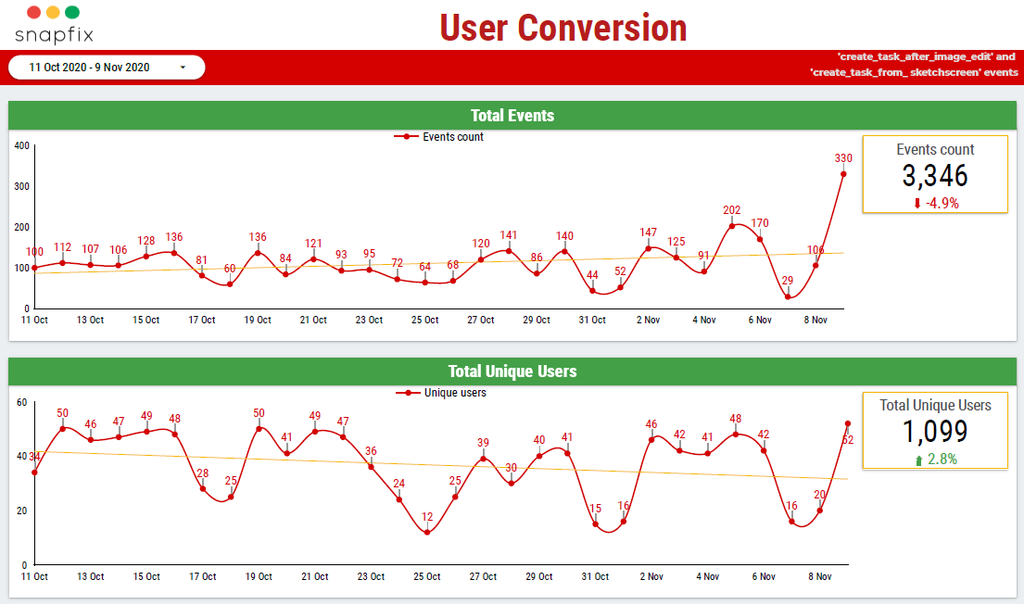
Conversion here is measured against the events that matter commercially, in this case creating a task after editing an image or drawing on a sketch screen. The management report tracks both event volume and the unique users behind it, so a spike from a handful of power users cannot be mistaken for growth.
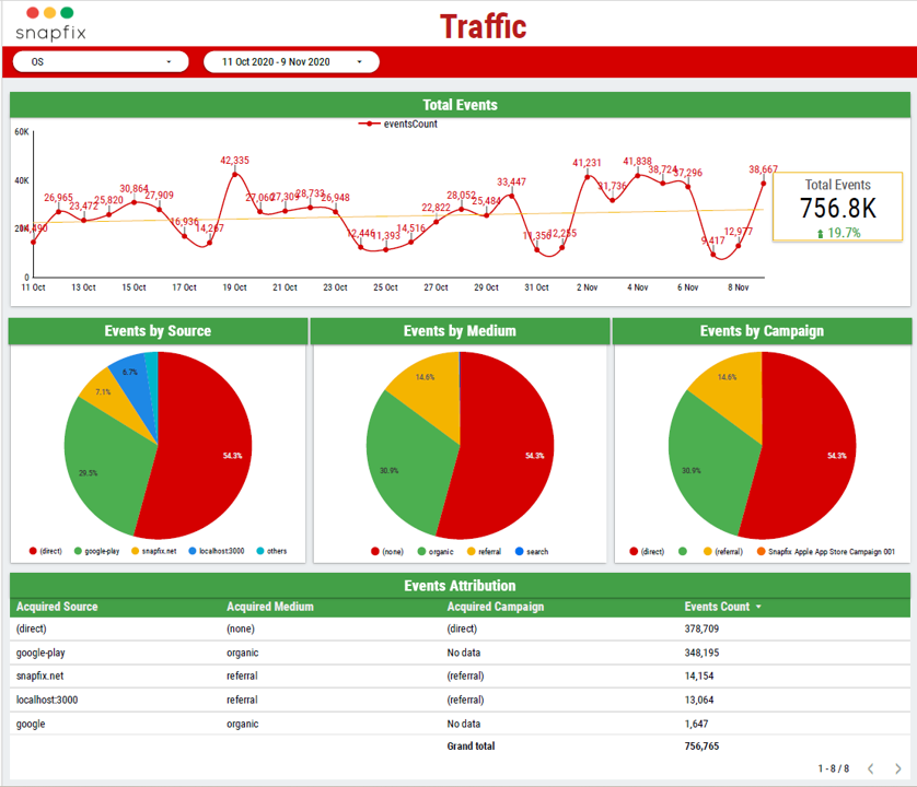
It is very important for any SaaS business to know where the traffic to their app comes from. This analysis informs the marketing decisions such as which marketing channels to focus on and which markets to target.
For example in one of our projects we tied 756,765 events back to source, medium and campaign, showing direct traffic at 54.3% and Google Play at 29.5%.
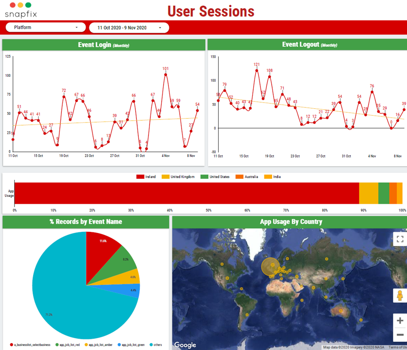
A separate view maps usage by country, which confirmed Ireland as the dominant market with the UK, US, Australia and India behind it.
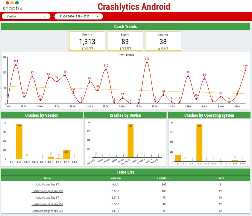
Engagement problems are often technical. When an app crashes it sometimes ruins the user experience and is more likely to lead to churn, especially for new users.
This Crashlytics page reports crash events, affected users and open issues, broken down by app version, device and operating system. The issue list names the exact file and line, so one release version accounted for 957 of the crash events.
In 2022, our consultants worked with ChargeBee, a subscription management platform in the SaaS space. This project went beyond dashboards. The goal was to build a reusable machine learning framework that ChargeBee’s own team could run on their product usage data to answer three questions: which users are likely to upgrade from free to paid, which features drive that decision, and how accounts group together by behaviour.
How it works, in plain terms. The framework has four stages. First, it cleans and prepares the raw usage data so a model can read it. Second, “user footprint” funnels visualise how each type of customer moves through product features, so you can see which features a segment relies on and which it ignores.
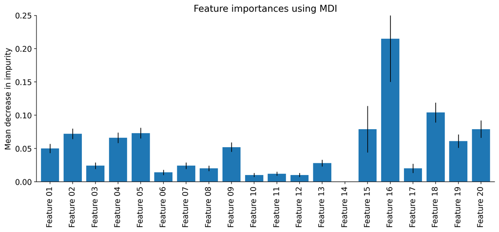
Third, tree-based models (random forest and decision trees) rank the features that most influence an outcome you choose, such as which plan a customer is on or whether they pay. Fourth, clustering groups accounts with similar behaviour so high-priority and cold leads can be separated and targeted differently.
Why this is valuable. For a business with a large free tier, the actionable insight is knowing which feature adoption predicts payment. If active days and specific feature use are what separate paying from non-paying accounts, you can build onboarding and success programmes that push users toward exactly those behaviours. The same framework extends to churn prediction, which was ChargeBee’s priority for the next phase.
Group your metrics by what they tell you, rather than tracking everything at once.
Activation
Engagement and stickiness
Retention
Financial outcomes
There is no universal definition of an active user, and this is the first decision to make. Get it wrong and every metric built on top of it is wrong.
Opening the app is a weak definition, because it counts users who open, look and leave. A stronger definition is based on the action that delivers your product’s core value: creating a task, sending a message, completing a booking. In the mobile app dashboards below, we defined active users by key in-app actions such as creating a job or capturing a photo, not by app opens.
Once agreed, this definition flows into DAU, WAU, MAU and stickiness. Write it down, apply it consistently, and revisit it only when the product itself changes.
The financial metrics above need billing data, which usually sits in Stripe rather than your product analytics tool.
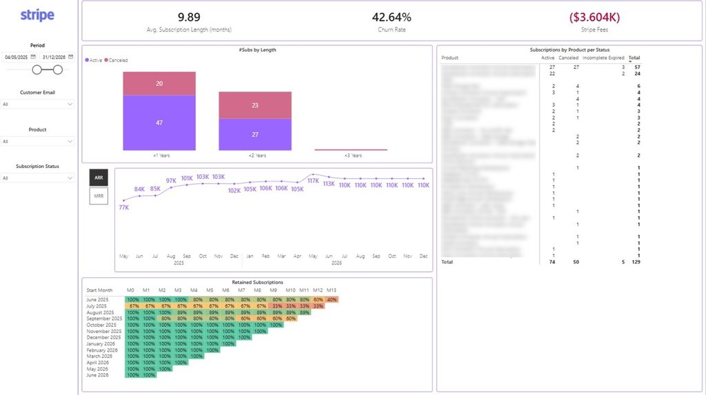
Our Power BI Template App for Stripe connects Stripe to Power BI with a prebuilt data model, DAX measures and three dashboards covering payments, renewals and retention. The retention dashboard tracks active subscriptions, cancellations, subscription duration and cohort analysis, which is the data you need to calculate CLV, ARPU, retention rate and churn.
The connector is a Stripe-approved app listed on the Stripe Marketplace, meaning it has passed Stripe’s security and technical review. The template is free to download.
Averages hide the story. A flat retention rate can easily be one segment growing while another collapses.
There are four approaches worth knowing:
In the property management SaaS project, we segmented users by business type, which showed maintenance businesses generating 1,856 unique users against 369 for cleaning and 240 for fire safety checks. In the healthcare project, we segmented by geography and clinical profile. For ChargeBee, we used clustering to group accounts by behaviour and separate high-priority leads from cold ones.
Start with two or three segments that map to a decision you actually need to make. More segments than that usually means slower analysis, not better analysis.
Most teams need three layers, and the tools in each do different jobs.
Firebase is the standard for mobile app event tracking, and includes Crashlytics for stability data. Amplitude and Mixpanel are product analytics platforms with strong built-in funnel, cohort and retention analysis. AppsFlyer handles attribution, telling you which campaign or channel produced an install. GA4 covers web and app together and is free at most volumes.
A note on scope: we analyse data from all of these, but we do not implement event tracking ourselves. If you need instrumentation set up, we can refer you to consultants who specialise in it.
Stripe holds subscription, renewal and revenue data. Without it you can measure engagement but not what engagement is worth.
BigQuery or SQL Server is your business intelligence data warehouse where raw events land and KPI logic is written. Firebase connects to BigQuery natively, which is the route we use most often.
Power BI suits teams already in the Microsoft ecosystem, working with large models or blending many sources. Looker Studio suits teams in the Google ecosystem, works well with BigQuery and GA4, and has no licence cost. We build in both.
| Job | Tool |
| Track events in a mobile app | Firebase |
| Track events across web and app | GA4 |
| Out-of-the-box funnels and cohorts | Amplitude or Mixpanel |
| Attribute installs to campaigns | AppsFlyer |
| Subscription, churn and revenue data | Stripe |
| Store raw events and calculate KPIs | BigQuery or SQL Server |
| Blend product, billing and CRM data in one report | Power BI or Looker Studio |
The honest guidance is that built-in reporting inside Firebase, Amplitude or Mixpanel is fine to start with. Teams outgrow it when they need to blend product data with billing or CRM data, when they need KPI definitions the tool does not support, or when licence costs stop making sense. That is the point at which a custom reporting solutions win.
Customer engagement analysis follows the same five steps regardless of your stack.
1. Define what engaged means. Pick the one or two events that represent real product value. Everything downstream depends on this.
2. Consolidate your sources. Move app events, billing data and attribution into one warehouse so they can be joined. Engagement data alone cannot tell you what a customer is worth.
3. Build the KPIs. Write the logic once, in SQL, so DAU means the same thing in every report. Stickiness is DAU divided by MAU; retention is measured by cohort from a fixed starting event.
4. Visualise it. Build a dashboard with filters for platform, date range and segment, so the team can answer follow-up questions without asking an analyst.
5. Act on the customer engagement insights. Take the largest drop-off in the funnel and run one change against it. Then measure whether it moved
Days 1–30: Define and connect. Agree your active user definition and pick one North Star metric. Inventory your data sources and get app events into a warehouse. We help with data modelling and consolidation. If tracking is not yet in place, we will point you to the right specialists.
Days 31–60: Build and validate. Build core KPIs — DAU/WAU/MAU, stickiness, retention cohorts, activation funnel — and the first dashboard in Power BI or Looker Studio. Check the numbers against a source you trust before anyone makes a decision on them. This is our core service.
Days 61–90: Act and iterate. Run your first segmentation, pick the single biggest drop-off, and ship one change against it. Set a fortnightly review so the dashboard stays in use. We support with new metrics, segmentation and analysis as questions come up.
Turning Engagement Data Into Decisions
Every dashboard on this page started with the same question: where are users dropping off, and what should we do about it. The value is not in the charts but in the decisions they make obvious.
If you want to see what your engagement data could look like, get in touch or explore our Looker Studio and Power BI consulting services.
It is the analysis of behavioural data showing how customers interact with your product, used to improve retention, conversion and revenue..
? There is no standard definition. Choose the action that represents core value in your product, apply it consistently, and build DAU, WAU and MAU on top of it.Migration moves data from one system to another; modernization re-architects how data is stored, cleaned, governed, and used. Migration is one step within a broader modernization program.
They are enough while your questions stay inside product data. You need a BI tool when you want to blend product data with billing, CRM or marketing data, or when licence costs outgrow the value.
Around 20% is widely treated as healthy, meaning one in five monthly users opens the app daily. The right target depends on whether your product is designed for daily use.Cost depends on the number of systems, data volumes, and how much cleansing your data needs. Starting with a scoped first phase keeps the initial investment small and proves value before you commit further.
Yes. Stripe holds subscription, cancellation and revenue data, which is what those metrics are built from. Our free Power BI template gives you retention and cohort dashboards from that data.
Power BI for Microsoft environments, large data models and complex blending. Looker Studio for Google environments, BigQuery and GA4 sources, and zero licence cost.


