

A CEO dashboard takes on the manual reporting and number-chasing that eats into a leadership team’s week. It can take on most of that repetitive work, but not on its own. How much it takes off comes down to which metrics you put on it, how clean the underlying data is, and how well the view drills into the detail behind a problem.
As a business intelligence consulting company, we have built dashboards for CEOs and leadership teams across professional services, SaaS, manufacturing, and other sectors in the UK, US, and beyond. Our work replaces scattered departmental reports with one view that tracks revenue and margin and flags churn and capacity early, reading from the systems a business already runs on.
This article walks through how we approach CEO dashboards at Vidi Corp: what one is and how it differs from an executive dashboard, the KPIs worth tracking, and a real example we built for a marketing agency, then how to build one, the best practices to follow, how it compares to a board dashboard, and where Power BI fits.
A CEO dashboard shows how the whole company is doing across its core functions, on one screen. It takes the headline numbers from finance, sales, marketing, operations, and people and sets them side by side, so the chief executive can read the state of the business in a couple of minutes instead of chasing five separate reports.
It is not an operational tool, and nobody runs their day from it. A CEO uses it to set priorities and to catch problems while they are still small. It also guides the bigger calls, where the next dollar goes and when the next hire happens. When a number looks off, the dashboard is where the question starts, and the answer sits in the departmental dashboards underneath.
Speed matters because a CEO’s time is short. The view stays high level and refreshes by itself, often several times a day, so it is current whenever they open it, and a big decision shows up in the numbers soon after it is made.
People use the two terms interchangeably, and they do overlap, but the distinction is worth drawing. “Executive dashboard” is the umbrella. It covers every leadership view in the business, including the ones built for individual function heads. The finance lead has one, the sales lead has one.
The CEO dashboard sits on top of all of them. It is the whole-company view, the one the chief executive uses to see the trade-offs between functions rather than any single function in depth. A departmental dashboard goes deep and narrow. The CEO version goes wide and shallow, then hands off to those deeper dashboards when a number needs chasing down.
For the wider set, broken down by function and industry, see our guide to Power BI executive dashboard examples. This piece stays on the CEO.
There is no standard template, and a generic one only gets you so far. The right metrics depend on how the business makes money and what the leadership team is trying to fix. Even so, most good CEO dashboards pull from the same short list of company-level numbers and leave everything else to the departmental views.
The ones that show up most often:
| KPI | What it shows |
| Revenue and revenue growth rate | Whether the business is expanding, and how quickly |
| Profit and gross margin | Whether that growth is being delivered efficiently |
| Cash position and runway | How long the business can operate on current reserves |
| Monthly recurring revenue | Predictable income, for subscription and retainer businesses |
| Pipeline or bookings | The revenue expected in the coming months |
| Client retention and churn | Whether existing customers are staying or leaving |
| Customer lifetime value | How much each client relationship is worth over time |
| Team utilization | Whether delivery capacity is under or over stretched |
| Headcount and employee retention | Whether the business has the people it needs to sustain growth |
The hard part is stopping. Every extra metric feels defensible on its own, but pile up enough of them and the signal disappears. The same data visualization principles that apply to any good report apply here: a number belongs on the screen only if it would change something the CEO decides.
The same idea, the whole company on one screen, looks different depending on what a business runs on. Here are CEO dashboards we have built for five kinds of business, each shaped around the decisions that matter most in that world.
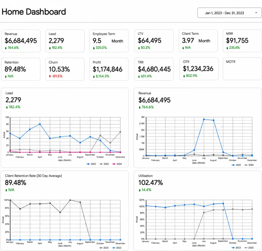
This one our Power BI developers built for the CEO of a marketing agency, and it works as a template for most professional services firms. The whole business sits on one screen, finance, marketing, sales, operations, and people, so the numbers get read together instead of chased across separate reports.
It carries a KPI or two from each function:
The charts underneath run this year against last for leads, revenue, retention, and utilization, so the CEO reads direction as well as the current figure.
For an agency, the two that earn their keep are utilization and retention. Utilization above 100% means the team is into overtime, which is the cue to bring in help before delivery slips and people burn out. A dip in retention gets seen early enough to save the account. Neither waits for the month-end pack, and the leadership team argues from one set of numbers instead of five versions of the story.
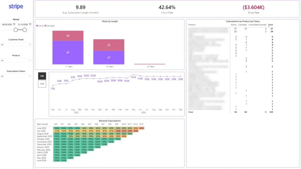
Swap the agency out for a SaaS company and the CEO’s questions change shape. Now it is all about the subscription: whether customers stay and whether recurring revenue keeps climbing. This dashboard developed by our business intelligence consultants runs on Stripe data.
It tracks the numbers a subscription CEO lives on:
The trend line runs ARR and MRR month by month, and a cohort grid underneath shows how each month’s signups hold up from signup out to a year later.
The cohort grid is the part CEOs tend to fixate on. A cohort that starts leaking early stands out, and catching it leaves time to fix the product or the onboarding behind it long before churn reaches the revenue line.
This is familiar ground for us. Before joining Vidi, one of our team built a C-suite subscription dashboard at Autodesk.
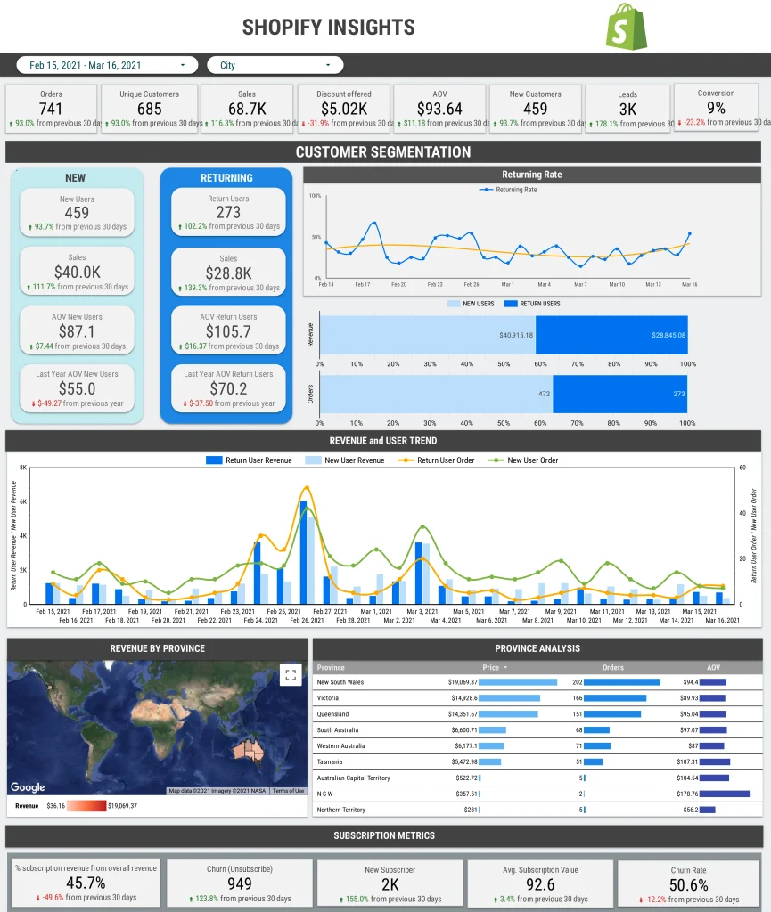
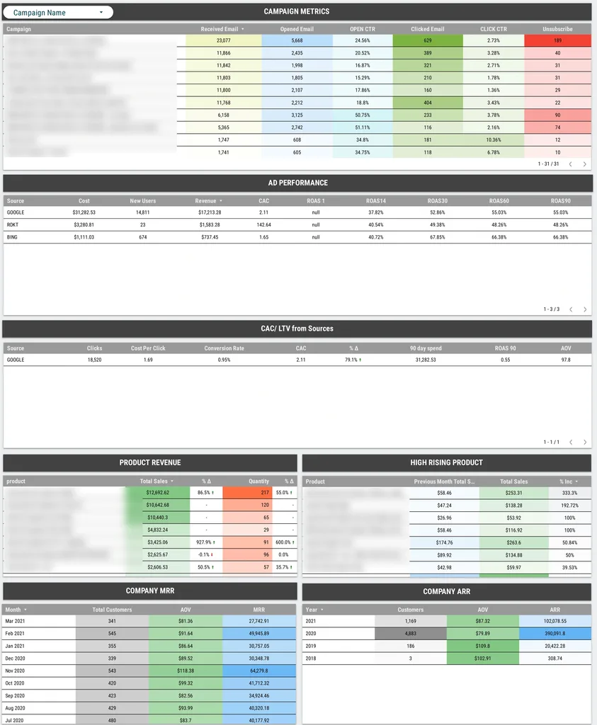
Ecommerce shifts the focus again, onto sales and average order value, and where the growth is coming from. This ecommerce dashboard keeps the storefront and the marketing side together.
It leads with the numbers a retail CEO checks first:
The trend charts run revenue and orders across the period, split by new and returning customers, with a map breaking revenue down by region.
The useful part for a CEO is catching a channel’s return on ad spend sliding, or AOV drifting down, while there is still room to move spend or adjust pricing, rather than finding out once the month closes.
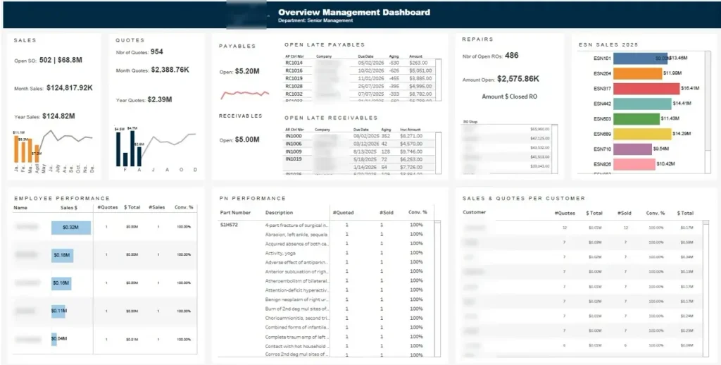
Manufacturing runs to a different rhythm. Here the CEO is balancing the order book against cash and capacity, so the manufacturing dashboard keeps the commercial and the financial side together.
It carries a KPI or two from each area:
The trend charts track sales and quotes month by month, and a ranked bar chart shows which product lines are pulling their weight.
A receivables position stretching out, or a win rate slipping on a particular product, shows at the top level, and the CEO can follow it down to the line or account behind it before it starts to bite on cash or delivery.
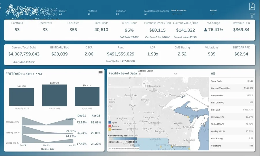
A hospital or care group has to watch capacity and quality without ever losing sight of cash, and this healthcare dashboard keeps all of it in view.
It carries a KPI or two from each area:
The trend charts follow EBITDAR and occupancy month by month, with a facility-level map plotting every site.
The map is where it earns its keep: a site whose occupancy or quality is slipping stands out, so leadership can get to it before the problem reaches the ratings or the accounts. For a CEO running a group of sites, it is a single view to govern from rather than a stack of facility reports.
After years of building executive dashboards, we have found their value goes well beyond a tidy screen of KPIs. Set up properly, a CEO dashboard helps leadership find opportunities buried in their own data and make the call with current numbers instead of last month’s. The three that come up most often are below, each with a client project where we saw it.
Find Cost Savings and Revenue Opportunities
The headline financial numbers are only useful if you can get behind them. A CEO dashboard ties each result to the data underneath, so leadership can drill into a business unit, a customer, a product line, or a cost category and see what is moving it and where there is room to do better.
For Neterra, we built Power BI reporting across finance, sales, marketing, procurement, and operations. Digging into it surfaced an immediate €50,000 cost saving, plus €10,000 to €20,000 of new monthly recurring revenue.
Make Strategic Decisions Faster
A slow decision usually means the answer took too long to find. When the metrics are current and every KPI has a clear path down to the data behind it, leadership can test a hunch or chase an opportunity in the moment, without commissioning a separate analysis first.
Our team also consolidated data from six separate systems into a single database and built real-time dashboards for leadership and stakeholders. The result was 40% faster strategic decisions, with executive review cycles cut by two business days a week.
Spend Less Time Preparing Executive Reports
Most executive reports get rebuilt from scratch every cycle, and that is time nobody gets back. A CEO dashboard reads straight from the accounting, CRM, and operational systems and refreshes on its own, so the numbers are ready for the review without anyone rebuilding the same deck.
For a financial services company, we connected QuickBooks Online, Zoho CRM, Zoho Creator, and Excel to automated Power BI reports covering financial performance and the sales pipeline. That saved them more than 10 hours a month.
The build is the easy part. Deciding what goes on the dashboard is where it is won or lost. This is the order we work in with clients.
Fitting all of that onto one readable screen is a design job in its own right. How you group and align the elements decides whether the CEO takes it in at a glance or gives up on it. The Gestalt principles are the shorthand designers use for that, and this short video runs through the seven worth knowing:
Prefer to hand this off? Our dashboard development team runs the whole thing, from picking the metrics to connecting the data and automating the refresh.
A handful of things decide whether the dashboard gets opened every morning or quietly ignored.
Keep it to one screen. If the CEO has to scroll or click through tabs to get the picture, the picture is too big. Everything that matters should be visible at once.
Stay ruthless about the metric count. This is a strategic view, so it carries strategic numbers and nothing else. The operational detail has a home already, in the departmental dashboards.
Automate what you can. Hand-updated reports fall behind, and once a number is stale a few times, people stop trusting the whole thing. An automatic refresh keeps it current and takes the reporting chore off someone’s plate, the same business process automation that saves teams hours everywhere else.
Always link down. The overview tells the CEO what is happening. The dashboards beneath it explain why. Connect the two and the CEO gets the answer without a single email or a one-off analysis.
Same data, different job. A CEO dashboard is a working tool, open all week, built for near real-time numbers and quick drill-downs while the chief executive is running the business.
A board dashboard is for the set-piece moment. It pulls back from the day to day and shows the board what it cares about, growth against plan, profit, cash, progress on the strategy. What matters there is the quarter’s trend, not this week’s wobble, plus enough context for people outside the business to follow it.
Plenty of teams keep both, off the same underlying data. If you report to a board or investors, our management reporting service covers reporting built for that room.
Power BI is a natural fit for a CEO dashboard because it connects to the systems a business already runs on and refreshes from them on a schedule. It reads from accounting platforms, CRMs, spreadsheets, and databases, brings the numbers together, and keeps them current without anyone exporting or pasting anything by hand.
For the chief executive, that means a single Power BI dashboard that stays up to date on its own and drills into the detail on demand. The same model that shows revenue at the company level can open it up by client, service, or month, so the overview and the analysis live in the same report rather than two separate tools.
Once it is live, the work shifts to keeping it that way, with refreshes running and the model updated as the business changes. That ongoing upkeep is what Power BI managed services cover, so the dashboard stays reliable without adding to anyone’s workload.
A CEO dashboard earns its keep when it is built around how your business runs and the calls you make at the top. Everything on it, from the metrics to the drill-downs, follows your model, which is why a template rarely fits a real leadership team. Get that right and it is the first thing you open in the morning, not another report waiting to be read.
Most of that work is modeling, defining the revenue, margin, and cash metrics so the numbers hold up, which is what our Power BI consultants do every week, across more than 1,000 dashboards to date. Contact us to talk through what you need, and we will show you what a CEO dashboard solution built around your business would look like.
One screen that shows how the whole company is performing across its core functions. It brings the company-level KPIs from finance, sales, operations and people together so the CEO can judge the state of the business at a glance and decide where to focus.
Usually revenue and growth, profit and margin, cash, pipeline or recurring revenue, retention and churn, and a people metric like utilization or headcount. The exact mix depends on the business. The rule that does not change is to keep the set small and tied to decisions.
Most business intelligence platforms can build one, including Power BI, Tableau, and Looker Studio, and many teams start in Excel. The platform matters less than how far the dashboard can be tailored to your data and the decisions you make from it. A CEO dashboard is only worth building when the metrics, sources, and drill-downs match how your business runs, which is why we build ours in Power BI around each client rather than from a fixed template.
“Executive dashboard” covers every leadership view, including the departmental ones function heads use. The CEO dashboard is the cross-functional layer on top, the one the chief executive uses to see the whole business and move between its parts.
On an automatic schedule, often several times a day, so the CEO is always looking at current numbers and nobody is updating the report by hand.


