
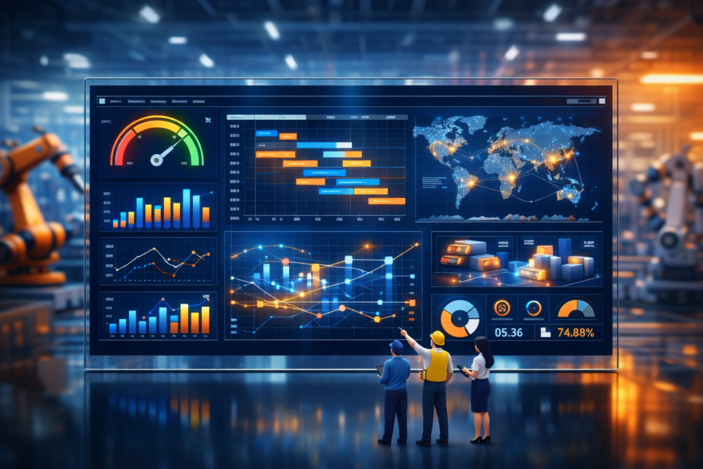
Modern manufacturing runs on data. From machines on the shop floor to ERP systems, warehouses, quality records, and finance platforms, every part of the operation generates information. The challenge is not collecting data, it’s turning it into something useful. A manufacturing company can leverage manufacturing analytics dashboards to gain data-driven insights, enabling better decision-making and improved operational efficiency.
As a data visualisation consultancy, we have delivered 1,000+ custom manufacturing analytics and dashboard solutions across operations, finance, quality, inventory, logistics, and sales. We specialise in building custom manufacturing dashboards that connect directly to ERP, MES, warehouse, quality, and machine data, helping manufacturers improve control, reduce inefficiencies, and support continuous improvement across their operations.
In this article, we explain what manufacturing analytics dashboards are, why manufacturing KPI dashboards matter in manufacturing, and how different manufacturing data visualization dashboard types support operational and business performance. We also walk through real dashboard examples, outline how to build effective manufacturing analytics dashboards, and cover the tools commonly used to support manufacturing analytics initiatives.
Manufacturing analytics dashboards are interactive reporting tools that bring together production, operational, financial, and supply chain data into a single dashboard that consolidates data from multiple sources.
Unlike manual reports or disconnected spreadsheets, manufacturing analytics dashboards centralise information from machines, ERP systems, warehouse systems, quality records, and financial platforms. They present this data through visualisations such as charts, KPIs, and trend analyses, making performance easy to interpret at a glance. An easily accessible platform ensures that important metrics and manufacturing metrics are available to all relevant team members, improving communication, training, and proactive decision-making.
These dashboards help manufacturers:
As manufacturing environments become more complex and data-rich, manufacturing data visualization dashboards play a critical role in connecting operational activity with measurable business outcomes. A performance dashboard provides real-time visibility into important metrics and supports proactive management, offering the structure and clarity needed to improve performance, increase efficiency, and support continuous improvement across the entire manufacturing value chain.
A manufacturing KPI dashboard is a powerful tool that helps streamline processes and improve production efficiency by making performance visible while there’s still time to act. On a production floor, waiting for end-of-shift reports or weekly spreadsheets often means problems are already baked into output, quality, or delivery. A manufacturing KPI dashboard puts the current state of operations in front of teams as it’s happening.
By tracking KPIs in real time or near real time, manufacturers can spot downtime, slowdowns, quality issues, or delivery risks the moment they emerge. This enables teams to improve production efficiency by identifying and addressing operational bottlenecks quickly. Instead of reacting after losses occur, teams can intervene early, limit impact, and keep production on track.
KPI dashboards also create shared awareness. When performance is visible across lines, shifts, or plants, operators, supervisors, and managers work from the same facts. That clarity improves accountability, speeds up communication, and helps teams focus on the issues that matter most.
Most importantly, manufacturing KPI dashboards support continuous improvement. By consistently measuring performance, highlighting trends, and exposing root causes, they help manufacturers streamline processes, improve efficiency, reduce waste, and make better decisions under real operational pressure.
Manufacturing data forms the backbone of effective decision-making in the manufacturing industry. By capturing and analyzing the right data, manufacturers can optimize production processes, improve quality, and reduce costs.
Harnessing manufacturing data across these categories enables manufacturers to make data-driven decisions, streamline production processes, and achieve their business objectives.
Manufacturing organisations always keep an eye on a bunch of key performance indicators (KPIs) across various operational areas. What those KPIs are, and how they’re grouped, can vary depending on the industry and production process, but generally speaking, they fall into production, quality, maintenance, inventory, supply chain, and financial performance.
These Production KPIs basically measure how well manufacturers are turning resources into finished products. They’re all about efficiency really.
Overall Equipment Effectiveness (OEE)
This is a single KPI that measures how good a job you’re doing of making the most of your equipment. And it can be worked out by looking at three things – how available the equipment is, how well it’s performing, and how good the quality is.

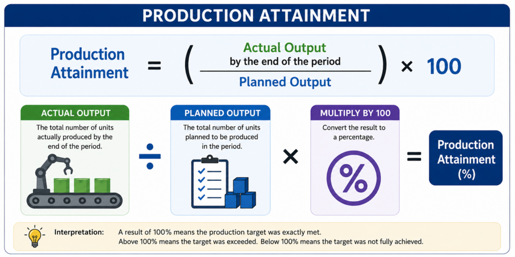
Production Attainment
This KPI is a simple one – it just checks whether you’re actually hitting your planned production targets.
Quality KPIs essentially give you a snapshot of how reliable your production processes are, and how many of the finished products meet quality standards.
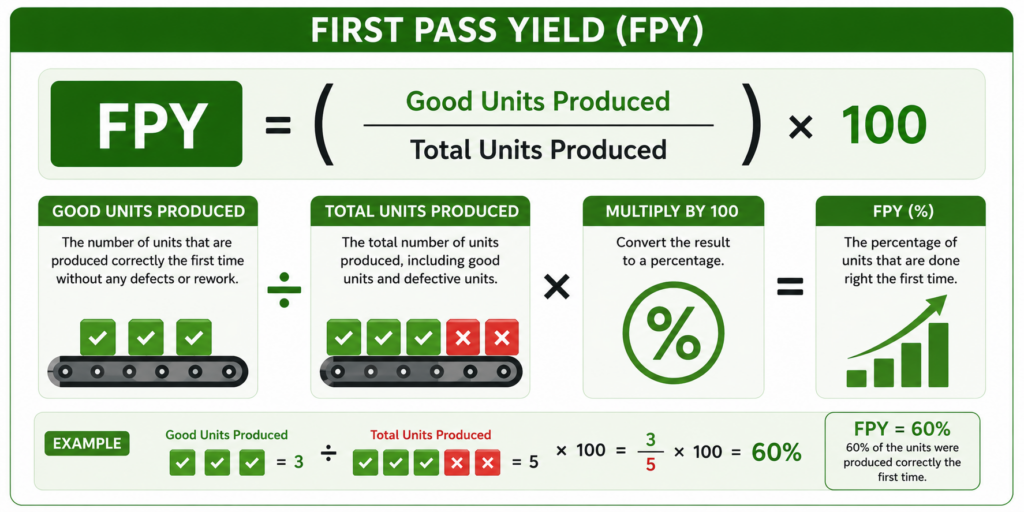
First Pass Yield (FPY)
This is the percentage of products that get done right the first time and don’t need to go through rework. That’s the kind of efficiency you want to see.
Defect Rate
This one tells you the percentage of products that fail quality checks – and that’s obviously the kind of thing you want to keep an eye on.

Maintenance KPIs are pretty straightforward – they’re there to help manufacturers keep track of equipment reliability and avoid unplanned downtime.
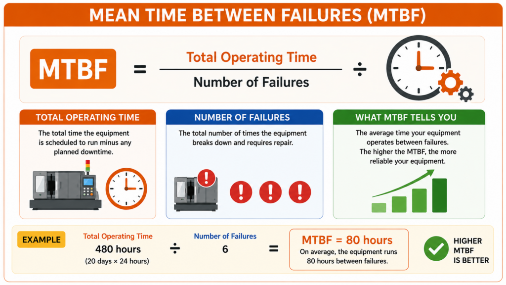
Mean Time Between Failures (MTBF)
This measures the average time you get out of your equipment between the time it breaks down. The longer that is the better.
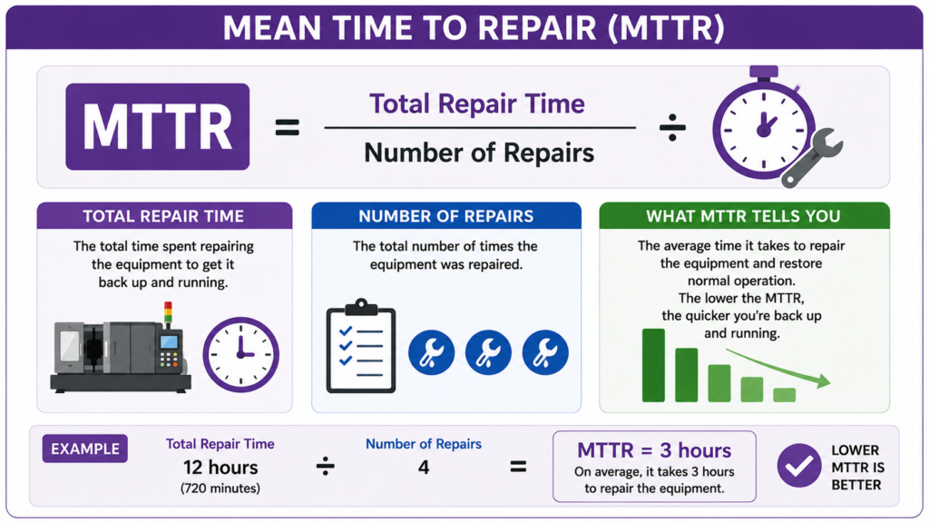
Mean Time To Repair (MTTR)
This is about how fast you can get the equipment up and running again after it breaks. The quicker the better.
These types of KPIs are a bit more about getting the stuff that you need to the right place at the right time.
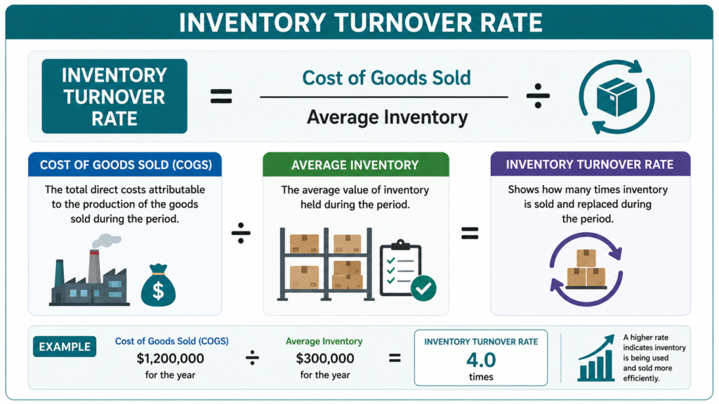
Inventory Turnover Rate
This one is about how fast you’re selling or using the stuff you’ve got in stock. If it’s moving quickly and efficiently you’re doing okay.
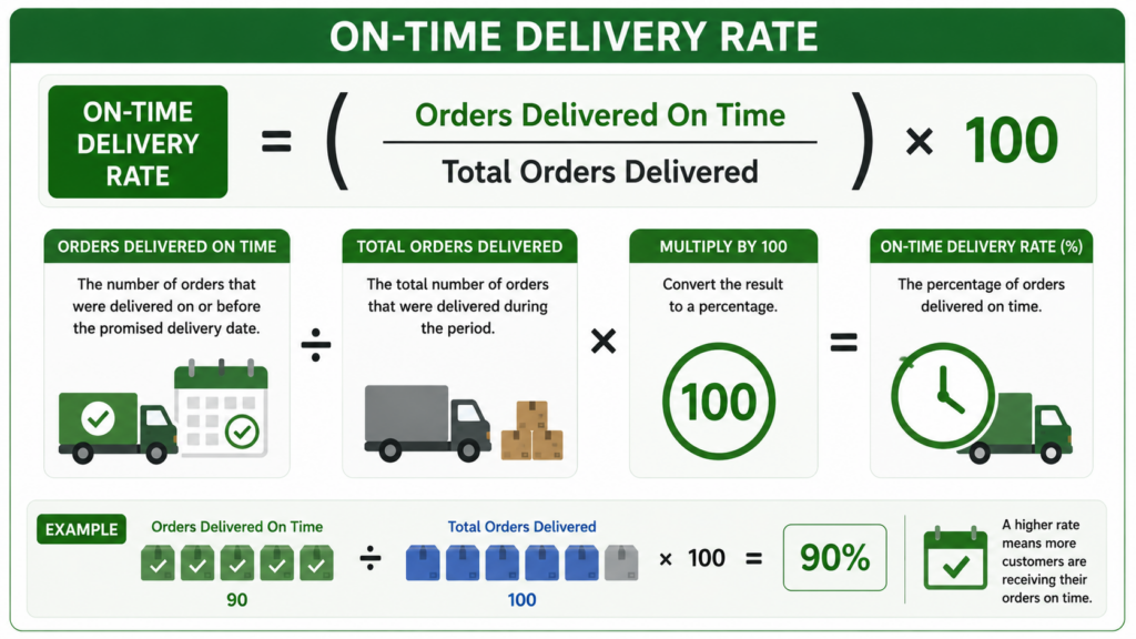
On-Time Delivery Rate
This is about the percentage of orders that are delivered on time. That’s pretty basic really – but it’s a key one.
The financial ones help manufacturers get a clearer idea of where their money is going and how they’re performing.
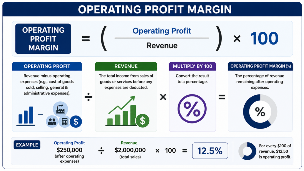
Operating Profit Margin
This is about what percentage of your revenue is left over after you’ve paid all the operating costs. That’s a pretty key number.
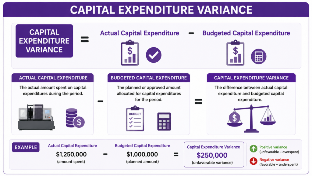
Capital Expenditure Variance
This measures whether the money you’re spending on new plant and equipment is staying within budget. As you’d expect, that’s a pretty big deal.
Manufacturing analytics dashboards support different functions across the manufacturing value chain, from the shop floor to finance, logistics, and commercial teams. Each dashboard type focuses on a specific area of performance, but together they provide a complete picture of how a manufacturing business operates.
Each example shows how data is structured, which metrics are tracked, and how dashboards are used in practice to support day-to-day decisions, improve control, and drive measurable performance improvements across operations, finance, inventory, quality, logistics, and sales.
Manufacturing operations dashboards give real-time visibility into how machines and equipment perform on the shop floor. They focus on usage, reliability, and wear to help teams keep production running smoothly and avoid disruptions.
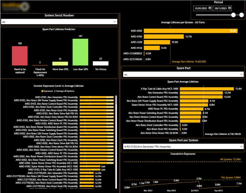
This dashboard includes:
How This Dashboard Is Used: Maintenance managers use this dashboard to keep an eye on how components are wearing out and spot parts that are running low on their expected lifespan. Maintenance planners use it to plan out their preventative maintenance activities and make sure their spare-parts inventory is in line with actual machine usage. Production supervisors use the dashboard to spot any equipment risks that could hit their production schedules and output.
Business Impact: Our client reported that after implementing this dashboard they gained much better visibility into equipment health which led to a 20% revenue increase. By catching components before they hit the end of their lifespan – or even when they’ve gone past it – the maintenance teams are much less likely to have to deal with unplanned downtime, their maintenance planning is better, and they get the most out of their spare-parts inventory.
Manufacturing finance dashboards track the costs directly linked to production. They focus on operational expenses and key cost drivers to help finance and operations teams manage spending and maintain healthy margins.
These dashboards show how costs change over time, where expenses are concentrated across departments or projects, and which categories have the greatest impact on overall manufacturing performance.
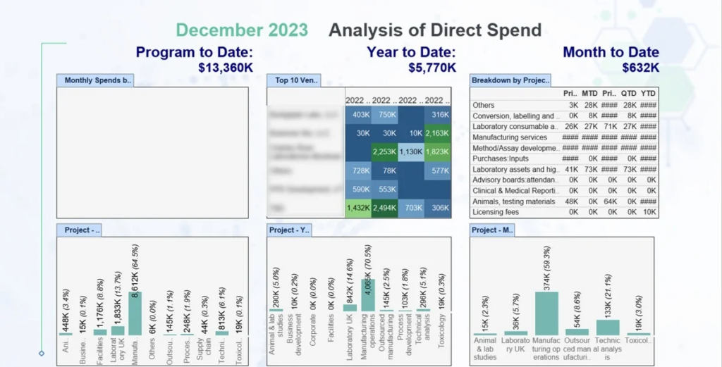
This dashboard includes:
How This Dashboard Is Used: We saw finance managers using this dashboard to keep track of where all the operational expenses are going across different departments, projects and cost categories. Operations leaders use it to figure out where in their manufacturing operations costs are piling up, while department managers used the analysis to get a handle on how much they’re spending in their areas of responsibility.
Business Impact: The dashboard developed by our BI consultants gave everyone a clearer picture of where production-related costs are heading and helped teams spot where people are overspending much earlier in the process. That gave them a chance to get their budgets back under control, make better financial decisions, and actually increase their overall profitability in manufacturing operations.
Manufacturing CapEx dashboards track how capital is invested across the business and ensure spending remains aligned with long-term strategic plans. They are especially important in capital-intensive industries where plants, equipment, and infrastructure require significant upfront investment and ongoing asset replacement.
These dashboards show how capital budgets are allocated, where investment is concentrated, and whether projects remain within approved spending limits.
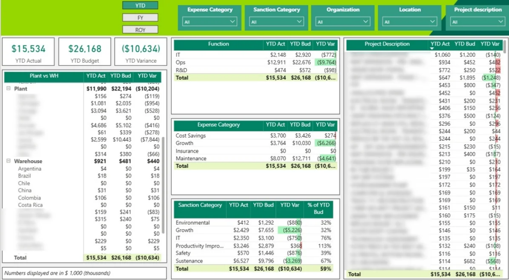
This dashboard includes:
How This Dashboard Is Used: Finance leaders used this dashboard to keep an eye on how their capital expenditure is performing across all their different plants, warehouses, and corporate facilities. Project managers used it to track their spending against what they were allowed to spend, while executives used the analysis to work out how to prioritize their investments and what funding they actually needed.
Business Impact: A chemical manufacturing firm we worked with reported that this dashboard helped them keep a tight handle on its capital spending and spot where they were getting off course before things really started to spiral. That let them make their capital allocation decisions a lot more effectively, up the governance on their finances, and make better long-term investment plans.
Manufacturing inventory management dashboards track how much material, work-in-process, and finished goods are held across warehouses and storage locations. They focus on stock levels and available capacity to support effective production planning and order fulfilment. In simple words, these dashboards are needed because there is no point producing more products when there is no capacity to store it in the warehouse.
These dashboards show where inventory is stored, how much space remains available, how quickly goods move in and out of the warehouse, and where bottlenecks or capacity constraints may arise.
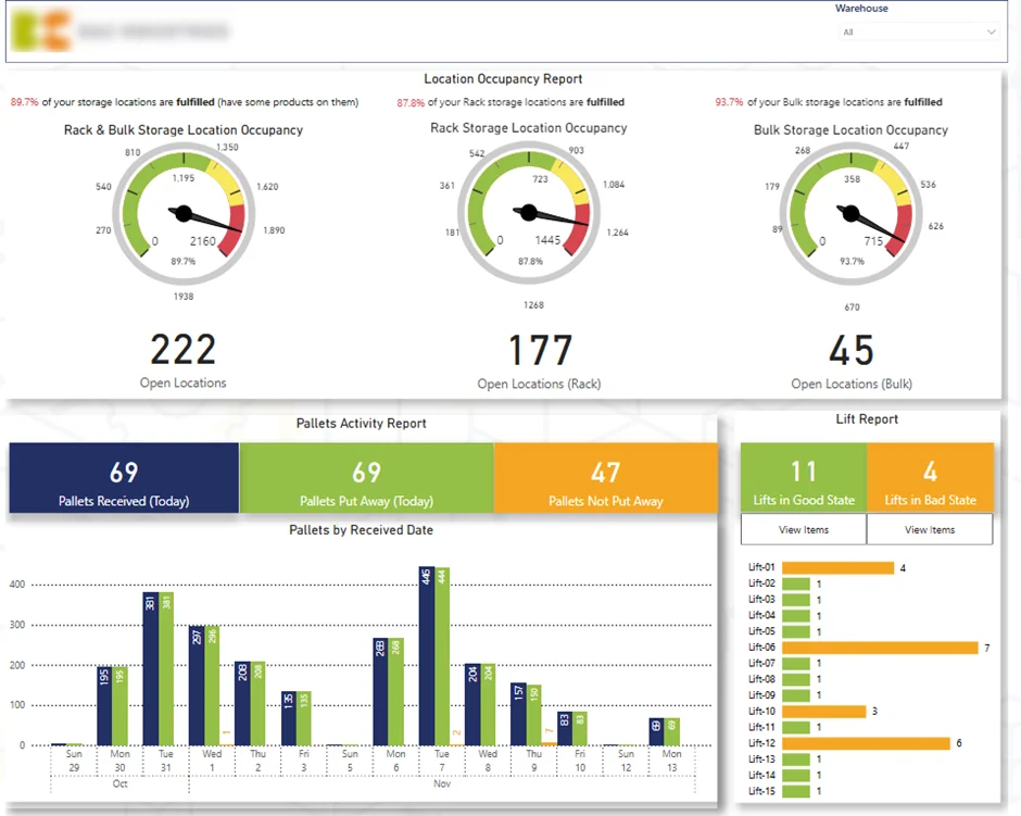
This dashboard includes:
How This Dashboard Is Used: Warehouse managers use this dashboard to keep an eye on how much inventory they have and what space they’ve got left over in their storage. Warehouse supervisors use it to spot bottlenecks in the way they’re bringing goods in, while their supply chain teams use the analysis to figure out how to plan their inventory and get the best out of their warehouse space.
Business Impact: The dashboard gives everyone a much clearer picture of what’s going on with their inventory and how much space they’ve got left in their warehouses. That helps them to make sure they’re shipping out orders with no delays and not running out of space, keep the flow of their inventory running smoothly and support more efficient warehouse and order fulfillment processes.
Manufacturing quality control dashboards monitor product quality throughout the production process. They concentrate on defects, rejections, and customer complaints to help teams understand where quality issues occur and how they evolve over time.
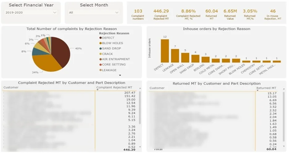
This dashboard includes:
How This Dashboard Is Used: Quality managers use this dashboard to keep an eye on where defects are starting to become a problem and what reasons are causing the same type of rejections to keep happening. Production managers use it to dig into what’s going on with quality issues by product, customer and part, while their operational leaders use the analysis to work out how much these quality problems are actually costing the company.
Business Impact: The dashboard built by our data visualization consultants lets the teams figure out where their priorities should be when they need to take action on quality issues – and it’s not just about how often something is going wrong, but also how much it’s actually costing them. That lets them cut down on rejection-related losses, reduce waste and rework, make their products better quality and make their customers a lot happier.
Manufacturing logistics dashboards oversee the movement of finished goods from the warehouse to the customer. They concentrate on fulfilment progress, shipping status, and on-time performance, allowing teams to address slowdowns quickly, prioritise urgent orders, and maintain dependable delivery performance.
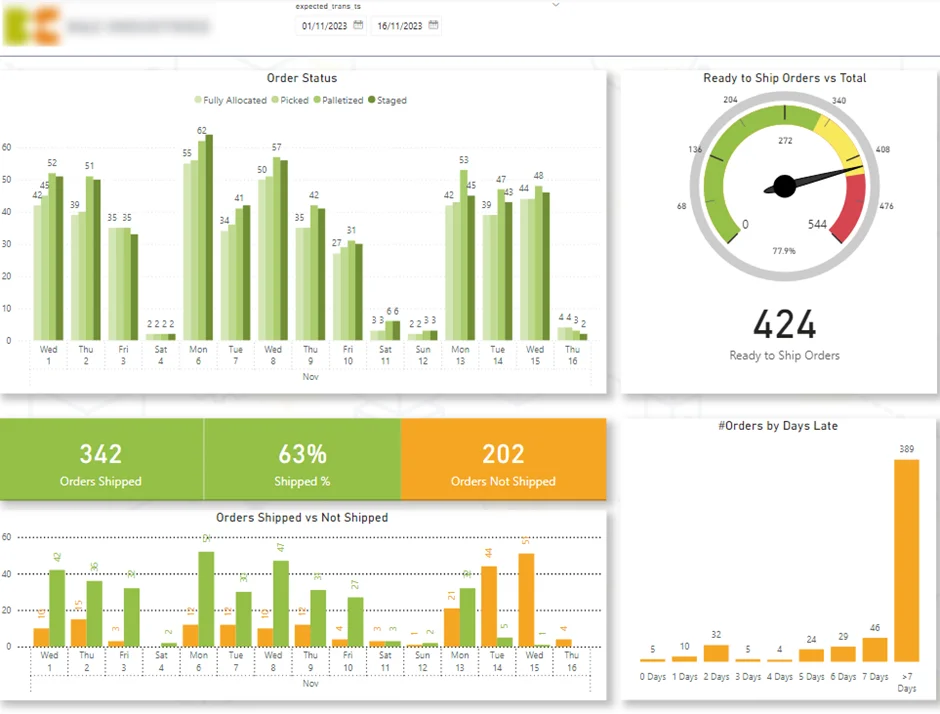
This dashboard includes:
How This Dashboard Is Used: Logistics managers use this dashboard to keep an eye on how well they’re fulfilling orders and moving goods out the door. Warehouse teams use it to spot where orders are delayed and prioritize getting those orders shipped out fast, while customer service teams use the analysis to work out where there are problems with getting goods delivered on time.
Business Impact: The dashboard gives everyone a much clearer picture of how their logistics are performing, including any delays in getting orders out to customers. That helps them to keep their order fulfillment activities in line, make sure they’re meeting their delivery deadlines, and keep their customer service levels high.
Manufacturing sales dashboards monitor how revenue develops across products, customers, and business units. They focus on identifying the drivers behind sales performance and understanding how growth shifts over time.
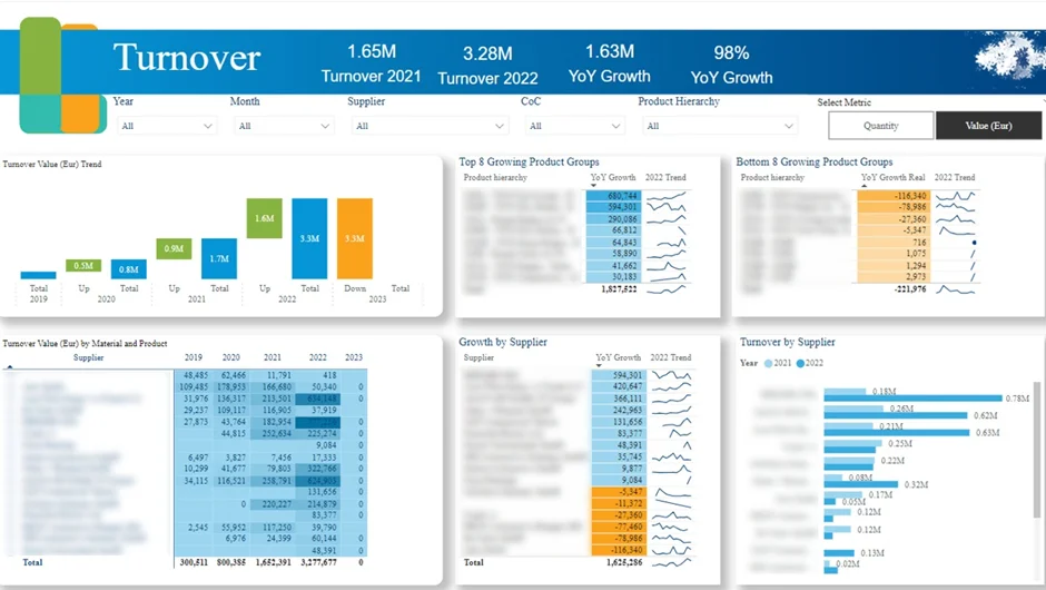
This dashboard includes:
How This Dashboard Is Used: Sales leaders use this dashboard to keep an eye on where their sales are growing across different products, suppliers and product groups. The commercial teams use the analysis to spot where there are new opportunities opening up, while their procurement and supply chain teams use it to work out how to plan for changes in demand.
Business Impact: The dashboard gives everyone a much clearer picture of what’s driving their sales performance. That lets them spot opportunities early on, react better to changes in the market and make their commercial and operational planning a lot more in line with each other.
Getting started with a manufacturing KPI dashboard begins with figuring out what kind of decisions you want the thing to help with. Whether you’re after a boost to production efficiency, fewer quality issues, lower costs, or better inventory management, it’s essential that your dashboard gives you a clear view of the key performance indicators that really matter. Every manufacturing set-up is different, but that’s why this process provides a bit of a roadmap for creating a dashboard that actually does what you need it to do.
First things first: you need to work out what the dashboard is meant to help you achieve. This might involve getting to the bottom of things like lower unplanned downtime, better first pass yields, more on-time deliveries, reducing the costs of holding onto inventory, or just increasing overall production output.
Once you’ve got your objectives sorted, it’s time to pick out the KPIs that’ll help you measure success. Resist the temptation to overload the dashboard – too many KPIs just makes it harder for users to focus on the things that really need their attention.
Manufacturing KPI dashboards often combine data from loads of different systems. You might be looking at ERP platforms, MES systems, warehouse management software, maintenance systems, quality management tools, spreadsheets, or even the production equipment itself.
Before you even think about building the dashboard, have a proper look at each of your data sources to see how good the data is, how often it’s updated, and just how much detail it contains. This will save you from all sorts of reporting headaches later on down the line.
The layout of your dashboard needs to be designed around the needs of the people who’ll be using it most. If you’ve got production supervisors on your team, they’ll need a detailed look at how things are running on the shop floor – but for executives, you’ll probably want to keep things a bit more high-level, with some trend analysis to boot.
Start by getting the most important KPIs up on the dashboard, and then add in some supporting charts, tables, and filters that help people see what’s behind the numbers. The clearer and more user-friendly your dashboard, the more likely it is to get used.
Think about where the dashboard will be displayed too – production KPIs are often on big screens in the production area, in the control room, or right on the factory floor where operators and supervisors can keep track of things throughout the day. Warehouse dashboards might be in the distribution centre, tracking inventory movements and inbound/outbound activity, while execs typically access theirs on laptops, tablets or mobile devices for high-level KPI reporting and trend analysis, not real-time operational monitoring.
Once you’ve got your requirements nailed down, it’s time to get the data talking to each other. This usually means building data integrations, transforming raw data into something more useful, defining how your KPIs get calculated, and setting up an automated process to make sure everything stays up to date.
Lots of manufacturers are now using data pipeline services to bring all their data together into one place – putting all that data from their ERP systems, production databases, warehouse platforms, and other operational systems into a single reporting environment. Getting this right is key to making sure your KPIs stay consistent and that users get the accurate, up-to-date info they need.
Before you even think about rolling your dashboard out to the wider organisation, test it with the people who are going to be using it most – and do it with a critical eye. This will help you make sure your KPI definitions are spot on, that your dashboard is nice and user friendly, and that the analysis is actually going to help people make informed decisions on a day-to-day basis.
As your reporting needs change and evolve, you can always add in more KPIs, data sources, and dashboard pages – many manufacturers start off with a single department or area before working their way up to things like quality, maintenance, supply chain, warehouse, and finance operations.
Don’t get caught up trying to cram a dozen metrics onto your dashboard. Focus on the KPIs that directly contribute to reaching your business goals. Are you trying to squeeze more out of your production line, get some downtime under control, improve overall quality, or keep costs in check? Those are your top priorities – stick to what really matters.
Your manufacturing decisions are only as good as the data you’re basing them on. The more data you can get from real-time systems the better, and make sure that data gets updated regularly so you’re always working with the most current numbers. Good data is your best defence against production problems causing inventory nightmares or customer blowups
Different people in your company will need to see the dashboard in different ways – your supervisors on the production floor are going to want more detail than the CEO who just wants the big picture. Design your dashboard to give them the level of detail they need, and make sure that data is presented in a clear and easy to understand way. This is where data visualization consulting services can help ensure dashboards are tailored to different user groups and reporting requirements.
Your KPIs shouldn’t just flag up when there’s a problem – they should also give you a clue about what went wrong. Think about adding some trends, breakdowns, filters and drill-downs to help people explore what happened and what’s causing it, which will give them the insight they need to take action fast.
Your manufacturing priorities are always changing – you’re launching new products, responding to shifts in the market or growing your business. The KPIs that got you to where you are today might not be the ones you need tomorrow. Keep reviewing them regularly and make sure they’re aligned with what matters most to your business.
Manufacturing analytics software and tools help companies analyse data from across their operations. They are used to bring together information from production, quality, logistics, inventory, and finance so performance can be tracked in one place.
Most manufacturers work with several systems at once, such as ERP, MES, warehouse management systems, quality tools, and machine or IoT data. Analytics software connects these systems and turns their data into manufacturing data visualization that teams can use day to day.
With the right tools in place, manufacturers can move away from manual reporting and scattered spreadsheets. Instead, they gain a consistent way to monitor KPIs, spot issues early, and support ongoing improvement across the business.
Even the most advanced manufacturing KPI dashboard can fail to deliver value if it is built on poor data, tracks the wrong KPIs, or does not meet the needs of its users. Understanding the most common implementation mistakes can help manufacturers improve dashboard adoption, maintain trust in reporting, and ensure KPI data supports better decision-making across the organisation.
Tracking Too Many KPIs
There’s a common mistake that manufacturers make by including every single metric on a dashboard. And yet, this so-called ‘comprehensive’ approach often makes reporting a nightmare and stops users from focusing on the KPIs that actually need attention. What you should be doing is prioritizing a small number of KPIs that are super relevant to your business objectives, and only bringing in supporting metrics when extra context is really needed.
The Problem With Poor-Quality Data
The effectiveness of a manufacturing KPI dashboard is only as good as the underlying data it’s based on. And if you’ve got all sorts of inconsistencies – product codes that just dont add up, records that are missing, duplicate transactions, or info that’s just plain out of date – then you can be sure that trust in the dashboard will go out the window. Before you even start implementing reporting, get your data standards sorted out, and make sure you’re regularly validating the sources of your data, so that KPI calculations stay accurate and reliable. Data engineering consulting can help manufacturers improve data quality, standardise reporting logic, and ensure KPI calculations remain accurate and reliable.
The Risk Of Building Dashboards Without Any User Input
A dashboard might look pretty impressive – all technical and whatnot – but still fail if it doesn’t actually support the people who have to use it. Production managers, maintenance teams, warehouse supervisors, and executives all need different sorts of information, not to mention different levels of detail. If you actually engage with your users during the design phase, you’ll find that the dashboard ends up reflecting the operational realities of your business, and that people are way more likely to adopt it.
The Pitfall Of Focusing On KPIs Without Any Context At All
KPIs are great for highlighting performance problems – no argument there. But most of the time, they don’t tell you why your performance has changed in the first place. For example, if on-time delivery has gone down, it could be because of production delays, inventory shortages, supplier issues, or equipment just plain going down. Include some trends, breakdowns, filters and drill-down functionality, and you’ll give your users the tools to actually get to the bottom of things and make some informed decisions.
The Risk Of Treating The Dashboard As Some One-Time Project
Manufacturing operations are constantly evolving – new products, new processes, new facilities, new systems springing up all over the place. A dashboard that works like a charm today might become completely irrelevant if you never review KPI definitions and reporting requirements. To avoid this, make sure you’re regularly gathering feedback, refining calculations, and adding in new analysis, so the dashboard continues to support your changing business priorities and delivers some real long-term value.
The future of manufacturing analytics dashboards is being shaped by rapid advancements in technology, promising even greater value for manufacturers seeking to optimize their operations.
As these trends continue to develop, manufacturing dashboards will become even more integral to achieving operational excellence, supporting real-time data analysis, and driving innovation in the manufacturing industry.
Manufacturing analytics dashboards give teams the visibility they need to improve performance across operations, quality, inventory, logistics, and finance. When data is structured correctly and presented in the right way, it becomes a practical tool for faster decisions, better control, and continuous improvement.
At Vidi Corp, we design and build custom manufacturing analytics dashboards tailored to how your business actually operates. From connecting complex data sources to delivering clear, role-specific insights, we help manufacturers move from fragmented reporting to decision-ready analytics.
Contact us to discuss your manufacturing analytics needs and see how a custom dashboard can support smarter, data-driven decisions across your organisation!


