

A CFO dashboard is a management tool that visualises financial data to help CFOs understand the financial health of the business. Instead of waiting on a static, manually compiled month-end report, CFOs use dashboards to track performance, identify risks, and support strategic decision-making.
CFO dashboards typically combine data from accounting systems, ERPs, and CRMs into a single view. Depending on the industry, dashboards may include specialised KPIs. However, there are also core financial dashboards that most CFOs rely on, regardless of whether they work in SaaS, professional services, manufacturing, or real estate.
In this article, we will show real CFO dashboards we have developed for clients and explain how finance leaders use them to drive operational and strategic decisions.
Before starting Vidi Corp, I worked as a Financial Analyst at Autodesk, where I built Power BI dashboards for Financial Directors and CFOs. Since founding Vidi Corp, our Power BI consultants have delivered dashboards for more than 100 CFOs and finance leaders, including companies such as Dermalogica and Tikkurila.
Based on this experience, we have seen how powerful CFO dashboards in Power BI can be in transforming the finance function. One example is our work with the CFO of Neterra Telecom. The Power BI dashboards we built delivered tangible business outcomes:
Power BI is particularly effective for CFO dashboards for three reasons. First, it automates data extraction and transformation from multiple financial systems. Second, financial business intelligence and visualisation make it easier to spot trends, risks, and opportunities that are hard to see in spreadsheets. Third, Power BI handles large data volumes without performance issues or file crashes.
All of the CFO dashboards described in the sections below were built using Power BI.
Every dashboard on this page is built around a specific set of KPIs, but it helps to see them all in one place. Below you’ll find the complete list of metrics our CFO dashboards track, from core revenue and cash flow figures through to forecasting accuracy, budget variance, and industry-specific measures for subscriptions, property, and hospitality.
On the sales side, the dashboards help you tell whether growth is coming from volume, pricing, or mix:
Cash flow is broken down so you can see exactly where money is moving:
Accounts receivable metrics make it easier to spot payment risk early:
Forecasting shows how well your predictions hold up against reality:
Below are real Power BI financial dashboards we’ve built for our clients. Each one tackles a different part of the CFO’s remit, from cash flow and receivables through to forecasting and budget tracking. We work in Power BI because it connects directly to the systems finance teams already use, refreshes automatically, and handles the data volumes that spreadsheets struggle with. Browse the examples to see how each dashboard works and which KPIs it brings together.
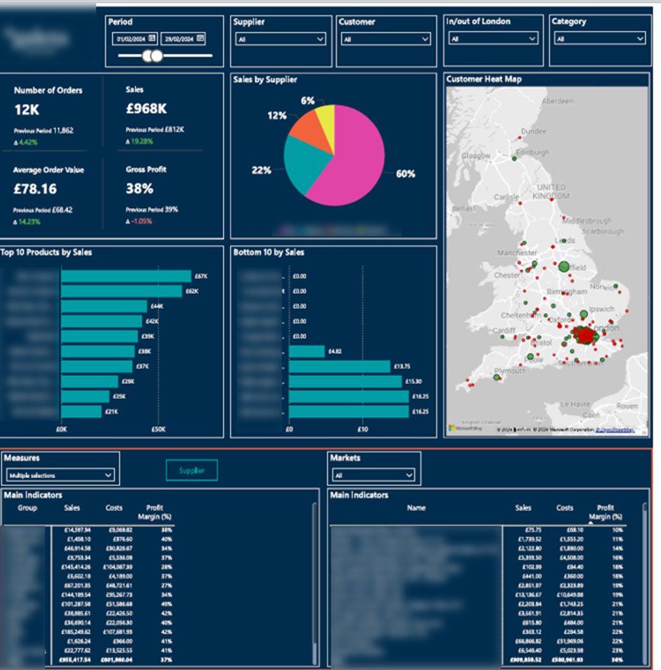
Revenue & Profitability Dashboard gives CFOs a clear view of how sales performance translates into profit across products, suppliers, and regions. By combining order-level data with profitability metrics, the dashboard helps finance leaders understand the factors driving revenue, margin performance, and sustainable growth.
The dashboard supports operational decision-making by breaking down sales and profit by supplier, product group, and individual product.
CFOs use supplier-level analysis to manage commercial relationships and identify dependency or margin risks. Top-10 and bottom-10 product views help determine which products should be discontinued, repriced, or promoted more aggressively. Geographic analysis reveals local market penetration and regional growth opportunities.
The flexible filters allow finance teams to tailor views for executive reviews, supplier negotiations, and pricing or product strategy discussions.
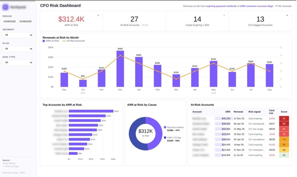
A CFO Risk Dashboard shows finance leaders where subscription revenue is at risk before it is lost. CFOs and finance teams use it at software and SaaS companies to protect renewal revenue and catch problems before contracts lapse. The dashboard combines billing data with signals from the customer success team, so financial risk and account health sit in one view.
As a Stripe certified partner, we built this dashboard for a B2B software company using data from Stripe and their CRM. It flags two kinds of risk: payment methods that are about to expire, and accounts the customer success team has marked as at risk. Each account is scored and ranked, so the highest-value risks stand out at a glance.
The dashboard breaks exposure down by renewal month, so CFOs can see when at-risk revenue is due and plan ahead. A ranked list surfaces the top accounts by value, and a cause split shows how much risk comes from expiring cards versus customer success flags. Together, these views answer the first question a CFO asks: which accounts, worth how much, and why.
Finance and customer success teams use the account table to act on each risk before the renewal date arrives. Every row pairs the revenue at stake with the reason and the card expiry date, so the team knows whether to request a card update or start a retention conversation. This turns renewal risk into a short, prioritised list of accounts to contact.
Watch the video of the dashboard installation guide here
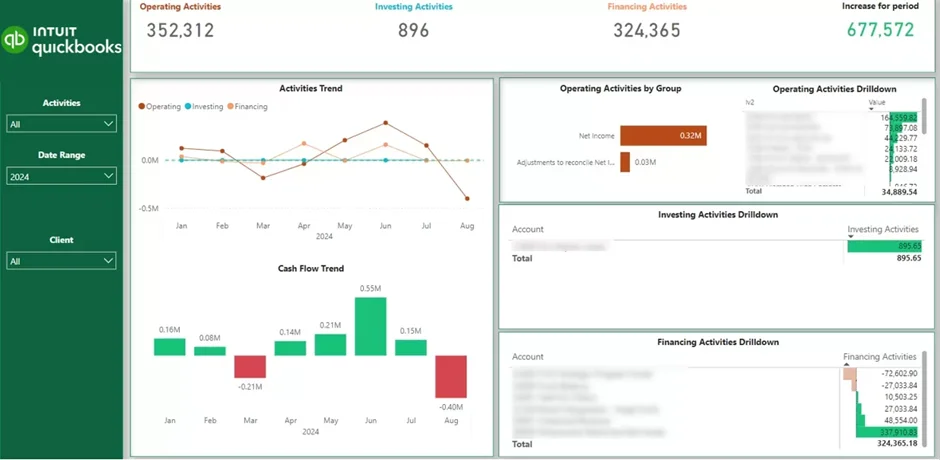
A Cash Flow Dashboard gives CFOs clear visibility into how cash reserves change over time. It shows whether the business is generating cash or consuming it. By tracking month-over-month movements, the dashboard helps finance leaders stay in control of liquidity and financial runway.
CFOs use this view to measure burn rate and understand what is driving cash consumption. It becomes clear whether cash burn comes from operations, growth investments, or financing decisions.
These insights support practical decisions. CFOs can adjust spending, slow down hiring, delay investments, or plan fundraising and financing activities before cash pressure builds.
Watch the connector and dashboard installation guide here
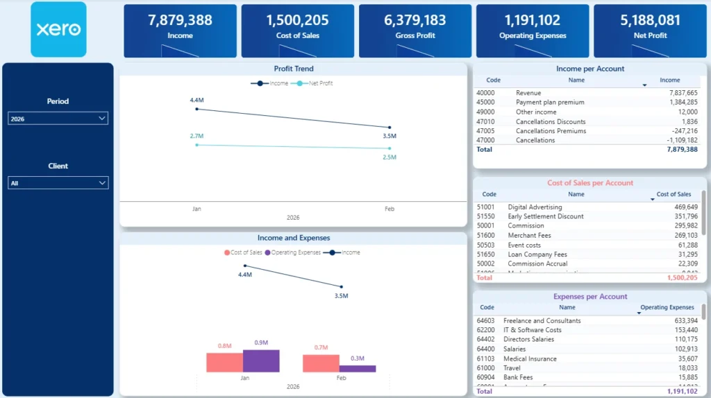
The P&L dashboard shows finance teams and business owners exactly how the business is performing month by month. It follows Income, Cost of Goods Sold (COGS), Gross Profit, Operating Expenses, and Net Profit over time, so you can see how your profitability is shifting and why.
The main chart plots the monthly movement of each core metric, which makes it easy to catch margin compression, creeping costs, or accelerating revenue at a glance. Alongside it, the tables on the right break Income, COGS, and Operating Expenses down by account, so you can pinpoint which accounts are behind any change in performance.
Our templates are ready-made with all the formulas included, so users just download and install. Watch the template installation video here
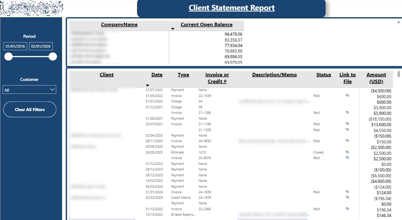
An Accounts Receivable Dashboard gives CFOs full visibility into outstanding customer balances and payment risk. Instead of relying on static aging reports, the dashboard shows who owes money, which invoices are overdue, and how receivables are trending over time. This helps finance leaders protect cash flow and reduce collection delays.
The dashboard centralizes all receivables data at the customer level. CFOs can quickly see which accounts require immediate attention and highlight them to the finance team.
By reviewing full trading history alongside open balances, CFOs gain context before taking action. This supports better decisions around credit limits, payment terms, and strategies to collect payments more quickly. The result is faster collections, improved cash predictability, and stronger working capital control.
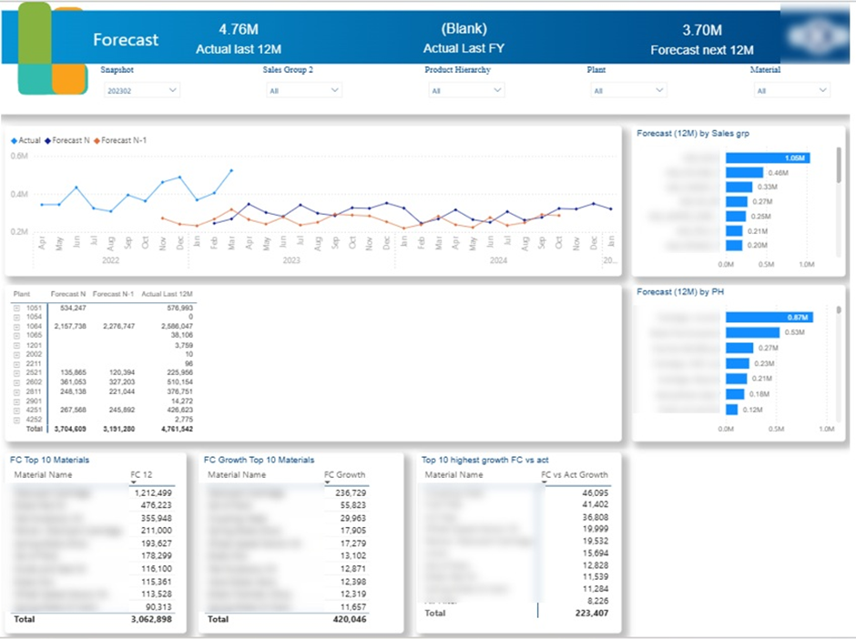
Financial forecasting is a core part of the CFO role. CFOs are expected to predict future revenue, plan cash requirements, and ensure the business is financially prepared for different growth scenarios. A Forecast Accuracy Dashboard helps CFOs understand how reliable their forecasts are and where assumptions consistently over- or under-estimate actual performance.
In my experience at Autodesk, the Power BI financial dashboards I built directly influenced forecasting decisions. Financial Directors reviewed actual performance in Power BI and then entered their forecasts into Anaplan. I later extracted forecast data from Anaplan and joined it with actual sales data in Power BI. This made it easy to compare forecasts against reality and measure forecast accuracy over time. While external tools like Anaplan are common, it is also common to calculate forecasts in Power BI using techniques such as linear regression.
When forecasts are reliable and improving, they provide the confidence needed to support expansion, approve additional resources, and commit to long-term operational decisions with lower financial risk. By comparing forecasts with actual results and pipeline assumptions, CFOs can advise whether hiring plans, inventory levels, and investment timelines are sustainable.
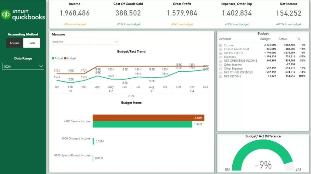
Budget tracking is a fundamental part of financial oversight. CFOs are expected to monitor whether the business is performing in line with agreed targets, explain variances to stakeholders, and make timely adjustments when performance deviates from plan. An Actuals vs Budget Dashboard gives CFOs a clear, ongoing view of how actual results compare against the financial targets set at the start of the year or quarter.
Unlike forecasts, which can be updated weekly to reflect the latest assumptions, budgets are fixed targets. They are typically set once a year or once a quarter and represent the financial commitments the business has made. This makes the actuals vs budget comparison a measure of execution — not prediction.
The scope of the dashboard depends on how granular the budget is. Finance teams can build budgets at every level of the P&L or balance sheet, or keep them focused on specific areas such as sales by product or product group. The dashboard is built to match that level of detail.
When a CFO opens this dashboard, they can immediately see which areas of the business are ahead of budget and which are falling short. This allows them to have more informed conversations with department heads, challenge assumptions early, and make spending decisions before variances compound. For board reporting, the dashboard turns a time-consuming manual exercise into a ready-made view that is always up to date.
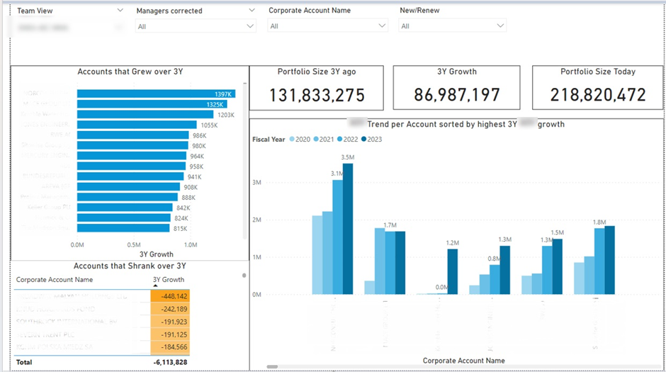
A Client Sales Dashboard helps CFOs understand how revenue from existing clients evolves over time. It provides visibility into which segments of the client portfolio are growing and which are shrinking. This allows CFOs to focus on sustainable growth rather than relying solely on new customer acquisition.
CFOs use this dashboard to spot patterns across the client base. It quickly becomes clear which countries and industries deliver the strongest growth and which consistently underperform. This insight helps CFOs guide strategic focus toward higher-growth markets and customer segments.
In one Power BI financial dashboard I created, the analysis showed that the fastest-growing accounts belonged to the same industry. CFOs used this insight to reassess commercial priorities and concentrate resources where portfolio expansion was most likely. In practice, dashboards like this enable CFOs to shape client strategy, reduce revenue risk, and drive growth by acting early on clear portfolio trends.
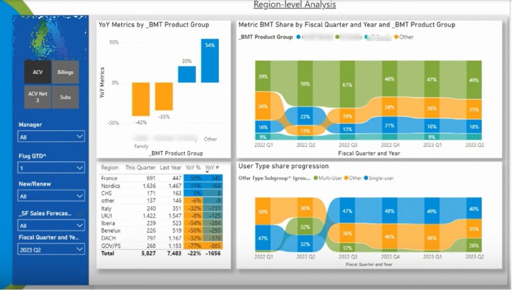
A SaaS CFO Dashboard gives CFOs visibility into subscription performance, revenue predictability, and in-quarter execution. In subscription businesses, revenue timing, renewals, and deal structure matter as much as total sales. This dashboard helps CFOs monitor how the quarter is shaping up and adjust expectations before results are locked in.
Metrics are broken down by subscription type, country, and product group. They are also split between new business and renewals. CFOs frequently compare performance to the same quarter last year and to the previous quarter to add context.
In my experience at Autodesk, Financial Directors used this dashboard throughout the quarter. They adjusted forecasts as new data came in, flagged performance changes to Sales Directors, and monitored linearity to assess execution risk. At quarter end, the same dashboard was used to review results, understand variances, and improve forecasting assumptions for future periods.
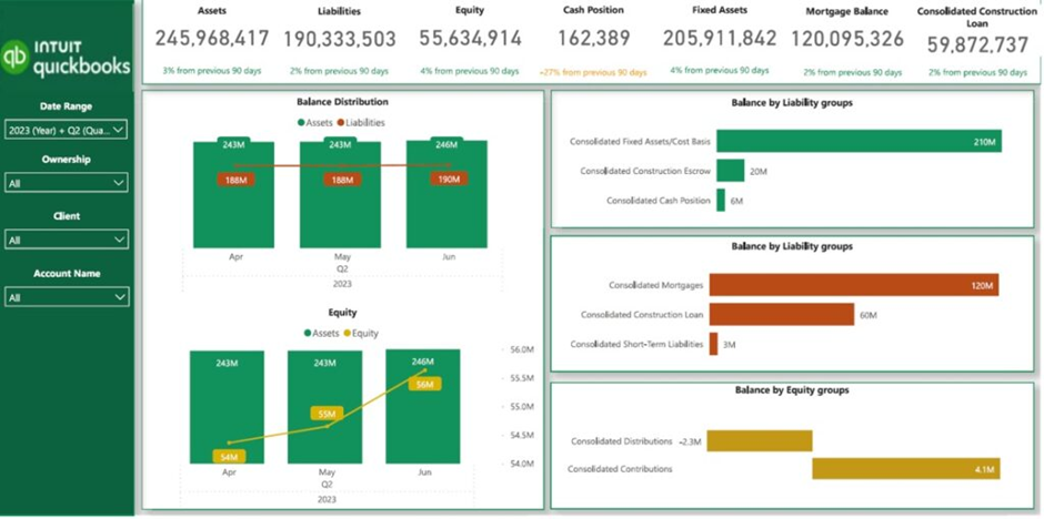
A Real Estate CFO Dashboard helps CFOs monitor financial health, debt exposure, and asset performance across a property portfolio. In real estate businesses, leverage is common, and profitability depends heavily on asset appreciation and rental income. This dashboard gives CFOs the visibility needed to balance growth, risk, and cash flow.
The dashboard compares assets against liabilities and breaks liabilities into clear groups. This allows CFOs to evaluate debt exposure and understand how leverage impacts overall financial health.
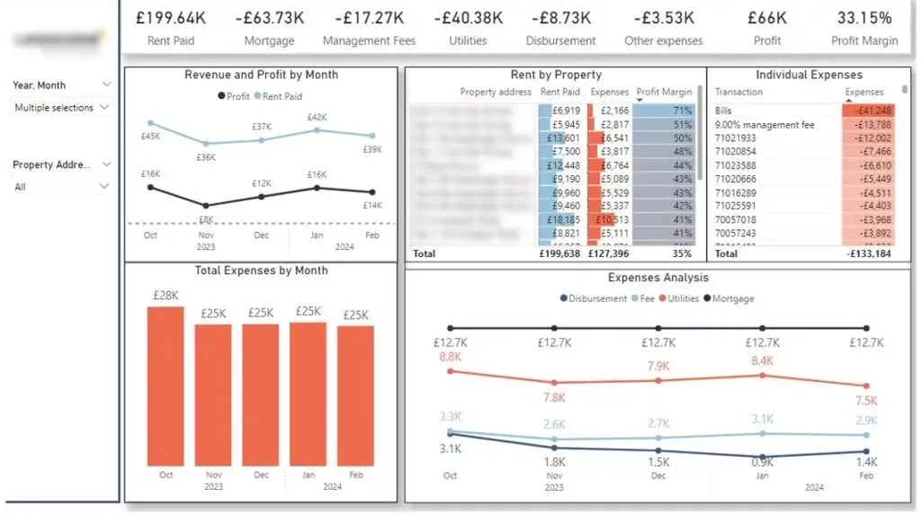
For rental portfolios, the dashboard provides a clear view of revenue, expenses, and profit by property. In one project, a client with 30 residential properties used this analysis to identify which assets generated the strongest margins. Monthly expense trends helped spot cost spikes early and trace them back to specific expense categories.
Property-level filtering allows CFOs to review rent and expense trends over time. This helps identify vacancies, plan for unexpected costs, and ensure cash flow remains positive across the portfolio.
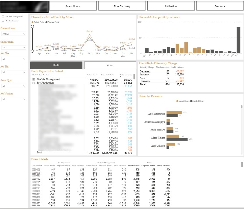
A Professional Services CFO Dashboard helps CFOs understand whether projects are delivering the profit that was originally budgeted. In project-based businesses, small changes in staffing, time spent, or delivery scope can quickly erode margins. This dashboard gives CFOs visibility into where profit leakage occurs and whether the business is improving its ability to meet budgeted targets over time.
The histogram at the top groups projects by profit variance brackets, such as +10% or +20% versus budget. This helps CFOs quickly assess how consistently the business delivers against its plans. Tables break down the main drivers of variance, including changes in resource seniority and excess time spent.
Filters allow CFOs to review performance by client and isolate problem accounts. The detailed event-level table at the bottom supports drill-down analysis. Together, these views help CFOs improve pricing assumptions, refine staffing models, and reduce profit leakage across future projects.
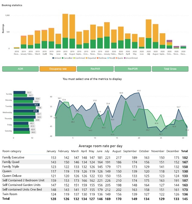
A Hospitality CFO Dashboard gives CFOs a single view of revenue performance and operational efficiency across hotel operations. Instead of reviewing disconnected reports, CFOs can track how rooms, food, drinks, and commissions contribute to overall performance. This dashboard supports faster decisions around pricing, capacity, and revenue optimisation.
The dashboard allows CFOs to select a key metric and analyse it across all charts. Metrics can be broken down by day of the week and compared year over year. This makes it easier to spot seasonal patterns and structural changes in demand.
Pricing analysis plays a central role in CFO decision-making. By reviewing average daily room rates by month and room category, CFOs can assess whether pricing strategies are aligned with demand. This insight helps refine rate structures, improve occupancy, and maximise revenue throughout the year.
All the dashboards shown in this article are based on real projects we have delivered for CFOs across industries. If you are considering building or improving your CFO dashboards in Power BI, we would be happy to help.
Contact us to discuss your requirements and see how a custom CFO dashboard can support better financial and operational decision-making in your organisation.


