

The Tableau dashboard examples you’re about to see were all built for real clients by Vidi Corp’s team of consultants – drawing from years of experience working with companies across a wide range of industries and business functions. Our Tableau consultants built over 1,000 dashboards for 600+ clients – the likes of Google, Heineken, and Delta, and we’re currently ranked #1 BI consultancy in the world by G2. Every single example featured here was created to solve a specific business problem for a real business.
These aren’t just templates you can copy & paste – each one was built to fit the client’s data sources, workflows and reporting needs. That’s why they look and behave so differently from anything you’ll find in Tableau’s template library. If you see something in this article that matches a need you have, then our team can build you an equivalent solution tailored to your business.
This article covers the most common types of dashboards we develop – from financial and sales dashboards to HR, supply chain and executive reporting. We’ll show you who uses them, what they do and how our clients have actually used them in practice. If you’d like to discuss a dashboard for your business, you can contact our team at the end of this article.
We’ve found that Tableau dashboards can be broadly grouped into three types: analytical, operational and tactical.
Analytical dashboards are all about deep exploration and root cause analysis – getting to the bottom of what’s going on.
Operational dashboards on the other hand, give you near real-time metrics so you can take action right now.
Tactical dashboards are all about tracking progress against medium-term goals and project milestones.
Each type is designed for a different audience and has a different decision-making timeframe in mind.
When it comes to analytical dashboards, the people who use them are usually data analytics teams, business intelligence consultants and department heads who need to get up close and personal with their data. These dashboards are all about scatter plots, heat maps, trend lines and multi-dimensional bar charts that help you spot patterns and test hypotheses. Data is usually refreshed on a daily or on-demand basis, and a single dashboard will typically have between 8 and 15 visuals on it so you can cross-reference and get a really deep understanding of what’s going on.
Operational BI dashboards are built for operations managers, logistics coordinators and frontline supervisors who need a quick read on performance right now. You’ll see things like KPI scorecards, gauges, status indicators and simple bar or line charts that highlight any deviations from targets. Data refreshes in near real-time or at very short intervals – often every few minutes – and these dashboards are kept nice and lean, typically with just 4 to 8 visuals on them so you can get a quick scan of what’s going on.
Strategic and executive dashboards are designed for the C-suite leaders, board members and senior managers who are tracking high-level business performance. They rely on summary metrics, trend lines, variance charts and geographic maps to communicate progress against long-term goals. Data is refreshed on a weekly or monthly basis, and the layout is designed to be intentionally concise – usually around 5 to 10 visuals – so you can see the key takeaways at a glance.
The following Tableau dashboard examples are a real showcase of what you can do with domain-specific data – turning it into clear, actionable insights across a range of industries. Each dashboard was built by our data visualisation consultancy for a real client to address a specific business need – from tracking operational performance to monitoring financial results. We’ll cover a cross-section of sectors to give you a sense of what Tableau can deliver in practice.
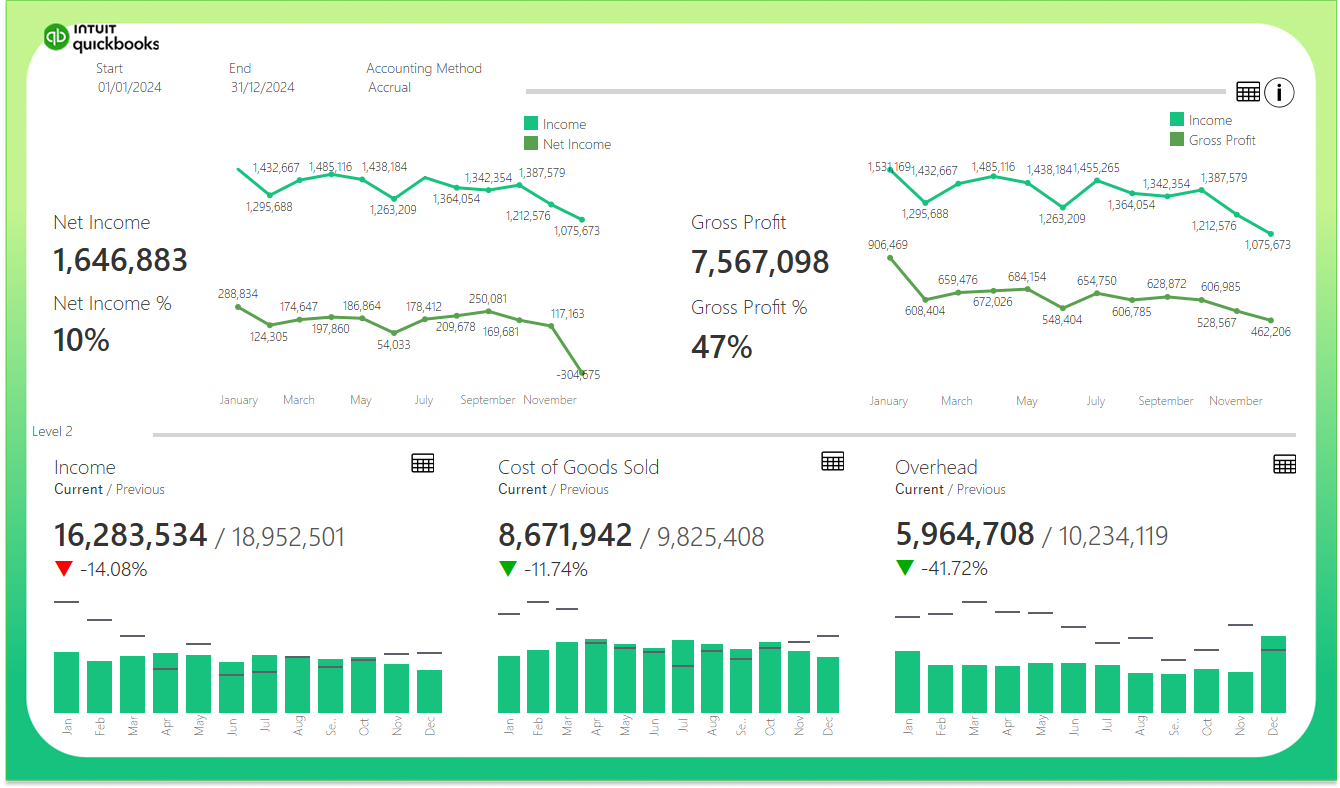
This Tableau finance dashboard is a game-changer for businesses that manage multiple QuickBooks Online accounts. This is a common setup in industries like retail, where each store has its own account. It takes all the data from each account, and consolidates it into one view – giving finance teams a single place to track income, costs and assets without having to manually build reports.
The dashboard is a bit of a powerhouse, with trend lines, scorecards, bar charts and detailed tables all in one place. Line charts show Income vs Net Income and Income vs Gross Profit over time, and a scorecard highlights the key differences between current and previous period results. Customisable filters let you switch between accrual and cash accounting methods, adjust date ranges and drill right down into granular category breakdowns across Income, COGS, Overhead and assets using a level parameter.
Finance teams use it to monitor monthly close results and get ready for board reviews – without having to build a new report each time. Fractional CFOs share it directly with clients as a performance update – and companies use it to keep investors in the loop, providing a consistent view of financial health that requires no extra work.

Our financial analytics consultants made this Tableau balance sheet dashboard, meant to be the obvious partner to the Profit & Loss view, the go-to tool for companies bringing multiple unifying reporting layers that make it easy for finance teams to get a clear picture of where the business stands at any given time without needing to jump between individual books or manually cobble together spreadsheets from multiple sources.
The layout is clean and information dense, with three distinct columns for Assets, Liabilities and Equity, each featuring horizontal bar charts that break down balances at the category level, colour coded in shades of green to reflect relative magnitude. Period-over-period percentage change indicators sit alongside each category, immediately flagging where balances have shifted significantly. Below the tables, summary scorecards compare current versus previous period totals with directional arrows showing the overall movement. Monthly bar charts spanning January to December reveal how each balance has trended throughout the year at a glance. Customisable filters at the top let users set the reporting window, toggle between accrual and cash accounting methods, and adjust the drill-down depth using the level parameter. This makes it easy to move between high-level summaries and granular account views depending on the audience or analysis required.
For finance teams, during the monthly close, it’s an essential tool – they use it to check that the balance sheet is in order before finalising the results, catching any weird swings in asset values or liability balances that need investigating. Fractional CFOs use it in conjunction with the P&L view to deliver a complete financial picture to their clients in one go, and companies prepping for board meetings or investor updates use it to present a consistent, always up-to-date view of their financial health that paints the full picture – and not just revenue and profit.
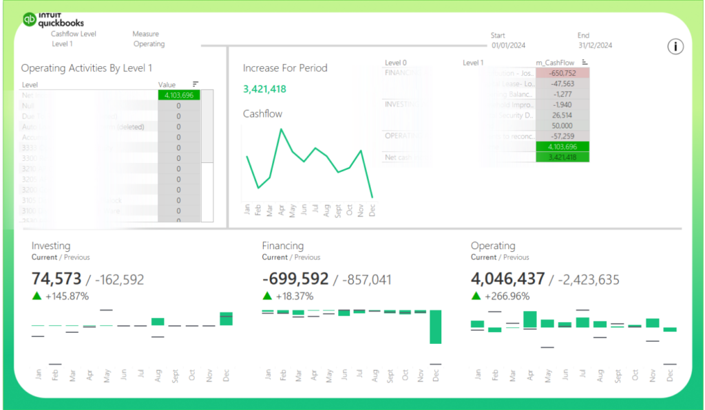
This Tableau cashflow dashboard is specifically built for companies looking to bring together multiple QuickBooks Online accounts into a single view. It’s designed to help businesses with multiple QB accounts get a picture of how cash is flowing in and out across Operating, Financing and Investing activities, saving them from having to pull cash flow reports from each account individually.
The dashboard development helps keep an eye on the big picture and still drill down into the details, if you need to. We’ve got a selection tool on the left so you can easily switch between cashflow levels and measures, while a detailed drill down on the right lets you see the data broken down into Level 0, Level 1 and Level 2 detail. It also sports a nice line chart that shows the overall cashflow trend over time – you can easily spot any patterns or dips in liquidity throughout the year. And to make things easy to compare at a glance, we’ve included three bar charts below that show current versus previous period results for investing, financing and operating activities. Each one comes with a KPI scorecard showing how things are tracking against last time, as a percentage change, and with an easy-to-read increase or decrease indicator to boot. Up at the top of the page, there are filters to let you select the exact time period you want to focus on.
Finance teams use it as part of the monthly close process to make sure cash movements are all as expected, and to investigate any weird swings before they get finalised. Our Fractional CFOs use it to present a complete picture of financial performance alongside the P&L and Balance Sheet to clients – all in one go. And for board meetings and investor updates, it gives a clear picture of your liquidity health with no need to do any manual prep – it answers the one question all stakeholders want to know: where is all the cash going to.
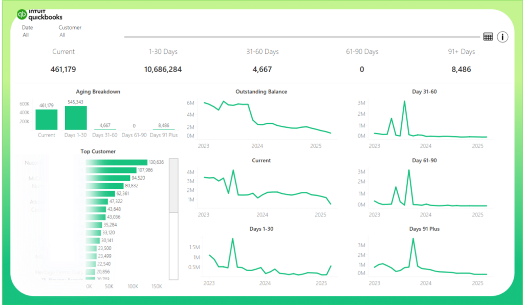
This Receivables dashboard takes financial business intelligence to the next level by giving businesses the ability to view all of their financials in one place. It gives finance teams a clear picture of what’s owed to them, who owes it, and for how long, without having to waste time digging through individual accounts.
The dashboard pulls together several different analytical tools that let you keep an eye on the bigger picture, but also drill down when you need to. The KPI cards right up top give you an at-a-glance view of total outstanding balances, broken down into different aging categories – right now, today, a week ago, two months back and so on – giving you a quick sense of how healthy your receivables are. The bar chart on the left shows you which customers owe the most, while the aging breakdown chart tells you where those balances fall in the different time periods – and it works both ways, so if you click on a customer, it filters the aging view, and if you select an aging period, it filters the customer view. On the right-hand side, you’ve got trend lines that let you see how those balances are changing over time – which makes it a lot easier to spot if the bad guys are actually starting to pay up, or if the problem is getting worse. And at the top of the page, you can use filters to zoom in on specific dates or customers for some really focused analysis.
Finance teams use it to get on top of collections, identifying the customers who are always late and where the money’s piling up before it becomes a crisis. Fractional CFOs share it with their clients as part of a regular check-in to highlight the cashflow risks that come from having customers who don’t pay on time. And for board meetings and investor talks, it gives you a clear, no-nonsense look at the state of your receivables that ties in perfectly with the P&L, Balance Sheet and Cashflow dashboards – so you can get a really complete picture of your business’s financial situation.

This Tableau operations dashboard is purpose-built for manufacturers who need to monitor direct spend tied to producing goods, designed in this instance for a biotechnology company manufacturing drugs. It consolidates operational expense data across laboratories, projects and cost categories into a single view, giving finance and operations teams clear visibility over where production costs are accumulating without having to pull reports from multiple sources.
The dashboard is structured around three time perspectives displayed prominently at the top: Programme to Date, Year to Date and Month to Date, each showing a headline spend figure that immediately contextualises the scale of expenditure. A treemap in the centre ranks the top ten vendors by quarterly spend, colour-coded to distinguish periods and sized to reflect relative magnitude. To the right, a detailed breakdown table segments expenses by cost category, including manufacturing services, laboratory consumables, outsourced manufacturing, technical analysis and more, with columns comparing Prior Month to Date, Month to Date, Prior Quarter to Date, Quarter to Date and Year to Date figures side by side. Across the bottom, three bar charts break down spend by individual project, showing both absolute values and percentage shares for each cost centre, such as animal and lab studies, laboratory operations, outsourced manufacturing and business development.
Finance and operations teams use it to maintain tight cost control over production spend, quickly identifying categories or projects where expenses are trending above expectations before they erode margins. Leadership relies on the multi-period comparisons to distinguish between one-off spikes and sustained cost increases that require intervention. For board reviews and programme governance meetings, it provides a clear, data-driven picture of direct spend efficiency that supports more informed decisions about resource allocation, vendor management and production planning.
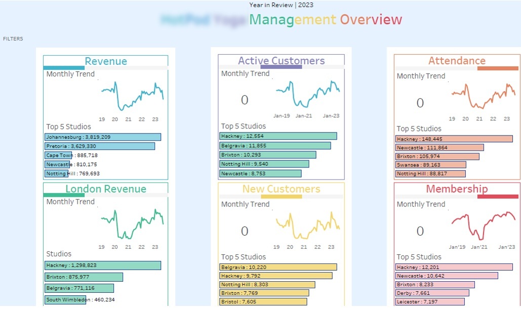
Our dashboard consultants built this Tableau sales dashboard for regional managers, franchise directors and senior leadership teams that oversee big fitness studio networks. We designed it for a UK, South Africa and Europe-based fitness company with around 80 studios – a mix of company-managed and franchised locations. The main challenge was giving leadership a single view of performance across a diverse estate where you couldn’t always compare direct and franchised studios side by side.
The dashboard tracks five Key Performance Indicators (KPIs) that are key to the business – revenue, active members, new customers, attendance and total memberships – each displayed in three different ways: a snapshot of the current total, a graph showing the trend over the past month, and a breakdown of where that total came from (location-wise). We’ve also built in a filter system that lets users split the studios by size of city, year they were opened, and whether they are franchised or not. That means a regional manager can boil down the numbers to just compare like-for-like places (say, newly opened suburban places versus established city centre places) in just a couple of clicks.
Leadership uses this to keep an eye on which locations are growing in membership and which are seeing attendance drop – without having to wait for those pesky manual reports from the regions. Meanwhile, the people in charge of franchises use the location breakdown to compare how franchised places are doing against company-run ones, all under the same conditions. And the filter bit is really useful when you’re doing strategic reviews and need to make quick decisions about whether to open new places or whether to shut underperforming ones, all based on clean, like-for-like data.
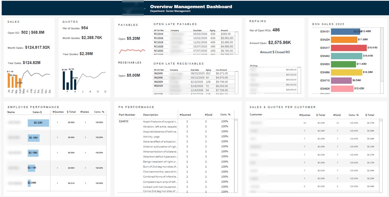
This executive Tableau dashboard was built by our team for all the C-level types (CEOs, COOs and CFOs) who need a bird’s-eye view of the entire business without having to dig into all those department-level reports. It shows the key metrics at the top level – sales performance, cash flow exposure and product mix – so they can quickly tell where their attention is most needed. This one doesn’t replace the operational dashboards, but rather acts as a high-level view that tells you where to go next.
You get to see sales figures for the current month and the year so far, alongside a breakdown by the individual who did the sales so leaders can get visibility into who’s doing what without having to get a separate sales report. We also show accounts receivable and payable balances along with the associated company name and the number of days they’re overdue so anyone can see at a glance if they’re starting to get into trouble. A sales breakdown by who the customer is and what they’re buying gives us a view of the high-value relationships and the products that are driving the most revenue.
The C-suite types use this executive dashboard at the start of the week to get a snapshot of where the business is at. If they see overdue receivables, it flags up that they need to chase up a client; if they see high payables balances, it helps inform cash management decisions. And the sales breakdown by item helps them spot which products are flying and which ones may need attention before they turn into a bigger problem.
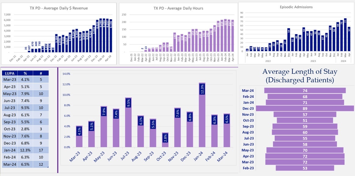
This healthcare Tableau dashboard was built by our healthcare business intelligence consultants for operations managers, clinical directors and finance teams working in care homes and home health networks in the US. One thing that’s particularly well-suited to healthcare is that Tableau can handle large volumes of patient and operational data while keeping the output accessible to non-technical users, a key requirement in environments where clinical and finance teams need to work from the same information. This dashboard gives leadership a view of care delivery, staffing and financial performance all in one place – without them having to pull data from multiple systems and then go through all the manual legwork.
The healthcare dashboard tracks average patient stay length, how many patients come in and out each month, average daily revenue and average daily hours worked – so teams can see how both care levels and resource utilisation are trending over time. Our dashboard also has an LUPA analysis module that tracks Low Utilization Payment Adjustment cases under PDGM, showing how many cases there are each month alongside how many of those cases triggered an adjustment. A branch-level filter lets clinicians and finance teams isolate locations with higher LUPA rates and see patterns before they affect reimbursement at a larger scale.
Home health agencies use this to spot LUPA risk early so they can recover revenue before a 30-day payment period closes without getting the right visits in. Operations managers use this to keep an eye on daily hours and admissions trends to ensure they’ve got the right staffing levels to match patient demand. Finance teams use the dashboard to track average daily revenue alongside LUPA exposure so they can see the real picture and spot where care delivery and financial performance need some extra attention.
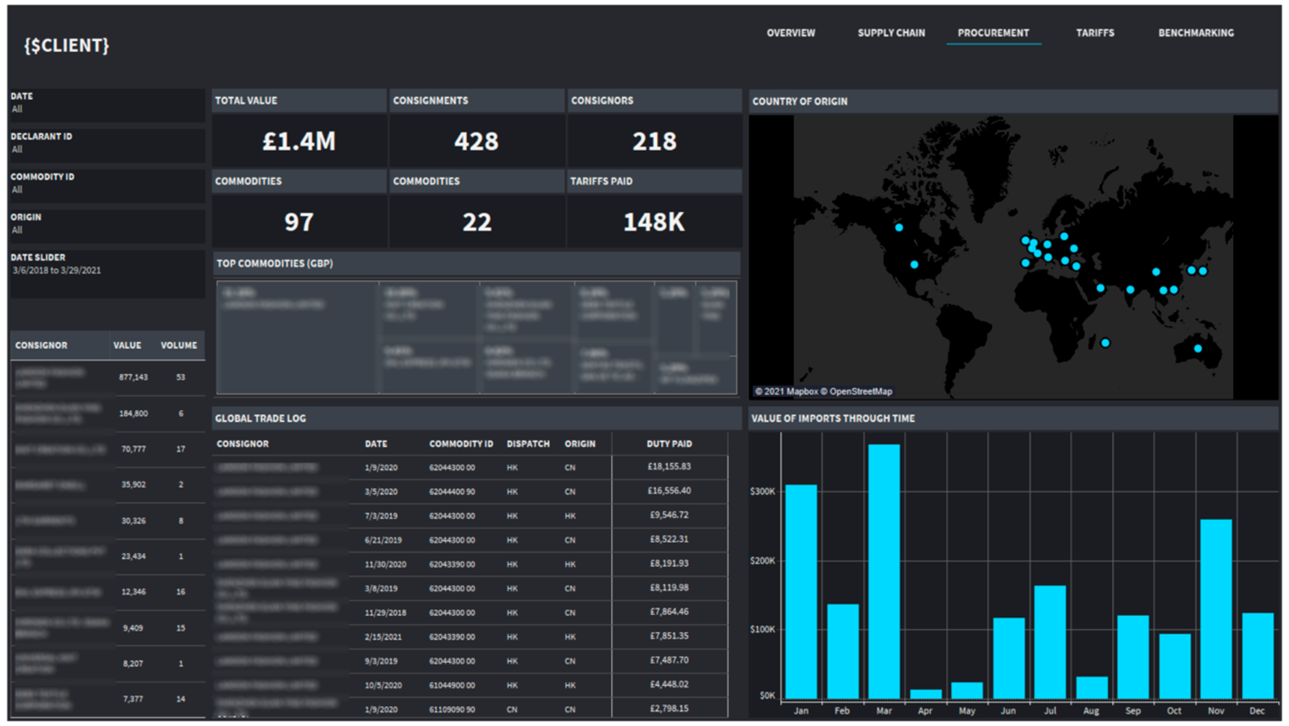
This supply chain Tableau dashboard was built by our team for importers, manufacturers, distributors and retailers managing cross-border logistics. This one consolidates shipment data, cost records and trade agreement classifications into a single view – so procurement and finance teams can get visibility into what their suppliers are up to, and how much they’re spending on imports without having to manually reconcile it all.
The supply chain BI dashboard tracks how much was shipped each month, how many consignments there were and how much in import tariffs was paid – all broken down by country of origin. It also shows which imports fall under preferential trade agreements and how many tariffs were claimed versus standard rates – so teams can quickly see where they’re benefiting from lower rates and whether they’re being used correctly.
The client’s financial impact was immediate. By comparing what they were paying in tariffs against the rates they should have been paying, this dashboard identified overpayments on preferential imports and quantified how much they could get back. They were able to recover overpaid tariffs directly – helping improve their cash flow and margin without having to change their supplier base.
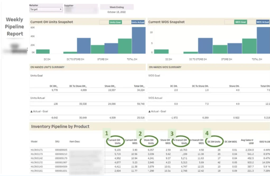
This inventory management Tableau dashboard was built by our retail analytics consulting team for consumer goods brands, wholesalers and manufacturers selling through big retailers. It gives sales and supply chain teams a clear view of stock levels at each store, weeks of supply and out of stock rates – so any inventory issues are spotted and actioned before they cause lost sales. The Dashboard keeps a close eye on inventory and supply levels for each product.
The dashboard does a great job of tracking on-hand inventory and how many weeks of supply you have for each product, along with the number of units sold each week and how often you’re out of stock. As soon as a particular product starts to run low – below target weeks of supply – the data makes it super clear that you need to get in touch with the retailer, pronto, and demand a restock. We built this dashboard for a client who was selling through Walmart and that’s when just how hard it could be to get a clear view of store-level inventory across a huge product range really hit home.
The client was able to identify products that were running low and use this data to open up some much-needed conversations with Walmart about getting more stock. And you know what? It worked – they saw additional orders and sales as a result. Over time, the dashboard really gave our client the upper hand in negotiations – no more guessing or relying on anecdotal evidence about what might be missing from the shelves. They had hard, real-time data to back up their requests.
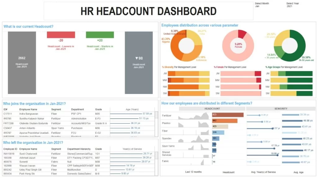
Our business analytics consultants at Vidi Corp built this Tableau dashboard for HR managers, people ops teams and senior leadership who need a clear, single view of the workforce. It’s designed to help organisations track headcount changes, see how diverse the workforce is, and identify trends and patterns at the department level. Rather than get stuck with a spreadsheet that takes ages to sort out, our clients now have a tool that pulls in all this data from multiple HR systems in one go.
The first thing you see on this HR dashboard is a summary of the headcount – how many people joined, how many left, and what the current headcount is. Then it breaks down the new joiners and leavers into a list, with details like age, gender and nationality. This gives HR teams a great picture of workforce diversity. Looking at the department level, you can see the current headcount, how many new people joined over the last 12 months, how long people are sticking around on average and what the average age is for each team.
HR managers use this to spot patterns in resignations and flag up the ones that keep happening in the same department. The diversity breakdown helps with reporting and lets leadership see how they’re doing on their hiring targets. Department heads use the tenure and age analysis to see which teams are getting too experienced and where they might need to think about succession planning.
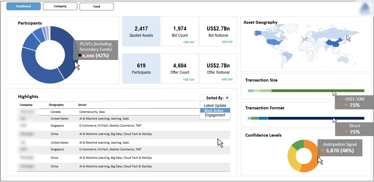
Our Tableau developers built a Tableau for procurement managers and compliance teams in the public sector who need to see tenders, bid activity and procurement patterns across the different regions and contract sizes. It needs to be clear and easy to read, because these teams are dealing with formal tender processes and need to be able to take a clear view of market engagement at each stage.
The dashboard tracks how many tenders are issued, how many people are participating, bidding and even making offers – so procurement teams get a complete picture of what’s going on. Tenders are then broken down by size and geography, making it easy to see where the competition is strongest and where certain regions or contract bands are often underserved.
Procurement teams use this to assess the health of their tender process and spot patterns that could mean low market engagement or supplier concentration in specific areas. The geographic breakdown helps leadership figure out the best way to reach out and develop new suppliers. The size breakdown helps with budget planning and makes sure that procurement activity is happening where it needs to be.
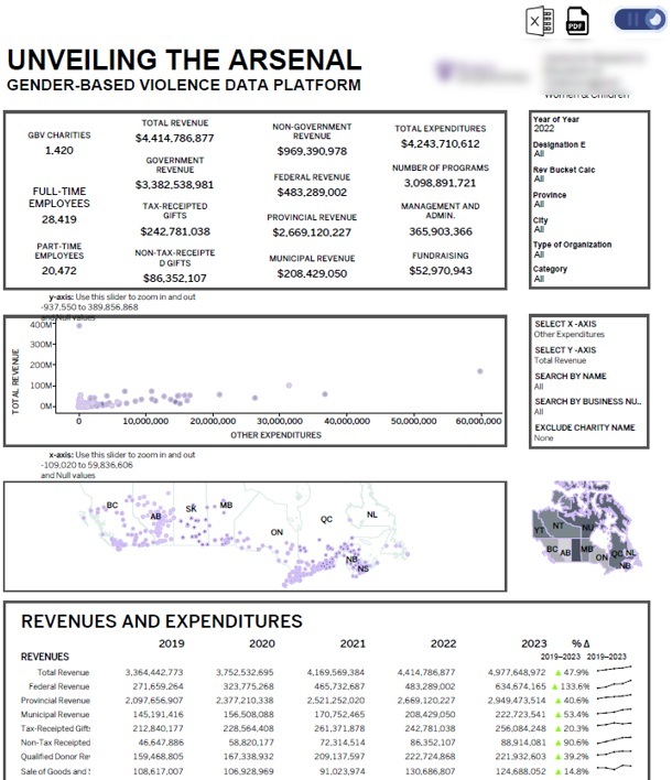
We built a dashboard for a global charity in Canada that does amazing work with women. This one is different because we built it to be shared publicly, so that donors, partners and even government agencies can see at a glance how funding is being used across the organisation’s programs.
The supply chain analytics dashboard shows total organisational revenue broken down by the sources of that revenue – so you can see where all that money is coming from. And then we drill down even further into the revenue by state – so stakeholders can see how the funding composition has changed over time. We also show the number of active programs running, so people can connect the dots between the money going in and the work being done.
The charity loves using this dashboard to show the world that they’re good stewards of donor funds. Governments can check that their grant allocations line up with what’s happening on the ground, and individual donors can see how their contributions compare to those of other donors. The geographic breakdown by state also helps with conversations between regional partners about where programs are working well and where there might be gaps.
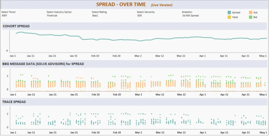
Our developers built an investment dashboard for private equity firms and asset managers who use data to drive buy and sell decisions. They’re all about monitoring financial assets in real-time and reporting back to their clients in a clear, consistent way. Common data sources for this type of analysis include Yahoo Finance, Benzinga and other financial market data providers.
The financial BI dashboard we built for a corporate bond investment company tracks bid and ask prices for their bond portfolio – so they can see how liquid their portfolio is and what the pricing is looking like. Data comes straight from live market feeds – not just end-of-day snapshots. This gives portfolio managers a clear idea of when to get in or out of a position.
Portfolio managers use this to inform their timing decisions – knowing when the market looks ripe for entry or exit on a given position. The dashboard also supports client reporting, making it super easy for these firms to present performance data without having to build a new report every time. For private equity teams juggling multiple assets, this consolidated view replaces all the manual data pulls from different market data providers.
The secret to a killer Tableau dashboard is making sure it’s about the user, not the data. You design a dashboard around how the person actually uses it – placing the most important metrics right where they’re going to see ’em first, and structuring the rest of the info around the stuff that’s most important to the task at hand. A CFO’s dashboard is going to look and behave a whole lot different to one built for an ops manager, even when the underlying numbers are pretty much the same.
The visual layout is just as important as the data itself. Keep similar metrics grouped together, make sure the sizing and alignment are consistent, and use a limited palette of colours to make it easy for people to read – you reduce the mental effort needed to get the info out of the dashboard. Don’t go throwing loads of different chart types and bright colours at it, or people are going to have to spend too long trying to decipher what’s going on – slowing down decisions instead of speeding them up.
Making the whole thing interactive should be about adding clarity, not complexity. Filters, drill-downs and tooltips work best when they’re giving people extra context on demand – and the default view should be clean and focused on the main story. A well-designed Tableau dashboard answers the most important question right away, and gives people the tools to dive deeper only when they need to.
Getting a reliable Tableau dashboard up and running starts with getting your data prep in order. You need to be able to blend multiple sources, set up the right join logic, and get a clean data model going – that way every metric on the dashboard is pulling from one, consistent source of truth. Cutting corners at this stage can cause problems downstream – the numbers are going to look different depending on how you filter or which data source you use first.
Calculated fields and level-of-detail expressions give you the exact control you need to make sure metrics behave the way you want them to, no matter what view or filter is being applied. Rather than relying on raw data fields, these tools let you define consistent measures – like revenue or headcount – that are going to work right whether you’re filtering by region, time period or product line.
Performance is your third pillar. If your business intelligence dashboards are too slow, people will stop using them – and that means data volumes are growing, but the interactivity just isn’t there. You can keep your dashboards responsive at scale by using efficient extract design and incremental refresh strategies – and that means people are still going to be able to interact with it even when the data is getting bigger.
Optimising for performance is also a matter of dashboard architecture. Cutting down on the number of visuals on a single sheet, reducing complex nested table calculations, and switching from live connections to extracts – these are the most reliable ways to get a responsive dashboard. One that loads quickly and responds to filters without delay is way more likely to be used consistently – and that makes performance a design decision as much as a technical one.
Tableau dashboards are only going to be as valuable as the impact they have on the business. The key KPIs – pipeline coverage ratio, average deal velocity, conversion rate by stage – give teams an early warning sign if performance is slipping before the final results are in. These metrics are ideal for operational and sales dashboards where decisions need to be made in real time.
The lagging KPIs – like revenue attainment, churn rate and gross margin trends – give you that retrospective view – confirming whether the business hit its targets and where performance deviated from plan. The executives and analysts usually anchor around these metrics, giving leadership the data needed to assess results and adjust strategy for the next period.
And don’t forget about dashboard adoption metrics. Tracking how often a dashboard is used, how long people spend in it, and which filters they use most often gives you a good idea if the tool is actually getting used in the day-to-day decision-making. Low adoption is usually a sign of a design or relevance problem – not a data problem.
The Tableau dashboard examples in this article illustrate how the right BI solution can turn complex, fragmented data into clear, actionable decisions – across industries, team sizes, and business functions. Whether the need is financial visibility, supply chain control, workforce analysis, or investor reporting – the principle is the same: the right metrics, structured for the right audience, in one place.
Vidi Corp has built Tableaus for clients in retail, healthcare, finance, logistics and the public sector. If you’ve got data that needs turning into a working dashboard, we’d love to help out. Get in touch with our team to start discussing your needs.
The best Tableau dashboard examples are the ones designed around a clear business decision. Common examples include finance dashboards, sales dashboards, operations dashboards, executive dashboards, HR dashboards, healthcare dashboards, supply chain dashboards and inventory dashboards. On this page, the examples are based on real client work across sectors such as retail, healthcare, finance, logistics and the public sector.
sing, transportation, and delivery.
A good Tableau dashboard should include the most important KPIs, clear visual hierarchy, filters for exploration and charts that match the question being answered. For example, operational dashboards often need concise KPI cards, status indicators and near real time updates, while analytical dashboards may need trend lines, heat maps and deeper drill downs.
The main types of Tableau dashboards are analytical dashboards, operational dashboards and strategic or executive dashboards. Analytical dashboards help teams investigate trends and root causes. Operational dashboards help managers monitor current performance. Strategic and executive dashboards give senior leaders a concise view of business performance over a longer timeframe.
An executive Tableau dashboard is best for CEOs, COOs, CFOs and senior leadership teams who need a high level view of performance without digging through department level reports. It should focus on headline KPIs, trends, variance and the areas that need management attention.
A Tableau finance dashboard can track profit and loss, balance sheet performance, cash flow, receivables and financial trends across multiple entities or accounts. For example, the finance dashboard on this page consolidates QuickBooks Online data into one view so finance teams can monitor income, costs, assets and period on period performance.
A Tableau sales dashboard can help regional managers, franchise directors and leadership teams compare sales performance across locations, regions, products or customer segments. A strong sales dashboard should make it easy to identify top performers, underperforming areas and changes in revenue over time.


