
A store performance dashboard gives retailers a single view of sales, inventory, promotions and customer behavior across every location, updated in real time. As retail operations grow more complex, spreadsheets and disconnected reports make it hard to spot trends early or react before they hit revenue. A well‑designed dashboard pulls every critical KPI into one place, so decisions get made faster and with more confidence.
At Vidi Corp, we build custom store performance dashboards in Power BI, Looker Studio and Tableau. Each one is fully automated, connected directly to POS, inventory and e‑commerce systems, and shaped around how the retailer actually operates. We’ve delivered retail analytics solutions for global brands including Ray‑Ban, Dermalogica and Chilly’s Bottles, and every example below comes from a real client build.
In this article, we will walk through real examples of store performance dashboards we’ve built for retailers. You’ll see how different dashboards support sales optimisation, inventory management, channel analysis, and customer retention, and how they improve day-to-day retail performance.
A store performance dashboard is a reporting tool that analyzes how a retail store performs across a range of key performance indicators. It consolidates operational and financial data into a single view, allowing management to monitor results in real time. Most dashboards rely on data extracted from point-of-sale systems.
Common data sources include POS platforms such as GoodTill, Lightspeed, and Shopify POS. We have experience integrating these systems into Power BI and automating data extraction to ensure reports refresh without manual intervention. The data can also be combined with inventory systems, e-commerce platforms, or internal spreadsheets to provide a complete view of operations.
A store performance dashboard allows retailers to monitor sales trends, inventory levels, promotion effectiveness, and customer retention in one place. Instead of reviewing separate reports, management can evaluate performance across multiple business areas at once. This supports faster decision-making and more consistent store management.
The right metrics depend on who’s using the dashboard, but most retailers need visibility across four areas: sales, customers, inventory and staff. The table below covers the KPIs we include most often in client builds, along with how each one is calculated.
| Area | Metric | What it tells you | How it’s calculated |
|---|---|---|---|
| Sales | Total sales | Overall revenue performance by store, category or period | Sum of all sales in the period |
| Same store sales growth | Whether existing stores are genuinely growing, excluding new openings | (Sales this period minus sales same period last year) ÷ sales same period last year × 100, for stores open in both periods | |
| Sales per square foot | How well each store uses its selling space | Total sales ÷ selling floor area | |
| Gross margin | How profitable sales are after product costs | (Revenue minus cost of goods sold) ÷ revenue × 100 | |
| Customers | Foot traffic | How many people visit the store | Count of visitors from door sensors or footfall counters |
| Conversion rate | How many visitors actually buy | Number of transactions ÷ footfall × 100 | |
| Average transaction value | How much each customer spends per visit | Total sales ÷ number of transactions | |
| Units per transaction | How well staff and merchandising drive add‑on sales | Total units sold ÷ number of transactions | |
| Returning customer rate | How well you retain customers after their first purchase | Returning customers ÷ total customers × 100 | |
| Inventory | Sell‑through rate | How quickly stock sells after it arrives | Units sold ÷ units received × 100 |
| Weeks of supply | How long current and incoming stock will last | (On‑hand units + on‑order units) ÷ average weekly units sold | |
| Inventory turnover | How many times stock is sold and replaced in a period | Cost of goods sold ÷ average inventory value | |
| Out‑of‑stock rate | How often products are unavailable to buy | SKUs out of stock ÷ total SKUs ranged × 100 | |
| Staff | Sales per staff hour | How productive your team is relative to labour cost | Total sales ÷ total staff hours worked |
You don’t need every metric on one screen. An executive summary might show total sales, like‑for‑like growth, gross margin and conversion rate across all stores, while a store manager’s view focuses on footfall, transaction value and stock availability for their own location. Pairing metrics also makes them more useful. Footfall on its own tells you little, but alongside conversion rate it shows whether a quiet day was down to fewer visitors or fewer sales per visitor.
You’ll see many of these metrics in action in the examples below, from weeks of supply in our inventory dashboard to conversion rate in the foot traffic dashboard.
Store performance dashboards consolidate data from multiple locations into a single, structured view. Instead of reviewing separate reports for each outlet, management can compare stores side by side and identify performance gaps immediately. This is especially valuable for regional managers overseeing dozens of locations.
These dashboards can also combine multiple data sources, such as POS systems, inventory databases, e-commerce platforms, and marketing tools. Bringing everything into one data model ensures consistency and eliminates fragmented reporting. As a result, leadership gains a unified view of revenue, profitability, stock levels, and customer behaviour across the entire retail network.
For example, we helped a CEO centralise six disconnected systems into one reporting environment, reducing manual data consolidation by 95% and cutting reporting time from 48 hours to under 5 minutes. This enabled daily dashboards instead of weekly or monthly reporting.
Store dashboards turn raw data into operational decisions. Retailers can use sales trends and current stock levels to identify slow-moving items, reduce holding costs, and decide what inventory to reorder and when. This reduces stockouts and prevents over-ordering of slow-moving products.
They also support marketing and commercial strategy. Teams can create targeted offers based on purchasing behaviour and evaluate the effectiveness of promotions by analysing changes in revenue, margin, and average order value. Instead of guessing what worked, management sees measurable results.
One retail client used automated reporting to track key revenue and profitability drivers across multiple businesses. The insights helped them identify unexpected expenses, optimise product selection, and protect cash flow tied up in inventory.
Store managers and retail executives operate in fast-paced environments. They do not have time to analyse spreadsheets or manually calculate KPIs. Visual dashboards present the most important metrics in a clear, structured format.
Interactive charts, filters, and automated commentary highlight trends, risks, and opportunities immediately. Managers can drill down into specific stores, products, or time periods without requesting new reports from analysts.
For example, a retail company that migrated its reporting into a centralised Power BI and SQL environment highlighted the importance of clear visibility and timely refreshes. The automated dashboards ensured data was always up to date and ready to use, with direct and timely communication supporting smooth adoption.
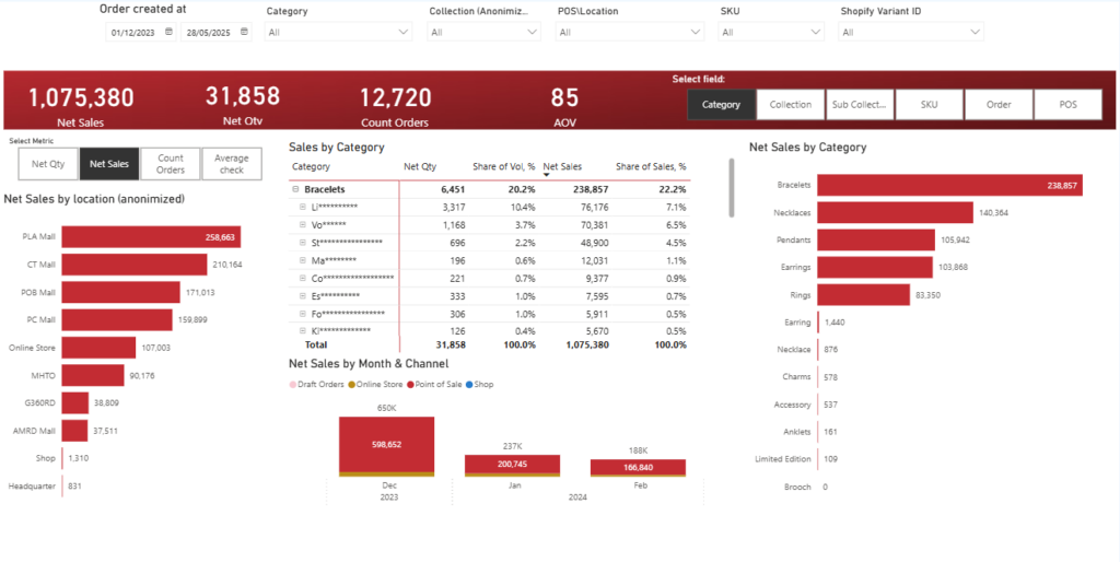
A retail store performance dashboard is designed for retail operations managers, regional managers, and executives who need visibility into sales and profitability across physical locations. It provides a clear breakdown of performance by store and product category. This type of dashboard is especially valuable for multi-store brands that need to monitor outlet-level trends and product mix in one place.
We built this Power BI dashboard for a jewellery brand that primarily sells through retail stores. The data is automatically extracted from Shopify POS using our Shopify connector and combined with the client’s internal spreadsheet that groups SKUs into collections and categories. The dashboard analyses key metrics, including Sales, Revenue, Average Order Value, and Number of Orders. Users can switch between these metrics using slicers and instantly change the breakdown by product category, collection, or sub-collection. Clicking on a specific store in the bar chart filters all other visuals, allowing management to analyse product performance at the store level with full drill-down capability.
This structure supports faster product and merchandising decisions. Management can quickly assess how newly launched collections perform compared to the core product line. Store managers can identify which categories drive revenue in their location. Regional leaders can compare outlets side by side and focus attention where margins or order values deviate from expectations.
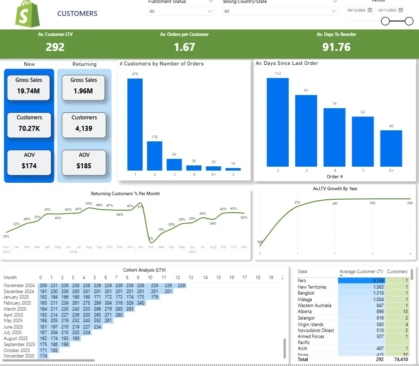
The Shopify Store Performance Dashboard is built for e-commerce founders and marketing managers who need to understand how customers behave after their first purchase. Using store performance dashboards, online retailers can gain valuable insights into customer preferences, allowing for personalized customer experiences. This dashboard focuses on retention, repeat purchasing patterns, and lifetime value. For brands running paid acquisition, this dashboard becomes a core decision-making tool.
We built this Shopify Customers Dashboard as part of our Shopify analytics template to analyse customer behaviour in depth. It begins by comparing new versus returning customers, alongside their associated revenue and average order value. A monthly line chart tracks the percentage of returning customers, helping teams monitor how effectively first-time buyers are converted into repeat customers. Another visual shows the distribution of orders per customer, clearly highlighting how many customers purchase once, twice, or multiple times.
The dashboard then analyses purchase timing and long-term value. A bar chart shows how many days customers take to place their second, third, and later orders, which supports email and paid reactivation planning. A lifetime value trend chart tracks how average LTV grows over time, helping ensure that customer acquisition cost remains below long-term revenue. At the bottom, a cohort table groups customers by their first purchase month and tracks LTV growth over time, making it clear how long each cohort takes to become profitable. Finally, LTV by state highlights the most valuable geographic markets, enabling smarter regional targeting and budget allocation.
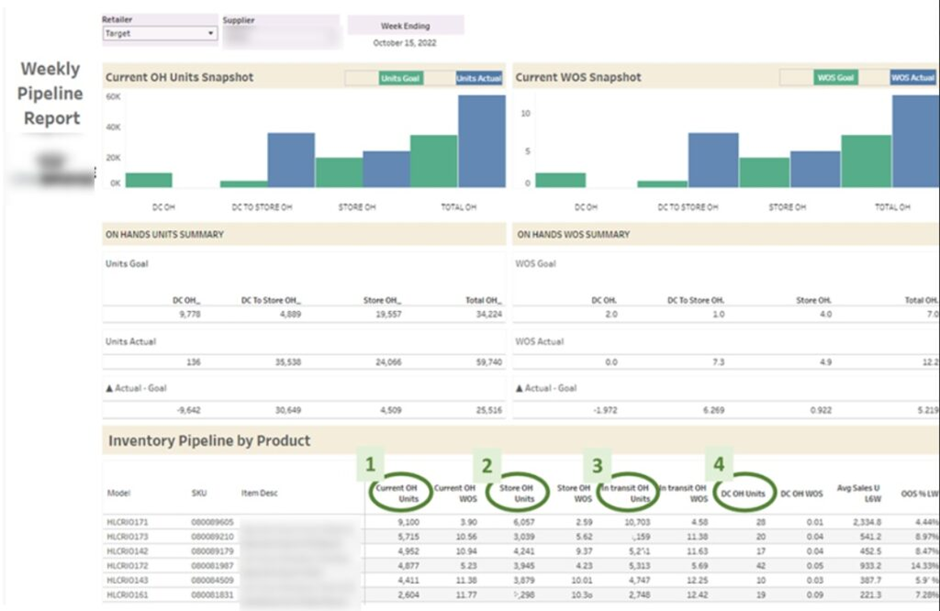
The Store Inventory Dashboard, also known as an inventory management dashboard, is designed for retail operations managers, supply chain teams, and buyers who need clear visibility into stock levels across stores and warehouses. It focuses on balancing demand with supply to avoid stockouts and excess inventory. This type of dashboard supports smarter replenishment and purchasing decisions.
Our BI consultants developed this inventory dashboard for a retail brand that needed tighter control over its product pipeline. The core KPIs include On-hand Units, which show how many items are currently available in stores and warehouses, and On-order Units, which represent stock that has been ordered but not yet delivered. These two metrics combine into Total Pipeline Units, giving a complete view of available and incoming stock. We also calculated Weeks of Supply by dividing Total Pipeline Units by Average Weekly Sales. This shows how many weeks the current pipeline can sustain demand. Another key metric is Units Sold Per Store Per Week, which normalises performance by dividing weekly sales by the number of stores stocking the product.
Beyond stock visibility, the dashboard analyzes weekly sales per product and calculates the average out-of-stock percentage. This highlights which products regularly run out and cost the company lost sales due to stockouts. These insights directly support conversations around increasing order quantities, adjusting replenishment cycles, and reallocating inventory between stores. The result is a more controlled supply chain process that protects revenue while reducing excess stock risk.
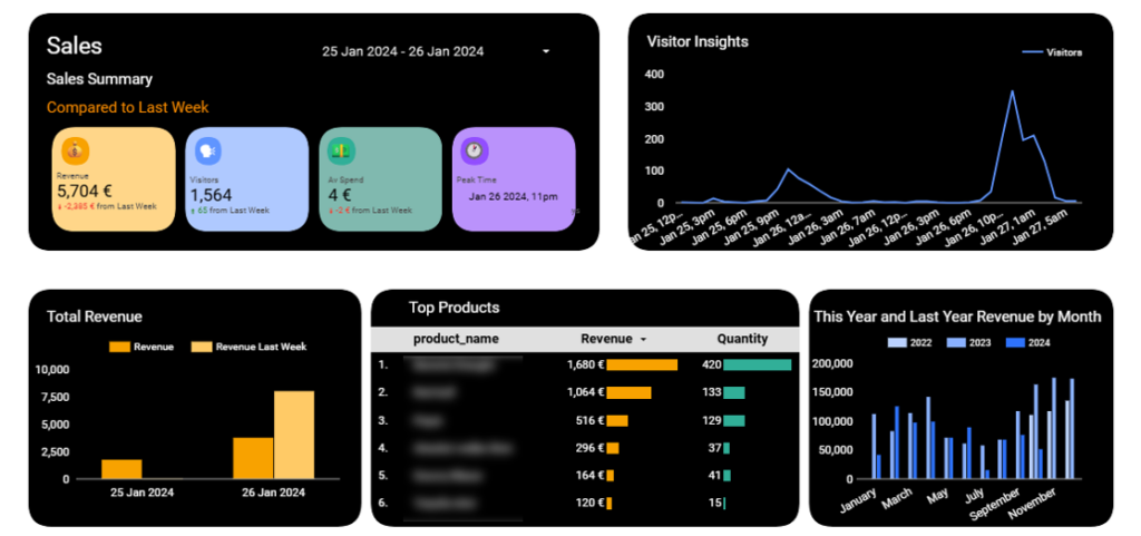
The Foot Traffic Dashboard is built for retail managers and operations teams who want to understand how store visits translate into sales. It connects in-store activity with revenue performance in one clear view.
Our Looker Studio consultants worked with a retail business that installed door sensors to capture the number of people entering the store. We automated the data extraction from these sensors and analysed footfall by hour. This data was then combined with revenue and quantity sold from the POS system, allowing us to evaluate sales performance alongside visitor volume.
This analysis helps retailers identify peak hours and measure visitor-to-customer conversion rates. Management can compare traffic patterns with sales trends to spot missed opportunities. The dashboard also supports smarter staff scheduling by aligning employee shifts with high-traffic periods, improving service quality while controlling labour costs.
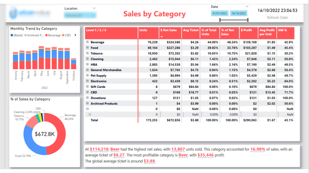
The Grocery Store Dashboard is designed for store managers, category managers, and retail executives who need a clear overview of category performance. It helps them understand which product groups drive revenue, volume, and profitability. This type of dashboard supports pricing, promotion, and assortment decisions.
Our Power BI developers built this dashboard to analyse sales by product category, including food, beverages, and tobacco. The main KPIs include revenue, units sold, average ticket price, profit, and profit margin. The charts on the left show monthly sales trends by category, while the pie chart visualises the percentage contribution of each category to total sales. At the bottom, an automated comment dynamically highlights the most profitable category and the category generating the highest sales for the selected period.
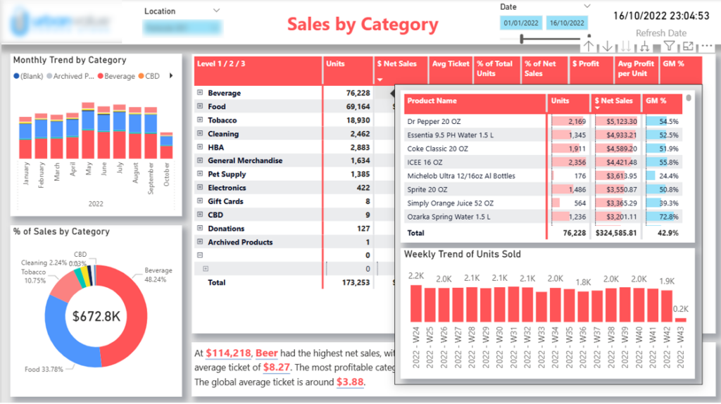
When users hover over a category in the table, they see a detailed breakdown by product, including sales, units sold, profit margin, and weekly trends.
This structure enables both high-level and detailed analysis in one view. Management can quickly identify which categories contribute the most to profit and which drive volume. Category managers can drill down into specific products to monitor margins and weekly sales trends. The automated commentary ensures that key insights are immediately visible, making performance reviews faster and more focused.
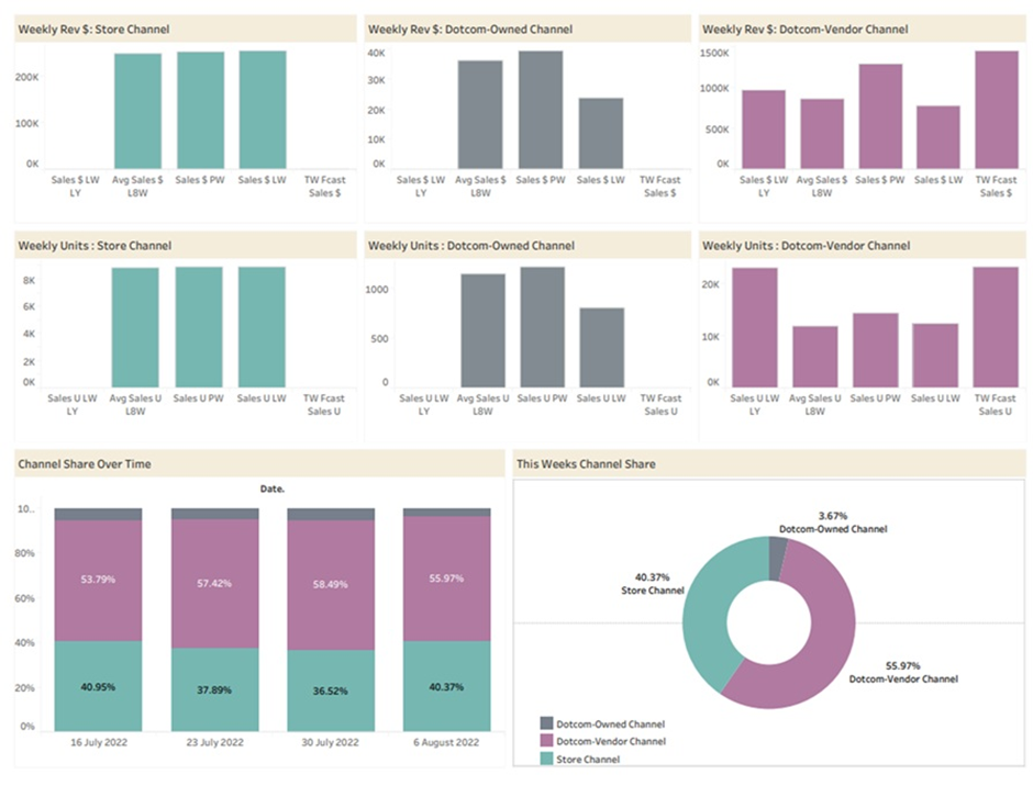
The Walmart Store Status Dashboard is designed for retail account managers, e-commerce managers, and brand owners who sell through Walmart’s brick-and-mortar and online channels. It provides a clear weekly view of performance by sales channel. This helps teams quickly assess whether growth is on track or requires intervention.
Our Tableau consultants built this dashboard for a retailer that distributes products through Walmart stores and Walmart.com. The report analyses last week’s sales, the average sales for the last eight weeks, forecasted sales for the current week, and sales for the same week last year. All metrics are segmented by channel, including physical stores and the online store. This structure allows management to compare short-term performance with historical trends and seasonality while clearly separating in-store and e-commerce results.
This channel-level visibility supports faster optimisation decisions. If online sales underperform compared to stores, the team can improve product images, refine descriptions, or adjust pricing and promotions. If brick-and-mortar performance declines, they can review packaging, shelf placement, or in-store marketing. By combining weekly tracking with forecasts and year-over-year comparisons, the dashboard turns Walmart data into a practical decision-making tool.
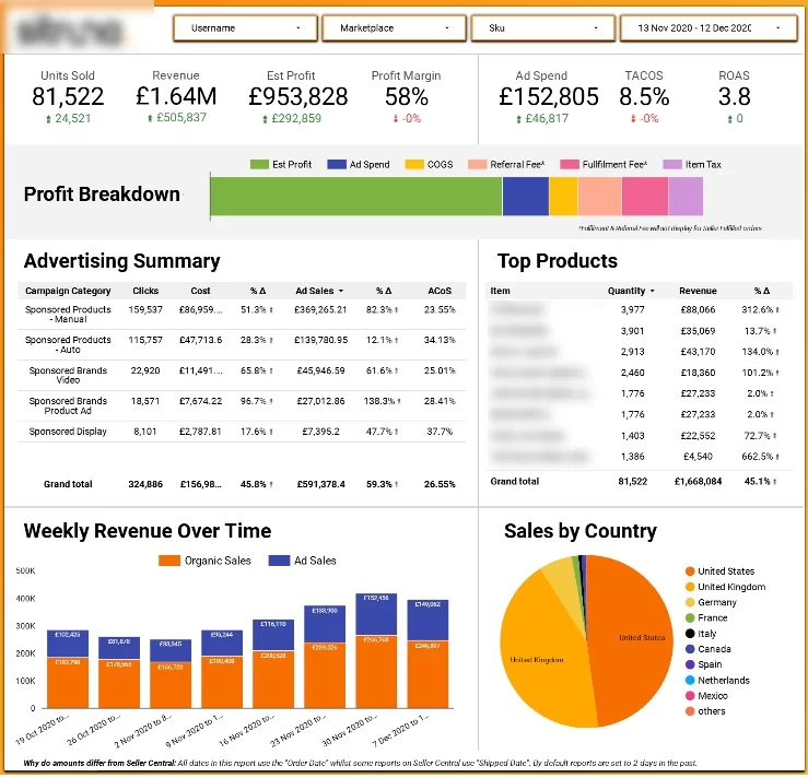
The Amazon Store Sales Dashboard is built for brand owners, e-commerce managers, and performance marketing teams who sell through Amazon. It combines organic sales from Amazon Seller Central with sponsored ads data from Amazon Ads. Analysing both together is essential to understand true profitability and growth.
We developed this dashboard for a retailer selling multiple products on Amazon. The top section shows high-level KPIs that measure overall performance and profitability. In addition to revenue and ad spend, we focus on Amazon-specific metrics such as ACoS (Advertising Cost of Sales), which shows ad spend as a percentage of ad-driven revenue, and TACoS (Total Advertising Cost of Sales), which measures ad spend against total revenue from both organic and paid sales. The dashboard also includes an advertising summary table by campaign, clearly highlighting where ACoS is highest and where optimisation is needed. Weekly trends compare organic and paid sales, while additional visuals break down performance by country and product.
This structure helps retailers optimise both advertising and organic strategy. Campaign-level analysis identifies inefficient ad spend and opportunities to reduce ACoS. Product-level insights highlight fast-growing SKUs that may benefit from increased budget or bundling strategies. By combining paid and organic performance in one view, the dashboard ensures that Amazon operations remain profitable and scalable.
Our store performance dashboards are developed in industry-leading business intelligence platforms such as Power BI, Looker Studio, and Tableau. We select the tool based on your existing technology stack, reporting requirements, and sharing preferences.
All dashboards are fully mobile responsive and can be accessed through dedicated mobile apps. This is especially useful for store managers, regional managers, and executives who are frequently on the move.
Whether visiting stores, travelling, or working remotely, you can monitor performance in real time directly from your phone or tablet.
Our dashboards are fully automated, covering data extraction, transformation, and refresh. We code direct integrations with your systems, such as POS platforms, inventory management tools, e-commerce platforms, and accounting systems.
Data refresh is scheduled multiple times per day, ensuring that your reports always reflect the latest performance without any manual intervention.
We implement role-based security to control data visibility across your organisation. If you want to share dashboards with store managers but restrict access to sensitive metrics such as profitability or margins, we can configure permissions accordingly.
This ensures that every employee sees only the information relevant to their role while maintaining full control over confidential business data
We build store performance dashboards in all three tools, and each one suits a different kind of retailer. Here’s how they compare for retail reporting.
| Power BI | Tableau | Looker Studio | |
|---|---|---|---|
| Cost | Low per‑user licence, free desktop authoring | Highest per‑user cost of the three | Free, with an optional paid Pro tier |
| Best for | Retailers using Microsoft 365, multi‑store networks, complex KPIs | Large retailers with analyst teams and complex visual analysis | Small retailers and e‑commerce brands working mainly with Google data |
| Data modelling | Strong, with Power Query and DAX for calculations like weeks of supply or like‑for‑like growth | Strong, with flexible calculated fields and relationships | Basic, with limited data blending |
| POS connectivity | Few native POS connectors, usually needs a custom or third‑party connector | Few native POS connectors, usually needs a custom or third‑party connector | Relies on partner connectors for most POS and e‑commerce platforms |
| Data refresh | Up to 8 scheduled refreshes a day on Pro, more on Premium | Scheduled extracts or live connections | Live connections, with data freshness set per source |
| Mobile access | Dedicated iOS and Android app with mobile layouts | Dedicated iOS and Android app | No dedicated app, reports open in a mobile browser |
| Role‑based security | Built‑in row‑level security, ideal for limiting each manager to their own store | Built‑in user filters and row‑level security | Limited, usually handled in the underlying data source |
| Sharing | Through the Power BI Service, Teams and SharePoint | Through Tableau Cloud or Tableau Server | Shared by link, like a Google Doc |
Power BI is our most common choice for store performance dashboards. It handles large volumes of POS and inventory data well, row‑level security makes it simple to give each store manager a view of their own location, and it fits naturally into businesses already using Teams, SharePoint and Excel. The licence cost per user is also low, which matters when you’re rolling a dashboard out to dozens of stores.
Tableau is a strong fit for larger retailers with in‑house analysts who want to explore data freely and build highly customised visuals. It’s excellent for detailed analysis across channels, as in our Walmart Store Status Dashboard, but the higher licence cost makes it less practical for wide rollouts to store‑level staff.
Looker Studio is free and quick to set up, which makes it a good starting point for smaller retailers or brands that already work in Google Analytics, Google Ads and Google Sheets. It has lighter modelling and security features, so it works best for simpler dashboards like our Foot Traffic Analysis Dashboard rather than complex multi‑store reporting.
A store performance dashboard is only useful if people act on it. Here’s the process we follow when building dashboards for retail clients.
Before choosing a single chart, agree on what the dashboard needs to help you decide. A regional manager comparing outlets needs a different view from a buyer trying to reduce stockouts. Write down two or three questions the dashboard must answer, such as “Which stores are missing their weekly target?” or “Which products will run out in the next fortnight?” Then pick the metrics that answer them directly. For store comparison, that might be sales, average transaction value and conversion rate. For inventory, it might be on‑hand units, weeks of supply and out‑of‑stock percentage. Aim for five to eight headline KPIs per page, and leave out anything that doesn’t change a decision.
Most store dashboards start with POS data from platforms such as GoodTill, Lightspeed or Shopify POS. From there, you can add inventory systems, e‑commerce platforms, footfall counters, accounting software or internal spreadsheets that group SKUs into categories. We build direct integrations so data is extracted automatically, which removes the manual exports that usually break reporting.
This is the step most DIY dashboards skip. Raw data from different systems rarely lines up, so store names, product codes and dates need to be standardised before anything is visualised. A proper data model also lets you calculate metrics like weeks of supply or units sold per store per week consistently, instead of rebuilding formulas in every report.
Put the most important KPIs at the top, then let users drill down by store, category or time period. Executives usually want a one‑page summary, while store managers need detail on their own location. Filters, slicers and automated commentary help people find answers without asking an analyst for a new report.
Schedule data to refresh several times a day so the numbers are always current, and configure role‑based security so store managers see their own store while sensitive figures like margin stay visible only to leadership. Make sure the dashboard works on mobile, since many retail managers check performance while visiting stores. Once it’s live, set a review rhythm, with daily checks for operational metrics and weekly or monthly reviews for trends, and assign an owner to each key metric so someone is responsible when a number drops.
A well-designed store performance dashboard gives retailers clarity, speed, and control. Instead of reacting to problems after they impact revenue, you can monitor sales trends, stock levels, channel performance, and customer behaviour in real time. With automated data integrations and clear visual reporting, decision-making becomes faster and more consistent across the organisation.
Whether you operate a single store or manage a global retail network, the right analytics framework can significantly improve profitability and operational efficiency. From POS integrations to inventory forecasting and channel-level analysis, custom dashboards turn your data into a structured decision-making system.
If you’re ready to build a store performance dashboard tailored to your business, contact us. Our BI consultants will assess your current setup, connect your data sources, and design a fully automated dashboard that supports smarter retail growth.
Most store dashboards track total sales, gross margin, conversion rate, average transaction value and footfall, alongside inventory metrics such as sell‑through rate and weeks of supply. Multi‑store retailers also compare like‑for‑like growth and sales per square foot across locations. The best mix depends on who uses the dashboard and which decisions it supports.
A good retail sales dashboard shows revenue, margin and average transaction value by store, product category and time period, with the ability to drill down into each. It should compare results against targets and the same period last year, so managers can see straight away where performance is off track. Automated data refreshes from your POS keep the figures current without manual exports.
A good retail dashboard puts five to eight headline KPIs at the top, with charts and filters below that let users drill into specific stores, products or dates. It’s clean, easy to read on mobile, and tailored to its audience, so an executive sees a network summary while a store manager sees detail for their own location. Automated commentary highlighting the biggest changes makes it even quicker to use.
Common retail examples include store sales dashboards, inventory dashboards, foot traffic dashboards, customer retention dashboards and channel dashboards for marketplaces like Walmart or Amazon. Each focuses on a different part of the business, from stock availability to repeat purchasing. You can see seven real examples we’ve built for retail clients earlier in this article
Start by setting targets for the metrics tied to each store’s goals, such as sales, margin, conversion rate and stock availability. Then compare actual results against those targets, previous periods and other stores in your network. A dashboard makes this ongoing rather than a monthly exercise, because the comparisons update automatically.
Power BI, Tableau and Looker Studio are all strong options. Power BI suits retailers already using Microsoft tools and offers powerful data modelling at a low cost per user, Tableau is well suited to complex visual analysis, and Looker Studio is a free, simple option for businesses working mainly with Google data. We recommend a tool based on your existing systems, budget and how you want to share reports.


