
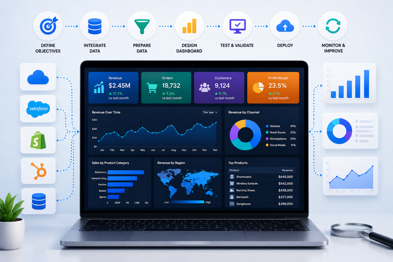
Dashboard development is more than just slapping some charts on a screen, it’s all about crafting the design and build of a dashboard that really helps business move forward by keeping performance visible , without having to rummage around in spreadsheets or juggle multiple systems. A great dashboard ties everything together – KPIs , trends and operational data – into one clear picture, so that your teams can spot potential problems way earlier and make some truly informed decisions along the way.
As a dashboard development agency, we help businesses build automated dashboards in Power BI, Tableau and Looker Studio. Generally our work involves grabbing data from a range of sources such as CRMs, ERPs, accounting platforms, marketing tools, SQL databases, APIs and cloud applications – then turning it into clear reporting that really matters to finance, sales, marketing, HR, ecommerce, operations and exec teams.
In this article we’ll take a closer look at what dashboard development actually is, how the whole development process works, what good practices make dashboards easier to use and which of the standard tools are most commonly used. We’ll also give you some lowdown on top dashboard development agencies and share some real world examples of what makes a great dashboard for different business needs.
Dashboard development’s all about creating & keeping up those dashboards that help businesses keep an eye on how they’re doing, make sense of any trends, and make good decisions a little quicker. Dashboards take data from loads of different systems & squish it all into one spot, showing KPIs, how things are running & business trends in real time.
Modern dashboards have all the usual suspects – data integration, KPIs done right, data getting turned around so it’s usable, visualising that data in a way that makes sense, automation to cut down on work, and keeping security tight. Depending on what the project is all about, dashboards might hook into CRMs, ERPs, accounting platforms, marketing tools, a SQL database or a cloud app.
Different industries have their own special kinds of dashboards. For instance:
The end goal of dashboard development isn’t just to show off the numbers. A properly done dashboard should help teams spot problems fast, see how they’re doing against targets, and make decent decisions to move the business forward.
At Vidi Corp, we’ve put together dashboards for finance, sales, ops, HR, ecommerce, and marketing teams in all sorts of industries. Some of our projects have been about getting data from loads of systems & churning it into an automated reporting environment that improves reporting speed and load. For example, we got one client down from 48 hours to under 5 minutes to get their reports done after we set up some automated dashboard infrastructure.
The first thing to do when building a dashboard is figure out what you’re hoping to get out of it. That means tying it to a specific goal – something like a key business objective or operational target rather than just asking for a bunch of reports.
Once you know what you’re trying to achieve, the next step is to figure out how you’ll measure success. That usually means picking out key performance indicators (KPIs) that will tell you if you’re on track or not. And ideally, these KPIs should help you answer some pretty practical business questions like:
At Vidi Corp, we normally kick off any dashboard project by jotting down all the business questions our client has been wanting answers to. We then group those questions together into sections of the dashboard and work out what kind of formulas, charts, filters & drill-down options we’ll need to put in place to help them make some decent decisions.
Take, for example, the time we built a Power BI sales dashboard for a client who was struggling to get a handle on which stores, product categories, and collections were driving all that revenue growth.
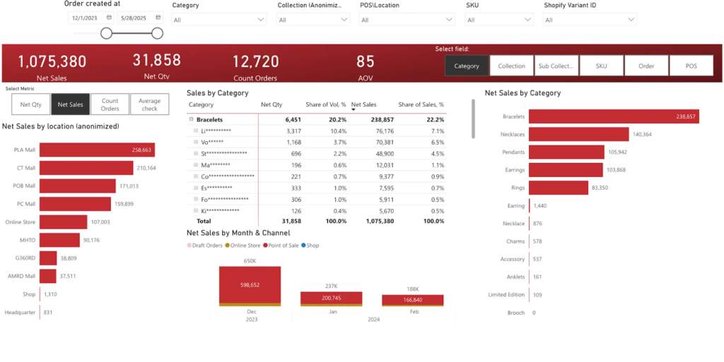
Based on their goal, our Power BI consultants came up with KPIs like sales, revenue, average order value, number of orders, sales per store and sales broken down by product hierarchy – you get the idea. We also made sure the dashboard allowed users to quickly drill down on underperforming stores, categories and products by location, which really helped them make some more informed merchandising decisions and keep an eye on how their new collections were doing.
The KPIs you choose will depend on the type of dashboard you’re building. A sales dashboard might help managers figure out which reps are on target and which ones need some help, while a financial dashboard is going to be more about cash flow, margins and budget variances. And a product development KPI dashboard will be all about things like sprint velocity, feature adoption and release timelines.
Once you’ve defined what matters most to your business with those KPIs, the next thing you need to do is figure out where all that data is hiding and get it integrated into your new dashboard. The sad truth is that most businesses store their data in multiple places, so getting everything lined up for your dashboard is often a multi-system challenge. That often means slinging data from CRMs, ERPs, financial software packages, marketing tools, spreadsheets, databases, and all sorts of cloud apps into the mix.
At this point it’s time to ask yourself some key questions:
For a lot of dashboard projects, the answer to that last question is a whole lot of automation – specifically by building automated data pipelines that get rid of the need for manual exports and all that tedium of reporting delays. Depending on the systems you’re working with, that might involve building custom API integrations, using databases in the cloud, writing your own connectors, or setting up some kind of automation workflow.
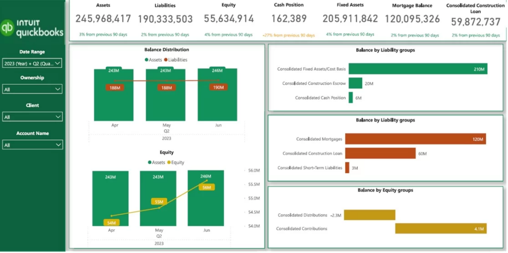
For instance, we did a balance sheet dashboard in Power BI that just magically pulled in financial data from QuickBooks Online using a custom Power BI connector we built in-house. That meant no more tedious Excel exports and the client was able to combine P&L, balance sheet, and cash flow reporting all in one place. The integration also meant that metrics like current cash position, total liabilities, retained earnings, and loan balances always, always stayed up to date.
Once you’ve got your data sources connected, it’s time to get ready for analysis. The truth is, raw business data is almost always going to be a mess – incomplete, inconsistent, and referenced in different ways across systems, so it really does need a good go over before you can even think about using it in a dashboard.
This whole process of getting your data into shape might involve:
The thing is, data has got to be well structured if you want anyone to take your reports seriously. Even if you’ve got a crackin’ good dashboard, it’s all for nothing if the underlying data is a jumble of inconsistencies and broken relationships between tables.
We’ve seen this play out first hand with a client, ProFundCom. They needed to migrate a clunky old PHP reporting system into something more modern using Power BI. We ended up needing to transform a bunch of SQL queries, PHP calculations, filters, and business logic into a clean, structured Power BI data model. The end result was a dashboard that matched the original reporting outputs but was way faster, more automated, and scalable.
Once the data is in shape, the next step is figuring out how to show that information to people in a way that makes sense to them. A good dashboard layout is all about making it easy to get a handle on how things are going, spotting any problems that crop up, and being able to jump in and out of different levels of detail easily. Great dashboards depend as much on thoughtful layout and usability choices as on the data itself, and interactive UX design courses are a practical way to sharpen those skills for dashboard work.
At this stage, the people designing the dashboard decide on:
Different kinds of dashboards need different levels of detail. For instance, the kinds of dashboards senior staff use tend to focus on high-level numbers and trends, while the ones used by day-to-day operations teams often have loads more detailed analysis and drill-down capability.
For example, the data visualization consultants here built an executive dashboard for the CEO of a marketing agency that put all the key numbers from finance, marketing, sales, ops, and HR in one handy view.
The dashboard tracked things like revenue, profit, number of leads, customer lifetime value, how much churn there was, how well they’re retaining clients, and which employees were actually doing the work.
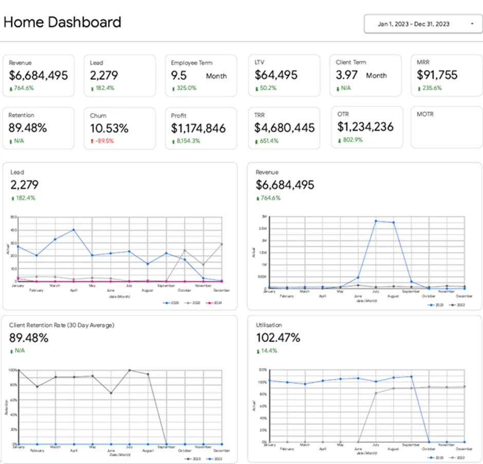
The idea was to design the layout so that leadership can quickly spot any issues and then only dive into more details when they need to. So if lead generation took a hit from one month to the next, the CEO can immediately jump into a more detailed marketing dashboard to figure out which channels or campaigns were slackening off. Similarly, if employee utilisation got a bit too high, leadership could quickly get a sense of whether they needed to bring in some more staff or start working with subcontractors to avoid burnout and delays.
Interactivity is a game-changer when it comes to turning dashboards from static reports into seriously useful tools for digging deeper and making quicker decisions. Instead of just looking at summary charts, users should be able to really get their teeth into the data to explore trends, spot issues and get a grip on performance from all sorts of different angles.
At this point, developers generally sort out the interactive bits like:
Navigation is also important to the overall UX of a dashboard. Many dashboards include buttons, bookmarks or tab-style navigation that let users jump between views like Overview, Sales, Marketing, Finance or Operations. This keeps reporting environments tidy and makes the dashboard a whole lot easier to get around.
Having some thought put into the interactivity can really pay off in terms of usability. For instance, selecting a region on a map might automatically filter all the other visuals on the page, or clicking a product category could reveal a more detailed profitability or margin breakdown.
Take, for example, the education dashboard we developed to analyse student attendance, absences and mobile app adoption across different groups and locations. The dashboard had interactive filters for date ranges, student names, gender and location, which let users quickly narrow down the analysis to the bits that mattered most.
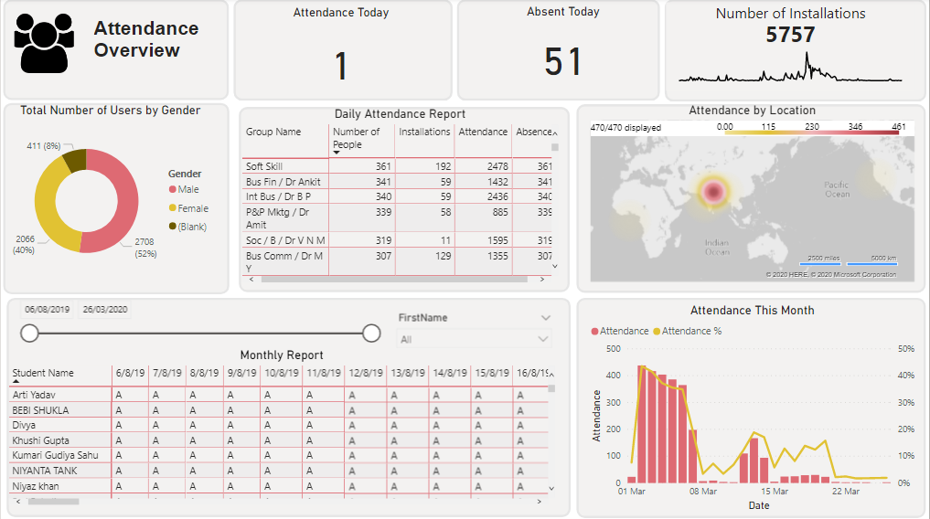
Users could then drill down from high-level attendance trends to see detailed records of individual students’ daily attendance and absence status. We also included export functionality so users could take the data and do their own analysis in Excel, and interactive charts that showed attendance in both absolute numbers and as percentages of the overall student body.
But when it comes to interactivity, balance is key. If there are too many filters, buttons or drill-downs, non-technical users are going to get lost. Lots of times, the best approach is to hide more advanced controls behind expandable “More Details” sections or secondary pages.
Finally, accessibility is another critical UX consideration when developing a dashboard. We believe that dashboards should use clear font sizes, obvious labels, strong colour contrast and intuitive navigation patterns so that everyone can use the thing comfortably.
Before you go live with a dashboard, it’s essential to put it through its paces to make sure it’s working like it should and that its data is accurate. Even tiny mistakes in the way you calculate things, apply filters, or tie related tables together can lead to misinformed reports and bad decisions.
When checking over a dashboard, developers usually make sure:
To wrap up testing, you need to do both the technical checks and the business end of things. Dashboard numbers are often compared to numbers from things like accounting systems, spreadsheets, or legacy reports to make sure the analysis is on track.
It’s also vital to test how users actually interact with the dashboard in the real world. For instance, the exec team may want to make sure KPIs update correctly when they apply some filters. Meanwhile, the ops team will likely want to test that drill-down analysis spits out the transaction-level detail they need to get the job done.
User acceptance testing is super important at this stage too. It’s a chance to double-check the dashboard is set up in a way that makes sense to the teams that actually use the data day in and day out.
Once you’ve got the dashboard tested and looking good, it’s time to get it live with the end users. On top of that, we want to make sure that folks get the latest and greatest info, without having to rely on those tedious manual exports or even worse, trying to get something out of a spreadsheet.
At this point in the process, what you’ll usually need to do is:
Dashboards usually end up getting deployed through some business intelligence platform like Power BI, Tableau, or Looker Studio – but the choice is usually going to depend on what the client needs and what they’re already using.
Once it’s deployed, the dashboard can just refresh on its own – whether it’s every so often or pretty much as soon as you need the latest numbers. Job done.
Automation is a big deal for ops and exec reporting. Without refreshing automatically, teams tend to fall back to those old manual exports and spreadsheet nightmares.
Take for example a marketing agency we worked with, they were having to do automated reporting for over 80 clients – that was a huge job, and they’d hooked it all up to platforms like Google Ads, Facebook Ads, GA4, SEMrush and lead generation systems. We helped them automate all of that, and it saved them over 50 hours a week, and also – pretty impressively – upped the accuracy of their reporting to 40% across all their dashboards.
Developing a dashboard is rarely a done-and-dusted affair. As a business grows, new requirements for reporting pop up, new systems get added to the mix, and teams find themselves needing extra Key Performance Indicators (KPIs), filters, integrations or the ability to really drill down into data.
The day-to-day reality of keeping your dashboard up to speed usually involves:
It’s not uncommon to see dashboards start out as simple reporting tools but then grow into much more sophisticated business intelligence platforms that help out loads of different departments and inform decision-making.
We often work with clients who start with a single dashboard then end up building out a much bigger reporting framework that covers everything from finance and operations to marketing, sales and executive reporting. As a business gets more mature in terms of its reporting, it usually ends up needing more automation, deeper analysis and more integration to cope with growing pains and shifting operational needs.
Cutting Down the Visual Noise
Clutter is a real party pooper when it comes to dashboards – it takes the main event and basically tells the viewer to “look away”. Too many colours, duplicated labels, pointless gridlines and way too much text all contribute to a visual nightmare.
Now, I’m gonna give you a quick tip: to make your dashboard easy to scan, try leaving some white space. Let visuals breathe and take up some room to be seen.
Using Colour With A Plan
Colour isn’t just about picking something nice to look at – it’s about helping the viewer get your message quickly. Bright or over the top colours can make a dashboard a real strain on the eyes.
It’s also a good idea to be consistent in how you use colour – for instance :
Pick The Right Visualisation Tool For The Job
Not all charts are created equal – some are better suited to certain types of analysis than others. Picking the wrong one can make insights about as useful as a chocolate teapot.
Here’s an example :
And the key, as always, is to keep things simple and clear.
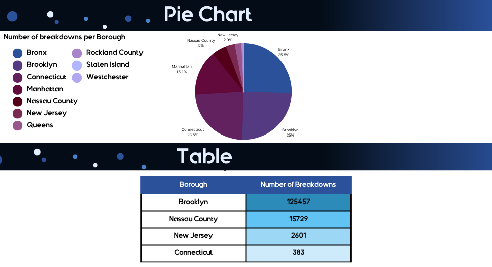
Pie Charts: Use Them Wisely
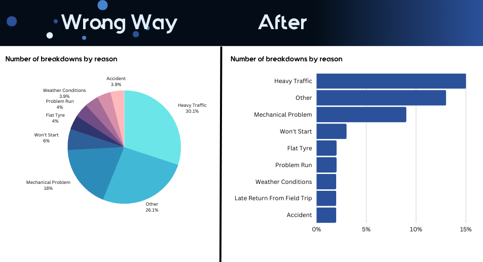
Pie and donut charts are tricky to get right. Avoid using them when you’re trying to compare loads of categories. Bar charts and stacked charts will probably come out on top in those situations.
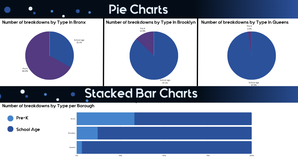
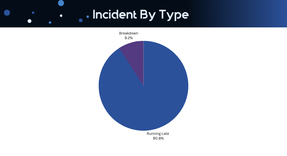
But – and this is a big but – pie charts can be a good choice when you’re looking at just two categories at a time.
Use Tables When Needed
Not all data needs to be turned into charts. Sometimes a simple table or pivot table will make things more clear and reduce the overall clutter.
This is especially useful when you’ve got a dashboard that’s getting a bit too busy to handle – too many lines, colours or overlapping trends making things hard to interpret.
There are loads of dashboard development tools out there, but the reality is that most business dashboards these days are built using Power BI, Tableau or Looker Studio. The platform you choose depends on all sorts of factors – how complicated your reporting needs are, the tech stack you’re already using, and what level of interactivity or automation you need. Teams may also compare a Thoughtspot alternative for easier self-service analytics.
Power BI
Power BI is probably the most widely used platform out there for business reporting and analytics – and for good reason. It supports interactive dashboards that let users drill down, automated refreshes, and integrations with loads of different data sources.
People use Power BI for all sorts of things like:
It’s especially popular with businesses that already use Microsoft tools like Excel, Azure, Dynamics 365 or SQL Server.
Tableau
Tableau is all about the visual side of things – it’s got some of the most advanced visualisation capabilities out there and is super flexible when it comes to exploratory data analysis. Big enterprises that need highly interactive dashboards and can handle large scale reporting environments love Tableau.
People use Tableau for things like:
The drag-and-drop interface makes it easy to use for business analysts and self-service BI teams too.
Looker Studio
Looker Studio is a cloud-based tool that’s primarily used for marketing and ecommerce reporting – and it integrates really nicely with Google platforms like Google Analytics and BigQuery.
People use Looker Studio for things like:
It’s a great choice for businesses looking for something lightweight and cost-effective.
When it comes to selecting a good dashboard development company, it matters because dashboard projects usually involve all sorts of things beyond just visualizing data. A top-notch dashboard development agency should be well-rounded in data modelling, automation, KPI design, UX, cloud infrastructure, and system integrations on top of reporting tools like Power BI, Tableau and Looker Studio.
When checking out dashboard development companies, businesses should look for companies with:
Vidi Corp
Vidi Corp is an expert in building dashboards, business intelligence consulting and automating reporting. They’ve developed dashboards for finance, sales, marketing, e-commerce, HR, and executive reporting across loads of different industries.
Some of their key areas of expertise include:
Some of the examples of work Vidi Corp has done include:
Their clients rave about the company’s technical expertise and ability to automate complex reporting workflows. One client even managed to cut their manual data consolidation by 95% after implementing an automated reporting solution from Vidi Corp.
Deloitte
Deloitte develops dashboard and analytics solutions for big companies. Their main focus tends to be on things like financial reporting, operational analytics, supply chain monitoring and cloud-based business intelligence projects.
Accenture
Accenture specialises in enterprise analytics, AI and cloud reporting. They regularly create executive dashboards, operational reporting systems and real-time analytics solutions that integrate with ERP and CRM platforms.
Slalom
Slalom is all about modern business intelligence and cloud analytics. They use platforms like Power BI, Tableau and Snowflake to build interactive dashboards and self-service reporting environments for their clients.
Avanade
Avanade is an expert in Microsoft-based analytics. This includes building Power BI dashboards, designing Azure data platforms and automating enterprise reporting. They’re particularly strong at integrating Microsoft products and doing cloud transformation work.
Dashboard development is about so much more than just shoving some charts and reports on a screen. A well-designed dashboard can be a game-changer for businesses – allowing them to get a handle on all their data, keep a close eye on those all-important KPIs, spot problems a whole lot faster and make better decisions across the board – finance, sales, marketing, HR, e-commerce, and operations alike.
When done properly, the best dashboard development projects marry up robust data integration, crystal-clear visualisation, automation that really works and an interface that’s an absolute breeze to use. Whether you’re after top-notch executive reporting, financial dashboards that knock it out of the park, operational analytics that give you real insight or e-commerce reporting that’s on point, the right dashboard environment can make a world of difference, boosting visibility across the whole business.
If you’re on the hunt for some help with your dashboard development, getting reporting automation dialed in or want to talk over some custom business intelligence solutions, then we’d be stoked to get you in touch to chat through your project!


