
Healthcare is the most data-rich industry on earth, and also one of the slowest to convert that data into decisions. According to RBC Capital Markets, a single hospital generates roughly 50 petabytes of data per year across EHRs, imaging, claims, devices, genomics, and patient engagement platforms. Yet by most credible estimates, more than 95% of it never reaches a clinician, actuary, or operations leader in a form they can act.
Our healthcare analytics consultants have delivered data analytics, Power BI, Looker Studio, automation, and data integration projects across healthcare, medical devices, care, and health-focused service organisations. Our work often focuses on connecting fragmented systems, automating reporting, and building dashboards that clinical, operational, finance, and leadership teams can use every day.
In this article, we’ll explain what healthcare data analytics services are, the main types of analytics, the most useful services for healthcare organisations, common implementation challenges, and how to choose the right analytics partner.
Healthcare data analytics is really about turning the mountain of information that flows through a healthcare organisation into something useful. It involves pulling that data together, tidying it up, joining it across systems, looking for patterns, and presenting it in a way that helps people make better decisions.
The data itself comes from all corners of the business. There’s clinical information about patients, of course, but also the day-to-day operational data, finances, appointments, claims, equipment usage, workforce numbers, and even marketing activity. When you bring all of that together, four questions become easier to answer: what is happening right now, why is it happening, what is likely to happen next, and what should we do about it?
There is one piece you can’t skip though, and that’s privacy. Healthcare data is some of the most sensitive information a person has, so any analytics work has to be built on solid governance from day one. In the US, that means following HIPAA rules to safeguard protected health information. In the UK and across the EU, health data is classed as special category data under GDPR, which carries a higher bar for how it can be stored, shared, and used. Get this part right, and analytics becomes a genuine asset. Get it wrong, and the consequences go well beyond a fine.
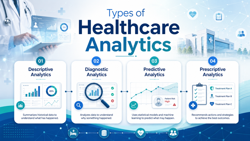
Descriptive analytics is the part that looks backwards. It tells you what has actually happened, drawing on the data you already have, so you can see how things have been going.
In a healthcare setting, that picture might cover how many patients you have seen, how many turned up for their appointments, how often people are being readmitted, how treatments are working out, how busy your staff have been, what’s happening with claims, how your equipment is being used, or whether scheduled visits are actually being completed.
The point of all this is simple: give your teams a clear, trustworthy view of where things stand and where they have been. In practice, that usually shows up as live dashboards, scheduled reports landing in inboxes, and a set of KPIs everyone can check at a glance.
If descriptive analytics tells you what happened, diagnostic analytics tells you why. It’s the layer that helps you get to the bottom of a change in performance instead of just noticing it.
Take a clinic that sees attendance start to slip. On its own, that figure doesn’t tell you very much. Diagnostic analytics lets you slice the same data in different ways, looking at it by location, by clinician, by the type of appointment, by where the referral came from, by patient group, or by how the appointment was confirmed. Patterns start to surface that were invisible in the headline number.
The result is a much sharper conversation. Instead of standing in a meeting saying “our attendance has dropped”, a manager can say “attendance has dropped mainly for follow-up appointments at two of our locations, and it started right after our reminder messages stopped sending.” That’s a problem someone can actually fix.
Predictive analytics is where things start to feel a bit like looking around the corner. Learning from what has happened before and what’s happening right now gives you a reasoned view of what is likely to happen next.
In healthcare, that opens up a lot of practical use cases. You can forecast patient demand so the right number of staff are rostered on, flag patients who are at higher risk of being readmitted, plan ahead for medical device servicing before something fails, spot the early signs that a patient might disengage from care, and make better calls about capacity across sites.
A good example from our own work: Vidi Corp built a set of Power BI reports for a medical device company that pulled together logs from their machines and tracked how each device was being used over time. With those trends in front of them, the client could see potential failures coming, notice when a device’s usage was tailing off, and reach out to customers earlier. The result was a 20% lift in service revenue and lower running costs at the same time.
Prescriptive analytics is the layer that goes one step further. It doesn’t just tell you what’s likely to happen, it tells you what to do about it. Based on the data in front of it, it suggests the next move, whether that’s a person making a decision or a system acting on its own.
In day-to-day healthcare operations, that can take all sorts of shapes. It might be an alert pinging the right inbox at the right moment. It might be a rule that nudges a manager to reallocate staff for the week ahead. It could be a suggested clinical intervention surfaced to a care team, a budget recommendation rolled into a finance review, or a workflow that simply runs itself in the background.
Two practical examples bring this to life. Picture a piece of medical equipment that quietly drops below its expected usage level. Rather than waiting for the customer to call in months later, the system can flag it straight away so the customer success or service team picks up the phone. Or imagine a patient who has missed a couple of check-ins. Instead of slipping through the cracks, staff get a gentle prompt to reach out and re-engage them before things get worse.
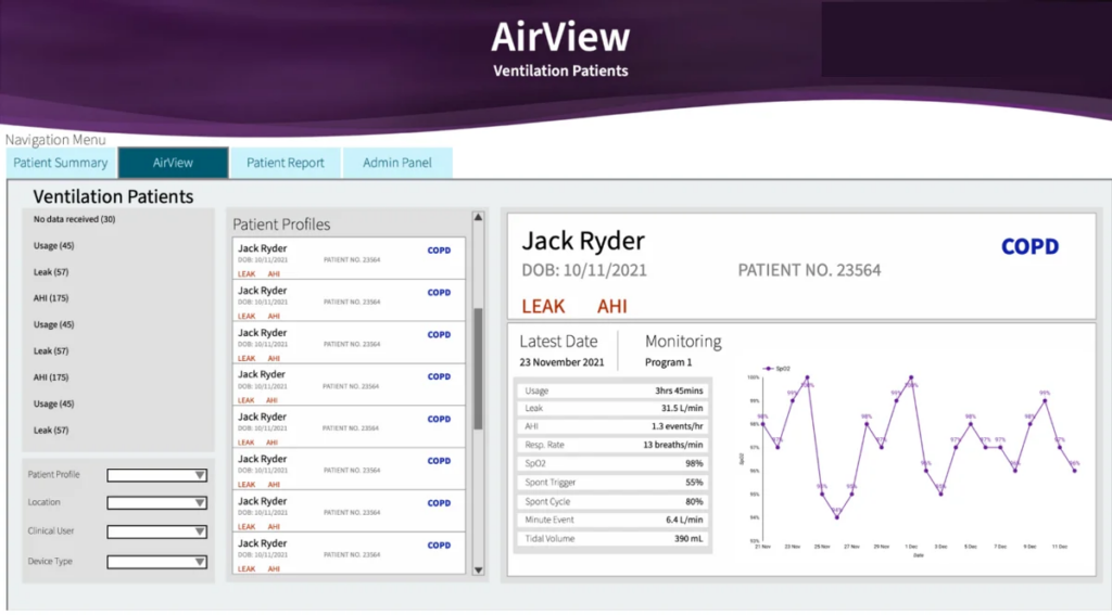
One of the quieter frustrations for clinicians treating patients on connected medical devices is that they rarely get to see the full picture. They know the headline outcomes, but the session-by-session detail of how a patient is actually using the device, and how that’s playing out in their health, often stays hidden. Without that view, it’s hard to know whether a therapy is really working, hard to catch the small irregularities that turn into bigger problems, and hard to fine-tune a treatment plan with confidence.
To close that gap, our Microsoft Power BI consultants built a dashboard that brings device performance and respiratory health data together in one place, so clinicians can drop down to the level of a single patient and a single session. A doctor can pick the patient they want to review, then walk through every recorded session, looking at things like session duration and leak rate side by side with clinical indicators such as respiration rate, AHI (Apnea-Hypopnea Index), SpO2, and tidal volume.
It’s also built to be properly interactive. Clinicians can drill into a specific date to dig into something that looks off, or zoom out and watch how a particular metric trends over weeks and months. That makes it far easier to see whether therapy is being delivered consistently, spot when respiratory patterns start to drift, and judge how well the device is genuinely supporting the patient.
The benefits:
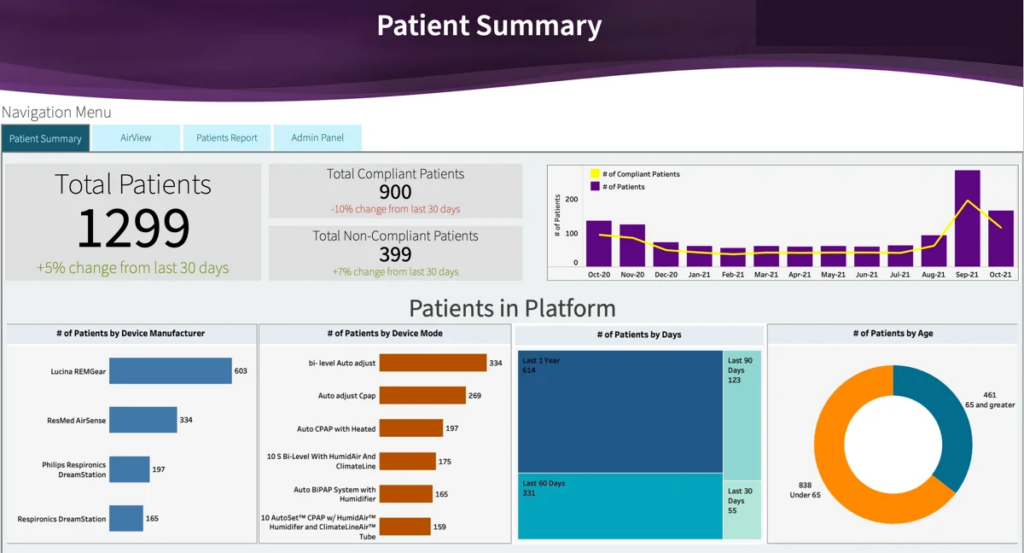
For a lot of healthcare organisations running remote monitoring programmes, one of the trickiest blind spots is engagement. Are patients actually using their connected devices day to day, and is the data still flowing back as it should? Without a straight answer to that, it’s hard to tell who has quietly drifted away, hard to spot a device that has gone offline, and hard to be confident the programme is doing what it’s meant to do.
That’s the gap this dashboard was built to close. It gives teams a running view of patient engagement and device activity, looking at compliance levels and data transmission patterns over time. Compliant and non-compliant patient counts are tracked month by month, so trends and drop-offs become easy to see rather than something you have to go looking for.
You can also slice the data in ways that actually help. The dashboard segments patients by device manufacturer, device mode, and age group, which makes it much easier to tell whether lower engagement is being driven by a particular device or a particular patient cohort. On top of that, activity windows of 365, 90, 60, and 30 days sit side by side, so you can quickly see the difference between someone having a quiet week and someone who has genuinely disengaged.
With this view in front of them, healthcare teams can keep an eye on compliance rates, pick up early warning signs of disengagement, flag devices that have gone quiet, and decide where to focus their follow-ups so data keeps coming in and patients stay properly monitored.
The benefits are:
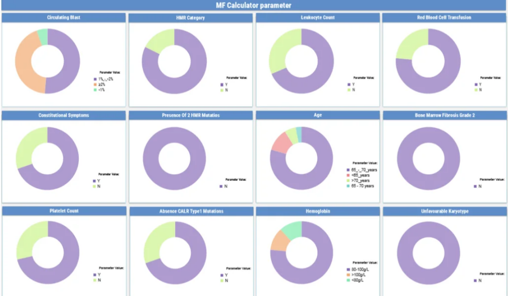
For most healthcare teams, one of the daily frustrations is that patient data is rarely in one place. It comes in through a clinic visit here, a mobile app there, a lab result somewhere else, and when you’re trying to manage a population of patients, especially those with complex or long-term conditions, that fragmentation makes life genuinely hard. It’s tough to keep track of the indicators that matter, tough to know how a patient is really doing overall, and tough to decide who needs your attention first.
To take that friction out of the way, our Tableau consulting services team built a dashboard that brings clinical data captured through a mobile app into a single, real-time view of the patient population. Instead of piecing things together across systems, healthcare professionals can sit in front of one interactive screen and see how patients are distributed across the medical indicators that matter most.
Because the dashboard tracks condition-specific parameters, teams can keep a finger on the pulse of overall health, surface the patients who are at highest risk, and notice when someone’s status starts to shift. Segmented views make it easy to compare different patient groups side by side, so it’s clear where attention is most needed rather than where it’s loudest.
The end result is a much steadier kind of monitoring, both of how patients are doing today and of how risk is spread across the wider population. With that picture in view, clinicians can prioritise their time more confidently and respond to emerging issues a lot faster than they could before.
The benefits look like this:
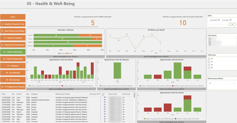
In a busy hospital or care home, one of the hardest things to keep on top of is the quiet, day-to-day rhythm of care. Are residents getting the medical visits they’re meant to be getting? Did anyone slip through the cracks this week? When the answers live in paper logs, spreadsheets, and people’s heads, working it out usually means a manual chase across wards and shifts. That takes time, and it leaves room for missed visits and gaps in care that no one notices until later.
To take the guesswork out of it, our Business Intelligence consulting services team built an analytics solution that pulls care scheduling and patient activity into one shared view. At the top level, it shows the proportion of residents who attended their essential medical visits versus those who declined, giving managers a straight, honest read on how care is actually being delivered.
From there, monthly trends make it easy to see how participation moves over time and to spot the periods where scheduling starts to slip. Filters by ward, unit, and time period let teams zoom in on a specific corner of the facility, surface patterns in missed visits, and uncover the operational quirks that are quietly getting in the way.
With that level of visibility, coordinating care becomes a much calmer process. Teams can make sure scheduled visits are happening, catch the breakdowns in planning or communication early, and keep care standards consistent across the whole facility rather than letting them drift in pockets.
The benefits:
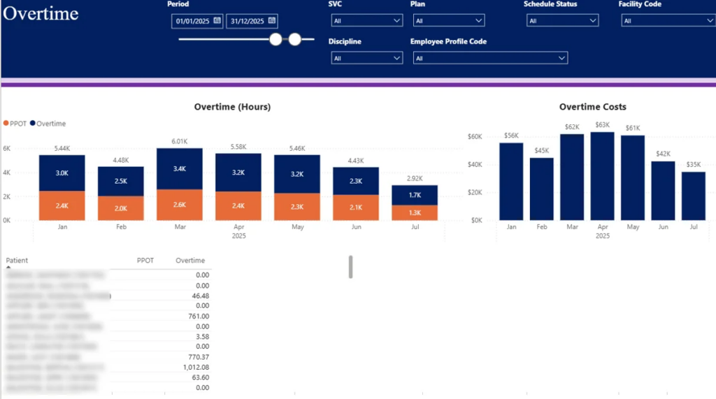
Overtime is one of those costs that has a habit of creeping up on healthcare organisations. Demand fluctuates, staffing is tight, and before long, overtime stops being an exception and becomes a line item. The trouble is that without proper visibility, it’s hard to tell what’s actually driving the spend, hard to keep budgets under control, and hard to make sure workloads are being shared out fairly.
Our team built an analytics solution that puts that picture back in front of leaders. It tracks overtime spend month by month so seasonal patterns and the periods where costs spike are easy to see, instead of being something you only notice when the payroll report lands.
The numbers are split into patient-paid overtime (PPOT) and hospital-paid overtime, which makes it much clearer how costs are distributed and where the real financial pressure is sitting. A patient-level breakdown then takes it a step further, showing which cases or assignments are quietly generating most of the extra hours. That’s often where the operational inefficiencies, or the genuinely high-demand scenarios, come into focus.
Filters for facility, medical discipline, and employee profile let users slice the same view by department or role. With that in hand, teams can keep an eye on how workload is being distributed, spot the imbalances, and see whether staffing levels are really keeping up with patient demand or just papering over the gaps.
Benefits
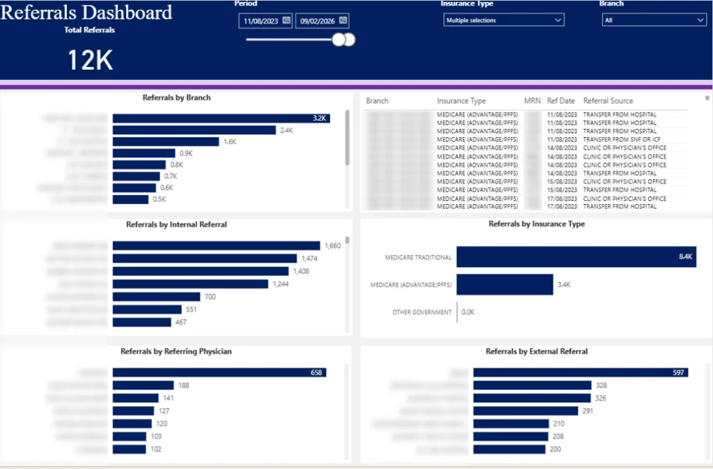
Hospitals often lack a clear, consolidated view of where new patients are coming from, making it difficult to track referral patterns and manage relationships with internal and external physicians. Referral data is typically fragmented across systems, limiting visibility into which branches, doctors, or partners drive patient growth.
Our Looker Studio consultants built an analytics solution that enables organisations to monitor referral activity across branches, physicians, and sources in a single view. It tracks total referrals by location, allowing leadership to compare performance and identify high- and low-performing branches.
Referrals are segmented into internal and external, providing insight into contribution at both doctor and partner levels. Additional breakdowns by referral source and by insurance type help teams understand patient mix and referral dynamics more deeply.
This makes it possible to analyse referral trends over time, identify key referral partners, detect gaps in underperforming locations, and evaluate how different sources contribute to patient inflow.
Benefits:
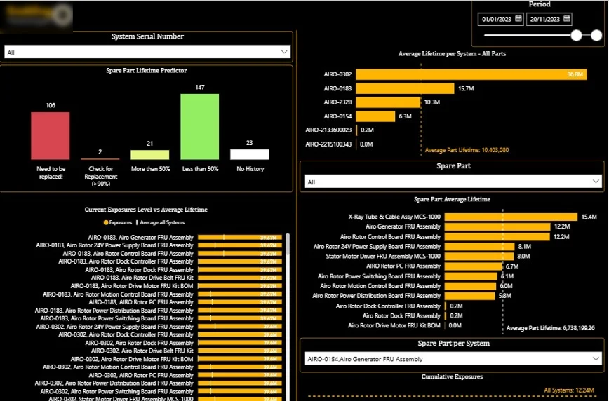
Healthcare organisations and medical device manufacturers often lack a structured understanding of equipment condition and component wear. Without proper monitoring, maintenance is typically reactive, leading to unexpected breakdowns, increased downtime, and disruption to patient care services.
This analytics solution allows teams to track equipment health and maintenance requirements by analysing machinery performance and component lifecycle data. It monitors utilisation and evaluates individual machine parts based on their lifetime in cycles, helping teams assess how equipment performs over time.
Components are grouped by wear level, highlighting those that have exceeded their expected lifespan or are approaching replacement. This supports early failure detection and more proactive maintenance planning. By analysing how quickly parts accumulate usage, organisations can also evaluate whether maintenance schedules are appropriately timed.
This approach supports more effective service planning, optimised spare-part management, and stronger reliability of critical medical equipment.
Benefits:
The first thing good analytics does is take the lid off your data. By pulling clinical, operational, and service information into dashboards that people actually use day to day, healthcare teams stop relying on isolated reports and start working from a shared, honest view of what’s going on.
Behind the scenes, this means connecting your source systems, agreeing on the KPIs that matter, and building dashboards that surface trends, flag exceptions, and let you drill into the detail when you need to. The pay-off is that a leader can look at performance by location, service, patient group, device, or team without waiting for someone to pull a report.
Reporting in healthcare often comes with a tax: hours spent in spreadsheets, exports stitched together by hand, and a nagging worry that something has been missed in the copy and paste. Analytics fixes that by replacing manual work with automated pipelines that simply keep the data flowing.
In practice, this looks like API connections, scheduled refreshes, a central data model that everyone shares, and dashboards that update on their own. Teams spend less time wrestling reports into shape and more time using what they say.
A good example is the work we did for a digital marketing agency that focuses on fitness and healthcare clients. We built automated Looker Studio dashboards for more than 80 of their clients, lifting GA4-based reporting accuracy by 40% and giving them back 50 hours a week.
Resource allocation gets a lot easier when you can actually see where demand, workload, and capacity have fallen out of step. Analytics surfaces the appointment volumes, staff availability, overtime, patient flow, service demand, and equipment utilisation that tend to live in different corners of the business, and brings them together so the picture is hard to argue with.
From there, leaders can adjust staffing, scheduling, procurement, or service planning based on evidence rather than instinct. The decisions become quicker and the outcomes more defensible.
We built a healthcare executive dashboard for a care home that tracked participation in essential medical visits, including residents who attended and those who declined. With that view in front of them, leadership could monitor care engagement over time and step in early when a particular team or unit needed support.
Compliance is one of those areas where analytics quietly takes a lot of stress off the table. Instead of scrambling to assemble evidence when an audit lands, you build the records, the audit trails, and the dashboards as you go, so the picture is always up to date.
That means centralising the evidence, automating the workflows that capture it, and giving the right people a clear view of any missing documents, overdue tasks, or gaps that need closing. When the regulator calls, the answer is already on the screen.
Healthcare data is some of the most sensitive information a person has, and any analytics solution has to treat it that way from day one. That means tight access controls, clear permissions, encryption where it’s needed, and careful handling of anything that could identify a patient. It matters even more when you’re working under HIPAA in the US, or UK and EU GDPR, where health data carries an extra layer of protection.
Most healthcare organisations are running on a patchwork of tools that were never really designed to talk to each other. The result is the same story everywhere: duplicate records, numbers that don’t quite match between reports, and someone in the team spending half their week reconciling spreadsheets by hand. Until those systems are properly connected, analytics will always be fighting with one hand tied behind its back.
Even when the data is in one place, it isn’t always clean. Missing fields, inconsistent categories, duplicate patient records, the wrong timestamps, free-text notes that no machine can easily parse, all of these creep in over time. Without proper cleaning and governance, you end up with dashboards that look the part but produce numbers your teams quietly don’t believe.
A dashboard only earns its keep if people actually open it. Adoption tends to fall away when a dashboard tries to do too much, when it doesn’t fit the way people really work, or when it answers questions nobody was asking. The dashboards that get used are the ones built around real decisions, not around every metric the database happens to hold.
A lot of healthcare organisations simply don’t have the time or the technical depth in-house to build analytics properly. That’s how you end up with slow projects, fragile spreadsheets, and reports that fall over the moment one person goes on holiday. A good analytics partner should leave you with proper documentation, trained users, and a setup that can be maintained without constant heroics.
You want a provider who understands sensitive data, operational workflows, and the importance of reporting that holds up to scrutiny. They don’t need to have worked with your exact system before, but they should be able to point to real experience across healthcare, care, medical devices, regulated services, or complex operational reporting.
If a healthcare analytics project stalls, it’s almost always at the integration layer. Your provider should be comfortable with APIs, SQL databases, data modelling, Power BI, Looker Studio, Tableau, Microsoft Fabric, Azure, SharePoint, and the automation tools that tie it all together.
A strong partner should be able to tell you, in plain terms, what changed after their work went live. Think reporting hours saved, accuracy improved, decisions made faster, revenue lifted, costs reduced, errors avoided, or compliance gaps closed. If they can’t point to outcomes, be cautious.
Sensible analytics needs sensible rules. Ask how the provider handles permissions, user roles, sensitive data, documentation, auditability, and secure data refreshes. The answers should sound considered, not improvised.
No two healthcare organisations operate in the same way. Templates can give you a useful head start, but the dashboards your teams rely on should be shaped around your systems, your KPIs, your workflows, and the decisions you actually need to make.
Healthcare analytics works best when it’s practical, secure, and tied to real decisions. Vidi Corp works with healthcare, care, medical device, and health-focused organisations to connect their data, automate the reporting that’s eating their week, and build dashboards their teams genuinely trust.
If you’d like to talk through what good looks like for your team, get in touch. We’ll help you design a reporting setup that improves visibility, gives you back time, and supports better decisions across the business.


