

Maritime business intelligence gives shipping and marine businesses one clear view of their vessel, voyage, fuel, and cost data, so teams can see how the fleet is performing, keep control of cost, and stay ahead of compliance instead of scrambling at reporting time. As operations grow more complex and emissions rules tighten, spreadsheets and manual month-end reporting make it hard to see what is really happening across vessels, routes, ports and bunker spend.
As the #1 rated BI consultancy on G2, we have worked with operators, ship managers, port and terminal teams and other marine businesses to build dashboards in Power BI. Our work replaces manual reporting with dashboards that show fleet utilization, voyage performance, fuel and bunker cost, and emissions compliance in one view.
In this article we explain what maritime business intelligence is, walk through real dashboards we have built for fleet performance, trade flow and landed cost, and cover the KPIs worth tracking, the data sources behind them, the tools worth knowing, and how a project comes together from first question to live dashboard.
Maritime business intelligence is the practice of taking all the data a shipping or marine business generates and turning it into something people can actually use, dashboards and reports that answer real questions instead of sitting in a folder.
It’s worth separating two things the term gets used for, because they’re not the same. One is the big maritime data products, platforms like Lloyd’s List Intelligence and S&P Global, that sell vessel-tracking and market data pulled from AIS and global shipping records. The other, and the one this guide is about, is the BI you build on your own numbers: your fleet, your voyages, your fuel, your costs, your compliance, all brought into one view. The first tells you what the market is doing. The second tells you how your own business is doing, and where you’re winning or quietly losing money.
For most companies, that second kind is where the quickest return hides, because the data already exists. It’s just scattered, a bit in noon reports, a bit in spreadsheets, a bit in the ERP, a lot in people’s inboxes. Maritime BI is mostly the work of pulling it together, which is the same core idea behind any custom reporting solution: take messy, separate sources and turn them into one thing a team can read.
Maritime BI has moved up the priority list in 2026 for a few concrete reasons.
Regulation is the main one. CII ratings, EEXI, the EU ETS now covering shipping, and FuelEU Maritime mean emissions have to be measured continuously, not tallied up once a year. That is a data problem first and foremost.
Cost is the second. Freight rates stay volatile and bunkers are still the largest operating expense, so the difference between a profitable route and a loss-making one often only shows up once the figures sit side by side. Reporting that surfaces early is worth real money, which is the same case we make in our guide to month-end reporting for finance and operations teams.
And there is simply more vessel data available now than most companies use. Turning it into a view managers actually read is what separates the operators getting value from it from those just collecting it.
Across the maritime sector, business intelligence tends to cluster around three high-value applications.
Vessel-movement data turns the open ocean into a sales map. By tracking incoming vessels and the cargo they carry, commercial teams can spot demand before it lands, identify which ports and routes are heating up, and reach operators at the moment they need a service. For agencies, suppliers, and service providers, knowing a vessel’s ETA and history is the difference between chasing business and being there when it arrives.
The same movement data underpins risk monitoring. BI tools flag deceptive shipping practices such as AIS gaps, dark activity, and suspicious ship-to-ship transfers, and screen counterparties and vessels against sanctions lists. With sanctions regimes shifting quickly through 2026, automated monitoring has moved from a nice-to-have to a baseline expectation for anyone financing, insuring, or chartering tonnage.
For operators, the payoff is in the running of the fleet. Combining voyage data, weather, and consumption records lets teams plan predictively rather than reactively: routing to cut fuel burn, sequencing port calls to reduce idle time, and scheduling maintenance around actual usage. On thin freight margins, small gains in fuel and utilization compound fast across a fleet.
Not every maritime BI project starts at the vessel level. For many marine businesses, the first and highest-return win is getting a clear view of their own trade and cost data, which is where the following client build began.
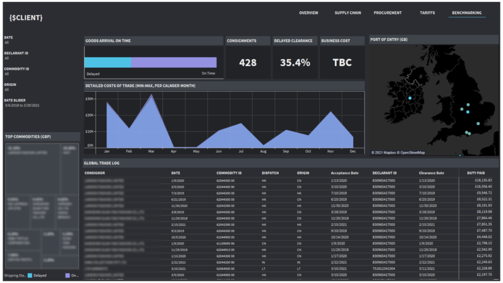
For one marine-sector client, our data visualization consultants pulled their whole import picture into a single Power BI dashboard, so schedule reliability, cost of trade, and where goods enter the UK all sit in one place instead of scattered across spreadsheets.
It shows how often goods arrived on time versus late, and the numbers weren’t pretty: more than a third of consignments hit delayed clearance. From there the client could see the cost of trade month by month, which UK ports their goods came through, and which commodities were tying up the most value. Underneath it all sits a full trade log, right down to clearance dates and duty paid on each consignment.
Once arrival performance and landing cost were in the same view, the patterns were hard to miss. The team could see where delays kept happening, what those delays were costing, and which ports and commodities carried the most risk. For port operators, ship managers, and cruise and ferry operators, that’s the kind of visibility that makes berth and schedule planning a lot less of a guessing game. And for shipbuilders and equipment manufacturers moving parts across borders, it showed plainly where clearance holdups were quietly eating into margin.
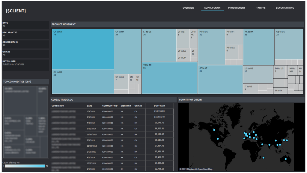
For the same marine-sector client, our Tableau consultants built a supply chain view that answers two simple questions that are surprisingly hard to see across raw records: where goods are moving, and where they’re coming from.
At the top, a movement heatmap lays out volume flowing country to country, so the busiest lanes jump straight out, CN to CN, CN to US, TR to TR, and so on down to the smaller flows. A country-of-origin map shows sourcing at a glance across the globe, and a trade log ties it together with duty paid by consignor and commodity. Off to the side, top commodities by value give a quick read on what’s actually driving the numbers.
Seeing the whole flow in one place made sourcing patterns obvious in a way a spreadsheet never could. The client could tell which routes carried the most volume, how concentrated their sourcing was in a handful of origins, and where the value really sat. For shipbuilders, equipment manufacturers, and repair operations, that same setup is a straightforward way to keep tabs on where parts and spares come from and how exposed they are to any one supplier or country. And for marine engineering firms and fishing and aquaculture businesses, it maps just as well onto product and catch flow, showing which routes and markets are worth the most.
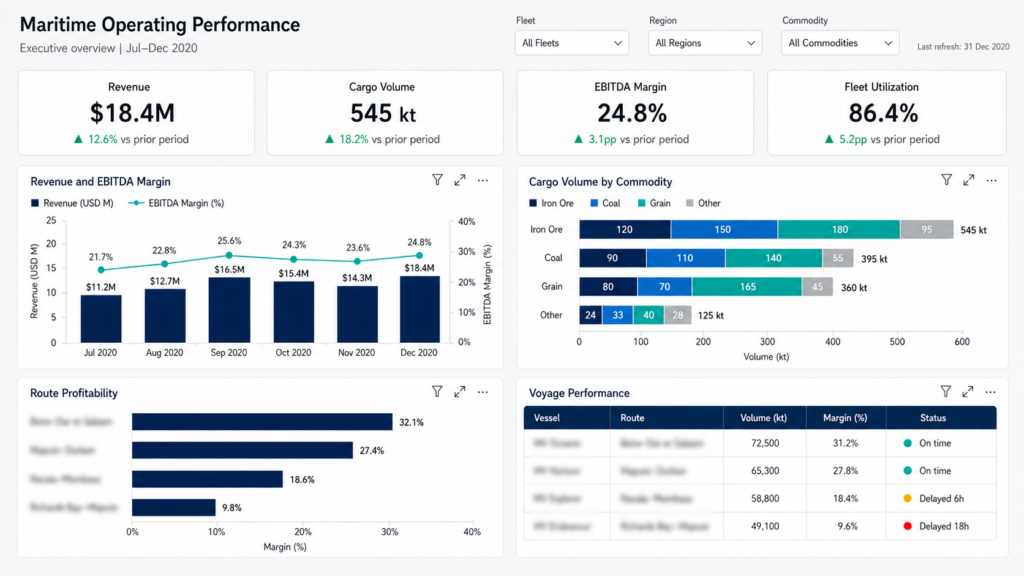
For a marine client, our team built an executive-level Power BI dashboard that pulls fleet performance into one place, the kind of top-line view a management team can open on a Monday morning and know where they stand.
It leads with the numbers that matter most: revenue, cargo volume, EBITDA margin, and fleet utilization, each shown against the prior period so the direction of travel is clear. From there it breaks down revenue and margin month by month, splits cargo volume by commodity, and ranks routes by profitability. A voyage performance table sits alongside, listing vessels by route with their volume, margin, and on-time or delayed status.
Having commercial and operational performance in a single view meant the team no longer had to reconcile figures across separate reports to see how the fleet was doing. They could see which routes were carrying the margin and which were lagging, how utilization was trending, and which voyages were slipping behind schedule. For ship management companies and cruise and ferry operators, that’s the kind of oversight that supports smarter deployment decisions. For freight and commercial teams, tying margin to route and commodity showed clearly where the business was actually making its money.
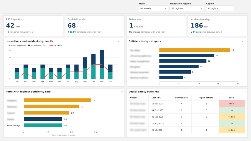
Safety data usually lives in too many places at once, inspection reports in one system, incident logs in another, open actions buried in email. This dashboard shows how that picture comes together in Power BI: Port State Control inspections, deficiencies, detentions, and incident-free days all in a single executive view.
Our Power BI dashboard tracks inspections and incidents month by month, ranks deficiencies by category so the most common problems stand out, and flags the ports where deficiency rates run above the fleet average. A vessel-level table ties it off, showing each vessel’s last PSC inspection, open deficiencies, outstanding actions, and an overall risk rating. The point is to see not just how many deficiencies there are, but where they cluster and which vessels are trending toward trouble.
For ship management companies, this is the kind of oversight owners and charterers increasingly expect, evidence that safety is being actively managed, not just nominally met. Spotting a recurring fire-safety or life-saving-appliance deficiency early is far cheaper than a detention that pulls a vessel out of service, and a clean, well-documented inspection record is a genuine commercial asset when competing for business.
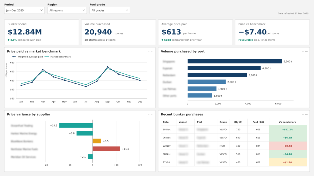
Fuel is the biggest variable cost most operators carry, and the buying side of it often runs on habit, the same ports, the same suppliers, without a clear read on whether that’s the best deal available. This dashboard shows how Power BI turns bunker purchasing into something measurable: total spend, volume, average price paid, and how that price compares to the market benchmark, all on one screen.
It plots weighted average price paid against the market benchmark month by month, so periods of buying above or below market stand out immediately. Volume by port shows where the fleet actually fuels, price variance by supplier ranks who consistently comes in cheap or expensive, and a recent-purchases table breaks each stem down by grade, quantity, price, and how it landed against benchmark. The favorable-versus-unfavorable coloring makes a good or bad buy readable at a glance.
For operators and ship management companies, even a small per-tonne saving compounds fast across an annual bunker spend running into the millions. Just as useful, having this history in hand changes the supplier conversation, negotiating from a clear picture of your own buying patterns and the prevailing market rate is a far stronger position than negotiating on trust.
There’s no universal list, since the right metrics follow whatever the business actually needs to decide. But most maritime dashboards pull from a familiar pool, and it helps to think of them in groups.
On the commercial side, you’ve got revenue per vessel, EBITDA margin, achieved freight or charter rate against the benchmark, and margin broken down by route or commodity. Operationally, the usual suspects are fleet utilization, days at sea versus idle days, cargo carried against capacity, and port turnaround. For voyages, it’s planned against actual distance, time, and cost, plus any weather delay and demurrage picked up along the way.
On fuel and emissions, fuel burn per nautical mile, bunker cost per tonne against market, CO2 emitted, and the current CII rating.
And for safety and compliance, Port State Control deficiencies, detentions, open corrective actions, and incident-free days.
The trap is trying to track all of it. The dashboards that get used are the ones that pick the handful of numbers tied to real decisions and show those clearly, the same discipline behind any well-built logistics dashboard.
A maritime dashboard is only ever as good as what feeds it, and in shipping the feed almost never starts tidy or in one place. A few sources do most of the work.
Noon reports are still the backbone, the daily position, consumption, and speed readings off each vessel. AIS data adds position and voyage tracking, whether from the ship’s own systems or a bought-in feed. The ERP and finance systems hold the money side, revenue, cost, invoicing, charter terms. Bunker records cover what fuel was bought, at what price, from whom, and where. Port and terminal data sits behind any turnaround analysis, since that’s where your arrival, berth, and departure times come from. And where vessels are fitted for it, sensor and IoT feeds give you far more frequent engine and consumption readings than a once-a-day noon report ever could.
The catch is that all of this shows up in different formats, at different intervals, at wildly different levels of quality. Honestly, most of a maritime BI project is the unglamorous work of connecting and cleaning these sources so you can trust them in a single view. If your data lives across a lot of systems, our data analytics implementation guide walks through how that consolidation actually gets done.
The first is the off-the-shelf maritime data platforms, Lloyd’s List Intelligence, S&P Global Market Intelligence, Windward. These sell you market-wide vessel, trade, and risk data. They earn their keep when you need to see beyond your own deck: what other operators are doing, how global flows are shifting, whether a counterparty or vessel trips a sanctions flag. You’re buying data you don’t hold yourself.
The second is a custom BI platform, most often Microsoft Power BI, built on the data you do hold. This is the route when the question is about you: how’s my fleet actually performing, where’s my cost base drifting, how do I sit against CII. Power BI connects to your noon reports, ERP, bunker, and port data, ties it together, and turns it into dashboards a team reads daily and digs into when something looks off.
They’re not either-or. Plenty of operators buy market data from a platform and build their internal performance view in Power BI, so the outside picture and the inside picture sit next to each other.
Most maritime BI projects move through the same five stages, and the order matters more than people expect.
Start with the questions, not the data. Work back from the decisions the business needs to make, which routes to keep, where fuel spend is leaking, how the fleet sits against CII, and let those choose your metrics. This is the groundwork a data strategy consultant would insist on before anything gets built, and it keeps the project focused instead of ballooning into a dashboard of everything and nothing.
Then audit the data. Map where each figure actually lives, noon reports, ERP, bunker records, port data, and be honest about the gaps and the quality. This stage nearly always turns up more than you hoped, and it’s a lot cheaper to find it here than three weeks into building.
Next, connect and model. Bring the sources together, clean and standardize them, and build a data model that ties vessel, voyage, cost, and compliance into one consistent structure. In practice this is where data warehouse work does the heavy lifting, giving everything else one reliable place to stand on.
Then build the dashboards around those original questions, an executive overview for the top line, detailed pages for fuel, voyage, safety, or cost. This is data visualization in the practical sense: each view should be read at a glance, with the detail waiting underneath for when someone wants to drill in.
Finally, roll out and train. Put the dashboards in front of the people who’ll actually use them, make sure they trust the numbers, and set a refresh rhythm so nothing goes stale. A dashboard nobody opens is just an expensive screenshot.
A few obstacles turn up in nearly every maritime BI project. None is a dealbreaker, and each has a well-worn fix.
Fragmented data is the big one. Fleet, finance, bunker, and port data usually sit in systems that were never built to talk to each other. The fix is to resolve it at the modeling stage rather than papering over it in the dashboard: a proper data model that maps each source to a common structure, so vessel, voyage, and cost data line up cleanly before anything gets visualized.
Noon-report quality is next. Manual entry means the odd gap, inconsistency, and outright error. The answer is validation built into the data pipeline, rules that flag missing or implausible entries as data comes in, so problems surface early instead of quietly skewing a number three dashboards later.
Connectivity at sea puts a ceiling on how much data can flow in real time. Rather than fight it, most builds work with it: scheduled syncs when a vessel has bandwidth, and dashboards designed around periodic reporting rather than a live feed. For the majority of decisions, a reliable daily picture is more than enough.
The common thread is that none of these is solved in the dashboard itself. They’re solved upstream, in how the data is modeled, validated, and moved, which is exactly why the early stages of a project matter more than the pretty end.
It’s using dashboards, reports, and analytics to turn a shipping or marine business’s data into something it can act on. The term stretches across both the big market-wide data platforms and the custom dashboards built on a company’s own fleet, voyage, cost, and compliance data.
It depends on the business, but the ones that come up most are fleet utilization, fuel burn per nautical mile, bunker cost against market, port turnaround, margin by route, and current CII rating. The trick is to track the few that line up with the decisions your team actually makes, not the whole list.
Yes, and it’s a common choice. Power BI connects to noon reports, ERP, bunker, and port data, models them together, and turns them into dashboards a team can read every day. It’s the usual route when the question is about your own fleet and costs rather than the wider market.
Lloyd’s List Intelligence and platforms like it sell market-wide vessel and trade data drawn from global records. Custom maritime BI is built on your own operational data to show how your specific fleet, routes, and costs are doing. A lot of operators use both side by side.
It comes down to how many data sources you have and what state they’re in. A focused first build, one clear set of questions and reasonably clean sources, moves faster than a sprawling one. Auditing and cleaning the data is almost always the longest part, not building the dashboards themselves.
The full range of the marine sector: shipowners and operators, ship management companies, port and terminal operators, cruise and ferry lines, shipbuilders, ship repair and marine engineering firms, equipment manufacturers, and fishing and aquaculture businesses. Anyone whose margins depend on how vessels, voyages, or cargo actually perform.
Maritime business intelligence isn’t really about dashboards. It’s about seeing your fleet, your costs, and your compliance clearly enough to make better calls, before a route quietly turns unprofitable or a deficiency turns into a detention. The companies getting ahead in 2026 aren’t the ones with the most data. They’re the ones who’ve turned what they already have into a view their teams actually use.
That’s the work our team does: connecting the scattered sources, modeling them properly, and building Power BI dashboards that hold up to daily use. If you’d like to see what that could look like for your fleet or your business, contact us and we’ll talk through where the quickest wins are!


