
A Power BI logistics dashboard turns scattered shipment, warehouse and cost data into one real-time view, so teams can track delivery performance, keep control of cost, and catch problems before they reach the customer. As logistics operations grow more complex, relying on spreadsheets and manual reporting makes it hard to see what is really happening across shipments, carriers, warehouses and stock.
As the #1 rated BI consultancy on G2, we have worked with importers, distributors, manufacturers and freight-heavy operations to build logistics dashboards in Power BI. Our work focuses on replacing manual reporting with automated dashboards that give teams real-time visibility into on-time delivery, warehouse operations, logistics cost and stock levels.
In this article we will explain what a Power BI logistics dashboard is, walk through real dashboards we have built for delivery performance, warehouse operations, cost and stock, and cover the KPIs worth tracking, the data sources behind them, and how to choose between a template and a custom build.
A Power BI logistics dashboard is an interactive report that brings shipment, warehouse and cost data together in one view. Instead of jumping between a transport system for delivery dates, a warehouse system for stock and a spreadsheet for freight cost, everything sits on one screen and refreshes on a schedule, so the numbers are current rather than a week old.
The difference from a static Excel report is what you can do with it in Power BI. Teams can filter by route, carrier, customer or country, drill from a headline figure into the single order behind it, and compare this month against last without rebuilding anything. A report tells you what happened. A dashboard lets you ask why, and get an answer in a few clicks. That is what makes it something people open on a Monday morning and act on, rather than a file that gets sent round once and forgotten.
Here are real Power BI logistics dashboards we have built, what each one tracks, and what changed for the client once it was in use. For a wider view of how analytics is used across the function, see our guide to business intelligence in logistics.
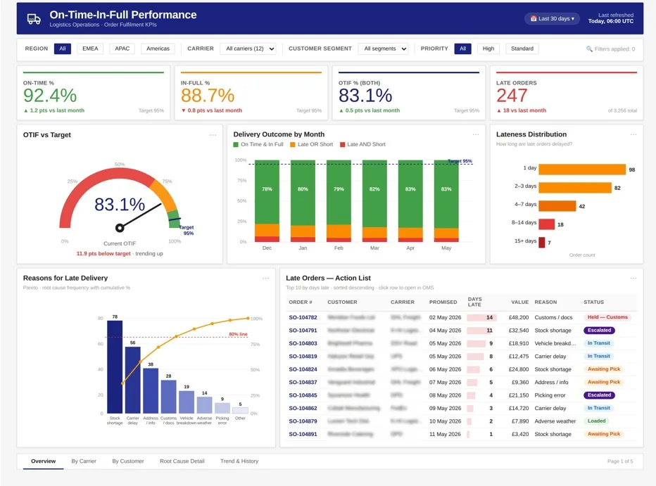
A team can usually see that an order left the building. What they cannot see is whether it arrived on the promised day, or whether it went out complete, so late and short deliveries get lumped together as one vague problem.
Our Power BI consultants built an OTIF dashboard that separates the two and then explains the misses instead of just counting them.
Managers get a straight read on fulfillment reliability, with on-time and in-full tracked separately and combined into a single OTIF figure. Average days late shows how bad the slippage is, late delivery reasons show why, and a line-level list of late orders by number means the worst cases can be pulled to the front of the queue rather than lost in an average. Leadership sees how dependable delivery really is without waiting on a monthly report.
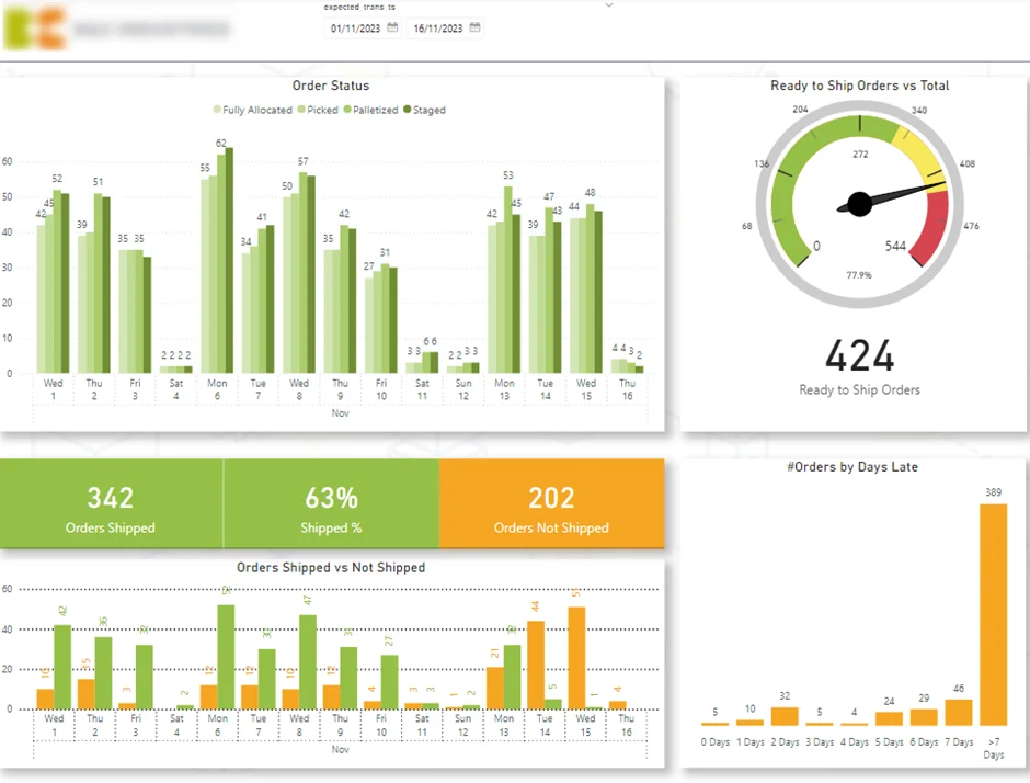
Getting orders out of the door depends on a chain of steps, and a delay at any one of them tends to go unnoticed until shipments start slipping.
We built an outbound dashboard that follows that chain, so a hold-up shows up while there is still time to do something about it.
The result is a team that can hold output steady through the week instead of lurching between quiet mornings and frantic afternoons. A ready-to-ship figure shows how much is good to go at any point, and the order status view breaks the pipeline into allocated, picked, packed and staged, so when throughput dips a manager can see whether the problem is in picking or further down the line. Comparing shipped against not-shipped orders by expected ship date turns a guess about the cause of a delay into a fix aimed at the actual stage.
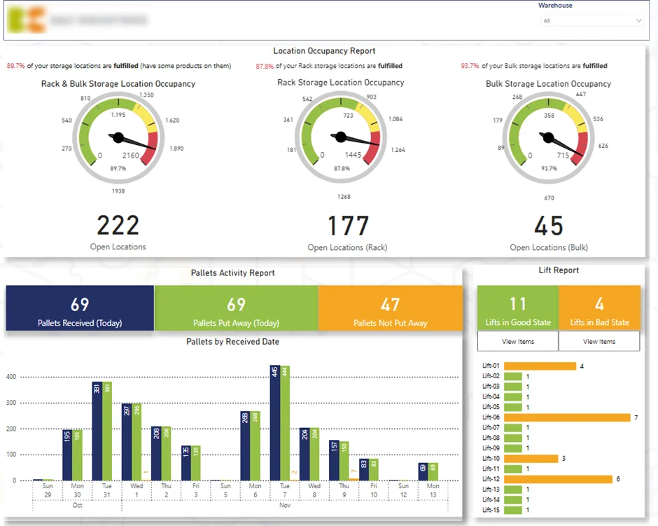
When nobody is watching inbound activity, racks and bulk locations quietly fill up, pallets sit waiting, and forklifts end up holding jobs that were never finished. Receiving slows and everything downstream feels it.
Our data visualization consultants built an inbound dashboard that gives a live health check on what is coming in.
Managers can rebalance inbound flow before congestion sets in, because rack and bulk occupancy, the day’s pallet arrivals, and the split between pallets put away and not put away all sit on one screen. Items per forklift shows what is still out on the floor, so the jobs holding things up get cleared first. Space gets used better and receiving moves quicker, without anyone walking the warehouse to work out where the pressure is.
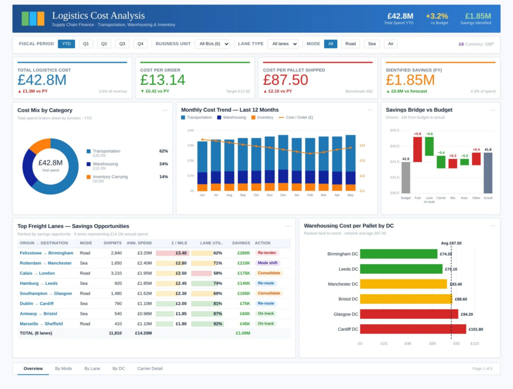
Logistics costs creep up where the data is scattered. A lane gets four percent more expensive, a warehouse runs below capacity, a delivery method costs more than it should, and none of it surfaces until margins tighten.
Our BI consultants built a cost dashboard that brings transport, warehousing and inventory spend into one view and breaks it down far enough to act on.
Finance and supply chain teams can point to exactly where overspend is coming from, because total logistics cost sits alongside cost per order and cost per pallet, and the split across transport, warehousing and inventory shows which part of the operation is driving it. Freight lane analysis and warehouse cost per pallet take it down to the level where a decision gets made, whether that is renegotiating a carrier, consolidating lanes or rerouting, and a savings-against-budget view and monthly trend keep those decisions honest over time.
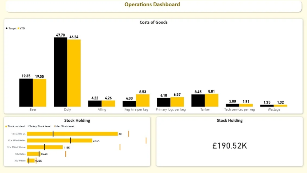
Hold too little stock and you are firefighting stockouts and paying for emergency restocks. Hold too much and cash sits idle on the shelf. On static reports, replenishment is always a reaction.
Our data analysts built a stock level dashboard that gives a live read on inventory health for every product.
It tracks stock on hand line by line, and works out both the safety stock level and the maximum stock level from demand patterns and lead times, so the healthy range is defined rather than guessed. When a product drifts toward its safety threshold the dashboard flags it, so orders go in ahead of a problem, and keeping an eye on the maximum stops the opposite mistake of over-ordering. Inventory becomes something the team manages against numbers they can measure rather than instinct.
If you are deciding what belongs on your own dashboard, this is the question that comes up most often, and it is worth answering before anyone opens Power BI. A useful logistics dashboard usually covers three areas: delivery performance, cost, and day-to-day operations.
Delivery performance is the core. It is the set of metrics that tells you whether you are keeping your promises to customers.
| Metric | What it tells you |
| On-time delivery rate | Share of orders that arrived by the promised date |
| Average delivery time | How long orders actually take, worth trending over the year and splitting by domestic and international |
| On-time in-full (OTIF) | The stricter measure, counting an order as good only if it was both punctual and complete |
| Return rate and damage rate | Failed deliveries the on-time figure misses, since an order that comes back or arrives broken still let the customer down |
| Delivery performance index | A single composite blending on-time, delay severity and cancellations for a quick read by region |
Cost is the second area. These figures show where the money goes and let you compare fairly rather than by headline price.
| Metric | What it tells you |
| Cost per shipment / cost per order | The everyday cost figures for moving goods |
| Cost per kilometer | Lets you compare carriers and routes on a level footing |
| Transport vs warehousing vs inventory cost | Which part of the operation is actually driving total spend |
Operations is the third. These tell you whether the day-to-day is keeping up with demand, and they are what let a supervisor run a stand-up off the dashboard instead of a spreadsheet.
| Metric | What it tells you |
| Items ready to ship | How much is good to go at any point in the week |
| Active vs fulfilled shipments | Whether orders are clearing as fast as they arrive |
| Warehouse throughput | How much the warehouse is processing against capacity |
| Stockouts | Where availability is about to cost you a sale |
You do not need all of these on day one. Most teams start with on-time performance and cost, then add the rest as the data allows.
Logistics data is almost always spread across several systems, and a good dashboard is really a job of joining them up. In most builds we work with four main sources.
The transport management system is the backbone, holding shipment records, origins and destinations, carriers and service levels. The warehouse management system adds the picking and put-away side, which matters because warehouse delays quietly become delivery delays. The ERP or finance system brings in freight cost, surcharges and fuel, which is what lets you look at the profitability of a route or a customer rather than just its volume. Where it is available, telematics or GPS data adds actual routes and real distance traveled, which is useful for comparing planned against actual.
Spreadsheets and master data usually fill the gaps, things like customer segments, regions and a proper calendar for spotting seasonal spikes. Power BI connectors pull all of these together, refreshed on a schedule, so everyone is working from the same set of numbers instead of three different versions of the truth. Getting that data model right, with shipments at the center and clean links out to dates, carriers, routes and customers, is most of what makes a dashboard fast and trustworthy.
If you are building your own, the rough shape of the job looks like this, working from shipment and carrier exports out of your TMS and ERP.
How you lay those visuals out matters as much as the numbers behind them. A dashboard that follows Power BI design principles is quicker to read and easier to trust, and our video on the gestalt principles of data visualization is a good primer if you are laying one out yourself.
That is the shape of it. Most of the real work is in the data model underneath, which is the part we tend to take on for clients so the numbers hold up once the dashboard is in daily use.
Both have their place, and which one suits you comes down to how standard your data is and how much the dashboard needs to reflect the way you actually work.
A template is the faster, cheaper way to start. If your data sits in a common system and you want something running quickly, a ready-made template gets you most of the way there, and you can adjust it in Power BI Desktop from there. Our free Power BI templates are a good place to see how that works and what a finished build looks like.
A custom build tends to win for logistics specifically. Routes, carriers, service levels and the way you work out cost vary so much from one operation to the next that a generic layout rarely fits without a lot of reworking. The examples above were all built around the client’s own data and the decisions they needed to make, which is the difference between a dashboard people glance at and one they run the operation from. If your operation runs wider than logistics, the same approach applies to a Power BI supply chain dashboard.
In short, a template is the quickest way to see what is possible, and a custom build is how you end up with a dashboard your team actually trusts and uses day to day.
It is a single interactive report that brings shipment, warehouse and cost data together so you can track delivery performance, spend and operations in one place, updated automatically rather than pulled together by hand.
Most teams start with on-time delivery, average delivery time, on-time in-full, and cost per shipment or per order, then add warehouse and stock metrics as the data allows. The right set depends on what decisions you are trying to make.
Yes. Delivery time, cost and volume can all be split by domestic and international, or by region, carrier and route, so you can compare like for like.
Power BI connects to transport, warehouse and finance systems, as well as spreadsheets, and refreshes on a schedule. We handle the joins between them so the numbers reconcile.
A template shows you the shape of a dashboard. A custom build reflects your actual routes, carriers and cost model, which is usually what teams end up needing.
It depends on how many data sources are involved and how much needs to be joined and cleaned. Get in touch and we can give you a straight answer once we understand your setup.
The dashboards on this page all started the same way, with a team that could see plenty of data but could not get a clear, current answer to the questions that mattered. Are we delivering on time, where is the cost creeping up, and what is holding orders back. A Power BI logistics dashboard built around your own shipments, warehouse activity and cost turns those questions into something you can answer in a few clicks, and keep answering as the numbers change.
You do not need every metric or every data source in place to begin. Most teams start with the delivery and cost figures they already have, get a working dashboard in front of people, and build it out from there. The important part is that it reflects how your operation actually runs, not a generic template.
We have built these for freight-heavy operations of every size, and we can do the same with yours. Get in touch and we will turn your shipment, warehouse and cost data into a dashboard your team can run the operation from.


