
Running an agency sometimes means living inside spreadsheets. Campaign data from Meta, click data from Google, email opens from Klaviyo, rankings from Ahrefs, conversions from GA4, and somewhere in the middle of it all, a client asking the question every account manager dreads: “So, how are things going this month?”
A Looker Studio agency dashboard is how you answer that question in thirty seconds instead of thirty tabs. It pulls every channel your agency manages into one clean, branded view that clients can actually read, and it updates itself while you sleep. No more Sunday night screenshot marathons. No more “let me get back to you on that figure.” Just live, trustworthy numbers that make the work you have already done finally look like the work you have actually done.
In this article, we walk through the agency dashboards our Looker Studio consultants build for real clients, covering Facebook Ads, Google Ads, SEO, local SEO, email marketing, social media, and full performance marketing setups. Every example is a custom project delivered by our team, so you will not find free templates to install here. What you will find is a clear picture of what is possible when your reporting finally works as hard as your agency does.
The moment your agency goes from managing one account to ten, the cracks start to show. Tabs multiply, spreadsheets drift out of sync, and the simple question of “how did last week perform?” suddenly takes an hour to answer. A Looker Studio agency dashboard fixes that headache by pulling every ad account into one live, automatically refreshing view, so you spend your time optimising campaigns rather than copy-pasting numbers into Google Sheets at midnight.
It gets trickier still once several media buyers are touching the same budgets. Without a shared source, it is almost impossible to see who is overspending, which campaigns are pulling their weight, and where the team is leaking margin. A centralised Looker Studio agency dashboard puts every activity side by side, which makes performance patterns obvious, holds the team accountable, and gives account leads the oversight they need to steer budgets with confidence.
Then there is the client side of the equation. Every agency owner knows that reporting is the quiet tax on agency life: necessary, time-consuming, and rarely charged for. Looker Studio is a genuinely elegant answer here because it is completely free, needs no per-seat licensing, and lets you share a live link with clients in seconds. Build the Looker Studio agency dashboard once, connect the data sources, and your clients can check real-time performance whenever curiosity strikes, no monthly PDF required.
In short, a Looker Studio agency dashboard pays you back three ways: it consolidates scattered ad data, sharpens internal team management, and turns client reporting from a dreaded chore into a quiet competitive advantage.
All of the Facebook Ads data feeding this Looker Studio agency dashboard was extracted using the Vidi Corp Facebook Ads connector, which handles the authentication side of things in a way that scales nicely as the agency takes on more clients.
Here is how it works in practice:
The neat part is that the moment a new client shares access with that same Gmail, their data flows into the dashboard automatically. No manual reconnection, no rebuilding the report, no chasing IT. Onboarding a new account becomes a five-second job rather than a fortnight of fiddling with API tokens.
This way, when a new client opens access to this email, the data for the new client is added automatically.
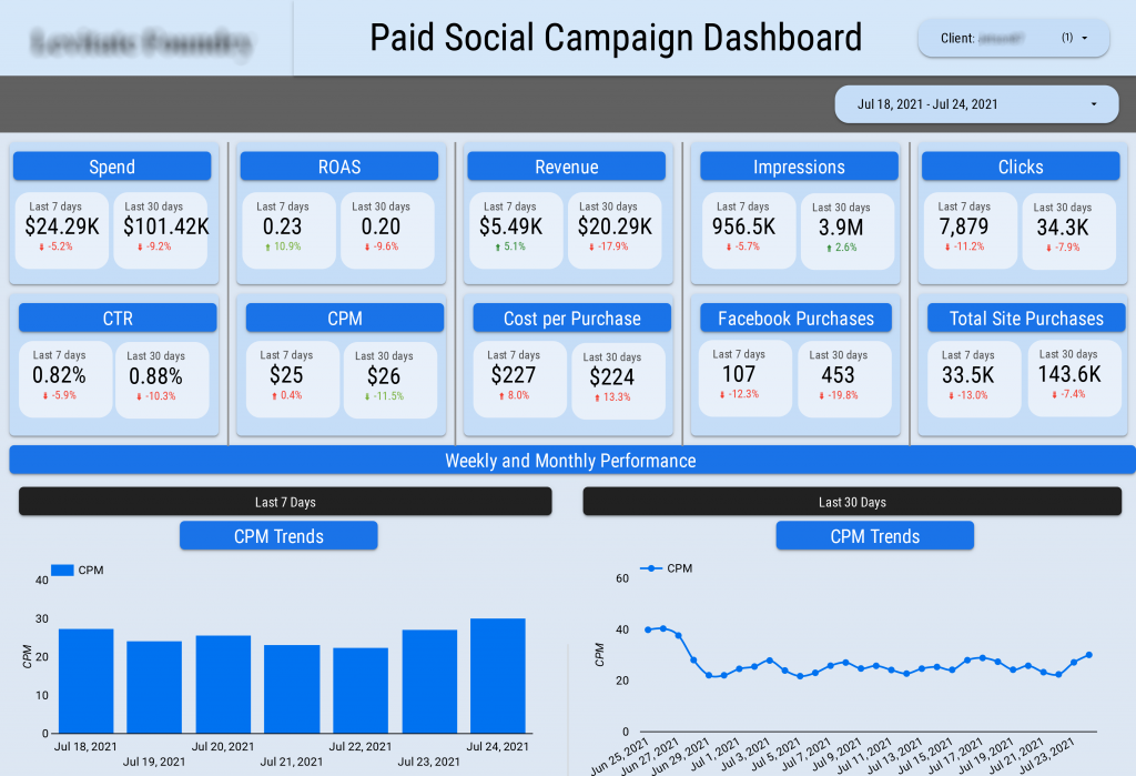
Trend charts are shown below for CPM for the last 7 days and the last 30 days.
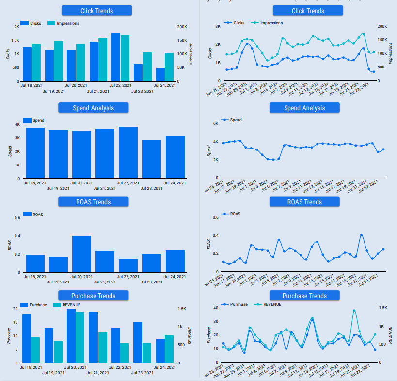
This dashboard earns its keep when you start watching rolling 7 and 30-day trends for clicks, impressions, ad spend, ROAS, purchases, and revenue. Over the last two days, the gap between clicks and impressions widened sharply, a classic sign that click-through rate is slipping due to creative fatigue or audience saturation.
Narrowing that gap becomes the obvious next move for the media buying team. Another pattern worth flagging is the revenue spike on the 20th of June, even though purchases barely moved. That tells you customers bought higher value products on the day rather than more of them. For agency leadership, that is a green light to review which offers were live and decide whether to scale them across other clients.
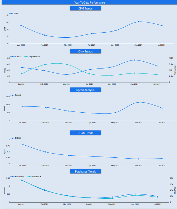
Each metric on the custom dashboard is broken down by month and shown for all the months this year.
You can see that the number of overall impressions per month decreased throughout the year whereas the number of clicks increased, which highlights improvements in CTR.
At the same time, ROAS has been decreasing throughout the year, which is a cause of concern and perhaps requires management attention.
It is also important for agencies to analyse the performance by campaign, adset and ad on their Looker Studio Dashboard. This part of the dashboard helps to identify which campaigns have high CTR/ROAS, which ones need to be optimised or discontinued.
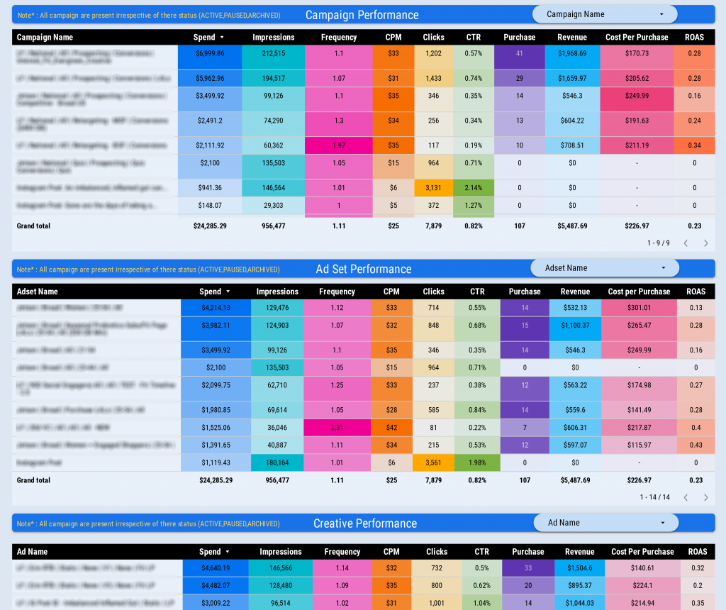
Finally, it is important for an agency dashboard to break down the performance by age, gender and location. The number of clicks is analysed by state, age group and device to better understand the demographics of the target audience.
For example, you can see on this page that most users who click on an ad do so via a mobile phone. You can also see that the company primarily targets 25-45-year-olds with their ads.
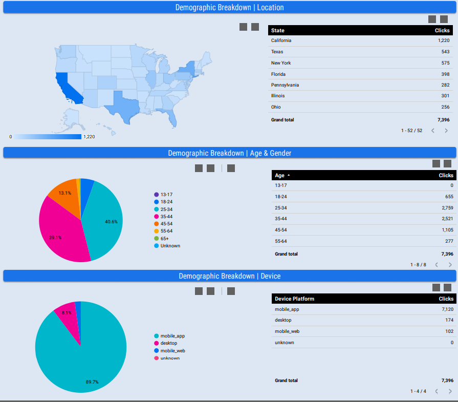
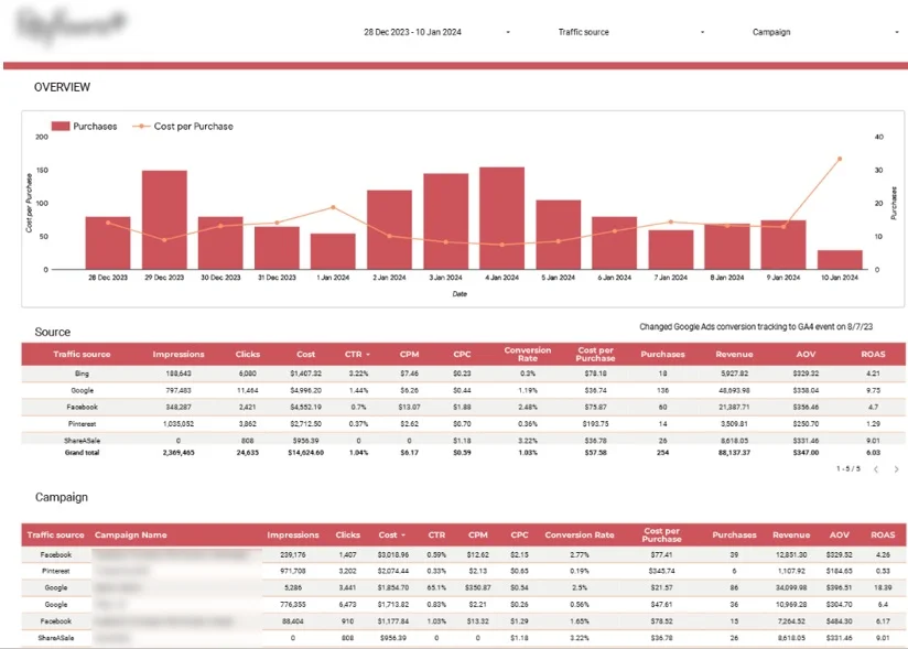
A digital marketing dashboard is built for agencies that need to see marketing efficiency across every channel in one place, without jumping between ten different ad platforms to piece the picture together. By centralising performance data into a single unified view, it quickly surfaces which channels are actually moving the needle on revenue, which makes budget allocation decisions far less guesswork and far more strategic.
A good example is the custom paid media dashboard we built for a flower delivery brand. It pulls data from Google Analytics, Google Ads, Bing Ads, Facebook, Pinterest, and several affiliate platforms into one clean report. The top of the dashboard tracks daily purchases alongside cost per purchase, so the team can see at a glance whether acquisition costs are creeping above average order value, which is usually the first sign that profitability is under pressure.
What the Dashboard Includes
Best Suited For – Marketing agencies managing multi-channel ecommerce campaigns and reporting performance to clients on a regular cadence. It is especially valuable for agencies whose clients run across several paid media platforms at once, where the absence of a unified view tends to cost both time and margin.
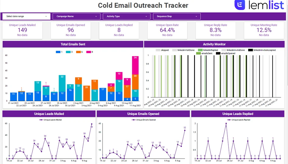
An email marketing dashboard gives agencies one clear place to track and improve outreach, pulling every campaign into a single view. It shows how each sequence performs at every stage of the funnel, which makes it far easier to report progress to clients, fine-tune timing, and point to the results that actually move the needle: replies landing in inboxes and meetings on the calendar.
The example above was built for an agency running a combined outreach programme across LinkedIn and Lemlist. The summary row along the top surfaces the headline metrics, so account managers can walk clients through performance in minutes rather than stitching reports together from separate tools.
What’s inside:
SEO reports should do one thing well: show clients the value your work is bringing to their business. That usually comes down to three things: visibility, traffic, and conversions. A good report tracks progress over time and gives the client real reasons to keep investing in SEO rather than vague reassurances.
– Keyword Ranking Dashboard
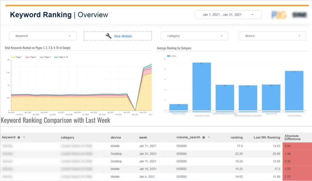
The dashboard above is a custom keyword ranking report we built for an SEO agency, pulling data straight from SEMrush. At the top, there’s a date filter and a set of dropdowns for keyword, category, and device, so the client can slice the view however they want. The chart on the left shows the total number of keywords ranking on pages 1, 2, 3, and 4 to 10 of Google over time, which makes it easy to see whether your efforts are pushing more terms onto page one or whether certain groups are slipping. Besides, the bar chart breaks down the average ranking by category, which is handy when a client wants to know which areas of their site are performing strongly and which still need work.
Underneath, the table compares this week’s rankings against last week’s for every keyword, alongside search volume and the absolute difference. The red cells draw the eye straight to the keywords that have moved, which is usually the first thing a client wants to talk about on a call.
Rankings alone don’t tell the full story, though. A proper SEO client report should also pull in impressions and clicks from Google Search Console, so the client can see how those rankings are actually turning into visits. Rankings are the leading indicator; traffic and conversions are what pay the bills.
Organic Traffic Dashboard
A Google Analytics dashboard gives agencies one clear place to see how a website is actually performing, pulling traffic and engagement figures into a single view where the numbers can be compared side by side. It shows how people are finding the site, what they do once they arrive, and where they lose interest and leave.
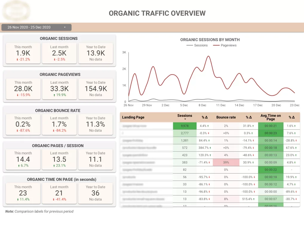
The custom dashboard above was built for a content‑driven website. It puts the current month’s engagement KPIs front and centre, with last month’s figures sitting right next to them, so the team can tell at a glance whether things are heading in the right direction.
The date selector at the top lets you widen the view for longer trend analysis or zoom in on a specific campaign window.
On the left, five metric panels walk through the essentials: organic sessions, organic pageviews, bounce rate, pages per session, and average time on page. Each one shows this month, last month, and the year to date, with coloured indicators flagging whether the number is up or down against the previous period. The red and green arrows make it obvious where attention is needed without having to pore over the figures.
On the right, a trend chart tracks sessions and pageviews across the month, so dips and spikes are easy to spot and tie back to specific content or activity. Underneath it, a landing page table ranks individual URLs by sessions and shows bounce rate and average time on page alongside the percentage change from the previous period. The colour-coding, a green-to-pink heatmap, draws the eye straight to the pages that are either punching above their weight or quietly underperforming.
What it includes:
Great for marketing agencies that need a clear read on traffic quality, engagement trends, and organic growth without having to dig through the standard Google Analytics interface every time a client asks for an update.
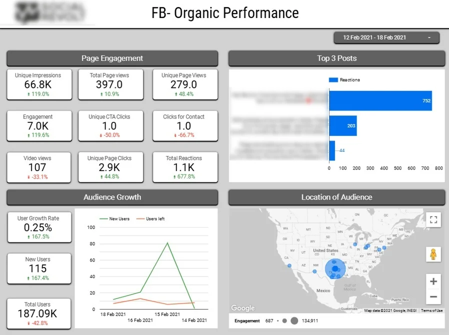
This custom Looker Studio dashboard was built for a social media marketing agency that wanted a cleaner, more transparent way to report on client performance across their social channels. Rather than stitching screenshots together from Facebook and Instagram each month, the team now has a single place to show what’s working, what isn’t, and where the audience is actually paying attention.
Key features:
The dashboard pulls data directly from Facebook and Instagram, with the focus squarely on content performance and audience growth. It’s built for social media teams who need to spot quickly which posts are landing well, so they can do more of what their audience actually responds to, rather than guessing.
Tracking followers and unfollows side by side over time makes it much easier to see the real impact of a campaign or a change in posting strategy. A sudden spike or dip stops being a mystery and starts telling a story you can take back to the client.
The state-by-state audience breakdown helps with content planning, too. Once you know where your most engaged followers are, regional campaigns, local partnerships, and posting times can be tuned around that rather than treating the whole audience as one block.
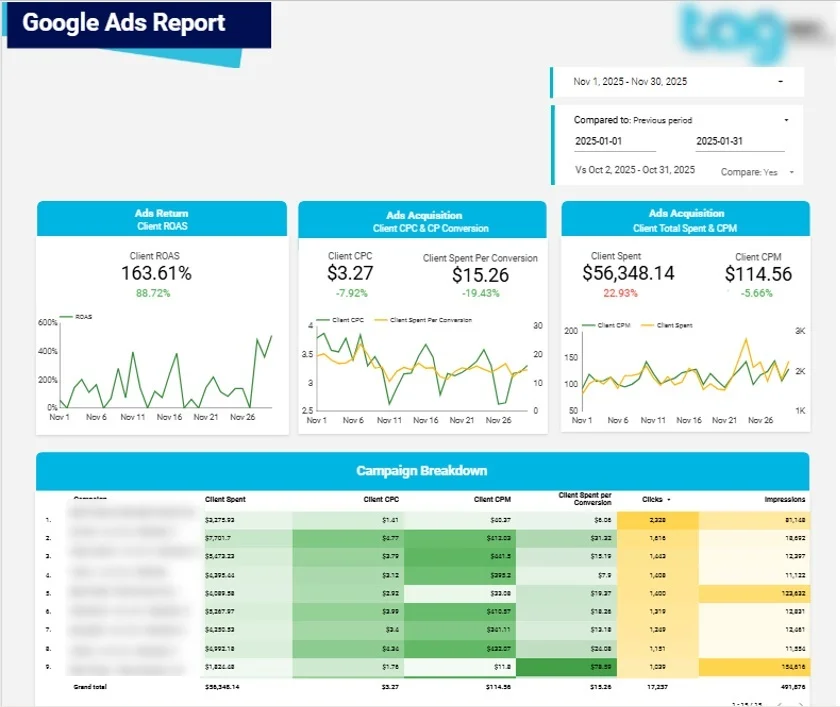
We built this custom Google Ads dashboard report for an ads agency that wanted a cleaner, more consistent way to show clients where their ad spend was actually going. It pulls the whole picture into one view, from daily clicks and conversions right through to return on ad spend, so account managers can walk a client through performance without flipping between tabs or exporting half a dozen CSVs.
Key features:
The dashboard connects natively to Google Ads, so there’s no manual data pulling or messy integrations to maintain. The focus is squarely on paid search performance across campaigns, keywords, and locations, the three angles clients tend to ask about most often when they want to know whether their budget is working hard enough.
Trusted by industry leaders to build Looker Studio agency dashboards that actually get used. Our consultants have delivered custom Looker Studio dashboards for TubeScience, NP Digital (Neil Patel’s agency), and Google itself, a track record that speaks to both our design standards and our technical depth.
Whether you’re reporting to clients, tracking campaigns, or scaling your agency’s analytics, we’ll build a Looker Studio dashboard that fits the way your team actually works. Get in touch today and let’s start building yours.

Support
All the support you need – when you need it. From 1-hour quick fix support to longer-term partnership that drives your business forward.

Consultancy
Advanced data thinking, creative ideas and the best Power Platform practices to unlock the true potential of your business data.

Training
Succeess shouldn’t be a one-off. When we train you teams user adoption surges and your Power Platform results radically improve.


