If you’re at the start of your BI journey, you’re likely trying to understand what business intelligence dashboards you can create and what they look like in different BI tools. Design, usability, and flexibility vary significantly between BI platforms, and seeing real examples is often the fastest way to decide what works for your business.
As the #1 rated BI consultancy on G2, we’ve delivered over 1,000 business intelligence dashboards for our clients. In this article, we explain what BI dashboards are, how they’re used in practice, review the leading BI tools, and showcase real dashboard examples built across different platforms to help you make an informed choice.
We will briefly explain what BI dashboards are, how they are used in business, what business intelligence tools are available and show business intelligence dashboard examples in every tool.
A business intelligence (BI) dashboard is an interactive reporting tool that automatically connects to company data sources, consolidates key performance indicators, and visualises them in charts and tables. Its purpose is to answer business questions quickly and help teams monitor performance and optimise processes using data.
By presenting information visually, BI dashboards make data easier to understand for non-technical users and highlight trends and patterns that are difficult to spot in spreadsheets. Some researchers found that visualizations were 25.5% quicker to understand than text and 46.5% quicker than tables.
The business value of a dashboard usually comes from one of the following benefits:
If you want help with building your BI dashboards, consider using our dashboard development services!
If you want to see more examples, you can see more Power BI KPI dashboards on our blog.
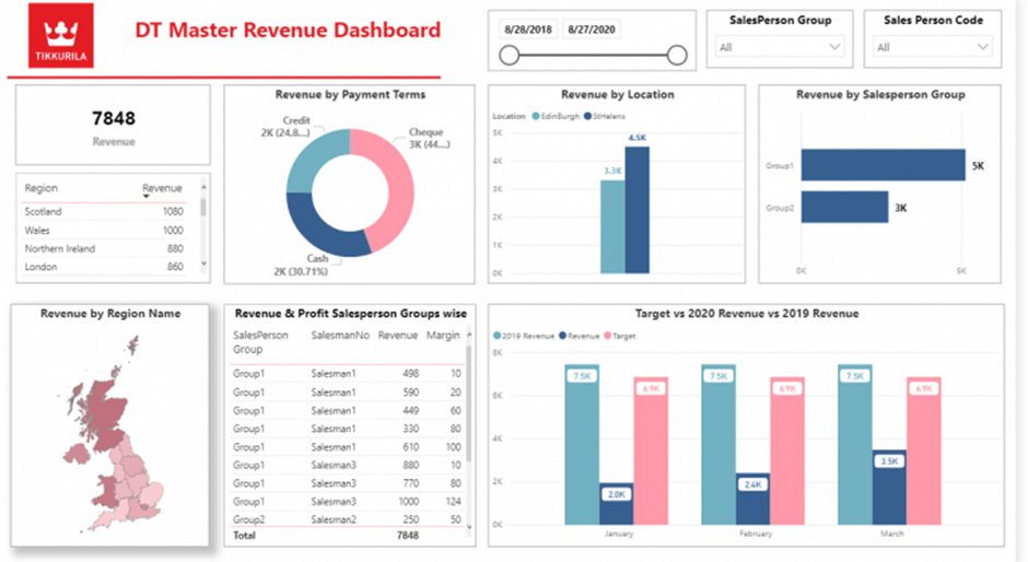
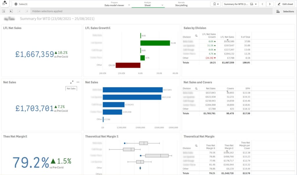
A business intelligence sales dashboard combines sales activity, revenue, and profitability into a single view used by sales and finance teams to track performance against targets and forecast future results.
Common metrics
Sales dashboards give finance and sales leaders early visibility into performance gaps. Declining regional revenue, underperforming sales reps, or falling margins often become visible weeks before targets are missed, allowing teams to act early.
In day-to-day operations, sales dashboards are used in weekly sales and finance meetings to review performance against targets, compare regions, and assess sales rep productivity. Over time, organisations use these dashboards for monthly and annual forecasting, product performance analysis, and more data-driven sales planning.
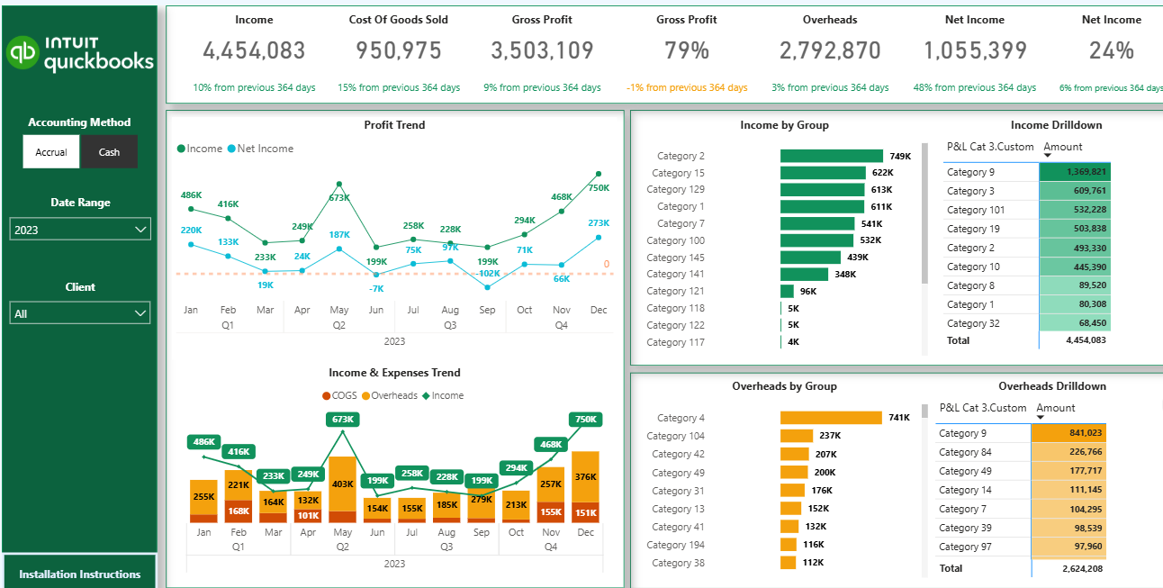
A financial business intelligence dashboard provides a structured view of company profitability by visualising key financial statements, most commonly the profit and loss (P&L). It helps finance teams understand how revenue, costs, and overheads evolve and what is driving overall performance.
Common metrics
Traditional P&L reports show totals but lack context. Financial BI dashboards add meaning through trends, comparisons, and drill-downs, helping finance leaders spot margin erosion, cost spikes, or revenue slowdowns before they materially impact results.
Finance teams use P&L dashboards for monthly close reviews and ongoing financial monitoring. Interactive filters allow users to switch between accrual and cash accounting, analyse performance by period, and drill down to individual transactions. Over time, organisations also use these dashboards to consolidate financial reporting across multiple entities or accounting systems into a single, reliable view.
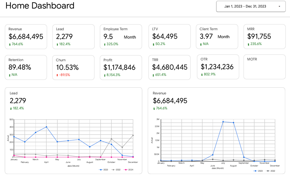
A business intelligence executive dashboard provides CEOs with a high-level view of performance across all major areas of the business, including sales, finance, marketing, operations, and HR. Its purpose is to provide leadership with a single source of truth for monitoring overall company health and identifying risks or opportunities early.
Common metrics
Executive dashboards replace fragmented reporting across multiple tools and spreadsheets. By bringing KPIs from every business function into one view, CEOs can quickly understand where their attention is needed, without relying on communication with individual departments.
On a day-to-day basis, executive dashboards are used by CEOs and senior leadership to track company performance at a glance. In leadership meetings, they provide a shared framework for discussions across sales, finance, operations, and HR. Over time, these dashboards help executives move to proactive management by continuously monitoring trends across the entire organisation.
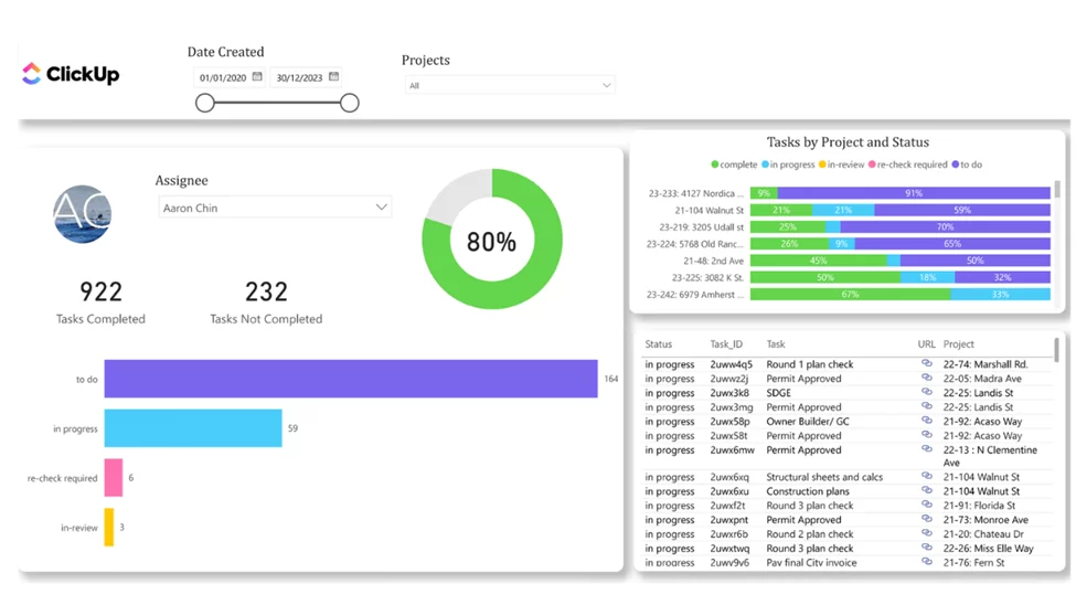
A project management business intelligence dashboard provides real-time visibility into project progress, budgets, and team workload. It helps project managers track delivery against plan, allocate resources more effectively, and reduce the risk of schedule delays or budget overruns.
Common metrics
Project dashboards make delivery issues visible early. Budget overruns, missed deadlines, or overloaded team members often appear in the data before they become critical problems. By tracking progress and risks in one place, teams can take corrective action before project performance is impacted.
Project managers utilise these dashboards daily to monitor task completion and the overall health of their projects. Task tracker views show which projects are close to completion and which are at risk due to a high number of open tasks. Workload analysis helps managers rebalance assignments across team members, while direct links to task management tools allow teams to jump straight into action and keep projects on track.
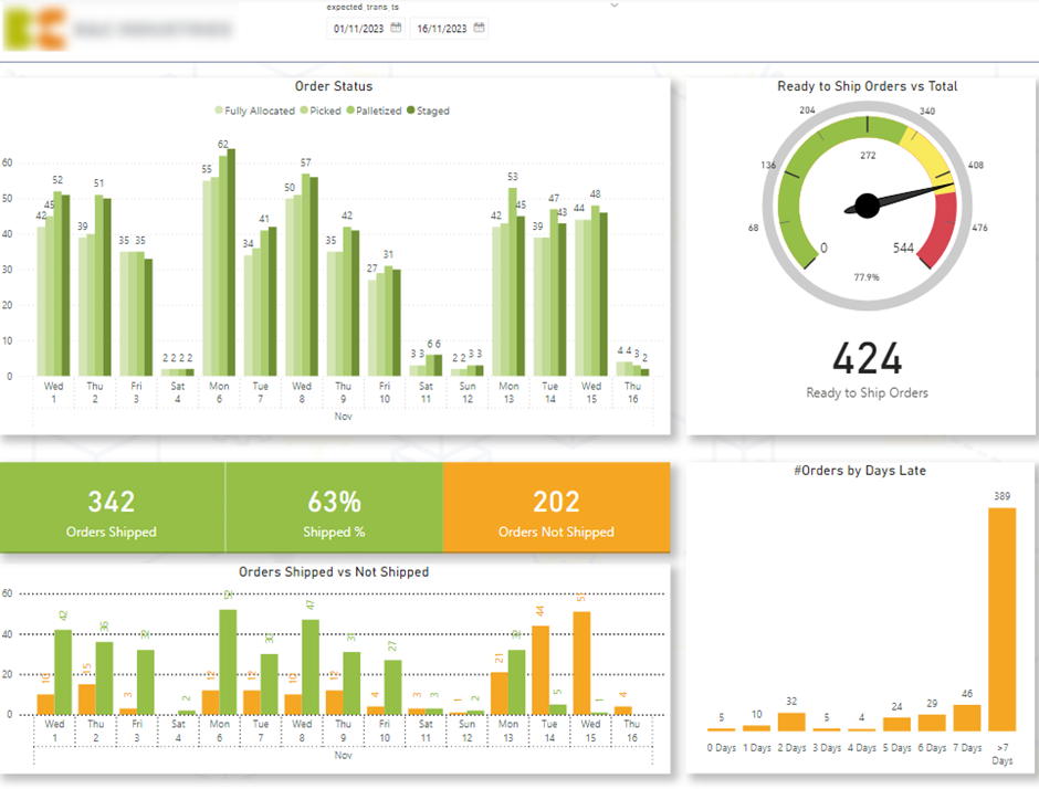
A logistics business intelligence dashboard provides real-time visibility into warehouse and delivery performance. It helps operations teams understand how efficiently orders move through the warehouse and whether deliveries are progressing on time.
Common metrics
Logistics dashboards help teams identify bottlenecks in the fulfilment process early. A drop in ready-to-ship items or a buildup of orders in a specific status often signals operational issues that can lead to delayed deliveries and dissatisfied customers if not addressed quickly.
Warehouse and logistics teams use these dashboards daily to monitor delivery flow and prioritise work. Gauge charts highlight whether shipping readiness is on track, while status breakdowns show where orders are getting stuck. Late-order analysis allows teams to drill down into specific delayed deliveries and resolve issues before they escalate, improving on-time delivery rates and overall operational efficiency.
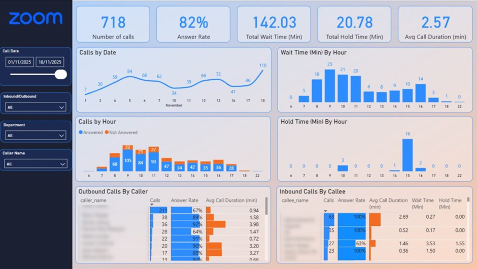
A customer service business intelligence dashboard provides real-time visibility into call centre performance and service levels. It helps support managers quickly identify when customer experience is declining and take action before missed calls or long wait times impact satisfaction.
Common metrics
Customer service issues often emerge during short peak periods rather than across the entire day. A drop in answer rate or a spike in wait time can quickly lead to frustrated customers and lost trust. BI dashboards make these patterns visible immediately, allowing managers to intervene before service levels fall below acceptable thresholds.
Call centre managers use these dashboards throughout the day to monitor coverage and agent performance. Hourly breakdowns highlight when unanswered calls increase, helping managers adjust staffing levels during peak periods. Agent-level analysis supports targeted coaching or call rerouting to maintain coverage, while wait-time analysis helps teams reduce delays and improve answer rates and overall customer experience in real time.
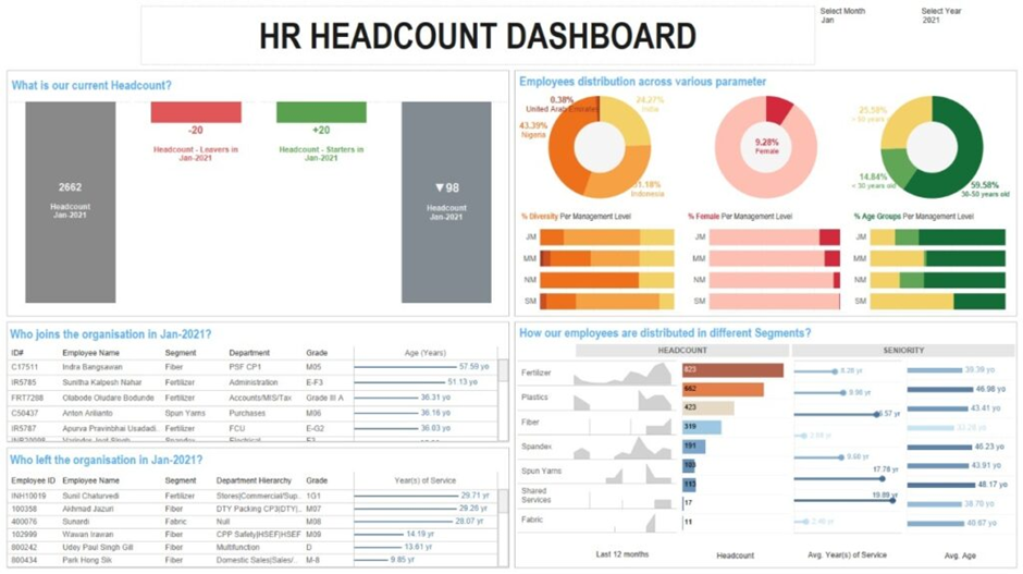
An HR business intelligence dashboard provides a structured view of workforce data across recruitment, retention, performance, and cost. It helps HR leaders and management teams understand how people-related decisions impact the wider business and identify issues early.
Common metrics
HR dashboards turn people data into actionable insight. Changes in attrition, rising overtime costs, or hiring delays often signal operational or cultural issues before they affect performance. By analysing workforce composition and trends, organisations can optimise seniority mix, control labour costs, and address potential biases in hiring and promotion.
HR teams use these dashboards regularly to monitor workforce stability and recruitment progress. Leadership uses headcount and diversity views to understand team composition, while recruitment dashboards support budget allocation and hiring prioritisation. Turnover and overtime analysis help managers respond to unplanned absences and workload imbalances, ensuring teams remain productive and sustainable over time.
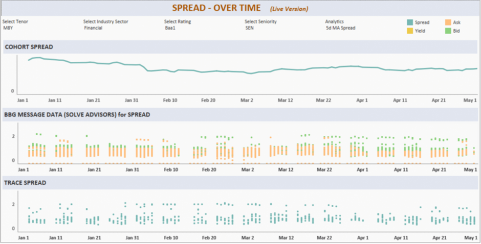
Business intelligence dashboards for fintech provide real-time visibility into market movements, pricing dynamics, and risk indicators. They are designed to support fast, data-driven decisions in environments where timing and accuracy directly impact returns.
Common metrics
In fintech and investment environments, delays in insight can lead to missed opportunities or increased risk. Dashboards that surface yield shifts, widening spreads, or changing liquidity conditions as they happen allow teams to react immediately rather than relying on delayed reports or fragmented data sources.
Investment teams use these dashboards throughout the trading day to monitor near-real-time market movements and prioritise analysis. Instead of manually pulling data from multiple systems, the dashboard highlights where pricing is becoming more attractive, where spreads are changing, and which instruments require attention. This enables faster allocation decisions, more confident trading execution, and a workflow where the dashboard actively guides daily investment priorities.
You can see more Looker Studio dashboard examples on our blog.
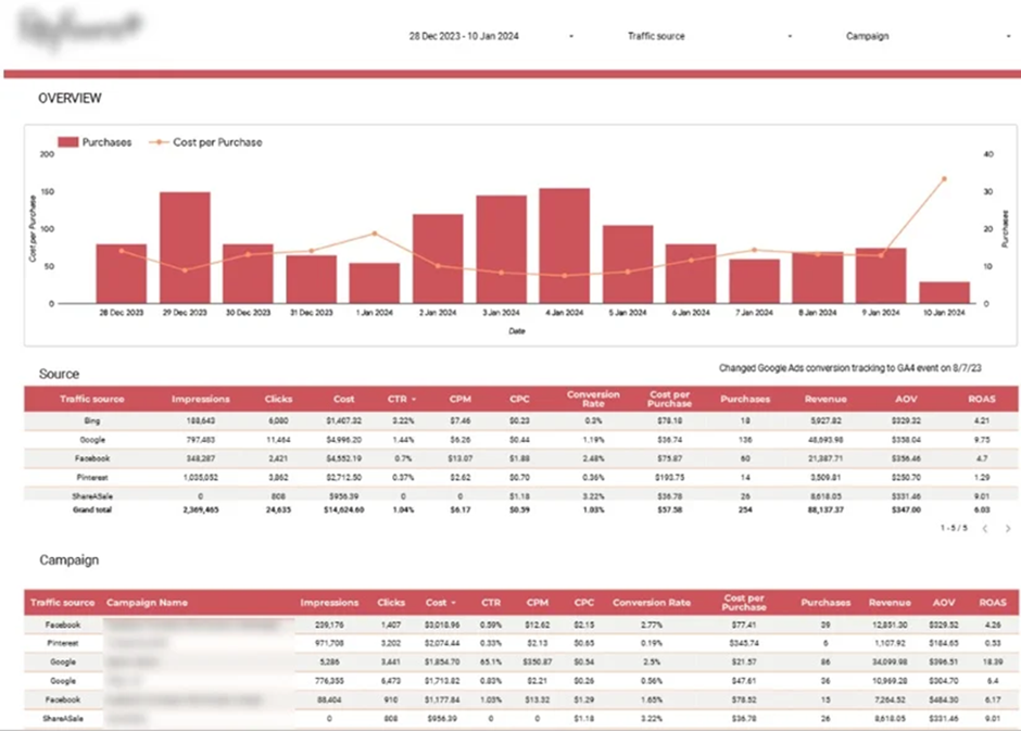
A marketing business intelligence dashboard provides a unified view of marketing performance across all acquisition channels. It helps teams understand how traffic, conversions, and spend translate into revenue and profitability, rather than analysing each channel in isolation.
Common metrics
Marketing performance often looks strong in isolation but weak when channels are compared side by side. BI dashboards reveal which channels drive profitable growth and which inflate costs. Monitoring daily purchases and cost per purchase helps teams ensure acquisition costs stay below revenue thresholds and adjust spend before efficiency drops.
Performance marketing teams use these dashboards daily to compare channels such as Google Ads, paid social, affiliates, and organic traffic in one place. High-level trend views monitor acquisition efficiency, while detailed channel and campaign tables help teams identify top-performing campaigns and reallocate budget toward the channels that generate the strongest ROI.
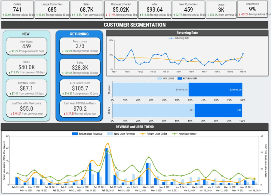
An ecommerce business intelligence dashboard brings together sales, customer behaviour, and marketing data into a single view. It helps ecommerce teams understand what drives revenue, how customers behave over time, and where to focus marketing and inventory decisions.
Common metrics
Ecommerce businesses generate large volumes of data, but without a BI dashboard it is difficult to turn that data into action. Ecommerce dashboards reveal which products, channels, and customers are truly profitable, helping brands avoid overspending on acquisition, reduce stock issues, and focus on high-impact growth opportunities.
Brand owners and marketing teams use ecommerce dashboards to plan acquisition budgets based on lifetime value, identify products to promote or bundle, and time reactivation campaigns more effectively. Operations teams use them to improve inventory planning and optimise reorder timing, while leadership uses the dashboard to track overall store performance and profitability across channels.
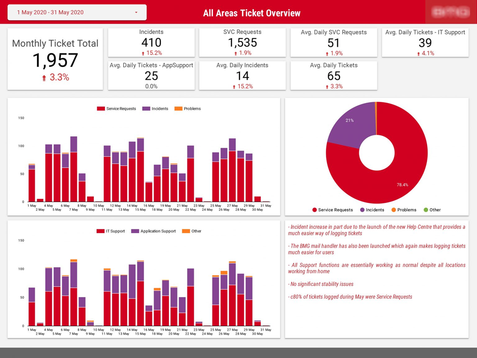
An IT operations business intelligence dashboard provides visibility into incidents, security controls, and support activity across the IT organisation. It helps IT leadership monitor operational risk, measure team workload, and report performance clearly to senior stakeholders and the board.
Common metrics
IT risks and operational issues often increase gradually before becoming critical. An IT operations dashboard makes trends visible early, such as rising security interventions or growing incident volumes. This enables leadership to prioritise resources, address recurring problem areas, and communicate IT performance in a clear, data-driven way.
IT leaders use these dashboards for monthly and board-level reporting to track security controls and incident resolution. Operations teams monitor ticket volumes by type, region, and application to identify pressure points and recurring issues. By breaking incidents down to specific systems or categories, teams can focus on root causes, improve system stability, and reduce future support demand.
You can see more DOMO dashboards on other articles in our blog.
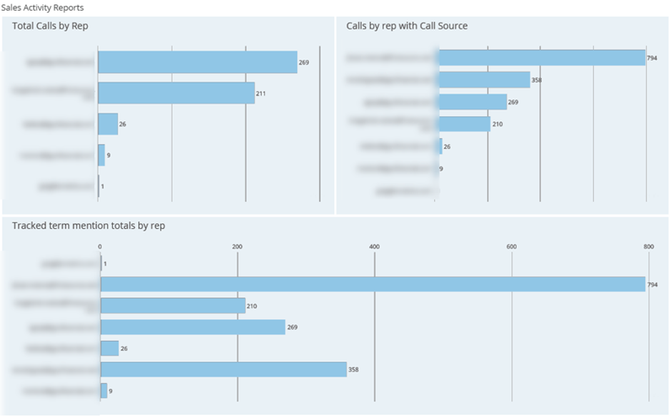
A CRM business intelligence dashboard consolidates sales activity and pipeline data from systems such as HubSpot, Zoho CRM, or Pipedrive into a single view. It helps leadership teams understand how sales activity translates into pipeline growth and revenue, and where inefficiencies exist in the sales process.
Common metrics
CRM dashboards connect sales efforts with outcomes. A drop in activity levels, stalled deals, or slow progression through pipeline stages often indicates future revenue risk. By making these patterns visible early, leadership can intervene before performance declines materially.
Senior leadership uses CRM dashboards to track sales productivity and pipeline health at a glance. Sales managers review activity leaderboards and pipeline metrics to coach reps, rebalance workload, and improve data quality in the CRM. Over time, weighted pipeline and deal velocity analysis helps teams forecast revenue more accurately and focus on the activities that drive deals forward.
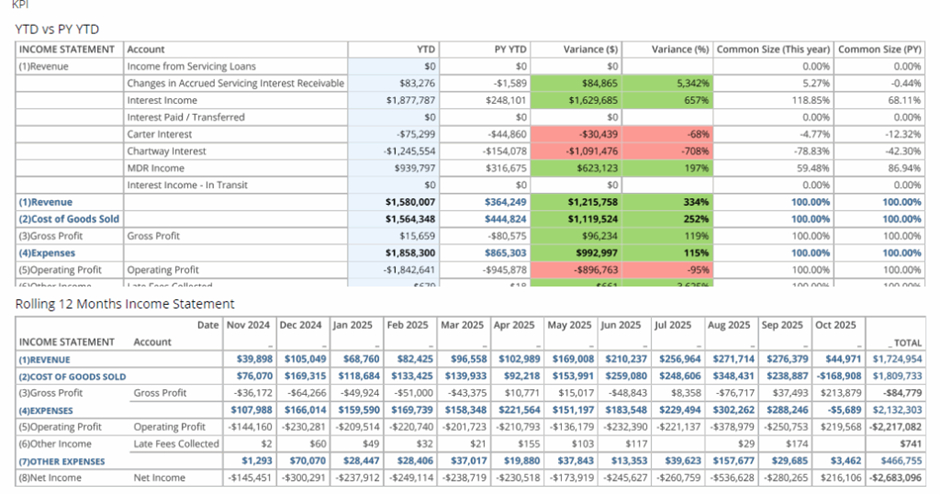
An accounting business intelligence dashboard provides a structured view of financial statements and accounting trends. It helps finance teams understand how income, expenses, assets, liabilities, and cash flow evolve and makes financial planning more predictable.
Common metrics
Accounting data often lives in static reports that make it difficult to spot trends early. BI dashboards add context by visualising financial statements over time, highlighting periods of cash burn, rising liabilities, or improving profitability before they become critical issues.
Finance teams use accounting dashboards for monthly close, financial reviews, and ongoing monitoring. P&L, balance sheet, and cash flow views are analysed together to understand overall financial health, while year-over-year and rolling 12-month comparisons help CFOs assess whether recent performance is sustainable and aligned with long-term financial goals.
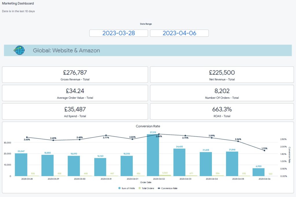
An online sales and marketing dashboard brings together revenue and performance data from all sales and marketing channels into a single, unified view. Its purpose is to show the full picture of marketing performance, rather than analysing each channel in isolation. This type of dashboard is especially valuable for businesses running campaigns across many platforms.
Common metrics
We built the Looker business intelligence dashboard above for an ecommerce brand selling through both Amazon and Shopify. Their marketing mix included Amazon Ads, Google Ads, Bing Ads, Facebook Ads, and Snapchat Ads. The dashboard combines revenue and ad spend from all platforms to calculate blended performance metrics across the entire marketing ecosystem.
Beyond the high-level view, users can scroll down to analyse the same KPIs by individual channel. This makes it easy to compare platforms, spot underperforming channels, and understand how each source contributes to total revenue and profitability.
Marketing teams use this dashboard to track overall budget pacing throughout the month and ensure total ad spend stays on target. It is also used to assess blended profitability, helping teams make informed decisions about reallocating budgets toward the channels that drive the strongest overall returns.
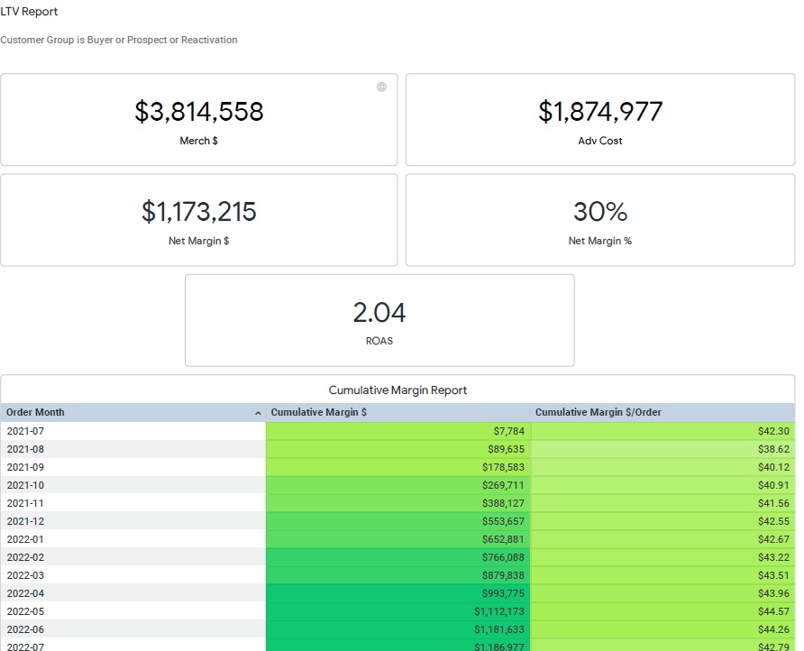
An LTV business intelligence dashboard measures customer lifetime value and how it grows over time. It is primarily used by ecommerce brands to guide marketing decisions and ensure that long-term customer value comfortably exceeds acquisition costs. The dashboard shifts the focus from short-term ROAS to sustainable profitability.
Common metrics
We built an LTV dashboard for an ecommerce brand by connecting their BigCommerce, Facebook Ads, and Google Ads data. The core of the dashboard was a cumulative revenue table that grouped customers by acquisition month and showed how much revenue those customers generated over time. This allowed the brand to clearly see the true lifetime value of each customer cohort.
The marketing team used these insights directly in their Google Ads bidding strategy. By setting target cost-per-acquisition thresholds based on real LTV data, Google Ads gradually optimised toward profitable acquisition levels. In parallel, the business began actively upselling existing customers to further increase LTV, using the dashboard as a benchmark to measure the impact of retention and upsell campaigns over time.
A C-suite business intelligence dashboard provides senior executives with a concise, high-level view of overall business performance. It is designed to surface what is happening across the organisation without overwhelming leadership with operational detail, making it ideal for regular executive reviews and strategic discussions.
Common metrics
We built the C-suite dashboard above for a restaurant group operating multiple locations. The dashboard analysed performance at both the individual restaurant level and the group level, allowing executives to quickly understand how each unit contributed to overall results. This dashboard became a standard part of weekly C-suite meetings and was also used to update investors on performance.
As a result, leadership gained early visibility into restaurants and business units showing signs of slowdown. By spotting declining sales or margin pressure early, the C-suite could react quickly with operational or strategic adjustments, protecting overall profitability and supporting more proactive decision-making at the executive level.
Business intelligence tools have matured significantly over the last few years. In 2026, the best BI platforms are no longer judged only by how much data they can handle, but by how effectively they help teams design clear dashboards, automate reporting, and turn insights into action.
We have worked with 10+ ad-hoc reporting tools delivering business intelligence dashboards to our clients. Based on our experience most companies go either one of Power BI, Tableau, Looker Studio or DOMO.
Best fit for: Microsoft-tech teams that want to produce analytics for internal users, have strong design control and good value for money.
Power BI is Microsoft’s business intelligence platform and remains the most widely used self-service BI tool in 2026. It offers a strong balance between ease of use and advanced analytical capabilities, which makes it suitable for both business users and data teams.
Power BI supports automatic data extraction from 250+ data sources, including Dynamics, Salesforce, Asana, SQL databases, and cloud platforms. Our Power BI consultants find that it quickly loads large datasets and can comfortably handle millions of rows, which makes it a solid choice for growing organisations.
From a dashboard design perspective, we have found that Power BI is highly flexible. Reports can be simple KPI overviews or complex multi-page analytical dashboards. Custom visuals, themes, and formatting options allow teams to closely align dashboards with internal reporting standards or brand guidelines.
Reports can be developed using a free license, while sharing typically requires a Power BI Pro license at $14 per user per month.
Best fit for: data-heavy teams that prioritise advanced visualisation and exploratory analysis, especially in Salesforce-centric environments.
Tableau has the most advanced data visualisation capabilities and, in our experience, it remains one of the strongest tools for data storytelling in 2026. It is commonly used by analysts and technically skilled users who want to interact with data freely and uncover patterns rather than just monitor predefined KPIs.
From a design perspective, we’ve found that Tableau offers more flexibility for complex and unconventional visualisations than most BI tools. It performs particularly well for use cases such as geospatial analysis or projects where unique design is the key.
Based on our work with clients, Tableau handles very large datasets reliably and has been used successfully in environments with hundreds of millions or even billions of rows. Since Tableau is owned by Salesforce, it integrates especially well with Salesforce data and is often chosen when dashboards need to be embedded directly into Salesforce.
The main drawbacks we see are cost and learning curve. Tableau requires a $75 per month paid license to develop dashboards and a $15-42 per month license for viewers. Some clients also find the tool overwhelming at first due to the breadth of functionality, although report development becomes very fast once users gain experience.
Best fit for: teams that need simple, shareable dashboards, particularly for marketing analytics and sharing reports outside their organization.
Looker Studio (previously known as Google Data Studio) is a free, fully web-based BI tool. In our experience, it is most commonly used for marketing dashboards and client-facing reports, where ease of access and sharing is more important than advanced analytics.
We’ve found Looker Studio particularly convenient when working with Google-native data sources such as Google Ads, GA4, BigQuery, and Search Console. There is also a wide ecosystem of low-cost third-party connectors for platforms like Facebook Ads, Klaviyo, and other marketing tools, which makes setup relatively quick.
From a dashboard design standpoint, Looker Studio works well for clean and straightforward layouts, but it has clear limitations. Customisation options are more restricted than in Power BI or Tableau, and more complex calculations or transformations often need to be handled upstream using SQL or other tools.
One of the biggest advantages we see is sharing. Report viewers do not need a license, which makes Looker Studio a strong option for agencies or businesses that regularly share dashboards with external stakeholders. On the downside, it is fully cloud-based and offers no on-premise deployment options, which can be a blocker for organisations with strict data governance requirements.
Best fit for: Product-led and enterprise-level teams that need governed analytics, multi-developer collaboration, and embedded dashboards for external users.
Looker is Google’s business intelligence platform and is primarily designed for organisations that want tightly controlled, model-driven analytics. It is less focused on flexible, self-service dashboarding and more on enforcing consistency through a central semantic layer. It is the most expensive tool on our list with the price starting $60,000 per year.
Based on our experience, Looker is the most limiting BI tool in terms of dashboard design and speed of development. Filters can only be placed at the top of dashboards and cannot be freely positioned. There is also no automatic data aggregation, meaning developers must define aggregations manually using formulas each time, which significantly slows down dashboard delivery compared to tools like Power BI or Tableau.
Where Looker performs well is in larger analytics projects that require multiple developers to work simultaneously. Its LookML modelling layer supports version control and structured collaboration, which reduces the risk of metric inconsistencies in complex environments. Looker also excels in embedded analytics use cases.
If you want to expose dashboards to your customers inside your own software, Looker allows you to embed its reporting module directly into your platform. This makes it a strong choice for SaaS companies that want customers to build and explore their own dashboards, even though it is less suitable for fast, design-driven internal reporting.
Best fit for: large enterprises that need real-time dashboards across a wide range of data sources and systems.
Domo is an enterprise BI platform with a strong focus on real-time reporting and operational monitoring. Based on our experience, it is usually considered when organisations have many disconnected systems and need dashboards that update frequently and support fast decision-making.
Where Domo stands out is in connectivity. It offers native integrations with 2,000+ data sources, which is significantly more than most BI tools. For companies dealing with dozens of internal and third-party systems, this can reduce the effort required to get data into a single reporting layer.
From a development perspective, we’ve found Domo to be more SQL-heavy than other self-service BI tools. This gives technical teams a lot of control, but it can be challenging for less technical users to build and maintain dashboards independently.
Domo is also the most expensive tool in this comparison. It targets enterprise customers exclusively and offers custom pricing rather than transparent per-user plans. As a result, we typically see it used in organisations where scale, real-time data, and system complexity outweigh cost considerations.
As this article shows, the value of a BI dashboard depends not only on the data behind it, but also on choosing the right tool and designing the dashboard around real business questions.
If you’re considering building or improving your BI dashboards, our team at Vidi Corp can help. As the #1 rated BI consultancy on G2, we’ve delivered over 1,000 dashboards across Power BI, Tableau, Looker Studio, and Domo. Contact us to discuss your requirements and see how we can design a dashboard tailored to your data, your tools, and your decision-making needs.
![]()
![]()
![]()