There’s no such thing as a one-size-fits-all Power BI executive dashboard. Every business runs on different data, processes, and priorities, which means off-the-shelf dashboards rarely show what truly matters. If you want executives to make better decisions, the dashboard has to reflect how your business actually works.
That’s exactly what we do. Our Power BI consultants build custom executive dashboards for C-level teams every day, and we’ve delivered over 1,000 dashboards across industries. Our approach combines speed with precision: we start from proven templates to move fast, then tailor the data, logic, and KPIs to your unique business. The result is an executive dashboard that’s built for your organisation, not adapted from someone else’s.
In this article, we will show you 9 Power BI executive dashboard examples that analyze various business functions across different industries. Those are screenshots from real-life projects that were developed specifically for our clients.
An executive dashboard is built for C-level leaders such as CEOs, CFOs, and COOs. It gives them a single place to review what is happening across the entire business. The dashboard typically shows the performance of each department using a small set of clearly defined KPIs.
The main purpose of an executive dashboard is to help senior leaders spot issues early and decide where to focus their attention. It also provides a consistent way to track progress over time and can be shared with investors to communicate how the business is performing.
A useful way to think about executive dashboards is through a simple analogy. When you ride a bicycle, you don’t need a dashboard. When you move to a motorcycle, you get a small one. Cars have larger dashboards, and airplanes have very complex ones.
Businesses work the same way. As a company grows, it becomes more complex. With more people, processes, and decisions, leadership needs a clearer and more comprehensive view of the business. An executive dashboard provides that view and helps ensure that the most important metrics stay healthy as the company scales.
Power BI executive dashboards can look very different depending on the business and industry. However, the most effective ones share a few core principles.
First, executive dashboards must stay high-level. They are built to support strategic decisions, not day-to-day operations. This is what separates them from operational dashboards used by line managers to monitor tasks, resolve issues, and manage performance in real time.
Second, executive dashboards need simple and intuitive visuals. CEOs and senior leaders should be able to understand every chart at a glance. Their time is limited, and a dashboard that requires explanation or long analysis will not be used.
Third, executive dashboards must be fully automated. Data extraction and refresh should happen automatically, often multiple times per day. This removes manual effort from employees and gives executives near real-time visibility into the business, allowing them to see the impact of strategic decisions as they happen.
Finally, executive dashboards should focus only on decision-driving KPIs. These are the metrics that guide choices such as who to hire, which marketing channels to prioritise, or which projects need attention. Adding too many metrics creates noise and distracts from what really matters at the executive level.
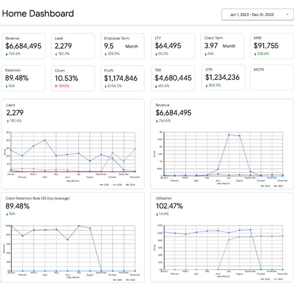
The executive summary dashboard brings all high-level business performance metrics into one clear view. It gives executives a quick snapshot of how the entire organisation is performing and helps them spot issues early. When something looks off, they can drill down into department-level dashboards for deeper analysis.
Our Power BI developers built the executive summary dashboard above for the CEO of a marketing agency. It consolidates the most important KPIs across all core functions, including:
The CEO uses this dashboard to set priorities and focus attention where it matters most.
For example, if the number of leads drops month over month, the issue is visible immediately. The CEO can then open a detailed marketing dashboard to see which channels or campaigns underperformed and decide where to invest more time or budget to boost lead generation.
The same applies to operations. If client retention starts to fall, the CEO can quickly identify which clients have left and discuss potential causes with the team before the problem escalates.
Utilisation metrics are just as valuable. If utilisation rises well above 100%, it signals that teams are overstretched and working overtime. With this insight, the CEO can decide whether to bring in subcontractors or hire a new full-time employee to protect performance and prevent burnout.
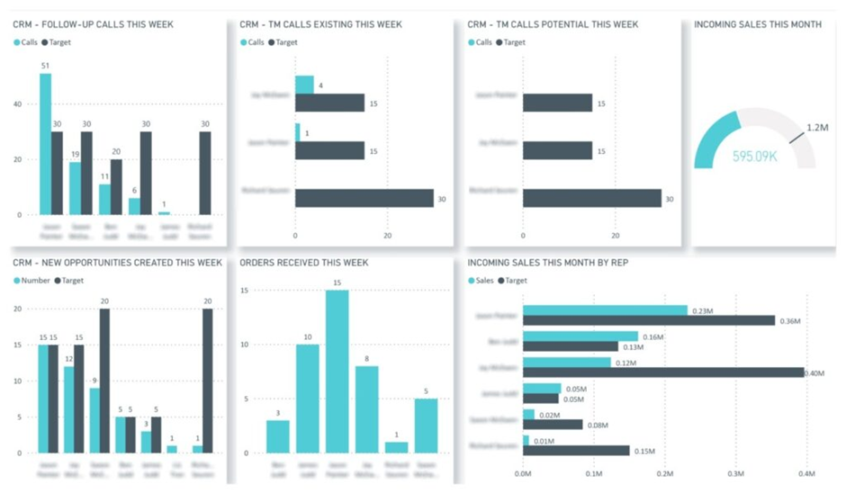
The sales executive dashboard gives C-level leaders a clear view of sales performance against targets. It focuses on activity, pipeline creation, and closed deals, helping executives understand whether revenue goals are on track and what that means for future cash flow and capacity planning. The dashboard is designed to support fast, high-level decisions, with the option to drill into individual reps only when needed.
Our BI Consultants built the sales executive dashboard above for a company using NetSuite as its CRM. The dashboard compares actual performance versus targets across key sales KPIs, including calls made, opportunities created, and deals won. Data is refreshed automatically every working hour, giving leadership a near real-time view of sales execution.
C-level executives use this dashboard in several practical ways. Finance leaders rely on closed deals and pipeline trends to forecast future cash flow and assess whether revenue targets are realistic. CEOs and COOs monitor deal volume and win rates to decide when additional subcontractors or delivery resources will be needed to support incoming work. If activity levels fall below target, leadership can quickly spot the issue and align with sales management on corrective actions before revenue is impacted.
By connecting sales activity directly to financial and operational planning, this executive sales dashboard turns CRM data into a strategic tool rather than a purely operational report.
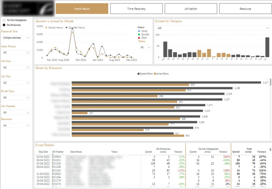
The project management executive dashboard gives C-level leaders visibility into how delivery teams use time and budget across projects. It focuses on resource utilisation, estimated versus actual hours, and project profitability, helping executives understand whether projects are being delivered efficiently and at the right margin. The dashboard is designed to support strategic decisions around pricing, staffing mix, and capacity planning.
We built the Power BI project management dashboard above for an event management company based in London. The executive team used it to monitor overall team effectiveness and profitability across corporate events. The dashboard compares quoted hours to actual hours at multiple levels, including project, task type, and individual contributor.
Executives use this dashboard in several practical ways. By identifying events that exceeded their budgeted hours, leadership can see where delivery assumptions break down and adjust future estimates. The dashboard also helps define the right balance between senior and junior staff by showing how different resource mixes impact delivery efficiency and margins. In addition, sales leaders use the insights to identify which sales reps consistently under-quote projects, allowing them to refine pricing guidelines and protect profitability. This turns project data into a clear feedback loop between sales, delivery, and executive planning.
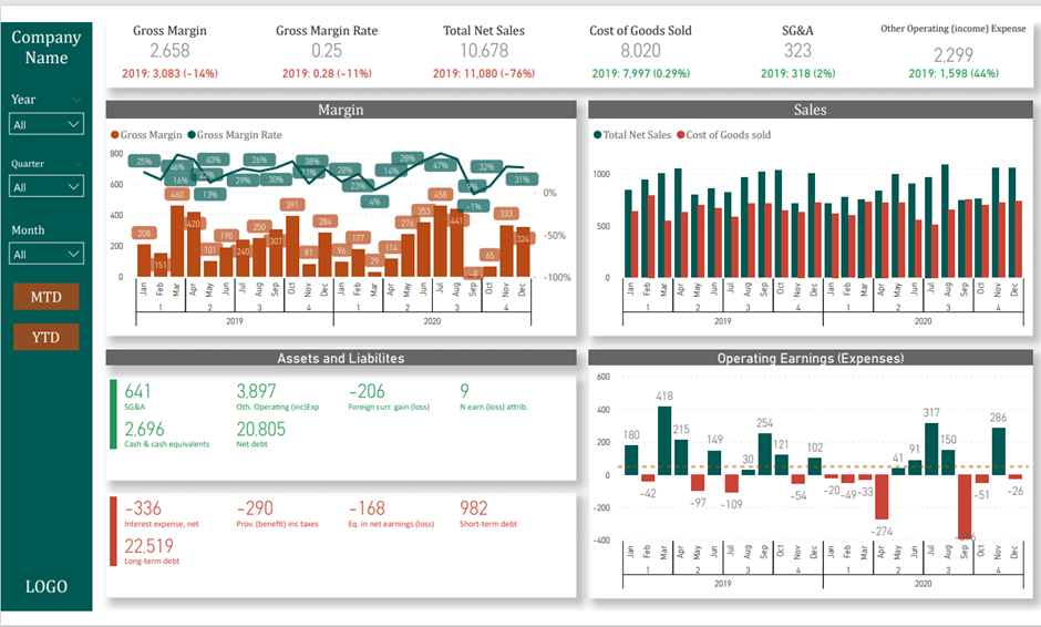
The executive financial dashboard gives CFOs and other C-level leaders a clear, high-level view of the company’s financial health. It brings together income statement and balance sheet metrics in one place, allowing executives to assess profitability, cost structure, and cash position while supporting operational decision-making across the business.
We built the Power BI executive financial dashboard above to help leadership teams monitor financial performance at a glance. The dashboard highlights key KPIs at the top, such as sales, cost of goods sold (COGS), gross margin, and operating earnings, and shows how these metrics are trending compared to last year. Sales and cost of sales are analysed by month and quarter, while balance sheet metrics provide visibility into assets, liabilities, and overall financial stability. Interactive filters allow executives to switch between year, quarter, month, and MTD or YTD views.
CFOs use this dashboard as a decision support tool when working with other executives. Rising COGS trends can trigger discussions about changing suppliers or renegotiating contracts. Increasing operating expenses highlight areas where costs may need to be reduced or processes streamlined. Cash and liability metrics help leadership assess whether the business can comfortably sustain operations or needs to improve cash flow by adjusting billing terms or accelerating collections. By combining performance, cost, and cash insights, the executive financial dashboard enables more confident, data-driven decisions at the leadership level.
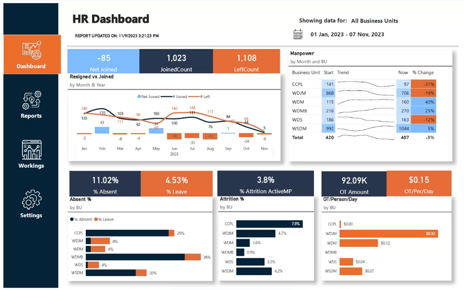
The HR executive dashboard is primarily relevant for large organisations or businesses with high hiring volumes, such as seasonal companies in hospitality, travel, or retail. It gives C-level executives visibility into workforce stability, hiring pace, and attrition risk, helping them ensure the business has enough capacity to sustain operations and meet deadlines.
We built the Power BI HR executive dashboard above for a diamond refinement company with over 400 employees and a high turnover rate. The leadership team used the dashboard to track headcount changes across departments and understand where employee departures were putting pressure on delivery teams. The core metrics included new joiners, resignations, and attrition percentage, broken down by business unit.
Executives use this dashboard to make proactive workforce decisions. By identifying departments with sustained attrition, leadership can prioritise hiring before workloads become unsustainable. Analysing resignation reasons helps HR and executives address structural issues that drive turnover. The dashboard also highlights where attrition leads to increased overtime costs, allowing executives to decide whether to accelerate recruitment, rebalance workloads, or invest in retention initiatives. This turns HR data into an operational planning tool rather than a purely administrative report.
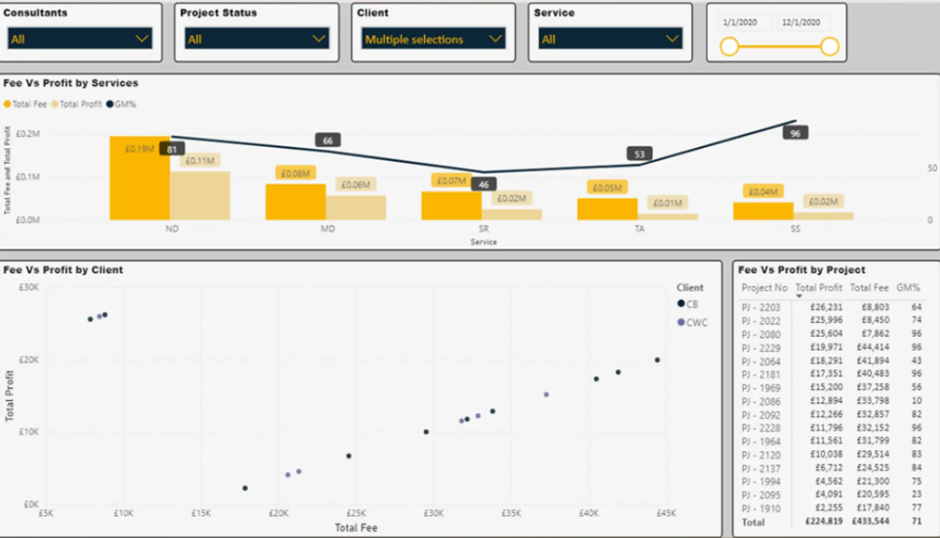
The professional services executive dashboard is designed to help leadership teams understand profitability as the business scales. For consulting, engineering, and advisory firms, growth alone is not enough. Executives need clear visibility into which projects, clients, and service lines are profitable and which ones quietly erode margins. This dashboard brings together financial, time tracking, and operational data to support informed growth decisions.
We built the Power BI executive dashboard above for a specialist engineering consultancy in the UK with around 15 employees and rapid year-on-year growth. The result was a clear picture of profitability across projects, clients, consultants, and regions.
C-level executives use this dashboard to guide sustainable growth. By understanding project and client profitability, leadership can avoid scaling unprofitable work and instead double down on high-margin services. Visibility into consultant utilisation and project margins helps executives price future work more accurately and plan hiring with confidence. For a growing professional services firm, this type of executive dashboard becomes a foundation for stability, ensuring that growth strengthens the business rather than introducing hidden financial risk.
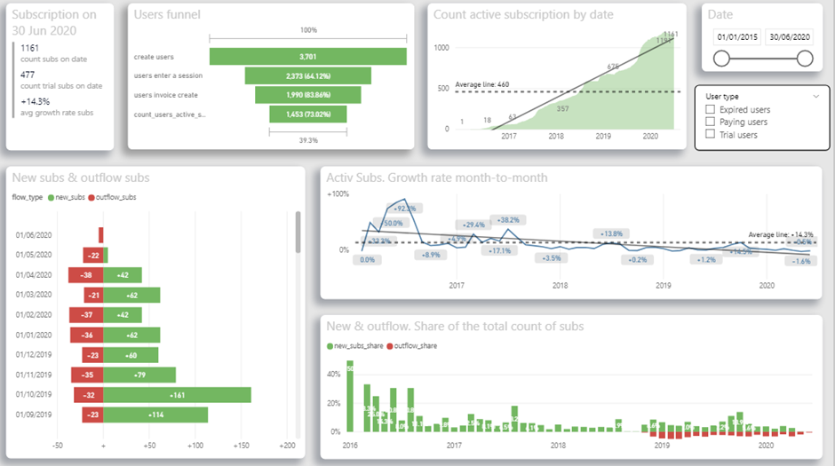
The SaaS executive dashboard is designed to help C-level leaders understand user behaviour, conversion, and subscription growth. It gives executives a clear view of the product funnel, from registration to paid subscription, and shows where users drop off or disengage. This allows leadership to align product development, marketing, and retention efforts around real usage data.
We built the Power BI SaaS executive dashboard above for a UK-based SaaS company targeting doctors. The CEO wanted a deeper understanding of how different user groups interact with the app and how those behaviours translate into revenue. The dashboard analyses user demographics, weekly usage hours, average monthly sessions, active subscriptions, free-trial conversion rates, and daily trends for new and churned users.
The CEO uses this dashboard to guide product and growth decisions. Funnel analysis shows how many users register, become active, and convert to paid subscriptions, helping identify where the user experience needs to be simplified or improved. Usage metrics highlight whether doctors are engaging with the app often enough to justify investment in new features or whether reactivation campaigns are needed. Subscription growth and churn trends support revenue forecasting and prioritisation of retention initiatives. By combining product usage and subscription data, the SaaS executive dashboard turns user behaviour into a strategic input for product and commercial planning.
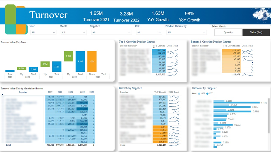
The manufacturing executive dashboard is designed to give senior leadership a clear view of operational performance, market trends, and supply chain risks. It helps executives understand which products the growth is coming from, which customers have a large backlog of orders to work through, and how product/regional performance compares to the wider market.
We built the Power BI manufacturing executive dashboard above for a public manufacturing company as part of a company-wide move away from Excel reporting. The client needed to migrate eight manually maintained reports into Power BI within three months. One of the reports, highly valued by senior management, took a full day to refresh manually. We consolidated shared data sources, automated refreshes, and redesigned the reports to improve data storytelling. In total, over 100 Power BI pages were delivered.
Executives use this dashboard to support strategic and operational decisions. Order backlog analysis highlights which products and clients are most affected by delays, helping leadership prioritise production and manage customer expectations. YoY growth analysis by product group, supplier, and region supports decisions around regional expansion, supplier negotiations, and portfolio focus.
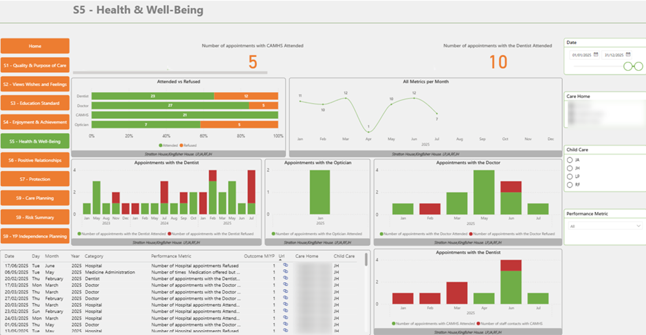
The healthcare executive dashboard is designed to help senior leaders in hospitals, clinics, and care homes oversee operations and ensure high standards of care. It provides a clear, high-level view of patient care metrics, allowing executives to monitor service quality, identify gaps, and take action before issues escalate.
We built the Power BI healthcare executive dashboard above for a care home. The dashboard tracks key care indicators, including the percentage of residents who attended essential medical visits such as dentists or opticians versus those who declined. These metrics are analysed over time, with monthly trends showing whether care engagement is improving or declining.
Executives use this dashboard to make informed operational decisions. By monitoring care participation rates, leadership can assess whether residents are receiving an appropriate level of medical attention and investigate areas where engagement is low. Trend analysis helps executives identify patterns early and work with care teams to improve outcomes. This turns care data into a practical management tool that supports both operational efficiency and quality of care.
Across industries from professional services and SaaS to manufacturing, healthcare, and finance, the best executive dashboards are always custom-built. They reflect how the business really operates and focus on the KPIs that drive decisions at the C-level.
If you’re considering an executive dashboard for your organisation, we’d be happy to help. At Vidi Corp, we’ve delivered 1,000+ Power BI dashboards for leadership teams across a wide range of industries. Get in touch to discuss your requirements, and we’ll show you how a custom executive dashboard can support better, faster decision-making in your business.
![]()
![]()
![]()