Data visualization dashboards are interactive reporting tools used by businesses to analyze their data and easily see patterns within. Their primary purpose is to help businesses to better manage critical processes in finance, marketing or other business functions by tracking critical metrics and making decisions based on data.
At Vidi Corp, we’ve delivered 1,000+ data visualization consulting solutions to 600+ clients worldwide, helping clients simplify reporting, identify trends, and make faster decisions. The data visualization dashboard examples in this article were developed by our consultants on real-world projects, bringing clarity to even the most complex datasets.
Many of these dashboards save 10+ working hours by month by automatically extracting the data from multiple sources, transforming it and presenting in a single report.
Good data visualization isn’t just about making charts look nice, it’s about communicating insights clearly with data. Clear visuals help teams see trends, spot patterns, and make higher-quality decisions based on hard data.
Here are a few tangible results that our clients achieved because of the insights powered by clean data visualization:
In short, good data visualization dashboards helps users find insights that lead to tangible business outcomes.
Our data visualization consultants have created dashboards for financial, marketing, HR and many other business functions. We conveniently grouped our data visualization dashboard examples by business function for you below.
We have written a longer article showing more financial dashboard examples. We are showing some of these dashboard examples below.
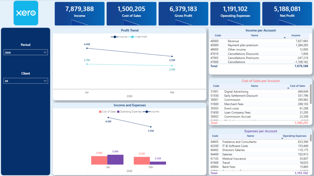
A P&L data visualization dashboard brings revenue, COGS, gross profit, overheads, and net income into one interactive view. It shows performance by month, quarter, or year, with breakdowns by income channel and expense category. Users can switch between cash and accrual accounting, apply date filters, and drill down to individual transactions directly from the dashboard.
This dashboard makes tracking profitability easy by automatically extracting data from Xero. Accountants and financial directors use it automate their month-end reporting, save 4-10 hours per month and manage the company finances more effectively.
Please note: our Xero Power BI template also includes a page on Balance Sheet analysis.
A fractional CFO consultancy that we worked with is using this dashboard to automatically extract data from 30+ Xero accounts and automate client reporting. Another retail brand we worked with is currently using this data visualization dashboard template to monitor profitability of 5 different stores and ensure it stays within their target.
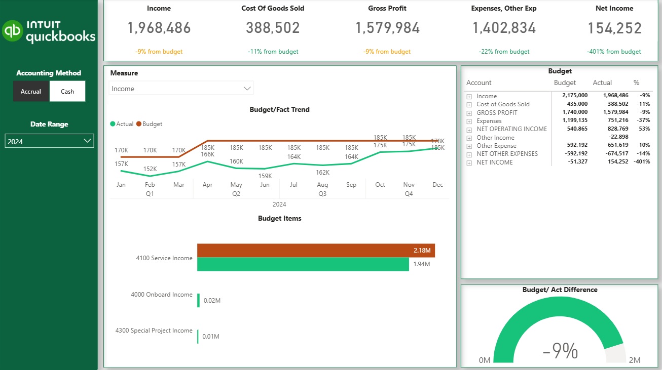
An actuals vs budget data visualization dashboard compares real sales and expense performance against predefined financial targets. It typically shows actuals versus budget by month, quarter, or year, with clear variances highlighting over- or under-performance. Depending on how detailed the budget is, the dashboard can track high-level revenue targets or drill down into specific P&L lines, products, or cost centers.
This data visualization dashboard helps finance teams and business leaders monitor financial discipline and stay aligned with targets. By visualizing variance to budget using clear charts and tables, teams quickly spot overspending, missed revenue targets, or areas outperforming plan. It replaces manual variance analysis and supports faster corrective action throughout the period.
A finance team we worked with uses this dashboard to track monthly performance against annual targets and flag deviations early. Another growing business uses the dashboard to monitor budget adherence across multiple departments, helping managers control costs and improve forecast accuracy before quarter-end.
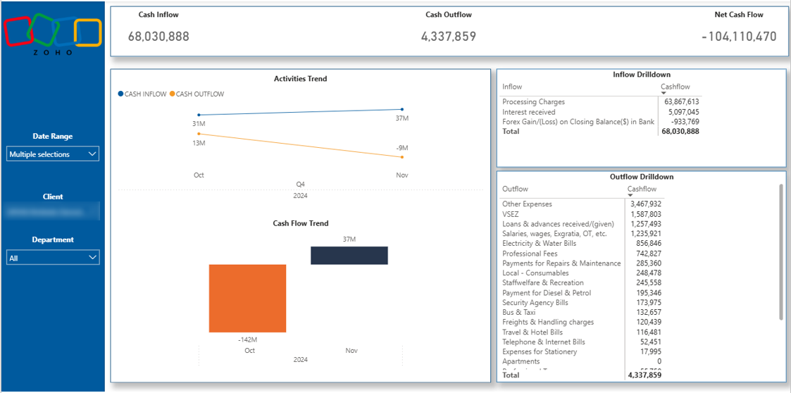
A cash flow data visualization dashboard focuses on how cash moves in and out of the business over time. It highlights cash inflows, cash outflows, and ending cash balance, helping teams understand liquidity beyond what the P&L shows. This dashboard makes it clear whether the business can meet short-term obligations and sustain daily operations.
This dashboard helps companies proactively manage cash and avoid liquidity issues that can threaten survival. Finance teams use it to monitor cash reserves, anticipate shortfalls, and plan payments or investments with confidence. By replacing manual cash tracking with automated visuals, the dashboard supports better decisions and reduces financial risk.
Please note: Our Zoho Books Power BI dashboard includes pages on P&L, Balance Sheet and Cash Flow, Aging Account Receivables and Outstanding Invoices analysis.
One company we worked with uses this data visualization dashboard to monitor weekly cash balances and ensure sufficient runway for operations. They rely on it to forecast upcoming cash gaps and adjust spending early, protecting the company from cash-related disruptions.
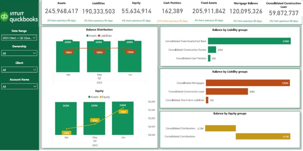
A balance sheet data visualization dashboard provides a clear snapshot of a company’s assets, liabilities, and equity in a single view. It is especially valuable for asset-heavy industries such as construction and real estate, where long-term loans, mortgages, and appreciating assets play a major role.
Visualizing balance sheet data on a dashboard helps businesses actively manage leverage, liquidity, and risk. Finance teams use it to track borrowing levels, monitor major creditors, and understand how long existing cash reserves can support operations. By making balance sheet metrics easy to interpret, the dashboard supports smarter financing decisions and stronger long-term planning.
Please note: Our QuickBooks Online Power BI dashboard includes pages on P&L, Balance Sheet and Cash Flow analysis
One construction company we worked with uses this data visualization dashboard to monitor loan balances and cash coverage each month. A real estate business relies on the dashboard to track asset growth and debt exposure across projects, helping leadership manage risk with confidence.
You can see more marketing dashboard examples in a separate article. In the meantime we are showing some of our best work examples below.
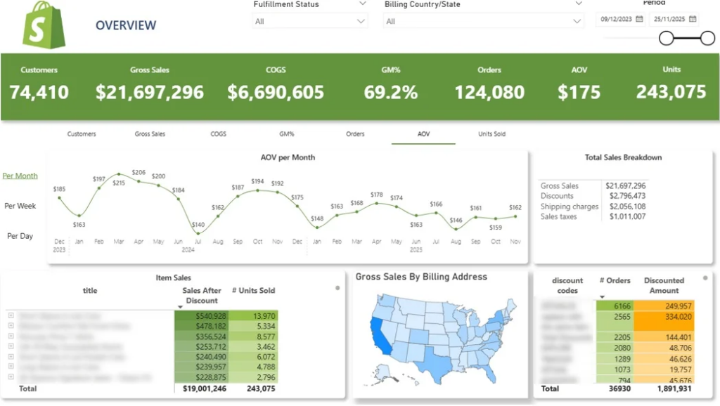
Shopify native reports can make it hard to quickly spot sales trends across products, locations, and promotions. With key metrics spread across multiple views, important patterns are easy to miss.
Our Shopify Analytics Dashboard helps businesses analyze customer behaviour, see what products they reorder, measure customer lifetime value and much more. It offers insights on key metrics like:
Instead of navigating multiple Shopify reports, brands get one clear dashboard to monitor sales performance, identify growth opportunities, and evaluate the performance.
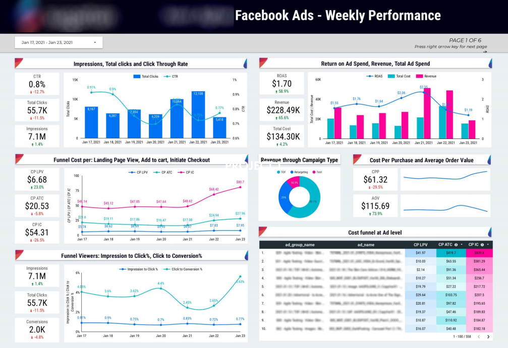
Evaluating paid social performance can be challenging when spend and results are spread across campaigns, ads, and audience segments. Marketers often struggle to understand where budget is being spent and which ads are actually driving results.
We created a Facebook Ads Looker Studio dashboard that centralizes ad performance data, showing spend allocation by ad, placement, and demographic alongside results such as impressions, clicks, and purchases. Key efficiency metrics include CPM, CPC, cost per purchase, and return on ad spend.
With high-level summaries and performance trends, the dashboard helps teams quickly assess account health and identify winning campaigns. Marketers use it to spot inefficiencies, compare performance over time, and optimize paid social spend with confidence.
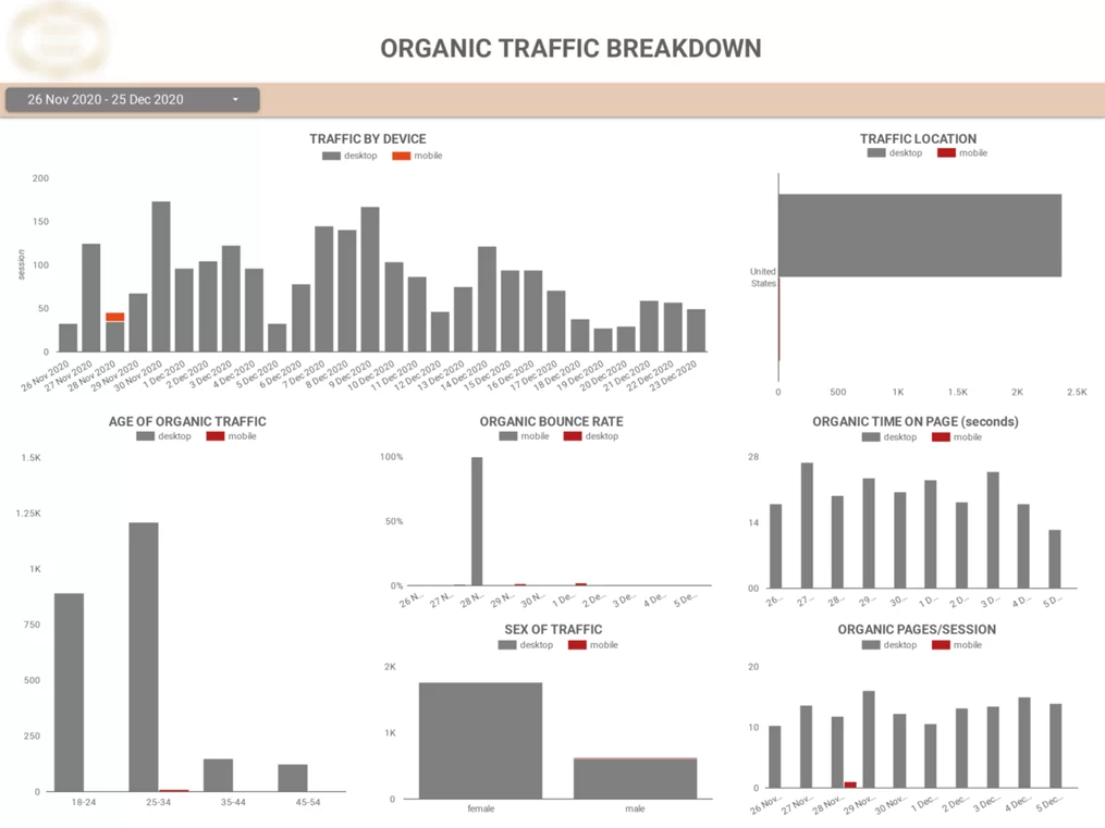
Understanding who your website visitors are and how they behave can be difficult when audience and behavior data is scattered across multiple GA4 reports. Teams often struggle to connect demographics, devices, and on-site behavior in a way that informs SEO and marketing decisions.
Our web analytics dashboard brings audience and behavior data into a single Looker Studio view, showing visitor characteristics such as device type, age, gender, and location alongside engagement metrics. It also breaks down user behavior by device, making it easy to see differences in time on site, page engagement, and browsing patterns.
With these insights, teams can optimize their websites for the most popular devices and tailor SEO content and marketing strategies to the audiences that matter most. Marketers use the dashboard to improve user experience, increase engagement, and drive better overall SEO performance.
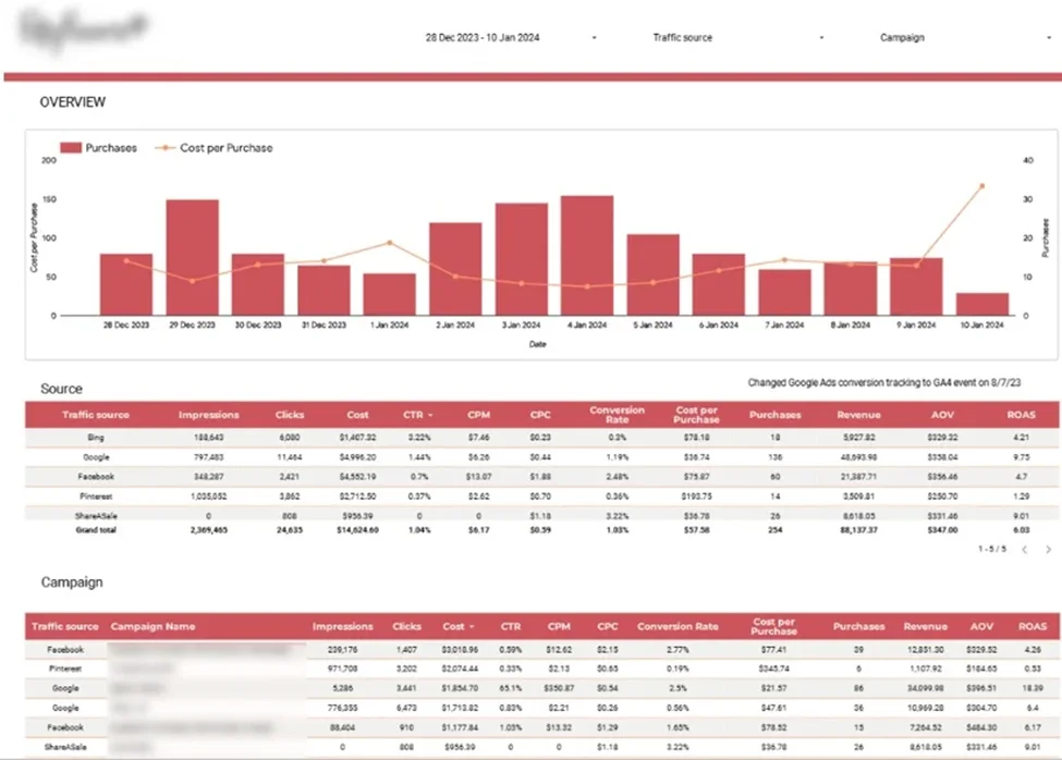
Evaluating marketing efficiency across ecommerce channels is challenging when performance data is spread across multiple platforms. Teams often struggle to identify which channels and campaigns drive profitable customer acquisition and how to allocate budgets effectively.
Our team developed a marketing analytics dashboard that combines data from Google Analytics, Google Ads, Bing, Facebook, Pinterest, and ShareASale into a single Looker Studio view. It visualizes daily purchases alongside cost per purchase to help monitor acquisition efficiency, and breaks down key metrics such as impressions, CPM, cost per purchase, ROAS, conversion rates, and revenue by channel and campaign.
With clear channel- and campaign-level comparisons, the dashboard helps teams identify the most profitable channels and the campaigns that deliver the best balance of efficiency, sales volume, and brand exposure. Ecommerce marketers use it to optimize budget allocation and improve overall marketing performance.

Managing PPC performance across multiple advertising platforms often means juggling disconnected dashboards and delayed reports. This makes it difficult to compare results, control budgets, and respond quickly to performance changes.
Our cross-channel PPC dashboard brings data from multiple ad platforms into a single Looker Studio view, allowing teams to analyze spend, budgets, and results across all campaigns. Dashboards can be filtered by client, account, campaign type, or date range for flexible analysis.
With automated data updates and unified visibility, teams can quickly identify high- and low-performing campaigns and shift budgets accordingly. Agencies and in-house teams use it to optimize faster and make decisions based on the most up-to-date performance data.

Email outreach performance can be difficult to analyse when engagement data is spread across multiple tools. Teams often struggle to understand why some sequences generate replies and meetings while others underperform.
Our marketing analysts created an Email Marketing Analytics dashboard that brings email and LinkedIn outreach data into a single Looker Studio view, showing how leads progress through sequences and how engagement changes over time. Key metrics include open rate, reply rate, meetings booked, and email volume by sequence step.
With breakdowns by day and hour, the dashboard helps teams identify the best-performing sequences and timing. Agencies use it to quickly spot underperforming outreach and optimize campaigns to increase replies, meetings, and overall impact.
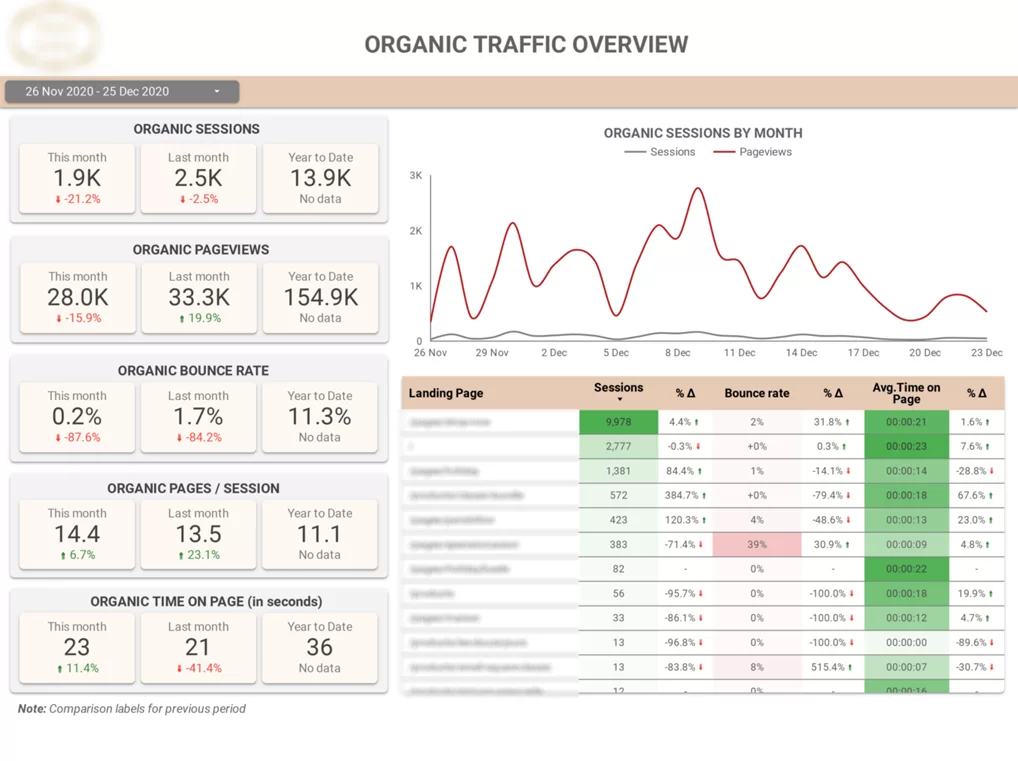
Client reporting can be challenging when analytics data is too complex or scattered across multiple tools. SEO agencies often struggle to clearly communicate performance and progress using raw GA4 data alone.
Our client reporting dashboard connects directly to Google Analytics 4 and focuses on organic search performance. It shows traffic acquisition by landing page, source, and medium, along with daily trends for sessions, pageviews, and engagement metrics.
By comparing Organic Search traffic to other channels, the dashboard helps agencies clearly demonstrate SEO impact. Teams use it to highlight top-performing pages, identify issues like high bounce rates, and deliver clear, client-friendly reports.
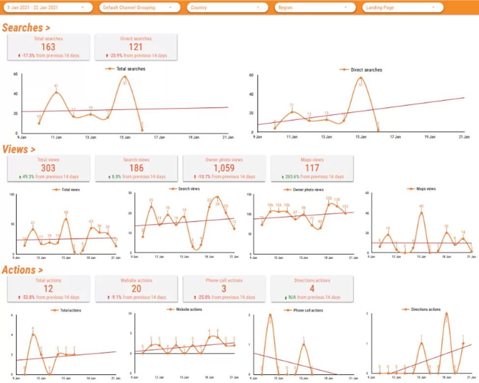
Understanding Google My Business performance is difficult when key metrics are hidden inside the GMB interface. Businesses often struggle to spot trends in views, searches, and customer actions without manually exporting data into spreadsheets.
Our Google My Business Looker Studio dashboard brings all GMB performance data into a single view, showing how customers interact with business listings on Google Search and Google Maps over time. Key metrics include profile views, direction requests, phone calls, and website clicks.
With clear trend visualizations, the dashboard helps agencies and brands identify changes in local visibility and customer behavior. Teams use it to demonstrate SEO impact, monitor performance over time, and turn local search data into actionable insights.
We have written a separate article showing more of our HR data visualization dashboards. In the meantime you can see some of them below.
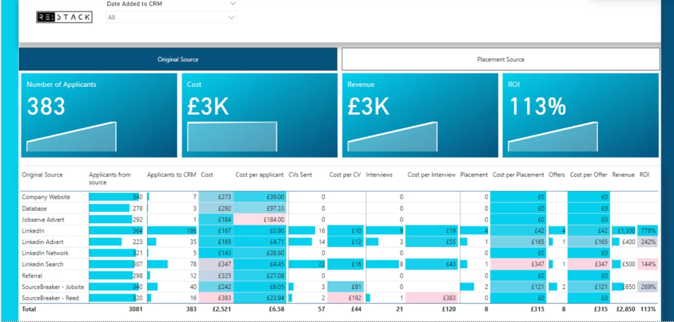
A recruitment data visualization dashboard tracks progress toward filling open roles and improves the candidate sourcing process. It’s usually built from ATS/CRM pipeline data and shows metrics like open vs filled roles, applications, interviews, and offers by role, location, or team.
This dashboard helps HR and hiring managers quickly see what’s happening across the funnel. By visualizing vacancies, bottlenecks, and hiring velocity, teams can improve predictability on time-to-fill and act faster when priorities change.
A packaged holiday provider we worked with uses it to track seasonal hiring, showing filled and unfilled positions by job role so recruiters know where to focus. It also highlights locations most affected by vacancies, flagging operational risk early.
Another client of ours uses a sourcing view that breaks down applications, costs, and offers by channel. It calculates cost per application, interview, and offer, helping teams identify the most cost-effective recruitment sources.
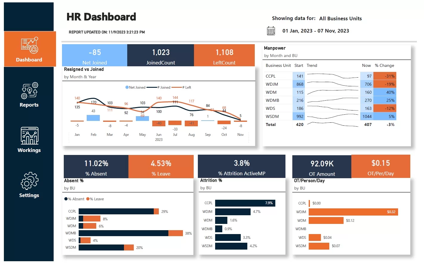
An attrition data visualization dashboard measures attrition risk—when employees leave and roles stay unfilled long enough to increase workload for those who remain. It typically tracks new joiners, resignations, net headcount change, and attrition % across time and business units.
This dashboard helps HR and business leaders spot where attrition is hurting workforce stability. By highlighting impacted departments and key resignation reasons, teams can prioritize retention actions and hiring plans.
One client we worked with uses the dashboard to monitor joiners vs resignations and the net change in headcount over a selected period. It also breaks down headcount movement by business unit between the start and end date.
The dashboard then shows attrition % by business unit, focusing on people who left and were not replaced within three months. It also compares overtime paid per person by business unit to reveal where workload pressure is rising.
Data visualization dashboards turn complex data into clarity. These data visualization dashboard examples show how teams can centralize metrics, spot trends quickly, and make better decisions across marketing channels. The result is less time spent reporting and more time acting on what matters.
At Vidi Corp, we’ve delivered over 1,000 analytics solutions for more than 600 clients worldwide. We’d be excited to bring that expertise to your project. Get in touch with us today to talk about your data visualization needs!
![]()
![]()
![]()