Business intelligence success stories show how organisations use data from multiple systems to support decision-making. Data from sources such as CRMs, ERPs, marketing platforms, and financial systems is collected, structured, and analysed through dashboards and reports. By bringing this data into a single reporting environment, business intelligence provides a clear and consistent view of performance across the organisation.
As a business intelligence consulting firm, we have delivered 1,000+ custom BI solutions across industries, including finance, marketing, operations, and HR. These solutions are designed to integrate multiple data sources, automate reporting processes, and provide reliable dashboards that support day-to-day business decisions.
This article presents practical business intelligence success stories and examples to show how BI is applied in real scenarios. It covers key applications across departments, real-world use cases, common tools, and the process and best practices behind successful BI implementations.

Business Intelligence (BI) – it’s all about getting the right tools, systems and processes in place to turn your data into better business decisions. It brings all sorts of data in from places like customer relationship management systems, enterprise resource planning software, marketing tools and finance reports and stitches it all together into a clear, easy to use view.
When you put it all into practice, Business Intelligence is usually delivered through dashboards and reports that are built using tools like Power BI, Tableau or Looker Studio. These dashboards are where you’ll find all the key performance indicators (KPIs), that tell you how your business is doing & they also help to highlight trends so you can see what’s going well and what needs fixing. You can also dig deep into pretty much any area of the business – like sales, finances or operations.
The core point of Business Intelligence is to take data and make it easier to use as part of your daily decision-making. Ditch those long hours spent manually collating reports or dealing with a bunch of disconnected spreadsheets – your teams should be able to tap into real time data, spot potential problems before they become major headaches and make better, more informed decisions as part of your business as a whole.
Business Intelligence is being used right across the organisation to give us a clearer idea of how we’re doing and make decisions that actually count . Each tool we use is focussed on getting a snapshot of one specific part of the business , but they all work the same way – helping us see our data in a clear and easy-to-understand way.
Business Intelligence For Finance: lets us keep an eye on revenue, costs, profit margins, and cash flow through automated reports connected up to our accounting systems. This means finance teams don’t have to spend all day trawling through spreadsheets to get a handle on how things are going.
Business Intelligence For Sales: breaks down pipeline performance, opportunities, and revenue generation. We can track how well we’re doing at converting leads into customers, keep an eye on our targets, and figure out what activities are actually driving sales.
Business Intelligence For Marketing: helps us measure how well our campaigns are doing, where our leads are coming from, and how much we’re spending on customer acquisition. This helps the marketing team work out which channels are actually working for us and make better decisions about how to spend their budget.
Business Intelligence For Operations: keeps an eye on stock levels, delivery times and how busy our resources are. It helps us spot where things are going wrong and get processes running smoothly again as quickly as possible.
Business Intelligence For HR: lets us keep an eye on how our employees are doing, how many we’re losing and whether we’re hiring the right people for the right roles. This helps us plan our staffing, manage our costs and keep our teams running in the best possible way.
Companies use business intelligence to tackle specific problems and improve their operations. You see this time and again in the examples of BI solutions being used to tackle real-world challenges – where they bring together data from all sorts of different systems, then use it to get a better view, work more efficiently, and make better decisions.
The following use cases are a good illustration of how BI has made a difference in various sectors – including finance, sales, marketing, and operations – as well as in HR and healthcare. Each case highlights the problem they were trying to solve, the BI solution they ended up with, and just what a difference it made to their business – in terms of dashboards and automated reports that actually demonstrate an impact.
A marketing agency was finding it tough to get a feel for how their business was performing because their reports were scattered all over the place – finance, marketing, sales, operations and HR all had different ways of tracking things which made it a right old job for the leadership team to get a complete and consistent view.
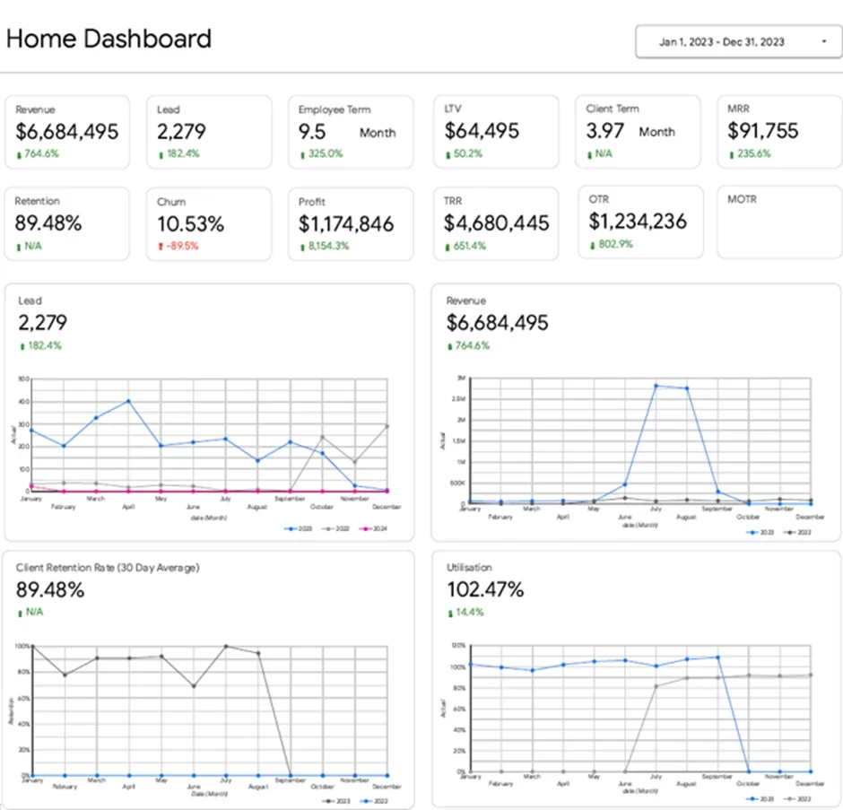
Our Power BI consultants worked with the agency to build a centralised executive dashboard that brings all that data together into one place. The dashboard gives an at a glance view of key things like revenue, profit, leads, lifetime value of customers, recurring revenue, client retention rates and staff utilisation and lets you drill down into each one of those areas to really get to grips with the numbers.
Now the CEO can get a really clear picture of any performance issues that are cropping up and be able to do something about them straight away. Any changes in the number of leads coming in, or in client retention, or in how much staff are actually being used, is immediately clear to leadership which lets them plan their next moves, get their teams all working in the same direction and make better decisions based on what’s really happening with the business.
A Fee-for-service CFO consultancy was struggling to get reporting right across multiple accounts – which meant their team had to manually trawl through dozens of QuickBooks Online instances, a laborious process that was prone to errors and sapped the reliability of the data they were working with.
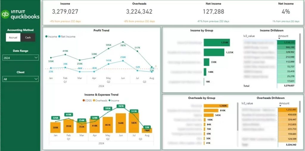
Our Power BI team got to work and built a slick Power BI financial dashboard that plugs directly into the client’s QuickBooks Online setup. It’s a game changer – it brings all financial data together in one place, meaning there’s no more tedious manual data extraction required, and what you get is consistent and spot on reporting across the board.
In short – it saved them a pretty significant 4 hours a month on report maintenance, and made their financial reporting rock solid reliable. With accurate & structured data in their back pocket, the team can now deliver crystal clear insights to clients with a lot less stress – and all without having to take on more work.
Sales teams just weren’t getting the clear view they needed of pipeline performance when it came to presenting to key stakeholders. The lack of a structured overview meant they had a hard time keeping tabs on their opportunities, getting a handle on how conversion rates varied by stage, and making sense of which lead sources were actually driving revenue.
Our Power BI experts stepped in and built a Power BI sales dashboard that takes a close look at leads and opportunities all the way through the pipeline. It shows the key numbers – won deals, expected revenue, and just how much of that revenue was coming from marketing, which is super useful. The dashboard also breaks down opportunities by their status and paints a picture of the sales funnel, so teams can see just how well leads are converting in each stage – and compare how well they’re doing at different stage.
As a result of having all this information at hand, teams can finally see exactly where the deals are and where things are falling off the wagon. With a clear view of just how well their conversion performance is doing and just how much revenue marketing is actually bringing in, sales and marketing teams can focus on the stuff that really matters and make real improvements to the efficiency of the whole pipeline.
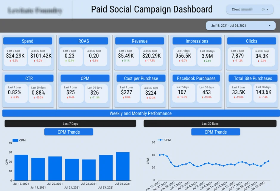
A marketing agency was getting bogged down with the drudge work of putting together marketing performance reports. Their team was spending ages pulling data from half a dozen different platforms – and the more they tried to juggle all these different sources the more the risk of cock-ups started to grow.
Our Power BI developers created a marketing agency dashboard that can automatically grab data from their CRM and all their ad accounts – 6 for Facebook Ads, 7 for Google Ads, and 14 for LinkedIn Ads. That dashboard centralised all the marketing data in one easy-to-get-to place, right so it put an end to the need for manual data juggling.
In the end, the team saves themselves a useful 30 hours every month that they were previously spending on this sort of thing & significantly reduced the number of errors that were creeping into their reports. With all that manual toil eliminated and their data now updating automatically they can finally keep an eye on how well their campaigns are doing without having to waste time sorting out the data first – so they can now concentrate on actually optimising things rather than just wrestling with spreadsheets.
An FMCG company with three pretty much iconic warehouses was really struggling to keep a pulse on what was going on in their operations. They were finding it tough to get a clear view of how their warehouses were performing, from monitoring how full they were to spotting inventory habits that just weren’t working and keeping track of where those delayed shipments were ending up.
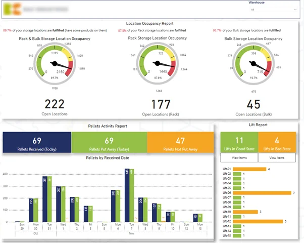
Our supply chain business intelligence consultants stepped in and built a Power BI warehouse dashboard that really puts the key numbers in a clear light, including warehouse use, how stock is moving around, and just when orders are going to be fulfilled. We also built in some automated alerts that sound the alarm when they spot issues like underused space or delayed shipments.
This has really helped the company cut out unnecessary resources by helping them spot where they’ve got inefficiencies in their warehouse operations, before they become a problem. And with this real-time view into how their inventory and logistics are performing, the team can now jump on issues the minute they come up and keep their warehouse operations running more smoothly than ever.
Operations teams – they’re juggling multiple projects at once – needed a way to see just where their time was going, how workload was being shared out, and what was happening with project progress in general. The thing is, without some kind of centralised view of all this, identifying bottlenecks was a real challenge, spotting imbalances in team workloads was a nightmare, and dealing with potential problems like delays or burnout was basically impossible.
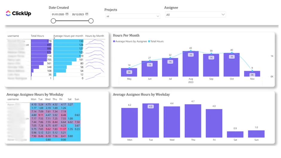
Our Power BI team helped build a project management dashboard that actually ties in with ClickUp, so you get a complete picture of all the time that’s being spent on each project plus how much each team member has to handle. What we ended up with is a system that highlights where workload distribution is falling down a bit, tracks project progress, and sets off alarms when capacity starts to get a bit tight or there’s a risk of late delivery.
The end result is that teams can finally plan resources a whole lot better and spread workloads out in a way that makes sense. And with clear visibility into just how time is being spent and where all the pressure points are coming from, operations managers can make much more informed decisions about what tasks to hand out to who, and keep their projects ticking along at just the right pace.
A diamond polishing company was getting hit hard with rising overtime costs & their management team just couldn’t pinpoint the cause . They struggled to get a handle on what was driving up overtime & whether workforce changes were making their day to day operational workload more or less manageable.
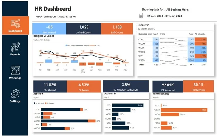
Our business intelligence team built an HR dashboard that tracks overtime hours, employee turnover, and hiring trends over time. We got data from their HR systems and stitched it all together so they can see in a snap how resignations and unfilled roles are throwing off their workload across different teams.
Thanks to this new visibility, the company managed to chop their overtime hours down from 15,000 a month in January to a more reasonable 1,000 a month by September . With a clearer picture of where their workforce is going & where they need to beef up their teams, their management can now take proactive steps to keep workloads in check & keep labour costs under control.
A Sony subsidiary had a pressing need to get a handle on costs associated with their Google Cloud Platform – and make a strong case to the top brass for the benefits of optimising their IT spend. The trouble was that without some kind of structured reporting in place, they were struggling to point to actual trends in costs and justify all the money they were throwing at infrastructure improvements.
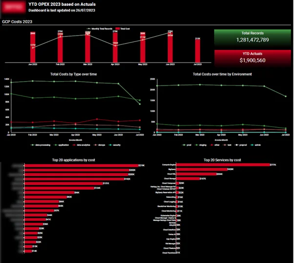
Our Power BI gurus stepped in and built a cloud cost analytics dashboard that keeps a close eye on patterns of database growth and the associated infrastructure spending over time. This solution gives the IT and finance teams a clear view on how usage and costs are evolving – allowing them to scrutinise performance and efficiency in detail.
As a result, the company was able to demonstrate to their finance team – and the management team as well – that while their databases had grown by a pretty dramatic 200%, the cost of running all that infrastructure had only gone up by a tiny bit. That gave the financial people the confidence to start planning their IT budgets on a much firmer footing, and management could finally see the value of all the hard work being put into keeping their IT spend in check.
A healthcare organisation was struggling to get a clear picture of patient data across all the different indicators that mattered. They were gathering patient info through a mobile app, but without a single place to look at it all, it was a real pain to try and figure out what was going on at a population level, spot the high-risk groups and actually give the care that mattered the most.
Our BI consultants came in and built a real-time healthcare dashboard that grabs all that clinical data and squishes it together into one interactive view. This lets healthcare professionals really dig into how patients are spread out across different key medical areas, see how the numbers are moving on specific conditions, and even compare different groups of patients in a way that makes sense.
So now, the clinical teams can zero in on the patients who are at the most risk a lot faster and actually respond to changes in their health before it gets too bad. With real-time access to all that patient data – and a clear idea of how the risk is distributed – they can plan their care and actually do the right thing for the patient.
Buffalo Public School was struggling to get a handle on how students across the different schools were performing in literacy and math. They had loads of info on academic results, attendance and special ed, but no easy way to tie all that together and spot any patterns or potential problems.
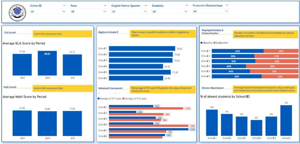
Our BI consulting built an academic performance dashboard that lets you see student results in literacy and math alongside attendance trends and special ed needs – all for each school and individual student group. This means you can now compare schools and student groups side by side and get a much clearer picture of how students are doing overall.
As a result, school leaders can now spot where students are falling behind, identify schools where attendance is getting worse and pinpoint where they need to give extra help. With a clear view of student results and needs all in one place the district can get in there faster, make a lot more of their resources count and generally improve the way they support students.
Business Intelligence provides measurable improvements in how organisations manage, analyse, and use data. By automating data processes and centralising reporting, BI reduces manual work, improves data reliability, and makes performance easier to monitor across teams.
The benefits of BI are pretty clear-cut when it comes to places like efficiency , reporting speed, decision-making, and data accuracy. The following examples show how these improvements get put into practice – and are backed up with real-life results from actual implementations.
Increased Efficiency through Automation
Business Intelligence takes manual work off the table by automating data extraction and reporting processes across multiple systems. It lets teams ditch boring repetitive tasks and free up a whole load of time that would’ve been spent slaving over reports.
One client achieved a 95% reduction in manual data consolidation and saved over 50% of time spent on reporting after implementing automated dashboards.
Faster Reporting and Data Availability
BI lets organisations knock reporting time down and turn data into a never-ending resource flow – so teams can always get their hands on the latest info when they need to review performance.
In one project, report generation time was reduced from 48 hours to under 5 minutes, enabling teams to move from periodic reporting to daily dashboards.
Faster Decision-Making
With all their data in one place and consistently updated, leadership teams can check in on performance a lot quicker and start responding to changes – without waiting for hours or days for the latest figures.
Clients reported 40% faster turnaround on strategic decisions and reduced executive review cycles by 2 business days per week after implementing BI dashboards.
Improved Data Accuracy
BI systems take the pressure off manual data entry and standardize the way data gets processed across all the different sources. This means teams can rely on accurate, consistent data for every report and dashboard.
One implementation resulted in an 80% reduction in data-entry errors and improved data integrity to 99.7% across business units.
Time Savings through Automated Reporting
Automated dashboards save teams again and again by cutting down on the effort needed to keep reports up to date and distributed. This lets teams give their time back to more important stuff – rather than devilishly boring reporting tasks.
Clients reported saving 4 hours per month on reporting tasks and up to 10 working hours per month through automated BI reporting solutions.
Most Business Intelligence projects are built using a pretty limited set of go-to tools. What tool you’d want to use really comes down to what kind of data you’re working with, what you need to report on, and how in-depth your analysis needs to be.
Power BI is one of the most widely used tools for putting together complete BI projects, especially in Microsoft-based environments. Our Power BI team has some experience in building automated dashboards that link up with systems like CRMs, ERPs and accounting tools – this makes it really easy to get real-time reporting across the board on finance, sales and operations. Head on over to our Power BI consulting services to take a look.
Tableau is all about delivering really advanced data visualisation and super flexible analytics. We tend to use it in projects where customers want super interactive dashboards and can really dig into their data – particularly when they’ve got really complicated data sets or need to do some pretty in-depth reporting at the exec level. Our Tableau consulting services and some of our dashboard examples are worth a gander.
Looker Studio is a lightweight BI tool that is pretty commonly used for marketing analytics. Our guys have got some experience in using it to slap together automated reports that link up with platforms like Google Analytics, Google Ads, and Search Console, which really helps marketing teams keep an eye on how their campaigns are doing in one place. Check out our Looker Studio dashboard examples.
DOMO is another cloud based BI platform that is designed to get real-time data from multiple business systems into one place and to help execs make decisions on the fly. We use it to centralise data from loads of different business systems and deliver live dashboards that support decision-making at the leadership level. Learn more about our DOMO consulting.
A business can only be truly successful if its Business Intelligence implementation runs on rails – that is, if data is accurate, consistent, and ready for decision-making at all times. And in the same way that a good foundation is always a good starting point, you also need some best practices in place to keep the whole solution running smoothly and hassle-free over time.
1. Data Extraction – Where it all Starts
First things first – you’ve got to connect to all that data live – think CRM systems, ERP’s, marketing platforms, and all those other data-heavy apps. One of the key things to keep an eye on here is automating the process wherever possible – no manual data exports if you can help it, they’re always a recipe for disaster. Staying on top of data extraction means you can get the data in one go, and in big enough chunks to make use of.
2. Data Cleaning and Transformation – Ironing Out the Wrinkles
Once you’ve got the data in, it’s got to be cleaned up and made sense of. You want to get rid of any inconsistencies, duplicates or just plain old errors. A big part of this is doing as much of the heavy lifting as you can outside of the dashboards themselves – avoid applying different transformation rules in different places, that just causes confusion and can lead to some pretty big headaches when you’re trying to make sense of it all. Get it all working from a central place and you’ll be much better off.
3. Data Modelling and Structuring – Mapping it All Out
This is the bit where you sort out the relationships between all the different datasets, and start creating a clear and practical data model. The aim is to keep it as simple as possible, while still giving you the flexibility to be able to do what you need to do with the data – and make sure you’re building the model off the business needs, rather than trying to make the data fit into boxes. Easy to maintain and easy to expand – these are the keys to a data model that works for years to come.
4. Dashboard Development – Making Sense of it All
Now it’s time to take the data you’ve worked so hard to clean up and model and turn it into something actually useful – an easy to use dashboard that lets people get to the bottom line straight away. Best thing to do here is keep things simple – don’t overload with too many metrics, use nice clear layouts and avoid any over complicated visuals – you want people to be able to see what’s going on at a glance, and be able to drill down a bit deeper when they need to.
5. Automation and Ongoing Usage – Getting it to Just Work
Last but by no means least, you need to get the whole system running smoothly and automatically – data refreshed, dashboards up and running and easily accessible to anyone who needs it. And when it comes to it all really coming together, one of the key things is getting the dashboards actually used – make sure they’re up front and centre in meetings and decision-making, and they’ll become as much a part of how the business operates as any other tool.
Business Intelligence isn’t just about slapping up some dashboards and reports. It’s about setting up a framework that lets you use your data in a way that makes sense for your organisation, whether that’s finance, sales, marketing, operations or HR. Take a look at the examples we’ve shown in the past, the right BI solution can really cut back on the manual work, give teams a clearer picture of what’s going on, and help them come to better decisions by basing them on the same data.
A good BI system ties your data sources together, automates the reporting for you and gives you a clear view of just how your business is performing. When you’ve got the right structure in place, teams are free to focus less on getting the data ready and more on actually using it to run their operations.If you’re looking to implement Business Intelligence or improve your current reporting setup, contact us to discuss your requirements and build a solution tailored to your business!
![]()
![]()
![]()