Power BI use cases give you a glimpse into how companies actually put data analysis to work in solving real-world problems and making better decisions. We aren’t talking simple dashboards here , but rather tailored solutions developed around actual business processes – like sales tracking, financial reporting, marketing performance, & operational management. And it’s all made possible when you take data from the likes of CRMs, ERPs, and marketing platforms and bring them into a single view – giving you a crystal clear picture of how your business is performing.
As a business intelligence consulting firm, we’ve built over 1,000 custom Power BI dashboards for businesses in finance, retail, healthcare and professional services . Our aim has always been to create solutions that pull in a whole bunch of different data sources, automate reporting and provide a rock solid foundation for ongoing business processes with actual real time insights you can trust.
This article takes you through some real-world Power BI use cases, broken down by business function and industry, plus it highlights the key benefits of using Power BI and some best practices for building dashboards that actually work.
Power BI use cases – these are real-life business scenarios where Power BI comes in to solve a specific problem or make a process a whole lot easier. And it’s not just about slapping up a pretty dashboard, it’s about building a custom solution that is actually tackling a genuine business need – like keeping track of performance, automating reports, or sniffing out new growth opportunities.
Each use case tends to home in on a key business process that’s going on within a department or industry. Maybe that’s analyzing your sales pipeline, checking how well your marketing is really paying off, or getting a better handle on your finances. The idea is to take all that raw data and turn it into something a lot clearer and more actionable – something that’ll actually help you make decisions that have real-world impact.
When we put Power BI use cases into practice, we’re talking about combining data from all sorts of different systems, figuring out the key metrics that really matter, and presenting them in a way that actually makes sense in the ongoing workflow. The ones that really work best are usually the ones that are tied to areas like revenue or cost control – and aren’t too difficult to quantify. When you get that kind of visibility, you can really start to see where you can make a measurable difference in your business.
Power BI use cases vary by department. Every department has its own data sources, KPIs, and scope for analysis. In the next section, we will demonstrate common use cases that we see in each department.
Power BI helps finance teams bring their entire financial data into one place & keep an eye on how things are going in real time. Gone are the days of hunting down bits of information across disjointed spreadsheets and accounting tools – now they’ve got a single, coherent view of their financial health.
They can use Power BI to monitor profitability, keep costs under control, & figure out what’s driving revenue in detail. Finance leaders can use this to get at the performance data by product, customer, or business unit and quickly spot where margins are going up or down.
Power BI also helps with financial planning and forecasting by combining historical data with what’s going on right now. This lets finance teams make faster & more informed decisions, and provide clear, data-backed insights to the people who need them.
Power BI Use Cases:
Our Power BI Example Of Profit And Loss Reporting:
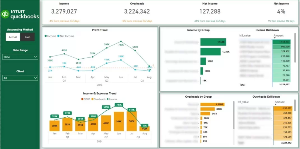
The Power BI finance dashboards that we build connect automatically to accounting tools like QuickBooks Online, Xero, and Dynamics – pulling the data in for you automatically so you don’t have to rely on endless, confusing spreadsheets.
In one of our recent projects, a fractional CFO consultancy wanted to automate their client reports. Their main challenge was having to extract the data manually from dozens of QuickBooks Online accounts. This often led to manual errors, which reduced the client’s trust in the data.
To address this issue, we created the automated P&L Power BI dashboard, which integrated directly with QuickBooks Online. As a result, this CFO consultancy saved 4 hours per month in report maintenance and improved customer service through better reporting.
This Power BI case study shows that finance teams can save valuable time by automating their accounting reports.
Power BI helps sales teams get all of their data from CRMs and revenue systems into one single view of pipeline and performance. In doing so, it replaces all those fragmented reports with a clear view of how deals make their way from lead to close.
They can use it to track conversion rates through each stage of the funnel and identify where opportunities are being lost. Sales leaders can quickly see which channels, regions, or reps are driving revenue and which areas need some attention.
Power BI also supports revenue forecasting by combining past performance with current pipeline data. This lets leadership plan capacity, set realistic targets, and make faster decisions based on real-time sales activity.
Power BI Use Cases:
Our Power BI Example Of Sales Pipeline Tracking:
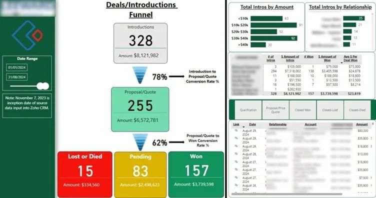
The Power BI sales dashboards that we build usually extract the data from different CRMs (Salesforce, Hubspot) in the B2B context and ERPs/POS systems (Shopify, Lightspeed, Brightpearl) in the B2C context.
For example, Teleperformance has engaged us before to build a B2B sales dashboard from their Salesforce CRM. The goal of this dashboard was to analyze the number of leads and opportunities per source, country, and service line. They also needed a way to measure which lead sources generate leads, deals, and revenue.
Before Power BI, they were relying on Excel reports, which were difficult to maintain and took 6 hours of work to refresh with new data. Another challenge was producing a good-looking data visualization, which was important since these reports went to the Global Head of Marketing.
Our Power BI consultants created a fully automated process to extract the data from Salesforce and LinkedIn Ads. We then automated data transformation in Power Query and designed professional-looking Power BI reports. You can read more about this Power BI case study here.
As a result of this project, Teleperformance was able to provide professional reporting to its marketing leadership and refreshed it automatically every day, which saved 30 working hours per week.
Power BI helps marketing teams get all of their data from multiple channels into one single, consistent view of performance. And it does this without needing to manually pull data from loads of different sources (PPC tools like Facebook Ads & Google Ads, email marketing tools like Mailchimp & Klaviyo, SEO systems like GA4, Ahrefs & SEMrush – you get the idea!)
They can use it to track how their budget is being spent and what results those dollars are generating across different channels. Marketers can then use this info to figure out which campaigns are really driving real business impact.
Power BI also helps uncover optimization opportunities by highlighting which campaigns, audiences, or keywords are underperforming. This lets them make faster adjustments and allocate their marketing spend more efficiently.
Power BI Use Cases:
Our Power BI Example Of Campaign Performance Tracking:
One of our marketing analytics Power BI case studies is producing reports for the marketing department of a FTSE 100 company. The key challenge that they wanted to solve through Power BI is reducing the amount of work needed to pull the data together.
Our Power BI marketing agency dashboard automated data extraction from their CRM, 6 Facebook ads, 7 Google ads, and 14 LinkedIn ads accounts. As a result, they reported saving 30 working hours per month and eliminating manual errors.
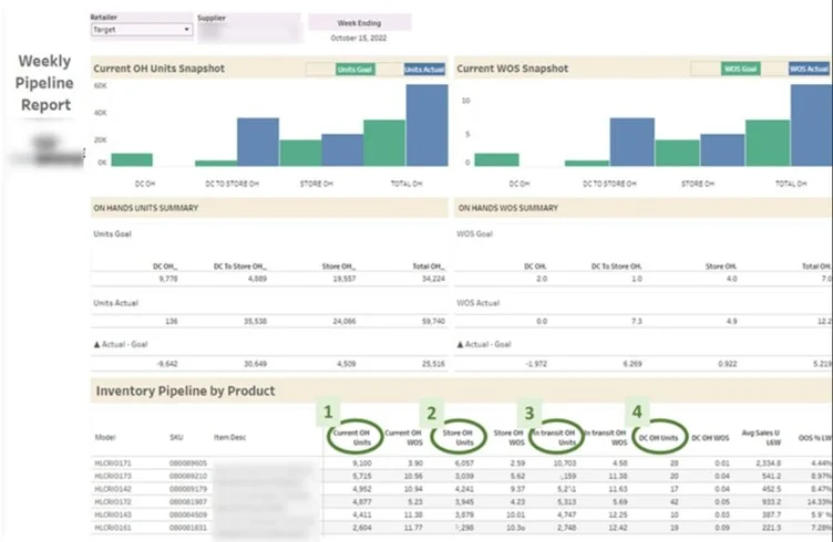
Power BI helps supply chain teams get all of their data from warehouses, ERPs, and logistics systems into one single operational view. In doing so, it replaces those disconnected reports with a clear overview of inventory, orders, & supplier performance.
Supply chain business intelligence helps to monitor stock levels, track order fulfillment, and spot delays across the supply chain. Managers can quickly spot if anything is amiss – like overstocking, stockouts, or late shipments – and take some corrective action.
Power BI also helps them plan better by analysing demand patterns and operational efficiency over time. This lets them optimise stock levels, reduce waste, and generally improve their supply chain performance.
Power BI use cases:
Our Power BI Example Of Warehouse Capacity Monitoring:
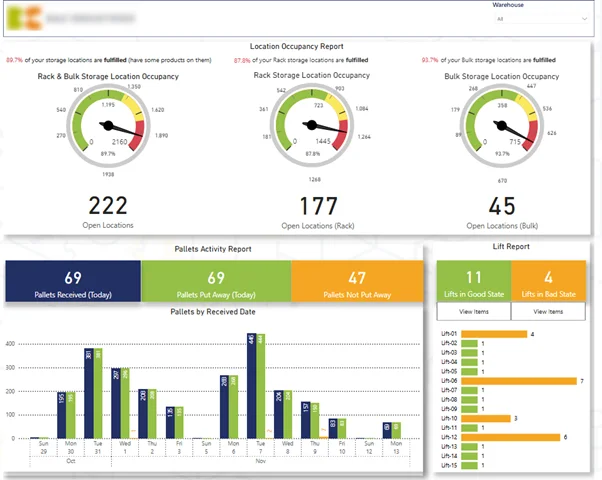
In one Power BI case study, we worked with an FMCG company that had 3 proprietary warehouses. They requested a Power BI warehouse dashboard to help them manage occupancy levels, detect bad inventory management practices, and track which orders are shipped out late.
Power BI implementation helped this company reduce idle resources by receiving automated alerts when specific issues were detected.
Power BI helps operations teams get a clear view of how time, resources, & tasks are being used across projects. It replaces all those scattered tracking tools with one single view of operational performance.
They can use it to monitor workload distribution, track task completion, and identify areas of inefficiency in their delivery processes. Teams can quickly spot if there are bottlenecks, overloaded employees or underutilised capacity.
Power BI also helps them plan better by analysing how time is being spent across projects and roles. This lets them optimise resource allocation, improve productivity, and keep projects on track.
Power BI Use Cases:
Our Power BI Example Of Time Tracking Report:
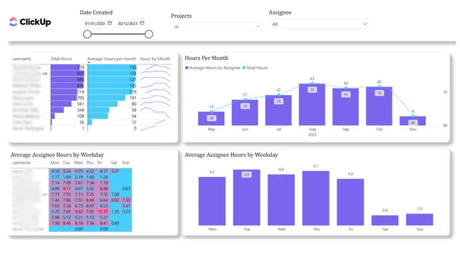
For operations departments juggling multiple projects and looming deadlines, it’s never truer than it is today. Our Microsoft Power BI consultants built this dashboard that integrates with ClickUp and gives you an end-to-end view of how much time is being spent across projects and team members.
Project management dashboards allow you to track how projects are progressing, be alerted when workloads are starting to get out of whack, and pick up on those early warning signs of burnout and underutilisation before they become a real problem. This lets you plan more effectively, assign tasks in a way that makes sense, and keep all of your projects ticking along at the right speed.
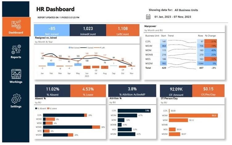
Power BI helps HR teams centralise their workforce data from HR systems, payroll, and recruitment tools into a single view. And it does this by replacing all those fragmented reports with a clear overview of employee trends & workforce performance.
They can use it to monitor turnover, track hiring pipelines, and figure out how changes in the workforce are impacting operations. HR leaders can identify which departments are seeing high turnover, work out any gaps in hiring, and take action before issues start biting at delivery.
Power BI also helps them plan their workforce by linking HR metrics to business outcomes like overtime costs and productivity. This lets organisations keep the right team structure in place while controlling costs.
Power BI Use Cases:
Our Power BI Example Of Employee Attrition Analysis:
The data for HR Power BI dashboards usually comes from learning management systems (LMSs), HR management systems like Workday, and sometimes Finance systems for payroll analytics.
One Power BI case study that comes to mind is how Vidi Corp built an HR dashboard for a diamond polishing company. The company experienced a sharp increase in overtime work and required management reporting to keep it under control.
Our business intelligence consultants have built the Power BI dashboards you see above for tracking the number of overtime hours by department and how it changed over time.
The main factor for driving overtime work was attrition (when employees resigned and the role remained vacant for more than 3 months). The dashboard that we built analyzed the number of new joiners and resignations by month and how they affect the attrition rate.
As a result of using this Power BI dashboard, the client reduced their overtime hours from 15k per month in January to 1k per month in September.
Power BI helps IT teams get all of their data from cloud platforms, monitoring tools, and data governance systems into one single view. And it does this by replacing all those fragmented reports with a clear overview of system performance, costs, and risks.
They can use it to track infrastructure usage, monitor cloud spending, and identify areas where resources are being misallocated. IT leaders can quickly see how systems are scaling over time and whether costs are aligned with use.
Power BI also helps them make better decisions by linking technical metrics to business impact. This lets them justify IT investments, optimise costs, and generally improve system reliability.
Power BI Use Cases:
Our Power BI Example Of Cloud Cost Monitoring:
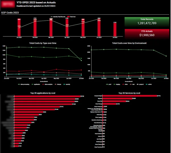
A Sony subsidiary that we worked with wanted to implement Power BI to report on Google Cloud Platform costs to management. This reporting was essential to prove the value of the IT department to management and highlight the effectiveness of their optimization initiatives.
The Power BI report that we created showed that the number of rows in the database has increased by 200% but the costs have only increased slightly. This analysis helped their finance team to budget for IT expenditure in the future and have predictable costs every month.
This Power BI use case demonstrates how Power BI reporting can be used to encourage management to keep investing in IT optimization initiatives.
Power BI helps leadership teams get a clear, high-level view of business performance across all the different departments. And it does this by replacing all those disconnected reports with one single source of truth for strategic decision-making.
They can use an executive dashboard to monitor key KPIs across finance, sales, marketing, operations, & HR in one place. Leaders can quickly spot if anything is amiss, track progress against targets, and focus on the areas that need attention.
Power BI also helps them make faster decisions by giving them real-time visibility into business performance. This lets them respond quickly to changes and align teams around data-driven priorities.
Power BI Use Cases:
Our Power BI Example Of Company-wide KPI Tracking:
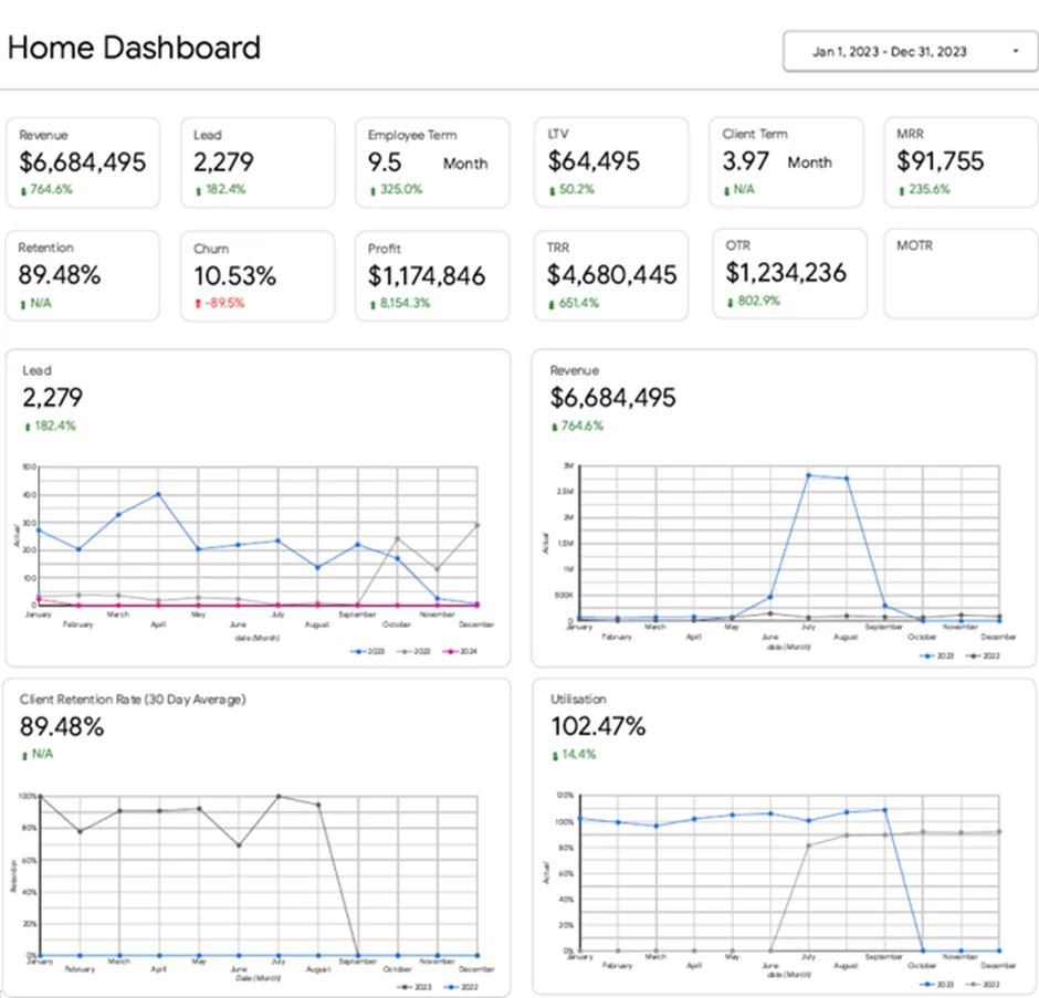
For example, we built an executive Power BI dashboard for the CEO of a marketing agency to provide a clear, high-level view of business performance. The goal of this dashboard was to consolidate key metrics across all departments and give leadership a single place to monitor the health of the business.
Before Power BI, reporting was fragmented across different teams and systems, making it difficult to get a consistent view of performance. Leadership had to review multiple reports to understand what was happening across finance, marketing, sales, operations, and HR.
Our Power BI consultants created a centralised executive dashboard that integrates data from all core functions. It tracks KPIs such as revenue and profit, leads and customer lifetime value, recurring revenue, client retention, and employee utilisation, with the ability to drill down into each department.
As a result, the CEO can quickly identify issues and take action. For example, a drop in leads immediately highlights a marketing issue, while changes in retention or utilisation help guide operational and hiring decisions.
Power BI makes it a cinch for retail companies to pull together data from all of their physical stores, e-commerce platforms and marketplaces into one place where they can easily see sales and inventory in one view. Gone are the days of having to sift through a bunch of disconnected reports – now they have a crystal clear picture of how products are performing and what their stock levels are looking like.
Retail analytics dashboard lets teams track sales by product, store and channel, as well as monitor inventory across warehouses and retail partners – which helps identify which products are flying off the shelves, which inventory is just taking up space and where there might be a danger of running out of stock and losing revenue.
Power BI also gives retailers a hand with demand planning by taking a close look at sales trends and making sure their inventory is in line with what they’re expecting to sell. This helps them keep their stock levels just right and maintain good relationships with their wholesale partners.
Retail Power BI Use Cases:
Our Power BI Example of Inventory Optimisation:
Our retail analytics consultants worked with a beverage business that sells through Walmart, wanted to get a better view of their stock levels so they could keep their products on the shelves. We built them a Power BI dashboard that pulls in data from Walmart and their own systems, so they can keep an eye on their current inventory levels and compare them to projected demand over the next 8 weeks. If they’re running low, they can get in touch with Walmart in time to restock.
The result for them was that they were able to keep their stock levels just right, avoid missing out on sales because of stockouts and make better decisions about how to manage their inventory and distribution.
Power BI makes it easier for ecommerce companies to combine data from their online store and marketing platforms into one place where they can get a clear picture of how things are going. They can get rid of all those disconnected reports and get a clear understanding of how customers behave and which channels are driving their sales.
Ecommerce business intelligence lets teams look at customer segments, track how different groups of customers behave over time and see how much value each customer is worth. Marketers can also compare their different acquisition channels and see where they’re getting the best return on their investment.
Power BI also helps businesses understand their profitability by linking their marketing spend with actual sales – this lets them see which channels are really driving sales and which ones might not be worth the investment.
Ecommerce Power BI Use Cases:
Our Power BI Example of Marketing ROI Analysis:
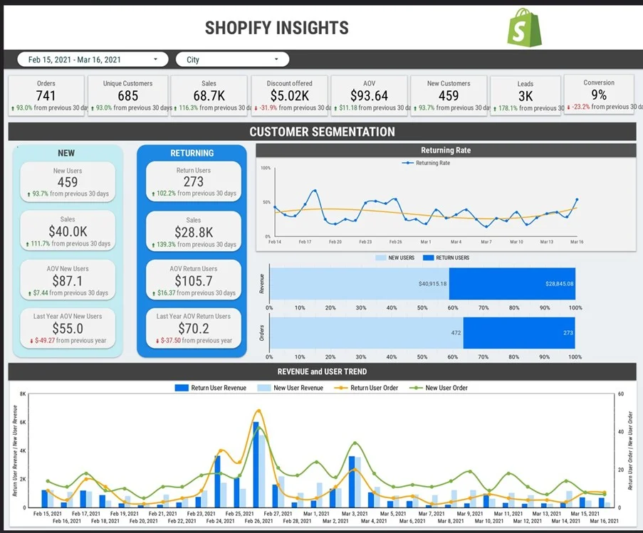
In one project, our ecommerce analytics consultants worked with a Shopify store that was selling through Facebook Ads, Google Ads and Amazon. They wanted to see where their marketing dollars were really going, and we helped them build a dashboard that pulls in data from Shopify and their marketing platforms to give them a clear picture of what’s working and what’s not.
As a result, they were able to see what was really driving their growth and make better decisions about where to put their budget.
Power BI helps real estate companies bring together all their financial and operational data from multiple properties into one place, where they can get a clear view of how things are going. Gone are the days of juggling scattered spreadsheets, rent rolls and invoices – now they have a clear overview of their portfolio performance.
Real Estate data analytics lets property managers and investors track rental income, monitor expenses and see how profitable each of their properties is. This makes it a whole lot easier to spot the properties that are really performing well and the ones where things might be slipping.
Power BI also helps teams keep a close eye on expenses and revenue over time, which lets them catch any problems early on and make better decisions about where to invest.
Real Estate Power BI Use Cases:
Our Power BI Example of Portfolio Performance Monitoring:
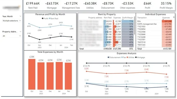
One UK-based property investor we worked with had a bunch of different properties that they wanted to get a better handle on – so we built them a Power BI real estate dashboard that pulls in all their rent payments, expenses and financial data. This lets them track income, monitor costs and compare performance across all their properties in one place.
As a result, they were able to get a clear understanding of which properties are driving the most profit and where costs are increasing, and make better decisions about how to manage their portfolio.
Power BI helps professional services companies get a handle on how their team is performing – by bringing together data from project management, finance and time-tracking systems into one place. This gives them a clear view of how projects are tracking, how resources are being used and where they might be able to make improvements.
This lets teams monitor project progress, track delivery against timelines and budgets and understand how resources are being allocated. Managers can look at performance across different clients, services and teams to spot areas where things are going wrong and make improvements.
Power BI also helps leadership understand which projects and clients are really driving profitability – and where they need to make adjustments to keep things on track.
Professional Services Power BI Use Cases:
Our Power BI Example of Resource Utilisation Analysis:
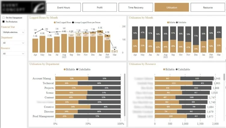
One event company in London wanted to get a better handle on how their team was spending their time – so we built them a Power BI project management dashboard that pulls in data from their project management tools and tracks working hours by task, project and employee. This lets them see which tasks are taking up the most time and which employees are running hot.
As a result, they were able to identify which team members are under the most pressure and get a better handle on how to allocate their resources.
Power BI helps market research companies take raw survey data and turn it into something that’s easy to understand. By bringing together data from survey tools like SurveyMonkey and other research platforms into one place, they can get a clear view of what’s going on.
This lets teams look at responses across different segments like demographics, regions and time periods – and track trends, compare audience groups and spot shifts in sentiment without having to manually process the data.
Power BI also helps research teams get their insights out the door faster by automating data updates and visualisation – which lets them focus on interpreting the data and making recommendations rather than spending time on manual reporting.
Market Research Power BI Use Cases:
Our Power BI Example of Survey Data Visualization:
One project we worked on with Consumer Intelligence was to visualise some survey data on public sentiment towards insurance during COVID-19.The dashboard integrates survey data and presents it visually so users can really get a grip on sentiment by age group, track changes over time, or pick out key concerns. It completely replaces those tedious PowerPoint reports with a dynamic view that’s always up to date.
As a result the client was able to get insights to their customers a lot faster, and turn that raw survey data into actionable information without having to do all that manual reporting.
Power BI is helping big pharma to tie together sales, clinical and patient workflow data all in one single view of performance. This gives companies a more structured view of how products are doing and how treatments are progressing over time.
Healthcare dashboards lets teams track product adoption, monitor referrals and break down treatment timelines. That’s really helpful for spotting bottlenecks in patient journeys and making sure new drugs get to patients when they’re needed.
Power BI also helps with decision-making by linking operational and commercial data together. That way companies in the pharma field can make the most of product rollout and improve their overall performance.
Pharma Power BI Use Cases:
Our Power BI Example of Drug Sales Performance Tracking:
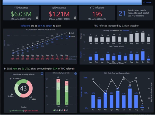
In one project, we put together a dashboard for a pharma company launching a new drug. The aim was to get a better view of product adoption and treatment progress.
This Power BI pharma dashboard keeps an eye on referrals from doctors, how many infusions are getting completed, and the time it takes for patients to start treatment. It provides a clear picture of progress against targets and highlights where delays are occurring.
As a result the client was able to keep a better eye on the rollout of the new drug, identify areas that needed improvement and manage performance with much better reporting.
Power BI is helping schools and universities to bring all those different data sources – like academic systems, marketing platforms and student records – into one single view of performance. This really helps to give clear visibility into student outcomes and institutional effectiveness.
It lets educators and administrators track student progress, monitor student engagement and break down performance across different schools, programs and time periods. And teams can even figure out which marketing channels are driving new student sign-ups, and how those students do over time.
Power BI also helps with strategic planning by linking academic performance with operational and engagement data. That way institutions can spot the areas that need some work and allocate resources more effectively.
Education Power BI Use Cases:
Our Power BI Example of Student Performance Analysis:
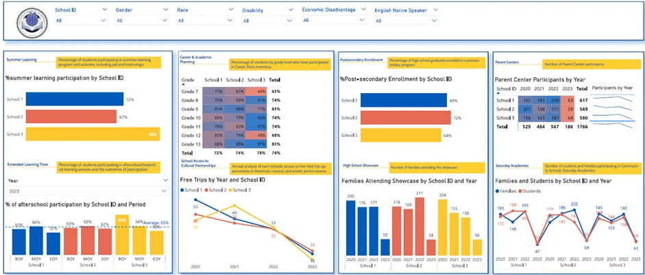
We have worked on several business intelligence in higher education projects, which demonstrate the value of Power BI.
In one project, we worked with the Buffalo Public Schools to tease out what progress they were making towards their 5 year strategic goals.
The dashboards track student participation in things like summer learning and afterschool activities as well as post-secondary enrollment and family engagement. They also let educators see how different schools are doing and track changes over time.
As a result, educators can see trends emerging, measure progress against goals and focus their support on areas that really need it.
Power BI is helping hospitality businesses to bring all their data – from booking systems, POS platforms and delivery channels – into one single view of the hotel’s performance. It gives businesses a real-time view of occupancy levels, pricing and revenue.
It lets managers track booking trends, monitor room or table utilisation and break down performance across different locations and services. And teams can figure out what demand patterns look like and make adjustments to pricing or staffing accordingly.
Power BI also helps with revenue optimization by linking demand, pricing and performance data. That way businesses can boost margins, plan for the busy periods and give their guests a better experience.
Hospitality Power BI Use Cases:
Our Power BI Example of Revenue & Occupancy Analysis:
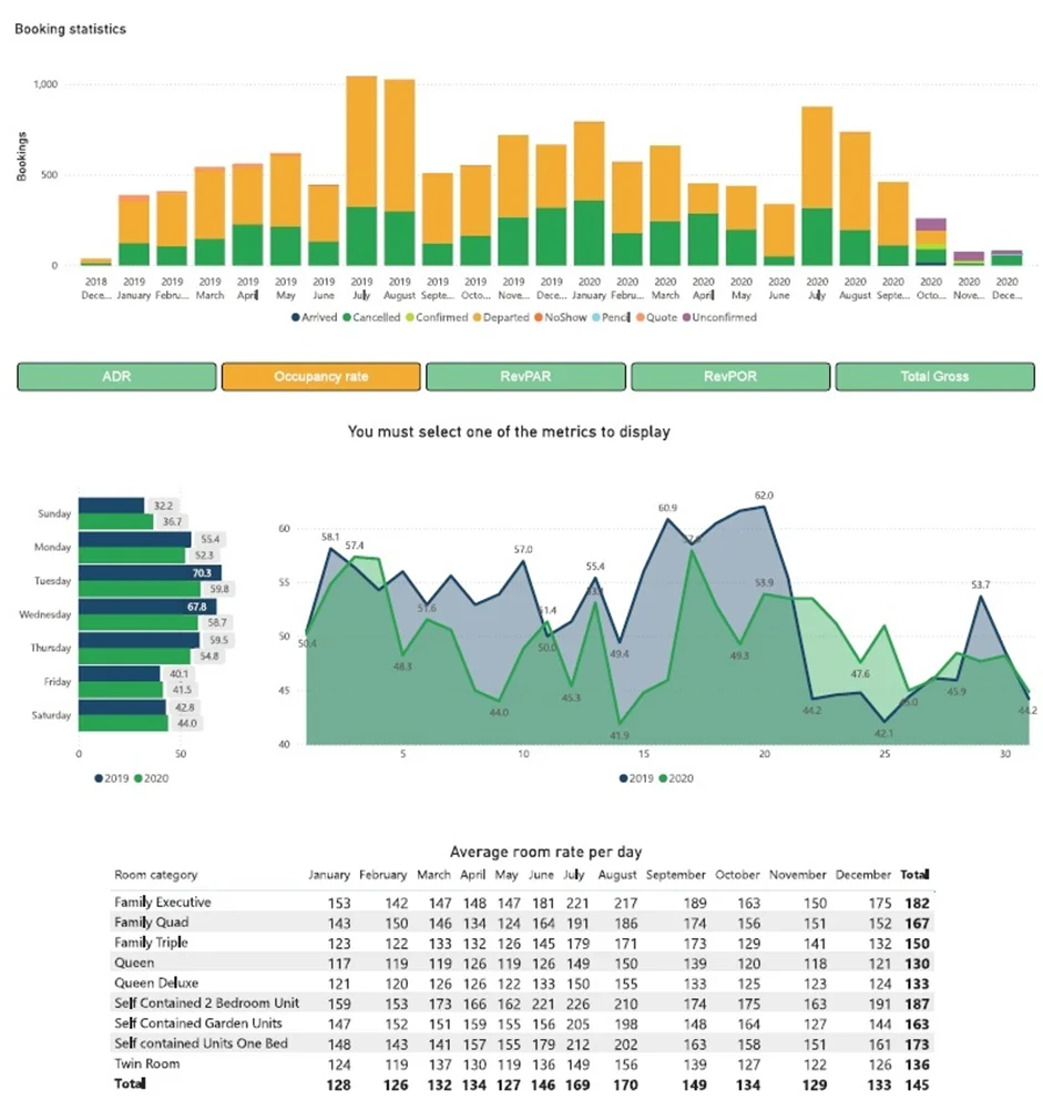
In one project, we built a Power BI dashboard for an Australian hotel chain to give a clear view of bookings, occupancy rates, room pricing and revenue.
The dashboard tracks trends over time, compares performance across different years and highlights which room categories are bringing in the most cash. It also lets managers keep an eye on cancellations and adjust pricing in line with changes in demand.
As a result the client got much better control over pricing and capacity planning, which in turn let them make better decisions and really improve their revenue and guest experience.
We also have had many other Power BI case studies demonstrating applications of data analytics in hospitality.
1. Less Manual Work , More Automation
Power BI scrapes data out of business systems, transforms it, and generates reports for you – all with one click. No more scrambling to pull together reports from multiple places and then trying to keep them up to date.
For example, Vidi Corp automated their reporting across multiple systems and ended up slashing manual data work by a whopping 95%. Plus, report generation used to take 48 hours but now it happens in under 5 minutes – and they can do daily reports, not just weekly ones.
2. Faster Decisions Because You Get Real-Time Data
Power BI gives you a clear picture of your business right now, not last week. With that info at your fingertips, you and your team can make decisions that actually make sense for where your business is right now. That means you’ll react faster to opportunities and risks.
One client told us that after they set up real-time Power BI dashboards, they were making strategic decisions about 40% faster than before. Plus, execs were saving 2 business days per week on review time.
3. Fewer Errors , More Accurate Data
Automating data flows and ditching manual handling with Power BI cuts down on errors big time. And you end up with reports that everyone can trust because they know they’re based on solid numbers.
One client saw their data entry errors cut by 80% and even better – data integrity went up to 99.7% across all their business units.
4. Get More Done – Less Report- Writing Time
Power BI helps your team spot where things are going wrong in your business and how to make them run more smoothly. By watching what’s going on across the whole organisation, you can really cut waste and get more out of your resources.
This digital agency, for example, was able to cut report prep time by over 50% after they started using Power BI. That gave them way more time to do the fun part – analysis – and less time on boring old manual report writing tasks.
5. No More Silos – Just One Unified View
Power BI lets you pull all your data from those multiple systems into one neat reporting layer that scales easily. That means no more data getting lost in silos, and everyone gets a clear view of how the business is doing.
In one project, a company reduced their data silos from 6 systems to just ONE central database – and suddenly they had totally consistent reporting and could see how all the different parts of the business were working.
Designing a dashboard that truly delivers needs more than just pretty pictures of data . When it comes to Power BI best practices, the goal is to build solutions that are actually tied to the way your business works and help you make better decisions.
The really great dashboards all have a few things in common: they’re focused on what the business is trying to achieve, they’re tracking the right numbers, and they’re based on data that you can actually trust. And on top of all that, they’re designed to help your users get the information they need when they need it, are easy to use, and fit right into their daily routines. Here are the key Power BI best practices to keep in mind when you’re building a dashboard that will actually make a real difference in your business.
1. Start by Identifying the Business Problem You’re Trying to Solve
Every Power BI dashboard should serve a particular purpose – be it boosting revenue, cutting costs, or improving operational efficiency – and ideally be tied to a specific process like sales, marketing or finance. If there’s no clear decision or workflow behind the dashboard, it’ll likely collect dust.
2. Focus Only on the KPIs That Drive Decisions
A great dashboard includes only the metrics that can actually influence decisions – and each one should have a clear purpose and goal tied to a specific business outcome. For example, tracking revenue in isolation is pointless – breaking it down by channel, product or customer segment makes it usable and easier to comprehend.
3. Bring All Your Data Together in One Place
Effective dashboards bring together data from multiple systems like CRM, ERP, marketing platforms, and accounting tools to give you a complete picture of your business. When data is all in one place, teams no longer have to juggle different tools or spend time manually combining reports – this saves them time and effort and keeps data consistent.
4. Design Dashboards with the End-User in Mind
Dashboards should be built with a specific role in mind – executives need a broad overview of key metrics, while operational teams need detailed and actionable insights. The layout, level of detail and visuals should all reflect how the user interacts with the data on a daily basis.
5. Automate and Keep Things Simple
Data should update automatically so users always have access to the latest information – this builds trust in the dashboard and saves manual effort. At the same time, it’s key to keep the design simple and easy to understand – clear visuals, a consistent structure and minimal clutter make dashboards more effective and easier to get on board with.
Power BI use cases are a great way to see how companies move from scattered data into a clear, actionable picture of how every part of the business is doing. When dashboards are built around the actual processes a company is trying to improve – like sales, finance, marketing, or operations – they become an actual useful tool for boosting performance, rather than just giving a snapshot of things.
What really works is when solutions take data from multiple places, focus on the right metrics to track, and are there for ongoing decision making. That’s what lets teams chop down on manual work, respond quickly to changes, and spot opportunities to grow.
If you’re thinking about bringing Power BI into your business, the first step is just to pick a clear goal and build a solution that works with your company’s workflows and data. If you need some help figuring out what to build – or getting it built – get in touch with our team today!
![]()
![]()
![]()