
The most basic form of Zoom analytics is simply reviewing the native reports available within Zoom. These built-in reports focus primarily on call centre activity and phone calls.
While Zoom’s native analytics are a good starting point, they come with several limitations:
Due to these constraints, companies often struggle to convert their Zoom data into meaningful month-end reporting.
As an approved Zoom technology partner, we help companies overcome these limitations through our Zoom integration. This integration automatically extracts Zoom data into an Azure SQL Server database, which you can then connect to Power BI, Tableau, or any analytics tool of your choice.
Vidi Corp also offers a free Zoom analytics dashboard in Power BI, covering both phone call and meeting performance metrics. In this article, we’ll walk you through the dashboard in detail and explain what decisions you can make based on the reported data.
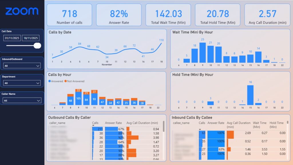
The Zoom Phone Analytics dashboard measures the number of calls, answer rate, wait time, hold time and average call duration. This dashboard helps companies to manage the inbound and outbound call activities and also see them combined.
You will find that this dashboard is the most useful when filtering to either inbound or outbound calls only.
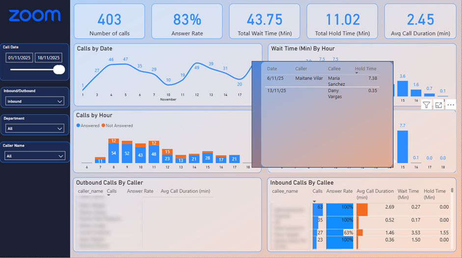
Analyzing inbound calls is mostly relevant to customer support departments or inbound sales teams.
Our Zoom Phone Analytics dashboard quickly shows that fewer than 100% of incoming calls were answered. The bar chart below highlights when those missed calls occurred by showing the number of unanswered calls by hour. As a call centre manager, you can use this insight to schedule additional staff during peak hours when most calls go unanswered.
The table below shows the call answer rate by agent. If certain agents are missing a high number of calls, you may decide to reroute some of their calls to others.
This table also displays the total time callers wait before each agent answers. With this information, you can speak with agents about reducing wait times, which in turn improves your overall answer rate.
Another important call centre goal is minimizing how long customers are placed on hold. The bar chart in the middle shows average hold time by hour of the day. Hovering over any bar reveals a tooltip with a detailed breakdown of hold time for each call.

Filtering the Zoom Phone Analytics dashboard to outbound calls is most useful for analyzing the outbound sales team’s performance.
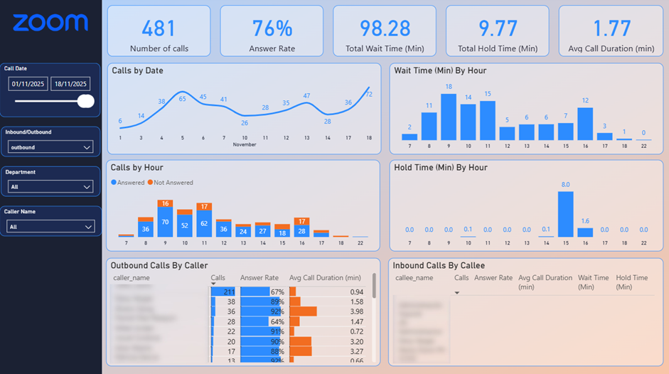
With this dashboard, management can instantly see whether each agent is making enough calls to meet their targets. The call answer rate also provides valuable insight into the quality of the leads being contacted by the sales team.
The bar chart showing answered and unanswered calls by hour helps identify the best times to reach leads. Likewise, the chart that analyzes wait time by hour highlights when sales reps experience the shortest wait before their calls are answered. In the example above, the optimal calling window is between 12:00 and 15:00, when answer rates are highest and wait times are lowest.
The table below breaks down call volume by sales rep, along with their answer rate and average call duration. This allows you to assess how effectively each rep engages with leads and how well they keep prospects on the call for a meaningful amount of time.
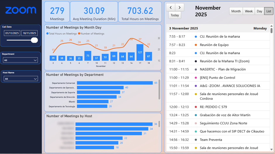
The Zoom Meetings Dashboard tracks the number of meetings, average meeting duration, and the total team hours spent in meetings. Its main purpose is to help you understand how much time your team spends in meetings, assess whether those meetings are necessary, and reduce them where possible.
The trend chart at the top shows the daily number of meetings along with total meeting hours. Clicking any bar filters the table on the right so you can view the specific meetings that took place on that day.
The bar charts break down the number of meetings by host and by department, allowing you to identify which teams spend the most time in meetings.
The table on the right can also be switched to a calendar view, showing every meeting by hour. You can use the arrows at the top to navigate between dates.
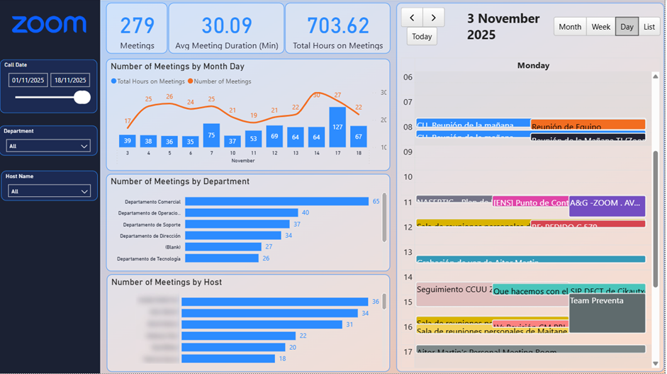
Overall, the Zoom Meetings Analytics Dashboard helps you measure team productivity, collaboration patterns, and meeting efficiency. These insights can be used to optimize meeting schedules, identify opportunities to streamline processes, and ensure Zoom is being used effectively across your organization.
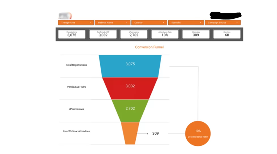
The Zoom Webinar Analytics Dashboard above tracks conversions from webinar registrations to actual attendance. It’s especially valuable for marketing teams responsible for driving potential customers to webinars.
This dashboard is not part of our standard reporting pack; it’s a custom solution we built for a client, combining data from Zoom, Facebook Ads, and Google Ads.
The funnel chart in the center shows the conversion flow from registrations to attendees. You can filter the funnel by webinar name, marketing campaign, or registrant country using the filters at the top.
If you’d like to build a similar dashboard for your organization, get in touch with us today! Our Power BI consultants would be happy to help.
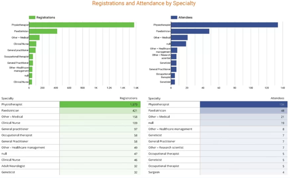
The second part of the dashboard breaks down webinar registrations and attendance by specialty. Since these webinars were designed for doctors across different fields, this section helps you track which specialties signed up and which ones actually attended.
Vidi Corp provides a simple, dependable solution for integrating Zoom with Power BI by building a connector that extracts Zoom data and delivers it to an Azure SQL Server database. From there, the database can be linked to Power BI, Tableau, Excel, or any other analytics tool you prefer.
Step 1 – Login From
Go to the connector login page to register and log in.
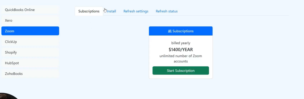
Step 2 – Subscription Installation
After logging in, navigate to the Zoom window and select the Install tab. You will receive a 14-day free trial, allowing you to fully evaluate the product.
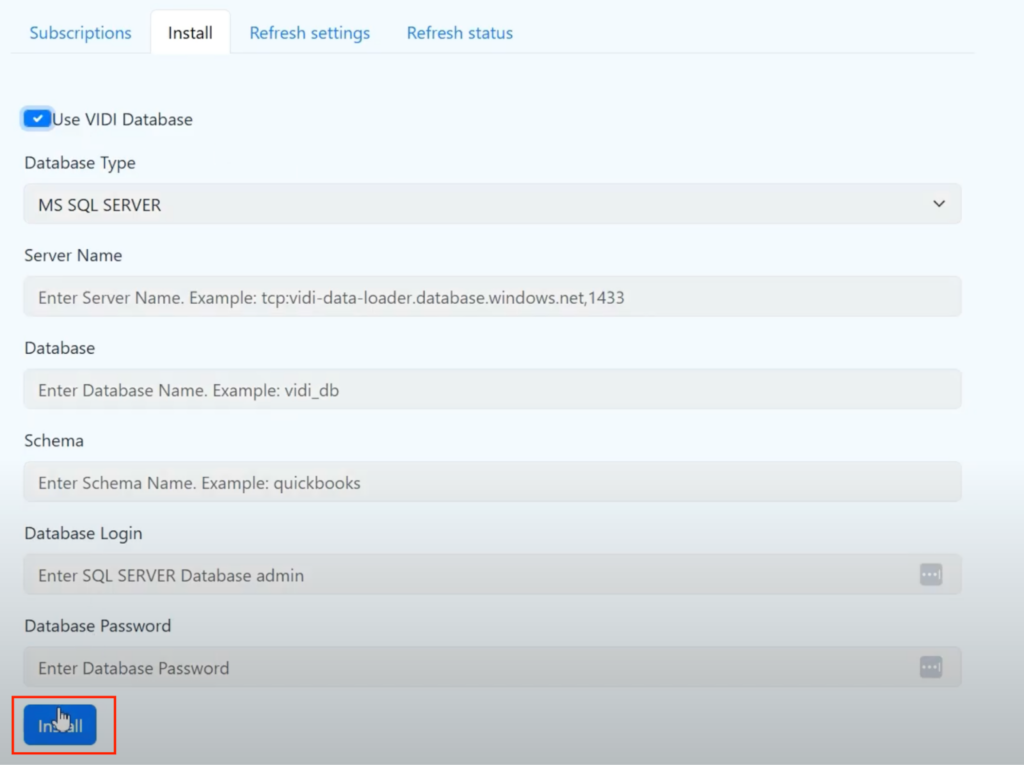
Step 3 – Database Installation
Next, select the database you want to use. You may choose the Vidi database for data extraction or opt to use your own. Click Install to proceed. The system will then begin creating the database. Once the setup window has fully loaded, your database will be ready to store your data.
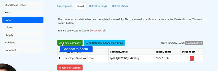
Step 4 – Database Connection to ClickUp
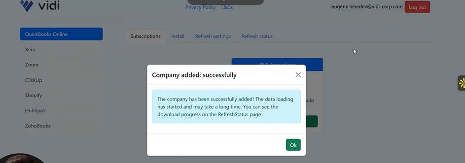
Once the database has been created, click on “Connect to Zoom”
Step 5 – Access Data
To access data click on ‘Send database connection string’ to receive an email.
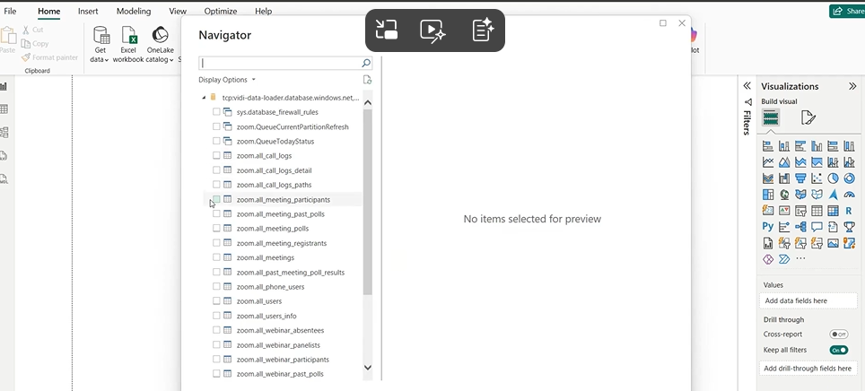
Step 6 – Connect SQL to Power BI
Click on import from SQL server to get the tables and visualise in Power BI
Zoom’s native reports offer a basic snapshot, but Zoom analytics dashboards in Power BI provide a far clearer, deeper view of what’s happening across every call and meeting. With the right setup, you can reduce missed calls, shorten wait and hold times, staff more effectively, and cut down on unnecessary meetings that drain your team’s productivity. Instead of wrestling with CSV exports, you can focus on asking smarter questions and acting on insights that actually move your business forward.
![]()
![]()
![]()