
Supply chain business intelligence involves visualising operational data in BI tools to optimize processes, reduce cost, improve availability, and increase efficiency. As supply chains grow more complex, relying on spreadsheets and manual reporting makes it difficult to see what is really happening across inventory, logistics, warehouses, and procurement.
As the #1 rated BI consultancy on G2, we’ve worked with manufacturers, retailers, distributors, and global organisations to design supply chain BI solutions using tools like Power BI and Tableau. Our work focuses on replacing manual reporting with automated dashboards that give teams real-time visibility into stock levels, warehouse operations, supplier performance, and purchasing approvals.
In this article, we’ll break down the key components of supply chain business intelligence, compare Power BI and Tableau for supply chain analytics, and walk through real dashboard examples covering logistics, inventory, warehouses, stock levels, and procurement.
A common challenge in supply chain management is the reliance on manual, Excel-based reporting. These processes are slow, error-prone, and hard to scale. Modern supply chain business intelligence replaces manual workflows with automated data pipelines and a clear analytics structure.
A modern supply chain BI stack typically includes:
This structure enables faster reporting, consistent metrics, and more reliable supply chain decisions.
Power BI is commonly used for supply chain business intelligence because it connects easily to core operational systems and makes complex data easier to analyse. It integrates natively with platforms such as Dynamics NAV, Dynamics 365 SCM, and Anaplan, which makes it a natural choice for organisations already using the Microsoft ecosystem. Connecting Power BI to NetSuite is also possible, although less obvious, which is why we’ve covered it in a dedicated blog.
Getting started with Power BI is simple and low-cost. Reports are built using the free Power BI Desktop app, and sharing dashboards with users requires a $14 per user per month license. This makes Power BI accessible for teams that want to improve supply chain visibility without committing to a large upfront investment.
Power BI is also part of Microsoft Fabric, which allows companies to scale supply chain analytics beyond dashboards as their data needs grow. Fabric provides:
This setup is especially useful for organisations looking to modernise their supply chain BI stack over time.
Tableau is often used for supply chain business intelligence when visual storytelling and geographic analysis are a priority. It is particularly strong for map-based visualisations, such as showing supplier locations, shipping routes, or flight paths, with the ability to vary line thickness or colour based on the volume of goods moved. This makes Tableau well-suited for logistics-heavy supply chains where movement and flow are central to decision-making.
Tableau connects well to enterprise planning and ERP systems such as Anaplan and SAP HANA, making it a common choice in organisations with complex supply chain planning environments. Licensing is more segmented than Power BI: creating dashboards requires a $75 per month Creator license, while report viewers need a $15 per month license.
For large-scale supply chain analytics, Tableau is commonly paired with Databricks rather than Microsoft Fabric. Databricks provides the data platform layer that Tableau sits on top of, including:
This setup is well-suited for organisations that prioritise advanced visualisation and already operate within a Databricks-based data stack.
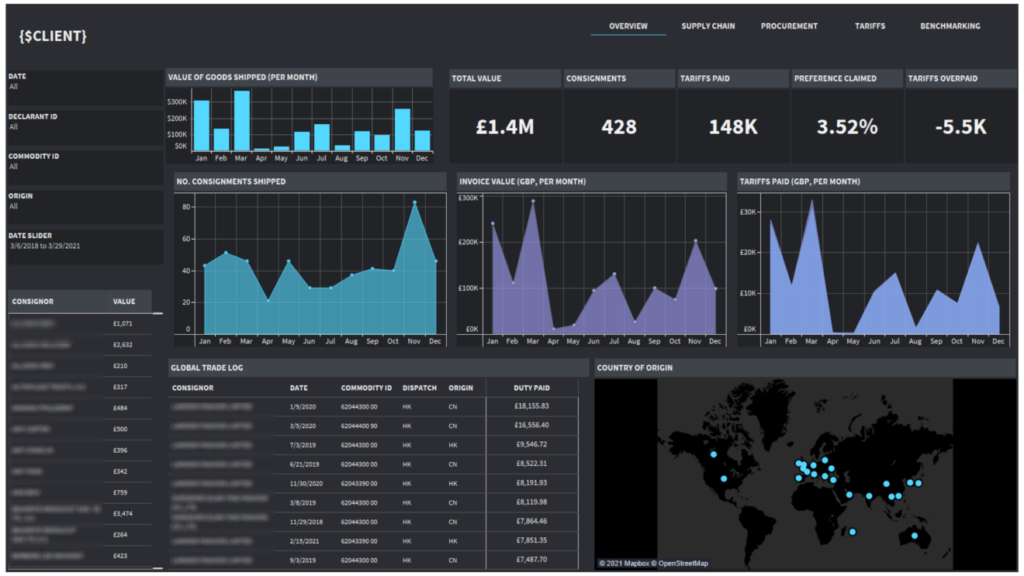
A Tableau logistics dashboard is designed to analyse purchasing activity, stock supply, and where goods are sourced from across the supply chain. It is most useful for importers, manufacturers, distributors, and retailers that manage cross-border logistics and want visibility into suppliers, shipment volumes, and import costs. These dashboards help organisations understand how their supply chain network impacts cost, risk, and efficiency.
Our Tableau consultants built the logistics BI dashboard above for a UK-based importer. The dashboard analyses where goods are coming from by country and tracks monthly shipment value, number of consignments, and import tariffs paid. It also highlights which imports fall under preferential trade agreements and shows the percentage of tariffs claimed versus standard rates.
This analysis delivered clear financial benefits for the client. The dashboard made it easy to identify countries generating the highest tariff costs and isolate imports eligible for reduced preferential tariffs. By comparing tariffs paid versus tariffs that should have been applied, the client could quantify overpayments and claim those amounts back from the government, directly improving cash flow and margin.
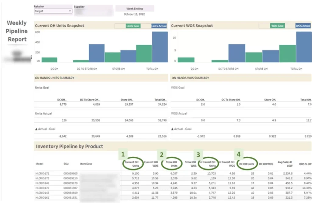
A Tableau inventory dashboard is designed to help businesses monitor stock levels in-store and understand when to replenish inventory. It is most useful for consumer goods brands, wholesalers, and manufacturers that sell through large retailers and need clear visibility into store-level availability. The goal is to prevent stockouts, maintain target coverage, and maximise on-shelf availability.
Our Tableau developers built the inventory dashboard above for a company selling products through Walmart. The dashboard analyses how much inventory Walmart holds in its stores (On Hand) and how many weeks that stock will last based on sales velocity (WOS). When specific products dropped below the target weeks of supply, our client used this data to raise the issue with Walmart, often resulting in additional replenishment orders and incremental sales.
The dashboard also tracks weekly units sold and the average out-of-stock rate by product (OOS%). This analysis supported data-driven conversations with Walmart about increasing order quantities to reduce stockouts. As a result, the client improved product availability, reduced lost sales due to empty shelves, and strengthened their position in retailer negotiations by backing requests with clear inventory data.
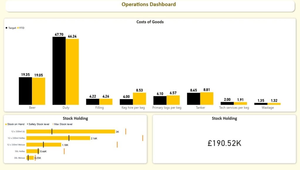
A Power BI stock level dashboard is built to analyse current stock levels across all products and show how much inventory the business is holding at any point in time. It is most useful for retailers, distributors, and FMCG brands that need tight control over inventory to avoid stockouts or excess working capital tied up in stock.
Our Power BI consultants developed the stock level dashboard above for a beverage company to help them manage inventory more proactively. The dashboard tracks current Stock on Hand by product and calculates both Safety Stock Level and Max Stock Level based on demand patterns and lead times. This gives operations teams a clear, real-time view of whether inventory levels are within the optimal range.
The dashboard automatically flags when stock levels approach the safety threshold, allowing the client to place replenishment orders with their operations team before issues arise. As a result, the company reduced emergency restocking, improved service levels, and maintained healthier inventory levels without over-ordering.
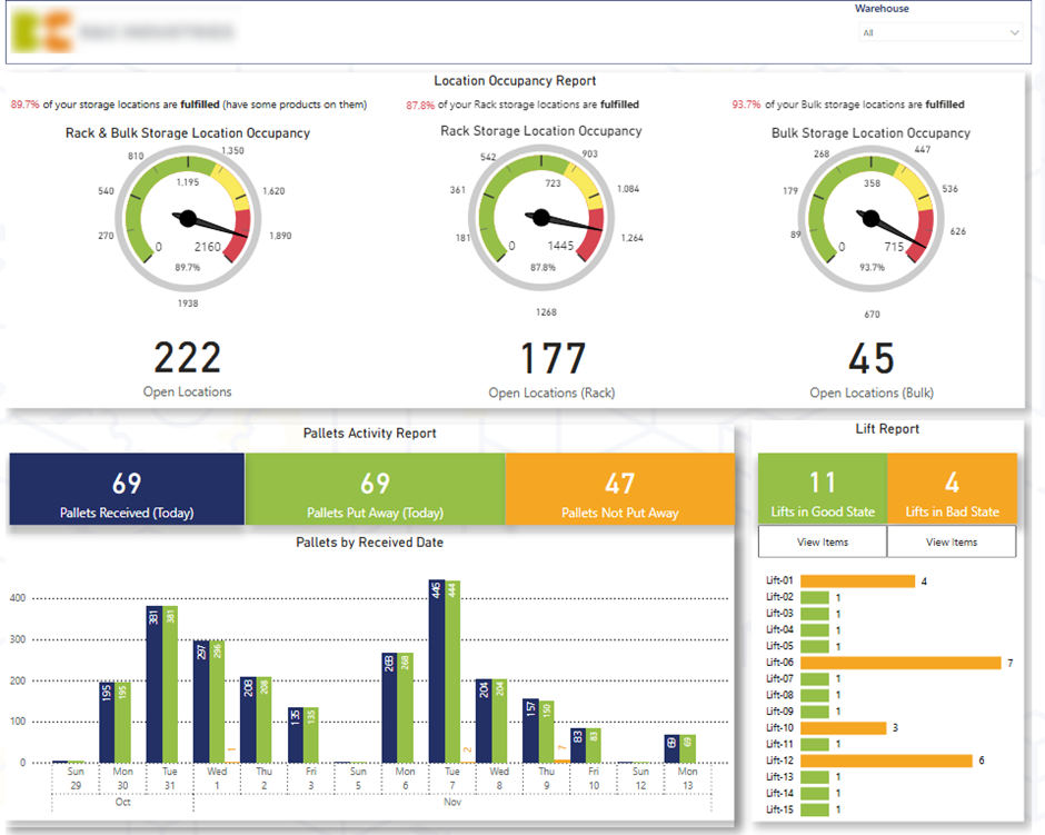
A Power BI warehouse dashboard is designed to give operations teams real-time visibility into how efficiently warehouses handle inbound and outbound activity. It is most useful for logistics-driven organisations that need to monitor storage capacity, inbound deliveries, and order fulfilment performance across one or multiple warehouses.
The first page of the Power BI warehouse dashboard provides a quick operational health check for inbound deliveries. It analyses how warehouses accept goods across two storage methods—Rack and Bulk, by showing how many locations are still open versus occupied (Fulfilled). The dashboard also tracks daily pallet arrivals and highlights how many pallets are Put Away versus Not Put Away, helping teams prioritise unallocated stock. In addition, the analysis shows the number of items per Forklift, allowing warehouse managers to drill into specific forklifts, view the remaining items, and instruct teams to clear them.
The first page improved control over inbound warehouse activity. By showing open versus occupied rack and bulk locations, the team could quickly assess capacity constraints and avoid congestion. Visibility into pallets not yet put away and items left on forklifts helped managers prioritise tasks, reduce handling delays, and improve space utilisation, leading to faster receiving and lower operational friction.
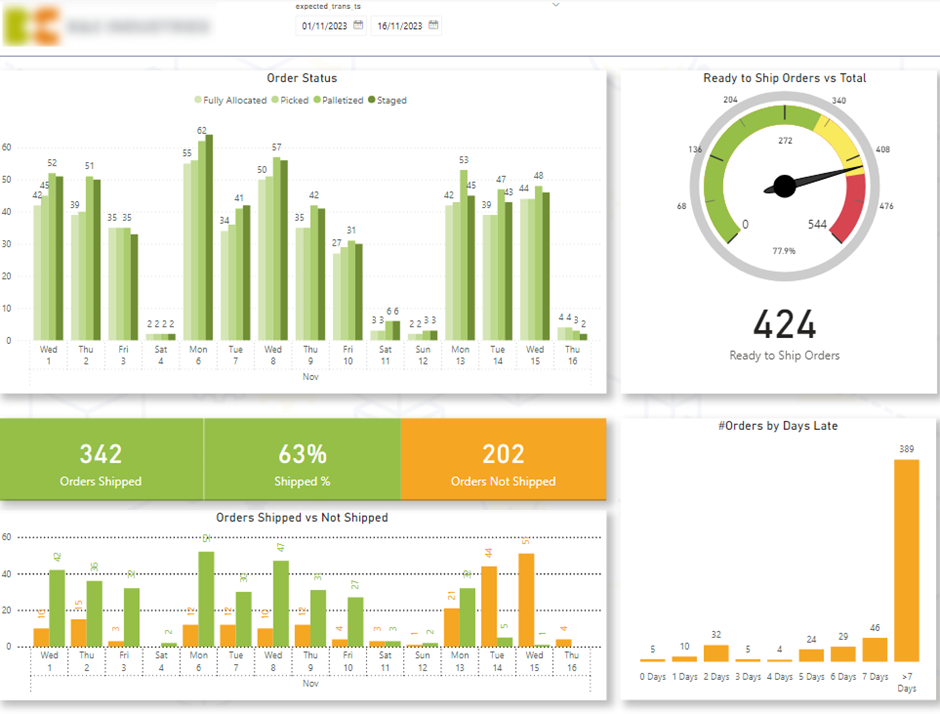
The second page focuses on outbound customer delivery performance. A gauge shows the percentage and number of items Ready to Ship, with the goal of keeping this as high as possible throughout the week. Delivery flow is analysed by status—Allocated, Picked, Packed, and Staged—to identify bottlenecks in the process. The dashboard also compares Shipped vs Not Shipped Orders by expected ship date and includes a histogram of orders by Days Late, enabling teams to drill into delayed orders and prioritise them before service levels are impacted.
The second page improved outbound performance by giving the business full visibility into order flow and delivery readiness. Tracking the percentage of items ready to ship helped teams maintain consistent throughput throughout the week, while delivery status analysis highlighted bottlenecks in allocation, picking, packing, or staging. Late-order analysis allowed managers to proactively prioritise delayed shipments, improving on-time delivery rates, customer satisfaction, and overall warehouse efficiency.
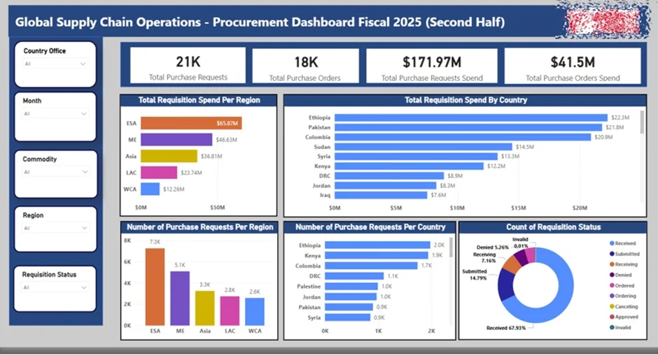
A Power BI procurement dashboard is designed to track and control the approval process for purchasing goods and services. It is most useful for large organisations operating across multiple countries, where procurement governance, budget control, and approval visibility are critical. The dashboard ensures transparency across the full request-to-purchase lifecycle and reduces the risk of unauthorised or delayed spend.
Our Power BI developers built the procurement dashboard above for a global humanitarian charity operating across multiple regions. The dashboard analyses the total number of Purchase Requests, Requested Budget, and Approved Budget, with breakdowns by country and region. Each purchase request is explicitly tied to a Purchase Order, giving the procurement team full confidence that spend is only incurred once approvals are complete. The dashboard also tracks requests by Requisition Status, showing where each request sits in the approval pipeline.
As a result of our project, the procurement teams gained real-time visibility into approval workloads, allowing them to identify bottlenecks and prioritise outstanding requests more effectively. By clearly linking requests to approved purchase orders and budgets, the dashboard strengthened spend control, reduced approval risk, and improved audit readiness—while automated data refresh from SAP Ariba saved time and enabled more frequent, reliable reporting across the global procurement function.
Supply chain business intelligence delivers the most value when it’s built around your data, processes, and decisions. Whether you need better visibility into inventory, warehouses, logistics, or procurement, the right BI setup can replace manual reporting with reliable, real-time insight.
If you’re looking to design or improve your supply chain dashboards in Power BI or Tableau, contact us. Our BI experts will help you turn your supply chain data into clear, actionable intelligence.
![]()
![]()
![]()